
CSS -弹出框底部弹出效果
效果图:
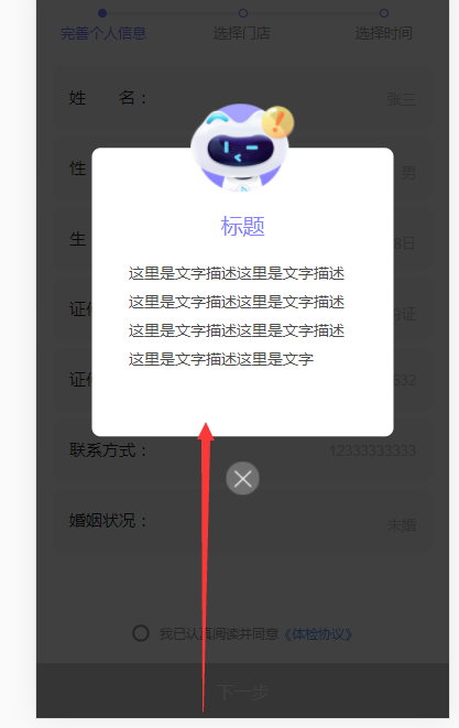
底部弹出


.bg-layer{
  background: rgba(0,0,0,0.75);
  position: fixed;
  z-index: 100;
  width: 100%;
  top: 0;
  left: 0;
  bottom: 0;
  right: 0;


  animation:sharePath .2s;
  animation-fill-mode:forwards;

  -webkit-animation:sharePath .2s;
  -webkit-animation-fill-mode:forwards;


  .bg-dialog{
    width: 7.333rem;
    height: 6.973rem;
    background: #fff;
    border-radius: .213rem;
    position: relative;
    left: 50%;
    top: 42%;
    transform: translate(-50%, -50%);
    .rob{
      width: 2.533rem;
      height: 2.133rem;
      position: absolute;
      top: 0;
      left: 50%;
      transform: translateX(-50%);
      margin-top: -1.067rem;
    }
    .title{
      font-size: .533rem;
      color: #877FFE;
      padding-top: 1.6rem;
      text-align: center;
    }
    .desc{
      margin: .533rem .907rem 0;
      font-size: .373rem;
      color: #4A4A4A;
      line-height: .7rem;
    }
  }
  .close{
    text-align: center;
    position: absolute;
    bottom: -0.8rem;
    margin-bottom: -.773rem;
    left: 50%;
    transform: translateX(-50%);
  }
  .dialog-close{
    width: .8rem;
    height: .8rem;
    text-align: center;
  }
}


@keyframes sharePath
{
    from {bottom:-50%;}
    to {bottom:0;}
}

@-webkit-keyframes sharePath{
  from {bottom:-50%;}
  to {bottom:0;}
}
animation:sharePath .2s;
animation-fill-mode:forwards;


 浙公网安备 33010602011771号