
ant-design可编辑单元格加入select选择器
1. 需求:
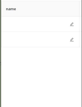
2. 分析:
- 使用ant-design里面Table表格的可编辑单元格模板以及select选择器进行改造。
https://www.antdv.com/components/table-cn/#components-table-demo-editable-cells
- 将Table表格可编辑单元格中的input框替换成select选择器,并且加上鼠标悬浮气泡提示
- 再进行数据传输
3. 代码
 1 <template>
 2   <div class="editable-cell">
 3     <div v-if="editable" class="editable-cell-input-wrapper">
 4       <a-select
 5         mode="multiple"
 6         style="width: 100%"
 7         placeholder="Please select"
 8         @change="handleChange"
 9       >
10         <a-select-option v-for="option in options" :key="option">
11           {{ option }}
12         </a-select-option>
13       </a-select>
14       <a-icon
15         type="save"
16         theme="filled"
17         class="editable-cell-icon-check"
18         @click="check"
19       />
20     </div>
21     <div v-else class="editable-cell-text-wrapper">
22       <a-tooltip :title="value">
23         <span class="text">{{ value }}</span>
24       </a-tooltip>
25       <a-icon type="edit" class="editable-cell-icon" @click="edit" />
26     </div>
27   </div>
28 </template>
29
30 <script>
31 export default {
32   props: {
33     options: {
34       type: Array,
35       default: [],
36     },
37   },
38   data() {
39     return {
40       value: "",
41       editable: false,
42     };
43   },
44   methods: {
45     handleChange(value) {
46       this.value = value.join(",");
47     },
48     edit() {
49       this.editable = true;
50     },
51     check() {
52       this.editable = false;
53     },
54   },
55 };
56 </script>
57
58 <style>
59 .editable-cell {
60   position: relative;
61 }
62
63 .editable-cell-input-wrapper,
64 .editable-cell-text-wrapper {
65   padding-right: 24px;
66   display: flex;
67   align-items: center;
68 }
69
70 .editable-cell-text-wrapper {
71   padding: 5px 24px 5px 5px;
72 }
73 .editable-cell-text-wrapper .text {
74   max-width: 200px;
75   overflow: hidden;
76   text-overflow: ellipsis;
77   white-space: nowrap;
78 }
79
80 .editable-cell-icon,
81 .editable-cell-icon-check {
82   position: absolute;
83   right: 0;
84   width: 20px;
85   cursor: pointer;
86 }
87
88 .editable-cell-icon,
89 .editable-cell-icon-check {
90   line-height: 18px;
91   display: inline-block;
92 }
93
94 .editable-cell-icon:hover,
95 .editable-cell-icon-check:hover {
96   color: #108ee9;
97 }
98 </style>
3.1 代码分析:
- options:父组件传过来的值,为select选择器的选项
- 定义两个变量:
- value:显示在span标签内以及提示框内的值
- editable:是否可编辑(true为可编辑,即显示select框)
- 定义的方法:
- handleChange:拿到当前选择的选项(多选情况下为数组),并且将其拼接成字符串
- edit和check:分别对应编辑按钮和保存按钮的点击事件

 浙公网安备 33010602011771号