呼吸灯的实现 用transform和animation实现
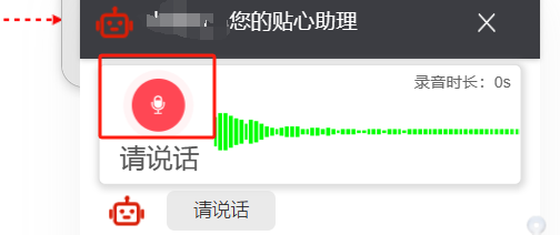
实现前端呼吸灯效果,录音效果
效果图如下:
<!DOCTYPE html>
<html lang="en">

<head>
     <meta charset="UTF-8">
     <meta http-equiv="X-UA-Compatible" content="IE=edge">
     <meta name="viewport" content="width=device-width, initial-scale=1.0">
     <title>Document</title>
     <style>
          .pulse {
    background: #FF4754;
    -webkit-box-shadow: 0 0 0 0 #FF4754;
    box-shadow: 0 0 #ff4754;
    border-radius: 50%;
    -ms-flex-item-align: center;
    align-self: center;
    z-index: 100;
    min-width: 8px;
    height: 8px;
    margin-right: 13px;
    -webkit-transform: scale(1);
    transform: scale(1);
    -webkit-animation: pulse-animation-0764004c 2s infinite;
    animation: pulse-animation-0764004c 2s infinite;
}
@keyframes pulse-animation-0764004c {
0% {
    -webkit-transform: scale(.95);
    transform: scale(.95);
    -webkit-box-shadow: 0 0 0 0 rgba(255,71,84,.7);
    box-shadow: 0 0 #ff4754b3;
}
70% {
    -webkit-transform: scale(1);
    transform: scale(1);
    -webkit-box-shadow: 0 0 0 7px rgba(255,71,84,0);
    box-shadow: 0 0 0 7px #ff475400;
}
100% {
    -webkit-transform: scale(.95);
    transform: scale(.95);
    -webkit-box-shadow: 0 0 0 0 rgba(255,71,84,0);
    box-shadow: 0 0 #ff475400;
}}
     </style>
</head>

<body>
     <div class="bg">
          <div class="pulse"  style=""></div>
     </div>
</body>

</html>

 浙公网安备 33010602011771号