
136python可视化图
灵感 :来自朋友让我帮它弄可视化图,持续更新,后期可直接套用
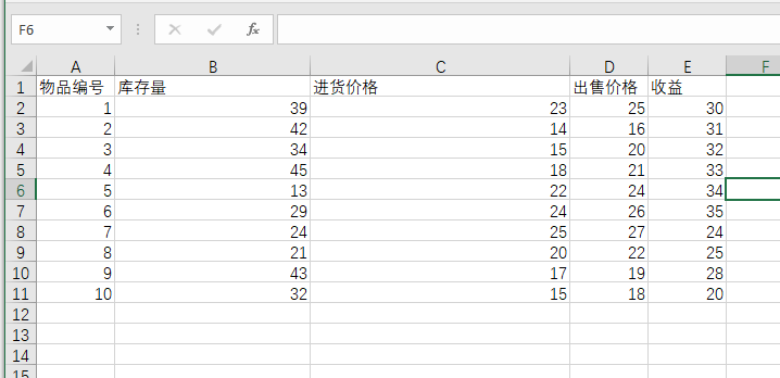
EXCEL文件
例子:
excel布局
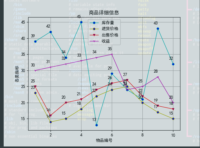
效果:
实现代码:
import pandas as pd
import matplotlib.pyplot as plt

plt.rcParams['font.sans-serif'] = ['SimHei']
plt.rcParams['axes.unicode_minus'] = False

df = pd.read_excel(r"C:\\Users\43701\\Desktop\可视化练习\\test01.xlsx")
# 输入折线图数据
plt.plot(df["物品编号"], df["库存量"], label='库存量', linewidth=1, color='c', marker='o', markerfacecolor='blue', markersize=5)
plt.plot(df["物品编号"], df["进货价格"], label='进货价格', linewidth=1, color='y', marker='o', markerfacecolor='blue', markersize=5)
plt.plot(df["物品编号"], df["出售价格"], label='出售价格', linewidth=1, color='r', marker='v', markerfacecolor='blue', markersize=5)
plt.plot(df["物品编号"], df["收益"], label='收益', linewidth=1, color='m', marker='1', markerfacecolor='blue', markersize=5)
plt.xlabel("物品编号")
plt.ylabel('各类指标')
plt.title("商品详细信息")

# 添加数据点注释
for x, y in zip(df["物品编号"], df["库存量"]):
    plt.annotate(str(y), xy=(x, y), xytext=(-10, 10), textcoords="offset points")


for x, y in zip(df["物品编号"], df["进货价格"]):
    plt.annotate(str(y), xy=(x, y), xytext=(-10, 10), textcoords="offset points")

for x, y in zip(df["物品编号"], df["出售价格"]):
    plt.annotate(str(y), xy=(x, y), xytext=(-10, 10), textcoords="offset points")

for x, y in zip(df["物品编号"], df["收益"]):
    plt.annotate(str(y), xy=(x, y), xytext=(-10, 10), textcoords="offset points")

# 图例说明
plt.legend()
# 显示网格
plt.grid()
# 保存折线图
plt.savefig('line_chartdemo3.png')
plt.show()
CSV文件
例子1
csv布局

效果:
代码如下:
# @author: zhc
# @Time: 2023/4/29
# @FileName: demo2
import pandas as pd
class Bar_429:
def start(self):
self.__testA_wy()
self.__testB_img()
def __testA_wy(self):
from bokeh.plotting import figure, output_file, show
from bokeh.models import CustomJS, ColumnDataSource
from bokeh.models.tools import HoverTool
# 读csv文件
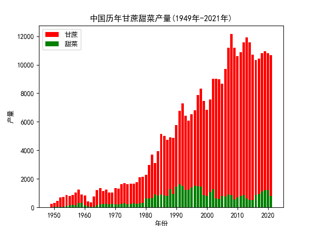
data = pd.read_csv('中国历年甘蔗甜菜产量(1949年-2021年).csv')
years = data['年份']
sugarcane = data['甘蔗产量']
beets = data['甜菜产量']
# 创建交互式图表
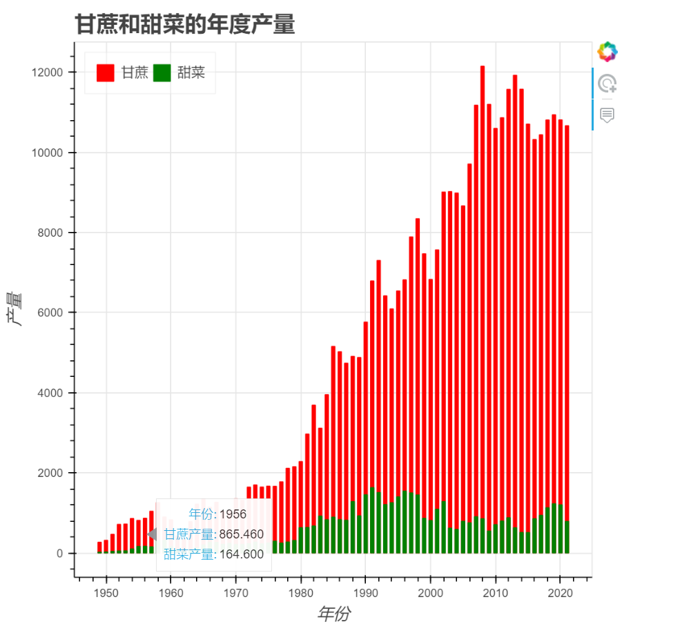
p = figure(title='中国历年甘蔗甜菜产量(1949年-2021年)', x_axis_label='年份', y_axis_label='产量', tools='tap')
# 添加柱状图
source = ColumnDataSource(data=dict(years=years, sugarcane=sugarcane, beets=beets))
p.vbar(x='years', top='sugarcane', color='red', width=0.5, legend_label='甘蔗', source=source)
p.vbar(x='years', top='beets', color='green', width=0.5, legend_label='甜菜', source=source)
# 添加鼠标悬停工具
p.add_tools(HoverTool(tooltips=[('年份', '@years'), ('甘蔗产量', '@sugarcane'), ('甜菜产量', '@beets')]))
# 设置图表样式
p.legend.location = "top_left"
p.legend.orientation = "horizontal"
p.legend.label_text_font_size = "10pt"
p.legend.background_fill_alpha = 0.3
p.xaxis.axis_label_text_font_size = "12pt"
p.yaxis.axis_label_text_font_size = "12pt"
p.title.text_font_size = "16pt"
# 添加回调函数
callback = CustomJS(args=dict(source=source), code="""
var selected_index = source.selected.indices[0];
var data = source.data;
var year = data['years'][selected_index];
var sugarcane = data['sugarcane'][selected_index];
var beets = data['beets'][selected_index];
alert("年份:" + year + "\n甘蔗产量:" + sugarcane + "\n甜菜产量:" + beets);
""")
p.js_on_event('tap', callback)
# 输出图表到HTML文件
output_file('chart.html')
show(p)
def __testB_img(self):
# 2
import pandas as pd
import matplotlib.pyplot as plt
# 读取数据
data = pd.read_csv('中国历年甘蔗甜菜产量(1949年-2021年).csv')
years = data['年份']
sugarcane = data['甘蔗产量']
beets = data['甜菜产量']
# 创建画布
fig, ax = plt.subplots()
# 添加柱状图
ax.bar(years, sugarcane, color='red', label='甘蔗')
ax.bar(years, beets, color='green', label='甜菜')
# 设置坐标轴标签和图例
ax.set_xlabel('年份')
ax.set_ylabel('产量')
ax.set_title('中国历年甘蔗甜菜产量(1949年-2021年)')
ax.legend()
# 添加鼠标悬停事件
def onclick(event):
index = event.xdata
if index is not None:
index = int(index)
print(f'年份: {years[index]}, 甘蔗产量: {sugarcane[index]}, 甜菜产量: {beets[index]}')
cid = fig.canvas.mpl_connect('button_press_event', onclick)
# 保存图形并显示
plt.savefig('chart.png')
plt.show()
if __name__ == '__main__':
bar = Bar_429()
bar.start()
本文来自博客园,作者:__username,转载请注明原文链接:https://www.cnblogs.com/code3/p/17364187.html

 浙公网安备 33010602011771号