
CSS绘制博客园logo
使用博客园好久了,去年10月开始尝试写博客,虽然输出的内容水平还有待提高,不过也是锻炼了我整理内容,对外输出的能力。虽然读者寥寥,并且至今零评论,不过我还是最喜欢这个纯粹的博客平台,今天来用CSS绘制一下博客园的logo,表达我对她的喜爱。
开发前准备
在博客园左上角找到博客园logo,在新网页打开,通过截图工具Snipaste来获取色值和px(急需更专业的获取尺寸工具,但现在找不到),logo是svg,可以直接获取色值和尺寸,不过临摹嘛,讲究一个所见即所得,看源码不太好,实现完再对照一下吧。

开始绘制
源码放在文章末尾
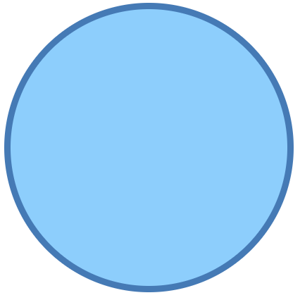
把底图画出来
.logo {
  position: relative;
  width: 628px;
  height: 628px;
  background-color: #8dcefc;
  border-radius: 50%;
  border: 13px solid #457ab5;
}
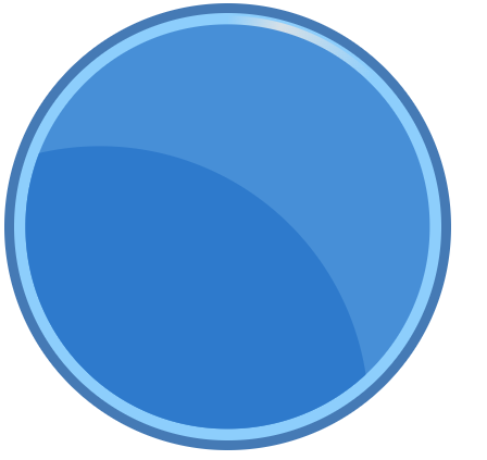
绘制圆环高亮
圆环右上角有一个高亮效果,这应该是一个从中间到两边的锥形渐变,使用锥形渐变绘制效果,再把里面的两个圆填进去,效果如下
绘制信号
接下拉是绘制这个信号图标,一个信号源和两条波,信号源就一个圆,没啥说的。
波的话,先用border画出一个弧,然后用::before和::after画出两个圆接到两端。
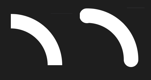
效果如下

有点感觉了,但还是有差距,一个是尺寸其实是不够准确的,还有就是原图的内部的深蓝色的图形,其实并不是一个圆形的一部分,而是一个更复杂的图案,我肉眼加截图工具,不太好复刻。
绘制底部阴影
这个阴影有点像一个椭圆,颜色应该是从中心到四周的径向渐变。

太规则了,然后我试了一下用阴影,效果也是不太好,只能还原到这了。
最后,使用scale缩小一下,截图放到博客园左上角的图标上,勉强也能以假乱真了

源码
<!DOCTYPE html>
<html lang="en">
  <head>
    <meta charset="UTF-8" />
    <meta http-equiv="X-UA-Compatible" content="IE=edge" />
    <meta name="viewport" content="width=device-width, initial-scale=1.0" />
    <title>Document</title>
    <style>
      * {
        margin: 0;
        padding: 0;
      }
      body {
        padding: 100px;
      }
      .logo {
        position: relative;
        width: 366px;
      }
      .circle {
        position: relative;
        width: 350px;
        height: 350px;
        background-color: #8dcefc;
        border-radius: 50%;
        border: 8px solid #457ab5;
        overflow: hidden;
      }
      .circle .highlight {
        position: absolute;
        transform: translate(-50%, -50%);
        left: 50%;
        top: 50%;
        width: 344px;
        height: 344px;
        background: conic-gradient(
          transparent 0deg,
          #d6e0e7 15deg,
          transparent 45deg
        );
        border-radius: 50%;
      }
      .circle .moon {
        position: absolute;
        transform: translate(-50%, -50%);
        left: 50%;
        top: 50%;
        width: 330px;
        height: 330px;
        background-color: #478fd7;
        border-radius: 50%;
        overflow: hidden;
      }
      .circle .moon .part-circle {
        position: absolute;
        right: 15%;
        top: 30%;
        width: 400px;
        height: 400px;
        padding: 20px;
        background-color: #2e7acc;
        border-radius: 50%;
      }
      .circle .network-signal {
        position: absolute;
      }
      .circle .network-signal .source {
        position: absolute;
        left: 77px;
        top: 203px;
        width: 78px;
        height: 78px;
        background-color: #fff;
        border-radius: 50%;
      }
      .wave1 {
        /* 整体的半径 */
        --radius: 114px;
        position: absolute;
        left: 84px;
        top: 127px;
      }
      .wave2 {
        /* 整体的半径 */
        --radius: 152px;
        position: absolute;
        left: 106px;
        top: 66px;
      }
      .arc {
        position: absolute;
        left: 19px;
        width: calc(var(--radius) - 19px);
        height: calc(var(--radius) - 19px);
        border-style: solid;
        border-top-width: 38px;
        border-bottom-width: 0px;
        border-left-width: 0px;
        border-right-width: 38px;
        border-color: #fff;
        background-color: transparent;
        border-top-right-radius: 200%;
        border-bottom-left-radius: 0;
      }
      .arc::before {
        content: '';
        position: absolute;
        left: -19px;
        top: -38px;
        width: 38px;
        height: 38px;
        background-color: #fff;
        border-radius: 50%;
      }
      .arc::after {
        content: '';
        position: absolute;
        right: -38px;
        bottom: -19px;
        width: 38px;
        height: 38px;
        background-color: #fff;
        border-radius: 50%;
      }
      .logo .shadow {
        position: absolute;
        transform: translate(-50%);
        left: 50%;
        top: 366px;
        width: 254px;
        height: 12px;
        background-image: radial-gradient(#969696, #fff);
        border-radius: 100%;
      }
    </style>
  </head>
  <body>
    <div class="logo">
      <div class="circle">
        <div class="highlight"></div>
        <div class="moon"><div class="part-circle"></div></div>
        <div class="network-signal">
          <div class="source"></div>
          <div class="wave1"><div class="arc"></div></div>
          <div class="wave2"><div class="arc"></div></div>
        </div>
      </div>
      <div class="shadow"></div>
    </div>
  </body>
</html>

 浙公网安备 33010602011771号