谈谈css中的before和after
css中的伪元素before和after,其实有很多小的妙用。
一、基础用法
w3c中的基础用法:用来给元素的内容前面(对应:before)或者后面(对应:after)插入新内容。
<p>
   love
</p>
<style>

//添加文字
   p:before{
       content:"I";
     }
   p:after {
       content:"you";
     }
//添加图片

    p:before {
       content: url(logo.gif) ;
    }

//添加href地址
    p:after {
        content:"(" attr(href) ")";
    }
</style>
分别显示的是“I love you” 、图片、地址。
二、扩展
除此之外,我们还能常常见到before和after伪元素,可以用来加小图标、清除浮动等作用。
1清除浮动
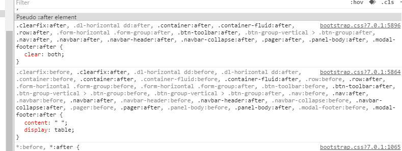
从上面的截图中,可以看到bootstrap框架中设置 :before和 :after clear:both,来清除浮动。
.clear-float {
     overflow:hidden;

}

.clear-float:{

   content:" "; display:table;  clear:both;
}
2 在特定位置添加小图标
有时候我们需要通过相对或者绝对定位的方式,来给父子元素放在相应的位置。那么用伪元素可以减少子元素标签的设置。举例如下:
<style>
   .test{ position:relative; width:300px; height:200px; border:1px solid #ddd;}
   .test:before{position:absolute; display:block; content:" ";top:0px; left:-101px;width:0; height:0; border-right-color: #e0e0e0; border: 50px solid transparent; }
</style>

<div class="test"></div>
结果如下:
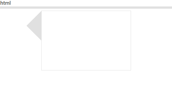
由图中可以看到通过将伪元素定位,实现了三角形的呈现。
3 小demo
<style>
  div{margin:100px; text-align:center;}
  .demo{
     display:inline-block;
     color:#fff;
     font-size:30px;
     width:200px;
     position:relative;
  }
   .demo:before,.demo:after{
     position:absolute;
   }
   .demo:hover:before{
     content:"^+^";
     left:-50px;
   }
   .demo:hover:after{
     content:"^+^";
     right:-50px;
   }
</style>
</head>

<body style="background-color: #0C1021">
    <div>
        <a class="demo" href="#">come on! baby</a>
    </div>

</body>
可以自己测试结果看下。
就先写到这里,表示加班到现在,还继续写了这篇博客,眼睛已经累的不行。^_^!
######如果对你有帮助,记得帮忙点个赞,支持我哦^o^。
######尊重原创,转载请注明。
######尊重原创,转载请注明。

 浙公网安备 33010602011771号