第十二 CSS基础
一、css三种引用方式
1.1.引用方式说明
1.1.1.写在div里面,直接引用
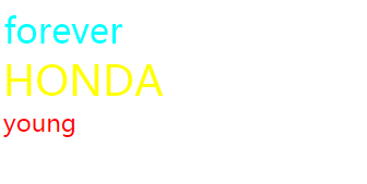
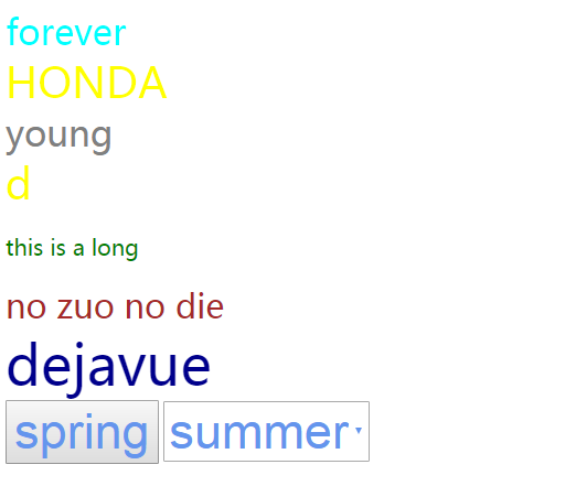
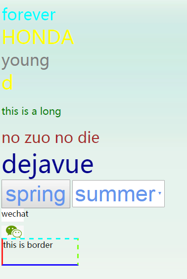
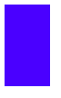
<div style="color: aqua;font-size: 32px">forever</div>
1.1.2.卸载head里面,全局引用
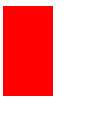
    <style>
        .cc {
            color: red;
            font-size: 22px;
        }
    </style>
1.1.3.写到文件里面导入引用
common.css
.kk{
    color: yellow;
    font-size: 38px;
}
head 里面引入
<link rel="stylesheet" href="common.css" />
1.2.示例说明
<!DOCTYPE html>
<html lang="en">
<head>
    <meta charset="UTF-8">
    <title>XieSha</title>
    <link rel="stylesheet" href="common.css" />
    <style>
        .cc {
            color: red;
            font-size: 22px;
        }
    </style>
</head>
<body>
    <div style="color: aqua;font-size: 32px">forever</div>
    <div class="kk">HONDA</div>
    <div class="cc">young</div>
</body>
</html>
common.css
.kk{
    color: yellow;
    font-size: 38px;
}
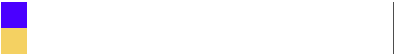
1.3.查看运行结果
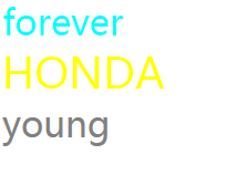
1.4.两种样式同时使用,后面的覆盖前面的
    <style>
        .cc {
            color: red;
            font-size: 22px;
        }
        .dd {
            color:gray;
            font-size: 32px;
        }
    </style>
<div class="cc dd">young</div>
结果如下:
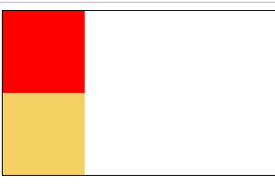
2.标签引用方式说明
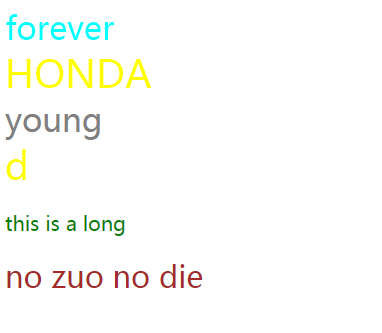
2.1.class选择器
.kk{
    color: yellow;
    font-size: 38px;
}
<div class="kk">d</div>
2.2.标签选择器
p {
    color: green;
    font-size: 20px;
}
<p>this is a long</p>
2.3.id选择器
#fu{
    color: brown;
    font-size: 30px;
}
<div id="fu">no zuo no die</div>
查看应用结果:
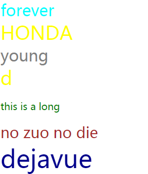
2.4.组合选择器之层级选择器
div a span {
    color: darkblue;
    font-size: 50px;
}
    <div class="c3">
        <a>
            <span id="#i7">
                dejavue
            </span>
        </a>
    </div>
运行结果:
2.5.组合选择器之或者
button,select {
    color: cornflowerblue;
    font-size: 45px;
}
    <button>
        spring
    </button>
    <select>
        <option>summer</option>
    </select>
查看结果:
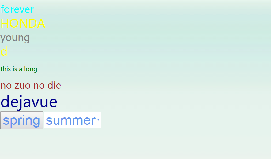
3.关于background
3.1.background要素
body {
    height: 500px;
    background-image: url("./img/bg.png");
    background-repeat: repeat-x;
}
3.2.图片
一条竖线进行的平铺
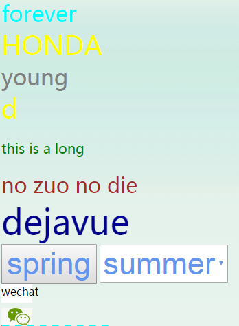
4.关于图标展示
4.1.代码如下
.cicon {
    height: 60px;
    width: 45px;
    background-image: url("img/GM.png");
    background-repeat: no-repeat;
    background-position: -100px -100px;
}
  <div class="cicon">
      wechat
    </div>
4.2.图片
只显示微信图标:
5.关于border
<div style="border-left: solid #ff2321;border-right: dashed #81ff17;border-bottom:solid #1e0eff;border-top:dashed #0cfff2;height: 50px;width: 150px;">
             this is border
    </div>
6.关于display
6.1.display将div块级标签变成内联标签
    <div style="height: 20px;">
        iamdiv
    </div>
    <div style="height: 20px;display: inline;">
        imadiv2
    </div>
查看结果:

下面的变成内联标签
6.2.display将span内联标签变成块级标签
<span style="height: 20px;">
        imaspan
</span>
<span style="height: 20px;display: block;">
        imaspan2
</span>
查看结果:

7.关于鼠标样式cursor
    <span style="cursor: pointer;height: 20px;" style="color: rgb(128, 0, 0);">">jingxi</span>
    <span style="cursor: help;height: 20px;" style="color: rgb(128, 0, 0);">">help</span>
    <span style="cursor: move;" style="color: rgb(128, 0, 0);">">move</span>
    <span style="cursor: wait;" style="color: rgb(128, 0, 0);">">wait</span>
    <span style="cursor: crosshair;" style="color: rgb(128, 0, 0);">">crosshair</span>
    <span style="cursor: url(img/favicon.ico),auto;" style="color: rgb(128, 0, 0);">">komizu</span>
鼠标样式及自定义样式
8.div布局float
8.1.float 基本
    <div style="width: 300px">
        <div style="float: left;width: 20%;" style="color: rgb(128, 0, 0);">">123</div>
        <div style="float: left;width: 50%;" style="color: rgb(128, 0, 0);">">456</div>
    </div>
运行结果:

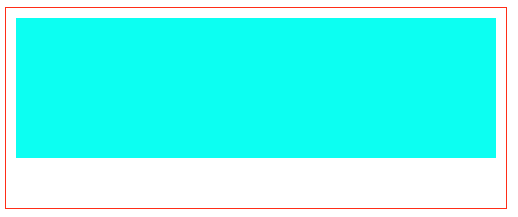
8.2.float 展示背景
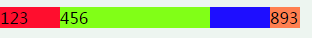
  <div style="width:300px;" style="color: rgb(128, 0, 0);">">
        <div style="float: left;width: 20%;" style="color: rgb(128, 0, 0);">">123</div>
        <div style="float: left;width: 50%;" style="color: rgb(128, 0, 0);">">456</div>
        <div style="float: right;width: 10%;">893</div>
    </div>

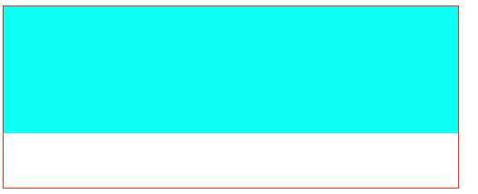
发现还有10%空白,没有应用父类的背景,要想使用,如下操作:
    <div style="width:300px;" style="color: rgb(128, 0, 0);">">
        <div style="float: left;width: 20%;" style="color: rgb(128, 0, 0);">">123</div>
        <div style="float: left;width: 50%;" style="color: rgb(128, 0, 0);">">456</div>
        <div style="float: right;width: 10%;">893</div>
        <div style="clear: both"></div>
    </div>
9.关于position
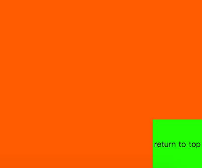
9.1.fixed
 <div style="position: fixed;bottom: 30px;right: 40px">返回顶部</div>
 <div style="height: 1400px;"></div>
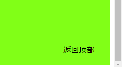
返回顶部,始终固定在右下角,不管页面如何变化,滑轮如何滑动,矢志不渝。
9.2.relative 和absolute
这两个经常一起使用
 <div style="position: relative;height: 300px;width: 300px;">
        <div style="position: absolute;bottom: 0px;right: 0px">
            小窗右下角
        </div>
 </div>
 <div style="height: 1400px;"></div>
结果展示:
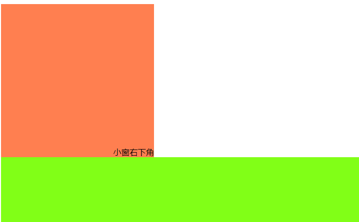
固定在小页面的右下角
10.css层叠及透明度
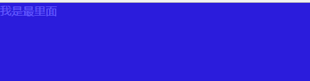
两个div堆叠,fixed固定,上下左右距离都是0,所以北京颜色会铺满整屏。z-index 哪个值大,哪个在上面
opacity:0.7 这个值在0-1之间,值越小越透明。登录弹出一个对话框,经常使用。
<div style="z-index:11;position:fixed;top:0;left:0;right:0;bottom:0;">
        <span style="color: white">
            我是最里面
        </span>
</div>
<div style="z-index:12;position:fixed;top:0;left:0;right:0;bottom:0;opacity: 0.7"></div>
查看页面:
11.边距
pandding 内边距;margin 外边距
11.1.原代码
<div style="border: solid #ff2d17 1px;height: 200px;width: 500px">
        <div style="height: 100px;"></div>
</div>

11.2.增加内边距
  <div style="border: solid #ff2d17 1px;height: 200px;width: 500px">
        <div style="height: 100px;padding: 20px;"></div>
  </div>
11.3.增加外边距
   <div style="border: solid #ff2d17 1px;height: 200px;width: 500px">
        <div style="height: 100px;padding: 20px;margin: 10px;"></div>
   </div>
padding: 10px; 上下左右都是10px;
padding: 10px 20px 11px 9px; 顺序是上右下左
padding: 10px 20px; 上下 左右
一、组合选择器
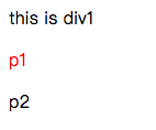
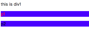
1.如下,如何只要p1颜色变红:
<!DOCTYPE html>
<html lang="en">
<head>
    <meta charset="UTF-8">
    <title>Title</title>
    <style>
        p.c1 {
            color: red;
        }
    </style>
</head>
<body>
    <div class="c1">this is div1</div>
    <p class="c1">p1</p>
    <p>p2</p>
</body>
</html>
效果:
2.p1引用多个样式
<!DOCTYPE html>
<html lang="en">
<head>
    <meta charset="UTF-8">
    <title>Title</title>
    <style>
        p.c1 {
            color: red;
        }

        .c2 {
            background-color: #1e0eff;
        }
    </style>
</head>
<body>
    <div class="c1">this is div1</div>
    <p class="c1 c2">p1</p>
    <p class="c2">p2</p>
</body>
</html>
效果:
使用场景:
<!DOCTYPE html>
<html lang="en">
<head>
    <meta charset="UTF-8">
    <title>Title</title>
    <style>
        p.c1 {
            color: red;
        }

        .c2 {
            background-color: #1e0eff;
        }

        .btn {
            background-color: slategrey;
            font-size: 22px;
            width: 60px;
            height: 70px;
            text-align: center;
            line-height: 60px;
            margin-top: 10px;
            color: whitesmoke;
        }

        .left {
            ....
        }

        .right {
            ....
        }
    </style>
</head>
<body>
    <div class="c1">this is div1</div>
    <p class="c1 c2">p1</p>
    <p class="c2">p2</p>
    <div class="btn left"> > </div>
    <div class="btn right"> < </div>
</body>
</html>
效果:

#如上,轮播图,左右都用同样的btn样式,但是左右各自有自己的特别样式,这时就需要用到多个样式
二、属性选择器
除了id和class等指定的选择器,我们也可以自定义选择器
2.1.自定义同样选择器,颜色改变
      [ckl] {
            color: #1e0eff;
        }
    </style>
</head>
<body>
    <div class="c1">this is div1</div>
    <p class="c1 c2">p1</p>
    <p class="c2">p2</p>
    <div class="btn"> > </div>
    <div class="btn"> < </div>
    <div ckl="hua">spring</div>
    <div ckl="xue">winter</div>
效果:

2.2.如果只要winter变色:
    [ckl="xue"] {
            color: #1e0eff;
        }
    </style>
</head>
<body>
    <div class="c1">this is div1</div>
    <p class="c1 c2">p1</p>
    <p class="c2">p2</p>
    <div class="btn"> > </div>
    <div class="btn"> < </div>
    <div ckl="hua">spring</div>
    <div ckl="xue">winter</div>
</body>
效果:

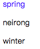
2.3.只允许div的spring颜色改变
        div[ckl="hua"] {
            color: #1e0eff;
        }

    </style>
</head>
<body>
    <div class="c1">this is div1</div>
    <p class="c1 c2">p1</p>
    <p class="c2">p2</p>
    <div class="btn"> > </div>
    <div class="btn"> < </div>
    <div ckl="hua">spring</div>
    <p ckl="hua">neirong</p>
    <div ckl="xue">winter</div>
效果:
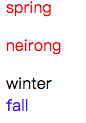
2.4.正则选择器,所有ha开头颜色变红
       [ckl^="hu"] {
            color: red;
        }

        [zld="feng"] {
            color: #1e0eff;
        }
    </style>
</head>
<body>
    <div class="c1">this is div1</div>
    <p class="c1 c2">p1</p>
    <p class="c2">p2</p>
    <div class="btn"> > </div>
    <div class="btn"> < </div>
    <div ckl="hua">spring</div>
    <p ckl="hua">neirong</p>
    <div ckl="xue">winter</div>
    <div zld="feng">fall</div>
</body>
效果:
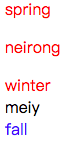
2.5.正则匹配,所有属性有e的颜色变绿
       [ckl*="u"] {
            color: red;
        }

        [zld="feng"] {
            color: #1e0eff;
        }
    </style>
</head>
<body>
    <div class="c1">this is div1</div>
    <p class="c1 c2">p1</p>
    <p class="c2">p2</p>
    <div class="btn"> > </div>
    <div class="btn"> < </div>
    <div ckl="hua">spring</div>
    <p ckl="hua">neirong</p>
    <div ckl="xue">winter</div>
    <div ckl="wa">meiy</div>
    <div zld="feng">fall</div>
</body>
</html>
效果:
三、伪类选择器
3.1.悬浮区域颜色改变
<!DOCTYPE html>
<html lang="en">
<head>
    <meta charset="UTF-8">
    <title>Title</title>
    <style>
        .c1 {
            width: 50px;
            height: 90px;
            background-color: #1e0eff;
        }

        .c1:hover {
            background-color: #ff0e2e;
        }
    </style>
</head>
<body>
    <div class="c1"></div>
</body>
</html>
效果:
当鼠标悬浮到这片区域:
3.2.进入选择框,颜色改变
<!DOCTYPE html>
<html lang="en">
<head>
    <meta charset="UTF-8">
    <title>Title</title>
    <style>
        .c1 {
            width: 90px;
            height: 90px;
            background-color: #1e0eff;
        }

        .c2 {
            width: 90px;
            height: 90px;
            background-color: #f1cf6b;
        }

        .box {
            border: solid 1px black;
        }
    </style>
</head>
<body>
    <div class="box">
        <div class="c1"></div>
        <div class="c2"></div>
    </div>

</body>
</html>
效果:
如果进入框区域,蓝色变红:
        .box:hover .c1 {
            background-color: #ff0e2e;
        }
效果:
3.3.before & after
在某个区域内通过属性添加内容
  .outer:after {
            content: "song";
            font-size: 20px;
            color: red;
        }

<body>
    <div class="box">
        <div class="c1"></div>
        <div class="c2"></div>
    </div>
    <div class="outer">
        <p>sing a </p>
    </div>

</body>
效果:

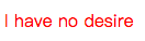
四、选择器优先级
4.1.class 和element
  <style>
        .c1 {
            color: red;
        }

        p {
            color: #1e0eff;
        }
    </style>
</head>
<body>
    <p class="c1" id="d2">I have no desire</p>
</body>
效果:
4.2.class和id
    <style>
        .c1 {
            color: red;
        }

        #d2 {
            color: #81ff17;
        }

    </style>
</head>
<body>
    <p class="c1" id="d2">I have no desire</p>
</body>
效果:
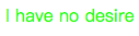
总结:优先级顺序 id > class > element
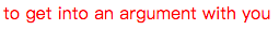
4.3.层级优先级1
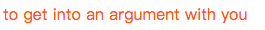
       .c1 .c2 p {
            color: red;
        }

        .c3 .c4 {
            color: green;
        }
    </style>
</head>
<body>
    <!--<p class="c1" id="d2">I have no desire</p>-->
    <div class="c1">
        <div class="c2">
            <div class="c3" id="d1">
                <p class="c4">to get into an argument with you</p>
            </div>
        </div>
    </div>
</body>
效果:
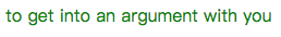
4.4.层级优先级2
<style>
        .c1 .c2 p {
            color: red;
        }

        .c2 .c3 .c4 {
            color: green;
        }
    </style>
</head>
<body>
    <!--<p class="c1" id="d2">I have no desire</p>-->
    <div class="c1">
        <div class="c2">
            <div class="c3" id="d1">
                <p class="c4">to get into an argument with you</p>
            </div>
        </div>
    </div>
</body>
效果:
4.5.层级优先级3
 <style>
        .c1 .c2 p {
            color: red;
        }

        .c2 .c3 .c4 {
            color: green;
        }

        #d1 .c4 {
            color: #f1cf6b;
        }
    </style>
</head>
<body>
    <!--<p class="c1" id="d2">I have no desire</p>-->
    <div class="c1">
        <div class="c2">
            <div class="c3" id="d1">
                <p class="c4">to get into an argument with you</p>
            </div>
        </div>
    </div>
</body>
效果:
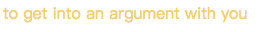
优先级权重,哪个值高,哪个优先,style(1000)>id(100)>class(10)>element(1)
4.6.如果优先级一样
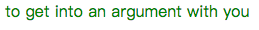
        .c1 .c2 p {
            color: red;
        }

        .c2 .c3 p {
            color: green;
        }

    </style>
</head>
<body>
    <!--<p class="c1" id="d2">I have no desire</p>-->
    <div class="c1">
        <div class="c2">
            <div class="c3" id="d1">
                <p class="c4">to get into an argument with you</p>
            </div>
        </div>
    </div>
</body>
效果:
        .c2 .c3 p {
            color: green;
        }

        .c1 .c2 p {
            color: red;
        }
效果:
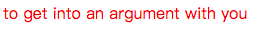
#结果:优先级一样,下面的生效,覆盖了上面的,效果如下:
<style>
        .c2 .c3 p {
            color: green;
            background-color: #1e0eff;
        }

        .c1 .c2 p {
            color: red;
        }
    </style>
</head>
<body>
    <!--<p class="c1" id="d2">I have no desire</p>-->
    <div class="c1">
        <div class="c2">
            <div class="c3" id="d1">
                <p class="c4">to get into an argument with you</p>
            </div>
        </div>
    </div>
</body>
效果:
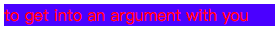
4.7.不再规则之内,优先级最高
       .c2 .c3 #d1 {
            color: green;
            background-color: #1e0eff;
        }


        .c4 {
            color: #ff6f06;!important;
        }
效果:
五、继承
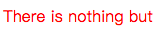
5.1.样式继承
<!DOCTYPE html>
<html lang="en">
<head>
    <meta charset="UTF-8">
    <title>Title</title>
    <style>
        .c1 {
            color: #1e0eff;
        }
    </style>
</head>
<body>
    <div class="c1">
        <div class="c2">
            <p>
                There is nothing but
            </p>
        </div>
    </div>
</body>
</html>
效果:
#如果没有指定样式,就继承样式
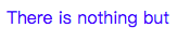
5.2.如果指定样式
<!DOCTYPE html>
<html lang="en">
<head>
    <meta charset="UTF-8">
    <title>Title</title>
    <style>
        .c1 {
            color: #1e0eff;
        }

        p {
            color: red;
        }
    </style>
</head>
<body>
    <div class="c1">
        <div class="c2">
            <p>
                There is nothing but
            </p>
        </div>
    </div>
</body>
</html>
效果:
#如果指定了,则以指定的为准
5.3.特殊的a标签
<!DOCTYPE html>
<html lang="en">
<head>
    <meta charset="UTF-8">
    <title>Title</title>
    <style>
        .c1 {
            color: #1e0eff;
        }

        p {
            color: red;
        }
    </style>
</head>
<body>
    <div class="c1">
        <div class="c2">
            <p>
                There is nothing but
            </p>
            <a>
                he knows
            </a>
        </div>
    </div>
</body>
</html>
效果:
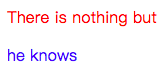
#a标签有默认的颜色,不继承
5.4.verticle-align 属性
<body>
    <div class="c1">
        <div class="c2">
            <p>
                There is nothing but
            </p>
            <a>
                he knows
            </a>
        </div>
    </div>
    <div>
        loveliness: <img src="img/maotu.png">
    </div>
</body>
效果:
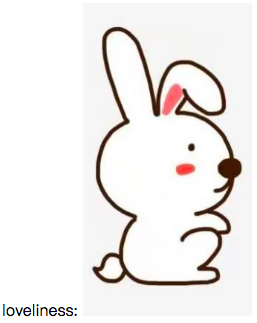
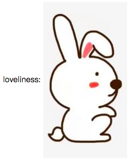
#如果想让字体在图片的中间?
       #图片属性
    .c3 {
            vertical-align: middle;
        }
    </style>
</head>
<body>
    <div class="c1">
        <div class="c2">
            <p>
                There is nothing but
            </p>
            <a>
                he knows
            </a>
        </div>
    </div>
    <div>
        loveliness: <img class="c3" src="img/maotu.png">
    </div>
</body>
效果:
#详细说明:https://www.cnblogs.com/yuanchenqi/articles/6870763.html
六、display属性
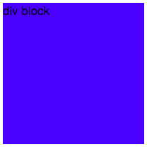
6.1.如下div块级变成内联
<!DOCTYPE html>
<html lang="en">
<head>
    <meta charset="UTF-8">
    <title>Title</title>
    <style>
        .c1 {
            width: 200px;
            height: 200px;
            background-color: #1e0eff;
        }
    </style>
</head>
<body>
    <div class="c1">
        div block
    </div>
</body>
</html><!DOCTYPE html>
<html lang="en">
<head>
    <meta charset="UTF-8">
    <title>Title</title>
    <style>
        .c1 {
            width: 200px;
            height: 200px;
            background-color: #1e0eff;
        }
    </style>
</head>
<body>
    <div class="c1">
        div block
    </div>
</body>
</html>
效果:
添加display属性将块级标签变成内联
        .c1 {
            width: 200px;
            height: 200px;
            background-color: #1e0eff;
            display: inline;
        }
效果:

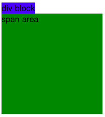
6.2.内联变块
<!DOCTYPE html>
<html lang="en">
<head>
    <meta charset="UTF-8">
    <title>Title</title>
    <style>
        .c1 {
            width: 200px;
            height: 200px;
            background-color: #1e0eff;
            display: inline;
        }

        .c2 {
            width: 200px;
            height: 200px;
            background-color: green;
        }
    </style>
</head>
<body>
    <div class="c1">
        div block
    </div>
    <span class="c2">
        span area
    </span>
</body>
</html>
效果:
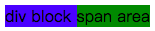
display属性修改:
        .c2 {
            width: 200px;
            height: 200px;
            background-color: green;
            display: block;
        }
结果:
如何在一行显示可以调节长宽的元素:1.float 2.display
6.3.display的布局
<head>
    <meta charset="UTF-8">
    <title>Title</title>
    <style>
        .c1 {
            width: 150px;
            height: 150px;
            background-color: #1e0eff;
        }

        .c2 {
            width: 150px;
            height: 150px;
            background-color: #ff6f06;
        }

        .c3 {
            width: 150px;
            height: 150px;
            background-color: #81ff17;
        }

    </style>
</head>
<body>
    <div class="c1"></div>
    <div class="c2"></div>
    <div class="c3"></div>
</body>
效果:
添加display属性,实现float:
       div {
            display: inline-block;
        }
效果:
6.4.display隐藏
       .Myhide {
            display: none;
        }
    </style>
</head>
<body>
    <div >
        <div class="c1"></div>
        <div class="c2"></div>
        <div class="c3 Myhide"></div>
    </div>
效果:
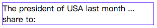
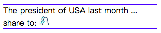
6.5.模拟分享
<style>
        .box {
            border: #1e0eff 1px solid;
            width: 300px;
        }

        /* 分享和图片在一行 */
        .share,.she{
            display: inline-block;
        }

        /* 图标默认隐藏 */
        .chide {
            display: none;
        }

        /* 鼠标悬浮到box时候,显示图标 */
        .box:hover img {
            display: block;
        }
    </style>
</head>
<body>
    <div class="box">
        <div class="text">The president of USA last month ...</div>
        <div class="text">
            <div class="share">share to: </div>
            <div class="she">
                <img class="chide" src="img/shejiao.png" alt="" width="20px" height="20px">
            </div>
        </div>
    </div>
</body>
效果:
悬浮:
七、清除浮动
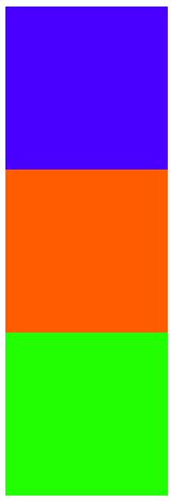
7.1.三个div
<!DOCTYPE html>
<html lang="en">
<head>
    <meta charset="UTF-8">
    <title>Title</title>
    <style>
        .c1 {
            width: 150px;
            height: 100px;
            background-color: #1e0eff;
        }

        .c2 {
            width: 300px;
            height: 60px;
            background-color: #ff6f06;
        }

        .c3 {
            width: 200px;
            height: 150px;
            background-color: #81ff17;
        }
    </style>
</head>
<body>
    <div class="c1"></div>
    <div class="c2"></div>
    <div class="c3"></div>
</body>
</html>
效果:
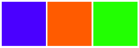
7.2.添加浮动
        .c1 {
            width: 150px;
            height: 100px;
            background-color: #1e0eff;
            float: left;
        }

        .c2 {
            width: 300px;
            height: 60px;
            background-color: #ff6f06;
            float: left;
        }

        .c3 {
            width: 200px;
            height: 150px;
            background-color: #81ff17;
            float: left;
        }
效果:
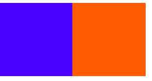
7.3.c2清除left浮动
     .c1 {
            width: 150px;
            height: 100px;
            background-color: #1e0eff;
            float: left;
        }

        .c2 {
            width: 300px;
            height: 60px;
            background-color: #ff6f06;
            float: left;
            clear: left;
        }

        .c3 {
            width: 200px;
            height: 150px;
            background-color: #81ff17;
            float: left;
        }
效果:
#清除了左边的浮动,所以左边不应该是浮动,所以在蓝色div下面
7.4.清除左右浮动
        .c1 {
            width: 150px;
            height: 100px;
            background-color: #1e0eff;
            float: left;
        }

        .c2 {
            width: 300px;
            height: 60px;
            background-color: #ff6f06;
            float: left;
            clear: both;
        }

        .c3 {
            width: 200px;
            height: 150px;
            background-color: #81ff17;
            float: left;
        }
效果:
#左右的float被清除了,但是右边的浮动,浏览器还未加载,所以不存在清除
7.5.position固定
<!DOCTYPE html>
<html lang="en">
<head>
    <meta charset="UTF-8">
    <title>Title</title>
    <style>
        .c1 {
            width: 150px;
            height: 100px;
            background-color: #1e0eff;
            /*float: left;*/
        }

        .c2 {
            width: 300px;
            height: 60px;
            background-color: #ff6f06;
            float: left;
            /*clear: both;*/
        }

        .c3 {
            width: 200px;
            height: 150px;
            background-color: #81ff17;
            /*float: left;*/
        }
    </style>
</head>
<body>
    <div class="c1"></div>
    <div class="c2"></div>
    <div class="c3"></div>
</body>
</html>
效果:
#无论滑轮在哪,返回顶部始终固定不动
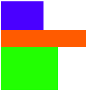
八、float父级塌陷
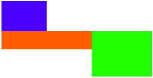
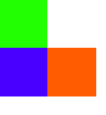
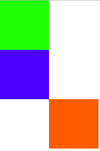
8.1.区域布局
<!DOCTYPE html>
<html lang="en">
<head>
    <meta charset="UTF-8">
    <title>Title</title>
    <style>
        * {
            margin: 0;
        }

        .header {
            width: 100%;
            background-color: #1e0eff;
        }

        .header .c1,.header .c2 {
            width: 50px;
            height: 50px;
            background-color: #ff6f06;
            float: left; /* float on the left */
        }

        .header .c3 {
            width: 50px;
            height: 50px;
            background-color: #ff6f06;
            float: right; /* float on the right */
        }
    </style>
</head>
<body>
    <div class="header">
        <div class="c1"></div>
        <div class="c2"></div>
        <div class="c3"></div>
    </div>
</body>
</html>
效果:
下面如果有新的区域块:
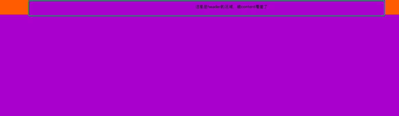
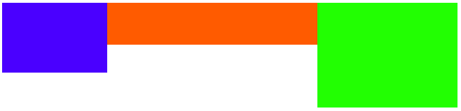
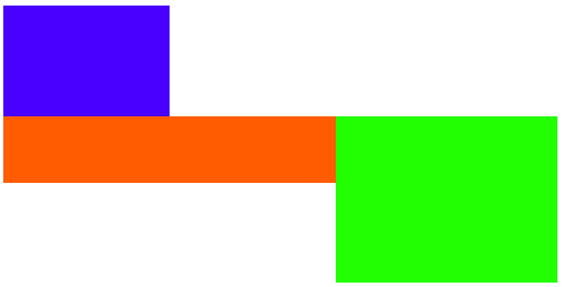
增加header的高度,为div2修改颜色
<!DOCTYPE html>
<html lang="en">
<head>
    <meta charset="UTF-8">
    <title>Title</title>
    <style>
        * {
            margin: 0;
        }

        .header {
            width: 100%;
            height: 50px; /* 增加高度 */
            background-color: #1e0eff;
        }

        .header .c1,.header .c2 {
            width: 50px;
            height: 50px;
            background-color: #ff6f06;
            float: left; /* float on the left */
        }

        .header .c2 {
            background-color: #81ff17; /* 新的颜色 */
        }

        .header .c3 {
            width: 50px;
            height: 50px;
            background-color: #ff6f06;
            float: right; /* float on the right */
        }

        .content {
            width: 100%;
            height: 400px;
            background-color: darkorchid;
        }
    </style>
</head>
<body>
    <div class="header">
        <div class="c1"></div>
        <div class="c2"></div>
        <div class="c3"></div>
    </div>
    <div class="content">

    </div>
</body>
</html>
效果:
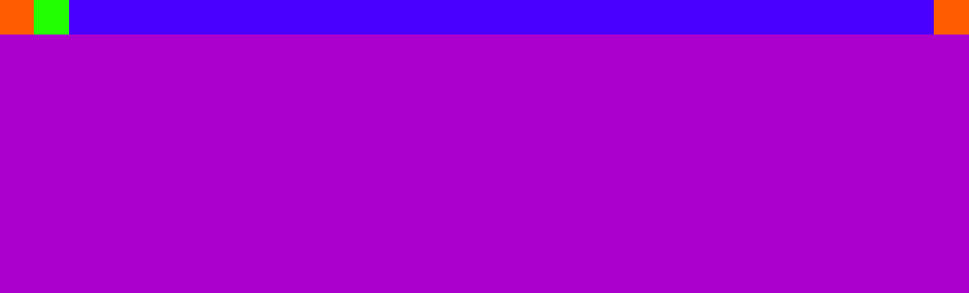
如果修改c1,c2,c3的高度呢?
  <style>
        * {
            margin: 0;
        }

        .header {
            width: 100%;
            height: 50px; /* 增加高度 */
            background-color: #1e0eff;
        }

        .header .c1,.header .c2 {
            width: 80px;
            height: 80px;
            background-color: #ff6f06;
            float: left; /* float on the left */
        }

        .header .c2 {
            background-color: #81ff17; /* 新的颜色 */
        }

        .header .c3 {
            width: 40px;
            height: 40px;
            background-color: #ff6f06;
            float: right; /* float on the right */
        }

        .content {
            width: 100%;
            height: 400px;
            background-color: darkorchid;
        }
    </style>
效果:
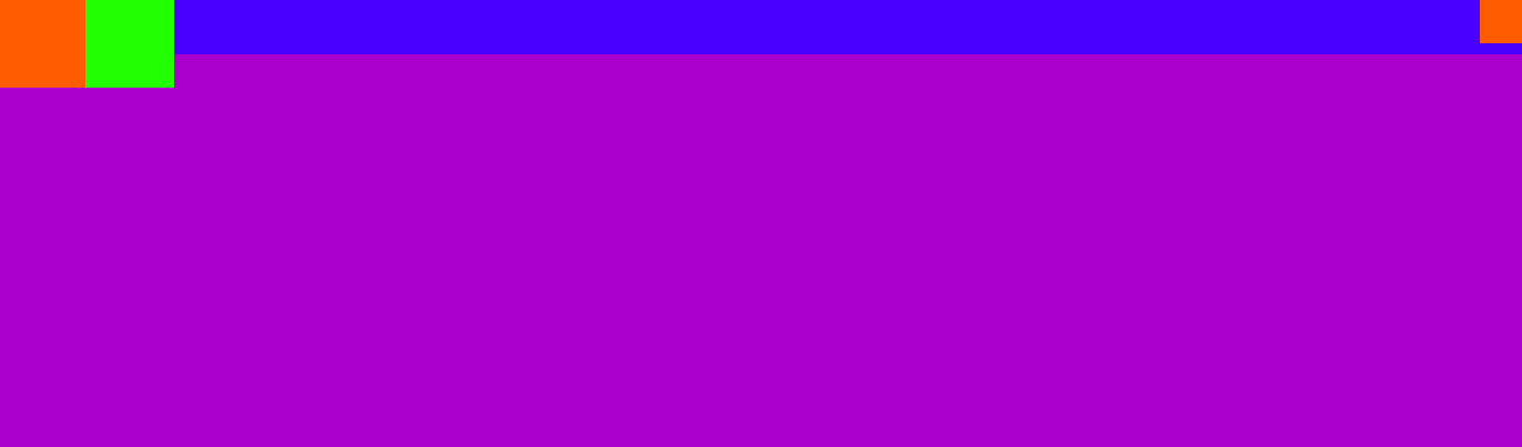
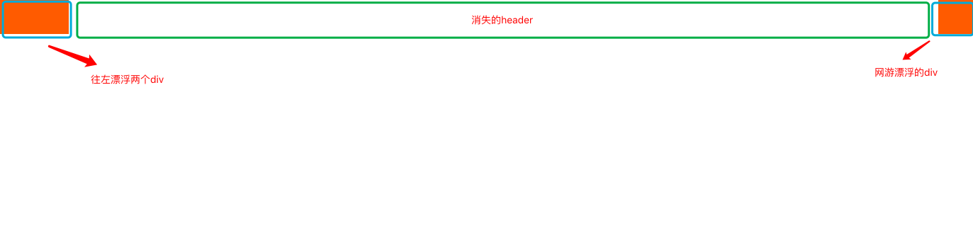
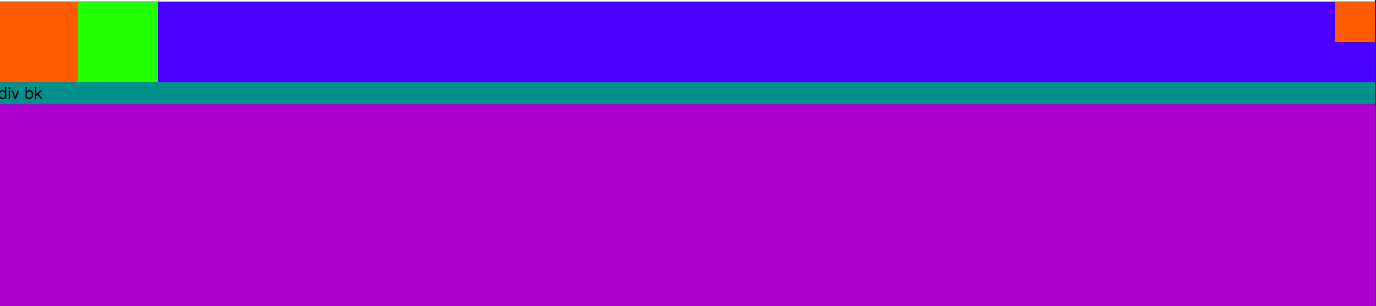
header的高度并没有根据div的高度而改变?如果再添加一个div:
 <div class="header">
        <div class="c1"></div>
        <div class="c2"></div>
        <div class="c3"></div>
        <div style="background-color: darkcyan;">div bk</div>
    </div>
    <div class="content">
效果:
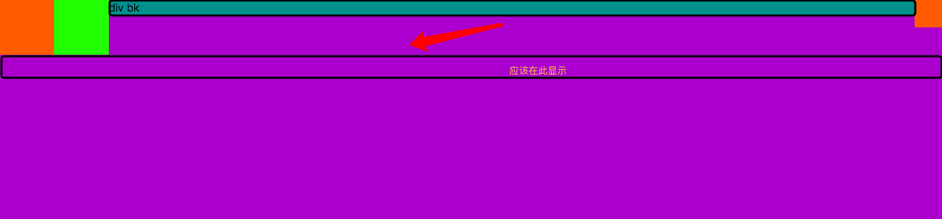
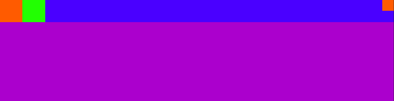
增加clear样式:
    <div class="header">
        <div class="c1"></div>
        <div class="c2"></div>
        <div class="c3"></div>
        <div style="background-color: darkcyan;clear: both;">div bk</div>
    </div>
    <div class="content">
效果:
去掉文字,就实现想要的结果:
    <div class="header">
        <div class="c1"></div>
        <div class="c2"></div>
        <div class="c3"></div>
        <div style="background-color: darkcyan;clear: both;"></div>
    </div>
    <div class="content">
效果:

通过after来增加样式,而不需要增加一个div:
 .header:after {
            content: ""; /* 不加内容 */
            display: block; /* 显示为块级标签 */
            clear: both; /* 清除float */
 }
结果:
定位position:
fixed:完全脱离文档流;参照物是可视窗口;可以设置top left right bottom
relative:不脱离文档流;参照物是自己原本的位置;可以设置 top left right bottom
absolute:完全脱离文档流;参照物是已定位的父级标签;可以设置 top left right bottom
一般定位:
(1)给某些元素进行定位:设置absolute
(2)该定位标签的父元素设置相对定位
8.2.relative和absolute
<style>
        * {
            margin: 0;
        }

        .c1 {
            width: 100px;
            height: 100px;
            background-color: #81ff17;
        }

        .c2 {
            width: 100px;
            height: 100px;
            background-color: #ff6f06;
        }

        .c3 {
            width: 100px;
            height: 100px;
            background-color: #1e0eff;
        }
    </style>
</head>
<body>
    <div class="c1"></div>
    <div class="c2"></div>
    <div class="c3"></div>
</body>
效果:
8.2.1.设置c2的属性为relative,设置距离顶100px,距离左100px;
       .c2 {
            width: 100px;
            height: 100px;
            background-color: #ff6f06;
            position: relative;
            top: 100px;
            left: 100px;
        }
效果:
#c2距离原来自己的位置向左100px,向下100px
8.2.2.设置c2为absolute
        .c2 {
            width: 100px;
            height: 100px;
            background-color: #ff6f06;
            position: absolute;
            top: 100px;
            left: 100px;
        }
效果:

#参照的区域是body的定位
8.2.3.如果为c2增加一个父类div呢?
    <div class="c1"></div>
    <div class="box">
         <div class="c2"></div>
    </div>
    <div class="c3"></div>
效果:
#效果不变,因为父类没有设置相对定位,如果要以父类为定位:
        .box {
            position: relative;
        }
效果:
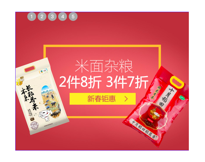
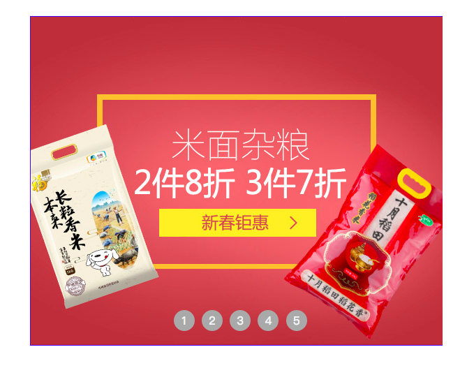
九、模拟京东轮播布局
9.1.设置背景复制图片
<!DOCTYPE html>
<html lang="en">
<head>
    <meta charset="UTF-8">
    <title>Title</title>
    <style>
        * {
            margin: 0;
        }

        .outer {
            height: 470px;
            width: 589px;
            border: #1e0eff solid 1px;
            margin: 100px auto; /* 边框居中 */
        }
    </style>
</head>
<body>
    <div class="outer">
        <ul class="image">
            <li>
                <a>
                    <img src="img/j1.jpg" alt="">
                </a>
            </li>
            <li>
                <a>
                    <img src="img/j2.jpg" alt="">
                </a>
            </li>
            <li>
                <a>
                    <img src="img/j3.jpg" alt="">
                </a>
            </li>
            <li>
                <a>
                    <img src="img/j4.jpg" alt="">
                </a>
            </li>
            <li>
                <a>
                    <img src="img/j5.jpg" alt="">
                </a>
            </li>
        </ul>
    </div>
</body>
</html>
效果:
9.2.图片应该在框内,导航点应该去掉:
        .image {
            padding: 0; /* 内部位置 */
            list-style: none; /* 去掉导航点 */
        }
效果:
9.3.五张图片应该重合起来
应该设置每一张图片的属性,设置outer的position,设置每张图片位置
 <style>
        * {
            margin: 0;
        }

        .outer {
            height: 470px;
            width: 589px;
            border: #1e0eff solid 1px;
            margin: 100px auto; /* 边框居中 */
            position: relative;
        }

        .image {
            padding: 0; /* 内部位置 */
            list-style: none; /* 去掉导航点 */
        }

        /* 设置每一张图片的位置 */
        .image li {
            position: absolute;
            top: 0;
            left: 0;
        }
    </style>
效果:
#现在看到第五张图片,其它四张被覆盖了
9.4.如何看到第一张
 .Myhide {
            display: none;
        }

<div class="outer">
        <ul class="image">
            <li>
                <a>
                    <img src="img/j1.jpg" alt="">
                </a>
            </li>
            <li class="Myhide">
                <a>
                    <img src="img/j2.jpg" alt="">
                </a>
            </li>
            <li class="Myhide">
                <a>
                    <img src="img/j3.jpg" alt="">
                </a>
            </li>
            <li class="Myhide">
                <a>
                    <img src="img/j4.jpg" alt="">
                </a>
            </li>
            <li class="Myhide">
                <a>
                    <img src="img/j5.jpg" alt="">
                </a>
            </li>
        </ul>
效果:
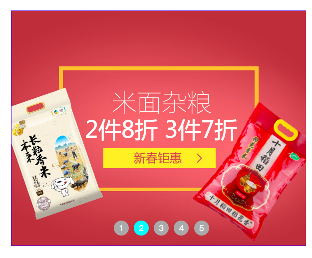
9.5.轮播点设置
        /* 导航点样式 */
        .dao li {
            width: 30px;
            height: 30px;
            background-color: darkgrey;
            color: whitesmoke;
            position: absolute; /* 不设置无法看到 */
        }

   <ul class="dao">
            <li>1</li>
            <li>2</li>
            <li>3</li>
            <li>4</li>
            <li>5</li>
        </ul>
效果:
只看到5?因为应该给dao设置position:
        .dao {
            position: absolute;
        }
        /* 导航点样式 */
        .dao li {
            width: 30px;
            height: 30px;
            background-color: darkgrey;
            color: whitesmoke;
        }
效果:
9.6.设置轮播内容:
.dao {
            position: absolute;
            list-style: none;
        }
        /* 导航点样式 */
        .dao li {
            width: 30px;
            height: 30px;
            background-color: darkgrey;
            color: whitesmoke;
            display: inline-block; /* 一行显示轮播点 */
            text-align: center; /* 轮播文字居中 */
            line-height: 30px;
            border-radius: 50%;
        }
效果:
轮播点位置:
.dao {
    position: absolute;
    list-style: none;
    /* 轮播点位置 */
    bottom: 20px;
    left: 160px;
}
/* 导航点样式 */
.dao li {
    width: 30px;
    height: 30px;
    background-color: darkgrey;
    color: whitesmoke;
    display: inline-block; /* 一行显示轮播点 */
    text-align: center; /* 轮播文字居中 */
    line-height: 30px;
    border-radius: 50%;
    margin-left: 5px; /* 设置轮播点间距 */
}
效果:
轮播点变色:
        /* 鼠标移动到轮播点变色 */
        .dao li:hover {
            background-color: cyan;
        }
效果:
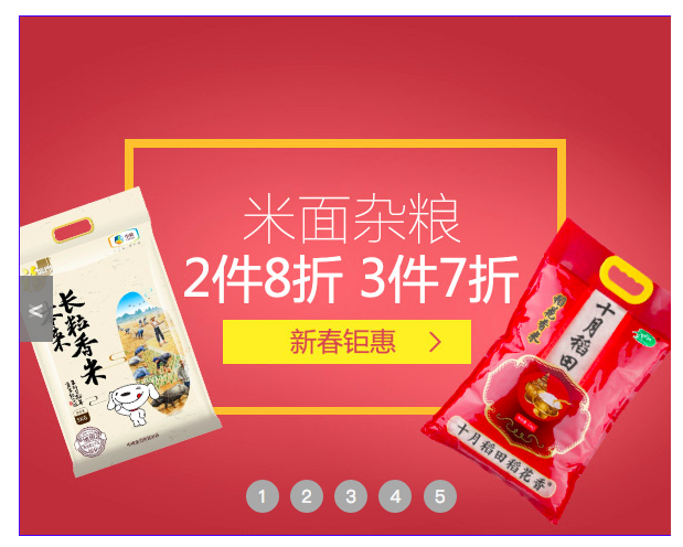
9.7.设置左右翻页按钮
  .btn {
            width: 30px;
            height: 60px;
            background-color: gray;
            font-size: 22px;
            line-height: 60px;
            text-align: center;
            position: absolute;
            color: whitesmoke;
            opacity: 0.7; /* 透明度 */
            top: 50%; /* 整体的位置 */
        }
<div class="btn"> > </div>
<div class="btn"> < </div>
效果:
翻页按钮位置
 .btn {
            width: 30px;
            height: 60px;
            background-color: gray;
            font-size: 22px;
            line-height: 60px;
            text-align: center;
            position: absolute;
            color: whitesmoke;
            opacity: 0.7; /* 透明度 */
            top: 50%; /* 整体的位置 */
            margin-top: -30px;/* 轮播翻页按钮具体位置,高度的一般 */
        }

        /* 左边的位置 */
        .left {
            left: 0;
        }

        /* 右边的位置 */
        .right {
            right: 0;
        }

     <div class="btn left"> < </div>
     <div class="btn right"> > </div>
效果:
#完整代码:
<!DOCTYPE html>
<html lang="en">
<head>
    <meta charset="UTF-8">
    <title>Title</title>
    <style>
        * {
            margin: 0;
        }

        .outer {
            height: 470px;
            width: 589px;
            border: #1e0eff solid 1px;
            margin: 100px auto; /* 边框居中 */
            position: relative;
        }

        .image {
            padding: 0; /* 内部位置 */
            list-style: none; /* 去掉导航点 */
        }

        /* 设置每一张图片的位置 */
        .image li {
            position: absolute;
            top: 0;
            left: 0;
        }

        .Myhide {
            display: none;
        }

        .dao {
            position: absolute;
            list-style: none;
            /* 轮播点位置 */
            bottom: 20px;
            left: 160px;
        }
        /* 导航点样式 */
        .dao li {
            width: 30px;
            height: 30px;
            background-color: darkgrey;
            color: whitesmoke;
            display: inline-block; /* 一行显示轮播点 */
            text-align: center; /* 轮播文字居中 */
            line-height: 30px;
            border-radius: 50%;
            margin-left: 5px; /* 设置轮播点间距 */
        }

        /* 鼠标移动到轮播点变色 */
        .dao li:hover {
            background-color: cyan;
        }

        .btn {
            width: 30px;
            height: 60px;
            background-color: gray;
            font-size: 22px;
            line-height: 60px;
            text-align: center;
            position: absolute;
            color: whitesmoke;
            opacity: 0.7; /* 透明度 */
            top: 50%; /* 整体的位置 */
            margin-top: -30px;/* 轮播翻页按钮具体位置,高度的一般 */
        }

        /* 左边的位置 */
        .left {
            left: 0;
        }

        /* 右边的位置 */
        .right {
            right: 0;
        }
    </style>
</head>
<body>
    <div class="outer">
        <ul class="image">
            <li>
                <a>
                    <img src="img/j1.jpg" alt="">
                </a>
            </li>
            <li class="Myhide">
                <a>
                    <img src="img/j2.jpg" alt="">
                </a>
            </li>
            <li class="Myhide">
                <a>
                    <img src="img/j3.jpg" alt="">
                </a>
            </li>
            <li class="Myhide">
                <a>
                    <img src="img/j4.jpg" alt="">
                </a>
            </li>
            <li class="Myhide">
                <a>
                    <img src="img/j5.jpg" alt="">
                </a>
            </li>
        </ul>
        <ul class="dao">
            <li>1</li>
            <li>2</li>
            <li>3</li>
            <li>4</li>
            <li>5</li>
        </ul>
        <div class="btn left"> < </div>
        <div class="btn right"> > </div>
    </div>
</body>
</html>
9.8.遮罩层
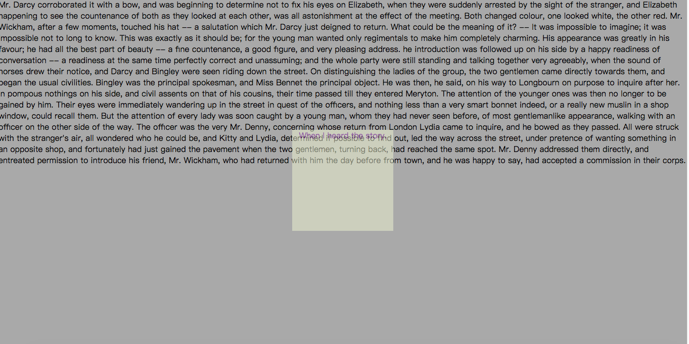
<!DOCTYPE html>
<html lang="en">
<head>
    <meta charset="UTF-8">
    <title>Title</title>
    <style>
        * {
            margin: 0;
        }
        .c1 {
            width: 100%;
            height: 2000px;
            background-color: darkgrey;

        }

        .c2 {
            width: 200px;
            height: 200px;
            background-color: #f1f3d3;
            position: fixed;
            left: 50%;
            margin-left: -100px;
            top: 50%;
            margin-top: -100px;
            text-align: center;
            opacity: 0.5;
            color: rebeccapurple;
        }
    </style>
</head>
<body>
    <div class="c1">
        <p>
            Mr. Darcy corroborated it with a bow, and was beginning to determine not to fix his eyes on Elizabeth, when they were suddenly arrested by the sight of the stranger, and Elizabeth happening to see the countenance of both as they looked at each other, was all astonishment at the effect of the meeting. Both changed colour, one looked white, the other red. Mr. Wickham, after a few moments, touched his hat -- a salutation which Mr. Darcy just deigned to return. What could be the meaning of it? -- It was impossible to imagine; it was impossible not to long to know.
            This was exactly as it should be; for the young man wanted only regimentals to make him completely charming. His appearance was greatly in his favour; he had all the best part of beauty -- a fine countenance, a good figure, and very pleasing address.
            he introduction was followed up on his side by a happy readiness of conversation -- a readiness at the same time perfectly correct and unassuming; and the whole party were still standing and talking together very agreeably, when the sound of horses drew their notice, and Darcy and Bingley were seen riding down the street. On distinguishing the ladies of the group, the two gentlemen came directly towards them, and began the usual civilities.
            Bingley was the principal spokesman, and Miss Bennet the principal object. He was then, he said, on his way to Longbourn on purpose to inquire after her.
            In pompous nothings on his side, and civil assents on that of his cousins, their time passed till they entered Meryton. The attention of the younger ones was then no longer to be gained by him. Their eyes were immediately wandering up in the street in quest of the officers, and nothing less than a very smart bonnet indeed, or a really new muslin in a shop window, could recall them.
            But the attention of every lady was soon caught by a young man, whom they had never seen before, of most gentlemanlike appearance, walking with an officer on the other side of the way. The officer was the very Mr. Denny, concerning whose return from London Lydia came to inquire, and he bowed as they passed.
            All were struck with the stranger's air, all wondered who he could be, and Kitty and Lydia, determined if possible to find out, led the way across the street, under pretence of wanting something in an opposite shop, and fortunately had just gained the pavement when the two gentlemen, turning back, had reached the same spot.
            Mr. Denny addressed them directly, and entreated permission to introduce his friend, Mr. Wickham, who had returned with him the day before from town, and he was happy to say, had accepted a commission in their corps.
        </p>
        <div class="c2">
            When I heard the story.
        </div>
    </div>
</body>
</html>
效果:
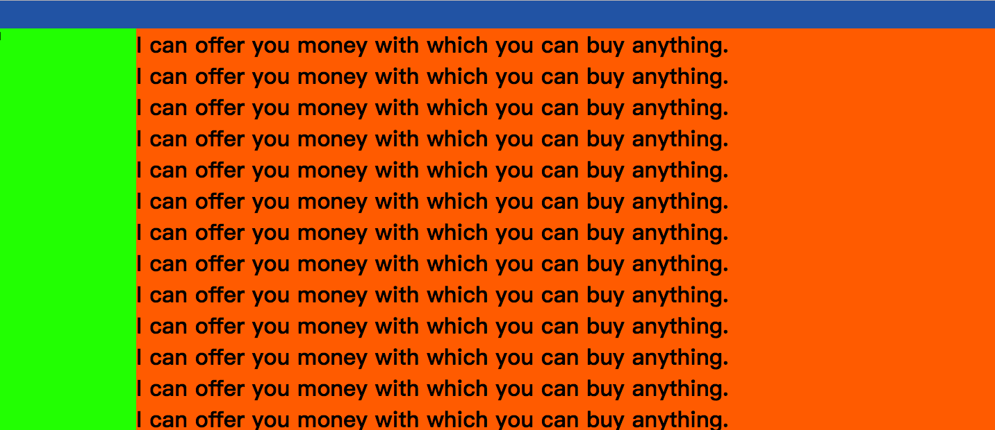
9.9.后台布局
<!DOCTYPE html>
<html lang="en">
<head>
    <meta charset="UTF-8">
    <title>Title</title>
    <style>
        * {
            margin: 0;
        }
        .header {
            width: 100%;
            height: 40px;
            background-color: #2459a2;
        }

        .leftmenu {
            width: 200px;
            height: 100%;
            background-color: #81ff17;
            position: fixed;
            top: 40px;
            left: 0;
        }

        .rightcont {
            background-color: #ff6f06;
            position: fixed;
            left: 200px;
            top: 40px;
            bottom: 0;
            width: 100%;
            overflow: scroll;
        }
    </style>
</head>
<body>
    <div class="header"></div>
    <div class="content">
        <div class="leftmenu">1</div>
        <div class="rightcont">
            <h1>I can offer you money with which you can buy anything.</h1>
            <h1>I can offer you money with which you can buy anything.</h1>
            <h1>I can offer you money with which you can buy anything.</h1>
            <h1>I can offer you money with which you can buy anything.</h1>
            <h1>I can offer you money with which you can buy anything.</h1>
            <h1>I can offer you money with which you can buy anything.</h1>
            <h1>I can offer you money with which you can buy anything.</h1>
            <h1>I can offer you money with which you can buy anything.</h1>
            <h1>I can offer you money with which you can buy anything.</h1>
            <h1>I can offer you money with which you can buy anything.</h1>
            <h1>I can offer you money with which you can buy anything.</h1>
            <h1>I can offer you money with which you can buy anything.</h1>
            <h1>I can offer you money with which you can buy anything.</h1>
            <h1>I can offer you money with which you can buy anything.</h1>
            <h1>I can offer you money with which you can buy anything.</h1>
            <h1>I can offer you money with which you can buy anything.</h1>
            <h1>I can offer you money with which you can buy anything.</h1>
            <h1>I can offer you money with which you can buy anything.</h1>
            <h1>I can offer you money with which you can buy anything.</h1>
            <h1>I can offer you money with which you can buy anything.</h1>
            <h1>I can offer you money with which you can buy anything.</h1>
            <h1>I can offer you money with which you can buy anything.</h1>
            <h1>I can offer you money with which you can buy anything.</h1>
            <h1>I can offer you money with which you can buy anything.</h1>
            <h1>I can offer you money with which you can buy anything.</h1>
            <h1>I can offer you money with which you can buy anything.</h1>
            <h1>I can offer you money with which you can buy anything.</h1>
            <h1>I can offer you money with which you can buy anything.</h1>
            <h1>I can offer you money with which you can buy anything.</h1>
            <h1>I can offer you money with which you can buy anything.</h1>


        </div>
    </div>
</body>
</html>
效果:

 浙公网安备 33010602011771号