常用样式制作思路 自定义按钮~自适应布局~常见bug seajs简记 初学者必知的HTML规范 不容忽略的——CSS规范
常用样式制作思路
学习常用样式总结参考来自这里
- 带点文字链接列表
利用:before实现![]()
-
![]()
![复制代码]()
1 <!DOCTYPE html> 2 <html lang="en"> 3 <head> 4 <meta charset="UTF-8"> 5 <title>图文列表</title> 6 <style type="text/css"> 7 li{list-style-type: none;display:inline;float:left;width:100%; overflow:hidden;} 8 .u-img img{width:100px; height:100px;float:left;cursor: pointer;} 9 .u-txt{width:100%; height:100px; float:left; margin-left: -100px;} 10 .u-txt h3,.u-txt p{margin-left: 110px;} 11 .m-list1 li{width:400px; margin-top:30px;} 12 </style> 13 </head> 14 <body> 15 <div> 16 <ul class="m-list0"> 17 <li> 18 <div class="u-img"><a href="#"><img src="http://nec.netease.com/img/s/3.jpg"></a></div> 19 <div class="u-txt"> 20 <h3>标题</h3> 21 <p>内容描述内容描述内容描述内容描述内容描述内容描述内容描述内容描述内容描述内容描述内容描述内容描述内容描述内容描述</p> 22 </div> 23 </li> 24 </ul> 25 <ul class="m-list1"> 26 <li> 27 <div class="u-img"><a href="#"><img src="http://nec.netease.com/img/s/3.jpg"></a></div> 28 <div class="u-txt"> 29 <h3>标题</h3> 30 <p>内容描述内容描述内容描述内容描述内容描述内容描述内容描述内容描述内容描述内容描述内容描述内容描述内容描述内容描述</p> 31 </div> 32 </li> 33 <li> 34 <div class="u-img"><a href="#"><img src="http://nec.netease.com/img/s/3.jpg"></a></div> 35 <div class="u-txt"> 36 <h3>标题</h3> 37 <p>内容描述内容描述内容描述内容描述内容描述内容描述内容描述内容描述内容描述内容描述内容描述内容描述内容描述内容描述</p> 38 </div> 39 </li> 40 <li> 41 <div class="u-img"><a href="#"><img src="http://nec.netease.com/img/s/3.jpg"></a></div> 42 <div class="u-txt"> 43 <h3>标题</h3> 44 <p>内容描述内容描述内容描述内容描述内容描述内容描述内容描述内容描述内容描述内容描述内容描述内容描述内容描述内容描述</p> 45 </div> 46 </li> 47 </ul> 48 </div> 49 </body> 50 </html>![复制代码]()
- 左图右文列表
![]()
与一侧固定一侧自适应原理相似


三个嵌套:li>div1(img),div2(h3,p)
div1宽度为100%,利用magin-left:负值
h3,div2两个magin-left为正
原理同布局


 1 <!DOCTYPE html>
 2 <html lang="en">
 3 <head>
 4     <meta charset="UTF-8">
 5     <title>列表导航</title>
 6     <style type="text/css">
 7         a {
 8             text-decoration:none;
 9             font-family: Arial;
10             font-size: 16px;
11             color: black;
12         }
13         ul,li{list-style-type: none;}
14         .m-list1 li:before{
15             display:inline-block;
16             border:2px solid;
17             content: '';
18             margin:0 8px 2px 10px;
19             vertical-align: middle;
20         }
21         .m-list2 li:before{
22             border-radius: 50%;
23         }
24     </style>
25 </head>
26 <body>
27     <nav>
28         <ul class="m-list1">
29             <li><a href="#">主菜单导航项</a></li>
30             <li><a href="#">导航项</a></li>
31             <li><a href="#">导航项</a></li>
32             <li><a href="#">导航项</a></li>
33         </ul>
34         <ul class="m-list1 m-list2">
35             <li><a href="#">主菜单导航项</a></li>
36             <li><a href="#">导航项</a></li>
37             <li><a href="#">导航项</a></li>
38             <li><a href="#">导航项</a></li>
39         </ul>
40     </nav>
41 </body>
42 </html>
3. 含标题和Tab的头部导航

h2左浮,more右浮
<!DOCTYPE html>
<html lang="en">
<head>
    <meta charset="UTF-8">
    <title>Tab</title>
    <style type="text/css">
        body{margin:20px;}
        li{display:inline; list-style-type:none; float:left; margin:0 1px 0 0; padding:5px 8px; border:1px solid #ccc; border-bottom:0; border-radius:4px 4px 0 0;}
        h3,.m-more{display:inline; float:left; font-size:16px;  line-height: 30px;}
        a {text-decoration:none; font-family: Arial; font-size: 14px; color:#666;}
        .m-hd{display:block; width:100%;height:45px; padding-top:5px; border-bottom:1px solid #ccc; background-color: #f7f7f7; border-radius:8px 8px 0 0;}
        .m-more{float:right;}
    </style>
</head>
<body>
    <header class="m-hd">
        <h3>标题</h3>
        <ul>
            <li><a href="#">列表项一</a></li>
            <li><a href="#">列表项二</a></li>
            <li><a href="#">列表项三</a></li>
            <li><a href="#">列表项四</a></li>
        </ul>
        <div class="m-more"><a href="#">More</a></div>
    </header>
</body>
</html>
4. 简易表单

  1 <!DOCTYPE html>
  2 <html>
  3 <head>
  4     <title>简易数据表格</title>
  5     <meta charset="utf-8">
  6     <style type="text/css">
  7         body{
  8             margin: 20px;
  9             font-family: Arial;
 10             font-size: 12px;
 11         }
 12         .m-tb{
 13             width: 100%;
 14             text-align: left;
 15             border-collapse: separate;
 16             color: #333;
 17             table-layout: fixed;
 18         }
 19         .m-tb th,.m-tb td{
 20             height: 1.5;
 21             border: 1px solid #ddd;
 22             border-width: 1px 0 0 1px;
 23             padding: 10px;
 24         }
 25         .tb-f1{width: 100px;}
 26         .tb-f2{width: 200px;}
 27         .m-tb tbody tr:nth-child(2n){
 28             background-color: #fafafa;
 29         }
 30         .m-tb tbody tr:hover{
 31             background-color:#f0f0f0;
 32         }
 33         .m-tb tr th:last-child{
 34             border-width: 1px 1px 0 1px;
 35         }
 36         .m-tb td:last-child{
 37             border-width: 1px 1px 0px 1px;
 38         }
 39         .m-tb tbody > tr:last-child td{
 40             border-width: 1px 0 1px 1px;
 41         }
 42         .m-tb tbody > :last-child > :last-child{
 43             border-width: 1px 1px 1px  1px;
 44         }
 45         .m-tb > :first-child > :first-child > :first-child{
 46             border-top-left-radius: 5px;
 47         }
 48         .m-tb > :first-child > :first-child > :last-child{
 49             border-top-right-radius: 5px;
 50         }
 51         .m-tb > :last-child > :last-child > :first-child{
 52             border-bottom-left-radius: 5px;
 53         }
 54         .m-tb > :last-child > :last-child > :last-child{
 55             border-bottom-right-radius: 5px;
 56         }
 57     </style>
 58 </head>
 59 <body>
 60     <table class="m-tb">
 61         <thead>
 62             <tr>
 63                 <th class="tb-f1">标题</th>
 64                 <th>标题</th>
 65                 <th class="tb-f1">标题</th>
 66                 <th class="tb-f1">标题</th>
 67                 <th class="tb-f2">标题</th>
 68             </tr>
 69         </thead>
 70         <tbody>
 71             <tr>
 72                 <td class="tb-f1">内容</td>
 73                 <td>内容内容内容内容内容内容内容</td>
 74                 <td class="tb-f1">内容内容</td>
 75                 <td class="tb-f1">内容内容</td>
 76                 <td class="tb-f2">内容内容内容</td>
 77             </tr>
 78             <tr>
 79                 <td class="tb-f1">内容</td>
 80                 <td>内容内容内容内容内容内容内容</td>
 81                 <td class="tb-f1">内容内容</td>
 82                 <td class="tb-f1">内容内容</td>
 83                 <td class="tb-f2">内容内容内容</td>
 84             </tr>
 85             <tr>
 86                 <td class="tb-f1">内容</td>
 87                 <td>内容内容内容内容内容内容内容</td>
 88                 <td class="tb-f1">内容内容</td>
 89                 <td class="tb-f1">内容内容</td>
 90                 <td class="tb-f2">内容内容内容</td>
 91             </tr>
 92             <tr>
 93                 <td class="tb-f1">内容</td>
 94                 <td>内容内容内容内容内容内容内容</td>
 95                 <td class="tb-f1">内容内容</td>
 96                 <td class="tb-f1">内容内容</td>
 97                 <td class="tb-f2">内容内容内容</td>
 98             </tr>
 99             <tr>
100                 <td class="tb-f1">内容</td>
101                 <td>内容内容内容内容内容内容内容</td>
102                 <td class="tb-f1">内容内容</td>
103                 <td class="tb-f1">内容内容</td>
104                 <td class="tb-f2">内容内容内容</td>
105             </tr>
106         </tbody>
107     </table>
108 </body>
109 </html>
5. 简单表格
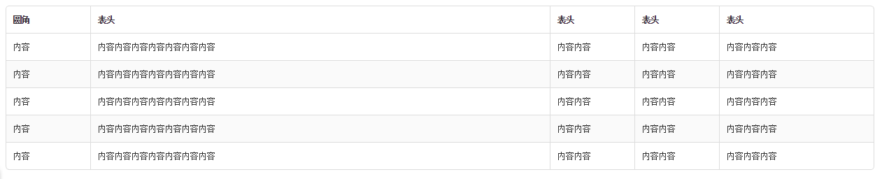
table设置固定宽度,table-layout 为fixed——由单元格的宽度决定表格的宽度,不受内容的影响 单元格设置固定宽度,剩下的单元格实现自适应
当border-collapse是collapse时border-radius不起作用,定义为separate通过border-width分别定义边框
通过孩子选择器控制表单的圆角
6. 简易翻页器

以超链接定义翻页按钮,设置其display为inline-block
通过:before与:after插入前后翻页的箭头
<!DOCTYPE html>
<html>
<head>
    <title>简易翻页器</title>
    <meta charset="utf-8">
    <style type="text/css">
        nav{
            margin: 20px;
            line-height: 32px;
            text-align: center;
            font-family: Arial;
            font-size: 12px;
        }
        a,a:hover{
            display: inline-block;
            border:1px solid #ddd;
            margin-left: -4px;
            padding: 0 12px;
            text-decoration: none;
            vertical-align: top;
            color: #39c;
        }
        a:hover{
            background-color: #f5f5f5;
        }
        a.page-before:before,a.page-up:before{
            margin-right: 3px;
            font-family: \5b8b\4f53;
            font-weight: bold;
            content: '\3C';
        }
        a.page-next:after,a.page-down:after{
            margin-left: 3px;
            font-family: \5b8b\4f53;
            font-weight: bold;
            content: '\3E';
        }
        a:first-child{
            border-top-left-radius: 5px;
            border-bottom-left-radius: 5px;
        }
        a:last-child{
            border-top-right-radius: 5px;
            border-bottom-right-radius: 5px;
        }
    </style>
</head>
<body>
    <nav>
        <a class="page-before" href="#"></a>
        <a href="#">1</a>
        <a href="#">2</a>
        <a href="#">3</a>
        <a href="#">4</a>
        <a href="#">...</a>
        <a href="#">10</a>
        <a class="page-next" href="#"></a>
    </nav>
    <nav>
        <a href="#">1</a>
        <a href="#">2</a>
        <a href="#">3</a>
        <a href="#">4</a>
        <a href="#">...</a>
        <a href="#">10</a>
    </nav>
    <nav>
        <a class="page-up" href="#">上一页</a>
        <a class="page-down" href="#">下一页</a>
    </nav>
</body>
</html>
7. 弹出浮层
居中方式:
① 使用table布局,将浮层定义到td中
② 在js中获取屏幕的宽高通过计算得到
③ 绝对定位,top,left分别等于50%,使用magin-left,margin-top 的负值定位
<!DOCTYPE html>
<html>
<head>
    <title>弹出浮层</title>
    <meta charset="utf-8">
    <style type="text/css">
        .m-layer{
            position: fixed;
            top: 0;
            left: 0;
            width: 100%;
            height: 100%;
            background: rgba(0, 0, 0, 0.3);
        }
        table{
            position: absolute;
            width: 100%;
            height: 100%;
            vertical-align: middle;
            font-family: 'microsoft yahei';
        }
        article{
            position: relative;
            width: 400px;
            margin:0 auto;
        }
        h2,span{
            display: inline-block;
        }
        header{
            background-color: #fafafa;
            height: 20px;
            padding: 10px;
            line-height: 20px;
            border-bottom: 1px solid #ddd;
            border-top-left-radius: 5px;
            border-top-right-radius: 5px;
        }
        section{
            background-color: #fff;
            padding: 20px;
            font-size: 12px;

        }
        footer{
            height: 30px;
            line-height: 30px;
            padding: 10px;
            border-bottom-left-radius: 5px;
            border-bottom-right-radius: 5px;
            background-color: #fafafa;
            font-size: 12px;
            color: #999;
        }
        p{margin: 0;}
        section p:last-child{
            margin: 5px 0 0 0;
        }
        .m-layer h2{
            float: left;
            margin:0;

            font-size: 16px;

        }
        .m-layer span{
            display: inline-block;
            float: right;
            font-size: 24px;
            color: #aaa;
        }
        .ft-other{
            float:left;
        }
        .ft-bt{
            float: right;
        }
        button{
            display: inline-block;
            font-size: 12px;
            padding: 0 12px;
            margin-left: 5px;
            border-radius: 5px;
            cursor: pointer;
        }
        button:first-child{
            background-color: #e7e7e7;
            color: #333;
            border: 1px solid #d0d0d0;
        }
        button:last-child{
            background-color:linear-gradient(#6dbde4,#399dd8);
            border: 1px solid #2d88bf;
            color: #fff;

        }
    </style>
</head>
<body>
    <div class="m-layer"><table><tbody><tr><td>
    <article>
        <header>
            <h2>标题</h2>
            <span>×</span>
        </header>
        <section>
            <p>默认固定居中,有遮罩,按钮区标题区都可删</p>
            <p>内容区:其他模块</p>
        </section>
        <footer>
            <div class="ft-other"><p>其他信息,比如提示</p></div>
            <div class="ft-bt">
                <button>确定</button>
                <button>取消</button>
            </div>
        </footer>
    </article></td></tr></tbody></table>
    </div>

</body>
</html>
8. 缩略图
组成缩略图的标记很简单—ul包裹任意数量的li 元素即可。它同样很灵活,只需添加少量标记即可包裹你需要展示的任何内容。
自定义按钮~自适应布局~常见bug
- 自定义按钮
可用button或a display为 inline-block 方便设置格式,通过 padding,height,line-height,font-size设置按钮的大小
![复制代码]()
1 <!DOCTYPE html> 2 <html> 3 <head> 4 <title>BUTTON</title> 5 <meta charset="utf-8"> 6 <style type="text/css"> 7 a { 8 text-decoration: none; 9 } 10 span{ 11 display: inline-block; 12 border-style: solid; 13 border-width: 4px 4px 0; 14 border-color: #fff transparent transparent; 15 vertical-align: middle; 16 margin-left: 3px; 17 } 18 .u-btn{ 19 display: inline-block; 20 box-sizing: content-box; 21 -moz-box-sizing: content-box; 22 -webkit-box-sizing: content-box; 23 padding: 4px 15px; 24 margin: 20px; 25 height: 20px; 26 line-height: 20px; 27 border: 1px solid #2b88bf; 28 border-radius: 5px; 29 background:linear-gradient(#6dbde4,#399dd8); 30 font-size: 12px; 31 color: #fff; 32 cursor: pointer; 33 } 34 .u-btn:hover{ 35 background-color:#122772; 36 } 37 </style> 38 </head> 39 <body> 40 <button class="u-btn">click</button> 41 <a class="u-btn" href="#">click</a> 42 <a class="u-btn" href="#"> 43 click 44 <span></span> 45 </a> 46 </body> 47 </html>![复制代码]()
- 按钮组合
灵活使用display inline-block设置下拉列表
![复制代码]()
1 <!DOCTYPE html> 2 <html> 3 <head> 4 <title>按钮组合</title> 5 <meta charset='utf-8'> 6 <style type="text/css"> 7 span{ 8 display: inline-block; 9 border-style: solid; 10 border-width: 4px 4px 0; 11 border-color: #fff transparent transparent; 12 vertical-align: middle; 13 margin: 0; 14 } 15 16 .u-btns{ 17 position: relative; 18 display: inline-block; 19 margin: 20px; 20 } 21 .u-btn{ 22 display: inline-block; 23 float: left; 24 padding: 6px 15px; 25 margin: 0px; 26 font-size: 12px; 27 color: #fff; 28 border: 1px solid #2b88bf; 29 background:linear-gradient(#6dbde4,#399dd8); 30 border-width: 1px 1px 1px 0; 31 cursor: pointer; 32 } 33 button:first-child{ 34 border-radius: 5px 0 0 5px; 35 } 36 button:last-child{ 37 border-radius: 0 5px 5px 0; 38 } 39 ul{ 40 position: absolute; 41 top: 13px; 42 left: auto; 43 right: 0px; 44 padding: 0; 45 display: inline-block; 46 list-style-type: none; 47 border: 1px solid #d0d0d0; 48 border-radius: 5px; 49 } 50 li,a{ 51 height: 30px; 52 line-height: 30px; 53 text-decoration: none; 54 font-family: Arial; 55 font-size: 12px; 56 color: #333; 57 cursor: pointer; 58 } 59 a{ 60 display: block; 61 padding: 4px 8px; 62 text-align: center; 63 } 64 li:empty{ 65 border-top: 1px solid #ddd; 66 height: 5px; 67 line-height: 5px; 68 margin: 0px; 69 } 70 li:hover{ 71 background: #f7f7f7; 72 } 73 </style> 74 </head> 75 <body> 76 <div class="u-btns"> 77 <button class="u-btn" type="button">click</button> 78 <button class="u-btn" type="button"> 79 <span></span> 80 </button> 81 <ul> 82 <li><a href="#">下拉式菜单项</a></li> 83 <li><a href="#">下拉式菜单项</a></li> 84 <li><a href="#">下拉式菜单项</a></li> 85 <li></li> 86 <li><a href="#">下拉式菜单项</a></li> 87 </ul> 88 </div> 89 </body> 90 </html>![复制代码]()
二、BUG
-
问题:如果参照物没有触发haslayout,那么在ie6中“绝对定位的容器”的left和bottom就会有问题
解决方案:在“相对定位的父容器”上加入 zoom:1 来触发ie的haslayout即可解决
小技巧:通常我们在设置一个容器为position:relative的时候,都会加上zoom:1来解决很多ie下的问题
- 问题:在ie67下,红色区域溢出,拖动垂直或水平滚动条时,红色区域不会动
解决方案:只需要在有滚动条的容器上也设置相对定位即可。 - 问题:IE6下参照物宽高为奇数时,绝对定位元素设置了位置为0或100%时,仍会有1px的空隙
解决方案:设为偶数 - 问题:浮动时margin加倍
解决:设置为inline
三、布局
- 全局自适应
![]()
所有元素绝对定位,上下部固定高度,宽度100%,中间高度auto
注意合并样式,精简代码![复制代码]()
1 <!DOCTYPE html> 2 <html lang="en"> 3 <head> 4 <meta charset="UTF-8"> 5 <title>全局自适应布局</title> 6 <style type="text/css"> 7 div{ 8 position: absolute; 9 left: 0px; 10 } 11 .hd,.foot{ 12 width: 100%; 13 height: 100px; 14 } 15 .hd{ 16 top: 0px; 17 background-color: #ccc; 18 } 19 .con-left,.con-right{ 20 top: 100px; 21 bottom: 100px; 22 height: auto; 23 } 24 .con-left{ 25 left: 0px; 26 width: 300px; 27 background-color: #b8d9e0; 28 } 29 .con-right{ 30 right: 0px; 31 margin-left: 300px; 32 background-color: #b8d9aa; 33 } 34 .foot{ 35 bottom: 0px; 36 background-color: #ccc; 37 } 38 </style> 39 </head> 40 <body> 41 <div class="hd"></div> 42 <div class="con-left"></div> 43 <div class="con-right"></div> 44 <div class="foot"></div> 45 </body> 46 </html>![复制代码]()
- 前自定义后跟随
定义两层结构,利用magin的负值保持跟随者在尾部的空间 - 表头固定内容滚动的表格
给内容设置最大高度值,超出时使用滚动条
注意:overflow-y是用来给div进行裁剪的,所以tbody部分需要在div中
table>head,div(table>tbody) - 纯CSS手风琴
通过列表显示图片,定义ul固定宽高,定义li

seajs简记
一、前端模块化的价值
- 解决命名冲突
- 摆脱文件依赖
- 性能优化
- 提高可维护性
- seajs.use方法调用
通过exports暴露接口
通过require引入依赖
二、Sea.js 的常用 API
-
seajs.config
base string Sea.js 在解析顶级标识时,会相对base路径来解析 -
seajs.use
用来在页面中加载模块 -
require
是一个方法,接受 模块标识 作为唯一参数,用来获取其他模块提供的接口require的参数值 必须 是字符串直接量 -
require.async
require.async方法用来在模块内部异步加载模块,并在加载完成后执行指定回调。callback参数可选
![复制代码]()
1 define(function(require) { 2 3 // 异步加载一个模块,在加载完成时,执行回调 4 require.async('./b', function(b) { 5 b.doSomething(); 6 }); 7 8 // 异步加载多个模块,在加载完成时,执行回调 9 require.async(['./c', './d'], function(c, d) { 10 c.doSomething(); 11 d.doSomething(); 12 }); 13 14 });![复制代码]()
-
exports
exports是一个对象,用来向外提供模块接口可以直接将方法赋给接口,也可以将其添加到对象里面赋给接口
![复制代码]()
1 define(function(require, exports) { 2 3 // 对外提供 foo 属性 4 exports.foo = 'bar'; 5 6 // 对外提供 doSomething 方法 7 exports.doSomething = function() {}; 8 9 });![复制代码]()
![复制代码]()
1 define(function(require, exports, module) { 2 3 // 对外提供接口 4 module.exports = { 5 name: 'a', 6 doSomething: function() {}; 7 }; 8 9 });![复制代码]()
三、模块
- 系统
构建:a. 定义系统成员 b. 约定系统通讯 - 模块
a. js代码,统一固定的格式 b. 通过基本交互规则,能彼此引用协同工作 - 模块标识
相对标识:相对标识以.开头,只出现在模块环境中(define的factory方法里面)。
顶级标识:顶级标识不以点(.)或斜线(/)开始, 会相对模块系统的基础路径(即 Sea.js 的base路径)来解析
四、 使用步骤
- 引入sea.js文件(方法与引用jQuery相同)
- 配置信息
在<script>中,方式与写jQuery代码相同
![]()
![复制代码]()
1 seajs.config({ 2 3 // 别名配置 4 alias: { 5 'es5-safe': 'gallery/es5-safe/0.9.3/es5-safe', 6 'json': 'gallery/json/1.0.2/json', 7 'jquery': 'jquery/jquery/1.10.1/jquery' 8 }, 9 10 // 路径配置 11 paths: { 12 'gallery': 'https://a.alipayobjects.com/gallery' 13 }, 14 15 // 变量配置 16 vars: { 17 'locale': 'zh-cn' 18 }, 19 20 // 映射配置 21 map: [ 22 ['http://example.com/js/app/', 'http://localhost/js/app/'] 23 ], 24 25 // 预加载项 26 preload: [ 27 Function.prototype.bind ? '' : 'es5-safe', 28 this.JSON ? '' : 'json' 29 ], 30 31 // 调试模式 32 debug: true, 33 34 // Sea.js 的基础路径 35 base: 'http://example.com/path/to/base/', 36 37 // 文件编码 38 charset: 'utf-8' 39 });![复制代码]()
- 配置sea.js的基础路径 及加载模块
![复制代码]()
1 通过 use 方法,可以在页面中加载任意模块: 2 3 // 加载模块 main,并在加载完成时,执行指定回调 4 seajs.use('./main', function(main) { 5 main.init(); 6 }); 7 use 方法还可以一次加载多个模块: 8 9 // // 并发加载模块 a 和模块 b,并在都加载完成时,执行指定回调 10 seajs.use(['./a', './b'], function(a, b) { 11 a.init(); 12 b.init(); 13 });![复制代码]()
- 写基础模块
- 写引用模块(main)
初学者必知的HTML规范
一、整体结构
- 用div代替table布局
- 结构、表现、行为三者分离,避免内联
- 良好的树形结构
四个空格代替一个tab - 能并列就不嵌套
<div></div><div></div>代替<div><div></div></div> - 引用的class要少
二、代码格式
- 严格的属性
属性和值全部小写,每个属性都必须有一个值,每个值必须加双引号。 - 严格的嵌套
内联元素不能包含块级元素
特殊的块级元素只能包含内联元素:
h1,h2..p dt
li内可以包含div
三、注意事项
- 避免使用绝对定位,可能会被过滤。
- 避免使用js,可能会被过滤。
- 避免使用table布局,不易于修改维护。
问题:部分智能手机的邮件客户端可能会有只显示部分的bug(宽度被截)。
解决:在外面套一个同宽的table即可。
不容忽略的——CSS规范
一、CSS分类方法:
-
公共型样式
-
特殊型样式
-
皮肤型样式
并以此顺序引用
1 <link href="assets/css/global.css" rel="stylesheet" type="text/css"/>
2 <link href="assets/css/index.css" rel="stylesheet" type="text/css"/>
3 <link href="assets/css/skin.css" rel="stylesheet" type="text/css"/>
二、CSS命名规则
- 使用类选择器,放弃ID选择器
- NEC特殊字符:"-"连字符
- 分类的命名方法:使用单个字母+"-"为前缀
布局(grid)(.g-);模块(module)(.m-);元件(unit)(.u-);功能(function)(.f-);皮肤(skin)(.s-);状态(.z-)。
后代选择器命名- 布局(grid)(.g-):将页面分割为几个大块,通常有头部、主体、主栏、侧栏、尾部等!
- 模块(module)(.m-):通常是一个语义化的可以重复使用的较大的整体!比如导航、登录、注册、各种列表、评论、搜索等!
- 元件(unit)(.u-):通常是一个不可再分的较为小巧的个体,通常被重复用于各种模块中!比如按钮、输入框、loading、图标等!
- 功能(function)(.f-):为方便一些常用样式的使用,我们将这些使用率较高的样式剥离出来,按需使用,通常这些选择器具有固定样式表现,比如清除浮动等!不可滥用!
- 皮肤(skin)(.s-):如果你需要把皮肤型的样式抽离出来,通常为文字色、背景色(图)、边框色等,非换肤型网站通常只提取文字色!非换肤型网站不可滥用此类!
- 状态(.z-):为状态类样式加入前缀,统一标识,方便识别,她只能组合使用或作为后代出现(.u-ipt.z-dis{},.m-list li.z-sel{}),具体详见命名规则的扩展相关项。
- 不以单个字母+"-"为前缀且长度大于等于2的类选择器为后代选择器
不允许单个字母的类选择器出现 - 相同语义的不同类命名
直接加数字或字母区分即可(如:.m-list、.m-list2、.m-list3等)
模块和元件的扩展类的命名方法
当A、B、C、...它们类型相同且外形相似区别不大,那么就以它们中出现率最高的做成基类,其他做成基类的扩展。
方法:+“-”+数字或字母(如:.m-list的扩展类为.m-list-1、.m-list-2等)。
补充:基类自身可以独立使用(如:class="m-list"即可),扩展类必须基于基类使用(如:class="m-list m-list-2")。
三、代码格式
- 选择器、属性和值都使用小写
- 最后一个值也以分号结尾
- 省略值为0时的单位
- 使用单引号
根据属性的重要性按顺序书写
显示属性、自身属性、文本属性和其他修饰
四、优化
如果CSS可以做到,就不要使用JS
五、注意
- .class{}
不要以一个没有类别的样式作为主选择器,这样的选择器只能作为后代选择器使用,比如.m-xxx .class{}。
- 选择器并不需要完整反映结构嵌套顺序,相反,能简则简。
- 扩展类必须和其基类同时使用于同一个节点。
错误:class="g-xxx g-yyy-1" class="m-xxx-1" class="u-xxx u-yyy-1" class="xxx-yyy"。
正确:class="g-xxx g-xxx-1" class="m-xxx m-xxx-1" class="u-yyy u-yyy-1" class="xxx xxx-yyy"。

 浙公网安备 33010602011771号