

这是用的echarts做的图表数据展示效果
1.先去在官网中下载echarts到项目中 地址:https://echarts.apache.org/zh/index.html
下载: npm install echarts --save
2.在项目main.js中导入引用echarts
    import echarts from 'echarts'
    Vue.prototype.$echarts = echarts
3.然后就可以在vue里面正常使用了,
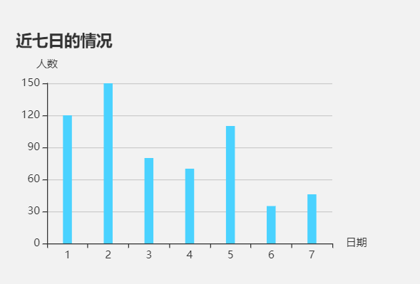
 mounted(){
    this.drawLine();
  },
  methods: {
    drawLine(){
      // 基于准备好的dom,初始化echarts实例
      let myChart3 = this.$echarts.init(document.getElementById('myChart3'))
      // 绘制图表
      myChart3.setOption({
        title: { text: '近七日的情况' },  //图表标题

        tooltip: {},
        xAxis: {
          name: '日期',     //x轴标题
          data: ["1","2","3","4","5","6","7"]  ////x轴数据
        },
        yAxis: {
          name: '人数',     //y轴标题
          type: 'value',
        },
        series: [{
          type: 'bar',      //图表形状
          //柱状图的颜色
          itemStyle:{
            normal:{
              color:'#4ad2ff'
            }
          },
          barWidth : 10,    //柱图宽度
          data: [120, 150, 80, 70, 110,35,46],  //图表数据
        }]
      });

    }
  }
4.展示结果
<div id="myChart3" :style="{width: '400px', height: '300px'}"></div>
以上就是在vue项目中使用echarts的全部过程了,数据换成自己的就可以啦! 有需要的快去试试吧

 浙公网安备 33010602011771号