CSS样式(第二篇)
CSS样式(第二篇)
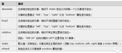
关于定位position:
li.widget {position: relative;}相对定位,设定一个参照物。
@media (max-width: 980px)
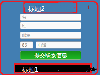
.textwidget h1 {float: left;position: absolute;top: 13px;margin-left: 20px;}
定义内部元素绝对定位,以最外面的边框为坐标定义它的位置。
.ClField-IsEmailExistsPopup.lcFieldWrapper.PopUpWrapper .ClField-BlockUiMessage.lcFieldWrapper.BlockUiWrapper

, .ClField-IsEmailExistsPopup.lcFieldWrapper.PopUpWrapper {background: #fff;width: 100%;height: 100%;display: block;position: fixed;fixed总是以body为定位时的对象,总是根据浏览器的窗口来进行元素的定位,通过"left"、 "top"、 "right"、 "bottom" 属性进行定位。

z-index: 999999999;Z-index 仅能在定位元素上奏效(例如 position:absolute;)!Z-index 可用于将在一个元素放置于另一元素之后,例如在一张图片的上面left: 0;top: 0;margin: 0;padding: 0;opacity: 0.9;opacity 属性设置元素的不透明级别}

.EmailExistsPopup {width: 312px;margin: 170px auto;display: block;padding-top: 57px;color: #000;font-size: 0.875em;text-align: left;float: none;}

.EmailExistsPopup p {color: #f00;font-size: 30px;margin: 0 0 10px;}

.EmailExistsPopup input[data-action="close"] {width: 120px;margin: 10px 0 0 170px;background: #8E8E8E;}

.EmailExistsPopup .LcWidget-QuickLoginWidget input[name="LoginSubmit"] {float: right;margin-right:105px !important;padding: 0 20px;line-height: 30px;}

!important作用是提高指定CSS样式规则的应用优先权。

.EmailExistsPopup .LcWidget-QuickLoginWidget {clear: both//清除左右两边浮动;padding-top: 20px;position: relative;生成相对定位的元素相对于其正常位置的定位}
.EmailExistsPopup .forgotpassword a {line-height: 35px;float:left;margin-left:65px;}

.EmailExistsPopup .LC-QuickLoginWidget .lcFieldWrapper {margin-bottom:20px;}

.ClField-BlockUiMessage.lcFieldWrapper.BlockUiWrapper label {background: url(/wp-content/uploads/2016/09/loading-bg.png) 用css代码加入背景图片center top no-repeat;定义图片居中,在顶部,不平铺的效果

width: 300px;height: 200px;margin: 200px auto;display: block;padding-top: 50px;color: #F00;font-size: 18px;text-align: center;float: none;}
.ClField-BlockUiMessage.lcFieldWrapper.BlockUiWrapper, .ClField-TradingExperiencePopup.lcFieldWrapper.PopUpWrapper, .ClField-TradingExperienceCFDPopup.lcFieldWrapper.PopUpWrapper

{background: rgba(250, 250, 250, 0.88);background:rgba(色值一,色值二,色值三,透明度);

width: 100%;height: 100%;position: fixed;left: 0;top: 0;padding: 0;z-index: 99999999;}

 li#menu-item-13311 a:hover{border-bottom: 2px solid #006bc6使div有2px的下边框;}

li#menu-item-13311 a:hover span{color:red}鼠标悬浮上去整个块变颜色

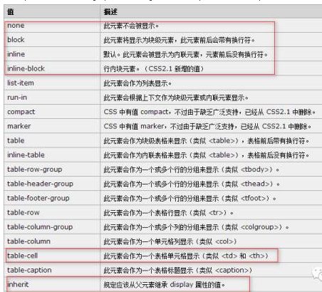
Display:inline; 定义高度 一般调整字体行高,line-height调节高度

font-family: 微软雅黑; font: 100% Microsoft YaHei; width:100%/auto;margin: 0 auto;定义宽度才能居中。  float的效果没有占空间,只有定义了height,div才有空间。

.et_pb_column_0 ul li

a {float: left;padding-top: 0;padding-right: 5px;padding-left: 5px !important;margin-bottom: 5px;height: 25px;line-height: 25px;margin-right: 10px;background-color: #E9E9E9;}
此效果也可以用以下css实现:#menu-my-profile li {display: inline-block;}
#menu-my-profile li a{float:none;}
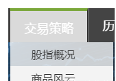
.textwidget h1 {float: left;position: absolute;top: 55px;margin-left:20px;}
.registration-tel {position: absolute;right: 70px;top: 55px;font-size: 16px;font-family: 微软雅黑;}
.textwidget {border-radius: 7px;}实现圆角效果。
Css定义属性类的层级关系
类中下一级定义
.et_pb_column.et_pb_column_1_4.et_pb_column_1.et_pb_column_single {width: 100%;}
对不同类同时定义
.et_pb_blurb_0 , .et_pb_blurb_3 , .et_pb_blurb_1 , .et_pb_blurb_2{width: 50%;float: left;}
仅对下一级生效
.et_pb_row_4col > .et_pb_column.et_pb_column_1_4 {width: 50% !important;margin-right: 0%;}
.LcContentHtml-OnlineDataTable{overflow: hidden;}溢出的元素进行隐藏
空格必须有
.post-70 .et_pb_blurb_container span {white-space: nowrap;/不换行overflow: hidden;display:block;}

@media (max-width:325px){h3.txth {padding: 0 !important;}对不同的屏幕下定义样式自适应。
768px:平板尺寸768px~320px手机尺寸
使两个div显示在一行用{display:inline-block;}
背景图片的位置
.footer { background-image: url("images/foot-bg.png"); background-position: right 15px; background-repeat: no-repeat;font-size: 12px;padding-left: 5px;line-height: 16px;color: #666;}

处理上述问题需用到z-idex属性:
.FixedMenuCover { position: fixed; right: 10px; bottom: 50px; z-index: 10;}

上述样式的实现代码如下:
<!doctype html>

<html>

 <head>

  <meta charset="UTF-8">

  <meta name="Generator" content="EditPlus®">

  <meta name="Author" content="">

  <meta name="Keywords" content="">

  <meta name="Description" content="">

  <title>Document</title>

 </head>

 <style type="text/css">

 select{

 border-radius:5px;border: solid 1px #000;
  /*很关键:将默认的select选择框样式清除*/

  appearance:none;

  -moz-appearance:none;

  -webkit-appearance:none;

  /*在选择框的最右侧中间显示小箭头图片*/

  background: url("bg.png") no-repeat scroll right  center transparent;

  /*为下拉小箭头留出一点位置,避免被文字覆盖*/

 font-size: 16px;

    height: 26px;

    font-family: 微软雅黑;

    color: green;

  padding-right: 14px;


  width:85px;

  padding-left: 10px;

  outline: none;

}

/*清除ie的默认选择框样式清除,隐藏下拉箭头*/

select::-ms-expand { display: none; }

 </style>

 <body>

  请选择您的出生地:

<select name="adress">

<option value="sichuang">四川</option>

<option value="beijing">北京</option>

<option value="xizang">西藏</option></select><br/>

 </body>

</html>
设置了div的高度height:50px;字体的行高要设置成和高度相同时才会垂直居中显示。
当用float设置了元素的布局,随着屏幕的缩小元素成两行分布时,需要清除浮动,相关的属性才不会受影响。
#mobile_menu {display: -webkit-box !important;-webkit-box-orient: vertical;-webkit-box-direction: reverse;}使文字倒叙排列
h1 {text-align: center;margin: 30px auto 10px auto;padding: 10px 0;color: #00A3D9;

font-size: 36px;text-shadow: 0px 2px 1px #444;background: url(http://www.gcmasia.com/wp-content/uploads/sites/1/2016/03/h1-bg.jpg)repeat-x 50%;}

h1 span {background: #fff;padding: 0 10px;}

#top-menu {float: right;display: -webkit-inline-box;display: -moz--inline-box;display: -ms-inline-box;}

#top-menu li {padding: 0;border-right: 1px solid #282727;border-left: 1px solid #737373;}

#top-menu li:hover {background: #dadada;border-top: 4px solid #7aa73a;}

#top-menu li.current-menu-item {background: #dadada;border-top: 4px solid #7aa73a;}
设置ul的背景,样式。
.nav li ul {z-index: 9999;width: 150px;background: none;visibility: hidden;opacity: 0;box-shadow: 0 2px 5px rgba(0, 0, 0, 0.1);-moz-box-shadow: 0 2px 5px rgba(0, 0, 0, 0.1);-webkit-box-shadow: 0 2px 5px rgba(0, 0, 0, 0.1);opacity: 0.8;border-radius: 1px;}
Li的背景用rgba设置透明度。
#top-menu li

li {padding: 0;border-right: none;border-left: none;background: rgba(250,250,250,0.8);height: 35px;}
设置悬停时a的背景变化,显示0.8透明度的背景颜色。
#top-menu li li a:hover {background: rgba(250,250,250,0.8);}
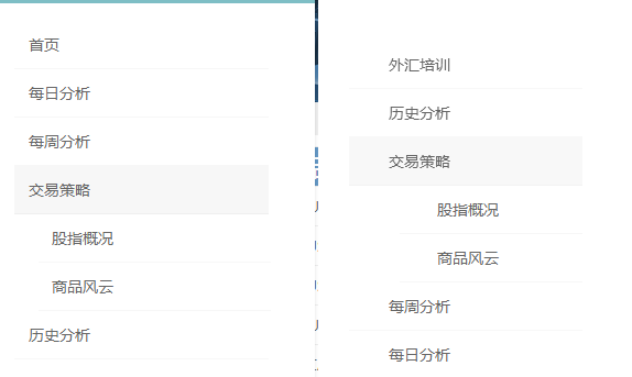
1. h4.widgettitle {font-size: 25px;font-family: 微软雅黑;font-weight: bold;color: #264a6c;background: url(/wp-content/uploads/2016/10/weighth4.png)no-repeat 100px;}
2. .et_pb_sidebar_0.et_pb_widget_area li {border-bottom: 1px dashed #ccc;}
.et_pb_widget ul li {margin-bottom: 6px;list-style-type: circle;}
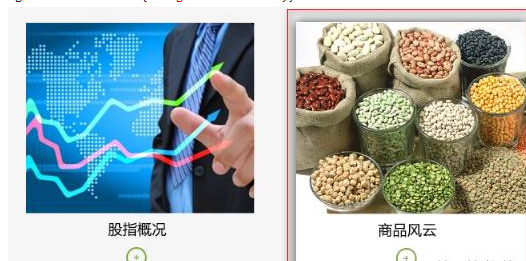
3. .goods {background: url(/wp-content/uploads/2016/10/h2.png) no-repeat 10px;height: 67px;border-bottom: 4px solid #8e8e8e;}
.goods-EURtable {width: 46%;background: #fff;padding: 10px;vertical-align: -15px;}

.goods-EURtable-title {background: #e2eef8;}

.goods-EURtable-tr {background: #f5f5f5;}
鼠标悬停时,图片的悬停状态:
.post-10721 .et_pb_image:hover {background: #fff;box-shadow: 0px 0px 15px #444;}
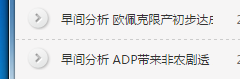
.et_pb_post {border-bottom: 1px dashed #ccc;虚线下划线background: url(/wp-content/uploads/2016/11/circle.png) no-repeat 10px 6px;定义背景小图片不平铺,height: 40px;line-height: 40px;给一行定义高度,定义相同的行高,使文字垂直居中
}
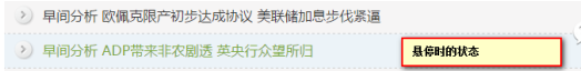
article.et_pb_post:hover {background-color: #ecf3f8;}悬停时背景颜色和字体变色。
#nav_menu-20 ul li a {line-height: 35px;padding-left: 60px;background: url(/wp-content/uploads/2016/09/tag1.png) 20px center no-repeat;}

#nav_menu-20 ul li a:hover {background: url(/wp-content/uploads/2016/09/tag1.png) 20px center no-repeat#BCBCBC !important;}

#nav_menu-20 ul li a:hover span {color: #006BC6;}
.et_pb_post h2 {overflow: hidden;width: 50%;white-space: nowrap;display: inline-block;}

 浙公网安备 33010602011771号