
CSS Grid布局
Grid局部,当该容器的元素,需要成行成列的排列时,适合使用Grid
有两种设置:
.grid-container {
display: grid;
}
.grid-container {
display: inline-grid;
}
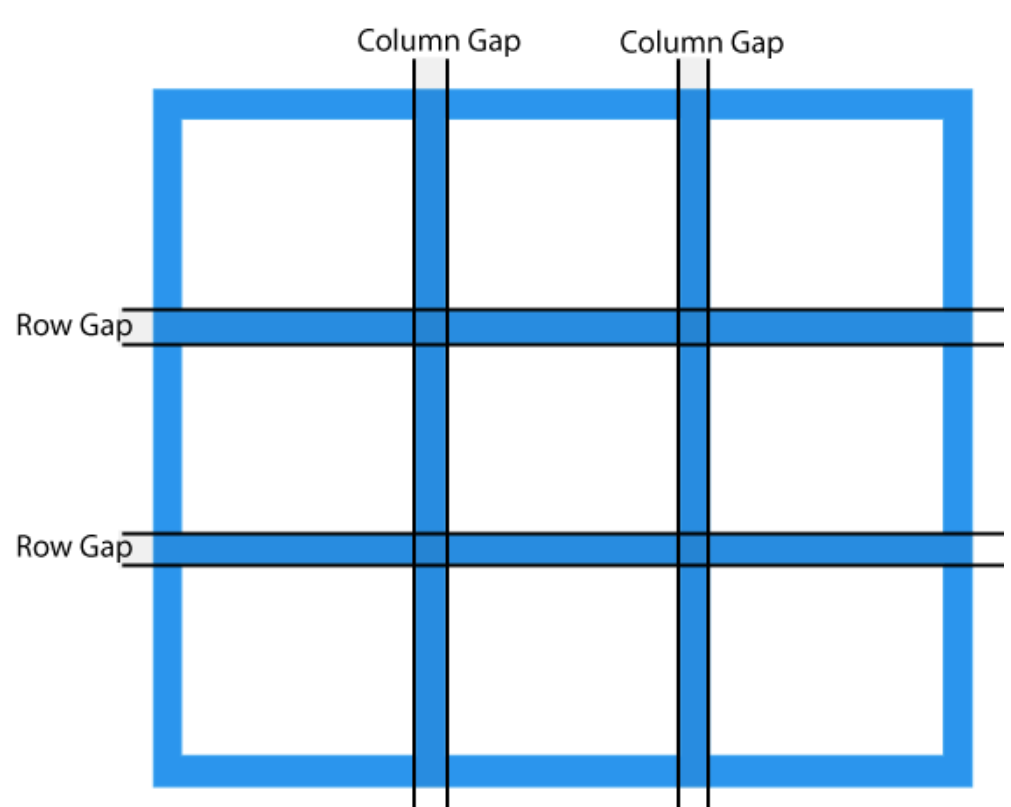
gap = row-gap+column-gap
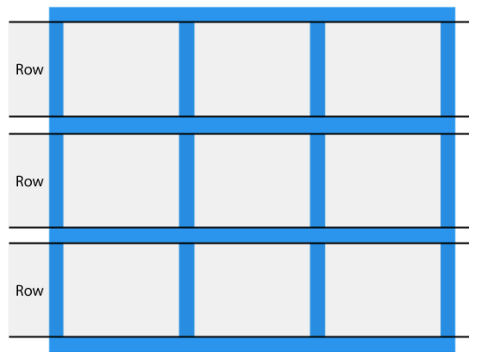
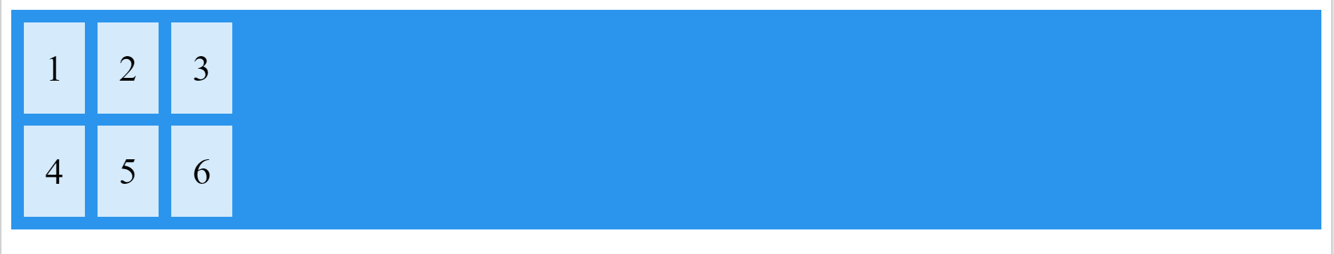
一、在外部容器上面,定义行和列
.grid-container {
display: grid;
grid-template-columns: auto auto auto;
grid-template-rows: 80px 200px;
gap: 10px;
background-color: #2196F3;
padding: 10px;
}

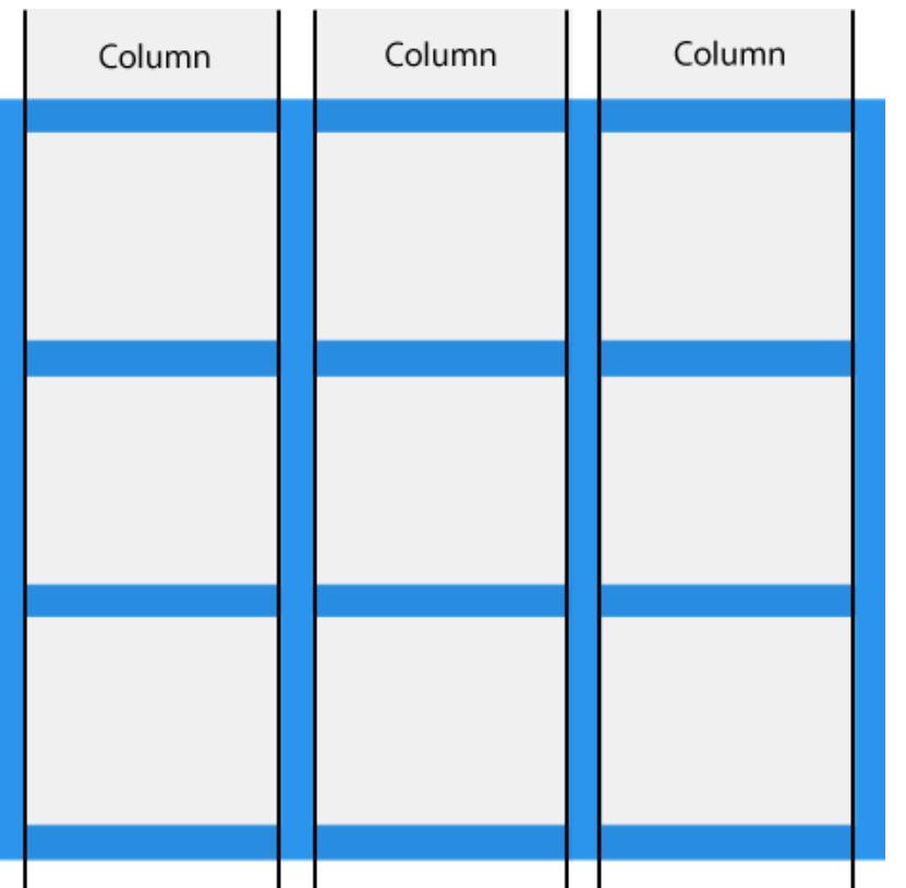
.grid-container {
display: grid;
grid-template-columns: 80px 200px auto 40px;
}
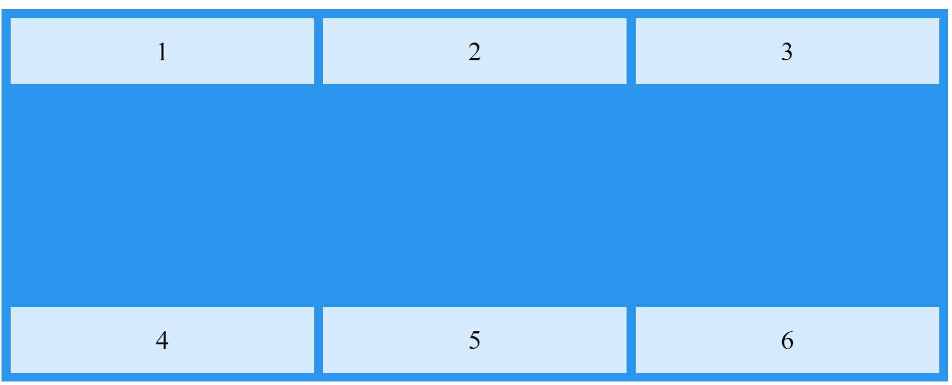
但所有列的宽度之和不足整个Grid,可以决定每一列的位置
.grid-container {
display: grid;
justify-content: start;
grid-template-columns: 50px 50px 50px; /*Make the grid smaller than the container*/
gap: 10px;
background-color: #2196F3;
padding: 10px;
}
所有行的高度不足整个Grid的高度,可以排列行的位置
.grid-container {
display: grid;
height: 400px;
align-content: space-between;
grid-template-columns: auto auto auto;
gap: 10px;
background-color: #2196F3;
padding: 10px;
}
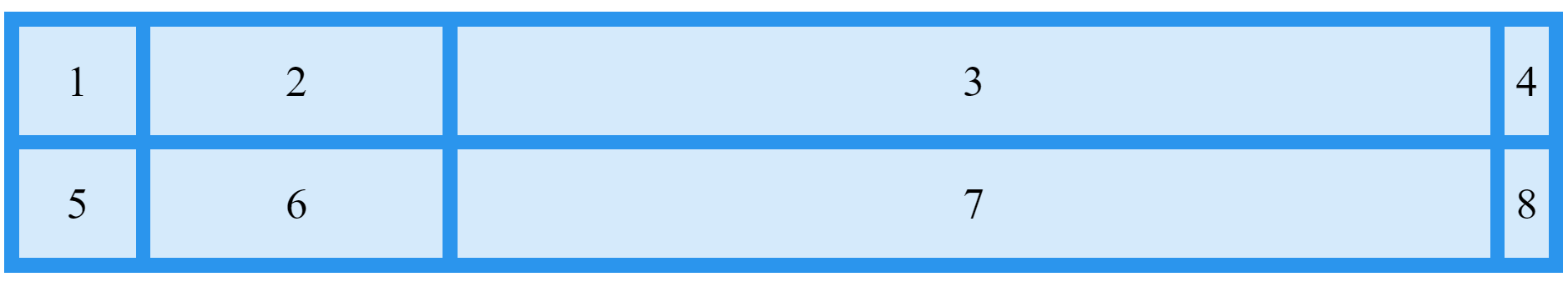
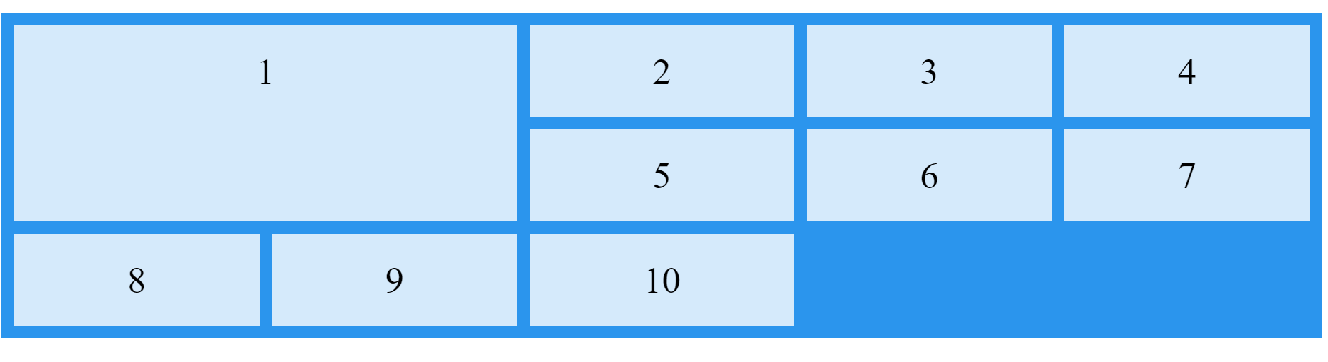
二、在内部元素上面,定义位置
grid-column: start column / end column +1
grid-row: start row / end row + 1
注意,可以设置span,推断出终止的行号和列号
grid-column: start column /span count
grid-row: start row / span count
简略写法:
grid-area: start column / end column / start row / end row
还有一种,结合命名,使用
.item1 {
grid-area: myArea;
}
.grid-container {
display: grid;
grid-template-areas: 'myArea myArea . . .' 'myArea myArea . . .';
gap: 10px;
background-color: #2196F3;
padding: 10px;
}


【推荐】国内首个AI IDE,深度理解中文开发场景,立即下载体验Trae
【推荐】编程新体验,更懂你的AI,立即体验豆包MarsCode编程助手
【推荐】抖音旗下AI助手豆包,你的智能百科全书,全免费不限次数
【推荐】轻量又高性能的 SSH 工具 IShell:AI 加持,快人一步
· 分享一个免费、快速、无限量使用的满血 DeepSeek R1 模型,支持深度思考和联网搜索!
· 基于 Docker 搭建 FRP 内网穿透开源项目(很简单哒)
· ollama系列1:轻松3步本地部署deepseek,普通电脑可用
· 按钮权限的设计及实现
· 【杂谈】分布式事务——高大上的无用知识?