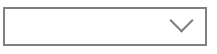
用border和transform变形制作下拉倒三角按钮
<style>
	div{
		width: 200px;
		height: 35px;
		border: 2px solid gray;
		/*父相*/
		position: relative;
	}
	span{
		/*子绝:相对于父元素进行绝对定位*/
		position: absolute;
		top: 3px;
		right:15px;
		/*定个宽高*/
		width: 15px;
		height: 15px;
		/*只要下边和右边*/
		border-bottom:2px solid gray;
		border-right: 2px solid gray;
		/*旋转形成下三角*/
		transform:rotate(45deg);
	}
</style>

	<div><span></span></div>
效果:

 浙公网安备 33010602011771号