flex布局、css3选择器
一、cs3选择器
https://www.w3school.com.cn/cssref/css_selectors.asp
Class^=,Class*= ,Class$= 其实就是一个使用正则的属性通配符selector
解释:
[attribute^=value],a[src^="https"],选择其 src 属性值以 "https" 开头的每个 <a> 元素。
[attribute*=value],a[src*="abc"],选择其 src 属性中包含 "abc" 子串的每个 <a> 元素。
[attribute*=value],a[src$="abc"],选择其 src 属性中值以 "abc" 结尾的每个 <a> 元素。
用[class*=" icon-"], [class^=icon-]经过测试发现,value可以加双引号,可以不加,效果一致。
二、flex布局语法及实战
语法:http://www.ruanyifeng.com/blog/2015/07/flex-grammar.html
实战:http://www.ruanyifeng.com/blog/2015/07/flex-examples.html
https://codepen.io/LandonSchropp/pen/KpzzGo
http://jsrun.net
1.总源码
<!DOCTYPE html>
<html>
<head>
	<title>用flex布局实现骰子</title>
</head>
<style type="text/css">
	.box-face{
		display: flex;
		display: -webkit-flex; /*webkit内核浏览器必须加上-webkit*/
		justify-content: center;

		/*display: inline-flex; /*行内弹性布局*/
		/*flex-direction:row;*/
	}


	/*骰子的面 此处利用了cs3的选择器写法:
	凡是class名的结尾为face的类都使用以下样式*/
	[class$="face"] {
	  margin: 16px;
	  padding: 4px;

	  background-color: #e7e7e7;
	  width: 104px;
	  height: 104px;
	  object-fit: contain;

	  box-shadow:
	    inset 0 5px white,
	    inset 0 -5px #bbb,
	    inset 5px 0 #d7d7d7,
	    inset -5px 0 #d7d7d7;

	  border-radius: 10%;
	}


	/*骰子的圆点*/
	.pip {
	  display: block;
	  width: 24px;
	  height: 24px;
	  border-radius: 50%;
	  margin: 4px;
	  background-color: #333;
	  box-shadow: inset 0 3px #111, inset 0 -3px #555;
	}
</style>
<body>

	<div class="box-face">
		<span class="item pip"></span>
	</div>

</body>
</html>
效果:中
justify-content: center; 此属性默认是没写就是左对齐
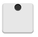
1.首行左对齐(默认布局)
4.四点布局
<!DOCTYPE html>
<html>
<head>
	<title>用flex布局实现骰子</title>
</head>
<style type="text/css">
	/*骰子的面 此处利用了cs3的选择器写法:
	凡是class名的结尾为face的类都使用以下样式*/
	[class$="face"] {
	  margin: 16px;
	  padding: 4px;

	  background-color: #e7e7e7;
	  width: 104px;
	  height: 104px;
	  object-fit: contain;

	  box-shadow:
	    inset 0 5px white,
	    inset 0 -5px #bbb,
	    inset 5px 0 #d7d7d7,
	    inset -5px 0 #d7d7d7;

	  border-radius: 10%;
	}


	/*骰子的圆点*/
	.pip {
	  display: block;
	  width: 24px;
	  height: 24px;
	  border-radius: 50%;
	  margin: 4px;
	  background-color: #333;
	  box-shadow: inset 0 3px #111, inset 0 -3px #555;
	}


	/*容器盒子*/
	.box-face{
		/*display: inline-flex; /*行内弹性布局*/

		/*1.使用弹性布局*/
		display: flex; /*默认首行左对齐*/
		display: -webkit-flex; /*webkit内核浏览器必须加上-webkit*/

		/*2.项目排列方向:row 行:左->右| row-reverse 行:右->左| column 列:上到下| column-reverse; 列:下到上*/
		/*flex-direction:column; */

		/*3.换行排列时*/
		flex-wrap:wrap;

		/*4.主轴行内容对齐:flex-start 左,center 中,flex-end 右; 多项目:space-between | space-around;*/
		/*justify-content:flex-end;*/


		/*5.交叉轴项目对齐:flex-start 上,center 中,flex-end 下; 多项目:space-between  | space-around;*/
		/*align-items: space-between;*/


		/*7.交叉轴上内容对齐*/
		align-content:space-between;

	}

	.column {
	 /*8. 项目占主轴宽度*/
	  flex-basis: 100%;
	  display: flex;
	  justify-content: space-between;
	  /*align-content:flex-end;*/
	}

	.item:nth-child(2){
		/*6.项目自控交叉轴对齐方式:auto | flex-start | flex-end | center | baseline | stretch;*/
		/*align-self:center;*/
	}

	.item:nth-child(3){
		/*align-self:flex-end;*/
	}
</style>
<body>

	<div class="box-face">
		<div class="column">
			<span class="item pip"></span>
			<span class="item pip"></span>
		</div>

		<div class="column">
			<span class="item pip"></span>
			<span class="item pip"></span>
		</div>

	</div>

</body>
</html>

6.6点
其它同4点,每个项目span多加一个

 浙公网安备 33010602011771号