
css transform解释及demo(基于chrome)
transform 属性向元素应用 2D 或 3D 转换。该属性允许我们对元素进行旋转、缩放、移动或倾斜。
Transform:(css3 转换)
注意:这些效果叠加时,中间用空格隔开
作用:能够对元素进行移动、缩放、转动、拉长、拉伸
转换:使元素改变形状、尺寸、位置的一种效果
Transform:转换方法:

1、translate()方法
translate(x): 沿着x轴移动x
translate(y): 沿着y轴移动y
translateXY(x, y): 沿着x轴移动x, 沿着y轴移动y
code:
<!DOCTYPE html>
<html lang="en">
<head>
    <meta charset="UTF-8">
    <title>Title</title>
    <style>
        #origin{
            width: 100px;
            height: 100px;
            background-color: red;
        }
        #translateX{
            width: 100px;
            height: 100px;
            background-color: red;
            transform: translateX(100px);
        }
        #translateY{
            width: 100px;
            height: 100px;
            background-color: red;
            transform: translateY(100px);
        }
        #translateXY{
            width: 100px;
            height: 100px;
            background-color: red;
            transform: translate(100px, 100px);
        }
    </style>
</head>
<body>

<div id="origin">
</div>
<div id="translateX">
</div>
<div id="translateY">
</div>
<div id="translateXY">
</div>
</body>
</html>
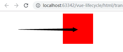
效果如下:
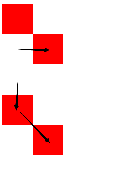
注:translate(200px),其实等同于translateX(200px)。
<!DOCTYPE html>
<html lang="en">
<head>
    <meta charset="UTF-8">
    <title>Title</title>
    <style>
        #origin{
            width: 100px;
            height: 100px;
            background-color: red;
            transform: translate(200px);
        }
    </style>
</head>
<body>

<div id="origin">
</div>
</body>
</html>
效果:
translate()方法 3D转化
就是多了z轴的变化。
<!DOCTYPE html>
<html lang="en">
<head>
    <meta charset="UTF-8">
    <title>Title</title>
    <style>

        #parent {
            width: 500px;
            height: 500px;
            -webkit-perspective: 1000px; /*镜头距离平面距离,镜头默认在中心,也可以通过perspective-origin调整*/
            -webkit-perspective-origin: 50px 50px; /*视点在平面上的具体位置*/
        }

        #origin {
            width: 100px;
            height: 100px;
            position: absolute;
            top: 0px;
            left: 0px;
            background-color: red;
        }

        #translateZ {
            width: 100px;
            height: 100px;
            position: absolute;
            top: 0px;
            left: 0px;
            background-color: blue;
            -webkit-transform: translate3d(50px, 50px, 50px);
        }

    </style>
</head>
<body>
<div id="parent">
    <div id="origin">
    </div>
    <div id="translateZ">
    </div>
</div>
</body>
</html>
这种条件下需要设置父元素的perspective属性
2、Rotate(angle)方法
rotate字面意思是旋转,设置元素顺时针旋转的角度,用法是:transform: rotate(x); 参数x必须是以deg结尾的角度数或0,可为负数表示反向。deg是度的意思,一圈有360度。
code:
<!DOCTYPE html>
<html lang="en">
<head>
<meta charset="UTF-8">
<title>Title</title>
<style>
#rotate {
width: 100px;
height: 100px;
margin-left: 30px;
margin-top: 30px;
background-color: yellow;
transform: rotate(30deg);
}
</style>
</head>
<body>
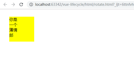
<div id="rotate">你是<br/>一个<br/>薄情<br/>郎</div>
</body>
</html>
原图:
旋转后的图:
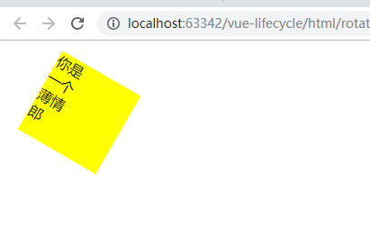
可以看出是沿z轴顺时针旋转,如果是负的,就是逆时针旋转
Rotate()方法 3D转化
RotateX(angle),rotateY(angle),rotateZ(angle):
围绕X/Y/Z轴旋转,angle为旋转的角度,可以是正值,顺时针旋转,可以是负值,逆时针旋转。
<!DOCTYPE html>
<html lang="en">
<head>
    <meta charset="UTF-8">
    <title>Title</title>
    <style>
        #rotate {
            width: 100px;
            height: 100px;
            margin-left: 30px;
            margin-top: 30px;
            background-color: yellow;
        }
        #rotateX {
            width: 100px;
            height: 100px;
            margin-left: 30px;
            margin-top: 30px;
            background-color: yellow;
            transform:rotateX(45deg);
        }
        #rotateY {
            width: 100px;
            height: 100px;
            margin-left: 30px;
            margin-top: 30px;
            background-color: yellow;
            transform:rotateY(45deg);
        }
        #rotateZ {
            width: 100px;
            height: 100px;
            margin-left: 30px;
            margin-top: 30px;
            background-color: yellow;
            transform:rotateZ(45deg);
        }
    </style>
</head>
<body>
<div id="rotate">你是<br/>一个<br/>薄情<br/>郎</div>
<div id="rotateX">你是<br/>一个<br/>薄情<br/>郎</div>
<div id="rotateY">你是<br/>一个<br/>薄情<br/>郎</div>
<div id="rotateZ">你是<br/>一个<br/>薄情<br/>郎</div>
</body>
</html>
效果图:


 浙公网安备 33010602011771号