

jquery简单插件到复杂插件(3)--顶部导航固定
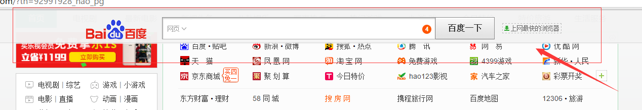
那个效果很多,比如hao123的头部
<!DOCTYPE html>
<html>
    <head>
        <meta charset="UTF-8">
        <title></title>
        <link rel="stylesheet" href="css/style.css"/>
        <script type="text/javascript" src="js/nav-top.js" ></script>
    </head>
    <body>
        <div id="nav">
            <ul>
                <li>1</li>
                <li>2</li>
                <li>3</li>
                <li>4</li>
            </ul>
        </div>
        <div id="content">

        </div>
    </body>
</html>
*
{
    padding: 0;
    margin: 0;
}
#nav
{
    width: 800px;
    height: 50px;
    background: red;
    margin: auto;
    position: absolute;
    left: 514px;
    top: 50px;
}
#nav ul li
{
    text-decoration: none;
    list-style: none;
    float: left;
    width: 180px;
}
#content
{
    width: 800px;
    height: 1500px;
    background: black;
    margin: auto;
    margin-top: 50px;
}
window.onload =scroll;
addEventListener("scroll",getHeight);
function getHeight ()
{
    var scrollHeigh = document.body.scrollTop;
    if(scrollHeigh > 50)
    {
        document.getElementById('nav').style.top=scrollHeigh+"px";
    }else
    {
        document.getElementById('nav').style.top=50+"px";
    }
}
document.body.scrollTop
document.body.offsetWidth + " (包括边线和滚动条的宽)";
网页可见区域宽: document.body.clientWidth
网页可见区域高: document.body.clientHeight
网页可见区域宽: document.body.offsetWidth (包括边线的宽)
网页可见区域高: document.body.offsetHeight (包括边线的高)
网页正文全文宽: document.body.scrollWidth
网页正文全文高: document.body.scrollHeight
网页被卷去的高: document.body.scrollTop
网页被卷去的左: document.body.scrollLeft
网页正文部分上: window.screenTop
网页正文部分左: window.screenLeft
屏幕分辨率的高: window.screen.height
屏幕分辨率的宽: window.screen.width
屏幕可用工作区高度: window.screen.availHeight
屏幕可用工作区宽度: window.screen.availWidth

