

css 边框颜色渐变的半圆
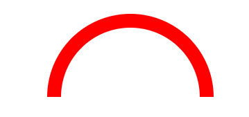
1.需求有这么个东西,个人不习惯背景图片来解决,开始了css尝试。

 1 <!DOCTYPE html>
 2 <html>
 3     <head>
 4         <meta charset="UTF-8">
 5         <title>边框渐变的拱形</title>
 6         <style>
 7
 8             .circle{
 9                 width: 200px;
10                 /*height: 200px;*/
11                 line-height: 100px;
12                 text-align: center;
13                 margin: 100px;
14                 /*background-color: red;*/
15             }
16             .semi-circle {
17                 border-radius: 200px 200px 0 0 ;
18                 height: 100px;
19                 border: 20px solid red;
20                 border-bottom: 0;
21                 /*border-image: -moz-linear-gradient(green,blue);
22                 border-image: -webkit-linear-gradient(green,blue);
23                 border-image: linear-gradient(to right,green,blue) 30 30;*/
24             }
25
26         </style>
27     </head>
28     <body>
29         <div class="circle semi-circle"></div>
30
31     </body>
32 </html>
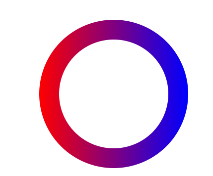
2.基于上图 尝试用背景渐变来解决,so border-image上了,(不要问为啥不用border-color),但是圆角没有了,因为他们都是对border的设置。后从网上看到有伪类去做的背景渐变的按钮。
 1 <!DOCTYPE html>
 2 <html>
 3     <head>
 4         <meta charset="UTF-8">
 5         <title>边框渐变的拱形</title>
 6         <style>
 7
 8             .border{
 9               position: relative;
10                 border: 4px solid transparent;
11                 border-radius: 16px;
12                 background: linear-gradient(orange, violet);
13                 background-clip: padding-box;
14                 padding: 10px;
15                 /* just to show box-shadow still works fine */
16                 box-shadow: 0 3px 9px black, inset 0 0 9px white;
17             }
18             .border::after{
19                 position: absolute;
20                 top: -4px; bottom: -4px;
21                 left: -4px; right: -4px;
22                 background: linear-gradient(red, blue);
23                 content: '';
24                 z-index: -1;
25                 border-radius: 16px;
26             }
27
28         </style>
29     </head>
30     <body>
31
32         <div class="border"></div>
33
34     </body>
35 </html>
效果如下:

3.然后开始改造
 1 <!DOCTYPE html>
 2 <html>
 3     <head>
 4         <meta charset="UTF-8">
 5         <title>边框渐变的拱形</title>
 6         <style>
 7
 8             .border1{
 9                 width: 200px;
10                 height: 200px;
11                 margin:100px auto;
12
13               position: relative;
14                 border: 1px solid transparent;
15                 border-radius: 200px;
16                 background: white;
17                 background-clip: padding-box;
18                 padding: 10px;
19             }
20             .border1::after{
21
22                 position: absolute;
23                 top: -40px;
24                 bottom: -40px;
25                 left: -40px;
26                  right: -40px;
27                 background: linear-gradient(to right,red, blue);
28                 content: '';
29                 z-index: -1;
30                 border-radius: 200px;
31             }
32
33         </style>
34     </head>
35     <body>
36
37         <div class="border1"></div>
38
39     </body>
40 </html>
4.再次改造
 1 <!DOCTYPE html>
 2 <html>
 3     <head>
 4         <meta charset="UTF-8">
 5         <title>边框渐变的拱形</title>
 6         <style>
 7
 8             .border2{
 9                 width: 200px;
10                 height: 100px;
11                 margin:100px auto;
12
13               position: relative;
14                 border: 1px solid transparent;
15                 border-bottom: 0;
16                 border-radius: 200px 200px 0 0;
17                 background: white;
18                 background-clip: padding-box;
19                 padding: 10px;
20             }
21             .border2::after{
22
23                 position: absolute;
24                 top: -40px;
25                 bottom: 0px;
26                 left: -40px;
27                  right: -40px;
28                 background: linear-gradient(to right,red, blue);
29                 content: '';
30                 z-index: -1;
31                 border-radius: 200px 200px 0 0;
32             }
33         </style>
34     </head>
35     <body>
36
37         <div class="border2"></div>
38     </body>
39 </html>
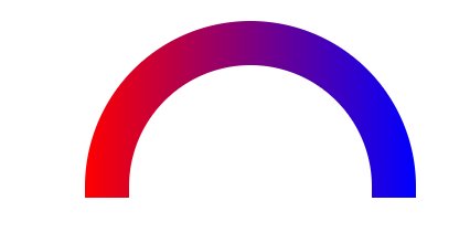
最终达到想要的效果。


【推荐】国内首个AI IDE,深度理解中文开发场景,立即下载体验Trae
【推荐】编程新体验,更懂你的AI,立即体验豆包MarsCode编程助手
【推荐】抖音旗下AI助手豆包,你的智能百科全书,全免费不限次数
【推荐】轻量又高性能的 SSH 工具 IShell:AI 加持,快人一步
· 10年+ .NET Coder 心语,封装的思维:从隐藏、稳定开始理解其本质意义
· .NET Core 中如何实现缓存的预热?
· 从 HTTP 原因短语缺失研究 HTTP/2 和 HTTP/3 的设计差异
· AI与.NET技术实操系列:向量存储与相似性搜索在 .NET 中的实现
· 基于Microsoft.Extensions.AI核心库实现RAG应用
· TypeScript + Deepseek 打造卜卦网站:技术与玄学的结合
· 阿里巴巴 QwQ-32B真的超越了 DeepSeek R-1吗?
· 【译】Visual Studio 中新的强大生产力特性
· 10年+ .NET Coder 心语 ── 封装的思维:从隐藏、稳定开始理解其本质意义
· 【设计模式】告别冗长if-else语句:使用策略模式优化代码结构