
web前端基础之Bootstrap(三) - 插件
模态框
放在body内的直接子元素
弹出方式
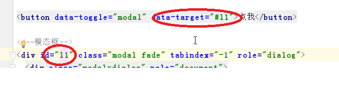
1.通过 data 属性
data-toggle="modal" data-target="#myModal"
按钮的data-target要与模态框的id建立关联
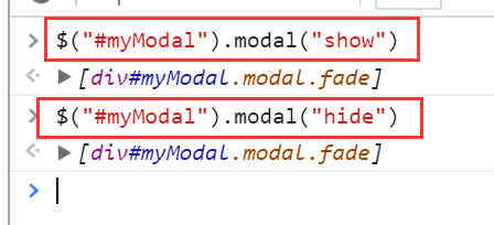
2.通过 JS代码
通过JS代码实现模态框的显示与隐藏
- $("#myModal").modal("show")  --> 显示出来

- $("#myModal").modal("hide)   --> 隐藏
模态框大小
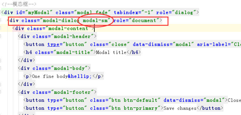
在模态框的第一子类中添加 model-lg,model-md,model-sm,model-xs
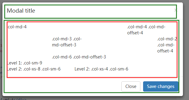
模态框结构
一个模态框包括
1. .modal-header 2. .modal-body 3. .modal-footer
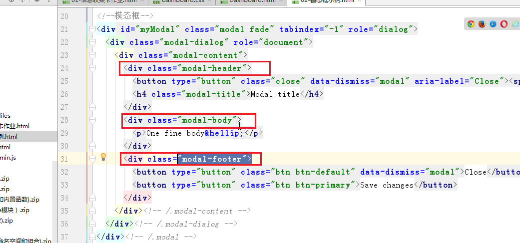
样式
模态框动画
模态框动画:在模态框的父类中添加 fade
若模态框类中没有fade则模态框不会有一个缓慢的弹出过程,只会立即跳出
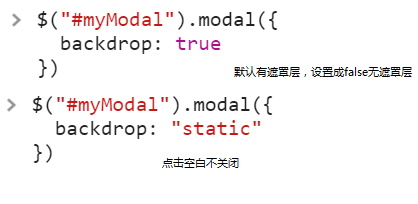
模态框参数
1.backdrop:遮罩层参数 ---> true/false/static
默认为true 显示灰色遮罩层,false为去掉遮罩层,static为点击空白不关闭模态框
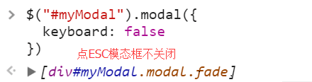
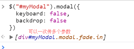
2.keyboard: 按键Esc ---> true/false
默认为true 按esc退出,false为按esc不退出模态框
3.模态框中的参数可以是多个值
模态框事件
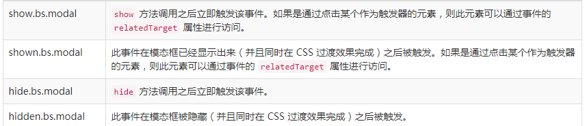
1.模态框显示之前,模态框显示之后


$(document).ready(function () {
    $('#myModal').on('show.bs.modal', function (e) {
    // do something...
    alert("我让模态框显示出来,但是它还没来得及显示");
    });

    $('#myModal').on('shown.bs.modal', function (e) {
                 // do something...
                alert("我让模态框显示出来,现在它已经显示出来了");
    })
2.模态框隐藏前,隐藏后
<!DOCTYPE html> <html lang="zh-CN"> <head> <meta charset="UTF-8"> <meta http-equiv="X-UA-Compatible" content="IE=edge"> <meta name="viewport" content="width=device-width, initial-scale=1, maximum-scale=1, user-scalable=no"> <title>模态框示例</title> <link rel="stylesheet" href="bootstrap/css/bootstrap.min.css"> </head> <body> <nav>导航</nav> <!--导航条--> <div class="container"> 。。。。 </div> <!--网页的内容--> <button data-toggle="modal" data-target="#myModal">点我</button> <!--模态框--> <div id="myModal" class="modal fade" tabindex="-1" role="dialog"> <div class="modal-dialog" role="document"> <div class="modal-content"> <div class="modal-header"> <button type="button" class="close" data-dismiss="modal" aria-label="Close"><span aria-hidden="true">×</span></button> <h4 class="modal-title">这里是标题</h4> </div> <div class="modal-body"> <form class="form-horizontal"> <div class="form-group"> <label for="inputEmail3" class="col-sm-2 control-label">姓名</label> <div class="col-sm-10"> <input type="email" class="form-control" id="inputEmail3" placeholder="Email"> </div> </div> <div class="form-group"> <label for="inputPassword3" class="col-sm-2 control-label">邮箱</label> <div class="col-sm-10"> <input type="password" class="form-control" id="inputPassword3" placeholder="Password"> </div> </div> <div class="form-group"> <label for="inputPassword3" class="col-sm-2 control-label">爱好</label> <div class="col-sm-10"> <input type="password" class="form-control" id="inputPassword3" placeholder="Password"> </div> </div> </form> </div> <div class="modal-footer"> <button type="button" class="btn btn-default" data-dismiss="modal">取消</button> <button type="button" class="btn btn-primary">保存</button> </div> </div><!-- /.modal-content --> </div><!-- /.modal-dialog --> </div><!-- /.modal --> <script src="jquery-3.2.1.min.js"></script> <script src="bootstrap/js/bootstrap.min.js"></script> <script> $(document).ready(function () { $('#myModal').on('show.bs.modal', function (e) { // do something... alert("我让模态框显示出来,但是它还没来得及显示"); }); $('#myModal').on('shown.bs.modal', function (e) { // do something... alert("我让模态框显示出来,现在它已经显示出来了"); }) }) </script> </body> </html>
轮播图

 $(document).ready(function () {
    $('#myModal').on('show.bs.modal', function (e) {
    // do something...
    alert("我让模态框显示出来,但是它还没来得及显示");
    });

    $('#myModal').on('shown.bs.modal', function (e) {
                 // do something...
                alert("我让模态框显示出来,现在它已经显示出来了");
    })
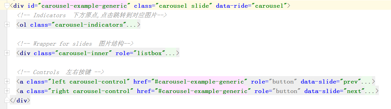
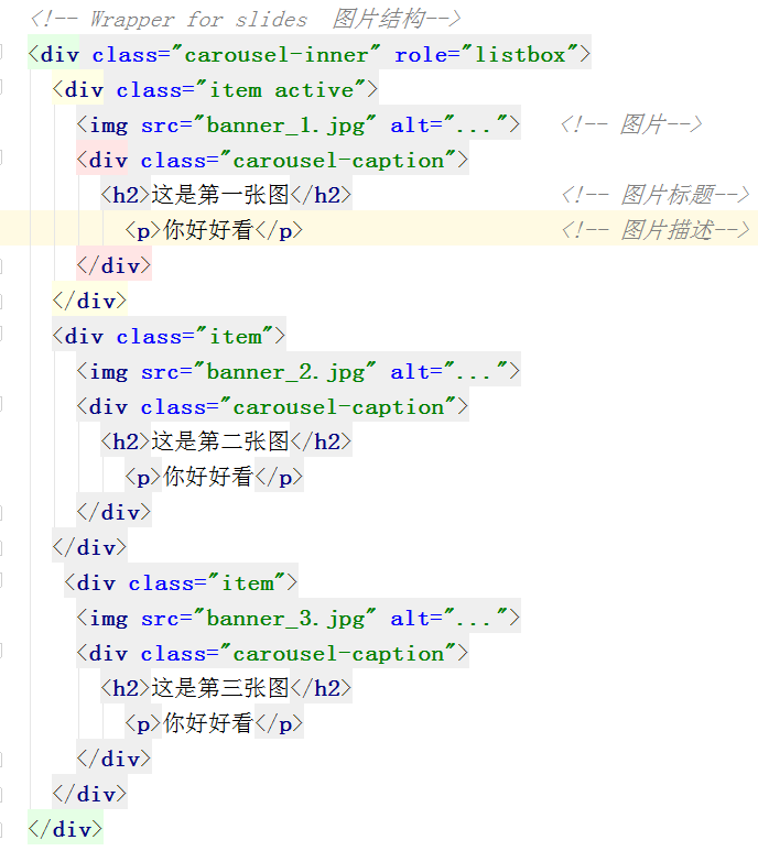
轮播图结构
轮播时间间隔
<script>
//    图片轮播时间  2s
    $('.carousel').carousel({
        interval: 2000
    })
</script>
<!DOCTYPE html>
<html lang="zh-CN">
<head>
    <meta charset="UTF-8">
    <meta http-equiv="X-UA-Compatible" content="IE=edge">
    <meta name="viewport" content="width=device-width, initial-scale=1, maximum-scale=1, user-scalable=no">
    <title>轮播图示例</title>
    <link rel="stylesheet" href="bootstrap/css/bootstrap.min.css">
</head>
<body>

<div id="carousel-example-generic" class="carousel slide" data-ride="carousel">
  <!-- Indicators  下方原点,点击跳转到对应图片-->
  <ol class="carousel-indicators">
    <li data-target="#carousel-example-generic" data-slide-to="0" class="active"></li>
    <li data-target="#carousel-example-generic" data-slide-to="1"></li>
    <li data-target="#carousel-example-generic" data-slide-to="2"></li>
  </ol>

  <!-- Wrapper for slides  图片结构-->
  <div class="carousel-inner" role="listbox">
    <div class="item active">
      <img src="banner_1.jpg" alt="...">   <!-- 图片-->
      <div class="carousel-caption">
        <h2>这是第一张图</h2>                 <!-- 图片标题-->
          <p>你好好看</p>                     <!-- 图片描述-->
      </div>
    </div>
    <div class="item">
      <img src="banner_2.jpg" alt="...">
      <div class="carousel-caption">
        <h2>这是第二张图</h2>
          <p>你好好看</p>
      </div>
    </div>
     <div class="item">
      <img src="banner_3.jpg" alt="...">
      <div class="carousel-caption">
        <h2>这是第三张图</h2>
          <p>你好好看</p>
      </div>
    </div>
  </div>

  <!-- Controls  左右按键 -->
  <a class="left carousel-control" href="#carousel-example-generic" role="button" data-slide="prev">
    <span class="glyphicon glyphicon-chevron-left" aria-hidden="true"></span>
    <span class="sr-only">Previous</span>
  </a>
  <a class="right carousel-control" href="#carousel-example-generic" role="button" data-slide="next">
    <span class="glyphicon glyphicon-chevron-right" aria-hidden="true"></span>
    <span class="sr-only">Next</span>
  </a>
</div>

<script src="jquery-3.2.1.min.js"></script>
<script src="bootstrap/js/bootstrap.min.js"></script>
<script>
//    图片轮播时间  2s
    $('.carousel').carousel({
        interval: 2000
    })
</script>
</body>
</html>
左侧下拉菜单
菜单结构
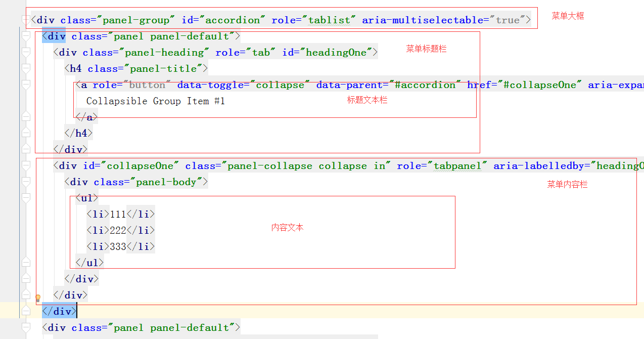
菜单点击与文本关系
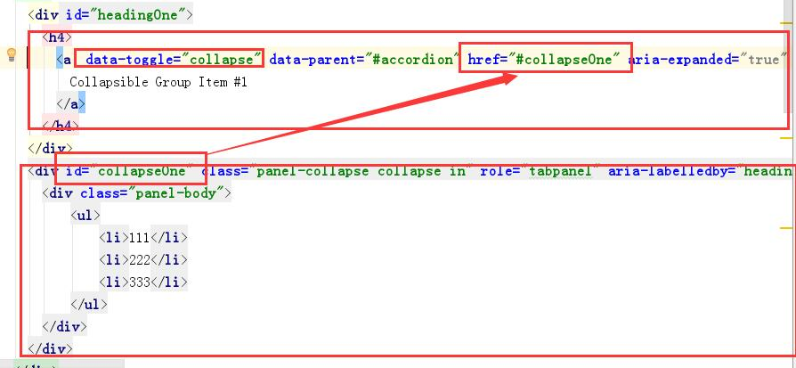
<!DOCTYPE html>
<html lang="zh-CN">
<head>
    <meta charset="UTF-8">
    <meta http-equiv="X-UA-Compatible" content="IE=edge">
    <meta name="viewport" content="width=device-width, initial-scale=1, maximum-scale=1, user-scalable=no">
    <title>Title</title>
    <link rel="stylesheet" href="bootstrap/css/bootstrap.min.css">
</head>
<body>

<div class="panel-group" id="accordion" role="tablist" aria-multiselectable="true">
  <div class="panel panel-default">
    <div class="panel-heading" role="tab" id="headingOne">
      <h4 class="panel-title">
        <a role="button" data-toggle="collapse" data-parent="#accordion" href="#collapseOne" aria-expanded="true" aria-controls="collapseOne">
          Collapsible Group Item #1
        </a>
      </h4>
    </div>
    <div id="collapseOne" class="panel-collapse collapse in" role="tabpanel" aria-labelledby="headingOne">
      <div class="panel-body">
        <ul>
          <li>111</li>
          <li>222</li>
          <li>333</li>
        </ul>
      </div>
    </div>
  </div>
  <div class="panel panel-default">
    <div class="panel-heading" role="tab" id="headingTwo">
      <h4 class="panel-title">
        <a class="collapsed" role="button" data-toggle="collapse" data-parent="#accordion" href="#collapseTwo" aria-expanded="false" aria-controls="collapseTwo">
          Collapsible Group Item #2
        </a>
      </h4>
    </div>
    <div id="collapseTwo" class="panel-collapse collapse" role="tabpanel" aria-labelledby="headingTwo">
      <div class="panel-body">
        Anim pariatur cliche reprehenderit, enim eiusmod high life accusamus terry richardson ad squid. 3 wolf moon officia aute, non cupidatat skateboard dolor brunch. Food truck quinoa nesciunt laborum eiusmod. Brunch 3 wolf moon tempor, sunt aliqua put a bird on it squid single-origin coffee nulla assumenda shoreditch et. Nihil anim keffiyeh helvetica, craft beer labore wes anderson cred nesciunt sapiente ea proident. Ad vegan excepteur butcher vice lomo. Leggings occaecat craft beer farm-to-table, raw denim aesthetic synth nesciunt you probably haven't heard of them accusamus labore sustainable VHS.
      </div>
    </div>
  </div>
  <div class="panel panel-default">
    <div class="panel-heading" role="tab" id="headingThree">
      <h4 class="panel-title">
        <a class="collapsed" role="button" data-toggle="collapse" data-parent="#accordion" href="#collapseThree" aria-expanded="false" aria-controls="collapseThree">
          Collapsible Group Item #3
        </a>
      </h4>
    </div>
    <div id="collapseThree" class="panel-collapse collapse" role="tabpanel" aria-labelledby="headingThree">
      <div class="panel-body">
        Anim pariatur cliche reprehenderit, enim eiusmod high life accusamus terry richardson ad squid. 3 wolf moon officia aute, non cupidatat skateboard dolor brunch. Food truck quinoa nesciunt laborum eiusmod. Brunch 3 wolf moon tempor, sunt aliqua put a bird on it squid single-origin coffee nulla assumenda shoreditch et. Nihil anim keffiyeh helvetica, craft beer labore wes anderson cred nesciunt sapiente ea proident. Ad vegan excepteur butcher vice lomo. Leggings occaecat craft beer farm-to-table, raw denim aesthetic synth nesciunt you probably haven't heard of them accusamus labore sustainable VHS.
      </div>
    </div>
  </div>
</div>
<script src="jquery-3.2.1.min.js"></script>
<script src="bootstrap/js/bootstrap.min.js"></script>
</body>
</html>
前端插件
FontAwesome字体插件
字体样式多,图标多
下载后 使用fontawesome文件中的css文件与fonts文件,放到自己文件中
代码导入结构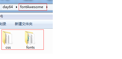
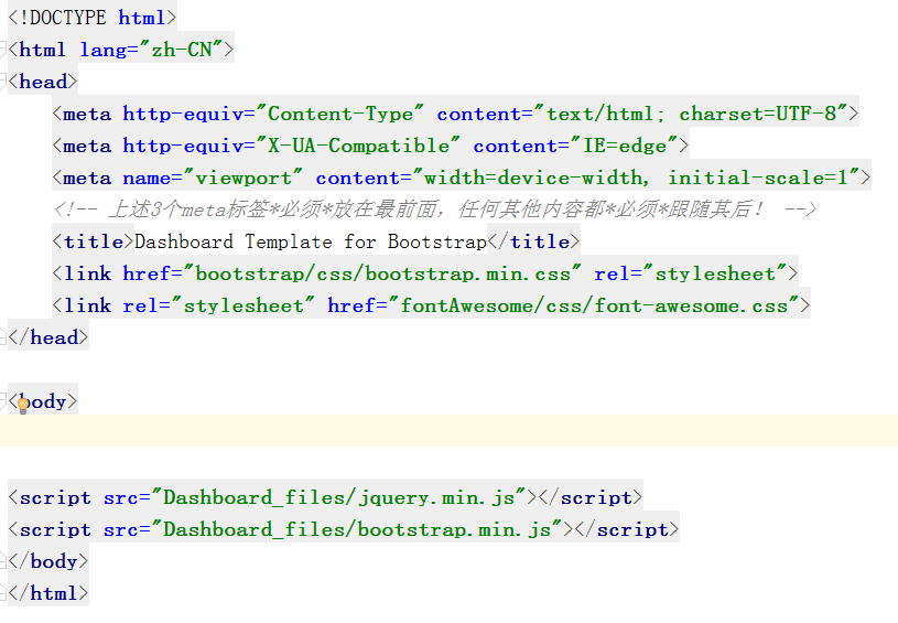
<!DOCTYPE html>
<html lang="zh-CN">
<head>
    <meta http-equiv="Content-Type" content="text/html; charset=UTF-8">
    <meta http-equiv="X-UA-Compatible" content="IE=edge">
    <meta name="viewport" content="width=device-width, initial-scale=1">
    <!-- 上述3个meta标签*必须*放在最前面,任何其他内容都*必须*跟随其后! -->
    <title>Dashboard Template for Bootstrap</title>
    <link href="bootstrap/css/bootstrap.min.css" rel="stylesheet">
    <link rel="stylesheet" href="fontAwesome/css/font-awesome.css">
</head>

<body>

<i class="fa fa-spinner fa-spin fa-3x fa-fw"></i>
<span class="sr-only">Loading...</span>

<i class="fa fa-bell"></i>
<i class="fa fa-twitter"></i>
<br>

<!--图标嵌套-->
<span class="fa-stack fa-lg">
  <i class="fa fa-square-o fa-stack-2x"></i>
  <i class="fa fa-twitter fa-stack-1x"></i>
</span>
fa-twitter on fa-square-o<br>
<span class="fa-stack fa-lg">
  <i class="fa fa-circle fa-stack-2x"></i>
  <i class="fa fa-flag fa-stack-1x fa-inverse"></i>
</span>
fa-flag on fa-circle<br>

<script src="Dashboard_files/jquery.min.js"></script>
<script src="Dashboard_files/bootstrap.min.js"></script>
</body>
</html>
SweetAlert2 插件
各种登录框,弹出框
官网 · https://limonte.github.io/sweetalert2/
下载后,把sweetalert2文件拷入文件中
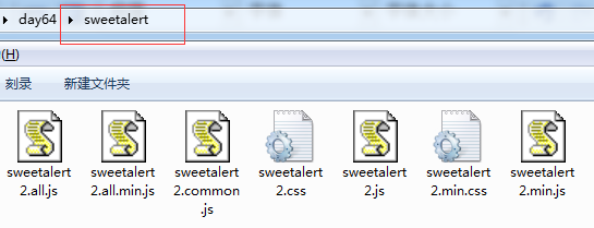
代码导入结构
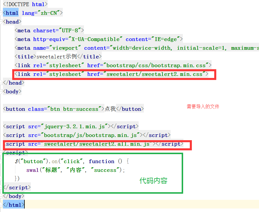
<!DOCTYPE html>
<html lang="zh-CN">
<head>
    <meta charset="UTF-8">
    <meta http-equiv="X-UA-Compatible" content="IE=edge">
    <meta name="viewport" content="width=device-width, initial-scale=1, maximum-scale=1, user-scalable=no">
    <title>sweetalert示例</title>
    <link rel="stylesheet" href="bootstrap/css/bootstrap.min.css">
    <link rel="stylesheet" href="sweetalert/sweetalert2.min.css">
</head>
<body>

<button class="btn btn-success">点我</button>

<script src="jquery-3.2.1.min.js"></script>
<script src="bootstrap/js/bootstrap.min.js"></script>
<script src="sweetalert/sweetalert2.all.min.js"></script>
<script>
    $("button").on("click", function () {
        swal("标题", "内容", "success");
    })
</script>
</body>
</html>

 浙公网安备 33010602011771号