【Datapane】快速制作报告
DataPane简介
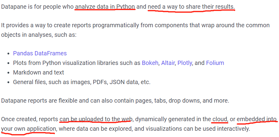
从前面记录的Streamlit到Dash到这个,变的是工具,不变的是主要需求:快速简易&灵活配置&便于分享的报告呈现😄。
pip方式安装:
$ pip3 install -U datapane
conda方式安装:
$ conda install -c conda-forge "datapane>=0.10.0"
快速入门
这次就不按照往常的一步一步贴图了, 直接展示运行Demo(复现官网社区某前辈的公开展示分享)

import pandas as pd
import numpy as np
import matplotlib.pyplot as plt
import datapane as dp
import warnings
warnings.filterwarnings('ignore')


df_raw = pd.read_csv(r'./dataS/german_credit_data.csv')

# 首页
FirstPageInfo = """xxx"""  # markdown语法,传参使用{{}},会自动换行
missing_rate = ((df_raw.isnull().sum())/df_raw.shape[0]).sort_values(ascending=False)
missing_rate_df = pd.DataFrame(missing_rate[missing_rate > 0], columns=['missingRate'])

objects = [
    dp.Select(blocks=[
        dp.Group(
            dp.BigNumber(heading="数据总条数", value=df_raw.shape[0]),
            dp.BigNumber(heading="数据特征数", value=df_raw.shape[1]),
            dp.BigNumber(heading="数据重复条数", value=df_raw.duplicated().sum()),
            dp.BigNumber(heading="数据重复占比",
                         value='{:.2%}'.format(df_raw.duplicated().sum()/df_raw.shape[0])),
            dp.BigNumber(heading="数据缺失个数", value=df_raw.isnull().sum().sum()),
            dp.BigNumber(heading="数据缺失个数占比",
                         value='{:.2%}'.format(df_raw.isnull().sum().sum()/(df_raw.shape[0]*df_raw.shape[1]))),
            columns=2, label='数据概览信息'
        ),
        dp.DataTable(df_raw.head(100), label='数据前100条'),
        dp.DataTable(df_raw.describe().reset_index(), label='数据统计学信息'),
        dp.Plot(missing_rate_df['missingRate'].plot(kind='bar', figsize=(12, 6), rot=0, grid=True), label='特征缺失占比'),
    ])
    # dp.File(file="./dp2.py", label='python files')  # html自带附件!!!
]


# 内容页
fig, num_axes = plt.subplots(1, 2, figsize=(15, 6))
num_axes[0].hist(df_raw['Age'])
num_axes[0].set_title('Age Distribution')
num_axes[1].hist(df_raw['Duration'])
num_axes[1].set_title('Duration Distribution')

def single_char_plot(data, single_character_list, y, ncols):
    # 以前写的code, 直接贴过来
    nrows = int(np.ceil(len(single_character_list) / 2)) if len(single_character_list) > ncols else 1
    fig, axes = plt.subplots(nrows=nrows, ncols=ncols, figsize=(15, 6))
    axes = axes.reshape(1, -1) if nrows == 1 else axes

    i = 0
    for row in range(nrows):
        for col in range(ncols):
            if i == len(single_character_list):
                break
            data.groupby([single_character_list[col], y])[single_character_list[col]].count().unstack().plot(
                kind='bar', stacked=True,
                ax=axes[row, col], grid=True, rot=30, fontsize=8
            )
            i += 1
    plt.subplots_adjust()
    plt.tight_layout()
    # plt.plot()
    # plt.show()
    return axes
chart_axes = single_chart_plot(df_raw, ['Sex', 'Job', 'Purpose'], 'Risk', ncols=3)


# 源码页(这个地方贴代码的时候似乎要注意下读取文件的路径格式/)
source_code = """xxx"""


# Page设置
report = dp.Report(
    dp.Page(label='简介', blocks=[dp.Text(FirstPageInfo).format(*objects)]),  # 改成dp.html可以支持html语法形式
    dp.Page(label='内容', blocks=[
        dp.Text("""## 数据分布"""),
        dp.Text("""### 数值型数据"""),
        dp.Group(
            dp.Plot(num_axes[0], label='年龄分布'),
            dp.Plot(num_axes[1], label='周期分布'),
            label='数值类型数据一览', columns=2
        ),
        dp.Text("""### 分类型数据"""),
        dp.Plot(chart_axes, label='数据展示'),
    ]),
    dp.Page(label='源码', blocks=[dp.Code(source_code)]),
)
report.save('demo.html', open=True)  # 生成本地HTML文件,并在默认浏览器内自动打开
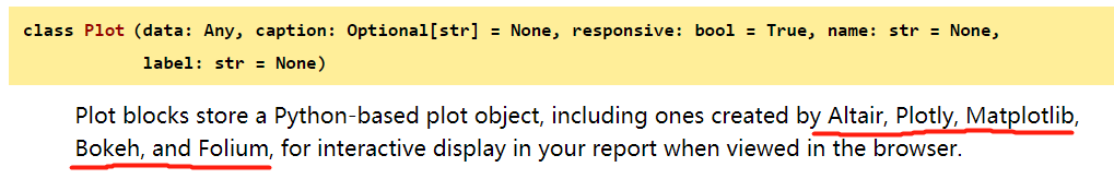
datapane支持的绘图模块如下:
可以看到上面的gif图——可视化界面出了点bug,这是因为dp.Plot()中的首个参数data需要是figure,而不是axes(一张画布是fig,里面可能有不同axes,绘图准确意义是在axes中绘制的来着,百度一下~). 将内容页部分代码改成如下即可看到区别:
# 内容页
plt.figure()
ax1 = plt.gca()
ax1.hist(df_raw['Age'])
ax1.set_title('Age Distribution')

plt.figure()
ax2 = plt.gca()
ax2.hist(df_raw['Duration'])
ax2.set_title('Duration Distribution')
使用感受
功能实现程度
1.翻页功能 -- Page --> 满足多页面
2.布局功能 -- Group --> 满足自由排版
3.交互功能 -- 根据可视化库选型,自带部分交互性
4.源码附件 -- 可携带附件
感觉这个产品还是蛮小众的。
官网社区看起来有些乱,尤其是点进他人分享页。不过目前公开分享的量较少,还好,再多些的话会更有些凌乱。。
看高访高赞的就能摸明白使用方法。本地版本生成html的体验还不错,够日常使用。
在线版支持更多的功能,自动云存储,DataTable数据导出啊,链接分享啊,挺香,操作上没啥太大区别。
注意事项
一定要考虑数据安全性, 不要将公司信息等重要数据publish到社区, 推荐保存为html格式进行展示(数据量较大时未做测试,生成的html页估计也会超大)
参考资源
1.Datapane快速入门 官网Doc: 学东西官网YYDS, 当然若是找到大佬翻成中文的内容&有案例说明更好
2.Datapane 官方分享Demo
3.Datapane 官方分享Demo
4.Building a pipeline monitoring system for credit risk models: 一个很好的公开案例

 浙公网安备 33010602011771号