

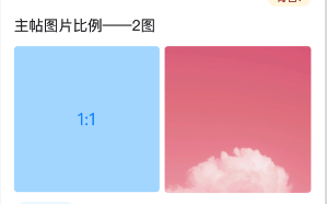
display布局—一行(容器宽度随手机屏幕而变,一行布局的子元素宽度均分,元素间的间距固定)
父元素设置display:flex布局,子元素设置flex: 1
renderTwoImg = (images, imgSize) => {
    return (
      <div className="ImageListNew ImageListNew__twoImg">
        {images.map((img, idx) => {
          const {id, isGif, isLongImage} = img
          return (
            <div
              className="ImageListNew__twoImg__wrap"
              key={id}
              role="button"
              tabIndex="0"
              onClick={this.onBrowseImages(idx)}
            >
              <div className="ImageListNew__twoImg__Paddingwrap">
                <img
                  alt=""
                  onError={(e) => {
                    // showToast('缩略图加载失败,请点击查看大图')
                    const oldSrc = e.target.src
                    const possibleNewSrc = img?.signurl
                    if (possibleNewSrc && oldSrc !== possibleNewSrc) {
                      e.target.src = possibleNewSrc
                    }
                  }}
                  src={getImgUrl(img, imgSize)}
                />
                {isGif && this.renderGifMask()}
                {isLongImage && this.renderLongImgMask()}
              </div>
            </div>
          )
        })}
      </div>
    )
  }
// 两图排列方式--通过设置flex:1
  &__twoImg {
    display: flex;
    justify-content: flex-start;
    &__wrap {
      display: inline-block;
      overflow: hidden;
      border-radius: 4px;
      box-sizing: border-box;
      flex: 1;
      // background: rgba(20, 158, 255, 0.3);
      &:first-of-type {
        margin-right: 6px;
      }
      .ImageListNew__twoImg__Paddingwrap {
        position: relative;
        box-sizing: border-box;
        width: 100%;
        padding-top: 100%;
        img {
          width: 100%;
          height: 100%;
          object-fit: cover;
          object-position: center center;
          border-radius: 4px;
          position: absolute;
          left: 0;
          top: 0;
        }
      }
    }
  }
效果图如下:

 浙公网安备 33010602011771号