
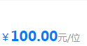
flex布局:所有元素居于底部,如金额单位的布局
关键:所有元素设置高度和字体大小一致,并且所有元素
align-self: flex-end;
具体代码如下:
<template>
	<view class="u-f-ac main">
		<view>价格:</view>
		<view class="u-f price-container">
			<view>¥</view>
			<view>100.00</view>
			<view>元/位</view>
		</view>
	</view>
</template>

<script>
	export default {
		data() {
			return {
				title: 'Hello'
			}
		},
		onLoad() {

		},
		methods: {

		}
	}
</script>

<style>
	.main{
		height: 188rpx;
	}
	.price-container{
		color: #007AFF;
		padding-left: 30rpx;
		/* border:1rpx solid red; */
	}
	.price-container>view{
		/* border:1rpx solid green; */
		display: flex;
		align-self: flex-end;
	}

	.price-container>view:first-child{
		font-size: 30rpx;
		height: 30rpx;
	}
	.price-container>view:nth-child(2){
		font-size: 40rpx;
		height: 40rpx;
		font-weight: bold;

	}
	.price-container>view:last-child{
		color:#999;
		font-size: 26rpx;
		height: 26rpx;
	}


	/* 公共css */
	.u-f,
	.u-f-ac,
	.u-f-as,
	.u-f-ajc,
	.u-f-jsb {
		display: flex;
	}

	.u-f-ac,
	.u-f-ajc {
		align-items: center;
	}
	.u-f-as{
		align-items: flex-start;
		justify-content: start;
	}
	.u-f-ajc {
		justify-content: center;
	}

	.u-f-jsb {
		justify-content: space-between;
	}

	.u-f-column {
		flex-direction: column;
	}
	.u-f-row {
		flex-direction: row;
	}
	.u-f1 {
		flex: 1;
	}

</style>
效果如下:

 浙公网安备 33010602011771号