echart插件--柱状图正负柱使用配置
一、bug记录:
1.yAxis中 boundaryGap:false, //坐标轴两边留白策略这个参数设置false时 表示柱状图和坐标轴无缝衔接,会出现当鼠标放在最下面和最上面的两个柱状图时,柱状图隐藏的状态,不知道为啥,但是就是这个配置导致的,删掉或者true就好了。
2.echart中toolTip是div 设置的层级z-index:9999999;所以自定义弹窗要记得设置z-index要大于toolTip的层级。
二、使用过程中配置的使用记录:
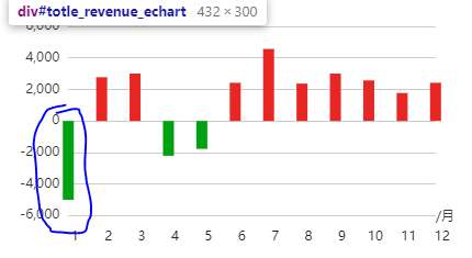
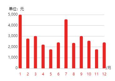
1.设置柱状图和y轴有一定的距离,如下图所示柱状图与Y轴距离太近
解决:xAxis:{boundaryGap:true,}//是否与坐标轴之间留白 默认是true 当时解决多列title显示不全的时候设置了false 导致问题出现,改成false即可。
下面X轴文字想要调整与y轴的距离:textStyle: {padding:[0,0,0,20]} 设置padding的值就可以了准寻上右下左的规律
2,标签过多显示不全的问题:
方法a:文字倾斜
axisLabel: {//解决标签过多显示不全
interval:0,
    rotate:30,
   }

方法2:文字竖排显示

axisLabel: {
    interval: 0,
    formatter:function(value)
    {
        return value.split("").join("\n");
    }
},
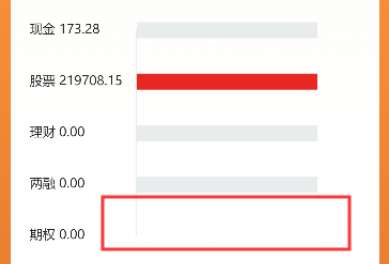
3.正负柱显示单位时要和x轴显示位置一致,如上图所示
解决:
  xAxis: {
					   type : 'category',
					   name:"/月",
					   nameLocation:"middle",
					   nameGap:-10, //组合起来控制name的位置
					   nameTextStyle:{
						   //定位坐标轴名称位置,获取当前echart的div的宽度减去合理的值
						   padding:[0,0,0,$("#year_revenue_echart").width()-80]
					   },
					}
相对完整的代码如下所示
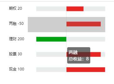
1.需求实现图:正负柱不同颜色显示,并且未到最大值的 用阴影补全显示。
代码实现:
 <div class="echart">
			<div id="totle_revenue_echart" style="width: 100%;height:300px;"></div>
			<div id="year_revenue_echart" style="width: 100%;height:300px;"></div>
 </div>
			   // 初始化echart
			   var totle_revenue_echart = echarts.init(document.getElementById("totle_revenue_echart"));
			   var option = {
				   tooltip : {//悬浮窗设置
					   trigger: 'axis',
					   formatter:function(params) {//自定义文字提示
						   return params[0].name+"<br />"+"总收益:"+params[0].value;
						},
					   axisPointer : {            // 坐标轴指示器,坐标轴触发有效
						   type : 'shadow', // 默认为直线,可选为:'line' | 'shadow'
						   lable:{
							textShadowColor:"red",
							width:"1px",
						    height:"1px"
						  },
						  shadowStyle:{
							  shadowOffsetX:0.5,
							  shadowOffsetY:0.5,
							  shadowBlur:0.5,
							  opacity:0.5
						  },

					   }
				   },
				   grid: {//设置表格的位置
					   top: "15px",
					   left:"-10px",
					   containLabel: true
				   },
				   xAxis: {
					   show:false
				   },
				   yAxis: {//y轴线
					   type : 'category',
					   left:"0",
					   axisLine: {
						   show: true,
						   onZero:true,
						   lineStyle:{
							   color:"#E9ECED",
						   }
					   },
					   axisTick: {show: false},//刻度线
					   axisLabel: {
							show:true,
						   // interval:0,//解决标签过多显示不全
						   // rotate:30,
						    align:'left',
							margin:60,
						    formatter:function (data,i) {//自定义设置y轴刻度名
							   var arry =[100,30,200,-50,20];
							   return data+" "+arry[i];
						   }
					   },
					   data:["现金","股票","理财","两融","期权"],
					   nameGap:30,
					   inverse:false,//坐标轴名称是否反相显示
					   boundaryGap:false, //坐标轴两边留白策略(解决坐标轴名字显示不全)
					   axisPointer:{
						   show:true,
						   lable:{
							   show:true,
							   precision:2,
							   formatter:function(data){
								  console.log(data);
							   }
							 }
					   }
				   },
				   series : [
					   {
						   name:"直接",
						   type:'bar',
						   stack:"one",
						   data:[9,8,-7,8,4],
						   barWidth : "15px",//设置条宽度
						   //配置样式
						   itemStyle: {
							   //通常情况下:
							   normal: {
								   // barBorderRadius: [0,4,4,0],
								   color: function (data) {//设置正负颜色值
									   return data.value>=0?"#E82724":"#00A212";
								   }
							   }
						   }
					   },
						{
						   name:"间接",
						   type:'bar',
						   stack:"one",
						   data:[0,1,0,1,5],
						   barWidth : "15px",//设置条宽度
						   //配置样式
						   itemStyle: {
							   //通常情况下:
							   normal: {
								   // barBorderRadius: [0,4,4,0],
								   color: "#E9ECED"
							   }
						   }
					   },{
						   name:"补充",
						   type:'bar',
						   stack:"one",
						   data:[-7,-7,9,-7,-7],
						   barWidth : "15px",//设置条宽度
						   //配置样式
						   itemStyle: {
							   //通常情况下:
							   normal: {
								   // barBorderRadius: [0,4,4,0],
								   color: "#E9ECED"
							   }
						   }
					   },
				   ]
			   };
			   totle_revenue_echart.setOption(option);//添加数据
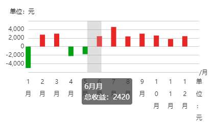
2.柱状图:柱状图显示,轴线刻度名称太长时也要显示,单位加上
代码实现:
//年度收益额走势
               // 初始化echart
               var year_revenue_echart = echarts.init(document.getElementById("year_revenue_echart"));

               option = {
                   tooltip : {
                       trigger: 'axis',
                       axisPointer : {            // 坐标轴指示器,坐标轴触发有效
                           type : 'shadow',        // 默认为直线,可选为:'line' | 'shadow'
                       },
                       formatter:function(params) {
                            console.log("params:",params[0]);
                            return params[0].name+"月<br />"+"总收益:"+params[0].value;
                        }
                    },
                   xAxis: {
                       type : 'category',
                       name:"/月",
                       // nameLocation:"end",
                       nameTextStyle:{
                           //定位坐标轴名称位置,和使用css中的padding功能一样
                           padding:[0,0,0,-10]
                       },
                       axisLine: {show: false},
                       axisTick: {show: false},
                       // data: ["1月","2月","3月","4月","5月","6月","7月","8月","9月","10月","11月","12月","单位:元"],
                       data: [1,2,3,4,5,6,7,8,9,10,11,12],
                       boundaryGap:false,
                         axisLabel: {
                          show: true, //坐标轴的文字是否显示
                          // interval:0,
                          // rotate:30 ,
                          textStyle: {
                            color: '#222', //坐标轴上的字体颜色
                            fontSize:'12' // 坐标轴字体大小
                          }
                        },

                   },
                   grid: {//设置表格位置
                       top: "36px",
                       left:"10%",
                       containLabel: true
                   },
                   yAxis: {
                       name:"单位:元",
                       nameTextStyle:{
                           color:"black",
                           padding:[0,24,-10,0]
                       },
                       axisLine: {show: false},
                       axisTick: {show: false}
                   },
                   series: [{
                       name: '收益额',
                       type: 'bar',
                       data: [5000, 2772, 3006, 2210, 1770, 2420,4566, 2370, 3006, 2570, 1770, 2420],
                       barWidth : "10px",//设置条宽度
                       //配置样式
                       itemStyle: {
                           normal: { //通常情况下:
                               barBorderRadius: [4, 4, 0, 0],//设置圆角
                               color: function (data) {//设置正负颜色值
                                   return data.value>=0?"#E82724":"#00A212";
                               }
// color: new echarts.graphic.LinearGradient(0, 1, 0, 0, [{//为柱状图设置渐变色
// offset: 0,
// color: "#FF6969" // 0% 处的颜色
// }, {
// offset: 1,
// color: "#FF3838" // 100% 处的颜色
// }], false)
                           }
                       }
                   }]
               };
               year_revenue_echart.setOption(option);//添加数据
               // year_revenue_echart.showLoading();//数据加载的时候loading


 浙公网安备 33010602011771号