

画堆积柱形图
一、plt画堆积柱形图
只需要这个一个参数(bottom=y)就OK了
import matplotlib.pyplot as plt
import matplotlib as mpl

mpl.rcParams["font.sans-serif"] = ["SimHei"]
mpl.rcParams["axes.unicode_minus"] = False

x = [1, 2, 3, 4, 5]
y = [6, 10, 4, 5, 1]
y1 = [2, 6, 3, 8, 5]

plt.figure(figsize=(16,12))
plt.bar(x, y, align="center", color="#66c2a5", tick_label=["A", "B", "C", "D", "E"], label="班级A")
plt.bar(x, y1, align="center", bottom=y, color="#8da0cb", label="班级B")

plt.xlabel("测试难度")
plt.ylabel("试卷份数")

plt.legend()

plt.show()

二、pandas中df.plot()画图
首先创造数据
#模拟生成数据集的方法

import pandas as pd
import numpy as np

boolean=[True,False]
gender=['男','女']
color=['green','blue','yellow']
tmp_1203=pd.DataFrame({'height':np.random.randint(150,190,100),
                   'weight':np.random.randint(40,90,100),
                   'smoker':[boolean[x] for x in np.random.randint(0,2,100)],
                   'gender':[gender[x] for x in np.random.randint(0,2,100)],
                   'age':np.random.randint(15,90,100),
                   'color':[color[x] for x in np.random.randint(0,len(color),100)]})
首先这样子尝试
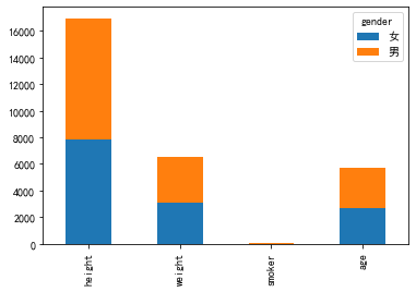
tmp_1203.iloc[0:5,:][['gender','age']].plot(kind='bar', stacked=True)
看着样子不行,再次尝试
tmp_1203.iloc[0:5,:][['gender','age','weight']].set_index('gender').T.plot(kind='bar', stacked=True)
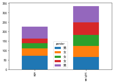
看着还行,但是感觉不是很对,或许我们可以首先聚合,然后在尝试
tmp_1203.groupby('gender').sum().T.plot(kind='bar', stacked=True)
样子看着是对上了,可是还差点感觉
使用新的数据
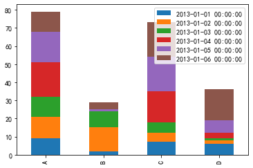
import pandas as pd
dates=pd.date_range('20130101',periods=6)
df=pd.DataFrame(np.random.randint(0,20,(6,4)),index=dates,columns=list('ABCD'))
df.index=pd.date_range('20130101',periods=df.shape[0])
df.index=pd.date_range('20130101',periods=len(df))

df.plot(kind='bar', stacked=True)

感觉对上了,装置再试一下
df.T.plot(kind='bar', stacked=True)
总结来了:反正就是索引index作为行x轴(所以想办法将你所需的转为索引,groupby,或者直接set_index('xx')),column作为堆叠类,切要主要参数stacked=True然后就可以画出想要的结果
三、seaborn
找了好多资料,还是没有方法
import seaborn as sns
sns.barplot(x=df.index,y='A',color = "red",data=df)
sns.barplot(x=df.index,y='C',color = "green",data=df)
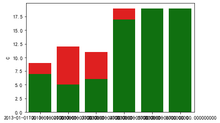
可以看出,其实第二个图的值如果比第一个图的值大,那么第一个图会被覆盖住,如果小,就会显示第一个图,正由于这种特性,我们可以将第一个图设置为总和,然后第二张图再设定为原来的第一张图,看代码
sns.set_style("white")
sns.set_context({"figure.figsize": (12, 8)})
#Plot 2 - overlay - "bottom" series
c = sns.barplot(x=df.index,y=df['C']+df['A'],color = "green")
sns.barplot(x=df.index,y='A',color = "red",data=df)

看着效果还可以,就是逗了个圈

 浙公网安备 33010602011771号