
风控模型6大核心指标(附代码)
目录
Part 1. 生成样本
Part 2. 计算AUC、KS、GINI
Part 3. PSI
Part 4. 分数分布
Part 5. 完整工程代码
正文
在我们开发完信用分模型后,经常需要计算如下的一些指标:
● 区分度的指标: ○ AUC ○ KS ○ GINI
● 稳定性的指标: ○ PSI
● 分数分布: ○ 总人数比例 ○ 坏用户比例
一、生成样本
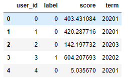
注意数据是构造的,而非真实的数据
import numpy as np
import pandas as pd

n_sample = 1000

#构造虚拟的数据,主要字段有4个
df_score = pd.DataFrame({
    'user_id': [u for u in range(n_sample)],
    'label':np.random.randint(2, size=n_sample),
    'score': 900*np.random.random(size=n_sample),
    'term': 20201+np.random.randint(5, size=n_sample)
})
统计下分term的总人数,坏人数和坏人比例:
#根据期限去计算好坏用户占比
df_score.groupby('term').agg(total=('label', 'count'),
                             bad=('label', 'sum'),
                             bad_rate=('label', 'mean'))

所以我们平时需要注意一下groupby之后的agg的用法
二、计算AUC、KS、GINI
这里对原有sklearn的auc计算做了一点修改,如果AUC<0.5的话会返回1-AUC, 这样能忽略区分度的方向性。
#KS,GINI,AUC

from sklearn.metrics import roc_auc_score, roc_curve

#auc
def get_auc(ytrue, yprob):
    auc = roc_auc_score(ytrue, yprob)
    if auc < 0.5:
        auc = 1 - auc
    return auc

#ks
def get_ks(ytrue, yprob):
    fpr, tpr, thr = roc_curve(ytrue, yprob)
    ks = max(abs(tpr - fpr))
    return ks
#gini=2 * auc - 1  (既然acu在80%左右,那么这个应该是在69%左右)
def get_gini(ytrue, yprob):
    auc = get_auc(ytrue, yprob)
    gini = 2 * auc - 1
    return gini

#根据期限去计算KS,GINI,AUC,score可以当做是预测值,label就是真实值,这样可以直接使用sklearn去计算
df_metrics = pd.DataFrame({
    'auc': df_score.groupby('term').apply(lambda x: get_auc(x['label'], x['score'])),
    'ks': df_score.groupby('term').apply(lambda x: get_ks(x['label'], x['score'])),
    'gini': df_score.groupby('term').apply(lambda x: get_gini(x['label'], x['score']))
})
最后得到一个包含这些指标的df

这里需要注意一下groupby.apply的用法
三、PSI模型稳定性
这里先分成2步:
-
简单对随机生成的信用分按固定分数区间分段;
-
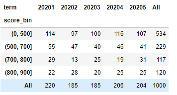
按照分段计算PSI:使用pivot_table把数据按照term进行排列计算每个term上的人数比例。
#PSI,也就是稳定性,可以认定为训练集和测试集的分布差异不大

df_score['score_bin'] = pd.cut(df_score['score'], [0, 500, 700, 800, 900])

df_total = pd.pivot_table(df_score,
                          values='user_id',
                          index='score_bin',
                          columns=['term'],
                          aggfunc="count",
                          margins=True)
df_ratio = df_total.div(df_total.iloc[-1, :], axis=1)
透视表之后的结果如下:
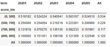
div里面的df是上面透视表最后一行,也就是说所有的数据对应的列分别除以最后一行对应的数据,最终结果如下:
根据人数比例计算PSI再放回表格内
eps = np.finfo(np.float32).eps
lst_psi = list()
for idx in range(1, len(df_ratio.columns)-1):
    last, cur = df_ratio.iloc[0, -1: idx-1]+eps, df_ratio.iloc[0, -1: idx]+eps
    psi = sum((cur-last) * np.log(cur / last))
    lst_psi.append(psi)
df_ratio.append(pd.Series([np.nan]+lst_psi+[np.nan],
                          index=df_ratio.columns,
                          name='psi'))

我们可以看出这个数据是这样计算出来的:
sum((cur-last) * np.log(cur / last)),其中cur是基准
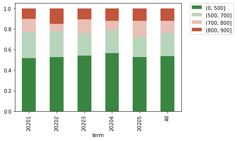
四、分数分布
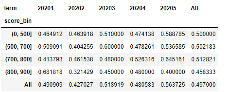
统计总人数分布和坏用户比例的分布,其实在上面计算PSI的时候已经计算出人数分布,就是上面的df_ratio:
所以,这里照葫芦画瓢把坏用户抽取出来再重复一遍,就可以把坏用户比例计算出来。
df_total = pd.pivot_table(df_score,
                          values='user_id',
                          index='score_bin',
                          columns=['term'],
                          aggfunc="count",
                          margins=True)
df_ratio = df_total.div(df_total.iloc[-1, :], axis=1)

df_bad = pd.pivot_table(df_score[df_score['label']==1],
                        values='user_id',
                        index='score_bin',
                        columns=['term'],
                        aggfunc="count",
                        margins=True)
df_bad_rate = df_bad/df_total
可以使用seaborn的stacked line和stacked bar来做出总用户的分布和坏用户的比列分布。
#做图

import seaborn as sns
import matplotlib.pyplot as plt

colormap = sns.diverging_palette(130, 20, as_cmap=True)
df_ratio.drop('All').T.plot(kind='bar', stacked=True, colormap=colormap)
plt.legend(bbox_to_anchor=(1.05, 1), loc=2, borderaxespad=0.)

colormap = sns.diverging_palette(130, 20, as_cmap=True)
df_bad_rate.drop('All').T.plot(kind='line', colormap=colormap)
plt.legend(bbox_to_anchor=(1.05, 1), loc=2, borderaxespad=0.)

附上代码


import numpy as np
import pandas as pd

n_sample = 1000

#构造虚拟的数据,主要字段有4个
df_score = pd.DataFrame({
    'user_id': [u for u in range(n_sample)],
    'label':np.random.randint(2, size=n_sample),
    'score': 900*np.random.random(size=n_sample),
    'term': 20201+np.random.randint(5, size=n_sample)
})


#根据期限去计算好坏用户占比
df_score.groupby('term').agg(total=('label', 'count'),
                             bad=('label', 'sum'),
                             bad_rate=('label', 'mean'))

#KS,GINI,AUC

from sklearn.metrics import roc_auc_score, roc_curve

#auc
def get_auc(ytrue, yprob):
    auc = roc_auc_score(ytrue, yprob)
    if auc < 0.5:
        auc = 1 - auc
    return auc

#ks
def get_ks(ytrue, yprob):
    fpr, tpr, thr = roc_curve(ytrue, yprob)
    ks = max(abs(tpr - fpr))
    return ks
#gini=2 * auc - 1  (既然acu在80%左右,那么这个应该是在69%左右)
def get_gini(ytrue, yprob):
    auc = get_auc(ytrue, yprob)
    gini = 2 * auc - 1
    return gini

#根据期限去计算KS,GINI,AUC,score可以当做是预测值,label就是真实值,这样可以直接使用sklearn去计算
df_metrics = pd.DataFrame({
    'auc': df_score.groupby('term').apply(lambda x: get_auc(x['label'], x['score'])),
    'ks': df_score.groupby('term').apply(lambda x: get_ks(x['label'], x['score'])),
    'gini': df_score.groupby('term').apply(lambda x: get_gini(x['label'], x['score']))
})


#PSI,也就是稳定性,可以认定为训练集和测试集的分布差异不大

df_score['score_bin'] = pd.cut(df_score['score'], [0, 500, 700, 800, 900])

df_total = pd.pivot_table(df_score,
                          values='user_id',
                          index='score_bin',
                          columns=['term'],
                          aggfunc="count",
                          margins=True)
df_ratio = df_total.div(df_total.iloc[-1, :], axis=1)

eps = np.finfo(np.float32).eps  #除法,处理分母为零的情况
lst_psi = list()
for idx in range(1, len(df_ratio.columns)-1):  #第一行不需要计算,因为需要以第一行为基准
    last, cur = df_ratio.iloc[0, -1: idx-1]+eps, df_ratio.iloc[0, -1: idx]+eps  #
    psi = sum((cur-last) * np.log(cur / last))
    lst_psi.append(psi)
df_ratio.append(pd.Series([np.nan]+lst_psi+[np.nan],
                          index=df_ratio.columns,
                          name='psi'))


#总人数比例和坏客户比例

df_total = pd.pivot_table(df_score,
                          values='user_id',
                          index='score_bin',
                          columns=['term'],
                          aggfunc="count",
                          margins=True)
df_ratio = df_total.div(df_total.iloc[-1, :], axis=1)

df_bad = pd.pivot_table(df_score[df_score['label']==1],
                        values='user_id',
                        index='score_bin',
                        columns=['term'],
                        aggfunc="count",
                        margins=True)
df_bad_rate = df_bad/df_total

#做图

import seaborn as sns

colormap = sns.diverging_palette(130, 20, as_cmap=True)
df_ratio.drop('All').T.plot(kind='bar', stacked=True, colormap=colormap)
plt.legend(bbox_to_anchor=(1.05, 1), loc=2, borderaxespad=0.)

colormap = sns.diverging_palette(130, 20, as_cmap=True)
df_bad_rate.drop('All').T.plot(kind='line', colormap=colormap)
plt.legend(bbox_to_anchor=(1.05, 1), loc=2, borderaxespad=0.)

 浙公网安备 33010602011771号