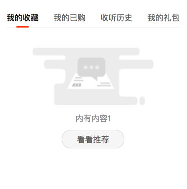
【微信小程序】tab选项卡
方法一
<view class="tabs">
    <view class="tabNav">
        <view class="{{currentTab==index ? 'cur' : ''}}" wx:for="{{navTab}}" wx:key="index" data-idx="{{index}}" bindtap="currentTab">
            <text>{{item}}</text>
        </view>
    </view>
    <view class="tabCont">
        <view class="tabItem" wx:if="{{currentTab==0}}">
            <view class="noCont">
                <image src="/images/noContent.png" mode="widthFix" />
                <text>内有内容1</text>
                <navigator url="" hover-class="className">看看推荐</navigator>
            </view>
        </view>

            <view class="tabItem" wx:if="{{currentTab==1}}">
            <view class="noCont">
                <image src="/images/noContent.png" mode="widthFix" />
                <text>内有内容2</text>
                <navigator url="" hover-class="className">看看推荐</navigator>
            </view>
        </view>

            <view class="tabItem" wx:if="{{currentTab==2}}">
            <view class="noCont">
                <image src="/images/noContent.png" mode="widthFix" />
                <text>内有内容3</text>
                <navigator url="" hover-class="className">看看推荐</navigator>
            </view>
        </view>

            <view class="tabItem" wx:if="{{currentTab==3}}">
            <view class="noCont">
                <image src="/images/noContent.png" mode="widthFix" />
                <text>内有内容4</text>
                <navigator url="" hover-class="className">看看推荐</navigator>
            </view>
        </view>

    </view>
</view>
data: {
  currentTab:0,
  navTab: ['我的收藏','我的已购','收听历史', '我的礼包']
},
currentTab:function(e){
  // console.log(e.currentTarget.dataset.idx);

  this.setData({
    currentTab: e.currentTarget.dataset.idx
  })

},
.tabs .tabNav {
  width: 100%;
  height: 80rpx;
  line-height: 80rpx;
  background: #fff;
  display: flex;
  justify-content: space-between;
  border-bottom: 1px solid #f5f5f5;
  margin-top: 40rpx;
}
.tabs .tabNav > view {
  text-align: center;
  color: #666;
}
.tabs .tabNav > view:last-child {
  margin-right: 0;
}
.tabs .tabNav > view text {
  height: 80rpx;
  display: inline-block;
  position: relative;
}
.tabs .tabNav .cur text {
  color: #000;
  font-weight: bold;
}
.tabs .tabNav .cur text::before {
  position: absolute;
  content: "";
  bottom: 0;
  left: 50%;
  transform: translateX(-50%);
  width: 50rpx;
  height: 6rpx;
  background: #ff4b1c;
  border-radius: 8rpx;
}
.tabs .tabCont .tabItem .noCont {
  margin-top: 80rpx;
  display: flex;
  flex-direction: column;
  justify-content: center;
  align-items: center;
}
.tabs .tabCont .tabItem .noCont image {
  width: 70%;
  margin-bottom: 30rpx;
}
.tabs .tabCont .tabItem .noCont text {
  color: #999;
  display: block;
  margin-bottom: 25rpx;
}
.tabs .tabCont .tabItem .noCont navigator {
  color: #666;
  background: #f7f7f7;
  width: 250rpx;
  height: 75rpx;
  line-height: 75rpx;
  text-align: center;
  border: 1rpx solid #ddd;
  border-radius: 80rpx;
}
方法二(滑动切换)
<view class="swiper-tab">
    <view class="swiper-tab-item {{currentTab==0?'active':''}}" data-current="0" bindtap="clickTab">全部</view>
    <view class="swiper-tab-item {{currentTab==1?'active':''}}" data-current="1" bindtap="clickTab">提现中</view>
    <view class="swiper-tab-item {{currentTab==2?'active':''}}" data-current="2" bindtap="clickTab">已提现</view>
</view>

<swiper current="{{currentTab}}" duration="300"  bindchange="swiperTab">
    <swiper-item ><view>全部</view></swiper-item>
    <swiper-item><view>提现中</view></swiper-item>
    <swiper-item><view>已提现</view></swiper-item>
</swiper>
.swiper-tab{
    width: 100%;
    border-bottom: 2rpx solid #ccc;
    text-align: center;
    height: 88rpx;
    line-height: 88rpx;
    display: flex;
    flex-flow: row;
    justify-content: space-between;
}
.swiper-tab-item{
    width: 30%;
    color:#434343;
}
.active{
    color:#F65959;
    border-bottom: 4rpx solid #F65959;
}
swiper{
  text-align: center;
}
Page({
  data: {
    currentTab: 0
  },
  onLoad: function (options) {
    // 页面初始化 options为页面跳转所带来的参数

  },
  //滑动切换
  swiperTab: function (e) {
    var that = this;
    that.setData({
      currentTab: e.detail.current
    });
  },
  //点击切换
  clickTab: function (e) {
    var that = this;
    if (this.data.currentTab === e.target.dataset.current) {
      return false;
    } else {
      that.setData({
        currentTab: e.target.dataset.current
      })
    }
  }
})
参考
https://www.dazhuanlan.com/2019/10/27/5db58990e6b81/
http://www.10qianwan.com/articledetail/474076.html
https://www.pianshen.com/article/786416492/
https://www.mk2048.com/blog/blog_020jhb002j.html

 浙公网安备 33010602011771号