Day6前端学习之路——布局
一.定位
1)静态定位
position:static(默认)
2)相对定位
position:relative(要配合top、bottom、left、right等属性来使用)
3)绝对定位
position:absolute
- 绝对定位固定元素是相对于
<html>元素或其最近的“positioned”祖先元素,一个“positioned”元素是指 position 值不是static的元素。
4)固定定位
position:fixed(要配合top、bottom、left、right等属性来使用)
- 固定定位固定元素则是相对于浏览器视口本身
5)堆叠顺序
z-index
几种定位的区别:https://baijiahao.baidu.com/s?id=1631432397252663686&wfr=spider&for=pc
http://zh.learnlayout.com/position.html
二、弹性盒子Flexbox
display:flex
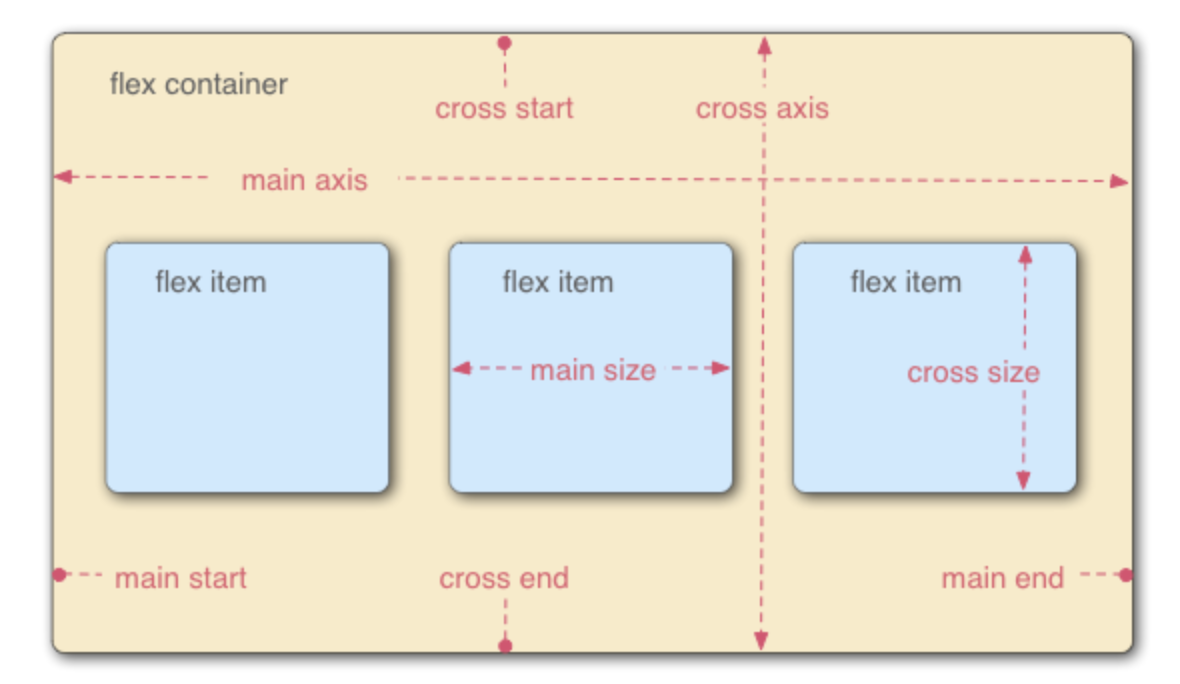
| 属性 | 备注 | 值 |
| flex-direction | 指定主轴的方向 | row/column,默认是row |
| flex-wrap | 换行 | wrap/wrap-reverse,flex-direction和flex-wrap可以合并为flex-flow: row wrap; |
| flex | 三个属性的缩写,flex-grow/flex-shrink /flex-basis | flex:0 1 auto(默认) |
| align-items | 控制在交叉轴的位置 | stretch(默认)/center/flex-start/flex-end |
| justify-content | 控制在主轴上的位置 | flex-start(默认)/flex-end/center/space-around(均匀分布)/space-between(不会在两端留下任何空间) |
| order | flex项排序 | 数字,默认0,越大越后面 |
三、布局
3.1 布局模型
- flow 流动模型(默认)
- float 浮动模型
- layer 层模型
3.1.1 流动模型
两个典型的特征:
- 块状元素以行的形式占据位置(独占一行),自上而下按顺序垂直延伸分布
- 行内元素在所包含元素内从左到右水平分布显示
3.1.2 浮动模型
任何元素默认不能浮动,使用css定义浮动
div{float:left;} div{float:right;}
3.1.3 层模型
三种形式:
- 相对定位-position:relative
- 绝对定位-position:absolute
- 固定定位-position:fixed
3.1.4 z-index
利用该属性,可以改变元素相互覆盖的顺序
- 只对定位元素有效(即position属性值为relative/absolute/fixed)
- 父子关系处理:如果父元素z-index有效,那么无论族元素是否设置z-index都会在父元素上方
- 相同z-index:若都没有设置改值,一个定位一个没有定位,定位元素覆盖未定位元素;若都没有定位但发生了重合或者都定位了且发生了位置重合,则按照文档流顺序,后面的覆盖前面的。
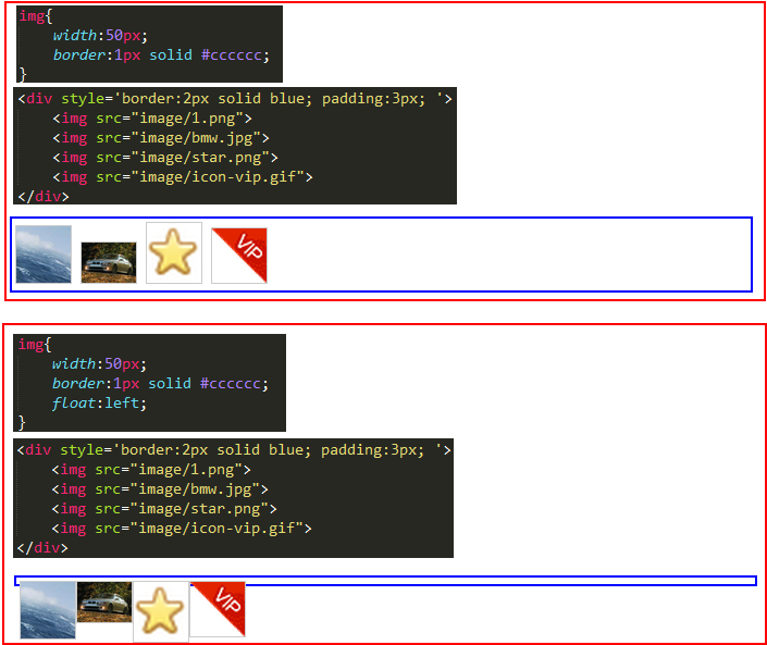
3.2 float详解
3.2.1 float多个特性
- 破坏性——破坏了父标签的原本结构,父标签出现了坍塌
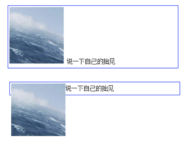
- 包裹性——普通的div如果不设置宽度,会撑满整个屏幕宽度,设置了float之后,宽度自动调整为包裹着内容宽度,而不是撑满整个父容器
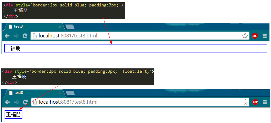
- 清空格——正常的img之间是有空格的,增加了float之后,img之间没有空格,根本原因是float会导致节点脱离文档流结构
3.2.2 清除浮动
- 为父元素添加 overflow:hidden(父元素就有了高度,但不会发生坍塌)
- 浮动父元素
- clear:both——通过在所有浮动元素下方添加一个clear:both的元素,可以消除float的破坏性。
- clearfix——通过伪元素选择器,在div后面增加了一个clear:both的元素,跟第三种方法是一个道理
3.3 网页布局方式
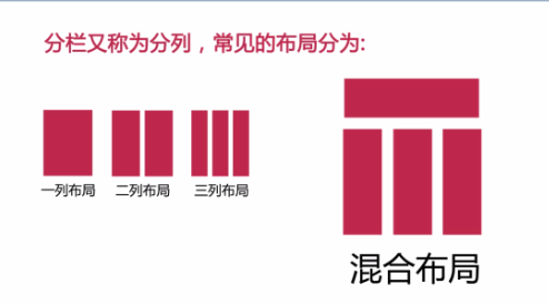
3.3.1 一列布局
固定宽和高,设置margin:0 auto来水平居中
3.3.2 二列布局
最常见的就是使用float来实现,但会出现文本环绕等效果,需要及时清除浮动
- 如何父级元素没有设置高度,则需要设置overflow:hidden来清除浮动产生的影响
- 对于自己相邻元素清除浮动产生的影响用:clear:both;
3.3.3 三列布局
两侧定宽中间自适应
首先设置父级元素的宽度,可以左左右设置浮动。然后中间设置margin调整间距。 也可以都设置成左浮动,设置margin,调整间距。同样注意清除浮动的影响!
 <div class="main">
        <div class="left">left</div>
        <div class="middle">middle</div>
        <div class="right">right</div>
 </div>
.main{
            width: 100%;
            background: red;
            overflow: hidden;
        }
        .left{
            background: yellow;
            float: left;
            width: 100px;
        }
        .middle{
             background: rosybrown;
             float: left;
             width: cacl(100%-200px);
         }
        .right{
            background: green;
            float: right;
            width: 100px%;
        }
或者为父级元素设置relative属性,再为子元素设置absolute属性,再分别定位,调整间距
<div class="parent" style="background-color: lightgrey;">
    <div class="left" style="background-color: lightblue;">
        <p>left</p>
    </div>
    <div class="center" style="background-color: pink;">
        <p>center</p>
        <p>center</p>
    </div>
    <div class="right"  style="background-color: lightgreen;">
        <p>right</p>
    </div>
</div>
<style>
p{margin: 0;}
.parent{position: relative;height:40px;}
.left,.right,.center{position: absolute;}
.left{left: 0;width:100px;}
.right{right: 0;width: 100px;}
.center{left: 120px; right: 120px;}
</style>
3.3.4 混合布局
在一列布局的基础上,保留top和foot部分,将中间的main部分改造成两列或三列布局,小的模块可以再逐级同理划分。
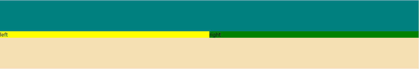
<div class="top"></div>
    <div class="main">
        <div class="left">left</div>
        <div class="right">right</div>
    </div>
<div class="footer"></div>
.top{
            height: 100px;
            background: teal;
        }
        .footer{
            height: 100px;
            background: wheat;
        }
        .main{
            width: 100%;
            background: red;
            overflow: hidden;
        }
        .left{
            background: yellow;
            float: left;
            width: 50%;
        }
        .right{
            background: green;
            float: right;
            width: 50%;
        }
3.4 对齐方式
3.4.1 水平居中
(1)行内元素的水平居中
如果被设置元素为文本、图片等行内元素时,在父元素中设置text-align:center实现行内元素水平居中,将子元素的display设置为inline-block,使子元素变成行内元素
<div class="parent" style="background-color: gray;">
  <div class="child" style="background-color: lightblue;">DEMO</div>
</div>
<style>
.parent{text-align: center;}
.child{display: inline-block;}
</style>
(2)块状元素的水平居中(定宽)
当被设置元素为定宽块级元素时用 text-align:center 就不起作用了。可以通过设置“左右margin”值为“auto”来实现居中的。
<div class="parent" style="background-color: gray;">
  <div class="child" style="background-color: lightblue;">DEMO</div>
</div>
        .child{
            width: 200px;
            margin: 0 auto;
        }
(3)块状元素的水平居中(不定定宽)
在实际工作中我们会遇到需要为“不定宽度的块级元素”设置居中,比如网页上的分页导航,因为分页的数量是不确定的,所以我们不能通过设置宽度来限制它的弹性。
可以直接给不定宽的块级元素设置text-align:center来实现,也可以给父元素加text-align:center 来实现居中效果。
当不定宽块级元素的宽度不要占一行时,可以设置display 为 inline 类型或inline-block(设置为 行内元素 显示或行内块元素)
<div class="container">
    <ul>
        <li><a href="#">1</a></li>
        <li><a href="#">2</a></li>
        <li><a href="#">3</a></li>
    </ul>
</div>
.container{text-align:center;background: beige}
.container ul{list-style:none;margin:0;padding:0;display:inline-block;}
.container li{margin-right:8px;display:inline-block;}
3.4.2 垂直居中
和水平居中一样,这里要讲垂直居中,首先设定两个条件即父元素是盒子容器且高度已经设定
场景1:子元素是行内元素,高度是由其内容撑开的
这种情况下,需要通过设定父元素的line-height为其高度来使得子元素垂直居中
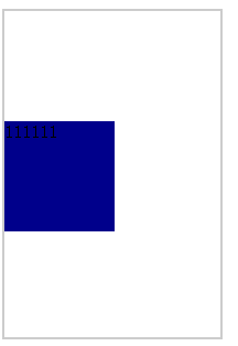
<div class="wrap line-height">
    <span class="span">111111</span>
</div>
 .wrap{
            width:200px ;
            height: 300px;
            line-height: 300px;
            border: 2px solid #ccc;
        }
.span{
            background: red;
        }
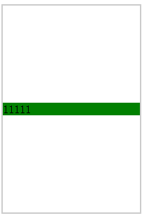
场景2:子元素是块级元素但是子元素高度没有设定
在这种情况下实际上是不知道子元素的高度的,无法通过计算得到padding或margin来调整,但是还是存在一些解法。
通过给父元素设定display:table-cell;vertical-align:middle来解决
<div class="wrap">
    <div class="non-height ">11111</div>
</div>
.wrap{
       width:200px ;
       height: 300px;
       border: 2px solid #ccc;
    display: table-cell;
    vertical-align: middle;
}
 .non-height{
       background: green;
        }
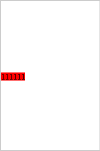
场景3:子元素是块级元素且高度已经设定
计算子元素的margin-top或margin-bottom,计算方法为父(元素高度-子元素高度)/2
<div class="wrap ">
    <div class="div1">111111</div>
</div>
  .wrap{
            width:200px ;
            height: 300px;
            border: 2px solid #ccc;
        }
.div1{
            width:100px ;
            height: 100px;
            margin-top: 100px;
            background: darkblue;
        }
3.4.3 水平垂直居中
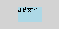
(1)水平对齐+行高
text-align + line-height实现单行文本水平垂直居中
<style>
.test{
    text-align: center;
    line-height: 100px;
}
</style>
<div class="test" style="background-color: lightblue;width: 200px;">测试文字</div>
(2)水平+垂直对齐
- text-align + vertical-align 在父元素设置text-align和vertical-align,并将父元素设置为table-cell元素,子元素设置为inline-block元素
<style>
.parent{
    display: table-cell;
    text-align: center;
    vertical-align: middle;
}
.child{
    display: inline-block;
}
</style>
<div class="parent" style=" width:200px; height:100px;">
  <div class="child" style="">测试文字</div>
</div>
<div class="parent" style="background-color: gray; width:200px; ">
  <img class="child" src="http://sandbox.runjs.cn/uploads/rs/26/ddzmgynp/img1.gif" width="50%" alt="test">
</div>
<style>
.parent{
    text-align: center;
    line-height: 100px;
    font-size: 0;
}
.child{
    vertical-align: middle;
}
</style>
(3)相对+绝对定位
使用absolute,利用绝对定位元素的盒模型特性,在偏移属性为确定值的基础上,设置margin:auto
<style>
.parent{
    position: relative;
}
.child{
    position: absolute;
    top: 0;
    left: 0;
    right: 0;
    bottom: 0;
    height: 50px;
    width: 80px;
    margin: auto;
}
</style>
<div class="parent" style="background-color: lightgray; width:200px; height:100px; ">
  <div class="child" style="background-color: lightblue;">测试文字</div>
</div>

 浙公网安备 33010602011771号