初始CSS
什么是CSS
css是cascading style sheets的缩写,即层叠样式表,它为我们节省了大量的工作,可以一次性控制多个网页的布局,也可以通过CSS来存储外部样式表。
CSS的基本语法
CSS语法也成为CSS基本规则,一个CSS规则由一个选择器和一个声明块组成,选择器表示你要定义CSS样式的HTML元素,声明块可以包含一个或者多个声明,每一个声明包含一个属性名称和一个值,中间用冒号隔开,多个声明之间要用分号隔开。
h1 {color:blue;font-size:12px;}
一个简单的CSS案例
<!DOCTYPE html>
<html lang="en">
<head>
    <meta charset="UTF-8">
    <meta name="viewport" content="width=device-width, initial-scale=1.0">
    <title>Document</title>
    <style>
        p {
            color: red;
            text-align: center;
        }
    </style>
</head>
<body>
    <p>Hello CSS</p>
    <p>这些段落用CSS进行了风格化处理</p>
</body>
</html>

如何添加CSS内联样式
当浏览器读取一个样式表时,它将根据样式表中的信息对HTML文档进行格式化,CSS中由三种插入样式表的方法,分别是:
内联CSS、内部CSS和外部CSS。
内联CSS又称为内联样式,也称为行内样式,它被用来为一个单一的元素应用一个独特的样式,要使用内联样式,需要将相关属性添加到相关的元素中,样式属性可以包含任何CSS属性。
需要注意的是:内联样式表失去了样式表的许多优点,尽量少用或者不用这种方法
内联样式的问题
没有使结构和样式相分离,也就是样式代码和CSS代码写到了一起,显得杂乱。
<!DOCTYPE html>
<html lang="en">
<head>
    <meta charset="UTF-8">
    <meta name="viewport" content="width=device-width, initial-scale=1.0">
    <title>Document</title>
</head>
<body>
    <!--
        提醒1:标签直接作为选择器使用
        提醒2:最后一个选择器可以不用加分号,但是还是建议添加上,这样在添加新的样式的时候,以免漏添
     -->
    <h1 style="text-align: center; color: blue";>分享喜欢的小故事</h1>
    <p style="color: red";>五岁的时候,你可以为捕捉一只蝴蝶,而跑到一公里外的田野;十岁的时候,你可以为一个冰淇凌,跑遍大街小巷的商店;十七岁的时候,你可以为喜欢的人,一个人去陌生的城市;二十七岁的时候,你可以只为了生活,而随便就找个人,过一辈子。你说,你越来越懒了,懒得去爱啦。</p>
</body>
</html>

如何添加CSS内部样式
内部样式一般添加在head元素里,通过style来定义,页面的样式声明均需要添加在style的内部
CSS选择器
用来寻找或者选择你想要定义样式的HTML元素的,CSS选择器包含很多种,例如:
元素选择器、
元素选择器
根据元素名称取选择HTML元素,一般选择的是全部的元素。
<!DOCTYPE html>
<html lang="en">
<head>
    <meta charset="UTF-8">
    <meta name="viewport" content="width=device-width, initial-scale=1.0">
    <title>Document</title>
    <style>
        body {
            background-color:linen;
        }
        h1 {
            color: maroon;
            /* margin-left 用于定义h1标题元素位于父容器左侧的距离 */
            margin-left: 40px;
        }
    </style>
</head>
<body>
    <h1>喜欢的句子</h1>
    <p>余春娇说:“我喜欢一个男生,他抽烟,我想跟他有共同话题,所以我也抽烟喽!后来有一天他跟我说,我要戒烟了,我问为什么,他说他喜欢的女孩不喜欢他抽烟。他的烟戒掉了,可是我没有。”</p>
</body>
</html>

如何添加CSS外部样式
内部样式解决了内联样式的问题,但是也有弊端,表现在以下两个方面:
- 内部样式只能作用于1个页面,如果要实现多个页面共享一个样式,就做不到了。
- 随着代码的增加,要不停的滚动屏幕来编辑样式,非常不方便。
综上,我们可以使用外部CSS来解决上面2个弊端
什么是外部CSS
外部CSS也叫外部样式,可以通过改变一个文件,来改变整个网页的外观,外部样式将CSS代码放在一个独立的,以.css为后缀名的文件中,使HTML结构文件和CSS样式文件,完全独立开来。
引用外部CSS样式的方法
<head>
    <meta charset="UTF-8">
    <meta name="viewport" content="width=device-width, initial-scale=1.0">
    <title>Document</title>
    <link rel="stylesheet" href="style.css">
</head>
CSS样式的规范
样式表的编写格式很宽松,但是我们编写样式的时候还是要有一定的规范,比如:
- 选择器和花括号之间,用一个空格隔开
- 每一行样式语句单独定义,不要多行写在一起,并且属性和属性值之间也建议添加一个空格
- 两组样式定义用空行来分割
css代码
body {
    background-color: lightblue;
}

p {
    margin-left: 20px;
    color: navy;
}
第一个网页代码
<!DOCTYPE html>
<html lang="en">
<head>
    <meta charset="UTF-8">
    <meta name="viewport" content="width=device-width, initial-scale=1.0">
    <title>Document</title>
    <link rel="stylesheet" href="style.css">
</head>
<body>
    <h1>喜欢的句子</h1>
    <p>无人与我立黄昏,无人问我粥可温,无人与我捻熄灯,无人共我书半生,无人陪我夜已深,无人与我把酒分,无人拭我相思泪,无人梦我与前尘,无人陪我顾星辰,无人醒我茶已冷,无人听我述衷肠,无人解我心头梦,无人拘我言中泪,无人愁我独行路,回首向来萧瑟处,无人等在灯火阑珊处。</p>
</body>
</html>

第二个网页的代码
<!DOCTYPE html>
<html lang="en">
<head>
    <meta charset="UTF-8">
    <meta name="viewport" content="width=device-width, initial-scale=1.0">
    <title>Document</title>
    <link rel="stylesheet" href="style.css">
</head>
<body>
    <h1>喜欢的句子</h1>
    <p>残阳与我立黄昏,阿婆问我粥可温。飞蛾与我捻熄灯,笔砚共我书半生。孤月陪我夜已深,往事与我把酒分。春风拭我相思泪,睡梦与我恋前尘。微风陪我顾星辰,案几知我茶已冷。归燕听我诉衷肠,暗香解我心头梦。素衣拘我言中泪,竹杖伴我独行路。回首向来萧瑟处,那人却在灯火阑珊处。</p>
</body>
</html>

CSS样式表的优先级
内联样式 > 内部样式
内联样式 > 外部样式
内部样式和外部样式,浏览器最后读取的优先级别高,我们知道这个特性就好,不建议将style定义的内部样式表放到body元素内
测试1,三个样式同时书写,内联样式优先级最高
<!DOCTYPE html>
<html lang="en">
<head>
    <meta charset="UTF-8">
    <meta name="viewport" content="width=device-width, initial-scale=1.0">
    <title>Document</title>
    <link rel="stylesheet" href="style.css">
    <style>
        h1 {
            color: purple;
        }
    </style>
</head>
<body>
    <h1 style="color:blue;text-align: center;">喜欢的句子</h1>
    <p style="color: red;">当一个女生在你面前放下她的高冷与不屑,像个听话的小孩子耐心的听着你讲述她所不知道的事,她睁大眼睛看着你,不忍错过关于你的一丝一毫,我想她应该很爱你。</p>
</body>
</html>
css代码
h1 {
    color: orange;
}

测试2,去掉内联样式,不修改其它代码(CSS代码不变)
<!DOCTYPE html>
<html lang="en">
<head>
    <meta charset="UTF-8">
    <meta name="viewport" content="width=device-width, initial-scale=1.0">
    <title>Document</title>
    <link rel="stylesheet" href="style.css">
    <style>
        h1 {
            color: purple;
        }
    </style>
</head>
<body>
    <h1 style="text-align: center;">喜欢的句子</h1>
    <p style="color: red;">当一个女生在你面前放下她的高冷与不屑,像个听话的小孩子耐心的听着你讲述她所不知道的事,她睁大眼睛看着你,不忍错过关于你的一丝一毫,我想她应该很爱你。</p>
</body>
</html>

测试3,将导入外部代码的语句放到内部样式下面(CSS代码不变)
<!DOCTYPE html>
<html lang="en">
<head>
    <meta charset="UTF-8">
    <meta name="viewport" content="width=device-width, initial-scale=1.0">
    <title>Document</title>
    <style>
        h1 {
            color: purple;
        }
        </style>
    <!-- 位置发生了变化 -->
    <link rel="stylesheet" href="style.css">
</head>
<body>
    <h1 style="text-align: center;">喜欢的句子</h1>
    <p style="color: red;">当一个女生在你面前放下她的高冷与不屑,像个听话的小孩子耐心的听着你讲述她所不知道的事,她睁大眼睛看着你,不忍错过关于你的一丝一毫,我想她应该很爱你。</p>
</body>
</html>

简单总结
当一个HTML元素有一个以上的样式时,作用的优先级如下:
- 在一个HTML元素内,内联样式优先级最高,会覆盖外部样式和内部样式以及浏览器默认样式。
- 在head里添加的内部样式和引入的外部样式,后添加和引入的优先级高。
- 浏览器默认样式优先级最低。
CSS选择器
选择器类别
简单选择器:根据名称、ID、类别来选择元素。
组合选择器:根据元素之间的特定关系来选择元素。
伪类选择器:根据某种状态来选择元素。
为元素选择器:为一个元素的指定部分设置样式。
属性选择器:根据一个属性或者属性值来选择元素。
简单选择器
CSS选择器是用来寻找或选择你想要定义样式的HTML的元素的
元素选择器
它是根据元素名称来选择HTML元素的
id选择器
是使用一个HTML元素的id属性来选择一个特定的元素,一个元素的id在一个页面中是唯一的,所以id选择器是用来选择一个唯一的元素的
要选择一个具有特定id的元素,可以使用#号字符,然后是改元素的id,比如
#para2需要注意的是,id名称不能以数字开头。
需求1,将第二段p标签的内容居中对齐
<!DOCTYPE html>
<html lang="en">
<head>
    <meta charset="UTF-8">
    <meta name="viewport" content="width=device-width, initial-scale=1.0">
    <title>Document</title>
    <style>
        h1 {
            color: purple;
            text-align: center;
        }

        p {
            color: red;
        }

        #para2 {
            text-align: center;
        }
    </style>
</head>
<body>
    <h1>喜欢的句子</h1>
    <p>《北爱》里的一段话:你不主动,我不主动,然后我们的关系就慢慢消失了,人与人之间没有谁离不开谁,只有谁不珍惜谁,一个转身,二个世界。一生之中有一个爱你,疼你,牵挂你的人,这就是幸福。万人追不如一人疼,万人宠不如一人懂。世界上不是所有人都可以掏心掏肺互诉衷肠。路过的都是缘,擦肩而过的都是客。</p>
    <p id="para2">多啦A梦陪了大雄80年,在大雄临死前,他对哆啦A梦说:“我走之后你就回到属于你的地方吧!”哆啦A梦同意了!大雄死后,哆啦A梦用时光机回到了80年前,对小时候的大雄说:“大雄你好,我是哆啦A梦。</p>
</body>
</html>

类选择器
类选择器可以选择具有特定class属性的HTML元素,要选择具有特定类别的元素,需要写一个点后面紧跟类别名称,比如
.italic
需求2,标题和第二个段落,都需要添加斜体效果,然后给第二个段落添加下划线,标题不需要添加下划线
<!DOCTYPE html>
<html lang="en">
<head>
    <meta charset="UTF-8">
    <meta name="viewport" content="width=device-width, initial-scale=1.0">
    <title>Document</title>
    <style>
        h1 {
            color: purple;
            text-align: center;
        }

        p {
            color: red;
        }

        #para2 {
            text-align: center;
        }

        .italic {
            /*
                font-style: 声明字体风格
                italic: 表示斜体
             */
             font-style: italic;

        }
        /* 也可以在定义类的时候,将元素名称添加到点的前面,这样的选选择器就更具体一些了 */
        p.deco {
            /*
                decoration: 表示修饰文本样式
                underline: 表示下划线
              */
              text-decoration: underline;
        }
    </style>
</head>
<body>
    <h1 class="italic">喜欢的句子</h1>
    <p>《北爱》里的一段话:你不主动,我不主动,然后我们的关系就慢慢消失了,人与人之间没有谁离不开谁,只有谁不珍惜谁,一个转身,二个世界。一生之中有一个爱你,疼你,牵挂你的人,这就是幸福。万人追不如一人疼,万人宠不如一人懂。世界上不是所有人都可以掏心掏肺互诉衷肠。路过的都是缘,擦肩而过的都是客。</p>
    <!-- class选择器可以添加多个,多个选择器之间使用空格隔开即可 -->
    <p id="para2" class="italic deco">多啦A梦陪了大雄80年,在大雄临死前,他对哆啦A梦说:“我走之后你就回到属于你的地方吧!”哆啦A梦同意了!大雄死后,哆啦A梦用时光机回到了80年前,对小时候的大雄说:“大雄你好,我是哆啦A梦。</p>
</body>
</html>

分组选择器
选择所有具有相同样式的HTML元素,实现的方法就是将多个选择器用逗号进行分割,比如
h1,p
通用选择器
选择页面上所有的HTML元素,定义选择器的方法是使用星号
*
需求3,给全部样式添加一个亚麻色的背景
<!DOCTYPE html>
<html lang="en">
<head>
    <meta charset="UTF-8">
    <meta name="viewport" content="width=device-width, initial-scale=1.0">
    <title>Document</title>
    <style>
        * {
            background-color: linen;
        }
        h1 {
            color: purple;
            text-align: center;
        }

        p {
            color: red;
        }

        #para2 {
            text-align: center;
        }

        /* 组合选择器 */
        .italic, #para2 {
            font-style: italic;
        }

        /* 也可以在定义类的时候,将元素名称添加到点的前面,这样的选选择器就更具体一些了 */
        p.deco {
            /*
                decoration: 表示修饰文本样式
                underline: 表示下划线
              */
              text-decoration: underline;
        }

    </style>
</head>
<body>
    <h1 class="italic">喜欢的句子</h1>
    <p>《北爱》里的一段话:你不主动,我不主动,然后我们的关系就慢慢消失了,人与人之间没有谁离不开谁,只有谁不珍惜谁,一个转身,二个世界。一生之中有一个爱你,疼你,牵挂你的人,这就是幸福。万人追不如一人疼,万人宠不如一人懂。世界上不是所有人都可以掏心掏肺互诉衷肠。路过的都是缘,擦肩而过的都是客。</p>
    <!-- class选择器可以添加多个,多个选择器之间使用空格隔开即可 -->
    <p id="para2" class="italic deco">多啦A梦陪了大雄80年,在大雄临死前,他对哆啦A梦说:“我走之后你就回到属于你的地方吧!”哆啦A梦同意了!大雄死后,哆啦A梦用时光机回到了80年前,对小时候的大雄说:“大雄你好,我是哆啦A梦。</p>
</body>
</html>

简单总结
| 选择器分类 | 选择器定义语法 | 例子 | 例子说明 |
|---|---|---|---|
| ID选择器 | #id | #firstname | 选择id="firstname"的元素 |
| 类选择器 | .class | .introduction | 选择所有带有class="introduction"的元素 |
| 类选择器(带有元素) | element.class | p.introduction | 只选择带有class="introduction"的 元素 |
| 通用选择器 | * | * | 选择所有元素 |
| 元素选择器 | element | p | 选择所有 元素 |
| 分组选择器 | element,element,... | div,p | 选择所有 元素和 元素 |
组合选择器
通过一些特殊符号,将多个选择器连接起来,就构成了组合选择器,在CSS中,组合选择器有四种
- 后代选择器,通过空格连接
div p
- 匹配作为指定元素后代的所有元素
- 子选择器,通过大于号连接
div>p- 兄弟选择器,通过加号连接
div+p- 一般兄弟选择器,通过波浪线连接
div~p
注意:组合选择器除了后代选择器,其它选择器的连接符号之间不建议添加空格
未优化前、定义了多个同样的color类选择器,代码冗余
<!DOCTYPE html>
<html lang="en">
<head>
    <meta charset="UTF-8">
    <meta name="viewport" content="width=device-width, initial-scale=1.0">
    <title>Document</title>
    <style>
        .color {
            color: blue;
        }
    </style>
</head>
<body>
    <div>
        <h1>喜欢的句子</h1>
        <p>曾经语文老师教了我们一句英文:I like you,but just like you.刚想说这个句子不错,正想把它摘抄到笔记本上时,老师告诉我们它的翻译:纵然万劫不复,纵然相思入骨,我也待你眉眼如初,岁月如故.</p>
        <h3 class="color">你最喜欢哪一条?</h3>
        <ol>
            <li>
                <p class="color">迟些遇见吧 你刚好成熟我刚好温柔</p>
            </li>
            <li>
                <p class="color">我忘记了你,但输入法却记得你。</p>
            </li>
            <li>
                <p class="color">17岁没能送你花 但愿27岁能请你喝酒</p>
            </li>
        </ol>
    </div>
</body>
</html>

后代选择器
优化后
<!DOCTYPE html>
<html lang="en">
<head>
    <meta charset="UTF-8">
    <meta name="viewport" content="width=device-width, initial-scale=1.0">
    <title>Document</title>
    <style>
        h3 {
            color: blue;
        }

        div ol p {
            color: blue;
        }
    </style>
</head>
<body>
    <div>
        <h1>喜欢的句子</h1>
        <p>曾经语文老师教了我们一句英文:I like you,but just like you.刚想说这个句子不错,正想把它摘抄到笔记本上时,老师告诉我们它的翻译:纵然万劫不复,纵然相思入骨,我也待你眉眼如初,岁月如故.</p>
        <h3>你最喜欢哪一条?</h3>
        <ol>
            <li>
                <p>迟些遇见吧 你刚好成熟我刚好温柔</p>
            </li>
            <li>
                <p>我忘记了你,但输入法却记得你。</p>
            </li>
            <li>
                <p>17岁没能送你花 但愿27岁能请你喝酒</p>
            </li>
        </ol>
    </div>
</body>
</html>
子选择器
子选择器只能选择作为某元素的子元素,不能作为孙辈的元素
div>p {
    color: red;
}
新需求,给div的第一个子元素p设置文本颜色为红色
<!DOCTYPE html>
<html lang="en">
<head>
    <meta charset="UTF-8">
    <meta name="viewport" content="width=device-width, initial-scale=1.0">
    <title>Document</title>
    <style>
        h3 {
            color: blue;
        }

        div ol p {
            color: blue;
        }

        div>p {
            color: red;
        }
    </style>
</head>
<body>
    <div>
        <h1>喜欢的句子</h1>
        <p>曾经语文老师教了我们一句英文:I like you,but just like you.刚想说这个句子不错,正想把它摘抄到笔记本上时,老师告诉我们它的翻译:纵然万劫不复,纵然相思入骨,我也待你眉眼如初,岁月如故.</p>
        <h3>你最喜欢哪一条?</h3>
        <ol>
            <li>
                <p>迟些遇见吧 你刚好成熟我刚好温柔</p>
            </li>
            <li>
                <p>我忘记了你,但输入法却记得你。</p>
            </li>
            <li>
                <p>17岁没能送你花 但愿27岁能请你喝酒</p>
            </li>
        </ol>
    </div>
</body>
</html>

简单的总结
| 选择器分类 | 选择器定义语法 | 例子 | 例子说明 |
|---|---|---|---|
| 后代选择器 | element element | div p | 选择 元素内的所有 元素 |
| 子选择器 | element>element | div>p | 选择所有父元素是 元素的 元素 |
伪类选择器
网站中的标签及文本,默认没有任何动态效果,如果要添加这样的动态样式,则需要配合鼠标的各种行为去完成,比如:鼠标点击,鼠标滑过等。
这些行为都可以使用CSS中的伪类选择器来实现。
什么是伪类选择器?
属于类选择器中的一种,根据特定状态选取元素
基本语法
selector:鼠标行为 {
    color: red;
}
/*
	selector 表示其它基础选择器
	冒号及鼠标行为就是常用的伪类选择器
*/
常见的伪类选择器
鼠标点击前 :link 代表鼠标没有操作元素时元素的默认样式
鼠标点击后 :visited 代表鼠标点击并离开元素之后的样式
鼠标悬停 :hover 代表鼠标悬停或者是划过元素时元素的样式
鼠标点击时 :active 代表鼠标点击元素瞬间,元素显示的样式

需要注意:
1.冒号和后面的鼠标行为,没有任何空格,必须连接在一起
2.四个未来选择器必须按照以上介绍的顺序书写(:link, :visited, :hover, :active),否则在浏览器中部分样式不能实现
3.伪类选择器全部一起使用的情况,主要是应用在超链接上,偶尔也会独立使用在其它标签上面
4.伪类选择器也可以应用在其它元素上,但是只能实现active激活瞬间和hover鼠标悬停效果
<!DOCTYPE html>
<html lang="en">
<head>
    <meta charset="UTF-8">
    <meta name="viewport" content="width=device-width, initial-scale=1.0">
    <title>Document</title>
    <style>
        a:link {
            color: red;
        }

        a:visited {
            color: green;
        }

        a:hover {
            color: yellow;
        }

        a:active {
            color: skyblue;
        }

        div {
            width: 200px;
            height: 200px;
            background-color: skyblue;
        }

        div:hover {
            background-color: red;
        }

        div:active {
            width: 100px;
            height: 100px;
        }
    </style>
</head>
<body>
    <a href="#">王者最强英雄出装</a>
    <div>我是一个普通的div标签</div>
</body>
</html>
伪元素选择器
伪元素选择器,顾名思义,伪可以理解成假的,元素就是我们的标签,所以伪元素选择器可以理解为假元素选择器。
通过伪元素选择器,可以设置元素指定部分的样式。主要用来设置元素内文本的首字母,首行的样式、或是在元素内容之前或之后插入其它内容
基本语法
selector::pseudo-element {
    color: red;
    font-size: 30px;
}
/*
	selector 表示目标元素
	pseudo-element 表示向目标元素内,添加伪元素,并对伪元素的内容进行修饰
*/
在CSS中,伪元素选择器有以下五种:
::first-letter 用来实现向文本的首个字符添加特殊样式
::first-line   用来实现向文本的首行添加特殊样式
::before       用来实现向元素内容之前插入内容
::after		   用来实现在元素内容之后插入内容
::selection    用来更改选中文本的样式
::first-letter
<!DOCTYPE html>
<html lang="en">
<head>
    <meta charset="UTF-8">
    <meta name="viewport" content="width=device-width, initial-scale=1.0">
    <title>Document</title>
    <style>
        div {
            background-color: linen;
            height: 100px;
            text-align: center;
        }

        div::first-letter {
            color: maroon;
            font-size: 30px;
        }
    </style>
</head>
<body>
    <div>
        听闻远方有你,动身跋涉千里;我吹过你吹过的风,这算不算相拥。
    </div>
</body>
</html>

::first-line
<!DOCTYPE html>
<html lang="en">
<head>
    <meta charset="UTF-8">
    <meta name="viewport" content="width=device-width, initial-scale=1.0">
    <title>Document</title>
    <style>
        div {
            background-color: linen;
            height: 100px;
            text-align: center;
        }

        div::first-line {
            color: maroon;
            font-size: 20px;
        }
    </style>
</head>
<body>
    <div>
        14岁:妈  我有女朋友了‘分手吧  你们还小’  15岁:妈 我有女朋友了 ‘分手吧 以学业为重’ 16:妈 我有女朋友了     ‘分手吧 你们还不懂爱情’ 18:妈我有女朋友了 ‘分手吧 快高考了’   24:妈我有女朋友了 ‘在一起多久了?’  ‘十年’
    </div>
</body>
</html>

在这里需要注意的是,无论你元素的宽度是变大还是变小,都只能对第一行的文本进行修饰
::before
<!DOCTYPE html>
<html lang="en">
<head>
    <meta charset="UTF-8">
    <meta name="viewport" content="width=device-width, initial-scale=1.0">
    <title>Document</title>
    <style>
        div {
            background-color: linen;
            height: 100px;
            text-align: center;
        }

        div::before {
            color: maroon;
            font-size: 25px;
            content: '我是向前添加';
        }

    </style>
</head>
<body>
    <div>
        五岁那年抓住了一只蝉,便以为抓住了整个夏天。
    </div>
</body>
</html>

::after
<!DOCTYPE html>
<html lang="en">
<head>
    <meta charset="UTF-8">
    <meta name="viewport" content="width=device-width, initial-scale=1.0">
    <title>Document</title>
    <style>
        div {
            background-color: linen;
            height: 100px;
            text-align: center;
        }

        div::after {
            color: maroon;
            font-size: 25px;
            content: '我是向后添加';
        }
    </style>
</head>
<body>
    <div>
        五岁那年抓住了一只蝉,便以为抓住了整个夏天。
    </div>
</body>
</html>

注意
在使用伪元素向前
::before向后::after插入内容时,必须配合content才能实现效果,向前向后插入的内容,都需要符合CSS样式声明的基本语法
::selection
需要注意的是:
selection伪元素选择器只支持以下几个样式声明:
color文本颜色
background背景
cursor鼠标样式
outline描边效果
<!DOCTYPE html>
<html lang="en">
<head>
    <meta charset="UTF-8">
    <meta name="viewport" content="width=device-width, initial-scale=1.0">
    <title>Document</title>
    <style>
        div {
            background-color: linen;
            height: 100px;
            text-align: center;
        }

        div::selection {
            background-color: tomato;
            color: #fff;
        }
    </style>
</head>
<body>
    <div>
        人的一生会遇到2个人,一个惊艳了时光,一个温柔了岁月。
    </div>
</body>
</html>

简单总结
| 选择器 | 例子 | 例子描述 |
|---|---|---|
| ::first-letter | p::first-letter | 选择每个 元素的首字母 |
| ::first-line | p::first-line | 选择每个 元素首行 |
| ::after | p::after | 在每个 元素之后插入内容 |
| ::before | p::before | 在每个 元素之前插入内容 |
| ::selection | p::selection | 选择用户选择的元素部分,去修改样式 |
属性选择器
上面介绍的几个选择器是为了提高查找的效率,如果要实现更加精准的查找,需要使用CSS属性选择器。
CSS属性选择器,是根据属性或属性值来查找元素。
基本语法为
Element[attribute]
/* 或者 */
Element[attribute="value"]
/*
	Element代表元素,attribute代表属性
	Element attribute 表示查找带有该属性的元素,然后添加样式声明。
*/
a[traget] {
    background-color: yellow;
}
/* 这段代码的含义是,查找带有traget属性的a元素,并且为a元素添加了背景颜色为黄色的样式声明 */
CSS选择器的常用的四种属性
[attribute]:来查找HTML结构中,带有attribute属性的所有元素。
[attribute="value"]:来查找HTML结构中,带有attribute属性,并且属性值为value的元素。
[attribute~="value"]:来查找HTML结构中,带有attribute属性,并且在多个属性值中包含vaule的元素。
[attribute|="value"]:来查找HTML结构中带有attribute属性,并且属性值以value或者是value-开头的元素,需要注意的是,该属性的值只能有一个不能有多个。
基础代码如下
<!DOCTYPE html>
<html lang="en">
<head>
    <meta charset="UTF-8">
    <meta name="viewport" content="width=device-width, initial-scale=1.0">
    <title>Document</title>
</head>
<body>
    <form action="">
        <h2>基础信息</h2>
        用户名:<input type="text" class="box" /> <br/>
        密码框:<input type="password"/> <br/>
        回答问题:<input type="text" /> <br/>
        性别选择:<input type="radio" name="sex">男
                 <input type="radio" name="sex">女 <br/>
        是否会摸鱼:<input type="radio" name="yesOrno">是
                  <input type="radio" name="yesOrno">否 <br/>
        <h2>元素修饰</h2>
        <p class="box big bobo">我是一个p元素我有三个类名,分别是:box,big,bobo</p>
        <p class="box bobo">我是一个p元素我有两个类名,分别是:box和bobo</p>
        <div class="box">我是一个div元素,我有一个类名叫做:box</div>
        <div class="box-xm">我是一个div元素,我有一个类名叫做:box-xm</div>
    </form>
</body>
</html>

单个属性演示[type]
<!DOCTYPE html>
<html lang="en">
<head>
    <meta charset="UTF-8">
    <meta name="viewport" content="width=device-width, initial-scale=1.0">
    <title>Document</title>
    <style>
        [type] {
            width: 50px;
            height: 50px;
        }
    </style>
</head>
<body>
    <form action="">
        <h2>基础信息</h2>
        用户名:<input type="text" class="box" /> <br/>
        密码框:<input type="password"/> <br/>
        回答问题:<input type="text" /> <br/>
        性别选择:<input type="radio" name="sex">男
                 <input type="radio" name="sex">女 <br/>
        是否会摸鱼:<input type="radio" name="yesOrno">是
                  <input type="radio" name="yesOrno">否 <br/>
        <h2>元素修饰</h2>
        <p class="box big bobo">我是一个p元素我有三个类名,分别是:box,big,bobo</p>
        <p class="box bobo">我是一个p元素我有两个类名,分别是:box和bobo</p>
        <div class="box">我是一个div元素,我有一个类名叫做:box</div>
        <div class="box-xm">我是一个div元素,我有一个类名叫做:box-xm</div>
    </form>
</body>
</html>

指定属性去查找[name="sex"]
<!DOCTYPE html>
<html lang="en">
<head>
    <meta charset="UTF-8">
    <meta name="viewport" content="width=device-width, initial-scale=1.0">
    <title>Document</title>
    <style>
        [type] {
            width: 50px;
            height: 50px;
        }

        [name="sex"] {
            width: 20px;
            height: 20px;
        }
    </style>
</head>
<body>
    <form action="">
        <h2>基础信息</h2>
        用户名:<input type="text" class="box" /> <br/>
        密码框:<input type="password"/> <br/>
        回答问题:<input type="text" /> <br/>
        性别选择:<input type="radio" name="sex">男
                 <input type="radio" name="sex">女 <br/>
        是否会摸鱼:<input type="radio" name="yesOrno">是
                  <input type="radio" name="yesOrno">否 <br/>
        <h2>元素修饰</h2>
        <p class="box big bobo">我是一个p元素我有三个类名,分别是:box,big,bobo</p>
        <p class="box bobo">我是一个p元素我有两个类名,分别是:box和bobo</p>
        <div class="box">我是一个div元素,我有一个类名叫做:box</div>
        <div class="box-xm">我是一个div元素,我有一个类名叫做:box-xm</div>
    </form>
</body>
</html>

[class~="box"]
<!DOCTYPE html>
<html lang="en">
<head>
    <meta charset="UTF-8">
    <meta name="viewport" content="width=device-width, initial-scale=1.0">
    <title>Document</title>
    <style>
        [type] {
            width: 50px;
            height: 50px;
        }

        [name="sex"] {
            width: 20px;
            height: 20px;
        }

        [class~="box"] {
            background-color: yellow;
        }
    </style>
</head>
<body>
    <form action="">
        <h2>基础信息</h2>
        用户名:<input type="text" class="box" /> <br/>
        密码框:<input type="password"/> <br/>
        回答问题:<input type="text" /> <br/>
        性别选择:<input type="radio" name="sex">男
                 <input type="radio" name="sex">女 <br/>
        是否会摸鱼:<input type="radio" name="yesOrno">是
                  <input type="radio" name="yesOrno">否 <br/>
        <h2>元素修饰</h2>
        <p class="box big bobo">我是一个p元素我有三个类名,分别是:box,big,bobo</p>
        <p class="box bobo">我是一个p元素我有两个类名,分别是:box和bobo</p>
        <div class="box">我是一个div元素,我有一个类名叫做:box</div>
        <div class="box-xm">我是一个div元素,我有一个类名叫做:box-xm</div>
    </form>
</body>
</html>

[class|="box"]
<!DOCTYPE html>
<html lang="en">
<head>
    <meta charset="UTF-8">
    <meta name="viewport" content="width=device-width, initial-scale=1.0">
    <title>Document</title>
    <style>
        [type] {
            width: 50px;
            height: 50px;
        }

        [name="sex"] {
            width: 20px;
            height: 20px;
        }

        [class~="box"] {
            background-color: yellow;
        }

        [class|="box"] {
            background-color: tomato;
        }
    </style>
</head>
<body>
    <form action="">
        <h2>基础信息</h2>
        用户名:<input type="text" class="box" /> <br/>
        密码框:<input type="password"/> <br/>
        回答问题:<input type="text" /> <br/>
        性别选择:<input type="radio" name="sex">男
                 <input type="radio" name="sex">女 <br/>
        是否会摸鱼:<input type="radio" name="yesOrno">是
                  <input type="radio" name="yesOrno">否 <br/>
        <h2>元素修饰</h2>
        <p class="box big bobo">我是一个p元素我有三个类名,分别是:box,big,bobo</p>
        <p class="box bobo">我是一个p元素我有两个类名,分别是:box和bobo</p>
        <div class="box">我是一个div元素,我有一个类名叫做:box</div>
        <div class="box-xm">我是一个div元素,我有一个类名叫做:box-xm</div>
    </form>
</body>
</html>

简单选择器可和组合选择器,可以完成元素的查找。
其他选择器可以更加精准高效的查找元素,从而提高我们编码速度。
属性选择器,在实际开发的过程中,大部分会应用在表单控件中,因为表单控件可以添加的属性比较多。
简单总结
| 选择器 | 例子 | 例子描述 |
|---|---|---|
| [attribute] | [target] | 选择带有traget属性的所有元素 |
| [attribute=value] | [target="_blank"] | 选择带有traget="_blank"属性的所有元素 |
| [attribute~=value] | [title~="flower"] | 选择带有包含"flower"一词的title属性的所有元素 |
| [attribute|=value] | [lang|="en"] | 选择带有以"en"开头的lang属性的所有元素 |
| [attribute^=value] | a[href^="https"] | 选择其href属性值以"https"开头的每个元素 |
| [attribute$=value] | a[href$=".pdf"] | 选择其属性值以".pdf"结尾的每个元素 |
| [attribute*=vale] | a[href*="w3school"] | 选择其href属性值包含字串"w3school"的每个元素 |
CSS文本颜色和大小写转化
文本颜色值
一个页面的默认文本颜色是在body选择器中定义的
RGB颜色值:rgb(160,32,240);
十六进制颜色值:#A020F0;
颜色名称:purple;
<!DOCTYPE html>
<html lang="en">
<head>
    <meta charset="UTF-8">
    <meta name="viewport" content="width=device-width, initial-scale=1.0">
    <title>Document</title>
    <style>
        .p1 {
            color: tomato;
        }

        .p2 {
            color: rgb(213, 188, 36);
        }

        .p3 {
            color: #AF6633;
        }
    </style>
</head>
<body>
    <p class="p1">我把秘密告诉了风,风却告诉了整片森林。</p>
    <p class="p2">周围都是人,可是我还是带起了耳机。</p>
    <p class="p3">I have loved you,I did my best——《万物理论》</p>
</body>
</html>

文本大小写转换
/*
	使用transfrom来实现文本大小写转换
	uppercase:文本被转化为大写
	lowercase:文本被转化为小写
	capitalize:每个单词的首字母被转换为大写

	需要注意的是,这些属性主要用来设置英文的文本,对中文无效

	基本语法如下:
*/
P.transfrom {
    text-transform: capitalize;
}
uppercase
<!DOCTYPE html>
<html lang="en">
<head>
    <meta charset="UTF-8">
    <meta name="viewport" content="width=device-width, initial-scale=1.0">
    <title>Document</title>
    <style>
        .p1 {
            color: tomato;
        }

        .p2 {
            color: rgb(213, 188, 36);
        }

        .p3 {
            color: #AF6633;
            text-transform: uppercase;
        }
    </style>
</head>
<body>
    <p class="p1">我把秘密告诉了风,风却告诉了整片森林。</p>
    <p class="p2">周围都是人,可是我还是带起了耳机。</p>
    <p class="p3">I have loved you,I did my best——《万物理论》</p>
</body>
</html>

lowercase
<!DOCTYPE html>
<html lang="en">
<head>
    <meta charset="UTF-8">
    <meta name="viewport" content="width=device-width, initial-scale=1.0">
    <title>Document</title>
    <style>
        .p1 {
            color: tomato;
        }

        .p2 {
            color: rgb(213, 188, 36);
        }

        .p3 {
            color: #AF6633;
            text-transform: lowercase;
        }
    </style>
</head>
<body>
    <p class="p1">我把秘密告诉了风,风却告诉了整片森林。</p>
    <p class="p2">周围都是人,可是我还是带起了耳机。</p>
    <p class="p3">I have loved you,I did my best——《万物理论》</p>
</body>
</html>

capitalize
<!DOCTYPE html>
<html lang="en">
<head>
    <meta charset="UTF-8">
    <meta name="viewport" content="width=device-width, initial-scale=1.0">
    <title>Document</title>
    <style>
        .p1 {
            color: tomato;
        }

        .p2 {
            color: rgb(213, 188, 36);
        }

        .p3 {
            color: #AF6633;
            text-transform: capitalize;
        }
    </style>
</head>
<body>
    <p class="p1">我把秘密告诉了风,风却告诉了整片森林。</p>
    <p class="p2">周围都是人,可是我还是带起了耳机。</p>
    <p class="p3">I have loved you,I did my best——《万物理论》</p>
</body>
</html>

小练习
<!DOCTYPE html>
<html lang="en">
<head>
    <meta charset="UTF-8">
    <meta name="viewport" content="width=device-width, initial-scale=1.0">
    <title>Document</title>
    <style>
        .box {
            width: 344px;
            height: 50px;
            background-color: #00bfff;
        }

        h1 {
            color: rgb(255,0,0);
        }

        p {
            background-color: #ffff00;
            font-weight: bold;
        }

        .p1 {
            color: green;
        }

        .span1 {
            background-color: #00ffff;
        }

        .p2 {
            text-transform: capitalize;
        }

        .span2 {
            background-color: #800080;
        }

        .p3 {
            text-transform: lowercase;
        }

        .span3 {
            background-color: blue;
        }

        .span4 {
            color: #3692e8;
        }

        .p5 {
            text-transform: uppercase;
        }
    </style>
</head>
<body>
    <div class="box">
        <h1>今日家庭作业</h1>
    </div>
    <p class="p1">今天的家庭作业是,完成该效果,该段落使用<span class="span1">十六进制</span>进行修饰</p>
    <p class="p2">today's <span class="span2">homework</span> is to complete the effect</p>
    <p class="p3">today's <span class="span3">homework</span> is to complete the effect</p>
    <p class="p4"><span class="span4">完成作业在屏幕中回复弹幕,</span>***同学作业已完成</p>
    <p class="p5">homework has been finished</p>
</body>
</html>

CSS文本对齐方式和文本间距
文本对齐方式
通过CSS可以设置文本的水平和垂直对齐方式,水平对齐方式使用
text-align实现,它的属性有三个:left: 居左(默认)
center: 居中
right: 居右
<!DOCTYPE html>
<html lang="en">
<head>
    <meta charset="UTF-8">
    <meta name="viewport" content="width=device-width, initial-scale=1.0">
    <title>Document</title>
    <style>
        h1 {
            background-color: linen;
            color: maroon;
            text-align: center;
        }

        .c1 {
            text-align: left;
        }

        .c2 {
            text-align: center;
        }

        .c3 {
            text-align: right;
        }
    </style>
</head>
<body>
    <h1>喜欢的句子</h1>
    <p class="c1">“我不会因为一个冰淇淋和你走!” “2个” “好那我去收拾行李。”</p>
    <p class="c2">“为什么有些人明明看起来友善,却总是独来独往?” “待人友善是修养,独来独往是性格。”</p>
    <p class="c3">“尽管没有风可我觉得池中的月亮都粉碎了。”——三岛由纪夫《金阁寺》</p>
</body>
</html>

当text-align属性设置成
justify时,每一行都被拉长,使每一行都有相等的宽度,而且左右的边界是对齐的,就像杂志和报纸的排版一样。
<!DOCTYPE html>
<html lang="en">
<head>
    <meta charset="UTF-8">
    <meta name="viewport" content="width=device-width, initial-scale=1.0">
    <title>Document</title>
    <style>

        p {
            text-align: justify;
            width: 222px;
        }
    </style>
</head>
<body>
    <h1>喜欢的句子</h1>
    <p class="c1">“我不会因为一个冰淇淋和你走!” “2个” “好那我去收拾行李。”</p>
    <p class="c2">“为什么有些人明明看起来友善,却总是独来独往?” “待人友善是修养,独来独往是性格。”</p>
    <p class="c3">“尽管没有风可我觉得池中的月亮都粉碎了。”——三岛由纪夫《金阁寺》</p>
</body>
</html>

垂直对齐方式vertical-align
垂直对齐方式通过
vertical-align方式来实现,它的属性值有5个
baseline:基线对齐
baseline是基于四线三个,倒数第二行进行对齐的,对于英文文本才有意义。
text-top: 文本顶部对齐
text-bottom: 文本底部对齐
sub:下角标对齐
super: 上角标对齐

(baseline的对齐方式图解)
<!DOCTYPE html>
<html lang="en">
<head>
    <meta charset="UTF-8">
    <meta name="viewport" content="width=device-width, initial-scale=1.0">
    <title>Document</title>
    <style>

        span {
            color: tomato;
        }

        p {
            font-size: 30px;
        }

        span.a {
            vertical-align: baseline;
        }

        span.b {
            vertical-align: text-top;
        }

        span.c {
            vertical-align: text-bottom;
        }

        span.d {
            vertical-align: sub;
        }

        span.e {
            vertical-align: super;
        }
    </style>
</head>
<body>
    <p><span class="a">⇒</span>Effert baseline</p>
    <p><span class="b">⇒</span>Effert text-top</p>
    <p><span class="c">⇒</span>Effert text-bottom</p>
    <p><span class="d">⇒</span>Effert sub</p>
    <p><span class="e">⇒</span>Effert super</p>
</body>
</html>

文本缩进text-indent
通过
text-indent来实现,使用长度值或者百分比来进行缩进
长度单位又分为
绝对单位和相对单位,比如:绝对单位:比如
50px相对单位:一般设置成em,缩进宽度为字符宽度的两倍,一般设置为
2em,就是空两格。字符宽度,如果是中文方块字,也可以成为字体大小,是通过
font-size属性来设置的。
- 百分比缩进是根据计算父元素单位得到的,这个很少使用。
需要注意的是,如果设置没有效果,请检查一下是否设置过justify属性,不要一起设置。
<!DOCTYPE html>
<html lang="en">
<head>
    <meta charset="UTF-8">
    <meta name="viewport" content="width=device-width, initial-scale=1.0">
    <title>Document</title>
    <style>
        p {
            text-indent: 2em;
            font-size: 20px;
        }

    </style>
</head>
<body>
    <p>你要记得那些大雨中为你撑伞的人 帮你挡住外来之物的人 黑暗中默默抱紧你的人 逗你笑的人陪你彻夜聊天的人 坐车来看望你的人 陪你哭过的人 在医院陪你的人总是以你为重的人 带着你四处游荡的人说想念你的人是这些人组成你生命中一点一滴的温暖是这些温暖使你远离阴霾是这些温暖使你成为善良的人。</p>
</body>
</html>

letter-spacing
letter-spacing用于指定中文文字或英文之母之间的空隙。
<!DOCTYPE html>
<html lang="en">
<head>
    <meta charset="UTF-8">
    <meta name="viewport" content="width=device-width, initial-scale=1.0">
    <title>Document</title>
    <style>
        p {
            text-indent: 2em;
            font-size: 20px;
            letter-spacing: 5px;
        }

    </style>
</head>
<body>
    <p>你要记得那些大雨中为你撑伞的人 帮你挡住外来之物的人 黑暗中默默抱紧你的人 逗你笑的人陪你彻夜聊天的人 坐车来看望你的人 陪你哭过的人 在医院陪你的人总是以你为重的人 带着你四处游荡的人说想念你的人是这些人组成你生命中一点一滴的温暖是这些温暖使你远离阴霾是这些温暖使你成为善良的人。</p>
</body>
</html>

行高line-height
line-height属性,用于指定行与行之间的高度,也就是行高。它的属性值有三个:
normal:也是默认值,浏览器会根据字符大小自动设置一个行高。一个数字:比如1.5,此数字与当前的字符大小相乘计算得到【推荐】绝对值:比如20px,-5px,设置固定的行间距。将行高设置成容器的高度,这样里面的文字就会自动居中了。

不管文本里有没有英文,基线都是一直存在的
line-height:1 x 文字高度 = 文字高度
而文字高度恰巧等于两行基线之间的距离(行高),所以当设置line-height:1的时候没有效果
英文单词间距word-spacing
word-spacing用于指定文本中的单词间距,只对英文有效。
<!DOCTYPE html>
<html lang="en">
<head>
    <meta charset="UTF-8">
    <meta name="viewport" content="width=device-width, initial-scale=1.0">
    <title>Document</title>
    <style>
        p {
            text-indent: 2em;
            font-size: 20px;
            word-spacing: 20px;
        }

    </style>
</head>
<body>
    <p>曾经语文老师教了我们一句英文:I like you,but just like you.刚想说这个句子不错,正想把它摘抄到笔记本上时,老师告诉我们它的翻译:纵然万劫不复,纵然相思入骨,我也待你眉眼如初,岁月如故.</p>
</body>
</html>

处理空白white-space
white-space属性指定了如何处理元素内部的空白,它有一个常用的值nowrap
nowrap:不管包含文本的元素宽度是多少,文本都不会换行,直到遇见<br>标签为止。
没有设置white-space之前
<!DOCTYPE html>
<html lang="en">
<head>
    <meta charset="UTF-8">
    <meta name="viewport" content="width=device-width, initial-scale=1.0">
    <title>Document</title>
    <style>
        .box {
            width: 200px;
            height: 200px;
            background-color: linen;
        }

        p {
            text-indent: 2em;
            font-size: 20px;
            word-spacing: 20px;
        }

    </style>
</head>
<body>
    <div class="box">
        这是一个宽度为200的盒子
        <p>万圣节去鬼屋玩,那个鬼挥棒子的时候不小心砸到我头了,于是瞬间所有鬼都围过来问我:....没事吧...。我:......</p>
    </div>
</body>
</html>

设置了white-space之后
<!DOCTYPE html>
<html lang="en">
<head>
    <meta charset="UTF-8">
    <meta name="viewport" content="width=device-width, initial-scale=1.0">
    <title>Document</title>
    <style>
        .box {
            width: 200px;
            height: 200px;
            background-color: linen;
        }

        p {
            white-space: nowrap;
            text-indent: 2em;
            font-size: 20px;
            word-spacing: 20px;
        }

    </style>
</head>
<body>
    <div class="box">
        这是一个宽度为200的盒子
        <p>万圣节去鬼屋玩,那个鬼挥棒子的时候不小心砸到我头了,于是瞬间所有鬼都围过来问我:....没事吧...。我:......</p>
    </div>
</body>
</html>

简单总结
| 属性 | 说明 |
|---|---|
text-align |
指定文本的水平对齐方式 |
vertical-align |
指定文本的垂直对齐方式 |
letter-spacing |
指定文本中字符之间的空隙 |
line-height |
指定行高 |
text-ident |
指定文本块中第一行的缩进 |
white-spacing |
指定如何处理一个元素内部的空白 |
word-spacing |
指定文本中单词之间的空隙(只对英文有效) |
CSS文本修饰
文本装饰线text-decoration-line
通过CSS文本装饰,可以为文本添加装饰线,为装饰线添加颜色,为装饰线指定风格,为装饰线指定厚度等效果。
为文本添加装饰线通过
text-decoration-line属性实现,可以结合一个以上的值,比如上划线和下划线,具体的值有三个:
overline:在文本上方添加line-through:在文本中间添加线条修饰,实现删除线的效果underline:在文本下方添加线条修饰
<!DOCTYPE html>
<html lang="en">
<head>
    <meta charset="UTF-8">
    <meta name="viewport" content="width=device-width, initial-scale=1.0">
    <title>Document</title>
    <style>
        h1 {
            text-decoration-line: overline;
        }

        h2 {
            text-decoration-line: line-through;
            color: tomato;
        }

        h3 {
            text-decoration-line: underline;
        }

        p {
            /* 如果要设置多个,用空格隔开就行 */
            text-decoration-line: overline underline;
        }
    </style>
</head>
<body>
    <h1>喜欢的句子</h1>
    <h2>后来我才知道,前程似锦是告别的意思</h2>
    <h3>“什么都明白的人最温柔也最冷漠”</h3>
    <p>迟些遇见吧 你刚好成熟我刚好温柔</p>
</body>
</html>

超链接默认有一条下划线,所以添加了超链接的文本,就不要再次去文本修饰了,去掉超链接的默认下划线,可以将其的值改为空即可。
a {
    text-decoration-line: none;
}
文本装饰线颜色text-decoration-color
为文本设置装饰线颜色,可以通过
text-decoration-color实现,属性值可以是任意合法的颜色值。
<!DOCTYPE html>
<html lang="en">
<head>
    <meta charset="UTF-8">
    <meta name="viewport" content="width=device-width, initial-scale=1.0">
    <title>Document</title>
    <style>
        h1 {
            text-decoration-line: overline;
            text-decoration-color: maroon;
        }

        h2 {
            text-decoration-line: line-through;
            text-decoration-color: tomato;
        }

        h3 {
            text-decoration-line: underline;
            text-decoration-color: deeppink;
        }

        p {
            /* 如果要设置多个,用空格隔开就行 */
            text-decoration-line: overline underline;
            text-decoration-color: green;
        }

        a {
            text-decoration-line: none;
        }
    </style>
</head>
<body>
    <h1>喜欢的句子</h1>
    <h2>后来我才知道,前程似锦是告别的意思</h2>
    <h3>“什么都明白的人最温柔也最冷漠”</h3>
    <p>迟些遇见吧 你刚好成熟我刚好温柔</p>
    <a href="https://www.cnblogs.com/ccsvip/">小满的博客</a>
</body>
</html>

装饰线风格text-decoration-style
为装饰线指定风格,通过
text-decoration-style属性来,其属性值有五个:
solid:实现double:双实线dotted:圆点线dashed:虚线wavy:波浪线
<!DOCTYPE html>
<html lang="en">
<head>
    <meta charset="UTF-8">
    <meta name="viewport" content="width=device-width, initial-scale=1.0">
    <title>Document</title>
    <style>
        h1 {
            text-decoration-line: underline;
            text-decoration-color: yellow;
            text-decoration-style: solid;
        }

        h2 {
            text-decoration-line: underline;
            text-decoration-color: blue;
            text-decoration-style: double;
        }

        h3 {
            text-decoration-line: underline;
            text-decoration-color: deeppink;
            text-decoration-style: dotted;
        }

        h4 {
            text-decoration-line: underline;
            text-decoration-color: purple;
            text-decoration-style: dashed;
        }

        p {
            text-decoration-line: underline;
            text-decoration-color: green;
            text-decoration-style: wavy;
        }
    </style>
</head>
<body>
    <h1>喜欢的句子</h1>
    <h2>后来我才知道,前程似锦是告别的意思</h2>
    <h3>“什么都明白的人最温柔也最冷漠”</h3>
    <h4>17岁没能送你花 但愿27岁能请你喝酒</h4>
    <p>迟些遇见吧 你刚好成熟我刚好温柔</p>
</body>
</html>

装饰线厚度text-decoration-thickness
通过
text-decoration-thickness属性为线条设置厚度,也就是线条的粗细,属性值有三种设置方法:
auto:默认值,这个值是不确定的,和所修饰的文字大小有关系px:像素大小,是一个绝对值,比如5px%:是一个相对值,根据修饰文字的高度计算出来的,比如25%
<!DOCTYPE html>
<html lang="en">
<head>
    <meta charset="UTF-8">
    <meta name="viewport" content="width=device-width, initial-scale=1.0">
    <title>Document</title>
    <style>
        h1 {
            text-decoration-line: underline;
            text-decoration-color: yellow;
            text-decoration-style: solid;
            text-decoration-thickness: auto;
        }

        h2 {
            text-decoration-line: underline;
            text-decoration-color: blue;
            text-decoration-style: double;
            text-decoration-thickness: auto;
        }

        h3 {
            text-decoration-line: underline;
            text-decoration-color: deeppink;
            text-decoration-style: dotted;
            text-decoration-thickness: 5px;
        }

        h4 {
            text-decoration-line: underline;
            text-decoration-color: purple;
            text-decoration-style: dashed;
            text-decoration-thickness: 25%;
        }

        p {
            text-decoration-line: underline;
            text-decoration-color: green;
            text-decoration-style: wavy;
        }
    </style>
</head>
<body>
    <h1>喜欢的句子</h1>
    <h2>后来我才知道,前程似锦是告别的意思</h2>
    <h3>“什么都明白的人最温柔也最冷漠”</h3>
    <h4>17岁没能送你花 但愿27岁能请你喝酒</h4>
    <p>迟些遇见吧 你刚好成熟我刚好温柔</p>
</body>
</html>

属性简写text-decoration
去掉最后一个单词,直接写
text-decoration就是简写,比如:
text-deciration: underline red double 5px;

/*
	underline ---> text-decoration-line
	red		  ---> text-decoration-color
	double	  ---> text-decoration-style
	5px		  ---> text-decoration-thickness

	需要注意的是,text-decoration-line这个属性必须设置,其他三个值可选
				几个值的设置顺序没有要求
				没有设置的值将采用默认值
				比如设置了
				text-decoration: underline; 表示设置了一个下划线 黑色 实线 自动粗细
*/

将刚刚的代码进行简写
<!DOCTYPE html>
<html lang="en">
<head>
    <meta charset="UTF-8">
    <meta name="viewport" content="width=device-width, initial-scale=1.0">
    <title>Document</title>
    <style>
        h1 {
            text-decoration: underline yellow;
        }

        h2 {
            text-decoration: underline blue double;
        }

        h3 {
            text-decoration: underline deeppink dotted 5px;

        }

        h4 {
            text-decoration: underline purple dashed 25%;
        }

        p {
            text-decoration: underline green wavy;
        }
    </style>
</head>
<body>
    <h1>喜欢的句子</h1>
    <h2>后来我才知道,前程似锦是告别的意思</h2>
    <h3>“什么都明白的人最温柔也最冷漠”</h3>
    <h4>17岁没能送你花 但愿27岁能请你喝酒</h4>
    <p>迟些遇见吧 你刚好成熟我刚好温柔</p>
</body>
</html>

简单总结
| 属性 | 说明 |
|---|---|
text-decoration |
在一个声明中设置所有的文本装饰属性 |
text-decoration-color |
指定文本装饰的颜色 |
text-decoration-line |
指定要使用的文本装饰的种类(下划线、上划线等) |
text-decoration-style |
指定文本装饰的样式(实心、点状等) |
text-decoration-thickness |
指定文本装饰线的厚度 |
CSS字体和字号
设置字体font-family
在
CSS中我们通过font-family设置字体,属性值是一个字体的名称,字体都有哪些名称呢?在
CSS中,英文字体有五类:
Serif:在每一个字母的边缘都有一个小比划,它们创造了一种正式和优雅的感觉,比如Times New Roman \ Georgia \ GaramondSans-serif:无衬线字体,有干净的线条,也就是不附带小比划,它们创造了一种现代和简约的外观,比如Arial \ Verdana \ Helveticamonospace:单空格字体,这里所有的字体都有相同固定的宽度,因此又称等宽字体,它们创造了一种机械的外观,一般我们在代码编辑器中会使用这些字体,比如Courier New \ Lucida \ Console \ MonacoCursive:草书字体,模仿人类的手写体,比如Brush Script MT \ Lucida HandwritingFantasy:幻想字体,是装饰性娱乐字体,比如Copperplate \ Papyrus在
CSS中,比较通用的中文字体有两个:
微软雅黑:window系统平方简:Mac系统
<!DOCTYPE html>
<html lang="en">
<head>
    <meta charset="UTF-8">
    <meta name="viewport" content="width=device-width, initial-scale=1.0">
    <title>Document</title>
    <style>
        h1 {
            font-family: 'Times New Roman';
        }

        h3 {
            font-family: 微软雅黑;
        }

        p {
            font-family: 华文仿宋;
        }
    </style>
</head>
<body>
    <h1>Lorem ipsum dolor sit amet consectetur adipisicing elit.</h1>
    <h3>我没有道德,你就没办法绑架我。</h3>
    <p>未来的我有多优秀,就代表我曾今有多喜欢你。</p>
</body>
</html>

字体的备选
只需要在
font-family中多设置几个字体就可以了,字体用逗号,隔开,如果所有字体用户电脑中都没有,就会使用默认的字体。
h1 {
    /* 多个名称的字体推荐使用单引号或者双引号引起来 */
	font-family: "Courier New", "BrushScript MT", 'Times New Roman';
}

设置文本字号font-size
文本的字号也就是文本的大小,在网页设计中是很重要的,它可以是网页布局有层次感,便于阅读,增强用户体验。
在
CSS中通过font-size设置文字的大小,属性值可以是绝对大小,也可以是相对大小
绝对大小 - px:将文本设置为指定大小,不允许用户在所有的浏览器中改变文字的大小。
相对大小 - em:也就是相对于周围元素的大小,使用em这个单位来设置,一般情况下,会根据计算下来的父元素的尺寸得到,相对大小允许用户通过浏览器去修改大小。
相对大小 - %:也是根据父元素的大小来计算尺寸的,比如父元素的文本大小16px,那么设置成100%,也是16px。
相对大小 - rem:Relative to the root element相对于根元素,即html元素,这样就不用像em那样,计算那么多层祖先元素的字体大小了。需要注意的是:
如果没有设置文本大小,正常的文本,比如段落,会继承祖先元素的大小,如果祖先元素也没有设置字体大小,则会使用浏览器的默认字体大小
16px;
通过em设置字体大小
<!DOCTYPE html>
<html lang="en">
<head>
    <meta charset="UTF-8">
    <meta name="viewport" content="width=device-width, initial-scale=1.0">
    <title>Document</title>
    <style>
        body {
            font-size: 16px;
        }

        h1 {
            font-family: "Courier New", "BrushScript MT", 'Times New Roman';
        }

        h3 {
            font-family: 微软雅黑;
        }

        p {
            /* 这里继承了body的16像素  * 2 = 32px */
            font-family: 华文仿宋;
            font-size: 2em;
        }
    </style>
</head>
<body>
    <h1>Lorem ipsum dolor sit amet consectetur adipisicing elit.</h1>
    <h3>我没有道德,你就没办法绑架我。</h3>
    <p>未来的我有多优秀,就代表我曾今有多喜欢你。</p>
</body>
</html>


通过rem设置字体大小
<!DOCTYPE html>
<html lang="en">
<head>
    <meta charset="UTF-8">
    <meta name="viewport" content="width=device-width, initial-scale=1.0">
    <title>Document</title>
    <style>
        html {
            font-size: 16px;
        }

        h1 {
            font-family: "Courier New", "BrushScript MT", 'Times New Roman';
        }

        h3 {
            font-family: 微软雅黑;
        }

        p {
            /* html的16px * 2 = 32px */
            font-family: 华文仿宋;
            font-size: 2rem;
            color: tomato;
            text-decoration-line: underline;
        }
    </style>
</head>
<body>
    <h1>Lorem ipsum dolor sit amet consectetur adipisicing elit.</h1>
    <h3>我没有道德,你就没办法绑架我。</h3>
    <p>未来的我有多优秀,就代表我曾今有多喜欢你。</p>
</body>
</html>

CSS字体风格和样式简写
通过
CSS可以很方便的设置文本倾斜、文本粗细以及文本字体大小等字体风格
文本斜体font-style
font-style主要用于文本的斜体显示,它有三个属性:
normal:默认值,文本正常显示italic:文本斜体显示oblique:和italic非常相似,但浏览器支持度较低
<!DOCTYPE html>
<html lang="en">
<head>
    <meta charset="UTF-8">
    <meta name="viewport" content="width=device-width, initial-scale=1.0">
    <title>Document</title>
    <style>
        .p1 {
            font-style: normal;
        }

        .p2 {
            font-style: italic;
        }

        .p3 {
            font-style: oblique;
        }
    </style>
</head>
<body>
    <h3 class="p1">不知道是怎么了,找不回初心了。</h3>
    <h3 class="p2">你走了也好,不然总担心你要走。</h3>
    <h3 class="p3">我把秘密告诉了风,风却告诉了整片森林。</h3>
</body>
</html>

文本粗细font-weight
font-weight属性设置了字体的粗细,属性值设置有两种方式,名称或数值。
名称:名称有四个,分别是:
lighter:细体normal:正常字体bold:加粗字体bolder:更粗字体
数值:设置有9个,分别是100 200 300 400 500 600 700 800 900,这种方式更能精细化的控制文本的粗细,值越大,文本越粗。数值和文本的对应关系是:
100对应lighter
400对应normal
700对应bold
900对应bolder
<!DOCTYPE html>
<html lang="en">
<head>
    <meta charset="UTF-8">
    <meta name="viewport" content="width=device-width, initial-scale=1.0">
    <title>Document</title>
    <style>
        h1 {
            /* 标题h1正常是粗体显示,现在变正常了 */
            font-weight: normal;
            color: tomato;
        }

        .p1 {
            font-style: normal;
            font-weight: bold;
        }

        .p2 {
            font-style: italic;
            font-weight: 700;
        }

        .p3 {
            font-style: oblique;
            /* 变细了 */
            font-weight: 100;
        }
    </style>
</head>
<body>
    <h1>喜欢的句子</h1>
    <h3 class="p1">不知道是怎么了,找不回初心了。</h3>
    <h3 class="p2">你走了也好,不然总担心你要走。</h3>
    <h3 class="p3">我把秘密告诉了风,风却告诉了整片森林。</h3>
</body>
</html>

小型大写字母font-variant
font-variant指定了文本是否应以小型大写字母显示,所谓小型大写字母,就是小一号的大写字母,正常的大写字母,四线三格里占用前两行,而小型大写字母指只占用第二行,它有两个值:
normal:正常显示small-caps:小型大写字母,这个值只对英文有效

<!DOCTYPE html>
<html lang="en">
<head>
    <meta charset="UTF-8">
    <meta name="viewport" content="width=device-width, initial-scale=1.0">
    <title>Document</title>
    <style>
        h1 {
            font-weight: normal;
            color: tomato;
        }

        .p2 {
            font-style: italic;
            font-weight: 700;
        }

        .p3 {
            font-weight: 100;
            font-variant: small-caps;
        }
    </style>
</head>
<body>
    <h1>喜欢的句子</h1>
    <h3 class="p2">I have loved you,I did my best——《万物理论》</h3>
    <h3 class="p3">"how are you?" " ̶s̶a̶d̶,̶ ̶b̶r̶o̶k̶e̶n̶,̶ ̶d̶e̶f̶e̶a̶t̶e̶d̶,̶ ̶c̶r̶u̶s̶h̶e̶d̶,̶ ̶l̶o̶n̶e̶l̶y̶,̶ ̶f̶a̶l̶l̶i̶n̶g̶ ̶a̶p̶a̶r̶t̶ i'm fine。"</h3>
</body>
</html>

字体简写font
字体简写使用
font,它的值可以是font-style \ font-variant \ font-weight \ font-size/line-height \ font-family组合在一起的值,中间用空格隔开,其中font-size和font-family这两个值是必须的,其他值缺少的话,使用它们的默认值

未使用简写
<!DOCTYPE html>
<html lang="en">
<head>
    <meta charset="UTF-8">
    <meta name="viewport" content="width=device-width, initial-scale=1.0">
    <title>Document</title>
    <style>
        h1 {
            color: tomato;
        }

        .p2 {
            font-style: italic;
            font-weight: 700;
            font-variant: small-caps;
            font-family: 华文仿宋;
            font-size: 2em;
        }

    </style>
</head>
<body>
    <h1>喜欢的句子</h1>
    <h3 class="p2">I have loved you,I did my best——《万物理论》</h3>
</body>
</html>

使用font简写属性
<!DOCTYPE html>
<html lang="en">
<head>
    <meta charset="UTF-8">
    <meta name="viewport" content="width=device-width, initial-scale=1.0">
    <title>Document</title>
    <style>
        h1 {
            color: tomato;
        }

        .p2 {
            font: 700 italic small-caps 2em 华文仿宋;
        }

    </style>
</head>
<body>
    <h1>喜欢的句子</h1>
    <h3 class="p2">I have loved you,I did my best——《万物理论》</h3>
</body>
</html>
CSS谷歌字体和icon图标
在
css中除了HTML的标准字体外,还可以使用谷歌字体,谷歌字体是免费使用的,并且有1000多种字体可供选择。我们再也不用担心用户电脑上是否安装过某个字体了。
要使用谷歌字体,只需要在
<head></head>标签里添加一个特殊的连接,就可以正常使用了
导入谷歌字体
<head>
    <!-- 谷歌字体网址?family=字体名称 -->
    <link rel="stylesheet" href="https://font.googleapis.com/css?family=Sofia">
    <!-- 如果要使用多个谷歌字体 用 | 隔开即可 -->
    <link rel="stylesheet" href="https://font.googleapis.com/css?family=Audiowide|Sofia|Trirong">
</head>
<!DOCTYPE html>
<html lang="en">
<head>
    <meta charset="UTF-8">
    <meta name="viewport" content="width=device-width, initial-scale=1.0">
    <link rel="preconnect" href="https://fonts.googleapis.com">
    <link rel="preconnect" href="https://fonts.gstatic.com" crossorigin>
    <link href="https://fonts.googleapis.com/css2?family=Anta&display=swap" rel="stylesheet">
    <title>Document</title>
    <style>
        h1 {
            color: tomato;
        }

        .p1 {
            font: 30px Anta;
            text-decoration: underline wavy green 2px;
        }
    </style>
</head>
<body>
    <h1>喜欢的句子</h1>
    <p>人生就像一盒巧克力,你永远不知道会尝到哪种滋味。</p>
    <p class="p1">Life was like a box of chocolate, you never know what you're gonna get.</p>
</body>
</html>

给导入的谷歌字体设置样式
<!-- 如果要给字体添加样式就在字体后面添加&effect=对应的属性即可 -->
<link rel="stylesheet" href="https://font.googleapis.com/css?family=Sofia&eccect=fire">
<!-- 如果要把这个样式属性应用到对应的字体上面,需要声明对应的class 格式为 font-effect-样式值 -->
<!-- 如果引用的样式包含多个,也可以使用管道符|隔开 -->
<link rel="stylesheet" href="https://font.googleapis.com/css?family=Sofia&eccect=fire|neon|outline|shadow-multiple">
<p class="font-effect-fire">你是年少的欢喜</p>
<!DOCTYPE html>
<html lang="en">
<head>
    <meta charset="UTF-8">
    <meta name="viewport" content="width=device-width, initial-scale=1.0">
    <link rel="stylesheet" href="https://fonts.googleapis.com/css?family=Sofia&effect=fire|outline">
    <title>Document</title>
    <style>
        .p1, .p2 {
            font: 2em Sofia;
        }

    </style>
</head>
<body>
    <p class="p1 font-effect-fire">Life was like a box of chocolate, you never know what you're gonna get.</p>
    <p class="p2 font-effect-outline">人のエゴで造られた 虚にだけはなりたくはなくて。</p>
</body>
</html>

添加icon图标
注册 https://fontawesome.com/ 然后把这段代码复制到<head>标签内部就可以了,使用图标可以去网站上面点开free,然后复制对应代码贴进去你的html里面就行。

<!DOCTYPE html>
<html lang="en">
<head>
    <meta charset="UTF-8">
    <meta name="viewport" content="width=device-width, initial-scale=1.0">
    <title>Document</title>
    <script src="https://kit.fontawesome.com/0f0be1c400.js" crossorigin="anonymous"></script>
</head>
<body>
    <p><i class="fa-solid fa-mug-hot"></i>听闻远方有你,动身跋涉千里;我吹过你吹过的风,这算不算相拥。 </p>
    <p><i class="fa-solid fa-award"></i>世界很大,而我很小,很高兴遇你。</p>
</body>
</html>

我也可以自己使用图片,一样可以实现啊,为什么还要使用图标?
icon字体图标的强大之处就是,你可以将这个图标当成是文本,任意的添加样式,可以参考下面的代码。
<!DOCTYPE html>
<html lang="en">
<head>
    <meta charset="UTF-8">
    <meta name="viewport" content="width=device-width, initial-scale=1.0">
    <title>Document</title>
    <script src="https://kit.fontawesome.com/0f0be1c400.js" crossorigin="anonymous"></script>
</head>
<body>
    <p><i class="fa-solid fa-mug-hot" style="color:skyblue"></i>听闻远方有你,动身跋涉千里;我吹过你吹过的风,这算不算相拥。 </p>
    <p><i class="fa-solid fa-award" style="color:tomato"></i>世界很大,而我很小,很高兴遇你。</p>
</body>
</html>

CSS文本与字体综合案例
<!DOCTYPE html>
<html lang="en">
<head>
    <meta charset="UTF-8">
    <meta name="viewport" content="width=device-width, initial-scale=1.0">
    <link rel="stylesheet" href="style.css">
    <script src="https://kit.fontawesome.com/0f0be1c400.js" crossorigin="anonymous"></script>
    <link rel="stylesheet" href="https://fonts.googleapis.com/css?family=Sofia&effect=fire|outline">
    <title>虐心小故事</title>
</head>
<body>
    <div class="box">
        <h1>QAQ</h1>
        <p>猫和猪是<span class="mark2">好朋友</span>。一天猫掉进大坑,猪拿来绳子,猫叫猪把绳子扔下来,结果它整捆扔了下去。</p>
        <p>猫很郁闷的说:这样扔下来,怎么拉我上去?猪说:不然怎么做?猫说:你应该拉住一头绳子啊!</p>
        <p>猪就跳下去,拿了绳子的一头,说:现在可以了!<span class="mark1">猫哭了,哭得很幸福……</span></p>
        <p><i class="fa-solid fa-heart" style="color:red"></i>Some people may not be very smart, but <span class="mark-end font-effect-fire">they are worth having for life.</span></p>
    </div>
    <div class="box">
        <img src="https://img1.baidu.com/it/u=107387678,2949633313&fm=253&fmt=auto&app=138&f=JPEG?w=500&h=333">
    </div>
</body>
</html>
.box {
    width: 500px;
    background-color: linen;
    padding: 10px;
    margin: 0 auto;
}

h1 {
    text-align: center;
    margin: 0 auto;
    width: 200px;
    height: 50px;
    background-color: #a52a2a;
    color: linen;
    font: 24px/50px 微软雅黑;
}

p {

    text-indent: 2em;
    line-height: 28px;
    word-spacing: 10px;
    text-transform: capitalize;
}

.mark1 {
    color: red;
    text-decoration: underline wavy green;

}

.mark2 {
    background-color: tomato;
    color: #fff;
    text-decoration-line: line-through;
    font-weight: 700;
}

span.mark-end {
    font-family: Sofia;
}

CSS选择器的权重
行内样式选择器 > ID选择器 > 类选择器 > 元素选择器 > 通用选择器
css选择器的权重是可以相加的,如果多个选择器都操作了同一个元素,那么计算权重就可以了。
/* 100 + 10 = 110 */
#p1, .box {
	color: red;
}
| 序号 | 选择器 | 例子 | 权重值 |
|---|---|---|---|
| 1 | 通用选择器 | * | 0 |
| 2 | 元素选择器 | h1, div, p |
1 |
| 3 | 类选择器 | .active, .light | 10 |
| 4 | ID选择器 | #box, #btn |
100 |
| 5 | 行内选择器 | <h1 style="..."> |
1000 |
CSS的边框
CSS边框属性允许我们指定一个元素的边框的样式、宽度和颜色
边框样式border-style
border-style指定了要显示什么样的边框,允许使用以下的值:
dotted:定义一个点状的边框dashed:定义一个虚线边框solid:定义一个实线边框double:定义一个双倍的边框none:定义无边框hidden:定义一个隐藏的边框
<!DOCTYPE html>
<html lang="en">
<head>
    <meta charset="UTF-8">
    <meta name="viewport" content="width=device-width, initial-scale=1.0">
    <title>Document</title>
    <style>
        p {
            font-size: 2em;
        }

        .p1 {
            border-style: dotted;
        }

        .p2 {
            border-style: dashed;
        }

        .p3 {
            border-style: solid;
        }

        .p4 {
            border-style: double;
        }

        .p5 {
            border-style: none;
        }

        .p6 {
            border: hidden;
        }
    </style>
</head>
<body>
    <p class="p1">点状的边框</p>
    <p class="p2">虚线边框</p>
    <p class="p3">实线边框</p>
    <p class="p4">双倍的边框</p>
    <p class="p5">无边框</p>
    <p class="p6">隐藏的边框</p>
</body>
</html>

none和hidden的区别
none和hidden在视觉上都不显示边框,那有什么区别呢?
<!DOCTYPE html>
<html lang="en">
<head>
    <meta charset="UTF-8">
    <meta name="viewport" content="width=device-width, initial-scale=1.0">
    <title>Document</title>
    <style>
        p {
            font-size: 2em;
        }

        .p1 {
            border-style: dotted;
        }

        .p2 {
            border-style: dashed;
        }

        .p3 {
            border-style: solid;
        }

        .p4 {
            border-style: double;
        }

        .p5 {
            border-style: none;
        }

        .p6 {
            border: hidden;
        }

        table {
            border-collapse: collapse;
        }

        table > tr, table td {
            font-size: 2em;
        }

        td.lm {
            border-style: dashed;
        }

        td.m {
            text-align: center;
            /* 左中和左上 中 以及左下 这些边框是相邻的 如果给中设置边框样式一定会产生冲突
                我们给中设置border: none 却没有去掉任何边框
            */
            border-style: none;
        }
    </style>
</head>
<body>
    <p class="p1">点状的边框</p>
    <p class="p2">虚线边框</p>
    <p class="p3">实线边框</p>
    <p class="p4">双倍的边框</p>
    <p class="p5">无边框</p>
    <p class="p6">隐藏的边框</p>

    <table border="1">
        <tr>
            <td>左上</td>
            <td>中上</td>
            <td>右上</td>
        </tr>
        <tr>
            <td class="lm">左中</td>
            <td class="m">中</td>
            <td>右中</td>
        </tr>
        <tr>
            <td>左下</td>
            <td>中下</td>
            <td>右下</td>
        </tr>
    </table>
</body>
</html>

当我们把中的border-style设置成hidden的时候
<!DOCTYPE html>
<html lang="en">
<head>
    <meta charset="UTF-8">
    <meta name="viewport" content="width=device-width, initial-scale=1.0">
    <title>Document</title>
    <style>
        p {
            font-size: 2em;
        }

        .p1 {
            border-style: dotted;
        }

        .p2 {
            border-style: dashed;
        }

        .p3 {
            border-style: solid;
        }

        .p4 {
            border-style: double;
        }

        .p5 {
            border-style: none;
        }

        .p6 {
            border: hidden;
        }

        table {
            border-collapse: collapse;
        }

        table > tr, table td {
            font-size: 2em;
        }

        td.lm {
            border-style: dashed;
        }

        td.m {
            text-align: center;
            /* 左中和左上 中 以及左下 这些边框是相邻的 如果给中设置边框样式一定会产生冲突
            */
            border-style: hidden;
        }
    </style>
</head>
<body>
    <p class="p1">点状的边框</p>
    <p class="p2">虚线边框</p>
    <p class="p3">实线边框</p>
    <p class="p4">双倍的边框</p>
    <p class="p5">无边框</p>
    <p class="p6">隐藏的边框</p>

    <table border="1">
        <tr>
            <td>左上</td>
            <td>中上</td>
            <td>右上</td>
        </tr>
        <tr>
            <td class="lm">左中</td>
            <td class="m">中</td>
            <td>右中</td>
        </tr>
        <tr>
            <td>左下</td>
            <td>中下</td>
            <td>右下</td>
        </tr>
    </table>
</body>
</html>

结论:当表格边框产生冲突时,
border-style:hidden优先级最高,border-style:solid优先级次之,border-style:none优先级最低。
单个边框线样式border-方位-style
在
border-style中间添加一个显示方式的词就可以单独设置某一边的样式了,分别有下面四个样式可以设置:
border-top-style:上border-right-style:右border-bottom-style:下border-left-style:左
<!DOCTYPE html>
<html lang="en">
<head>
    <meta charset="UTF-8">
    <meta name="viewport" content="width=device-width, initial-scale=1.0">
    <title>Document</title>
    <style>
        p {
            font-size: 2em;
        }

        .p1 {
            border-style: dotted;
        }

        .p2 {
            border-style: dashed;
        }

        .p3 {
            border-style: solid;
        }

        .p4 {
            border-style: double;
        }

        .p5 {
            border-style: none;
        }

        .p6 {
            border: hidden;
        }

        table {
            border-collapse: collapse;
        }

        table > tr, table td {
            font-size: 2em;
        }

        td.lm {
            border-style: dashed;
            border-right-style: none;
        }

        td.m {
            text-align: center;
            /* 左中和左上 中 以及左下 这些边框是相邻的 如果给中设置边框样式一定会产生冲突
            */
            border-style: hidden;
            border-style: dotted;
        }
    </style>
</head>
<body>
    <p class="p1">点状的边框</p>
    <p class="p2">虚线边框</p>
    <p class="p3">实线边框</p>
    <p class="p4">双倍的边框</p>
    <p class="p5">无边框</p>
    <p class="p6">隐藏的边框</p>

    <table border="1">
        <tr>
            <td>左上</td>
            <td>中上</td>
            <td>右上</td>
        </tr>
        <tr>
            <td class="lm">左中</td>
            <td class="m">中</td>
            <td>右中</td>
        </tr>
        <tr>
            <td>左下</td>
            <td>中下</td>
            <td>右下</td>
        </tr>
    </table>
</body>
</html>

边框样式设置多个值
四个值:代表
上 右 下 左三个值:代表
上 左右 下两个值:代表
上下 左右一个值:代表
上下左右全部设置
border-style: dotted dashed solid double;   /* 上 右 下 左 */
border-style: dotted dashed solid;  /* 上 左右 下 */
border-style: dotted dashed; /* 上下 左右 */
border-style: dotted; /* 四个面全部设置 */
<!DOCTYPE html>
<html lang="en">
<head>
    <meta charset="UTF-8">
    <meta name="viewport" content="width=device-width, initial-scale=1.0">
    <title>Document</title>
    <style>
        .img1 {
            border-style: dashed dotted solid double;
        }

        .img2 {
            border-style: dashed dotted solid;
        }

        .img3 {
            border-style: dashed solid;
        }

        .img4 {
            border-style: dotted;
        }
    </style>
</head>
<body>
    <img class="img1" src="https://img2.baidu.com/it/u=47516167,1091480343&fm=253&fmt=auto&app=138&f=GIF?w=198&h=200" width="150" alt="一张动漫图片">
    <img class="img2" src="https://img2.baidu.com/it/u=47516167,1091480343&fm=253&fmt=auto&app=138&f=GIF?w=198&h=200" width="150" alt="一张动漫图片">
    <img class="img3" src="https://img2.baidu.com/it/u=47516167,1091480343&fm=253&fmt=auto&app=138&f=GIF?w=198&h=200" width="150" alt="一张动漫图片">
    <img class="img4" src="https://img2.baidu.com/it/u=47516167,1091480343&fm=253&fmt=auto&app=138&f=GIF?w=198&h=200" width="150" alt="一张动漫图片">
</body>
</html>

边框宽度border-width
border-width设置边框的宽度,宽度可以用来设置一个特定的尺寸,以px,em等为单位,或者使用三个预定义的值:
thin:薄medium:中thick:厚
<!DOCTYPE html>
<html lang="en">
<head>
    <meta charset="UTF-8">
    <meta name="viewport" content="width=device-width, initial-scale=1.0">
    <title>Document</title>
    <style>
        .img1 {
            border-style: dashed dotted solid double;
            border-width: 5px;
        }

        .img2 {
            border-style: dashed dotted solid;
            border-width: thin;
        }

        .img3 {
            border-style: dashed solid;
            border-width: 1.5em;
        }

        .img4 {
            border-style: dotted;
            border-width: medium;
        }
    </style>
</head>
<body>
    <img class="img1" src="https://img2.baidu.com/it/u=47516167,1091480343&fm=253&fmt=auto&app=138&f=GIF?w=198&h=200" width="150" alt="一张动漫图片">
    <img class="img2" src="https://img2.baidu.com/it/u=47516167,1091480343&fm=253&fmt=auto&app=138&f=GIF?w=198&h=200" width="150" alt="一张动漫图片">
    <img class="img3" src="https://img2.baidu.com/it/u=47516167,1091480343&fm=253&fmt=auto&app=138&f=GIF?w=198&h=200" width="150" alt="一张动漫图片">
    <img class="img4" src="https://img2.baidu.com/it/u=47516167,1091480343&fm=253&fmt=auto&app=138&f=GIF?w=198&h=200" width="150" alt="一张动漫图片">
</body>
</html>

同
border-style一样,border-width也支持多个值:四个值:代表
上 右 下 左三个值:代表
上 左右 下两个值:代表
上下 左右一个值:代表
上下左右全部设置
<!DOCTYPE html>
<html lang="en">
<head>
    <meta charset="UTF-8">
    <meta name="viewport" content="width=device-width, initial-scale=1.0">
    <title>Document</title>
    <style>
        .img1 {
            border-style: dashed dotted solid double;
            border-width: 5px 5px thin thick;
        }

        .img2 {
            border-style: dashed dotted solid;
            border-width: thin 1.2em 4px;
        }

        .img3 {
            border-style: dashed solid;
            border-width: 1.5em thin;
        }

        .img4 {
            border-style: dotted;
            border-width: medium;
        }
    </style>
</head>
<body>
    <img class="img1" src="https://img2.baidu.com/it/u=47516167,1091480343&fm=253&fmt=auto&app=138&f=GIF?w=198&h=200" width="150" alt="一张动漫图片">
    <img class="img2" src="https://img2.baidu.com/it/u=47516167,1091480343&fm=253&fmt=auto&app=138&f=GIF?w=198&h=200" width="150" alt="一张动漫图片">
    <img class="img3" src="https://img2.baidu.com/it/u=47516167,1091480343&fm=253&fmt=auto&app=138&f=GIF?w=198&h=200" width="150" alt="一张动漫图片">
    <img class="img4" src="https://img2.baidu.com/it/u=47516167,1091480343&fm=253&fmt=auto&app=138&f=GIF?w=198&h=200" width="150" alt="一张动漫图片">
</body>
</html>

边框颜色border-color
边框颜色是可以是任意合法的颜色值
十六进制,rgb,颜色值名称均可,也可以通过transparent来设置透明,其他同border-style和border-width一样,也支持简写。
<!DOCTYPE html>
<html lang="en">
<head>
    <meta charset="UTF-8">
    <meta name="viewport" content="width=device-width, initial-scale=1.0">
    <title>Document</title>
    <style>
        .img1 {
            border-style: dashed dotted solid double;
            border-width: 5px 5px thin thick;
            border-color: transparent;
        }

        .img2 {
            border-style: dashed dotted solid;
            border-width: thin 1.2em 4px;
            border-color: tomato;
        }

        .img3 {
            border-style: dashed solid;
            border-width: 1.5em thin;
            border-color: aliceblue;
        }

        .img4 {
            border-style: dotted;
            border-width: medium;
            border-color: skyblue;
        }
    </style>
</head>
<body>
    <img class="img1" src="https://img2.baidu.com/it/u=47516167,1091480343&fm=253&fmt=auto&app=138&f=GIF?w=198&h=200" width="150" alt="一张动漫图片">
    <img class="img2" src="https://img2.baidu.com/it/u=47516167,1091480343&fm=253&fmt=auto&app=138&f=GIF?w=198&h=200" width="150" alt="一张动漫图片">
    <img class="img3" src="https://img2.baidu.com/it/u=47516167,1091480343&fm=253&fmt=auto&app=138&f=GIF?w=198&h=200" width="150" alt="一张动漫图片">
    <img class="img4" src="https://img2.baidu.com/it/u=47516167,1091480343&fm=253&fmt=auto&app=138&f=GIF?w=198&h=200" width="150" alt="一张动漫图片">
</body>
</html>

边框的简写属性border
border: border-style border-width border-color,需要注意的是,border-style是一定要声明的,其他两个可以省略,省略后会采取1像素,黑色实线的默认值。
<!DOCTYPE html>
<html lang="en">
<head>
    <meta charset="UTF-8">
    <meta name="viewport" content="width=device-width, initial-scale=1.0">
    <title>Document</title>
    <style>
        .img1 {
            border: 2px solid tomato;
        }

        .img2 {
           border: 5px dotted maroon;
        }

        .img3 {
            border: medium double deeppink;
        }

        .img4 {
            border: thin dashed green;
        }
    </style>
</head>
<body>
    <img class="img1" src="https://img2.baidu.com/it/u=47516167,1091480343&fm=253&fmt=auto&app=138&f=GIF?w=198&h=200" width="150" alt="一张动漫图片">
    <img class="img2" src="https://img2.baidu.com/it/u=47516167,1091480343&fm=253&fmt=auto&app=138&f=GIF?w=198&h=200" width="150" alt="一张动漫图片">
    <img class="img3" src="https://img2.baidu.com/it/u=47516167,1091480343&fm=253&fmt=auto&app=138&f=GIF?w=198&h=200" width="150" alt="一张动漫图片">
    <img class="img4" src="https://img2.baidu.com/it/u=47516167,1091480343&fm=253&fmt=auto&app=138&f=GIF?w=198&h=200" width="150" alt="一张动漫图片">
</body>
</html>

单独定义一条边border-名称
border-名称:border-top border-right border-bottom border-left,这样单独的一个边一样可以支持简写。
<!DOCTYPE html>
<html lang="en">
<head>
    <meta charset="UTF-8">
    <meta name="viewport" content="width=device-width, initial-scale=1.0">
    <title>Document</title>
    <style>
        .img1 {
            border-top: 5px solid tomato;
        }

        }
    </style>
</head>
<body>
    <img class="img1" src="https://img2.baidu.com/it/u=47516167,1091480343&fm=253&fmt=auto&app=138&f=GIF?w=198&h=200" width="150" alt="一张动漫图片">
</body>
</html>
CSS边框综合案例
样式中给元素添加宽高,是不包含边框宽高的,只包含元素内容的宽高。
250px = 150px + 50px + 50px
<!DOCTYPE html>
<html lang="en">
<head>
    <meta charset="UTF-8">
    <meta name="viewport" content="width=device-width, initial-scale=1.0">
    <title>Document</title>
    <style>
        .box {
            width: 150px;
            height: 150px;
            border-top: 50px solid green;
            border-right: 50px solid tomato;
            border-bottom: 50px solid blue;
            border-left: 50px solid deeppink;
        }
    </style>
</head>
<body>
    <div class="box"></div>
</body>
</html>

实现一个正方形效果
其实就是把内部元素的高度和宽度改成0即可
<!DOCTYPE html>
<html lang="en">
<head>
    <meta charset="UTF-8">
    <meta name="viewport" content="width=device-width, initial-scale=1.0">
    <title>Document</title>
    <style>
        .box {
            width: 0;
            height: 0;
            border-top: 50px solid tomato;
            border-right: 50px solid blue;
            border-bottom: 50px solid green;
            border-left: 50px solid hotpink;

        }
    </style>
</head>
<body>
    <div class="box"></div>
</body>
</html>

实现一个三角形的效果
实际就是把其他三个边框设置成透明即可
<!DOCTYPE html>
<html lang="en">
<head>
    <meta charset="UTF-8">
    <meta name="viewport" content="width=device-width, initial-scale=1.0">
    <title>Document</title>
    <style>
        .box {
            width: 0;
            height: 0;
            border: 50px solid transparent;
            border-top: 50px solid tomato;
        }
    </style>
</head>
<body>
    <div class="box"></div>
</body>
</html>

实现一个梯形
<!DOCTYPE html>
<html lang="en">
<head>
    <meta charset="UTF-8">
    <meta name="viewport" content="width=device-width, initial-scale=1.0">
    <title>Document</title>
    <style>
        .box {
            width: 0;
            height: 0;
            border-left: 50px solid transparent;
            border-right: 50px solid tomato;
            border-bottom: 50px solid maroon;
        }
    </style>
</head>
<body>
    <div class="box"></div>
</body>
</html>

实现一个风车效果
通过浮动
<!DOCTYPE html>
<html lang="en">
<head>
    <meta charset="UTF-8">
    <meta name="viewport" content="width=device-width, initial-scale=1.0">
    <title>Document</title>
    <style>
        #windmills {
            width: 200px;
            height: 200px;
            border: 2px solid gray;
        }

        #windmills > div {
            float: left;
        }

        .box1 {
            width: 0;
            height: 0;
            border: 50px solid transparent;
            border-bottom: 50px solid tomato;
        }

        .box2 {
            width: 0;
            height: 0;
            border: 50px solid transparent;
            border-left: 50px solid red;
        }

        .box3 {
            width: 0;
            height: 0;
            border: 50px solid transparent;
            border-right: 50px solid green;
        }

        .box4 {
            width: 0;
            height: 0;
            border: 50px solid transparent;
            border-top: 50px solid blue;
        }
    </style>
</head>
<body>
    <div id="windmills">
        <div class="box1"></div>
        <div class="box2"></div>
        <div class="box3"></div>
        <div class="box4"></div>
    </div>
</body>
</html>

CSS列表
在HTML中,最常用的列表就是无序列表和有序列表,使用
ol和ul实现,列表项标记通过不同的属性实现不同的效果,比如数字或者空心,实心圆点等。在
CSS中,允许我们为有序列表,无序列表设置不同的列表项标记,甚至可以使用一个图像,还可以为列表和列表项添加背景颜色
列表项标记list-style-type
使用
list-style-type属性可以设置不同的列表项标记,属性值有很多,比如:在
ul中可以设置
circle:空心圆点 (默认)disc:实心圆点square:小方点在
ol中可以设置:
decimal:数字 (默认)upper-roman:大写罗马字母lower-alpha:小写字母等。。。
<!DOCTYPE html>
<html lang="en">
<head>
    <meta charset="UTF-8">
    <meta name="viewport" content="width=device-width, initial-scale=1.0">
    <title>Document</title>
    <style>
        ul.a {
            list-style-type: circle;
        }

        ul.b {
            list-style-type: disc;
        }

        ul.c {
            list-style-type: square;
        }

        ol.d {
            list-style-type: decimal;
        }

        ol.e {
            list-style-type: upper-roman;
        }

        ol.f {
            list-style-type: lower-alpha;
        }
    </style>
</head>
<body>
    <ul class="a">
        <li>HTML</li>
        <li>CSS</li>
        <li>JavaScript</li>
    </ul>
    <ul class="b">
        <li>小程序</li>
        <li>前端</li>
        <li>jQuery</li>
    </ul>
    <ul class="c">
        <li>MySQL</li>
        <li>typescript</li>
        <li>dart</li>
    </ul>

    <ol class="d">
        <li>HTML</li>
        <li>CSS</li>
        <li>JavaScript</li>
    </ol>
    <ol class="e">
        <li>小程序</li>
        <li>前端</li>
        <li>jQuery</li>
    </ol>
    <ol class="f">
        <li>MySQL</li>
        <li>typescript</li>
        <li>dart</li>
    </ol>
</body>
</html>

更多案例可以参考下面


图像列表项标记list-style-image
list-style-image属性指定了一个图像作为列表项的标记,属性值为url(),括号里面写入图片的路径即可,这个路径可以是网络地址也可以是本地路径。
<!DOCTYPE html>
<html lang="en">
<head>
    <meta charset="UTF-8">
    <meta name="viewport" content="width=device-width, initial-scale=1.0">
    <title>Document</title>
    <script src="https://kit.fontawesome.com/0f0be1c400.js" crossorigin="anonymous"></script>
    <style>
        h2 {
            color: tomato;
        }

        ul.study {
            list-style-image: url(https://www.shareicon.net/data/16x16/2016/07/09/118500_pencil_512x512.png);
        }

    </style>
</head>
<body>
    <h2><i class="fa-solid fa-lightbulb"></i>建议小满掌握的技能</h2>
    <ul class="study">
        <li>HTML</li>
        <li>CSS</li>
        <li>JavaScript</li>
        <li>Dart</li>
        <li>TypeScript</li>
        <li>MySQL</li>
        <li>Golang</li>
        <li>And more..</li>
    </ul>
</body>
</html>

列表项标记位置list-style-position
通过
list-style-position来实现,它的属性值有两个:
outside:表示标记在列表项之外(默认)inside:表示标记在列表项的内部
<!DOCTYPE html>
<html lang="en">
<head>
    <meta charset="UTF-8">
    <meta name="viewport" content="width=device-width, initial-scale=1.0">
    <title>Document</title>
    <script src="https://kit.fontawesome.com/0f0be1c400.js" crossorigin="anonymous"></script>
    <style>
        h2 {
            color: tomato;
        }

        ul.l1, ol.l2 {
            list-style-image: url(https://www.shareicon.net/data/16x16/2016/07/09/118500_pencil_512x512.png);
        }

        ul.li {
            list-style-position: outside;
        }

        ol.l2 {
            list-style-position: inside;
        }

        li {
            border: 1px solid green;
        }

    </style>
</head>
<body>
    <h2><i class="fa-solid fa-lightbulb"></i>建议小满掌握的技能</h2>
    <ul class="l1">
        <li>HTML</li>
        <li>CSS</li>
        <li>JavaScript</li>
        <li>Dart</li>
    </ul>
    <ol class="l2">
        <li>TypeScript</li>
        <li>MySQL</li>
        <li>Golang</li>
        <li>And more..</li>
    </ol>
</body>
</html>

去掉列表项标记list-style-type:none
有时,我们不需要列表项,标记,我们可以通过
list-styl-type:none;来去掉标记
<!DOCTYPE html>
<html lang="en">
<head>
    <meta charset="UTF-8">
    <meta name="viewport" content="width=device-width, initial-scale=1.0">
    <title>Document</title>
    <style>
        h2 {
            color: tomato;
        }

        ul.sentence {
            list-style-type: none;
        }

    </style>
</head>
<body>
    <h2>喜欢的句子</h2>
    <ul class="sentence">
        <li>所有正确的事情都有代价,但不能因为有代价就不去做。《第二十条》</li>
        <li>我在爱情上的愚钝就像是门窗紧闭的屋子,虽然爱情的脚步在屋前走过去又走过来,我也听到了,可是我觉得那是路过的脚步,那是走向别人的脚步。直到有一天,这个脚步停留在这里。</li>
    </ul>
</body>
</html>

列表项简写list-style
list-style被用来在一个声明中,设置所有的属性,属性值按照下面的顺序,某个值缺省的话就使用它的默认值。list-style: square inside url(./purple.gif); /* list-style-type list-style-position list-style-image */

<!DOCTYPE html>
<html lang="en">
<head>
    <meta charset="UTF-8">
    <meta name="viewport" content="width=device-width, initial-scale=1.0">
    <title>Document</title>
    <script src="https://kit.fontawesome.com/0f0be1c400.js" crossorigin="anonymous"></script>
    <style>
        h2 {
            color: tomato;
        }

        ul.l1 {
            list-style: outside url(https://www.shareicon.net/data/16x16/2016/07/09/118500_pencil_512x512.png);
        }

        ol.l2 {
            list-style: inside url(https://www.shareicon.net/data/16x16/2016/07/09/118485_edit_512x512.png);
        }

    </style>
</head>
<body>
    <h2><i class="fa-solid fa-lightbulb"></i>建议小满掌握的技能</h2>
    <ul class="l1">
        <li>HTML</li>
        <li>CSS</li>
        <li>JavaScript</li>
        <li>Dart</li>
    </ul>
    <ol class="l2">
        <li>TypeScript</li>
        <li>MySQL</li>
        <li>Golang</li>
        <li>And more..</li>
    </ol>
</body>
</html>

使用颜色装饰列表
我们还可以使用颜色来装饰列表,使它们看起来更有趣,添加到
ol或ul的样式,都会影响到整个列表,而添加到li的属性,只会影响单个列表项。
<!DOCTYPE html>
<html lang="en">
<head>
    <meta charset="UTF-8">
    <meta name="viewport" content="width=device-width, initial-scale=1.0">
    <title>Document</title>
    <script src="https://kit.fontawesome.com/0f0be1c400.js" crossorigin="anonymous"></script>
    <style>
        h2 {
            color: tomato;
        }

        ul.l1 {
            list-style: outside url(https://www.shareicon.net/data/16x16/2016/07/09/118500_pencil_512x512.png);
            background-color: lightsalmon;
            padding: 20px;
        }

        ol.l2 {
            list-style: inside url(https://www.shareicon.net/data/16x16/2016/07/09/118485_edit_512x512.png);
            background-color: lightpink;
            padding: 20px;
        }

        ul.l1 > li {
            background-color: brown;
            color: #fff;
            margin: 5px;
        }

        ol.l2 > li {
            background-color: brown;
            color: #fff;
            margin: 5px;
        }
    </style>


    </style>
</head>
<body>
    <h2><i class="fa-solid fa-lightbulb"></i>建议小满掌握的技能</h2>
    <ul class="l1">
        <li>HTML</li>
        <li>CSS</li>
        <li>JavaScript</li>
        <li>Dart</li>
    </ul>
    <ol class="l2">
        <li>TypeScript</li>
        <li>MySQL</li>
        <li>Golang</li>
        <li>And more..</li>
    </ol>
</body>
</html>

简单总结
| 属性 | 描述 |
|---|---|
list-style |
在一个声明中设置一个列表的所有属性 |
list-style-image |
指定一个图像作为列表项的标记 |
list-style-position |
指定列表项标记的位置 |
list-style-type |
指定list-item标记的类型 |
小练习
<!DOCTYPE html>
<html lang="en">
<head>
    <meta charset="UTF-8">
    <meta name="viewport" content="width=device-width, initial-scale=1.0">
    <title>Document</title>
    <script src="https://kit.fontawesome.com/0f0be1c400.js" crossorigin="anonymous"></script>
    <style>
        ul.learn {
            list-style: none inside;
            background-color: linen;
            border: 1px solid black;
            padding: 20px;
            border-left: 8px solid maroon;
        }

        ol.sentence {
            list-style: none inside;
            background-color: #c7c5c5;
            border: 1px solid #333;
        }

        ol.sentence > li {
            padding: 10px;
            margin-left: -40px;
            border-bottom: 1px solid #333;
        }

    </style>
</head>
<body>
    <h3>想要掌握的语言</h3>
    <ul class="learn">
        <li>JavaScript</li>
        <li>typescript</li>
        <li>dart</li>
        <li>more..</li>
    </ul>
    <h3>喜欢的句子</h3>
    <ol class="sentence">
        <li>叫不如自己的人为老师,不难受吗</li>
        <li>你来过一阵子,我却记得一辈子。</li>
        <li>频频回头的人走不了远路</li>
    </ol>
</body>
</html>

列表和边框综合案例
<!DOCTYPE html>
<html lang="en">
<head>
    <meta charset="UTF-8">
    <meta name="viewport" content="width=device-width, initial-scale=1.0">
    <title>Document</title>
    <script src="https://kit.fontawesome.com/0f0be1c400.js" crossorigin="anonymous"></script>
    <style>
        * {
            margin: 0;
            padding: 0;
        }

        .bigBox {
            width: 500px;
            height: 310px;
            /* background-color: linen; */
            margin-top: 30px;
            margin-left: 30px;
        }

        .bigBox>div {
            height: 60px;
            font-size: 20px;
            color: maroon;
            border-top: 2px solid brown;
            border-bottom: 1px solid brown;
            line-height: 60px;
            font-weight: 700;
            text-indent: 1em;
        }

        .bigBox>ul {
            font-size: 18px;
            line-height: 35px;
            list-style: inside;
            margin-top: 30px;
        }

        .bigBox>ul > li:hover {
            color: maroon;
            text-decoration: underline;
        }
    </style>
</head>
<body>
    <div class="bigBox">
        <div>喜欢的句子</div>

        <ul>
            <li>我爱你,与你无关。</li>
            <li>对失望抱有期望,你就不会感到失望。</li>
            <li>我们并不陌生,我们只是久别重逢。</li>
            <li>世界很大,而我很小,很高兴遇你。</li>
            <li>你那么孤独,却说一个人真好;</li>
            <li>熬夜和想你,我都该戒掉了;</li>
        </ul>
    </div>
</body>
</html>

CSS背景
当使用
div创建一个盒子的时候,默认这个盒子是没有背景的,或者说这个背景是透明的,事实上,body也是一个容器,也可以设置背景图片或者颜色,body容器的宽度默认情况下是占满整个窗口的,body的高度当生长成百分比时,是基于父元素的,也就是html,如果要给body设置高度为100%,那么也需要给html也生成成100%,这样才能占据整个窗口大小。
html, body {
	height: 100%;
}
背景图片background-image
要添加背景图片,可以使用
background-image实现,属性值为url(),括号里面填入一个图片的url地址即可,可以是互联网地址图片,也可以是本地的地址图片。
<!DOCTYPE html>
<html lang="en">
<head>
    <meta charset="UTF-8">
    <meta name="viewport" content="width=device-width, initial-scale=1.0">
    <title>Document</title>
    <script src="https://kit.fontawesome.com/0f0be1c400.js" crossorigin="anonymous"></script>
    <style>
        html,body {
            height: 100%;
            background-image: url(https://i.pinimg.com/564x/aa/f5/00/aaf50058084c41d27610b3fbef91f43b.jpg);
        }
    </style>
</head>
<body>

</body>
</html>

为什么会出现这么多图片呢,明明只是添加了一张图而已?
原因是因为,当我们给元素添加背景图片时,图片是以平铺方式来展现的。
什么是平铺呢?
平铺就是当我们添加一张背景图片的时候,默认情况下这个图片会向四周扩散,无限进行重复,又由于容器是由大小限制的,所以看到的就是这么多而已。
控制背景图片重复background-repeat
将
background-repeat的属性值设置为no-repeat,就表示不重复,虽然默认是重复的,不过如果要给小的素材让其重复的话,建议手动设置background-repeat:repeat;,这样也方便代码的阅读以及后续的维护。
<!DOCTYPE html>
<html lang="en">
<head>
    <meta charset="UTF-8">
    <meta name="viewport" content="width=device-width, initial-scale=1.0">
    <title>Document</title>
    <script src="https://kit.fontawesome.com/0f0be1c400.js" crossorigin="anonymous"></script>
    <style>
        html,body {
            height: 100%;
            background-image: url(https://i.pinimg.com/564x/aa/f5/00/aaf50058084c41d27610b3fbef91f43b.jpg);
            background-repeat: no-repeat;
        }
    </style>
</head>
<body>

</body>
</html>

在网页开发中的小技巧,如果要设置背景,会经常设置为一个很小的图片,然后设置
background-repaet的值为repeat,就会得到一张无限大的图。
html, body {
    background-repeat: repeat;
    background-image: url(./img.png);
}
设置图片的位置background-position
控制图片的位置可以使用
background-position,它的属性由两个值组成:
- 第一个值用来设置水平方向上的对齐方式,可选值为:
left center right- 第二个值表示垂直方向上的对齐方式,可选择为:
top center bottom

<!DOCTYPE html>
<html lang="en">
<head>
    <meta charset="UTF-8">
    <meta name="viewport" content="width=device-width, initial-scale=1.0">
    <title>Document</title>
    <script src="https://kit.fontawesome.com/0f0be1c400.js" crossorigin="anonymous"></script>
    <style>
        html,body {
            height: 100%;
            background-image: url(https://i.pinimg.com/564x/aa/f5/00/aaf50058084c41d27610b3fbef91f43b.jpg);
            background-repeat: no-repeat;
            background-position: center center;
        }
    </style>
</head>
<body>

</body>
</html>

背景图片与内容的依附方式background-attachment
可以通过
background-attachment来设置背景图片与内容的依附方式,值有两个:
fixed:图片固定scrool:同时滚动
<!DOCTYPE html>
<html lang="en">
<head>
    <meta charset="UTF-8">
    <meta name="viewport" content="width=device-width, initial-scale=1.0">
    <title>Document</title>
    <script src="https://kit.fontawesome.com/0f0be1c400.js" crossorigin="anonymous"></script>
    <style>
        html,body {
            height: 100%;
            background-image: url(https://i.pinimg.com/564x/07/b0/45/07b045db2a74d50fbdea42539cc4ccbf.jpg);
            background-repeat: repeat;
            background-position: center center;
            background-attachment: fiexed;
        }

        p {
            text-indent: 2em;
        }
    </style>
</head>
<body>
    <!-- 考虑到篇幅 这里使用快捷键去创建 -->
    (p>lorem)*20
</body>
</html>

背景颜色background-color
用来给容器设置背景颜色
background-color,值为任意合法的颜色名称:
颜色值名称16进制演算纸rgb颜色值rgba:这里的rgb就是代表rgb颜色值a就是alpha的简写,表示不透明度,是一个介意0-1之间的数字,0表示完全透明,1表示完全不透明,比如rgba(0,0,0,0.5);表示的就是黑色半透明
<!DOCTYPE html>
<html lang="en">
<head>
    <meta charset="UTF-8">
    <meta name="viewport" content="width=device-width, initial-scale=1.0">
    <title>Document</title>
    <script src="https://kit.fontawesome.com/0f0be1c400.js" crossorigin="anonymous"></script>
    <style>

        * {
            padding: 0;
            margin: 0;
        }

        html,body {
            height: 100%;
            background-repeat: repeat;
            background-position: center center;
            background-attachment: fiexed;
            background-color: rgba(255, 0, 0, 0.1);
        }

        p {
            text-indent: 2em;
            padding: 10px;
        }
    </style>
</head>
<body>
    <h2>喜欢的句子</h2>
    <p>我讨厌热闹也不喜欢孤独, 我总是熬夜,会一个人听着歌,想着自己做过的事,没有一个爱我爱到心里的人,我没有面包,也没有清酒。 有的只是一腔孤勇。如果哪天我撑不住了,眼睛红红的站在你面前不说话,你也什么都别问,带我走。去哪里都好。 我到底欠了你什么,做梦都让我难过;</p>
    <p>全体渣男起立,入队宣誓,我宣示:做个俗人,不谈亏欠,不负遇见。做个俗人,没心没肺。没感情。安稳自由,谈笑风生。做个俗人,只沾酒沾烟,不染感情。做个俗人,忘南不归。做个俗人,贪财好色,一身正气。做个俗人,你我无心,永不用心。从此寻花问柳,闭口不谈一生厮守。从此红灯绿酒,再也不掐牵谁 </p>
    <p>不能断干净 又不能和好如初 最折磨人。</p>
    <p>思念如马,自别离,无停蹄</p>
    <p>孤独成风,不得你,无归期</p>
    <p>相思若留,飘满城,尽飞絮</p>
    <p>回忆似酒,入愁肠,醉南墙</p>
    <p>Life was like a box of chocolate, you never know what you're gonna get.</p>
    <p>人生就像一盒巧克力,你永远不知道会尝到哪种滋味。</p>
    <p>"喂!" "干什么?" "走了?" "是啊。" "去哪里啊?" "回家。" "然后呢?" "上班喽!" "不上班行不行?" "不上班你养我啊?" "喂!" "又怎么了?" "我养你啊!" "你先养好你自己吧,傻瓜!"</p>
</body>
</html>

背景图片铺满整个容器background-size:cover
background-size: cover;是CSS中用于设置背景图片大小的属性值之一。当将background-size设置为cover时,背景图片会被放大或缩小,以使其完全覆盖背景区域,同时保持其宽高比例不变,也就是图片大于盒子会部分裁剪,图片小于部分会放大图片,不过确保图片铺满整个容器。
正常的图片

<!DOCTYPE html>
<html lang="en">
<head>
    <meta charset="UTF-8">
    <meta name="viewport" content="width=device-width, initial-scale=1.0">
    <title>Document</title>
    <script src="https://kit.fontawesome.com/0f0be1c400.js" crossorigin="anonymous"></script>
    <style>
        * {
            /* 消除元素默认的内外边距 */
            margin: 0;
            padding: 0;
        }

        html, body {
            height: 100%;
            background-image: url(https://i.pinimg.com/564x/34/6a/8f/346a8f6e70a726ad8ca9e53fd160472b.jpg);
            background-size: cover;
        }
    </style>
</head>
<body>
    <div class="box"></div>
</body>
</html>

背景属性简写background
可以把全部背景属性合并到
background里,可以参考以下下面的写法:background: rgba(255,0,0,0.1) url(./img.png) no-repeat right bottom fixed; /* background-color --> 背景颜色 background-image --> 背景图片 background-repeat --> 平铺方式 background-position --> 背景图片位置 background-attachment --> 背景依附 */ background: url(./img.png) no-repeat 0px 0px/cover fixed; /* 需要注意的是: 如果background-size:cover属性应用到简写形式中 那么它的前面必须添加背景图片的位置,即使位置不调整,也要添加0px 0px这一对值 */
<!DOCTYPE html>
<html lang="en">
<head>
    <meta charset="UTF-8">
    <meta name="viewport" content="width=device-width, initial-scale=1.0">
    <title>Document</title>
    <script src="https://kit.fontawesome.com/0f0be1c400.js" crossorigin="anonymous"></script>
    <style>

        * {
            padding: 0;
            margin: 0;
        }

        html,body {
            height: 100%;
            background: rgba(255,0,0,0.1) url(https://imgs.qiubiaoqing.com/qiubiaoqing/imgs/6070ce75877e4hWx.gif) no-repeat right bottom fixed;
        }

        p {
            text-indent: 2em;
            padding: 10px;
        }
    </style>
</head>
<body>
    <h2>喜欢的句子</h2>
    <p>我讨厌热闹也不喜欢孤独, 我总是熬夜,会一个人听着歌,想着自己做过的事,没有一个爱我爱到心里的人,我没有面包,也没有清酒。 有的只是一腔孤勇。如果哪天我撑不住了,眼睛红红的站在你面前不说话,你也什么都别问,带我走。去哪里都好。 我到底欠了你什么,做梦都让我难过;</p>
    <p>全体渣男起立,入队宣誓,我宣示:做个俗人,不谈亏欠,不负遇见。做个俗人,没心没肺。没感情。安稳自由,谈笑风生。做个俗人,只沾酒沾烟,不染感情。做个俗人,忘南不归。做个俗人,贪财好色,一身正气。做个俗人,你我无心,永不用心。从此寻花问柳,闭口不谈一生厮守。从此红灯绿酒,再也不掐牵谁 </p>
    <p>不能断干净 又不能和好如初 最折磨人。</p>
    <p>思念如马,自别离,无停蹄</p>
    <p>孤独成风,不得你,无归期</p>
    <p>相思若留,飘满城,尽飞絮</p>
    <p>回忆似酒,入愁肠,醉南墙</p>
    <p>Life was like a box of chocolate, you never know what you're gonna get.</p>
    <p>人生就像一盒巧克力,你永远不知道会尝到哪种滋味。</p>
    <p>"喂!" "干什么?" "走了?" "是啊。" "去哪里啊?" "回家。" "然后呢?" "上班喽!" "不上班行不行?" "不上班你养我啊?" "喂!" "又怎么了?" "我养你啊!" "你先养好你自己吧,傻瓜!"</p>
</body>
</html>

简单总结
| 属性 | 解释 |
|---|---|
background-color |
设置背景颜色 |
background-image |
设置背景图片,设置的背景图片默认会产生平铺 |
background-position |
用来调整背景图片位置的,默认取消平铺,背景图片在容器左上角,取值一般为一组值;x y;x水平位置,y垂直位置 |
background-repeat |
用来解决平铺的:由四个取值repeat,no-repeat,repeat-x,repeat-y |
background-attachment |
被称之为背景依附,也可以称之为,背景固定和滚动,两个取值fixed或scroll |
background |
为复合属性,一个属性有吗可以取多个值:background: color image repeat position attachment; |
CSS精灵图
CSS精灵图也称雪碧图或者妖怪图,基本原理就是将网页中使用的各种图片进行分类,整齐划一的摆在一张背景透明的图片上面,通过CSS背景技术实现图片的引入,从而减少服务器发送和接收请求的次数,提高页面的加载速度。

雪碧图小案例
我需要用到雪碧图上标注的三个图片,这几个坐标距离都是距离左上角的距离,然后根据数值去移动
position的位置即可

<!DOCTYPE html>
<html lang="en">
<head>
    <meta charset="UTF-8">
    <meta name="viewport" content="width=device-width, initial-scale=1.0">
    <title>Document</title>
    <script src="https://kit.fontawesome.com/0f0be1c400.js" crossorigin="anonymous"></script>
    <style>
        div {
            width: 104px;
            height: 117px;
            border: 2px solid gray;
            float: left;
            margin: 10px;
        }

        .box1 {
            /* 要使用雪碧图或者精灵图 background-position的两个值都设置成数字即可 负数往反方向移动 */
            background: url(./img/food.png) no-repeat -160px -156px;
        }

        .box2 {
            background: url(./img/food.png) no-repeat -18px -428px;
        }

        .box3 {
            background: url(./img/food.png) no-repeat -440px -300px;
        }
    </style>
</head>
<body>
    <div class="box1"></div>
    <div class="box2"></div>
    <div class="box3"></div>
</body>
</html>

CSS背景综合案例
视觉差
当页面滚动的时候,当前的页面并没有一起滚动上去,而是在原来的位置慢慢消失,被后面的图片慢慢的替换掉,这种效果称之为视觉差,视觉差效果在实际开发过程中应用也是非常广泛的。
效果演示可以参考这个网站:https://www.fluttuo.com/#home
视觉差效果是如何实现的?
视觉差效果有多少张图片切换,就需要有多少个容器,背景图片没有平铺,而是占满了图片的所有位置,使用了
background-attachment:fixed;实现了背景的固定。
<!DOCTYPE html>
<html lang="en">
<head>
    <meta charset="UTF-8">
    <meta name="viewport" content="width=device-width, initial-scale=1.0">
    <title>Document</title>
    <script src="https://kit.fontawesome.com/0f0be1c400.js" crossorigin="anonymous"></script>
    <style>
        * {
            /* 消除元素默认的内外边距 */
            margin: 0;
            padding: 0;
        }

        html, body {
            height: 100%;
            background-size: cover;
        }

        div {
            height: 100%;
        }

        .box1 {
            background: url(https://w.wallhaven.cc/full/gp/wallhaven-gpx2qd.png) no-repeat 0px 0px/cover fixed;
        }

        .box2 {
            background: url(https://w.wallhaven.cc/full/gp/wallhaven-gpxdye.png) no-repeat 0px 0px/cover fixed;
        }

        .box3 {
            background: url(https://w.wallhaven.cc/full/85/wallhaven-856jzo.png) no-repeat 0px 0px/cover fixed;
        }
    </style>
</head>
<body>
    <div class="box1"></div>
    <div class="box2"></div>
    <div class="box3"></div>
</body>
</html>

CSS轮廓
轮廓是在元素周围画的一条线,在边框之外,是元素在视觉上有突出的显示,
CSS轮廓属性包括:
outline-style:轮廓样式outline-color:轮廓颜色outline-width:轮廓宽度outline-offset:轮廓偏移outline:轮廓简写

轮廓线样式outline-style
使用
outline-style定义轮廓的样式,它的属性值包括:
dotted:定义一个点状的轮廓dashed:定义一个虚线的轮廓solid:定义一个实现的轮廓double:定义一个双线轮廓none:表示无轮廓hidden:定义一个隐藏的轮廓
<!DOCTYPE html>
<html lang="en">
<head>
    <meta charset="UTF-8">
    <meta name="viewport" content="width=device-width, initial-scale=1.0">
    <title>Document</title>
    <script src="https://kit.fontawesome.com/0f0be1c400.js" crossorigin="anonymous"></script>
    <style>
        p {
            width: 300px;
            border: 2px solid maroon;
        }

        p.dotted-style {
            outline-style: dotted;
        }

        p.dashed-style {
            outline-style: dashed;
        }

        p.solid-style {
            outline-style: solid;
        }

        p.double-style {
            outline-style: double;
        }
    </style>
</head>
<body>
    <p class="dotted-style">点状轮廓</p>
    <br>
    <p class="dashed-style">虚线轮廓</p>
    <br>
    <p class="solid-style">实线轮廓</p>
    <br>
    <p class="double-style">双线轮廓</p>
    <br>
</body>
</html>

轮廓线宽度outline-width
轮廓线宽度通过
outline-width实现,它的值有:
thin:一般为1pxmedium:一般为3pxthick:一般为5px一个特定的尺寸以
px \ em为单位,比如10px
<!DOCTYPE html>
<html lang="en">
<head>
    <meta charset="UTF-8">
    <meta name="viewport" content="width=device-width, initial-scale=1.0">
    <title>Document</title>
    <script src="https://kit.fontawesome.com/0f0be1c400.js" crossorigin="anonymous"></script>
    <style>
        p {
            width: 300px;
            border: 2px solid green;
        }

        p.dotted-style {
            outline-style: dotted;
            outline-width: 20px;
        }

        p.dashed-style {
            outline-style: dashed;
            outline-width: thick;
        }

        p.solid-style {
            outline-style: solid;
            outline-width: medium;
        }

        p.double-style {
            outline-style: double;
            outline-width: thin;
        }
    </style>
</head>
<body>
    <p class="dotted-style">点状轮廓</p>
    <br>
    <p class="dashed-style">虚线轮廓</p>
    <br>
    <p class="solid-style">实线轮廓</p>
    <br>
    <p class="double-style">双线轮廓</p>
    <br>
</body>
</html>

轮廓和边框的区别
上面的例子中,第一个段落轮廓覆盖了其他元素,但是元素的高度并没有发生变化,这就是轮廓与边框不同的地方,轮廓是在边框之外绘制的,并且可能与其他内容重叠,它不是元素尺寸的一部分,元素的总宽度和总高度不受轮廓宽度的影响。
轮廓线颜色outline-color
设置轮廓线颜色,可以通过
outline-color实现,它的值可以是任意合法的颜色值:
颜色值名称16进制颜色值rgb颜值色
<!DOCTYPE html>
<html lang="en">
<head>
    <meta charset="UTF-8">
    <meta name="viewport" content="width=device-width, initial-scale=1.0">
    <title>Document</title>
    <script src="https://kit.fontawesome.com/0f0be1c400.js" crossorigin="anonymous"></script>
    <style>
        p {
            width: 300px;
            border: 2px solid green;
        }

        p.dotted-style {
            outline-style: dotted;
            outline-width: 20px;
            outline-color: tomato;
        }

        p.dashed-style {
            outline-style: dashed;
            outline-width: thick;
            outline-color: #be2;
        }

        p.solid-style {
            outline-style: solid;
            outline-width: medium;
            outline-color: rgb(242, 23, 88);
        }

        p.double-style {
            outline-style: double;
            outline-width: thin;
        }
    </style>
</head>
<body>
    <p class="dotted-style">点状轮廓</p>
    <br>
    <p class="dashed-style">虚线轮廓</p>
    <br>
    <p class="solid-style">实线轮廓</p>
    <br>
    <p class="double-style">双线轮廓</p>
    <br>
</body>
</html>

轮廓简写outline
和边框一样,轮廓也可以简写,使用
outline进行简写,用于设置outline-style,outline-width,outline-color三个属性,其中outline-style必须设置。outline: double thick tomato;
<!DOCTYPE html>
<html lang="en">
<head>
    <meta charset="UTF-8">
    <meta name="viewport" content="width=device-width, initial-scale=1.0">
    <title>Document</title>
    <script src="https://kit.fontawesome.com/0f0be1c400.js" crossorigin="anonymous"></script>
    <style>
        p {
            width: 300px;
            border: 2px solid green;
        }

        p.dotted-style {
            outline: dotted 20px tomato
        }

        p.dashed-style {
            outline: dashed thick #be2;
        }

        p.solid-style {
            outline: solid medium rgb(242, 23, 88);
        }

        p.double-style {
            outline: double thin gray;
        }
    </style>
</head>
<body>
    <p class="dotted-style">点状轮廓</p>
    <br>
    <p class="dashed-style">虚线轮廓</p>
    <br>
    <p class="solid-style">实线轮廓</p>
    <br>
    <p class="double-style">双线轮廓</p>
    <br>
</body>
</html>

轮廓和元素间空隙outline-offset
使用
outline-offset设置轮廓和元素间的空隙,这个空隙是透明的,比如outline-offset: 5px;,比如,给实现轮廓添加5px的空隙。
<!DOCTYPE html>
<html lang="en">
<head>
    <meta charset="UTF-8">
    <meta name="viewport" content="width=device-width, initial-scale=1.0">
    <title>Document</title>
    <script src="https://kit.fontawesome.com/0f0be1c400.js" crossorigin="anonymous"></script>
    <style>
        p {
            width: 300px;
            border: 2px solid green;
        }

        p.dotted-style {
            outline: dotted 20px tomato
        }

        p.dashed-style {
            outline: dashed thick #be2;
        }

        p.solid-style {
            outline: solid medium rgb(242, 23, 88);
            outline-offset: 5px;
        }

        p.double-style {
            outline: double thin gray;
        }
    </style>
</head>
<body>
    <p class="dotted-style">点状轮廓</p>
    <br>
    <p class="dashed-style">虚线轮廓</p>
    <br>
    <p class="solid-style">实线轮廓</p>
    <br>
    <p class="double-style">双线轮廓</p>
    <br>
</body>
</html>

简单总结
| 属性 | 解释 |
|---|---|
outline |
一个速记属性,用于在一个声明中设置轮廓宽度、轮廓样式和轮廓颜色 |
outline-color |
设置轮廓的颜色 |
outline-offset |
指定轮廓与元素的边缘或边界之间的空间 |
outline-style |
设置轮廓的样式 |
outline-width |
设置轮廓的宽度 |
CSS边距属性
在网站布局中,区块间的空隙可以使布局显得整齐有序,清晰明了,
CSS属性用来在元素周围创造空间,也就是控制元素边框外的距离,可以通过:
margin-top: 设置上边距margin-right: 设置右边距margin-bottom:设置下边距margin-left:设置左边距所有的边距属性,都右以下值:
auto:浏览器自动计算的边距length:以px pt cm等为单位指定边距,比如10px,25pt,0.5cm等
- 这里的
pt是point的简称,中文我们叫做磅,常用于印刷中,1磅=0.376毫米length和%都可以取负值,表示减少外边距的空间大小%:百分比,以父元素宽度的百分比来指定边距,比如10%
<!DOCTYPE html>
<html lang="en">
<head>
    <meta charset="UTF-8">
    <meta name="viewport" content="width=device-width, initial-scale=1.0">
    <title>Document</title>
    <script src="https://kit.fontawesome.com/0f0be1c400.js" crossorigin="anonymous"></script>
    <style>
        div {
            border: 1px solid black;
            margin-top: 100px;
            margin-bottom: 100px;
            margin-right: 150px;
            margin-left: 80px;
            background-color: lightblue;
        }
    </style>
</head>
<body>
    <h1>喜欢的句子</h1>
    <div>小时候买方便面,先捏碎,再把调味包撒进去,使劲摇,然后吃,吃的剩下最后一点全倒手里,然后左右手倒来倒去,把多余的调味粉抖掉,觉得差不多了就一把扣嘴里,再把爪子舔干净。更有趣的是在往袋子里接点水涮涮袋子把水也喝了。都有谁这样吃过方便面,我猜你笑了。可是,又有一些心酸。致老去的我们QAQ</div>
</body>
</html>

边距简写margin
为了简化代码,在一个
margin中,编指定所有的边距属性,可以参考下面去设置:四个值:代表
上 右 下 左三个值:代表
上 左右 下两个值:代表
上下 左右一个值:代表
上下左右全部设置
margin: 40px 30px 20px 10px; /* 上右下左 */
margin: 40px 30px 20px; /* 上 左右 下 */
margin: 40px 30px; /* 上下 左右 */
margin: 40px; /* 四个值全部设置 */
<!DOCTYPE html>
<html lang="en">
<head>
    <meta charset="UTF-8">
    <meta name="viewport" content="width=device-width, initial-scale=1.0">
    <title>Document</title>
    <script src="https://kit.fontawesome.com/0f0be1c400.js" crossorigin="anonymous"></script>
    <style>
        div {
            border: 1px solid black;
            margin: 100px 150px 100px 80px;
            background-color: lightblue;
        }
    </style>
</head>
<body>
    <h1>喜欢的句子</h1>
    <div>小时候买方便面,先捏碎,再把调味包撒进去,使劲摇,然后吃,吃的剩下最后一点全倒手里,然后左右手倒来倒去,把多余的调味粉抖掉,觉得差不多了就一把扣嘴里,再把爪子舔干净。更有趣的是在往袋子里接点水涮涮袋子把水也喝了。都有谁这样吃过方便面,我猜你笑了。可是,又有一些心酸。致老去的我们QAQ</div>
</body>
</html>
居中auto
我们也可以把
margin的值设置为auto,使其元素在其父元素内或其容器内水平居中,该元素会占用指定的宽度,剩余的空间将在左右边距之间平分

<!DOCTYPE html>
<html lang="en">
<head>
    <meta charset="UTF-8">
    <meta name="viewport" content="width=device-width, initial-scale=1.0">
    <title>Document</title>
    <script src="https://kit.fontawesome.com/0f0be1c400.js" crossorigin="anonymous"></script>
    <style>
        div {
            border: 1px solid black;
            /* div的父元素为body 所以会在页面水平方向上居中 */
            margin: auto;
            width: 200px;
            background-color: lightblue;
        }
    </style>
</head>
<body>
    <h1>喜欢的句子</h1>
    <div>小时候买方便面,先捏碎,再把调味包撒进去,使劲摇,然后吃,吃的剩下最后一点全倒手里,然后左右手倒来倒去,把多余的调味粉抖掉,觉得差不多了就一把扣嘴里,再把爪子舔干净。更有趣的是在往袋子里接点水涮涮袋子把水也喝了。都有谁这样吃过方便面,我猜你笑了。可是,又有一些心酸。致老去的我们QAQ</div>
</body>
</html>

简单总结
| 属性 | 解释 |
|---|---|
margin |
一个速记属性,用于在一个声明中设置所有的margin的属性 |
margin-botom |
设置元素的底边距 |
margin-left |
设置元素的左边距 |
margin-right |
设置元素的右边距 |
margin-top |
设置元素的顶部边距 |
边距塌陷
在两个容器的邻接处,有时会出现边距塌陷的问题,我们也称之为
margin塌陷,一般发生在相邻块元素垂直边距和块元素垂直边距邻接的时候,比如下面的案例:内容区域二的底部边距和内容区域一的顶部边距,会被折叠成一个单一的边距,这个边距等于两个中最大的那个,需要强调的是,
这种情况不会法生产左右边距上,只会发生在顶部和底部的边距上。


边距塌陷演示
可以清晰的看到,两个边距的间距并不是
70px,而是两个间距中最大的那个,也就是h1的下边距50px塌陷听起来像出了问题,其实浏览器并没有错,而是浏览器认为:
你重复设定了值,我只能取一个如果你的需求是两个边距的叠加,只需要给一个容器定义边距就可以了。
<!DOCTYPE html>
<html lang="en">
<head>
    <meta charset="UTF-8">
    <meta name="viewport" content="width=device-width, initial-scale=1.0">
    <title>Document</title>
    <script src="https://kit.fontawesome.com/0f0be1c400.js" crossorigin="anonymous"></script>
    <style>
        h1 {
            margin: 0 0 50px 0;
        }

        h2 {
            margin: 20px 0 0 0;
        }
    </style>
</head>
<body>
    <h1>喜欢的句子</h1>
    <h2>我们究竟是活了365天还是活了1天重复了364遍.</h2>
</body>
</html>

边距塌陷解决
如果两个容器的边距重复了,设置一个容器的边距就好
<!DOCTYPE html>
<html lang="en">
<head>
    <meta charset="UTF-8">
    <meta name="viewport" content="width=device-width, initial-scale=1.0">
    <title>Document</title>
    <script src="https://kit.fontawesome.com/0f0be1c400.js" crossorigin="anonymous"></script>
    <style>
        h1 {
            margin: 0 0 70px 0;
        }
    </style>
</head>
<body>
    <h1>喜欢的句子</h1>
    <h2>我们究竟是活了365天还是活了1天重复了364遍.</h2>
</body>
</html>

嵌套塌陷
除了相邻块元素外,嵌套块元素垂直边距也会发生塌陷,两个嵌套关系的块元素,有时父元素的上边距会与子元素的上边距也会发生合并,合并后,边距也是两者中的较大的值。
<!DOCTYPE html>
<html lang="en">
<head>
    <meta charset="UTF-8">
    <meta name="viewport" content="width=device-width, initial-scale=1.0">
    <title>Document</title>
    <script src="https://kit.fontawesome.com/0f0be1c400.js" crossorigin="anonymous"></script>
    <style>
        div {
            margin-top: 50px;
            border: 1px solid black;
        }

        div>p {
            margin-top: 20px;
        }
    </style>
</head>
<body>
    <h1>喜欢的句子</h1>
    <h2>我们究竟是活了365天还是活了1天重复了364遍.</h2>
    <div>
        <p>卡农出生在天空之城,偶然进入了风居住的街道,得到了雨的印记进入了雪之梦,在梦中的婚礼上他和秋日私语,那年菊次郎的夏天里他是否又弹了克罗地亚狂想曲,最后他望向星空,看了看梦中的雪,伴着神秘园之歌走向了蓝色多瑙河。</p>
    </div>
</body>
</html>

解决嵌套塌陷
一样设置一边的外边距就可以了
<!DOCTYPE html>
<html lang="en">
<head>
    <meta charset="UTF-8">
    <meta name="viewport" content="width=device-width, initial-scale=1.0">
    <title>Document</title>
    <script src="https://kit.fontawesome.com/0f0be1c400.js" crossorigin="anonymous"></script>
    <style>
        div {
            margin-top: 70px;
            border: 1px solid black;
        }
    </style>
</head>
<body>
    <h1>喜欢的句子</h1>
    <h2>我们究竟是活了365天还是活了1天重复了364遍.</h2>
    <div>
        <p>卡农出生在天空之城,偶然进入了风居住的街道,得到了雨的印记进入了雪之梦,在梦中的婚礼上他和秋日私语,那年菊次郎的夏天里他是否又弹了克罗地亚狂想曲,最后他望向星空,看了看梦中的雪,伴着神秘园之歌走向了蓝色多瑙河。</p>
    </div>
</body>
</html>

CSS填充和宽高
CSS的填充属性,用于在一个元素的内容周围产生空间,也就是边框内到内容外之间的距离,可以通过:
padding-top: 上内边距padding-right:右内边距padding-bottom:下内边距padding-left:左内边距来设置其对应的内边距,所有的
padding属性都有以下值:
length:以px pt cm等为单位指定填充,比如10px,24pt,0.5cm等%:百分比,以父元素宽度的百分比来指定填充,比如10%
length和%都可以取负值,表示减少内部填充的空间大小

<!DOCTYPE html>
<html lang="en">
<head>
    <meta charset="UTF-8">
    <meta name="viewport" content="width=device-width, initial-scale=1.0">
    <title>Document</title>
    <script src="https://kit.fontawesome.com/0f0be1c400.js" crossorigin="anonymous"></script>
    <style>
        h1 {
            color: tomato;
        }

        div {
            padding-top: 50px;
            padding-right: 30px;
            padding-bottom: 50px;
            padding-left: 80px;
            border: 1px solid black;
            background-color: linen;
            color: maroon;
        }
    </style>
</head>
<body>
    <h1>喜欢的句子</h1>
    <div>尤为喜欢那一类拥有独立人格的人。懂得照顾自己,在事情处理妥帖后能尽情享受生活。他们不常倾诉,因自己的苦难自己有能力消释。他们很少表现出攻击性,因内心强大而生出一种体恤式的温柔。他们不被廉价的言论和情感煽动,坚持自己的判断不后悔。喜欢这些人,也因他们并不在乎别人是否喜欢他们。</div>
</body>
</html>

内边距的简写padding
为了简化代码,可以在一个
padding中填充所有属性,可以参考下面设置:四个值:代表
上 右 下 左三个值:代表
上 左右 下两个值:代表
上下 左右一个值:代表
上下左右全部设置padding: 40px 30px 20px 10px; /* 上右下左 */ padding: 40px 30px 20px; /* 上 左右 下 */ padding: 40px 30px; /* 上下 左右 */ padding: 40px; /* 四个值全部设置 */
<!DOCTYPE html>
<html lang="en">
<head>
    <meta charset="UTF-8">
    <meta name="viewport" content="width=device-width, initial-scale=1.0">
    <title>Document</title>
    <script src="https://kit.fontawesome.com/0f0be1c400.js" crossorigin="anonymous"></script>
    <style>
        h1 {
            color: tomato;
        }

        div {
            padding: 50px 30px 50px 80px;
            border: 1px solid black;
            background-color: linen;
            color: maroon;
        }
    </style>
</head>
<body>
    <h1>喜欢的句子</h1>
    <div>尤为喜欢那一类拥有独立人格的人。懂得照顾自己,在事情处理妥帖后能尽情享受生活。他们不常倾诉,因自己的苦难自己有能力消释。他们很少表现出攻击性,因内心强大而生出一种体恤式的温柔。他们不被廉价的言论和情感煽动,坚持自己的判断不后悔。喜欢这些人,也因他们并不在乎别人是否喜欢他们。</div>
</body>
</html>
.
如果一个元素有指定的宽度,那么加在该元素上的填充,就会加到该元素的总宽度上
<!DOCTYPE html>
<html lang="en">
<head>
    <meta charset="UTF-8">
    <meta name="viewport" content="width=device-width, initial-scale=1.0">
    <title>Document</title>
    <script src="https://kit.fontawesome.com/0f0be1c400.js" crossorigin="anonymous"></script>
    <style>
        h1 {
            color: tomato;
            border: 1px solid black;
            background-color: linen;
            width: 300px;
        }

        div {
            width: 300px;
            padding: 50px 30px 50px 80px;
            border: 1px solid black;
            background-color: linen;
            color: maroon;
        }
    </style>
</head>
<body>
    <h1>喜欢的句子</h1>
    <div>尤为喜欢那一类拥有独立人格的人。懂得照顾自己,在事情处理妥帖后能尽情享受生活。他们不常倾诉,因自己的苦难自己有能力消释。他们很少表现出攻击性,因内心强大而生出一种体恤式的温柔。他们不被廉价的言论和情感煽动,坚持自己的判断不后悔。喜欢这些人,也因他们并不在乎别人是否喜欢他们。</div>
</body>
</html>

宽度和高度
通过
CSS的width和height属性来设置一个元素的宽度和高度,我们在前面很多案例中都使用过它们,宽度和高度不包括margin, border, padding区域,只是用来定义元素的内容尺寸,可以设置的值有:
auto:浏览器会自动计算出高度和宽度length:以px pt cm等为单位的高度和宽度,比如20px,24pt,3cm等%:百分比,以父元素的宽高的百分比来定义高度和宽度,比如20%initial:将高度和宽度设置为默认值,实际上就是auto了
<!DOCTYPE html>
<html lang="en">
<head>
    <meta charset="UTF-8">
    <meta name="viewport" content="width=device-width, initial-scale=1.0">
    <title>Document</title>
    <script src="https://kit.fontawesome.com/0f0be1c400.js" crossorigin="anonymous"></script>
    <style>
        h1 {
            color: tomato;
        }

        div {
            /* 修改了宽度为百分比 */
            width: 50%;
            padding: 50px 30px 50px 80px;
            border: 1px solid black;
            background-color: linen;
            color: maroon;
        }
    </style>
</head>
<body>
    <h1>喜欢的句子</h1>
    <div>尤为喜欢那一类拥有独立人格的人。懂得照顾自己,在事情处理妥帖后能尽情享受生活。他们不常倾诉,因自己的苦难自己有能力消释。他们很少表现出攻击性,因内心强大而生出一种体恤式的温柔。他们不被廉价的言论和情感煽动,坚持自己的判断不后悔。喜欢这些人,也因他们并不在乎别人是否喜欢他们。</div>
</body>
</html>

再次强调:
width和height属性,是不包含内填充,外边框和内边距的
简单总结
| 属性 | 解释 |
|---|---|
padding |
一个速记属性,用于在一个声明中设置所有的padding属性 |
padding-bottom |
设置一个元素的底部填充 |
padding-left |
设置元素的左侧填充 |
padding-right |
设置元素的右侧填充 |
padding-top |
设置元素的顶部填充 |
height |
设置元素的高度 |
width |
设置元素的宽度 |
CSS盒模型
在网站布局中,我们会使用各种各样的元素,这些元素本质上就是一个一个小容器,也称之为盒子,盒子里面可以放置文本,图片,或者其他元素。
那什么是
CSS盒模型呢?
css盒模型本质上就是包裹每个HTML元素的盒子,包含margin border padding content四部分,浏览器就是通过盒模型来计算元素在网页空间中占据大小的。
content:表示盒子的内容,包含文本、图像等等padding:表示填充内容周围的一个区域,它是透明的border:表示围绕填充和内容的边框margin:表示边框以外的区域,它也是透明的

取消所有元素默认边距和填充样式
* {
    margin: 0;
    padding: 0;
}
给盒子添加内填充,边框,外边距之后,盒子会变大并且位置会发生变化
<!DOCTYPE html>
<html lang="en">
<head>
    <meta charset="UTF-8">
    <meta name="viewport" content="width=device-width, initial-scale=1.0">
    <title>Document</title>
    <script src="https://kit.fontawesome.com/0f0be1c400.js" crossorigin="anonymous"></script>
    <style>
        * {
            margin: 0;
            padding: 0;
        }

        div {
            width: 200px;
            height: 200px;

        }

        h1 {
            color: maroon;
        }

        .box1 {
            background-color: orange;
            border: 20px solid gray;
            padding: 20px;
            margin: 20px;
        }

        .box2 {
            background-color: deeppink;
        }
    </style>
</head>
<body>
    <h1>喜欢的句子</h1>
    <div class="box1">俄罗斯方块教会我们:如果你合群,就会消失。</div>
    <div class="box2">独自一人,并不是你错了,很多时候,英雄都是孤独的。</div>
</body>
</html>

标准盒模型content-box
如何在浏览器中正确设置一个盒子的宽度和高度呢?
盒子的宽度 = 内容宽度 + 左填充 + 右填充 + 左边框 + 右边框 + 左边距 + 右边距
盒子的高度 = 内容高度 + 上填充 + 下填充 + 上边框 + 下边框 + 上边距 + 下边距
这对于精确的页面布局意义重大,再次强调:
当应用
CSS设置一个元素的width和height属性时,只是设置了内容区域的宽度和高度,要计算一个盒子的完整尺寸,必须要加上填充、边框和外边距,我们将上面这种计算元素大小的盒模型,称为标准盒模型。
boxsizing:content;就是用来触发元素的标准盒模型,这也是盒模型的默认值,如果没有给容器设置boxsizing属性,容器的大小就会按照标准盒模型来计算


怪异盒模型border-box
能不能给元素设置了
margin和padding属性后,盒子的宽高就固定为width和height的值呢?给元素声明
box-sizing属性,取值为border-box,这个元素就按照怪异盒模型来呈现大小了
<!DOCTYPE html>
<html lang="en">
<head>
    <meta charset="UTF-8">
    <meta name="viewport" content="width=device-width, initial-scale=1.0">
    <title>Document</title>
    <script src="https://kit.fontawesome.com/0f0be1c400.js" crossorigin="anonymous"></script>
    <style>
        * {
            margin: 0;
            padding: 0;
        }

        div {
            width: 200px;
            height: 200px;

        }

        h1 {
            color: maroon;
        }

        .box1 {
            background-color: orange;
            box-sizing: border-box;
            border: 20px solid gray;
            padding: 20px;
            margin: 20px;
        }

        .box2 {
            background-color: deeppink;
        }
    </style>
</head>
<body>
    <h1>喜欢的句子</h1>
    <div class="box1">俄罗斯方块教会我们:如果你合群,就会消失。</div>
    <div class="box2">独自一人,并不是你错了,很多时候,英雄都是孤独的。</div>
</body>
</html>

怪异盒模型的计算方式
盒子的宽度 = CSS样式设置的width值 + 左边距 + 右边距离
盒子的高度 = CSS样式设置的height值 + 上边距 + 下边距


CSS盒模型案例
<!DOCTYPE html>
<html lang="en">
<head>
    <meta charset="UTF-8">
    <meta name="viewport" content="width=device-width, initial-scale=1.0">
    <title>Document</title>
    <link rel="stylesheet" href="style.css">
    <script src="https://kit.fontawesome.com/0f0be1c400.js" crossorigin="anonymous"></script>
    <style>

    </style>
</head>
<body>
    <div class="container">
        <div class="title">
            <p class="left">人のエゴで造られた 虚にだけはなりたくはなくて</p>
            <p class="right">更多></p>
        </div>
        <div class="info">
            <div class="left">
                <img class="pic1" src="https://w.wallhaven.cc/full/vq/wallhaven-vqvy25.png" alt="一个动漫女孩">
                <div>
                    <p class="p1">喜欢的句子</p>
                    <p class="p2">“别人稍一注意你,你就敞开心扉,你觉得这是坦率,其实这是孤独。” </p>
                </div>
            </div>
            <div class="center">
                <img class="pic2" src="https://w.wallhaven.cc/full/m3/wallhaven-m3vdk1.png" alt="一个动漫女孩">
                <div>
                    <p class="p1">喜欢的句子</p>
                    <p class="p2">“大圣,此去欲何?” “踏南天,碎凌霄。” “若一去不回……” “便一去不回!”</p>
                </div>
            </div>
            <div class="right">
                <img class="pic3" src="https://w.wallhaven.cc/full/o5/wallhaven-o5v5e9.jpg" alt="一个动漫女孩">
                <div>
                    <p class="p1">喜欢的句子</p>
                    <p class="p2">在遇见你的那一刻,我杀死了心里的另一个自己。这便是全世界最微小的杀人事件。</p>
                </div>
            </div>
        </div>
    </div>
</html>
* {
    margin: 0;
    padding: 0;
}

body {
    background: url(https://w.wallhaven.cc/full/1p/wallhaven-1pwmpg.jpg) no-repeat fixed #f2f1ef;
    /* opacity: 0.8; */
}

.container {
    width: 740px;
    height: 315px;
    /* 辅助背景色,成品会去掉 */
    /* background-color: tomato; */
    margin: 300px auto;
    border: 1px solid #ccc;
}

.title {
    height: 60px;
    line-height: 60px;
    background: url(https://i.pinimg.com/564x/07/b0/45/07b045db2a74d50fbdea42539cc4ccbf.jpg) repeat;
}

.info {
    height: 255px;
}

.title>.left {
    float: left;
    font: 700 18px/60px "微软雅黑";
    padding-left: 15px;
    color: tomato;
}

.title>.right {
    float: right;
    font-size: 14px;
    color: #333;
    text-decoration: underline;
    padding-right: 5px;
}

.info>div {
    width: 226px;
    height: 255px;
    float: left;
}

.info>.center {
    margin: 0 31px;
}

.info img {
    vertical-align: middle;
    width: 226px;
}

.pic1 {
    border-bottom: 4px solid #1fc0ef;
}

.pic2 {
    border-bottom: 4px solid #f6a544;
}

.pic3 {
    border-bottom: 4px solid #8cbe00;
}

.info>div>div {
    height: 110px;
    background-color: linen;
    padding: 14px 10px;
    font-size: 14px;
    line-height: 20px;
    box-sizing: border-box;
}

.info>div>div>p {
    color: maroon;
}

.info>div>div>p:first-child {
    text-align: center;
}


.info .p2 {
    color: gray;
}

CSS布局之显示属性
display是控制CSS布局最重要的CSS属性,它指定了一个元素是否显示,以及如何显示
- 每个
HTML元素都有一个默认的显示值- 元素类型不同,默认的显示值也不同
- 大多数元素的默认显示值是
block,或者是inline
block:元素显示为块级元素,块级元素总是从一个新行开始,并占据可用的全部宽度,尽可能的向左向右伸展inline:元素显示为行内元素,内联元素不从新的一行开始,只占据必要的宽度


<!DOCTYPE html>
<html lang="en">
<head>
    <meta charset="UTF-8">
    <meta name="viewport" content="width=device-width, initial-scale=1.0">
    <title>Document</title>
    <script src="https://kit.fontawesome.com/0f0be1c400.js" crossorigin="anonymous"></script>
</head>
<body>
    <ul>
        <li>HTML</li>
        <li>CSS</li>
        <li>JavaScript</li>
    </ul>
    <p><span>欢迎访问</span><a href="https://www.cnblogs.com/ccsvip">小满的博客园</a></p>
</body>
</html>

<!DOCTYPE html>
<html lang="en">
<head>
    <meta charset="UTF-8">
    <meta name="viewport" content="width=device-width, initial-scale=1.0">
    <title>Document</title>
    <script src="https://kit.fontawesome.com/0f0be1c400.js" crossorigin="anonymous"></script>
    <style>
        ul {
            border: 1px solid black;
        }

        ul li {
            display: inline;
        }

        span, a {
            display: block;
            border: 1px solid red;
        }
    </style>
</head>
<body>
    <ul>
        <li>HTML</li>
        <li>CSS</li>
        <li>JavaScript</li>
    </ul>
    <p><span>欢迎访问</span><a href="https://www.cnblogs.com/ccsvip">小满的博客园</a></p>
</body>
</html>

隐藏元素不占据空间display:none
通常设置
display属性为block或者inline来显示元素,通过none来隐藏元素,隐藏后它原来占据的空间消失了
正常的效果
<!DOCTYPE html>
<html lang="en">
<head>
    <meta charset="UTF-8">
    <meta name="viewport" content="width=device-width, initial-scale=1.0">
    <title>Document</title>
    <script src="https://kit.fontawesome.com/0f0be1c400.js" crossorigin="anonymous"></script>
    <style>
        .imgbox {
            float: left;
            text-align: center;
            width: 240px;
            margin: 4px;
            padding: 6px;
            border: 1px solid #ccc;
        }

        img {
            width: 240px;
        }
    </style>
</head>
<body>
    <div class="imgbox" id="imgbox1"><img src="https://i.pinimg.com/564x/73/aa/56/73aa56f9000bd509765a53caa3fce196.jpg">Box 1</div>
    <div class="imgbox" id="imgbox2"><img src="https://i.pinimg.com/564x/73/aa/56/73aa56f9000bd509765a53caa3fce196.jpg">Box 2</div>
    <div class="imgbox" id="imgbox3"><img src="https://i.pinimg.com/564x/73/aa/56/73aa56f9000bd509765a53caa3fce196.jpg">Box 3</div>
</body>
</html>

将中间的盒子给隐藏掉,即设置display:none
第二个盒子消失了,第三个盒子左移,占据了第二个盒子的空间
<!DOCTYPE html>
<html lang="en">
<head>
    <meta charset="UTF-8">
    <meta name="viewport" content="width=device-width, initial-scale=1.0">
    <title>Document</title>
    <script src="https://kit.fontawesome.com/0f0be1c400.js" crossorigin="anonymous"></script>
    <style>
        .imgbox {
            float: left;
            text-align: center;
            width: 240px;
            margin: 4px;
            padding: 6px;
            border: 1px solid #ccc;
        }

        img {
            width: 240px;
        }

        #imgbox2 {
            display: none;
        }
    </style>
</head>
<body>
    <div class="imgbox" id="imgbox1"><img src="https://i.pinimg.com/564x/73/aa/56/73aa56f9000bd509765a53caa3fce196.jpg">Box 1</div>
    <div class="imgbox" id="imgbox2"><img src="https://i.pinimg.com/564x/73/aa/56/73aa56f9000bd509765a53caa3fce196.jpg">Box 2</div>
    <div class="imgbox" id="imgbox3"><img src="https://i.pinimg.com/564x/73/aa/56/73aa56f9000bd509765a53caa3fce196.jpg">Box 3</div>
</body>
</html>

再将imgbox2的display设置成block,盒子又回来了
#imgbox2 {
    display: block;
}
/* 其它代码不变 */
隐藏元素但占据空间visibility:hidden
样式
visibility:hidden也会隐藏一个元素,和display:none不同的是,它仍将占用隐藏前相同的空间,元素虽然看不见了,但仍然影响页面布局,也可以设置visibility:visible来重新显示盒子,这在应用javascript动态控制元素显示和隐藏时非常有用
<!DOCTYPE html>
<html lang="en">
<head>
    <meta charset="UTF-8">
    <meta name="viewport" content="width=device-width, initial-scale=1.0">
    <title>Document</title>
    <script src="https://kit.fontawesome.com/0f0be1c400.js" crossorigin="anonymous"></script>
    <style>
        .imgbox {
            float: left;
            text-align: center;
            width: 240px;
            margin: 4px;
            padding: 6px;
            border: 1px solid #ccc;
        }

        img {
            width: 240px;
        }

        #imgbox2 {
            /* 修改了这里 */
            visibility: hidden;
        }
    </style>
</head>
<body>
    <div class="imgbox" id="imgbox1"><img src="https://i.pinimg.com/564x/73/aa/56/73aa56f9000bd509765a53caa3fce196.jpg">Box 1</div>
    <div class="imgbox" id="imgbox2"><img src="https://i.pinimg.com/564x/73/aa/56/73aa56f9000bd509765a53caa3fce196.jpg">Box 2</div>
    <div class="imgbox" id="imgbox3"><img src="https://i.pinimg.com/564x/73/aa/56/73aa56f9000bd509765a53caa3fce196.jpg">Box 3</div>
</body>
</html>

将visibility设置为visible后,隐藏的元素重新回来了
#imgbox2 {
	visibility: visible;
}
/* 其它代码不变 */
CSS布局之元素类型
- 行内元素不能设置宽高样式
- 行内元素可以设置边框样式
- 行内元素可以设置内填充样式
- 行内元素可以设置左右方向的外边距样式(不能设置上下外边距)
<!DOCTYPE html>
<html lang="en">
<head>
    <meta charset="UTF-8">
    <meta name="viewport" content="width=device-width, initial-scale=1.0">
    <title>Document</title>
    <script src="https://kit.fontawesome.com/0f0be1c400.js" crossorigin="anonymous"></script>
    <style>
        * {
            margin: 0;
            padding: 0;
        }

        .box1, .box2 {
            width: 300px;
            height: 300px;
            background-color: magenta;
            margin: 20px;
            padding: 0;
        }

        .box1 span {
            display: inline;
            background-color: yellow;
            width: 100px;
            height: 100px;
            border: 1px solid blue;
            margin: 10px;
            padding: 10px
        }

        .box2 div {
            display: block;
            background-color: yellow;
        }
    </style>
</head>
<body>
    <div class="box1">
        <span>span1</span>
        <span>span2</span>
    </div>

    <div class="box2">
        <div>div1</div>
        <div>div2</div>
    </div>
</body>
</html>

给块元素设置宽高、边框线、内填充、外边距样式都是有效的。
<!DOCTYPE html>
<html lang="en">
<head>
    <meta charset="UTF-8">
    <meta name="viewport" content="width=device-width, initial-scale=1.0">
    <title>Document</title>
    <script src="https://kit.fontawesome.com/0f0be1c400.js" crossorigin="anonymous"></script>
    <style>
        * {
            margin: 0;
            padding: 0;
        }

        .box1, .box2 {
            width: 300px;
            height: 300px;
            background-color: magenta;
            margin: 20px;
            padding: 0;
        }

        .box1 span {
            display: inline;
            background-color: yellow;
            width: 100px;
            height: 100px;
            border: 1px solid blue;
            margin: 10px;
            padding: 10px
        }

        .box2 div {
            display: block;
            background-color: yellow;
            width: 100px;
            height: 100px;
            border: 1px solid blue;
            margin: 10px;
            padding: 10px
        }
    </style>
</head>
<body>
    <div class="box1">
        <span>span1</span>
        <span>span2</span>
    </div>

    <div class="box2">
        <div>div1</div>
        <div>div2</div>
    </div>
</body>
</html>

内联块级元素inline-block
块元素虽然可以设置盒模型的全部样式,但是每个块元素会独占一样,可以使用
display属性值设置为inline-block来实现
inline-block顾名思义,具有inline和block两种显示类型的特点,比如,即可设置宽高,又可以让它们在一行上显示,一般设置给块元素
<!DOCTYPE html>
<html lang="en">
<head>
    <meta charset="UTF-8">
    <meta name="viewport" content="width=device-width, initial-scale=1.0">
    <title>Document</title>
    <script src="https://kit.fontawesome.com/0f0be1c400.js" crossorigin="anonymous"></script>
    <style>
        * {
            margin: 0;
            padding: 0;
        }

        div {
            width: 300px;
            height: 300px;
            background-color: magenta;
            margin: 20px;
            padding: 0;
        }

        .box2 div {
            display: block;
            background-color: yellow;
            width: 100px;
            height: 100px;
            border: 1px solid blue;
            margin: 10px;
            padding: 10px
        }

        .box3 div {
            display: inline-block;
            background-color: yellow;
            width: 100px;
            height: 100px;
            border: 1px solid blue;
            margin: 10px;
            padding: 10px
        }
    </style>
</head>
<body>
    <div class="box2">
        <div>div1</div>
        <div>div2</div>
        <p>我的display是block</p>
    </div>

    <div class="box3">
        <div>div1</div>
        <div>div2</div>
        <p>我的display是inline-block</p>
    </div>
</body>
</html>

嵌套规则
可以看到,两个
div在一行上显示,margin塌陷的问题也不存在了,这里需要声明一下:设置一个元素的
display属性,只能改变该该元素的显示方式,而不能正在改变html元素的类型。比如,设置一个具有
display:inline的块元素,还是不允许在它的内部有其它块元素。这就引申出了一个话题,在搭建网页结构时,虽然有很多html元素可以使用,但还是要遵循一些嵌套规则的:
- 块元素可以包含行内元素或某些块元素,但行内元素却不能包含块元素,它只能包含其它的行内元素。
- 块元素不能放在
p元素里面。- 有几个特殊的块级元素只能包含行内元素,不能再包含块元素,这几个特殊的元素是:
h1、h2、h3,h4,h5,h6,p,dt。- 会计元素一般与块级元素并列、行内元素一般与行内元素并列。
规则1,第三组不合规

规则2,都不合规

规则3,都不合规

规则4,第三组不合规

li元素是否可以包含div元素
是的,<li> 元素可以包含 <div> 元素。在 HTML 中,<li> 表示一个列表中的单个项目,通常用在 <ul>(无序列表)或 <ol>(有序列表)中。<div> 元素用于创建一个块级容器,可以包含其他元素,用于组织和布局内容。
因此,您可以在 <li> 元素内部包含 <div> 元素,以实现更复杂的布局或结构。例如:
<ul>
    <li>
        <div>
            <h2>标题</h2>
            <p>这是一些内容。</p>
        </div>
    </li>
    <li>
        <div>
            <h2>另一个标题</h2>
            <p>这是另一些内容。</p>
        </div>
    </li>
</ul>
在这个示例中,每个 <li> 列表项包含一个 <div> 块级容器,用于包裹标题和内容。这种结构可以帮助您更好地组织和样式化列表项内部的内容。
CSS布局之溢出处理
css的overflow属性,指定了当一个元素的内容太大,无法容纳在指定区域时,是否要裁剪内容或添加滚动条,overflow属性有以下几个之:
visible:默认值,溢出的内容不会被裁剪掉,内容会在元素的框外呈现hidden:溢出的内容会被裁剪掉,其余的内容将不可见scroll:溢出的内容被剪掉,并且增加一个滚动条来查看其余的内容auto:类似于scroll,但它只有在必要时才添加滚动条
正常的效果
<!DOCTYPE html>
<html lang="en">
<head>
    <meta charset="UTF-8">
    <meta name="viewport" content="width=device-width, initial-scale=1.0">
    <title>Document</title>
    <script src="https://kit.fontawesome.com/0f0be1c400.js" crossorigin="anonymous"></script>
    <style>
        * {
            margin: 0;
            padding: 0;
        }

        #overflowTest {
            width: 50%;
            background-color: linen;
            padding: 20px;
            border: 1px solid maroon
        }
    </style>
</head>
<body>
    <div id="overflowTest">
        <p>Lorem ipsum dolor sit amet consectetur adipisicing elit. Eligendi iure mollitia, laborum eaque repudiandae, vero enim maxime culpa dolores rem saepe blanditiis voluptatum at nulla cupiditate nobis sit. Cum, corporis?</p>
        <p>
            <img src="https://i.pinimg.com/564x/d1/81/0f/d1810fd176e8bb4b39a255d979e8710e.jpg" alt="a dog" width="400">
        </p>
        <p>Lorem ipsum dolor sit amet consectetur adipisicing elit. Enim, doloremque repudiandae ducimus animi tenetur qui inventore itaque ad adipisci corrupti alias similique facere natus nulla dicta illo, hic possimus provident.</p>
    </div>
</body>
</html>

溢出正常显示overflow:visible
将盒子的高度修改小一些,虽然容器的高度小于内容的总体高度,但是容器里面的内容还是全部显示了,这说明,浏览器在默认情况下对溢出的部分是完全显示的,即便设置了
overflow:visible效果也是一样,这说明overflow:visible是overflow属性的默认值。
#overflowTest {
	/* 新增一个宽度, 其它不变 */
	height: 300px;
    /* overflow: visible */
}

溢出隐藏overflow:hidden
<!DOCTYPE html>
<html lang="en">
<head>
    <meta charset="UTF-8">
    <meta name="viewport" content="width=device-width, initial-scale=1.0">
    <title>Document</title>
    <script src="https://kit.fontawesome.com/0f0be1c400.js" crossorigin="anonymous"></script>
    <style>
        * {
            margin: 0;
            padding: 0;
        }

        #overflowTest {
            width: 50%;
            overflow: hidden;
            height: 300px;
            background-color: linen;
            padding: 20px;
            border: 1px solid maroon
        }
    </style>
</head>
<body>
    <div id="overflowTest">
        <p>Lorem ipsum dolor sit amet consectetur adipisicing elit. Eligendi iure mollitia, laborum eaque repudiandae, vero enim maxime culpa dolores rem saepe blanditiis voluptatum at nulla cupiditate nobis sit. Cum, corporis?</p>
        <p>
            <img src="https://i.pinimg.com/564x/d1/81/0f/d1810fd176e8bb4b39a255d979e8710e.jpg" alt="a dog" width="400">
        </p>
        <p>Lorem ipsum dolor sit amet consectetur adipisicing elit. Enim, doloremque repudiandae ducimus animi tenetur qui inventore itaque ad adipisci corrupti alias similique facere natus nulla dicta illo, hic possimus provident.</p>
    </div>
</body>
</html>

显示滚动条scroll
<!DOCTYPE html>
<html lang="en">
<head>
    <meta charset="UTF-8">
    <meta name="viewport" content="width=device-width, initial-scale=1.0">
    <title>Document</title>
    <script src="https://kit.fontawesome.com/0f0be1c400.js" crossorigin="anonymous"></script>
    <style>
        * {
            margin: 0;
            padding: 0;
        }

        #overflowTest {
            width: 50%;
            overflow: scroll;
            height: 300px;
            background-color: linen;
            padding: 20px;
            border: 1px solid maroon
        }
    </style>
</head>
<body>
    <div id="overflowTest">
        <p>Lorem ipsum dolor sit amet consectetur adipisicing elit. Eligendi iure mollitia, laborum eaque repudiandae, vero enim maxime culpa dolores rem saepe blanditiis voluptatum at nulla cupiditate nobis sit. Cum, corporis?</p>
        <p>
            <img src="https://i.pinimg.com/564x/d1/81/0f/d1810fd176e8bb4b39a255d979e8710e.jpg" alt="a dog" width="200">
        </p>
        <p>Lorem ipsum dolor sit amet consectetur adipisicing elit. Enim, doloremque repudiandae ducimus animi tenetur qui inventore itaque ad adipisci corrupti alias similique facere natus nulla dicta illo, hic possimus provident.</p>
    </div>
</body>
</html>

某一边设置滚动条overflow-x/y
比如要设置水平方向有滚动条,而垂直方向没有滚动条,反正同理。
overflow-x: scroll;
overflow-y: hidden;

自动滚动条auto
自动滚动条当需要显示滚动条的时候,浏览器会自己添加
<!DOCTYPE html>
<html lang="en">
<head>
    <meta charset="UTF-8">
    <meta name="viewport" content="width=device-width, initial-scale=1.0">
    <title>Document</title>
    <script src="https://kit.fontawesome.com/0f0be1c400.js" crossorigin="anonymous"></script>
    <style>
        * {
            margin: 0;
            padding: 0;
        }

        #overflowTest {
            width: 50%;
            overflow: auto;
            height: 300px;
            background-color: linen;
            padding: 20px;
            border: 1px solid maroon
        }
    </style>
</head>
<body>
    <div id="overflowTest">
        <p>Lorem ipsum dolor sit amet consectetur adipisicing elit. Eligendi iure mollitia, laborum eaque repudiandae, vero enim maxime culpa dolores rem saepe blanditiis voluptatum at nulla cupiditate nobis sit. Cum, corporis?</p>
        <p>
            <img src="https://i.pinimg.com/564x/d1/81/0f/d1810fd176e8bb4b39a255d979e8710e.jpg" alt="a dog" width="300">
        </p>
        <p>Lorem ipsum dolor sit amet consectetur adipisicing elit. Enim, doloremque repudiandae ducimus animi tenetur qui inventore itaque ad adipisci corrupti alias similique facere natus nulla dicta illo, hic possimus provident.</p>
    </div>
</body>
</html>

文字溢出容器显示省略号text-overflow:ellipsis
有时,文字标题或者内容所在的容器空间有限,不能显示出全部内容的时候,会出现一个省略号,示意读者,内容显示不全,可以点击查看详细内容,这个效果可以通过``来实现。
需要注意的是,这个要和
overflow:hidden设置在同一个元素里面,不然不生效。/* 核心代码 */ overflow: hidden; text-overflow: ellipsis; white-space: nowrap;
错误的示范,将
overflow:hidden和text-overflow:ellipsis分开设置
<!DOCTYPE html>
<html lang="en">
<head>
    <meta charset="UTF-8">
    <meta name="viewport" content="width=device-width, initial-scale=1.0">
    <title>Document</title>
    <script src="https://kit.fontawesome.com/0f0be1c400.js" crossorigin="anonymous"></script>
    <style>
        * {
            margin: 0;
            padding: 0;
        }

        div.box {
            width: 300px;
            border: 1px solid maroon;
            padding: 20px;
            margin: 20px;
            background-color: linen;
            overflow: hidden;
        }

        p {

            text-overflow: ellipsis;
            color: maroon;
            white-space: nowrap;
        }

    </style>
</head>
<body>
    <div class="box">
        <p>你要记得那些大雨中为你撑伞的人 帮你挡住外来之物的人 黑暗中默默抱紧你的人 逗你笑的人陪你彻夜聊天的人 坐车来看望你的人 陪你哭过的人 在医院陪你的人总是以你为重的人 带着你四处游荡的人说想念你的人是这些人组成你生命中一点一滴的温暖是这些温暖使你远离阴霾是这些温暖使你成为善良的人</p>
    </div>
</body>
</html>

正确的示范,设置到同一个元素里面
<!DOCTYPE html>
<html lang="en">
<head>
    <meta charset="UTF-8">
    <meta name="viewport" content="width=device-width, initial-scale=1.0">
    <title>Document</title>
    <script src="https://kit.fontawesome.com/0f0be1c400.js" crossorigin="anonymous"></script>
    <style>
        * {
            margin: 0;
            padding: 0;
        }

        div.box {
            width: 300px;
            border: 1px solid maroon;
            padding: 20px;
            margin: 20px;
            background-color: linen;
        }

        p {
            overflow: hidden;
            text-overflow: ellipsis;
            white-space: nowrap;
            color: maroon;
        }

    </style>
</head>
<body>
    <div class="box">
        <p>你要记得那些大雨中为你撑伞的人 帮你挡住外来之物的人 黑暗中默默抱紧你的人 逗你笑的人陪你彻夜聊天的人 坐车来看望你的人 陪你哭过的人 在医院陪你的人总是以你为重的人 带着你四处游荡的人说想念你的人是这些人组成你生命中一点一滴的温暖是这些温暖使你远离阴霾是这些温暖使你成为善良的人</p>
    </div>
</body>
</html>

简单总结
| 属性 | 解释 |
|---|---|
overflow |
指定如果内容溢出元素的盒子会发生什么 |
overflow-x |
指定如果内容溢出元素的内容区域,该如何处理内容的左/右边缘 |
overflow-y |
指定当内容溢出元素的内容区域时,对内容的上/下边缘的处理 |
text-overflow |
控制文本溢出样式 |
CSS布局之浮动基础
先参考如下代码:
<!DOCTYPE html>
<html lang="en">
<head>
    <meta charset="UTF-8">
    <meta name="viewport" content="width=device-width, initial-scale=1.0">
    <title>Document</title>
    <script src="https://kit.fontawesome.com/0f0be1c400.js" crossorigin="anonymous"></script>
    <style>
        div {
            margin: 20px;
            height: 100px
        }

        div.box1 {
            background-color: skyblue;
            width: 250px;
        }

        div.box2 {
            background-color: yellow;
            width: 200px;
        }

        div.box3 {
            background-color: pink;
            width: 350px;
        }
    </style>
</head>
<body>
    <div class="box1">box1</div>
    <div class="box2">box2</div>
    <div class="box3">box3</div>
</body>
</html>

怎样把三个盒子并排显示呢?
方案1
给三个盒子均设置为display:inline的样式,其它代码不变,确实可以横向排列了,但是容器的高度和宽度变小了,似乎只有文本的大小,方案1失败。
.box1,.box2,.box3{
    display: inline;
}

方案2
给三个盒子均设置display:inline-block的样式,其它代码不变,虽然容器的高度和宽度保留了,但是元素和元素之间有间隙,这个间隙是不可避免的,方案2失败。
.box1,.box2,.box3{
    display: inline-block;
}

浮动引出
容器浮动以后,会脱离标准文档流,相当于飘起来了,比如给第一个盒子添加了浮动,那么它会脱离文档流,并且不占据原来的位置,2号容器随之上去补位置

浮动介绍
浮动样式的属性名为
float,它的值分别有:
left:左侧浮动right:右侧浮动none:不浮动
浮动只能在当前行的左侧或者右侧排列
<!DOCTYPE html>
<html lang="en">
<head>
    <meta charset="UTF-8">
    <meta name="viewport" content="width=device-width, initial-scale=1.0">
    <title>Document</title>
    <script src="https://kit.fontawesome.com/0f0be1c400.js" crossorigin="anonymous"></script>
    <style>
        div {
            margin: 20px;
            height: 100px
        }

        .box1, .box2, .box3 {
            border: 2px solid black;
        }

        hr {
            color: black;
            border: 1px solid black;
        }

        div.box1 {
            background-color: skyblue;
            width: 250px;
        }

        div.box2 {
            background-color: yellow;
            width: 200px;
            float:left
        }

        div.box3 {
            background-color: pink;
            width: 350px;
        }
    </style>
</head>
<body>
    <div class="box1">box1
        <hr>
    </div>
    <div class="box2">box2
        <hr>
    </div>
    <div class="box3">box3
        <hr>
    </div>
</body>
</html>

div.box2 {
    background-color: yellow;
    width: 200px;
    float:right;
}

实现多个容器横向排列,只需要给所有的容器添加浮动样式即可
<!DOCTYPE html>
<html lang="en">
<head>
    <meta charset="UTF-8">
    <meta name="viewport" content="width=device-width, initial-scale=1.0">
    <title>Document</title>
    <script src="https://kit.fontawesome.com/0f0be1c400.js" crossorigin="anonymous"></script>
    <style>
        div {
            margin: 10px 0;
            height: 100px
        }

        .box1, .box2, .box3 {
            float: left;
        }

        div.box1 {
            background-color: skyblue;
            width: 250px;
        }

        div.box2 {
            background-color: yellow;
            width: 200px;
        }

        div.box3 {
            background-color: pink;
            width: 350px;
        }
    </style>
</head>
<body>
    <div class="box1">box1</div>
    <div class="box2">box2</div>
    <div class="box3">box3</div>
</body>
</html>

小案例
没有添加浮动前
<!DOCTYPE html>
<html lang="en">
<head>
    <meta charset="UTF-8">
    <meta name="viewport" content="width=device-width, initial-scale=1.0">
    <title>Document</title>
    <script src="https://kit.fontawesome.com/0f0be1c400.js" crossorigin="anonymous"></script>
    <style>
        ul {
            list-style-type: none;
        }
        ul li {
            border: 1px solid black;
            background-color: tomato;
            margin: 20px;
            padding: 10px;
            width: 180px;
            text-align: center;
            color: #fff;
        }
    </style>
</head>
<body>
    <ul>
        <li>HTML知识</li>
        <li>CSS知识</li>
        <li>JavaScript知识</li>
        <li>TypeScript知识</li>
    </ul>
</body>
</html>

添加浮动后
<!DOCTYPE html>
<html lang="en">
<head>
    <meta charset="UTF-8">
    <meta name="viewport" content="width=device-width, initial-scale=1.0">
    <title>Document</title>
    <script src="https://kit.fontawesome.com/0f0be1c400.js" crossorigin="anonymous"></script>
    <style>
        ul {
            list-style-type: none;
        }
        ul li {
            border: 1px solid black;
            background-color: tomato;
            margin: 20px;
            padding: 10px;
            width: 180px;
            text-align: center;
            color: #fff;
            float: left;
        }
    </style>
</head>
<body>
    <ul>
        <li>HTML知识</li>
        <li>CSS知识</li>
        <li>JavaScript知识</li>
        <li>TypeScript知识</li>
    </ul>
</body>
</html>

CSS布局值浮动清理
对于浮动元素来说,它最大的特点就是脱离文档流,与其它元素会产生重叠的现象。
<!DOCTYPE html>
<html lang="en">
<head>
    <meta charset="UTF-8">
    <meta name="viewport" content="width=device-width, initial-scale=1.0">
    <title>Document</title>
    <script src="https://kit.fontawesome.com/0f0be1c400.js" crossorigin="anonymous"></script>
    <style>
       * {
        margin: 0;
        padding: 0;
       }

       .box {
        width: 50%;
        margin: 100px auto;
       }

       .box > div {
            height: 200px;
            float: left;
            text-align: center;
            line-height: 200px;
       }

       .box .a {
        width: 20%;
        background-color: tomato;
       }

       .box .b {
        width: 60%;
        background-color: orange;
       }

       .box .c {
        width: 20%;
        background-color: tomato;
       }
    </style>
</head>
<body>
    <div class="box">
        <div class="a">float:left</div>
        <div class="b">float:left</div>
        <div class="c">float:left</div>
    </div>
</body>
</html>

由于三个元素都是浮动的,那么后面的元素就会被这三个元素所遮挡,添加第四个
div让其不浮动,结果如下。
<!DOCTYPE html>
<html lang="en">
<head>
    <meta charset="UTF-8">
    <meta name="viewport" content="width=device-width, initial-scale=1.0">
    <title>Document</title>
    <script src="https://kit.fontawesome.com/0f0be1c400.js" crossorigin="anonymous"></script>
    <style>
       * {
        margin: 0;
        padding: 0;
       }

       .box {
        width: 50%;
        margin: 100px auto;
       }

       .box > div {
            height: 200px;
            text-align: center;
            line-height: 200px;
       }

       .box .a {
        width: 20%;
        float: left;
        background-color: tomato;
       }

       .box .b {
        width: 60%;
        float: left;
        background-color: orange;
       }

       .box .c {
        width: 20%;
        float: left;
        background-color: tomato;
       }

       .box .d {
        width: 100%;
        height: 300px;
        background-color: gray;
       }
    </style>
</head>
<body>
    <div class="box">
        <div class="a">float:left</div>
        <div class="b">float:left</div>
        <div class="c">float:left</div>
        <div class="d"></div>
    </div>
</body>
</html>

需要特别说明一下,对于普通元素来讲,子元素是完全可以将父元素撑开的,但对于容器里的浮动元素,它们是不占据空间的,也就不能将父元素撑开了,如下演示,给三个浮动的
div创建一个父级的div,看第四个div是否可以正常显示。结论:问题仍然没有解决
<!DOCTYPE html>
<html lang="en">
<head>
    <meta charset="UTF-8">
    <meta name="viewport" content="width=device-width, initial-scale=1.0">
    <title>Document</title>
    <script src="https://kit.fontawesome.com/0f0be1c400.js" crossorigin="anonymous"></script>
    <style>
       * {
        margin: 0;
        padding: 0;
       }

       .box {
        width: 50%;
        margin: 100px auto;
       }

       #container {
        border: 3px dashed black;
       }

       #container > div {
            height: 200px;
            text-align: center;
            line-height: 200px;
       }

       .box .a {
        width: 20%;
        float: left;
        background-color: tomato;
       }

       .box .b {
        width: 60%;
        float: left;
        background-color: orange;
       }

       .box .c {
        width: 20%;
        float: left;
        background-color: tomato;
       }

       .box .d {
        width: 100%;
        height: 300px;
        background-color: gray;
       }
    </style>
</head>
<body>
    <div class="box">
        <div id="container">
            <div class="a">float:left</div>
            <div class="b">float:left</div>
            <div class="c">float:left</div>
        </div>
        <div class="d"></div>
    </div>
</body>
</html>

解决方案1,给父元素指定高度
<!DOCTYPE html>
<html lang="en">
<head>
    <meta charset="UTF-8">
    <meta name="viewport" content="width=device-width, initial-scale=1.0">
    <title>Document</title>
    <script src="https://kit.fontawesome.com/0f0be1c400.js" crossorigin="anonymous"></script>
    <style>
       * {
        margin: 0;
        padding: 0;
       }

       .box {
        width: 50%;
        margin: 100px auto;
       }

       #container {
        border: 3px dashed black;
        height: 200px;
       }

       #container > div {
            height: 200px;
            text-align: center;
            line-height: 200px;
       }

       .box .a {
        width: 20%;
        float: left;
        background-color: tomato;
       }

       .box .b {
        width: 60%;
        float: left;
        background-color: orange;
       }

       .box .c {
        width: 20%;
        float: left;
        background-color: tomato;
       }

       .box .d {
        width: 100%;
        height: 300px;
        background-color: gray;
       }
    </style>
</head>
<body>
    <div class="box">
        <div id="container">
            <div class="a">float:left</div>
            <div class="b">float:left</div>
            <div class="c">float:left</div>
        </div>
        <div class="d"></div>
    </div>
</body>
</html>

解决方案2,父元素设置overflow:auto
如果不想手动指定父元素的高度,可以给父元素设置
overflow:auto,这个样式的含义是:对于超出边界的函数,父元素可以做自动的调整,这样一来,父元素的高度就变的正常了,自然也就不会影响后面的布局了。
<!DOCTYPE html>
<html lang="en">
<head>
    <meta charset="UTF-8">
    <meta name="viewport" content="width=device-width, initial-scale=1.0">
    <title>Document</title>
    <script src="https://kit.fontawesome.com/0f0be1c400.js" crossorigin="anonymous"></script>
    <style>
       * {
        margin: 0;
        padding: 0;
       }

       .box {
        width: 50%;
        margin: 100px auto;
       }

       #container {
        border: 3px dashed black;
        /* 设置了这里 */
        overflow: auto;
       }

       #container > div {
            height: 200px;
            text-align: center;
            line-height: 200px;
       }

       .box .a {
        width: 20%;
        float: left;
        background-color: tomato;
       }

       .box .b {
        width: 60%;
        float: left;
        background-color: orange;
       }

       .box .c {
        width: 20%;
        float: left;
        background-color: tomato;
       }

       .box .d {
        width: 100%;
        height: 300px;
        background-color: gray;
       }
    </style>
</head>
<body>
    <div class="box">
        <div id="container">
            <div class="a">float:left</div>
            <div class="b">float:left</div>
            <div class="c">float:left</div>
        </div>
        <div class="d"></div>
    </div>
</body>
</html>

解决方案3,clear样式属性
clear这个样式叫做清除浮动,简单的说,当我们不需要当前元素比如.d受到前面浮动元素影响的时候,就给当前元素增加clear这个样式,换一种说法就是:
谁不希望受到影响,谁就添加clear样式
clear属性常见的值右三个,分别是:
left:表示当前元素不受左浮动的影响right:表示当前元素不受右浮动的影响both:表示当前元素既不受左浮动影响,也不受右浮动影响
clear样式值怎么设置,实际上只需要参照紧挨着它的容器的浮动样式值就可以了

<!DOCTYPE html>
<html lang="en">
<head>
    <meta charset="UTF-8">
    <meta name="viewport" content="width=device-width, initial-scale=1.0">
    <title>Document</title>
    <script src="https://kit.fontawesome.com/0f0be1c400.js" crossorigin="anonymous"></script>
    <style>
       * {
        margin: 0;
        padding: 0;
       }

       .box {
        width: 50%;
        margin: 100px auto;
       }

       .box div {
        height: 200px;
        text-align: center;
        line-height: 200px;
       }

       .box .a {
        width: 20%;
        float: left;
        background-color: tomato;
       }

       .box .b {
        width: 60%;
        float: left;
        background-color: orange;
       }

       .box .c {
        width: 20%;
        float: left;
        background-color: tomato;
       }

       .box .d {
        width: 100%;
        height: 300px;
        background-color: gray;
        /* 设置了这里 */
        clear: left;
       }

    </style>
</head>
<body>
    <div class="box">
        <div class="a">float:left</div>
        <div class="b">float:left</div>
        <div class="c">float:left</div>
        <div class="d"></div>
    </div>
</body>
</html>

CSS布局之浮动综合案例
<div>
    <!-- 首页导航栏 -->
    <ul>
        <li><a href="#home">首页</a></li>
        <li><a href="#news">新闻</a></li>
        <li><a href="#concat">联系我们</a></li>
        <li><a href="#about">关于我们</a></li>
    </ul>
</div>
思考1:为什么布局采用
ul,li无序列表元素,使用两个div元素不也一样吗?两个span元素是不是也可以呢?
- 一般情况下,在布局页面结构时,元素选择尽量使用不同的标签
- 这样做的好处是,通过元素选择器就可以分别给它们添加样式了。
- 如果都使用
div元素,就需要给它们分别添加一个类属性才能区别开,增加样式定义的复杂性。- 另外,导航条都有宽高,如果使用
span去布局,显然也不合适。思考2:为什么要多添加一个
a元素呢?把导航内容直接放到li里不好吗?
- 顶部导航,其实是一个网站的连接,点击它会打开其他的页面,所以需要使用
a元素。思考3:连接使用锚点的写法是为什么呢?不是打开新页面吗?
- 其实这是一个习惯,也是一个技巧,这我们不知道具体的连接之前,可以使用锚点连接的写法,也可以写一个
#号,但切记,不要空着。不然浏览器就不会为连接添加默认样式了。
通用清理浮动的方法clearfix
定义一个
clearfix的类选择器,然后css的代码如下:
/* 清除浮动 */
.clearfix::after {
    /* 伪元素的内容是空的,这样页面没用什么影响,视觉上也不占据空间
    在这个元素上清除浮动,这样后面的元素比如footer就不会受浮动的影响了
    */
    content: '';
    /* display block 很关键,它就伪元素转换为块元素,这样才可以正常的清理浮动 */
    display: block;
    clear: both;
}
<!DOCTYPE html>
<html lang="en">
  <head>
    <meta charset="UTF-8" />
    <meta name="viewport" content="width=device-width, initial-scale=1.0" />
    <title>Document</title>
    <link rel="stylesheet" href="style.css">
  </head>
  <body>
    <div>
      <!-- 首页导航栏 -->
      <ul class="topmenu">
        <li><a href="#home" class="active">首页</a></li>
        <li><a href="#news">新闻</a></li>
        <li><a href="#concat">联系我们</a></li>
        <li><a href="#about">关于我们</a></li>
      </ul>
    </div>

    <!-- 页面主体 -->
    <div class="clearfix">
      <!-- 左侧导航 -->
      <div class="column sidemenu">
        <ul>
          <li><a href="#flight">战争</a></li>
          <li><a href="#city" class="active">城市</a></li>
          <li><a href="#island">岛屿</a></li>
          <li><a href="#food">美食</a></li>
          <li><a href="#people">人文</a></li>
          <li><a href="#history">历史</a></li>
          <li><a href="#oceans">海洋</a></li>
        </ul>
      </div>

      <!-- 内容区域 -->
      <div class="column content">
        <div class="header">
          <h1>城市</h1>
        </div>
          <h1>冰岛</h1>
          <p>冰岛是北大西洋中的一个岛国,位于格陵兰岛和英国中间,首都雷克雅未克。</p>
          <p>冰岛其实是高山腰上的村庄,只在霎那间,我感觉那一棵棵老态龙钟的古茶树,就是站在近乎荒凉的山坡上的古建筑,如果不是清风摇动它的枝叶,它就是大地上的一幅幅剪影,沧桑而悲凉地立在炽热的阳光下,沉默是它对冰岛的诉说。</p>
      </div>
    </div>
    <footer>
      <p>页面底部</p>
    </footer>
  </body>
</html>
* {
    /* 设置border-box 这样所有元素的width 和 height 样式属性声明,就可以设置元素的实际宽高了 */
    box-sizing: border-box;
}

body {
    /* body默认会有8px的 外边距,需要去掉 */
    margin: 0;

}

.topmenu {
    list-style-type: none;
    margin: 0;
    padding: 0;
    background-color: #777;
    /* 清除li的浮动 */
    overflow: auto;
}

.topmenu li {
    float: left;
}

.topmenu li a {
    display: inline-block;
    padding: 16px;
    text-align: center;
    color: white;
    text-decoration: none;
}

.topmenu li a.active {
    background-color: #4caf50;;
}

/* 页面主体 */
.column {
    float: left;
    padding: 20px;
}

/* 左侧页面 */
.sidemenu {
    width: 25%;
}

.sidemenu > ul {
    list-style: none;
    margin: 0;
    padding: 0;
}

.sidemenu > ul >li > a {
    display: block;
    margin-bottom: 4px;
    padding: 8px;
    background-color: #eee;
    text-align: center;
    text-decoration: none;
    color: #666;
}

.sidemenu > ul >li > a:hover {
    background-color: #555;
    color: white;
}

.sidemenu  .active {
    background-color: #008cba;
    color: white;
}

/* 右侧页面 */
.content {
    width: 75%;
}

.column .header {
    background-color: #2196f3;
    color: white;
    text-align: center;
    padding: 15px;
}

/* 页面底部 */
footer {
    background-color: #444;
    color: white;
    padding: 15px;
    /* clear: both; */
    text-align: center;
}

/* 清除浮动 */
.clearfix::after {
    /* 伪元素的内容是空的,这样页面没用什么影响,视觉上也不占据空间
    在这个元素上清除浮动,这样后面的元素比如footer就不会受浮动的影响了
    */
    content: '';
    /* display block 很关键,它就伪元素转换为块元素,这样才可以正常的清理浮动 */
    display: block;
    clear: both;
}

CSS布局之定位
定位在网站布局中随处可见,像地图的标记点,电商网站的各种标识和按钮,浮动快捷入口,吸附导航等等效果。
position属性指定了元素的定位方式,它有五个不同的类型之:
static: 静态定位releative: 相对定位fixed: 固定定位absoulte: 绝对定位sticky: 粘性定位。
给元素设置了
position后,再使用top bottom left right属性对元素进行定位。
.box {
    position: sticky;
    top: 100px;
    bottom: 10px;
    left: 20px;
    right: 5px;
}
相对定位position:relative
使用
position:relative可以设置相对定位,相对定位有什么特点呢?
position:relative相对样式需要配合left \ top \ right \ bottom这些定位属性才能生效。relative相对的是容器自身的屏幕坐标0,0点。- 容器位置发生位移后,原来占据的空间依然保留。
- 默认会覆盖没有定位的容器。
给第二个盒子设置相对定位
<!DOCTYPE html>
<html lang="en">
<head>
  <meta charset="UTF-8">
  <meta name="viewport" content="width=device-width, initial-scale=1.0">
  <title>Document</title>
  <link rel="stylesheet" href="style.css">
</head>
<body>
  <div class="container clearfix">
    <div class="box1">盒子1</div>
    <div class="box2">盒子2</div>
    <div class="box3">盒子3</div>
  </div>
</body>
</html>
* {
    box-sizing: border-box;
}

body, html {
    height: 100%;
}

.container > div {
    float: left;
    width: 150px;
    height: 150px;
    line-height: 150px;
    border: 1px solid black;
    text-align: center;
}

.clearfix:after {
    display: block;
    content: '';
    clear: both;
}

.box1 {
    background-color: orange;
}

.box2 {
    background-color: skyblue;
    /* 给第二个盒子设置相对定位 */
    position: relative;
    top: 50px;
    left: 50px;
}

.box3 {
    background-color: hotpink;
}

绝对定位position:absoulte
当一个容器做绝对定位时,它会脱离文档流,绝对定位的特点:
- 决定定位的元素会脱离文档流。
- 绝对定位的参照点为,有定位位置的离他最近的祖先元素的
0,0坐标。- 绝对定位的容器默认会覆盖没用定位的容器。
/*  其他代码不变
	绝对定位脱离了文档流,例如本案例中,盒子2盖在了盒子1上面
*/
.box2 {
    background-color: skyblue;
    position: absolute;
}

/* 盒子2的父元素添加一些样式看效果,并且设置定位属性 */
.container {
    display: inline-block;
    margin-top: 100px;
    margin-left: 100px;
    /* 这里不论设置为absolute 还是 relative 都不会影响盒子2的位置了 */
    /*
    	绝对定位的参照元素只要设置了定位属性,无论是哪一种定位方式都可以
    比如本案例的盒子2的父元素设置了定位属性
    */
    /* position: absolute; */
    position: relative;
}

.box2 {
    background-color: skyblue;
    position: absolute;
    top: 50px;
    left: 50px;

}

静态定位position:static
static表示元素为静态定位,也就和不给元素添加position一个意思
/* 其他代码不变 */
.box2 {
    background-color: skyblue;
    position: static;
    top: 50px;
    left: 50px;
}

固定定位position:fixed
固定定位的特点:
- 固定定位的元素是相对于浏览器视口定位的,这意味着即使页面发生滚动,它也始终保持在同一个位置。
top \ right \ bottom \ left属性被用来设置定位元素,但不是必须的。
/* 给盒子的父元素设置一个2000px的高度 */
.container {
    height: 2000px;
}

/* 其它代码不变 */
.box2 {
    background-color: skyblue;
    position: fixed;
    top: 50px;
    right: 50px;

}

粘性定位position:sticky
粘性定位:它会产生动态效果,很像
static和fixed的结合。某些状态下是static定位,某些状态下自动变成了fixed定位。如果
sticky定位没用效果,一般有下面几个原因:
- 父元素不能添加
overflow:hidden或者overflow:auto属性。- 元素自身必须声明
top \ bottom \ left \ right一个或多个属性,否则就相当于静态定位了。- 父元素的高度不能低于
sticky定位元素的高度。sticky定位元素仅在其父元素内生效。。
粘性定位的特点:
- 粘性定位初始状态相当于
static定位。- 相当于父容器的定位条件符合时,容器变为固定定位。
top \ right \ bottom \ left至少声明一个,粘性定位才能生效。
盒子4为粘性定位,设置粘性定位的时候,一定要给父元素高度,一般是给body设置
* {
    box-sizing: border-box;
}

body, html {
    height: 100%;
}

body {
    height: 2000px;
}

.container > div {
    float: left;
    width: 150px;
    height: 150px;
    line-height: 150px;
    border: 1px solid black;
    text-align: center;
}

.clearfix:after {
    display: block;
    content: '';
    clear: both;
}

.outer {
    background-color: linen;
    border: 1px solid black;
    height: 400px;
    width: 700px;
    text-align: center;
    margin: 50px auto;
}

.box1 {
    background-color: orange;
}

.container {
    display: inline-block;
    margin-top: 100px;
    margin-left: 100px;
}

.box2 {
    background-color: skyblue;
    position: sticky;
    top: 50px;
    right: 50px;

}

.box3 {
    background-color: hotpink;
}

.box4 {
    background-color: #444;
    color: white;
    height: 30px;
    line-height: 30px;
    text-align: center;
    position: sticky;
    top: 0;
}
<!DOCTYPE html>
<html lang="en">
<head>
  <meta charset="UTF-8">
  <meta name="viewport" content="width=device-width, initial-scale=1.0">
  <title>Document</title>
  <link rel="stylesheet" href="style.css">
</head>
<body>
  <div class="outer">
    <div class="container clearfix">
      <div class="box1">盒子1</div>
      <div class="box2">盒子2</div>
      <div class="box3">盒子3</div>
    </div>
  </div>
  <div class="box4">盒子4</div>
</body>
</html>
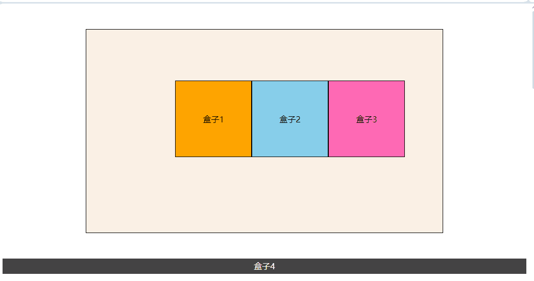
CSS定位的堆叠顺序
z-index属性
CSS为盒模型的布局提供了三种不同的定位方案
- 正常文档流
- 浮动
- 定位
我们已经知道
绝对定位会把元素从正常的文档流中完全一走,它最终的落脚点将取决于我们的开发者,通过设置top \ right \ bottom \ left的值,我们可以在二维空间中对元素进行定位,但CSS同时也允许我们使用z-index属性,把它放置在三维空间中。三维空间:
x轴代表水平方向,y轴代表垂直方向。z轴则表示我们的目光向页面或屏幕看进去的时候,各元素的布局情况,由于屏幕是一块二维平面,我们实际上并没有真的看到z轴,更多的时候我们是通过透视的形式,当多个元素共享同一块二维平面时,有的元素在上面,有的元素在下面,由此我们感受到了z轴的存在。为了决定某个元素在
z轴方向的位置,CSS允许我们为z-index设定一个整数值,它可以是一个正整数,负整数,或者是0,值越大元素就离我们“越近”,值越小,元素自然就离我们“越远”。如果两个元素定位之后共享同一块二维空间,那么在这块空间中
z-index值越大的元素,将可能覆盖z-index值较小的元素。


默认情况下,子容器覆盖了父容器,兄弟容器根据
html书写顺序对应,后面的覆盖前面的。
<!DOCTYPE html>
<html lang="en">
    <head>
        <meta charset="UTF-8" />
        <meta name="viewport" content="width=device-width, initial-scale=1.0" />
        <title>Document</title>
        <link rel="stylesheet" href="style.css" />
    </head>
    <body>
        <div class="one">
            盒子1
            <div class="two">盒子2</div>
            <div class="three">盒子3</div>
        </div>
    </body>
</html>
* {
    box-sizing: border-box;
}

body, html {
    height: 100%;
}

body {
    margin: 0;
}

div {
    width: 200px;
    height: 200px;
    padding: 20px;
}

.one, .two, .three, .four {
    position: absolute;
    outline: 5px solid #000;
}

.one {
    background-color: #f00;
    top: 100px;
    left: 200px;
}

.two {
    background-color: #0f0;
    top: 50px;
    left: 75px;
}

.three {
    background-color: #0ff;
    top: 125px;
    left: 25px;
}

设置
z-index属性,并且跳转三个盒子的顺序,没用列出的代码表示没用修改。即便前端页面的
box2和box3顺序发生了修改,但是由于使用了z-index,所以位置根据z-index来决定了
<body>
    <div class="one">
        盒子1
        <div class="three">盒子3</div>
        <div class="two">盒子2</div>
    </div>
</body>
.one {
    background-color: #f00;
    top: 100px;
    left: 200px;
    z-index: 10;
}

.two {
    background-color: #0f0;
    top: 50px;
    left: 75px;
    z-index: 100;
}

.three {
    background-color: #0ff;
    top: 125px;
    left: 25px;
    z-index: 150;
}
1
<!DOCTYPE html>
<html lang="en">
    <head>
        <meta charset="UTF-8" />
        <meta name="viewport" content="width=device-width, initial-scale=1.0" />
        <title>Document</title>
        <link rel="stylesheet" href="style.css" />
    </head>
    <body>
        <div class="one">
            盒子1
            <div class="three">盒子3</div>
            <div class="two">盒子2</div>
        </div>
        <div class="four">盒子4</div>
    </body>
</html>
* {
    box-sizing: border-box;
}

body, html {
    height: 100%;
}

body {
    margin: 0;
}

div {
    width: 200px;
    height: 200px;
    padding: 20px;
}

.one, .two, .three, .four {
    position: absolute;
    outline: 5px solid #000;
}

.one {
    background-color: #f00;
    top: 100px;
    left: 200px;
    /* 值最小,还是在最底部 */
    z-index: 10;
}

.two {
    background-color: #0f0;
    top: 50px;
    left: 75px;
    /* 中间位置 */
    z-index: 100;
}

.three {
    background-color: #0ff;
    top: 125px;
    left: 25px;
    /* 值最大,最顶部 */
    z-index: 150;
}

.four {
    background-color: #00f;
    outline: 5px solid tomato;
    top: 200px;
    left: 350px;
    /* 盒子1和盒子4是兄弟标签 */
    z-index: 50;
}

结论
容器的堆叠顺序的计算,是先比较同级容器的。子容器是不会超出父容器的堆叠顺序的。
举个栗子:两张桌子,一张在一层,一张在地下室,一层的桌子上面放了10本书,地下室的桌子放了30本数,地下室的桌子上无论放了多少本书,也不可能超过第一层桌子上书的高度。

 浙公网安备 33010602011771号