spc
<div id="myDiv" style="width: 600px"></div>
<script src="../plugins/d3.3.5.17.min.js"></script>
<script src="../plugins/plotly.min.js"></script>
<script>
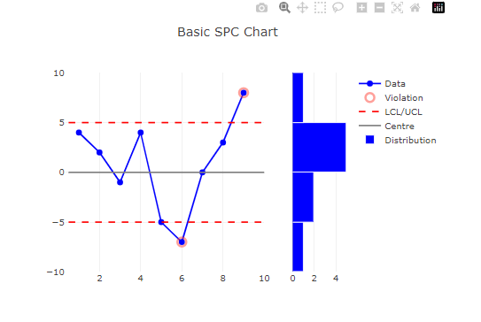
var Data = {
type: "scatter",
x: [1, 2, 3, 4, 5, 6, 7, 8, 9],
y: [4, 2, -1, 4, -5, -7, 0, 3, 8],
mode: "lines+markers",
name: "Data",
showlegend: true,
hoverinfo: "all",
line: {
color: "blue",
width: 2,
},
marker: {
color: "blue",
size: 8,
symbol: "circle",
},
};
var Viol = {
type: "scatter",
x: [6, 9],
y: [-7, 8],
mode: "markers",
name: "Violation",
showlegend: true,
marker: {
color: "rgb(255,65,54)",
line: { width: 3 },
opacity: 0.5,
size: 12,
symbol: "circle-open",
},
};
var CL = {
type: "scatter",
x: [0.5, 10, null, 0.5, 10],
y: [-5, -5, null, 5, 5],
mode: "lines",
name: "LCL/UCL",
showlegend: true,
line: {
color: "red",
width: 2,
dash: "dash",
},
};
var Centre = {
type: "scatter",
x: [0.5, 10],
y: [0, 0],
mode: "lines",
name: "Centre",
showlegend: true,
line: {
color: "grey",
width: 2,
},
};
var histo = {
type: "histogram",
x: [1, 2, 3, 4, 5, 6, 7, 8, 9],
y: [4, 2, -1, 4, -5, -7, 0, 3, 8],
name: "Distribution",
orientation: "h",
marker: {
color: "blue",
line: {
color: "white",
width: 1,
},
},
xaxis: "x2",
yaxis: "y2",
};
var data = [Data, Viol, CL, Centre, histo];
// layout
var layout = {
title: "Basic SPC Chart",
xaxis: {
domain: [0, 0.7], // 0 to 70% of width
zeroline: false,
},
yaxis: {
range: [-10, 10],
zeroline: false,
},
xaxis2: {
domain: [0.8, 1], // 70 to 100% of width
},
yaxis2: {
anchor: "x2",
showticklabels: false,
},
};
Plotly.newPlot("myDiv", data, layout);
</script>
![]()
hover
<div id="myDiv" style="width: 600px"></div>
<div id="myDiv1" style="width: 600px"></div>
<div id="myDiv2" style="width: 600px"></div>

<script src="../plugins/d3.3.5.17.min.js"></script>
<script src="../plugins/plotly.min.js"></script>
<script>
  var data = [
    {
      x: [0, 0.5, 1, 1.5, 2],
      y: [1, 3, 2, 4, 2],
      mode: "markers",
      marker: { size: 16 },
      text: ["Text A", "Text B", "Text C", "Text D", "Text E"],
      type: "scatter",
    },
  ];
  var layout = { title: "Hover over the points to see the text" };
  Plotly.newPlot("myDiv", data, layout);
</script>

<script>
  var N = 40,
    x = d3.range(N).map(d3.random.normal()),
    y1 = d3.range(N).map(d3.random.normal()),
    y2 = d3.range(N).map(d3.random.normal()),
    data = [
      { x: x, y: y1, type: "scatter", mode: "markers", marker: { color: "rgba(200, 50, 100, .7)", size: 16 }, hoverinfo: "x+y" },
      { x: x, y: y2, type: "scatter", mode: "markers", marker: { color: "rgba(10, 180, 180, .8)", size: 16 }, hoverinfo: "x+y" },
    ];
  layout = {
    hovermode: "closest",
    title: "Formatting X & Y Hover Values",
    xaxis: { zeroline: false, hoverformat: ".2f", title: "Rounded: 2 values after the decimal point on hover" },
    yaxis: { zeroline: false, hoverformat: ".2r", title: "Rounded: 2 significant values on hover" },
  };

  Plotly.newPlot("myDiv1", data, layout);
</script>
<script>
  var data = [
    {
      type: "scatter",
      mode: "lines+markers",
      x: [1, 2, 3, 4, 5],
      y: [2.02825, 1.63728, 6.83839, 4.8485, 4.73463],
      hovertemplate: "<i>Price</i>: $%{y:.2f}" + "<br><b>X</b>: %{x}<br>" + "<b>%{text}</b>",
      text: ["Text A", "Text B", "Text C", "Text D", "Text E"],
      showlegend: false,
    },
    {
      x: [1, 2, 3, 4, 5],
      y: [3.02825, 2.63728, 4.83839, 3.8485, 1.73463],
      hovertemplate: "Price: %{y:$.2f}<extra></extra>",
      showlegend: false,
    },
  ];

  var layout = {
    title: "Set hover text with hovertemplate",
  };

  Plotly.newPlot("myDiv2", data, layout);
</script>
![]()
shapes
<div id="myDiv2" style="width: 600px"></div>
<div id="myDiv3" style="width: 600px"></div>
<div id="myDiv4" style="width: 600px"></div>
<script src="../plugins/d3.3.5.17.min.js"></script>
<script src="../plugins/plotly.min.js"></script>

<script>
  var trace1 = {
    x: ["a0", "a1", "a2", "a3", "a4"],
    y: [1, 5, 3, 7, 5],
    mode: "lines+markers",
    type: "scatter",
    line: { color: "#17BECF" },
    marker: {
      color: "#C8A2C8",
      line: {
        width: 2.5,
      },
    },
  };

  var trace2 = {
    x: ["a1", "a2", "a3", "a4", "a5"],
    y: [4, 0, 4, 6, 8],
    mode: "lines+markers",
    type: "scatter",
  };

  var trace3 = {
    type: "scatter",
    x: ["a0", "a5", null, "a0", "a5", null, "a0", "a5"],
    y: [1, 1, null, 4, 4, null, 6, 6],
    mode: "lines",
    name: "LCL/UCL",
    showlegend: true,
    line: {
      color: "red",
      width: 2,
      dash: "dash",
    },
  };

  var data = [trace1, trace2, trace3];

  layout2 = {
    title: "plot",
  };
  Plotly.newPlot("myDiv2", data, layout2, { modeBarButtonsToRemove: ["pan2d", "select2d", "lasso2d"], displaylogo: false });
</script>
<script>
  var trace1 = {
    x: ["a0", "a1", "a2", "a3", "a4"],
    y: [1, 5, 3, 7, 5],
    mode: "lines+markers",
    type: "scatter",
    line: { color: "#17BECF" },
    marker: {
      color: "#C8A2C8",
      line: {
        width: 2.5,
      },
    },
  };

  var trace2 = {
    x: ["a1", "a2", "a3", "a4", "a5"],
    y: [4, 0, 4, 6, 8],
    mode: "lines+markers",
    type: "scatter",
  };

  var data = [trace1, trace2];

  layout2 = {
    title: "plot",
    yaxis: {
      zeroline: true,
      visible: true,
    },
    xaxis: {
      zeroline: true,
      visible: true,
    },
    shapes: [
      {
        type: "line",
        yref: "y",
        xref: "paper",
        x0: 0,
        y0: 1,
        x1: 1,
        y1: 1,
        line: {
          color: "red",
          dash: "dot",
          width: 1,
        },
      },
      {
        type: "line",
        yref: "y",
        xref: "paper",
        x0: 0,
        y0: 3,
        x1: 1,
        y1: 3,
        line: {
          color: "red",
          dash: "dot",
          width: 1,
        },
      },
      ,
      {
        type: "line",
        yref: "y",
        xref: "paper",
        x0: 0,
        y0: 5,
        x1: 1,
        y1: 5,
        line: {
          color: "red",
          dash: "dot",
          width: 1,
        },
      },
    ],
    annotations: [
      {
        xref: "paper",
        yref: "y",
        x: 1,
        xanchor: "left",
        y: 5,
        yanchor: "middle",
        text: "bmax",
        showarrow: false,
      },
      {
        xref: "paper",
        yref: "y",
        x: 1,
        xanchor: "left",
        y: 3,
        yanchor: "middle",
        text: "sval",
        showarrow: false,
      },
      {
        xref: "paper",
        yref: "y",
        x: 1,
        xanchor: "left",
        y: 1,
        yanchor: "middle",
        text: "bmin",
        showarrow: false,
      },
    ],
  };
  Plotly.newPlot("myDiv3", data, layout2, { modeBarButtonsToRemove: ["pan2d", "select2d", "lasso2d"], displaylogo: false });
</script>

<script>
  var trace1 = {
    x: ["a1"],
    y: [4],
    mode: "lines+markers",
    type: "scatter",
  };

  var trace2 = {
    type: "scatter",
    x: ["a1"],
    y: [1],
    mode: "lines",
    name: "LCL/UCL",
    showlegend: true,
    line: {
      color: "red",
      width: 1,
      dash: "dash",
    },
  };

  var data = [trace1];

  layout2 = {
    title: "plot",
    yaxis: {
      zeroline: true,
      visible: true,
    },
    xaxis: {
      zeroline: true,
      visible: true,
    },
    shapes: [
      {
        type: "line",
        yref: "y",
        xref: "paper",
        x0: 0,
        y0: 5,
        x1: 1,
        y1: 5,
        line: {
          color: "red",
          dash: "dot",
          width: 1,
        },
      },
    ],
    annotations: [
      {
        xref: "paper",
        yref: "y",
        x: 1,
        xanchor: "left",
        y: 5,
        yanchor: "middle",
        text: "bmax",
        showarrow: false,
      },
    ],
  };
  Plotly.newPlot("myDiv4", data, layout2, { modeBarButtonsToRemove: ["pan2d", "select2d", "lasso2d"], displaylogo: false });
</script>
![]()


 浙公网安备 33010602011771号