matplotlib绘图表(Python)
在Python中,matplotlib是最著名的绘图库,它支持几乎所有2D绘图和部分3D绘图,被广泛应用在科学计算和数据可视化领域。
一、柱状图
import csv
import matplotlib.pyplot as plt
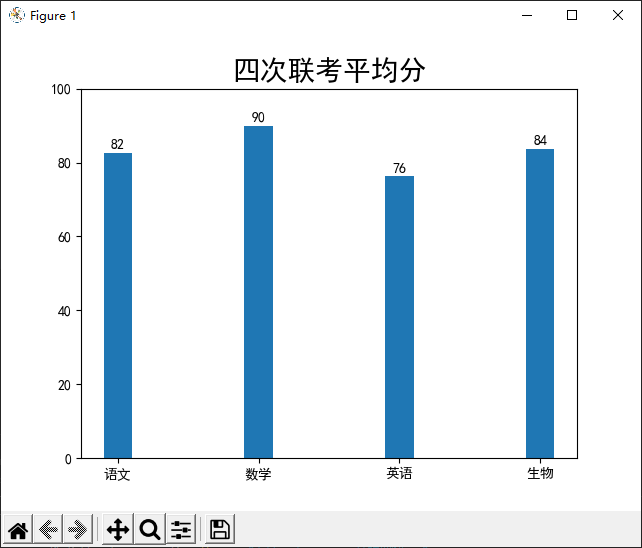
subject = ["语文","数学","英语","生物"]
score_first = [75, 90, 70, 77]
score_second = [80, 90, 80, 80]
score_third = [85, 90, 75, 88]
score_fourth = [90, 90, 80, 90]
# 写数据
with open ("test.csv", 'w', encoding="utf8", newline="") as f:
# 基于文件对象构建csv写入对象
csv_write = csv.writer(f)
# 逐行写入
csv_write.writerow(subject)
csv_write.writerow (score_first)
csv_write.writerow (score_second)
csv_write.writerow (score_third)
csv_write.writerow (score_fourth)
# 读数据
with open ("test.csv", 'r', encoding="utf8", newline="") as f:
# 基于文件对象构建读取对象
csv_read = csv.reader(f)
# 逐行读取
data = []
for row in csv_read:
data.append(row)
# 计算各科目平均分
sumlist = []
for i in range (0,4):
sum = 0
for j in range (1, 5):
#print (j,i)
sum = sum + int (data[j][i])
sumlist.append(sum/4)
# 画图
x_axis_data = data[0]
y_axis_data = sumlist
# y_axis_data加标签数据
for x, y in zip(x_axis_data, y_axis_data):
plt.text(x, y+0.5, '%.00f' % y, ha='center', va='bottom', fontsize=10)
# 画柱状图
plt.bar(x_axis_data, y_axis_data, width=0.2)
# 设置y轴范围
plt.ylim([0, 100])
# 设置matplotlib显示中文
plt.rcParams['font.sans-serif'] = ['SimHei']
# 设置柱状图标题
plt.title("四次联考平均分", fontsize=20)
# 显示柱状图
plt.show()
二、折线图
import csv
from turtle import color
import matplotlib.pyplot as plt
import numpy as np


subject = ["语文","数学","英语","生物","物理","化学"]
score_first = [65, 70, 80, 85, 77, 65]
score_second = [70, 75, 85, 90, 84, 94]
score_third = [80, 60, 75, 88, 67, 55]
score_fourth = [90, 65, 77, 95, 63, 88]

# 写数据
with open ("test.csv", 'w', encoding="utf8", newline="") as f:
    # 基于文件对象构建csv写入对象
    csv_write = csv.writer(f)
    # 逐行写入
    csv_write.writerow(subject)
    csv_write.writerow (score_first)
    csv_write.writerow (score_second)
    csv_write.writerow (score_third)
    csv_write.writerow (score_fourth)

# 读数据
with open ("test.csv", 'r', encoding="utf8", newline="") as f:
    # 基于文件对象构建读取对象
    csv_read = csv.reader(f)
    # 逐行读取
    data = []
    for row in csv_read:
        data.append(row)

# 已知数据
x_axis_data = data[0]
y_axis_data1 = [int(x)  for x in data[1]]
y_axis_data2 = [int(x)  for x in data[2]]
y_axis_data3 = [int(x)  for x in data[3]]
y_axis_data4 = [int(x)  for x in data[4]]

# 设置图片大小
plt.figure (figsize=(12, 8), dpi=90)
# 设置matplotlib显示中文
plt.rcParams['font.sans-serif'] = ['SimHei']

# 画折线图
plt.plot(x_axis_data, y_axis_data1, color='r', linestyle='--', label="第一次联考")
plt.scatter (x_axis_data, y_axis_data1, color='r')
plt.plot(x_axis_data, y_axis_data2, color='b', linestyle='--', label="第二次联考")
plt.scatter (x_axis_data, y_axis_data2, color='b')
plt.plot(x_axis_data, y_axis_data3, color='g', linestyle='--', label="第三次联考")
plt.scatter (x_axis_data, y_axis_data3, color='g')
plt.plot(x_axis_data, y_axis_data4, color='y', linestyle='--', label="第四次联考")
plt.scatter (x_axis_data, y_axis_data4, color='y')

# 设置y轴范围
plt.ylim(0, 100)
# 设置图例字体大小
plt.legend(fontsize=15)
# 显示网格
plt.grid (alpha=0.2)

# 设置柱状图标题
plt.title("四次联考平均分", fontsize=20)
# 显示柱状图
plt.show()

三、散点图
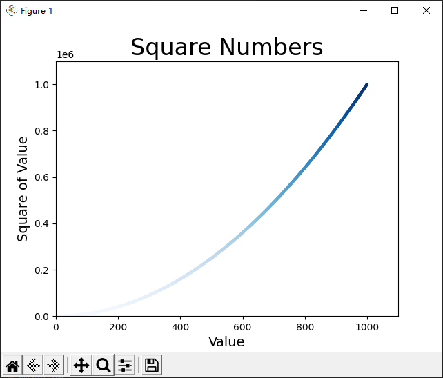
import matplotlib.pyplot as plt
x_values = list(range(1, 1001))
y_values = [x**2 for x in x_values]
plt.scatter(x_values, y_values,c=y_values, cmap=plt.cm.Blues ,edgecolors='none', s=10)
# 设置图表标题并给坐标加上标签
plt.title("Square Numbers", fontsize=24)
plt.xlabel("Value", fontsize=14)
plt.ylabel("Square of Value", fontsize=14)
# 设置每个坐标的取值范围
plt.axis([0, 1100, 0, 1100000])
plt.show()

 浙公网安备 33010602011771号