元素居中方式
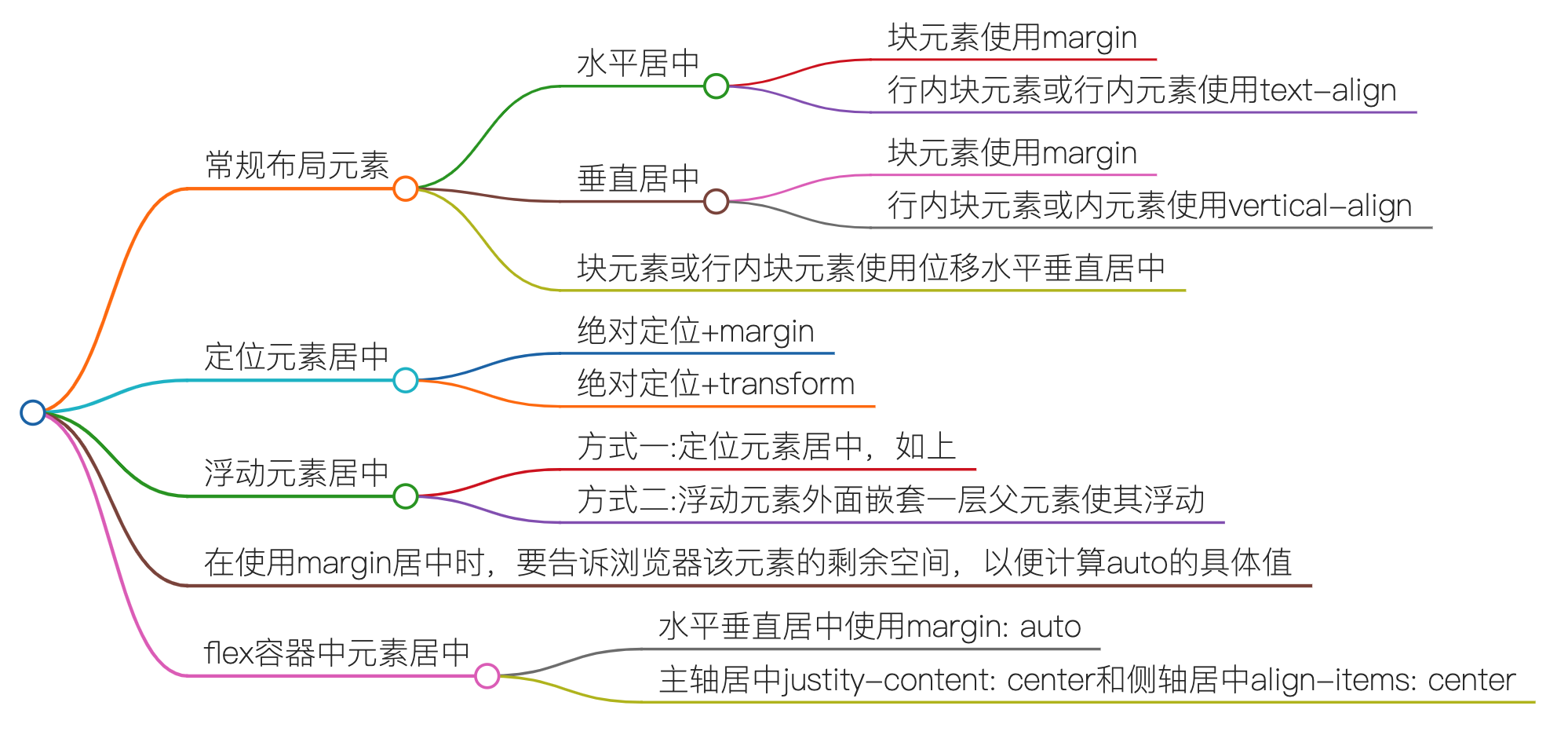
常规布局元素
水平居中
块元素使用margin
1.设置元素的margin: 0 auto;
2.在使用margin: 0 auto时需要指定该元素的width;
行内块元素或行内元素使用text-align
设置父元素的text-align: center;
垂直居中
块元素使用margin
1.设置父元素overflow: hidden;消除子元素margin塌陷;
2.设置元素的margin-top: 值px; 值: (父元素content高度 - 元素盒子总高度) / 2;
行内块元素或内元素使用vertical-align
1.设置父元素的line-height: 父元素高度;
2.对该元素以及该元素的所有兄弟元素设置vertical-align: middle;
3.绝对居中: 设置父元素的font-size: 0px;(补充),然后再对子元素单独设置字体大小;
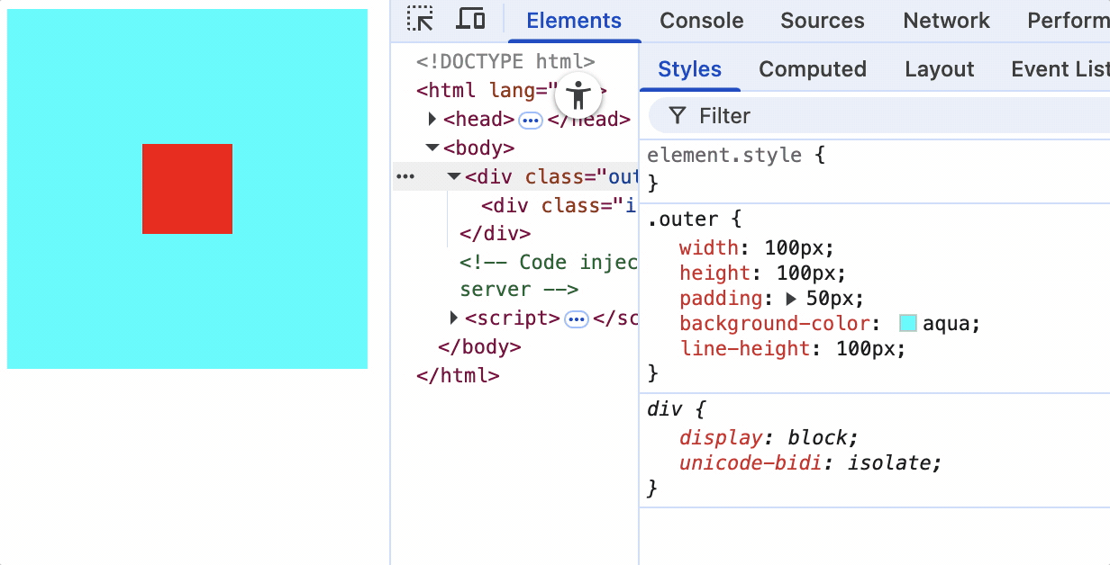
块元素或行内块元素使用位移水平垂直居中
水平位移: (父元素content宽度 - 元素盒子总宽度) / 2
垂直位移: (父元素content高度 - 元素盒子总高度) / 2
<style>
    .outer {
        width: 100px;
        height: 100px;
        padding: 50px;
        background-color: aqua;
        line-height: 100px;
    }
    .inner {
        width: 50px;
        height: 50px;
        background-color: red;
        /* 水平位移: (父元素content宽度 - 元素盒子总宽度) / 2
        垂直位移: (父元素content高度 - 元素盒子总高度) / 2 */
        transform: translate(25px, 25px);
    }
</style>
<div class="outer">
    <div class="inner"></div>
</div>
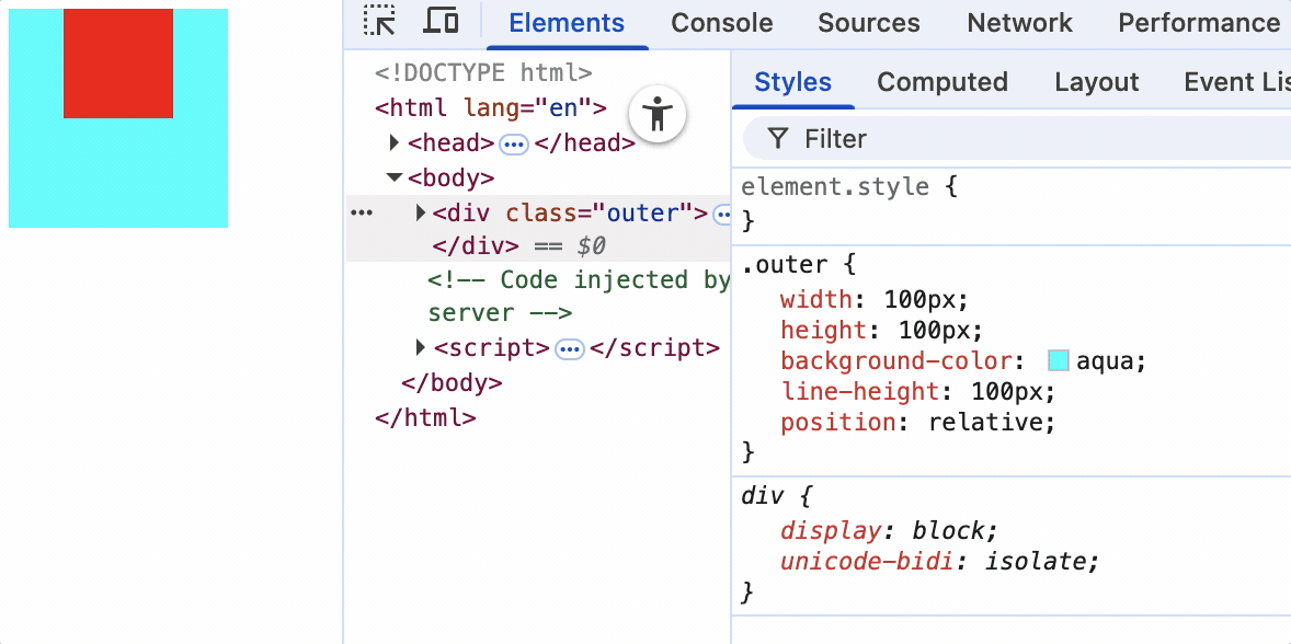
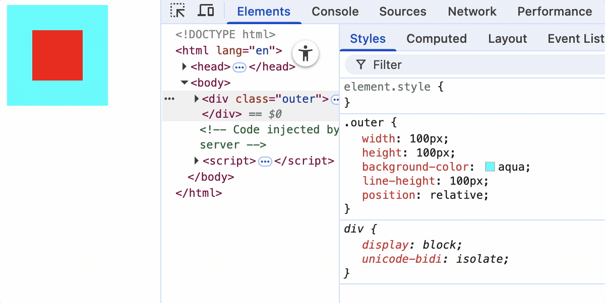
定位元素居中
元素定位后设置位置距离使其居中,该定位元素可以是浮动元素。
绝对定位+margin
<style>
    .outer {
        width: 100px;
        height: 100px;
        background-color: aqua;
        line-height: 100px;
        position: relative;
    }
    .inner {
        width: 50px;
        height: 50px;
        background-color: red;
        float: left;
        position: absolute;
        left: 0;
        right: 0;
        top: 0;
        bottom: 0;
        margin: auto;
    }
</style>
<div class="outer">
    <div class="inner"></div>
</div>
1.设置父元素的position: relative;
2.元素设置position: absolute;
3.设置元素的left: 0; right: 0; top: 0; bottom: 0;
4.设置元素的margin: auto;
绝对定位+transform
<style>
    .out {
        width: 200px;
        height: 200px;
        background-color: #ccc;
        border: 1px solid #000;
        position: relative;
        padding: 50px;
    }
    .inner {
        width: 150px;
        height: 150px;
        background-color: aqua;
        position: absolute;
        top: 50%;
        left: 50%;
        transform: translate(-50%, -50%);
    }
</style>
<div class="out">
    <div class="inner"></div>
</div>
1.设置父元素的position: relative;
2.设置元素的position: absolute;
3.设置元素的top: 50%; left: 50%;
4.设置元素位移transform: translate(-50%, -50%);
浮动元素居中
方式一:定位元素居中,如上
方式二:浮动元素外面嵌套一层父元素使其浮动
<style>
    .outer {
        width: 300px;
        height: 300px;
        background-color: aqua;
    }
    .inner1 {
        width: 100px;
        height: 100px;
        line-height: 100px;
        background-color: red;
        display: inline-block;
        vertical-align: middle;
    }
    .inner2 {
        width: 100px;
        height: 100px;
        background-color: green;
    }
    .nest {
        float: left;
        width: 300px;
        height: 300px;
        line-height: 300px;
        text-align: center;
    }
</style>
<div class="outer">
    <!-- 嵌套一层父元素,使之成为浮动元素 -->
    <div class="nest">
        <div class="inner1">盒子1-块元素</div>
    </div>
</div>
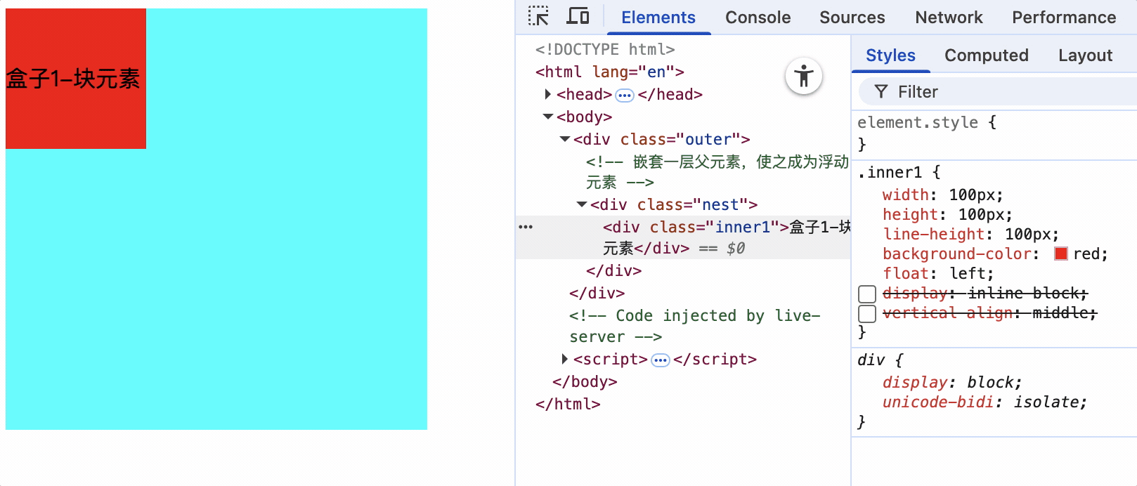
1.去掉元素浮动,嵌套一层父元素,使父元素浮动
2.设置元素为行内块元素
3.父元素设置line-height: 父元素高度;,使元素垂直居中
4.父元素设置text-align: center;,使元素水平居中
在使用margin居中时,要告诉浏览器该元素的剩余空间,以便计算auto的具体值
文章: https://www.cnblogs.com/can1606/p/18805983
标题: margin: auto不能垂直居中,在绝对定位或flex容器中可以垂直居中,他们有什么区别
定位改标题查看原因
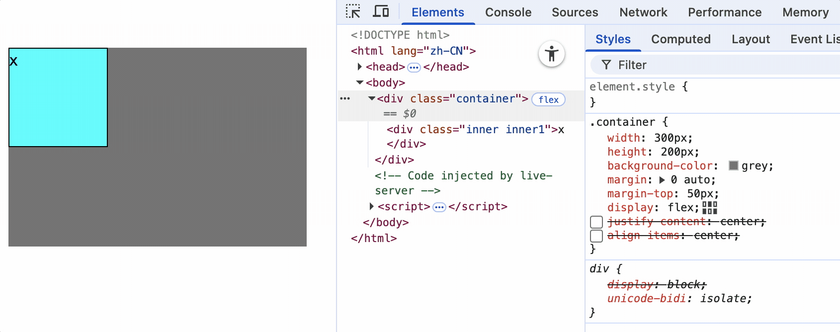
flex容器中元素居中
水平垂直居中使用margin: auto
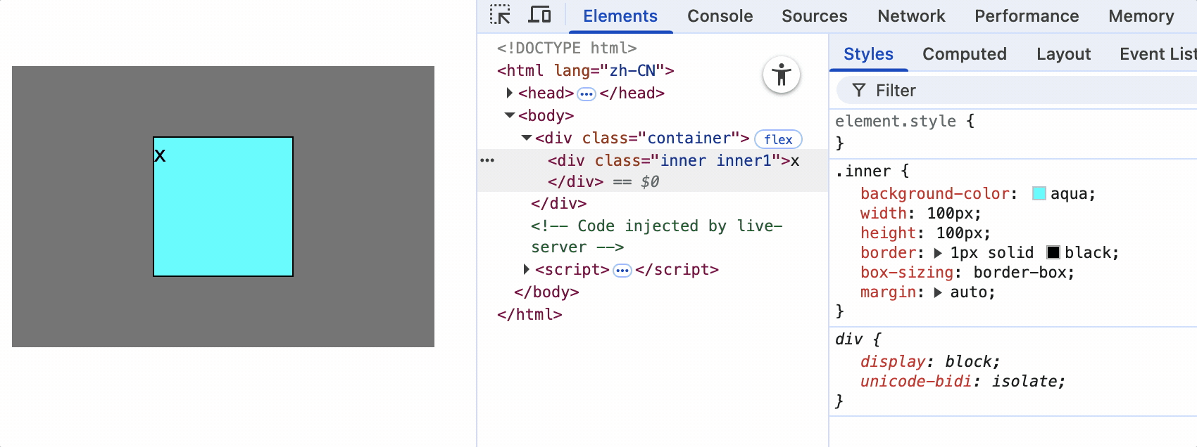
主轴居中justity-content: center和侧轴居中align-items: center

 浙公网安备 33010602011771号