CSS基础
- 浏览器和CSS规范
- 网页icon图标
- 外部引入样式方式
- 样式表的优先级
- 选择器
- 选择器的优先级
- CSS三大特性
- 像素
- 颜色
- 字体样式
- 文本属性
- 列表相关属性
- 表格相关属性
- 背景相关属性
- 鼠标相关属性
- 盒模型
- 浮动float
- 定位
- 相对定位
- 相对定位特点
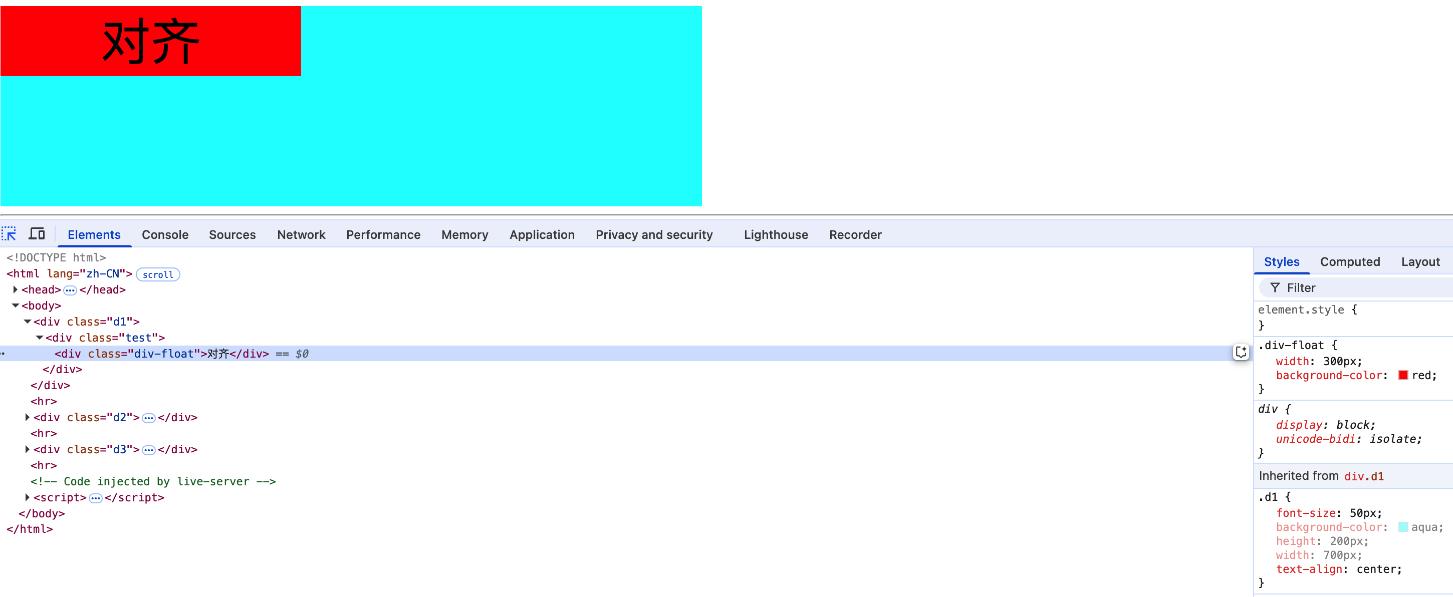
- 1.相对定位的元素是指,相对于它没有相对定位时的位置,如上图设置绿色容器相对定位,并且距离左侧为100px,即相对于它之前的位置向右移动了100px。
- 2.相对定位并没有脱离文档流,相对定位的空间仍在占据着文档流,不会越过父元素padding。如上3D图,即使left距离超过了200px,橙色div也不会顶上去。不会对其他元素产生影响。
- 3.开启相对定位的元素,层级要比普通元素要高,但无论相对定位还是绝对定位,他们的显示层级优先级都是一样的,哪个元素后写的,就会覆盖先写的元素。
- 4.left和right不能一起设置,如果都设置left生效。top和bottom不能一起设置,如果都设置top生效。
- 5.相对定位的元素也能浮动,但不推荐这样做。
- 6.相对定位的元素,也能通过margin调整位置,但不推荐这样做。
- 使用场景
- 相对定位特点
- 绝对定位
- 固定定位
- 粘性定位
- 定位层级
- 子元素定位可以越过父元素的padding
- 相对定位百分比
- 绝对定位百分比
- 定位的特殊应用
- 相对定位
- 绝对定位和浮动对比
- 布局
浏览器和CSS规范
浏览器发展史
1990年 - 1993年:早期浏览器
WorldWideWeb:由Tim Berners-Lee在1990年创建,这是第一个网页浏览器,后来更名为Nexus。
Mosaic:1993年由NCSA(美国国家超级计算机应用中心)开发,是第一个广泛使用的图形化浏览器,对互联网的普及起到了重要作用。
1994年 - 1998年:浏览器大战
Netscape Navigator:1994年推出,迅速成为最流行的浏览器。
Internet Explorer:1995年微软推出,凭借Windows操作系统的捆绑销售,逐渐超越Netscape Navigator,成为市场主导者。
1999年 - 2004年:多浏览器竞争
Opera:1996年推出,以其轻量级和创新功能著称。
Mozilla Firefox:2002年作为Mozilla项目的分支开始开发,2004年正式发布,迅速获得用户青睐。
2005年 - 2010年:现代浏览器时代
Google Chrome:2008年推出,凭借其速度快、稳定性高和扩展性强的特点,迅速成为主流浏览器之一。
Safari:2003年由苹果公司推出,主要在Mac和iOS设备上使用。
2011年至今:移动互联网时代
移动浏览器:随着智能手机和平板电脑的普及,各大浏览器厂商纷纷推出移动版本,如Chrome for Android、Safari for iOS等。
新兴浏览器:如Microsoft Edge(2015年推出,取代Internet Explorer)、Brave(2016年推出,注重隐私保护)等。
CSS发展史
1994年 - 1996年:CSS的诞生
Håkon Wium Lie:1994年提出CSS的概念,旨在解决HTML中样式和结构混杂的问题。
W3C:1996年,W3C发布了CSS1规范,定义了基本的样式规则。
1997年 - 2000年:CSS1和CSS2
CSS1:1996年发布,支持基本的文本和布局样式。
CSS2:1998年发布,增加了更复杂的布局功能,如定位、浮动、表格布局等。
2001年 - 2007年:CSS2.1和CSS3模块化
CSS2.1:2004年发布,对CSS2进行了修订和优化,解决了许多兼容性和实现问题。
CSS3:2001年开始开发,采用模块化设计,每个模块独立发展,包括选择器、背景和边框、动画、媒体查询等。
2008年 - 2015年:CSS3的广泛支持
浏览器支持:各大浏览器逐渐增加对CSS3新特性的支持,如圆角、阴影、渐变、动画等。
响应式设计:2010年左右,随着移动设备的普及,响应式设计成为主流,CSS3的媒体查询和弹性布局(Flexbox)等特性发挥了重要作用。
2016年至今:CSS4和未来趋势
CSS4:虽然没有正式命名,但CSS4特指CSS3之后的新模块,如变量、网格布局(Grid Layout)、容器查询等。
未来趋势:CSS继续向更强大的布局和动画功能发展,同时注重性能优化和跨平台兼容性。
浏览器和CSS的发展相辅相成,从最初的简单文本显示到现在的复杂交互和动态效果,它们共同推动了互联网技术的进步。未来,随着新技术的不断涌现,浏览器和CSS将继续演进,为用户提供更加丰富和流畅的网络体验。
网页icon图标
使用vscode的lessserver插件,自动引入favicon图标。
配置网页的cion图标
在网站根目录下放置 favicon.ico 文件,浏览器在加载网页的时候会自动加载的。这个图片只能是 ico 格式,并且只能叫这个名字
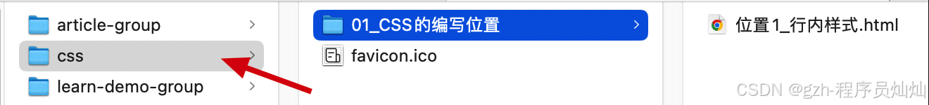
如: css项目的根目录下
刷新网站没有生效,需要强制刷新,shift + 刷新
使用link标签引入
<link rel="shortcut icon" href="../favicon.ico" type="image/x-icon">
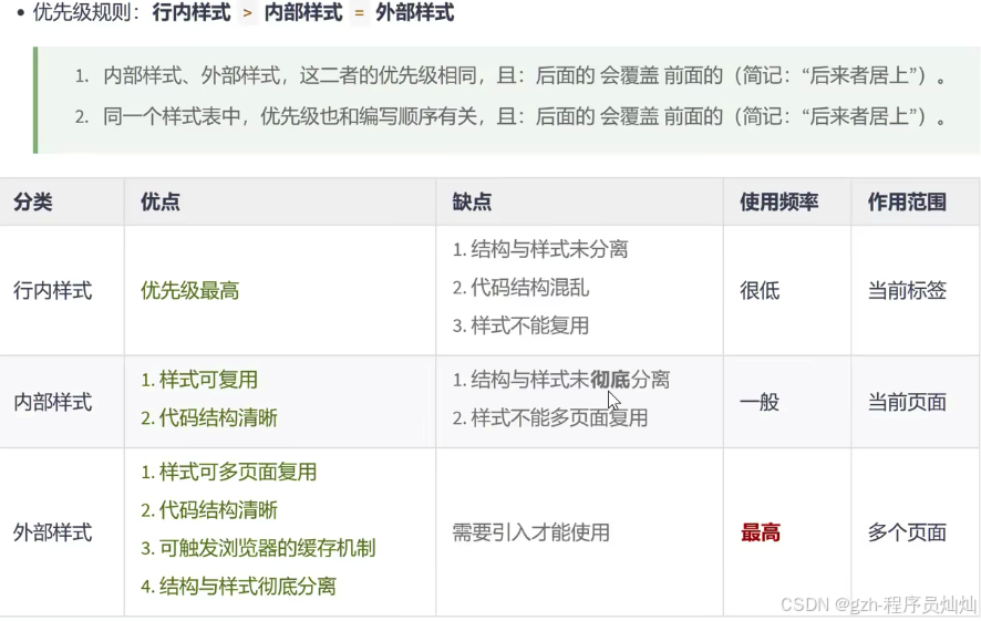
外部引入样式方式
<head>
    <meta charset="UTF-8">
    <title>Document</title>
    <!-- rel: 指定引入文件和当前html的关系类型,如果不指定有些浏览器则不识别 -->
    <link rel="stylesheet" href="./position.css">
</head>
position.css
img {
    width: 100px;
    height: 100px;
}
优势:样式复用,html结构清晰,可触发浏览器缓存提高加载css速度
样式表的优先级
样式优先级: 行内样式 > 内部样式 = 外部样式,内部样式和外部样式按照加载顺序覆盖(后来者居上)
选择器
基本选择器
通配选择器
<head>
<meta charset="UTF-8">
<title>Document</title>
<style>
* {
color: red;
}
</style>
</head>
<body>
<h1>与天奋斗,与地奋斗,与人奋斗,其乐无穷</h1>
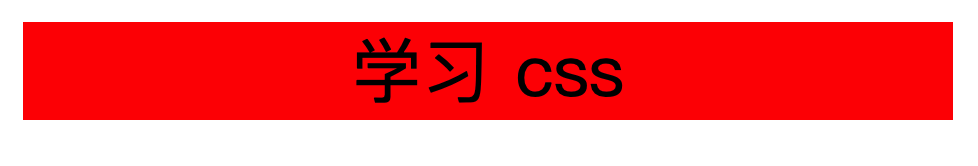
<p>学习CSS</p>
</body>
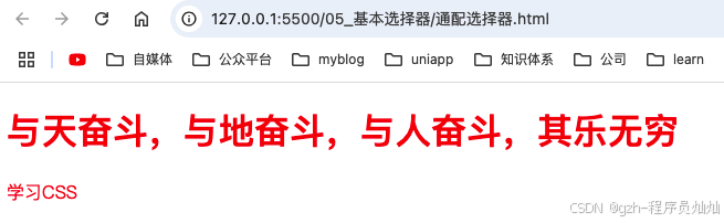
使用场景:可使用通配符选择器清除样式
元素选择器
<style>
    p {
        color: blue;
    }
</style>
对p标签设置样式,选中了所有的p标签,无法差异化设置样式,
类选择器
<!DOCTYPE html>
<html lang="en">

<head>
    <meta charset="UTF-8">
    <title>Document</title>
    <style>
        .title {
            color: blue;
        }

        .size {
            font-size: 80px;
        }

        .custom-position {
            text-align: center;
        }
    </style>

</head>

<body>
    <p class="title size custom-position">学习CSS</p>
</body>

</html>
根据class名匹配元素,并为其添加样式。使用-用作名称单词连接,如custom-position
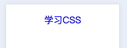
ID选择器
<!DOCTYPE html>
<html lang="en">

<head>
    <meta charset="UTF-8">
    <title>Document</title>
    <style>
        #color {
            color: blue;
        }
    </style>

</head>

<body>
    <p id="color">学习CSS</p>
</body>

</html>
注意:不能是数字开头,如1color,尽量以字母、数字、下划线、短杠(-)组成,不要包含空格,区分大小写
一个元素只能有一个ID属性
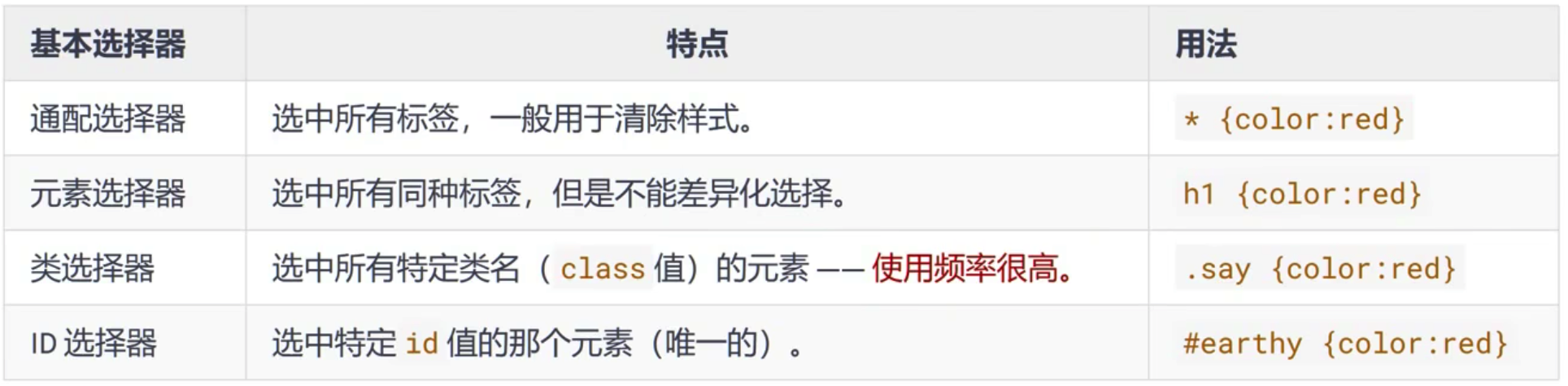
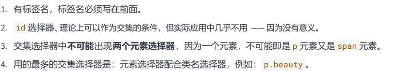
复合选择器
交集选择器
选中同时符合多个条件的元素,选择器之间没有空格,保持连续
语法: 选择器1选择器2...选择器n {}
<!DOCTYPE html>
<html lang="en">

<head>
    <meta charset="UTF-8">
    <title>Document</title>
    <style>
        p#size {
            font-size: 50px;
        }
        #size.color {
            color: red;
        }
    </style>

</head>

<body>
    <p id="size">学习CSS</p>
    <p class="color" id="size">id和类交集</p>
    <p class="color">学习CSS</p>
</body>

</html>
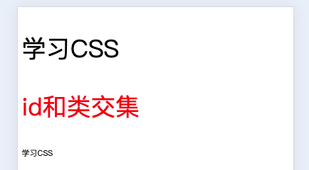
注意:交集标签最多包含一个元素标签,而且元素必须在开头紧跟着是ID选择器或者类选择器,如p#size
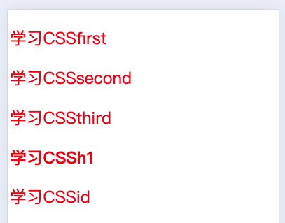
并集选择器
选中多个对应的元素,又称分组选择器
语法: 选择器1,选择器2...选择器n {}
逗号含义为 或
<!DOCTYPE html>
<html lang="en">

<head>
    <meta charset="UTF-8">
    <title>Document</title>
    <style>
        .first,
        .second,
        .third,
        h1,
        #id {
            color: red;
            font-size: 60px;
        }
    </style>

</head>

<body>
    <p class="first">学习CSSfirst</p>
    <p class="second">学习CSSsecond</p>
    <p class="third">学习CSSthird</p>
    <h1>学习CSSh1</h1>
    <p id="id">学习CSSid</p>
</body>

</html>
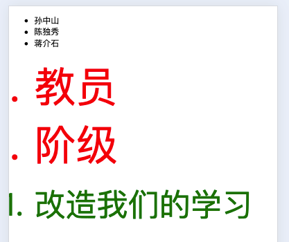
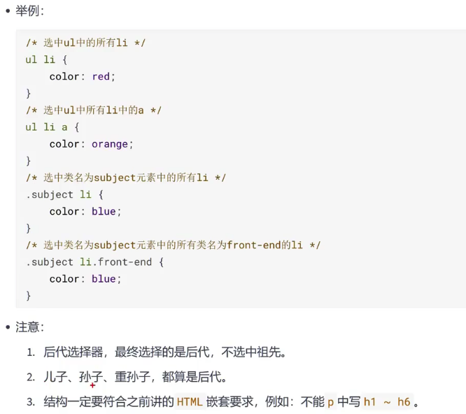
后代选择器
作用: 选中指定元素中,符合要求的后代元素
语法: 选择器1 选择器2 选择器2 ... 选择器n {}
选择器中的空格可以理解为 xxx中的,就是xxx的后代,选择器可以是任意类型的中的选择器,如ID选择器,class选择器,元素选择器,交集选择器,并集选择器
<!DOCTYPE html>
<html lang="en">

<head>
    <meta charset="UTF-8">
    <title>Document</title>
    <style>
        ol li {
            color: red;
            font-size: 80px;
        }

        .change li {
            color: green;
            font-size: 60px;
        }
    </style>

</head>

<body>
    <ul>
        <li>孙中山</li>
        <li>陈独秀</li>
        <li>蒋介石</li>
    </ul>
    <ol>
        <li>教员</li>
        <div>
            <li>阶级</li>
        </div>
    </ol>
    <ol class="change">
        <li>改造我们的学习</li>
    </ol>
</body>

</html>
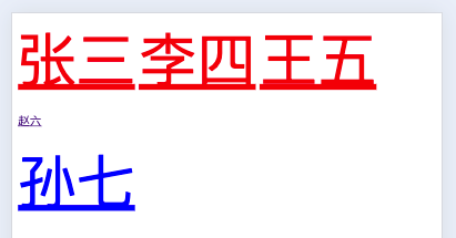
子代选择器
作用: 选中指定元素中,符合要求的子元素(儿子元素)
子代选择器又称子元素选择器或子选择器
>含义,可以理解为 xxx的子代。选择器可以是我们学过的任意一种
语法: 选择器1>选择器2>...选择器n {}
<!DOCTYPE html>
<html lang="en">

<head>
    <meta charset="UTF-8">
    <title>Document</title>
    <style>
        div>a {
            color: red;
            font-size: 80px;
        }

        .sun>a{
            color: blue;
            font-size: 80px;
        }
    </style>

</head>

<body>
    <div>
        <a href="">张三</a>
        <a href="">李四</a>
        <a href="">王五</a>
        <p>
            <a href="">赵六</a>
        <div class="sun">
            <a class="sun" href="">孙七</a>
        </div>
        </p>
    </div>
</body>

</html>
兄弟选择器
-
紧邻兄弟选择器: 选中指定元素后,符合条件的紧邻兄弟元素
所谓相邻就是紧挨着它的下一个元素,睡在我下铺的兄弟。相邻元素不是指定元素也不会选中 -
语法:
选择器1+选择器2 {} -
一般兄弟选择器: 选中指定元素后,符合条件的所有兄弟元素。睡在我下铺的所有兄弟。不相邻的兄弟元素只要是指定元素也会被选中
-
语法:
选择器1~选择器2 {}
<!DOCTYPE html>
<html lang="en">
<head>
<meta charset="UTF-8">
<title>Document</title>
<style>
/* 选中div后紧紧相邻的兄弟p元素,相邻兄弟选择器 */
div+p {
color: red;
font-size: 80px;
}
/* 选中div后所有的兄弟p元素,通用兄弟选择器 */
/* div~p {
color: red;
font-size: 80px;
} */
/* 选中li相邻的li标签,选中li标签,那么1,2,3都可以选中,相邻的li,就只有第2,3个li,因此只有2,3的li选中 */
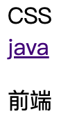
li+li {
color: blue;
font-size: 80px;
}
</style>
</head>
<body>
<p>java</p>
<div>CSS</div>
<p>前端</p>
<p>后端</p>
<ul>
<li>1</li>
<li>2</li>
<li>3</li>
</ul>
</body>
</html>
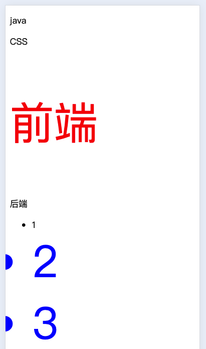
兄弟选择器: 不相邻的元素不会选中
<style>
  /* 选中div后紧紧相邻的兄弟p元素,相邻兄弟选择器 */
  div + p {
    color: red;
    font-size: 80px;
  }
</style>
<body>
  <div>CSS</div>
  <a href="">java</a>
  <p>前端</p>
</body>
一般兄弟选择器: 选中睡在我下铺的所有兄弟
<style>
  /* 选中div后紧紧相邻的兄弟p元素,相邻兄弟选择器 */
  div ~ p {
    color: red;
    font-size: 80px;
  }
</style>
<div>CSS</div>
<div>1</div>
<p>前端</p>
<div>
  <p>你好</p>
</div>
<p>2</p>
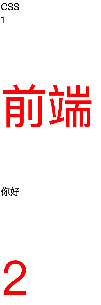
注意: 两种选择器选中的都是下面的兄弟元素。上面的元素不会选中
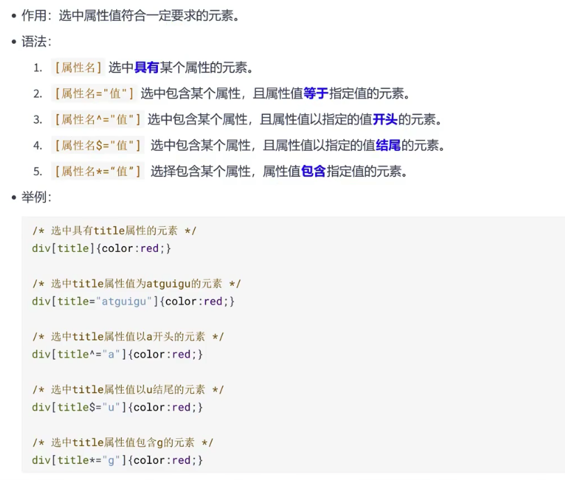
属性选择器
<!DOCTYPE html>
<html lang="en">
<head>
<meta charset="UTF-8">
<title>Document</title>
<style>
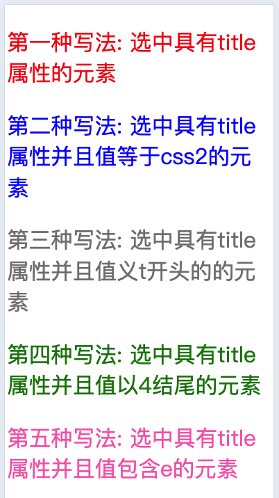
/* 第一种写法: 选中具有title属性的元素 */
[title] {
color: red;
font-size: 80px;
}
/* 第二种写法: 选中具有title属性并且值等于css2的元素 */
[title="css2"] {
color: blue;
font-size: 80px;
}
/* 第三种写法: 选中具有title属性并且值以t开头的的元素 */
[title^="t"] {
color: gray;
font-size: 80px;
}
/* 第四种写法: 选中具有title属性并且值以4结尾的元素 */
[title$="4"] {
color: green;
font-size: 80px;
}
/* 第五种写法: 选中具有title属性并且值包含e的元素 */
[title*="e"] {
color: hotpink;
font-size: 80px;
}
</style>
</head>
<body>
<p title="css1">第一种写法: 选中具有title属性的元素</p>
<p title="css2">第二种写法: 选中具有title属性并且值等于css2的元素</p>
<p title="tcss3">第三种写法: 选中具有title属性并且值义t开头的的元素</p>
<p title="css4">第四种写法: 选中具有title属性并且值以4结尾的元素</p>
<p title="css5e">第五种写法: 选中具有title属性并且值包含e的元素</p>
</body>
</html>
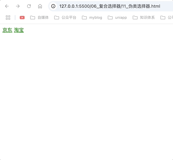
伪类选择器
作用: 选中特殊状态的元素
伪类: 像class,但不是class,是元素的一种特殊状态。
<!DOCTYPE html>
<html lang="en">

<head>
    <meta charset="UTF-8">
    <title>Document</title>
    <style>
        /* 未访问过的a标签文字红色 */
        a:link {
            color: green;
        }
        /* 把访问过的元素设置为红色 */
        a:visited {
            color: red;
        }
    </style>

</head>

<body>
    <a href="https://jd.com">京东</a>
    <a href="https://taobao.com">淘宝</a>
</body>

</html>
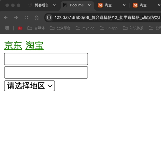
动态伪类
:link: 超链接被访问的状态,只作用于超链接
:visited: 超链接访问过的状态,只作用于超链接
:hover: 鼠标悬停在元素上的状态
:active: 元素激活的状态
激活: 按下鼠标不松
注意点: 遵循LVHA的顺序,即,link、visited、hover、active
:focus: 获取焦点的元素,表单类才能使用focus。
<!DOCTYPE html>
<html lang="en">

<head>
    <meta charset="UTF-8">
    <title>Document</title>
    <style>
        /* 把访问过的元素设置为红色 */
        a:link {
            color: green;
        }

        /* 把访问过的元素设置为红色 */
        a:visited {
            color: red;
        }

        /* 鼠标悬浮设置为蓝色 */
        a:hover {
            color: blue;
        }

        /* 点击激活设置为黄色 */
        a:active {
            color: rgb(255, 247, 0);
        }

        /* 获取焦点时选中 */
        input:focus {
            background-color: chocolate;
        }

        select:focus {
            background-color: chocolate;
        }
    </style>

</head>

<body>
    <a href="https://jd.com">京东</a>
    <a href="https://taobao.com">淘宝</a>
    <br>
    <input type="text">
    <br>
    <input type="text">
    <br>
    <select>
        <option>请选择地区</option>
        <option>上海</option>
        <option>北京</option>
    </select>
</body>

</html>
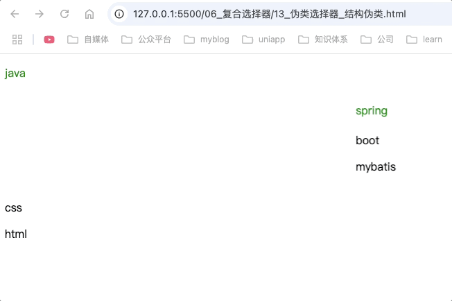
结构伪类
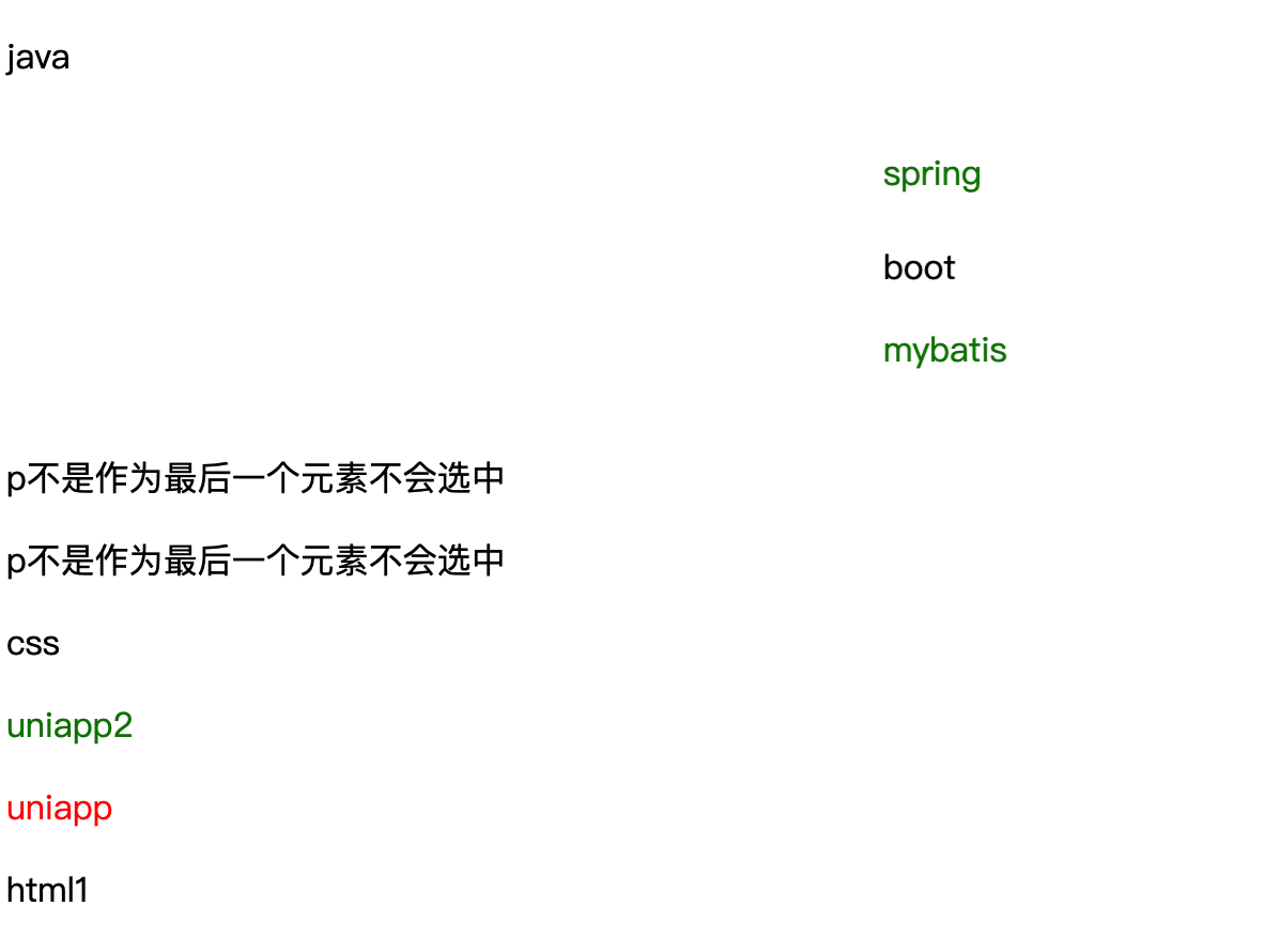
:first-child
作用: 选中那些是其父元素的第一个兄弟子元素,并且这个子元素恰好是<p>标签的元素
<!DOCTYPE html>
<html lang="en">

<head>
    <meta charset="UTF-8">
    <title>Document</title>
    <style>
        /*
        选中第一个子元素为p的所有p元素 因此选中了body的第一个兄弟子元素p和marquee第一个子元素p,
        而mybatis未被选中的原因是不是作为marquee的第一个子元素
        */
        p:first-child {
            color: green;
        }
    </style>
</head>

<body>
    <p>java</p>
    <marquee>
        <p>spirng</p>
    </marquee>
    <marquee>
        <span>boot</span>
        <p>mybatis</p>
    </marquee>
    <p>css</p>
    <p>html</p>

</body>

</html>
<!DOCTYPE html>
<html lang="en">
<head>
<meta charset="UTF-8">
<title>Document</title>
<style>
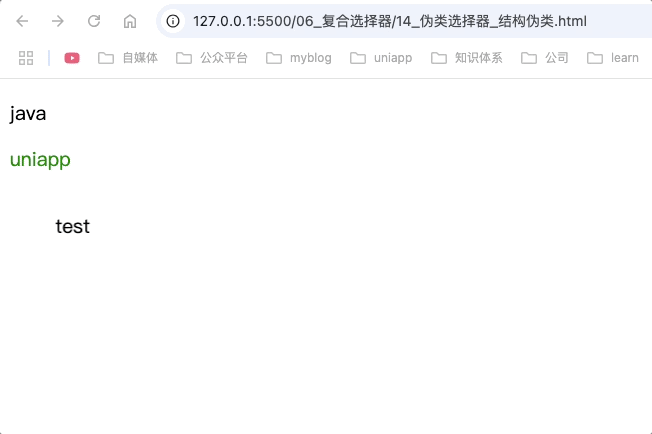
/* 选中div标签中第一个子元素为p的元素 因此选中了uniapp */
div>p:first-child {
color: green;
}
</style>
</head>
<body>
<p>java</p>
<div>
<p>uniapp</p>
<marquee>
<p>test</p>
</marquee>
</div>
</body>
</html>
:last-child
作用: 选中从多组兄弟元素中某一个元素,并且该元素是作为最后一个子元素的元素。
p:last-child: 选中p标签,并且该p标签在兄弟元素中是最后一个元素。符合该条件的p标签则选中
<style>
/* 选中div标签的最后一个儿子标签为p元素,因此uniapp选中 */
div>p:last-child {
color: red
}
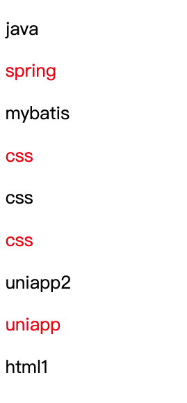
/* 选中p标签,并且符合该p标签在兄弟元素中是最后一个p标签,因此应该选中spring,mybatis,uniapp2,uniapp html1 */
p:last-child {
color: green;
}
</style>
<body>
<p>java</p>
<marquee>
<p>spring</p>
</marquee>
<marquee>
<span>boot</span>
<p>mybatis</p>
</marquee>
<div>
<p>p不是作为最后一个元素不会选中</p>
<p>p不是作为最后一个元素不会选中</p>
<span></span>
</div>
<p>css</p>
<div>
<span>
<p>uniapp2</p>
</span>
<p>uniapp</p>
</div>
<p>html1</p>
</body>
uniapp为红色是因为样式权重高,因此color: red生效
html1未选中是因为浏览器渲染时自动加了标签,因此html1不是最后一个元素
为什么:last-child没有生效?
- 为什么html1没有被选中?
原因是浏览器在渲染时自动加了标签
uniapp应该先被div>p:last-child选中,又被p:last-child选中,按理说会被覆盖为绿色,为什么会是红色?
div>p:last-child 是一个后代选择器,它选择了<div>的直接子元素且是最后一个<p>的元素。这个选择器的优先级高于仅使用元素选择器的 p:last-child
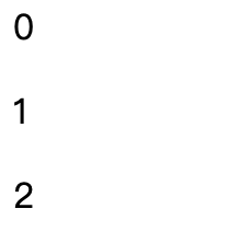
:nth-child()
作用: 它用于选择属于其父元素的特定子元素。通过指定一个模式或条件,:nth-child() 可以帮助开发者选中一组兄弟元素中的特定一个或多个元素。这个选择器非常强大,因为它允许基于元素在其父元素中的位置来应用样式
<style>
  div p:nth-child(1) {
    color: red
  }
</style>
<body>
  <div>
    <div>0</div>
    <p>1</p>
    <p>2</p>
  </div>
</body>
nth-child根据位置和元素同时匹配,由于div第一个元素不是p因此不选中
<!DOCTYPE html>
<html lang="en">

<head>
    <meta charset="UTF-8">
    <title>Document</title>
    <style>
        /* 当n=0是,返回5,当n=1是返回4...0,因此选中父标签的前5个兄弟子元素,并且是p标签的元素 */
        p:nth-child(-n+5) {
            color: red
        }
    </style>
</head>

<body>
    <!-- 第1个元素 -->
    <p>java</p>
    <!-- 第2个元素 -->
    <marquee>
        <p>spring</p>
    </marquee>
    <!-- 第3个元素 -->
    <marquee>
        <span>boot</span>
        <p>mybatis</p>
    </marquee>
    <!-- 第4个元素 -->
    <p>css</p>
    <!-- 第5个元素 -->
    <p>css</p>
    <!-- 第6个元素 -->
    <p>css</p>
    <div>
        <span>
            <p>uniapp2</p>
        </span>
        <p>uniapp</p>
    </div>
    <p>html1</p>
</body>

</html>
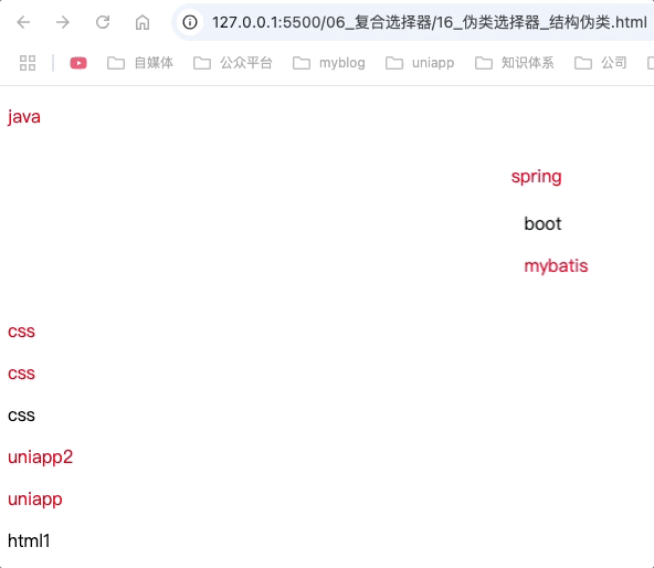
第偶数个: 使用2n或者even表示
第奇数个: 使用2n+1或者odd表示
前x个: 使用-n + x表示,如前3个 -n + 3
<!DOCTYPE html>
<html lang="en">

<head>
    <meta charset="UTF-8">
    <title>Document</title>
    <style>
        p:nth-child(even) {
            color: red
        }
    </style>
</head>

<body>
    <!-- 第1个元素 -->
    <p>java</p>
    <!-- 第2个元素 -->
    <p>spring</p>
    <!-- 第3个元素 -->
    <p>mybatis</p>
    <!-- 第4个元素 -->
    <p>css</p>
    <!-- 第5个元素 -->
    <p>css</p>
    <!-- 第6个元素 -->
    <p>css</p>
    <!-- 第7个元素 -->
    <p>uniapp2</p>
    <!-- 第8个元素 -->
    <p>uniapp</p>
    <!-- 第9个元素 -->
    <p>html1</p>
</body>

</html>
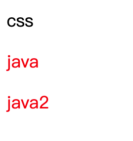
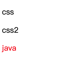
:first-of-type
作用: 选择属于其父元素的特定类型的第一个子元素。
在同类型元素中找第一个元素。
<!DOCTYPE html>
<html lang="en">

<head>
    <meta charset="UTF-8">
    <title>Document</title>
    <style>
        p:first-of-type {
            color: red
        }
    </style>
</head>

<body>
    <div>
        <span>css</span>
        <p>java</p>
    </div>
    <p>java2</p>
</body>

</html>
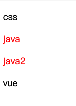
:last-of-type
作用: 选择属于其父元素的特定类型的最后一个子元素。
<!DOCTYPE html>
<html lang="en">

<head>
    <meta charset="UTF-8">
    <title>Document</title>
    <style>
        p:last-of-type {
            color: red
        }
    </style>
</head>

<body>
    <div>

        <p>css</p>
        <p>java</p>
    </div>
    <p>java2</p>
    <span>vue</span>
</body>

</html>
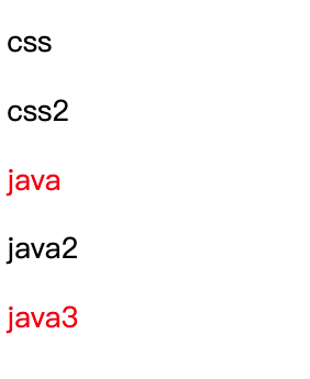
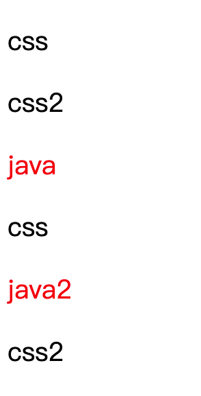
:nth-of-type()
作用: 根据元素的类型和位置来选择特定的子元素。这个选择器非常强大,因为它提供了一种基于元素类型和位置(而非ID或类名)来选择元素的方法。
<!DOCTYPE html>
<html lang="en">

<head>
    <meta charset="UTF-8">
    <title>Document</title>
    <style>
        /* 选中父标签的子标签为p标签,且是第2个p标签 */
        p:nth-of-type(2) {
            color: red
        }
    </style>
</head>

<body>
    <div>
        <p>css</p>
        <span>css2</span>
        <p>java</p>
    </div>
    <p>java2</p>
    <p>java3</p>
</body>

</html>
:nth-last-child()
作用: 从父元素的末尾开始,选择特定位置的子元素。这个选择器在创建对称布局、实现特定的样式效果或处理有序列表时非常有用。
<!DOCTYPE html>
<html lang="en">

<head>
    <meta charset="UTF-8">
    <title>Document</title>
    <style>
        /* 选中div中倒数第n个的儿子p元素(按照所有兄弟) */
        p:nth-last-child(1) {
            color: red
        }
    </style>
</head>

<body>
    <div>
        <p>css</p>
        <span>css2</span>
        <p>java</p>
    </div>
</body>

</html>
:nth-last-of-type()
作用: 从父元素的末尾开始,选择特定类型的子元素中的第 N 个。这个选择器对于在复杂布局中精确控制样式非常有用,特别是在需要针对特定类型的元素进行样式调整时。
<!DOCTYPE html>
<html lang="en">

<head>
    <meta charset="UTF-8">
    <title>Document</title>
    <style>
        p:nth-last-of-type(1) {
            color: red
        }
    </style>
</head>

<body>
    <div>
        <p>css</p>
        <span>css2</span>
        <p>java</p>
    </div>
    <div>
        <p>css</p>
        <p>java2</p>
        <span>css2</span>
    </div>
</body>

</html>
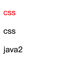
:only-child
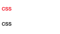
作用: 选择那些是其父元素唯一子元素的元素。换句话说,如果一个元素在其父元素中没有任何兄弟元素(即它是父元素的唯一子元素),那么这个元素就会被 :only-child 选择器选中,并应用相应的样式规则。
<!DOCTYPE html>
<html lang="en">

<head>
    <meta charset="UTF-8">
    <title>Document</title>
    <style>
        p:only-child {
            color: red
        }
    </style>
</head>

<body>
    <div>
        <p>css</p>
    </div>
    <div>
        <p>css</p>
        <p>java2</p>
    </div>
</body>

</html>
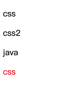
:only-of-type
作用: 选择那些在其父元素中属于特定类型且是该类型唯一子元素的元素。具体来说,如果一个元素在其父元素中没有其他相同类型的兄弟元素(即它是该类型元素的唯一代表),那么这个元素就会被 :only-of-type 选择器选中,并应用相应的样式规则。
<!DOCTYPE html>
<html lang="en">

<head>
    <meta charset="UTF-8">
    <title>Document</title>
    <style>
        p:only-of-type {
            color: red
        }
    </style>
</head>

<body>
    <div>
        <p>css</p>
        <p>css2</p>
    </div>
    <div>
        <span>java</span>
        <p>css</p>
    </div>
</body>

</html>
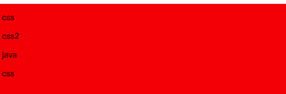
:root
作用: 选中html的的根元素,即html标签
<!DOCTYPE html>
<html lang="en">

<head>
    <meta charset="UTF-8">
    <title>Document</title>
    <style>
        :root {
            background-color: red;
        }
    </style>
</head>

<body>
    <div>
        <p>css</p>
        <p>css2</p>
    </div>
    <div>
        <span>java</span>
        <p>css</p>
    </div>
</body>

</html>
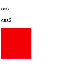
:empty
作用: 选择那些没有任何子元素(包括文本节点、注释节点、换行、空格等)的元素。换句话说,如果一个元素内部是完全空的,没有任何内容,那么这个元素就会被 :empty 选择器选中,并应用相应的样式规则。
<!DOCTYPE html>
<html lang="en">

<head>
    <meta charset="UTF-8">
    <title>Document</title>
    <style>
        /* 第一个div不会选中,因为有换行,第二个div为空内容,可以被选中*/
        div:empty {
            width: 100px;
            height: 100px;
            background-color: red;
        }
    </style>
</head>

<body>
    <div>
        <p>css</p>
        <p>css2</p>
    </div>
    <div>
    </div>
    <div></div>
</body>

</html>
否定伪类:not()
作用: 选择除了指定条件之外的元素。这个选择器允许你排除掉某些特定的元素,以便将样式应用于其他所有元素。
<!DOCTYPE html>
<html lang="en">

<head>
    <meta charset="UTF-8">
    <title>Document</title>
    <style>
        div>p:not(.fail) {
            color: red;
        }
    </style>
</head>

<body>
    <div>
        <p>css</p>
        <p class="fail">css</p>
    </div>
</body>

</html>
div>p:not(:first-child) : 排除掉div中第一个子元素为p的元素,如果第一个不为p则不排除
UI伪类
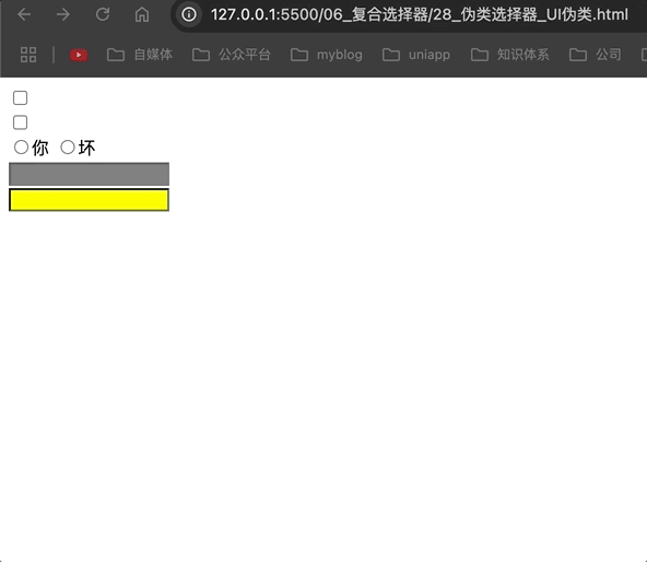
:active :checked :enabled :disabled
:active: 被点击的元素
:checked: 被选中的复选框或单选按钮
:enabled: 可用的表单元素
:disabled: 不可用的表单元素
<!DOCTYPE html>
<html lang="en">

<head>
    <meta charset="UTF-8">
    <title>Document</title>
    <style>
        .check:active {
            width: 50px;
            height: 50px;
        }

        .checked:checked {
            width: 50px;
            height: 50px;
        }

        .com:checked {
            width: 50px;
            height: 50px;
        }

        input:disabled {
            background-color: gray;
        }

        input:enabled {
            background-color: yellow;
        }
    </style>
</head>

<body>
    <div>
        <input class="check" type="checkbox">
        <br>
        <input class="checked" type="checkbox">
        <br>
        <input class="com" name="test" type="radio">你
        <input class="com" name="test" type="radio">坏
        <br>
        <input disabled type="text">
        <br>
        <input type="text">
    </div>
</body>

</html>
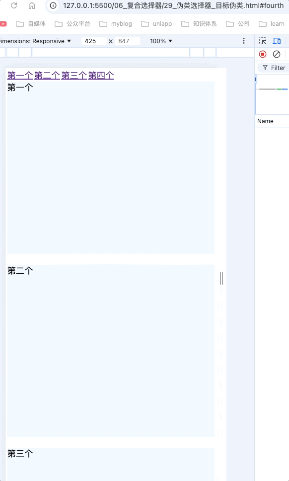
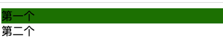
目标伪类:target
:target: 选中锚点指定的元素
<!DOCTYPE html>
<html lang="en">

<head>
    <meta charset="UTF-8">
    <title>Document</title>
    <style>
        a {
            font-size: 40px;
        }

        div {
            height: 800px;
            font-size: 40px;
            margin-bottom: 50px;
            background-color: aliceblue;
        }

        div:target {
            background-color: green;
        }
    </style>
</head>

<body>
    <a href="#first">第一个</a>
    <a href="#second">第二个</a>
    <a href="#third">第三个</a>
    <a href="#fourth">第四个</a>
    <div id="first">第一个</div>
    <div id="second">第二个</div>
    <div id="third">第三个</div>
    <div id="fourth">第四个</div>
</body>

</html>
语言伪类:lang()
:lang(): 根据指定的语言选择元素(本质只匹配lang的属性值,不管属性值是什么,只要字符串匹配,那么就能选中)
<!DOCTYPE html>
<html lang="en">

<head>
    <meta charset="UTF-8">
    <title>Document</title>
    <style>
        div:lang(zh-CN) {
            background-color: green;
        }
    </style>
</head>

<body>
    <div lang="zh-CN">第一个</div>
    <div>第二个</div>
</body>

</html>
伪元素选择器
作用: 选中元素的特殊位置
::first-letter: 选中元素中的第一个文字
::first-line: 选中元素中的第一行文字
::selection: 选中被鼠标选中的内容
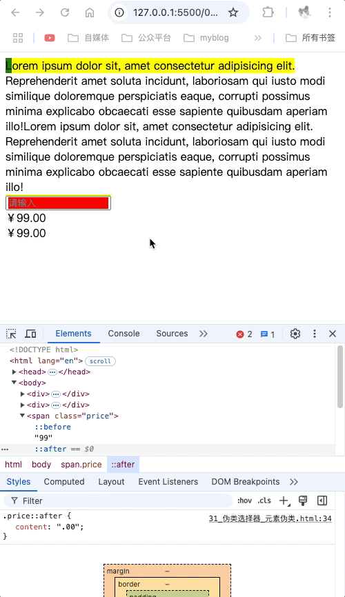
::before: 在元素最开始的位置创建一个子元素,必须使用content属性指定内容
::after: 在元素最后的位置创建一个子元素,必须使用content属性指定内容
::before和::after创建的内容都不会被鼠标选中,默认元素是行内元素,请看下方动图。
<!DOCTYPE html>
<html lang="en">

<head>
    <meta charset="UTF-8">
    <title>Document</title>
    <style>
        /* 选中div元素中的第一个字符 */
        div::first-letter {
            background-color: green;
        }

        /* 选中div元素中的第一行 */
        div::first-line {
            background-color: yellow;
        }

        /* 选中div元素中被鼠标选中的内容 */
        div::selection {
            background-color: blue;
        }

        /* 选中输入框中placeholder */
        input::placeholder {
            background-color: red;
        }

        /* 选中元素中最开始的位置,随后创建一个子元素 */
        .price::before {
            content: "¥";
        }

        /* 选中元素中最末位的位置,随后创建一个子元素 */
        .price::after {
            content: ".00";
        }
    </style>
</head>

<body>
    <div>Lorem ipsum dolor sit, amet consectetur adipisicing elit. Reprehenderit amet soluta incidunt, laboriosam qui
        iusto modi similique doloremque perspiciatis eaque, corrupti possimus minima explicabo obcaecati esse sapiente
        quibusdam aperiam illo!Lorem ipsum dolor sit, amet consectetur adipisicing elit. Reprehenderit amet soluta
        incidunt, laboriosam qui
        iusto modi similique doloremque perspiciatis eaque, corrupti possimus minima explicabo obcaecati esse sapiente
        quibusdam aperiam illo!</div>
    <div><input type="text" placeholder="请输入"></div>

    <span class="price">99</span>
    <br>
    <span class="price">99</span>
</body>

</html>
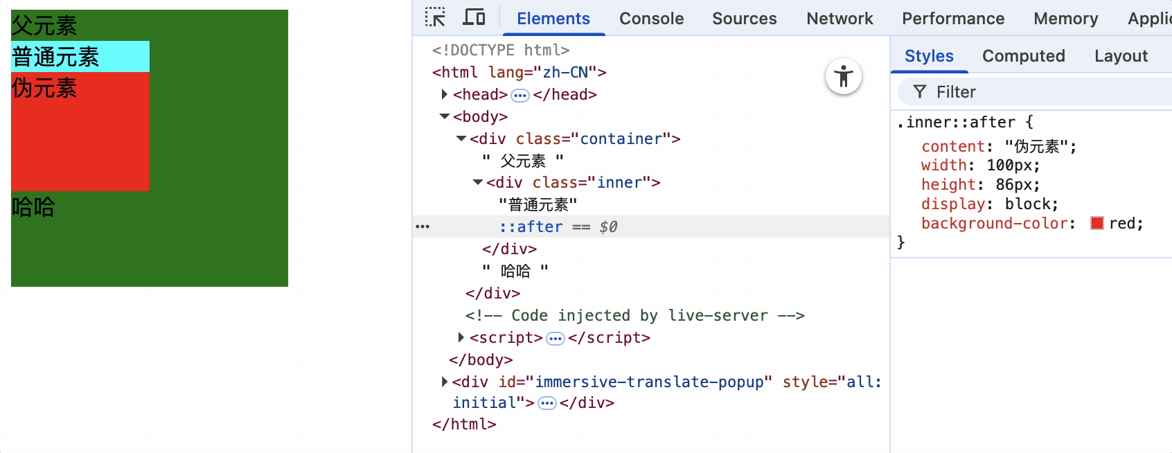
伪元素占据当前元素的内容区,在当前元素内容区向前填充或向后追加,但不占据文档流
<!DOCTYPE html>
<html lang="zh-CN">
  <head>
    <meta charset="UTF-8" />
    <title>09_伪元素占据文档流</title>
    <style>
      .container {
        width: 200px;
        height: 200px;
        background-color: green;
      }
      .inner {
        width: 100px;
        height: 150px;
        background-color: aqua;
      }
      .inner::after {
        content: "伪元素";
        width: 100px;
        height: 100px;
        display: block;
        background-color: red;
      }
    </style>
  </head>
  <body>
    <div class="container">
      父元素
      <div class="inner">普通元素</div>
      哈哈
    </div>
  </body>
</html>
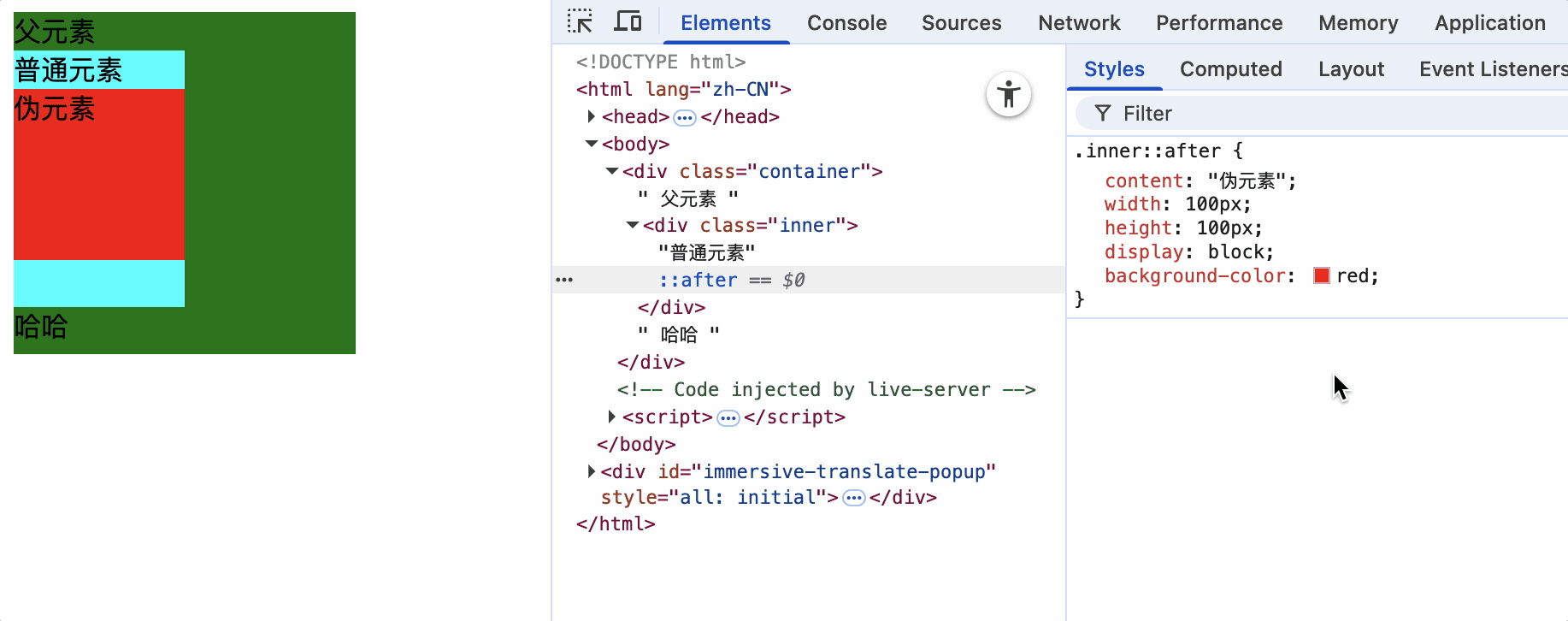
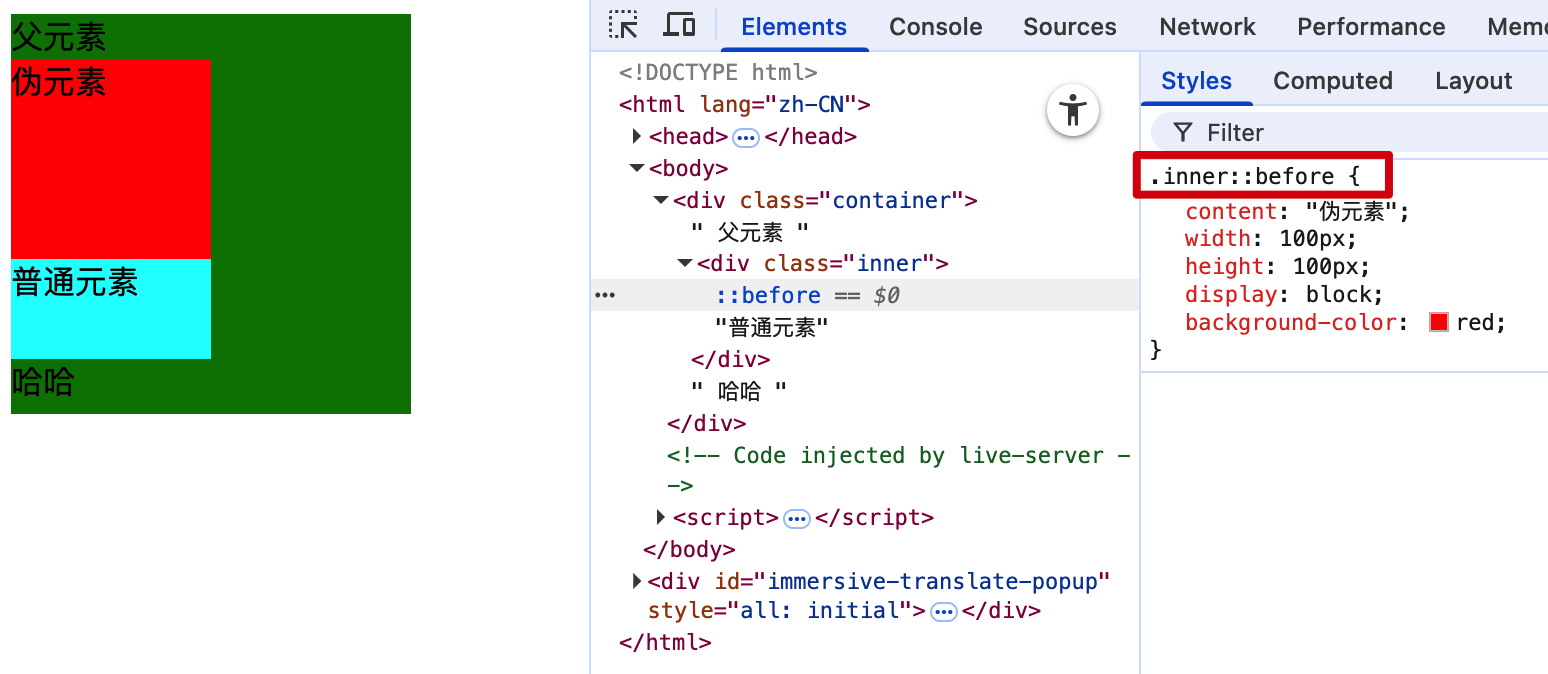
当元素不设置宽高时由伪元素撑开,设置宽高后,伪元素大小对该元素宽高没有影响
选择器的优先级
通过不同的选择器,选中相同的元素,并且为相同的样式名设置不同的值时,就会发生样式的冲突。选择哪个样式,就需要根据优先级选择。
简单优先级: 行内 > ID选择器 > 类选择器 > 元素选择器 > 通配符选择器
<!DOCTYPE html>
<html lang="en">

<head>
    <meta charset="UTF-8">
    <title>Document</title>
    <style>
        div {
            color: red;
        }

        * {
            color: blue
        }
    </style>

</head>

<body>
    <div>
        优先级
    </div>
</body>

</html>
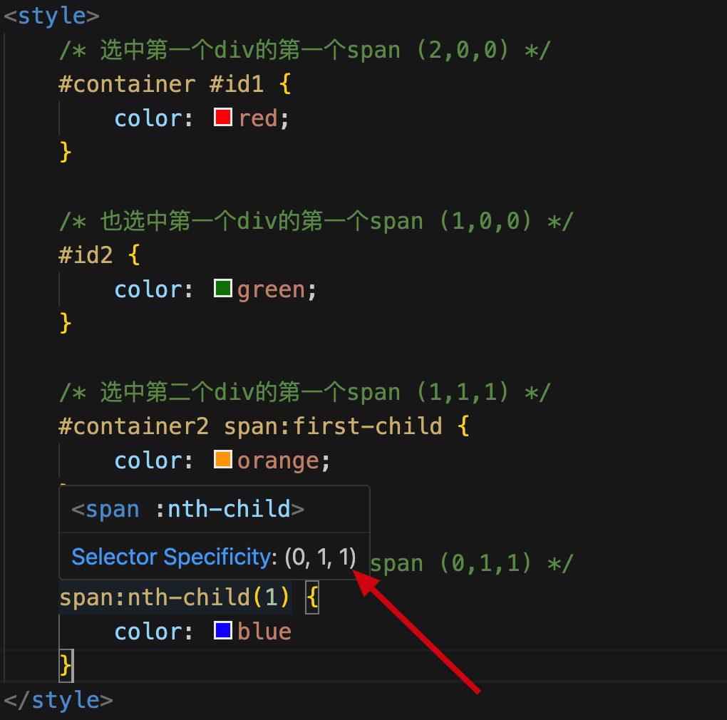
选择器优先级的权重计算方式
格式: ( a, b, c)
a: ID选择器的个数
b: 类、伪类、属性选择器的个数
c: 元素、伪元素选择器的个数
<!DOCTYPE html>
<html lang="en">

<head>
    <meta charset="UTF-8">
    <title>Document</title>
    <style>
        /* 选中第一个div的第一个span (2,0,0) */
        #container #id1 {
            color: red;
        }

        /* 也选中第一个div的第一个span (1,0,0) */
        #id2 {
            color: green;
        }

        /* 选中第二个div的第一个span (1,1,1) */
        #container2 span:first-child {
            color: orange;
        }

        /* 也选中第二个div的第一个span (0,1,1) */
        span:nth-child(1) {
            color: blue
        }

        #html4 {
            color: aqua !important;
        }

        #html4 {
            color: rgb(6, 31, 31);
        }
    </style>

</head>

<body>
    <div id="container">
        <span id="id1" id="id2">java</span>
        <span id="id3">css</span>
    </div>
    <div id="container2">
        <span>html1</span>
        <span>html2</span>
        <span>html3</span>
        <span id="html4">html4</span>
    </div>
</body>

</html>
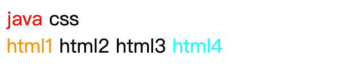
鼠标悬停选择器,vscode计算权重,如图
!important
!important: 作用于具体的样式,优先级比行内样式还要高,但是要慎用,因为一旦使用!important,如果想使用其他选择器选中并修改,也不会生效,即使使用js也改变不了样式。使用场景比较极端,比如线上hotfix。
CSS三大特性
层叠性
概念: 如果发生了样式冲突,那就会根据一定的规则(选择器优先级),进行样式的层叠(覆盖)
样式冲突: 元素的同一个样式名,被设置了不同的值,这就是冲突。如下
<!DOCTYPE html>
<html lang="en">

<head>
    <meta charset="UTF-8">
    <title>Document</title>
    <style>
        div {
            color: red;
        }

        * {
            color: blue
        }
    </style>

</head>

<body>
    <div>
        层叠性
    </div>
</body>

</html>
引入外部样式css文件,内容如下
#test {
    color: blue;
}
<!DOCTYPE html>
<html lang="en">

<head>
    <meta charset="UTF-8">
    <title>Document</title>
    <style>
        * {
            color: blue
        }
        div {
            color: red;
        }
    </style>
    <link rel="stylesheet" href="css.css">
</head>

<body>
    <div id="test">
        层叠性
    </div>
</body>

</html>

外部样式和内容样式优先级相同,渲染为内部样式就是
* {
	color: blue
}
div {
	color: red;
}
#test {
	color: blue;
}
由于ID选择器优先级最高,因此被选中
继承性
概念: 元素会自动拥有其父元素、或其祖先元素上所设置的某些样式,并不是所有样式都能继承。
规则: 优先继承离得近的。
常见的可继承属性: text-??,font-??,line-??,color ...
可根据MDN网站,可查询属性是否能够被继承。
<!DOCTYPE html>
<html lang="en">
<head>
<meta charset="UTF-8">
<title>Document</title>
<style>
div {
color: red;
font-size: 50px;
background-color: blue;
}
</style>
</head>
<body>
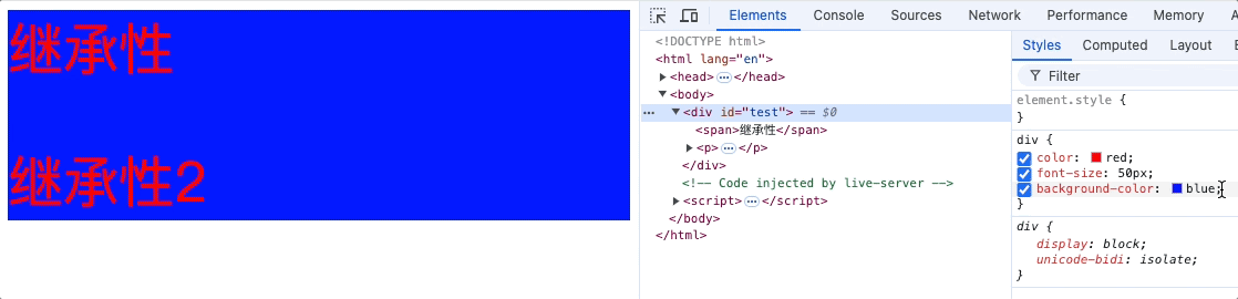
<div id="test">
<span>继承性</span>
<p><span>继承性2</span></p>
</div>
</body>
</html>
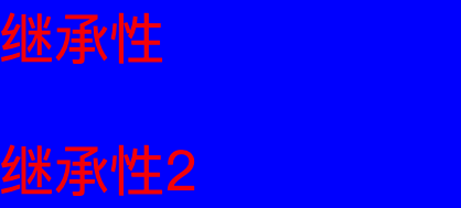
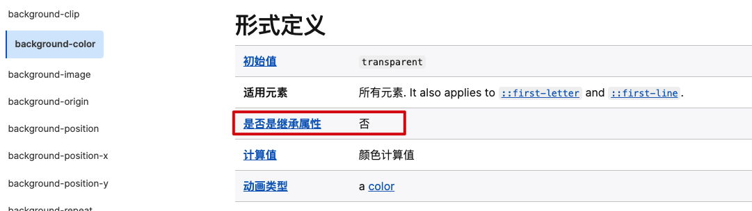
从表现形式来看,span好像是继承了background-color,实际上该元素并不能被继承,我们通过浏览器,可以看出,span只继承了color和font-size,如下图
也可以通过MDN网站查看元素的继承性
优先级
!important > 行内样式 > ID选择器 > 类选择器 > 元素选择器 > * 通配符选择器 > 浏览器默认样式 > 继承的样式
<!DOCTYPE html>
<html lang="en">

<head>
    <meta charset="UTF-8">
    <title>Document</title>
    <style>
        div {
            color: red;
            font-size: 50px;
        }

        * {
            color: blue;
        }
    </style>
</head>

<body>
    <div id="test">
        <span>继承性</span>
        <p><span>继承性2</span></p>
    </div>
</body>

</html>
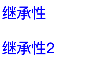
span会继承div的 color和font-size,由于通配符优先级大于继承样式,因此color会被覆盖。
计算优先级的需要注意的点:
并集选择器的每个部分是分开计算的。
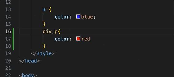
就相当于有两个元素样式,分别是div{},和p{}
像素
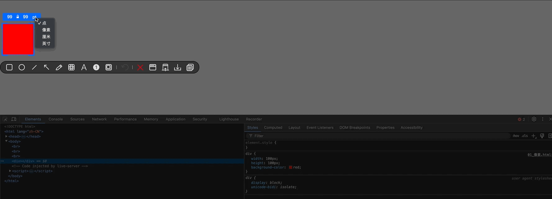
看到像素,如图截图工具可以选中屏幕的指定像素的宽度和长度
实际生活中,显示器越贵像素点越小,展示的画面越细腻,因此像素是一个相对的范围,不同设备的像素范围不同。
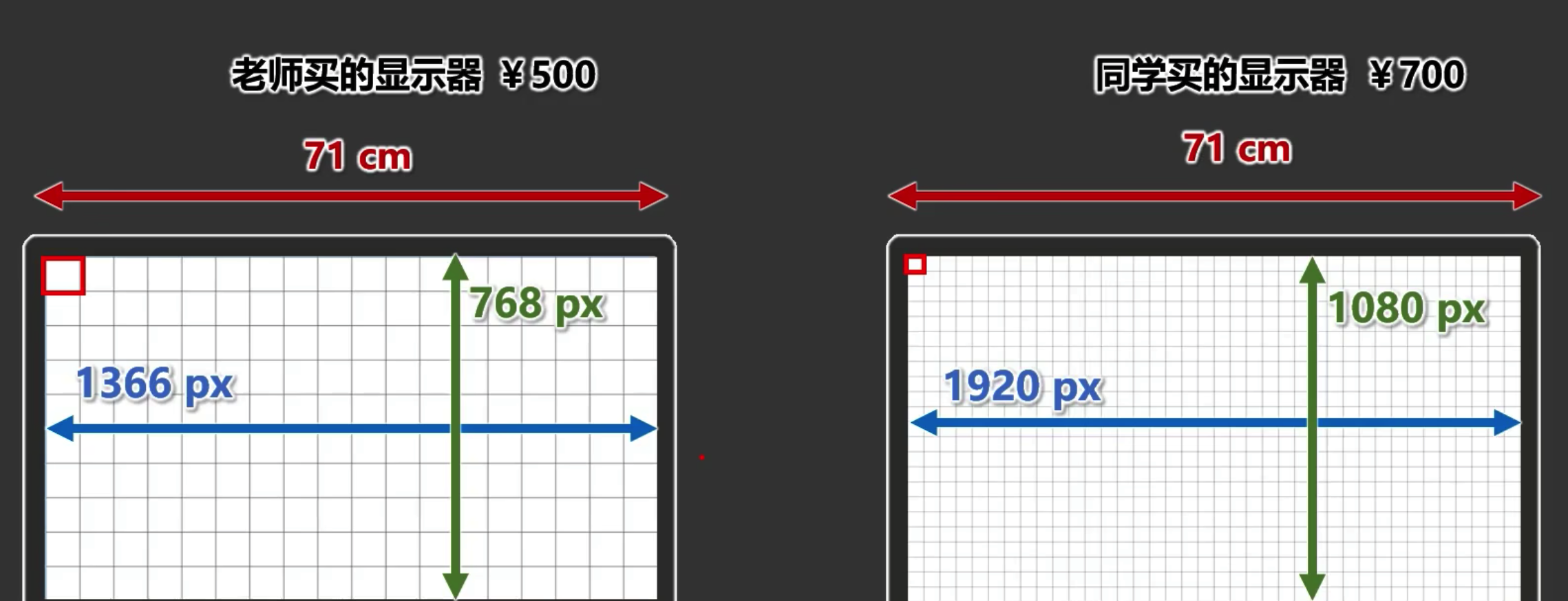
截图工具不能精确像素的原因
在使用截图工具量取图片像素时并不准确,因为截图工具受到电脑放缩比例和浏览器放缩比例的影响。
举个例子:
div为100px100px,如果放大浏览器,使div充满整个屏幕,然后再使用截图工具截图,调整截图工具的大小为100px100px,那么只能截图div的一部分。
也就是说,截图工具是按照设备的真实像素大小计算的,而由于设备放大或者缩小,代码在设备中展示出的图像范围并不一定等于设备的真实像素大小。
颜色
颜色名称有哪些,通过mdn网站查找
https://developer.mozilla.org/zh-CN/docs/Web/CSS/named-color
rgb和rgba
rgb和rgba的区别:
RGB 是一种颜色表示方法,它通过红(Red)、绿(Green)、蓝(Blue)三种颜色的不同强度组合来生成各种颜色。RGB 值通常表示为三个介于 0 到 255 之间的整数,可以使用百分比表示,但不能正数和百分比组合表示。
RGBA 是 RGB 的扩展,增加了第四个参数 Alpha,用于表示颜色的透明度。Alpha 值范围从 0.0(完全透明)到 1.0(完全不透明)。例如 rgba(255, 0, 0, 0.5) 表示半透明的红色。
透明度0.x中0可以省略为.x,如: color: rgba(255, 0, 0, .5)
<!DOCTYPE html>
<html lang="zh-CN">
<head>
<meta charset="UTF-8">
<title>Document</title>
<style>
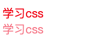
.rgb {
color: rgb(255, 0, 0);
}
.rgb2 {
color: rgba(255, 0, 0, .5);
}
</style>
</head>
<body>
<div class="rgb">学习css</div>
<div class="rgb2">学习css</div>
</body>
</html>
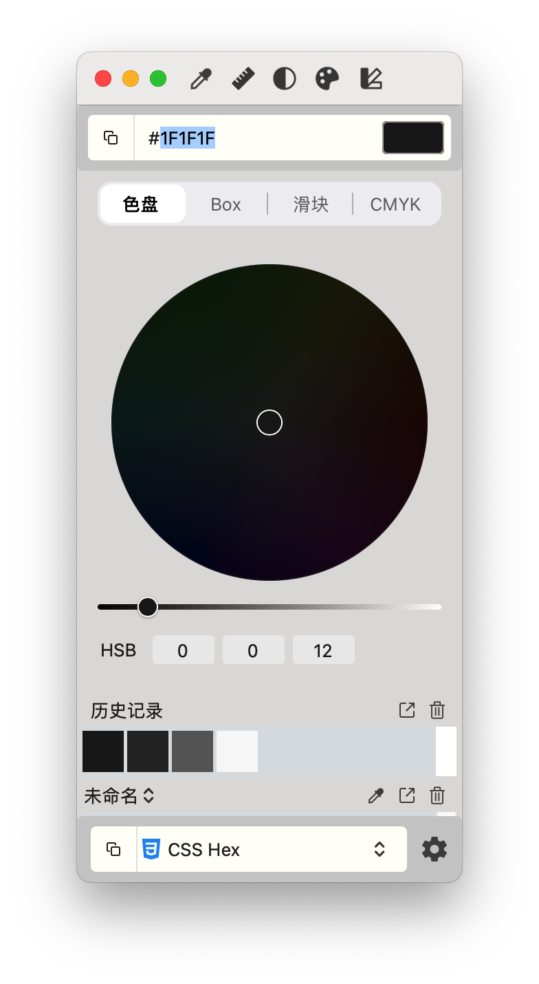
推荐mac取色器工具,Pixeur,屏幕任何位置取色。
HEX和HEXA
HEX
定义:HEX 是一种表示颜色的方法,使用 6 位十六进制数来表示 RGB(红、绿、蓝)颜色值。
格式:#RRGGBB
RR 表示红色分量
GG 表示绿色分量
BB 表示蓝色分量
color: #FF0000; /* 红色 */
color: #00FF00; /* 绿色 */
color: #0000FF; /* 蓝色 */
HEXA
定义:HEXA 是 HEX 的扩展形式,除了表示 RGB 颜色外,还增加了一个额外的两位来表示 Alpha 通道(透明度)。
格式:#RRGGBBAA
RR 表示红色分量
GG 表示绿色分量
BB 表示蓝色分量
AA 表示 Alpha 通道(透明度)
color: #FF0000FF; /* 红色,完全不透明 */
color: #FF000080; /* 红色,半透明 */
color: #00FF00CC; /* 绿色,部分透明 */
80 在十六进制中转换为十进制是 128,这大约是 FF(255)的一半,所以 80 表示的是半透明。而 88 在十六进制中转换为十进制是 136,比 128 稍微不透明一些,但仍然是半透明的。
简写:
#00FF00CC 可以简写为 #0F0C
<!DOCTYPE html>
<html lang="zh-CN">
<head>
<meta charset="UTF-8">
<title>Document</title>
<style>
.hex {
color: #000;
}
.hexa {
color: #0008;
}
</style>
</head>
<body>
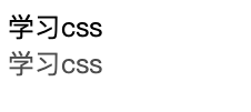
<div class="hex">学习css</div>
<div class="hexa">学习css</div>
</body>
</html>
注意:
IE浏览器不支持 HEXA但是支持HEX
HSL和HSLA
/* 格式 */
hsl(Hue, Saturation, Lightness);
Hue (色相): 用角度值(0° - 360°)表示,对应于色轮上的位置。0° 或 360° 表示红色,120° 表示绿色,240° 表示蓝色。
0deg表示0角度,可以省略deg字母缩写。
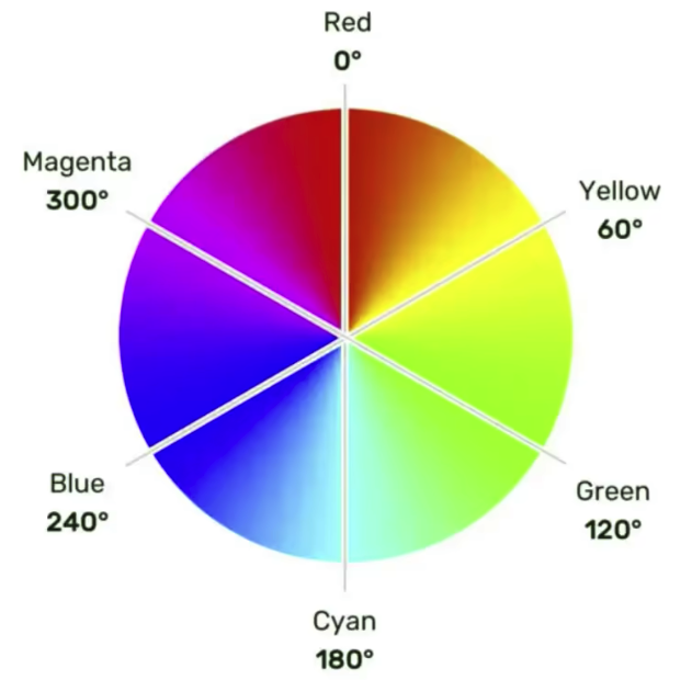
Saturation (饱和度): 用百分比(0% - 100%)表示,表示颜色的纯度。0% 表示灰色,100% 表示完全饱和的颜色。
Lightness (亮度): 用百分比(0% - 100%)表示,表示颜色的明亮程度。0% 表示黑色,100% 表示白色,50% 表示正常亮度。
background-color: hsl(240deg, 100%, 50%);
/* deg单位可以省略 */
background-color: hsl(240, 100%, 50%);
HSLA 是 HSL 的扩展,增加了 alpha 通道来控制颜色的透明度。
Alpha (透明度): 用一个介于 0.0(完全透明)和 1.0(完全不透明)之间的浮点数表示。
background-color: hsla(240, 100%, 50%, 0.5)
<style>
    .hsl {
        color: hsl(0, 100%, 50%);
    }

    .hsla {
        color: hsl(0, 0%, 50%);
    }
    .hsla2 {
        color: hsl(0, 0%, 10%);
    }
    .hsla3 {
        color: hsl(0, 0%, 0%, 10%);
    }
</style>
<body>
    <div class="hsl">学习css</div>
    <div class="hsla">学习css</div>
    <div class="hsla2">学习css</div>
    <div class="hsla3">学习css</div>
</body>
饱和度的百分比设置可以理解为,百分比越小,参入灰色越多。
亮度的百分比设置可以理解为,百分比越小,参入黑色越多。100%则为白色。
字体样式
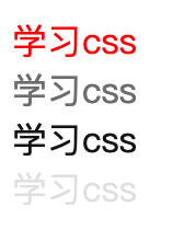
字体大小font-size
<!DOCTYPE html>
<html lang="zh-CN">
<head>
<meta charset="UTF-8">
<title>Document</title>
<style>
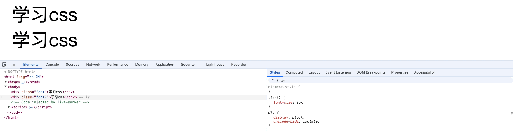
.font {
font-size: 12px;
}
.font2 {
font-size: 3px;
}
</style>
</head>
<body>
<div class="font">学习css</div>
<div class="font2">学习css</div>
</body>
</html>
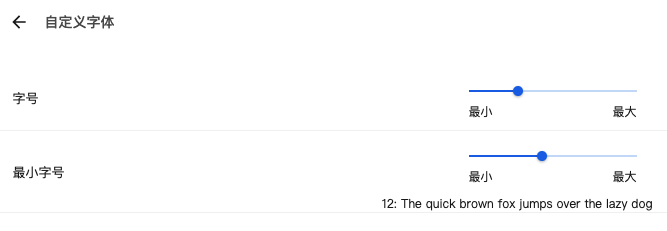
字号: 浏览器默认字体带下,在不指定字体大小时,默认16px
最小字号: 浏览器最小字体,默认0px。
当浏览器设置最小字体时,css样式字体小于浏览器最小字体时就会失效。如浏览器最小字体为12px,css设置字体为3px,那么浏览器仍然展示12px。
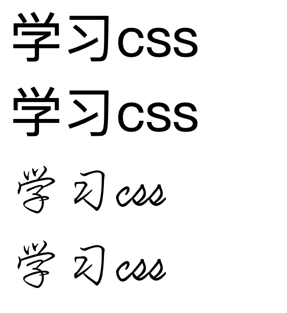
字体族font-family
查看mac已安装的字体,打开字体册.app
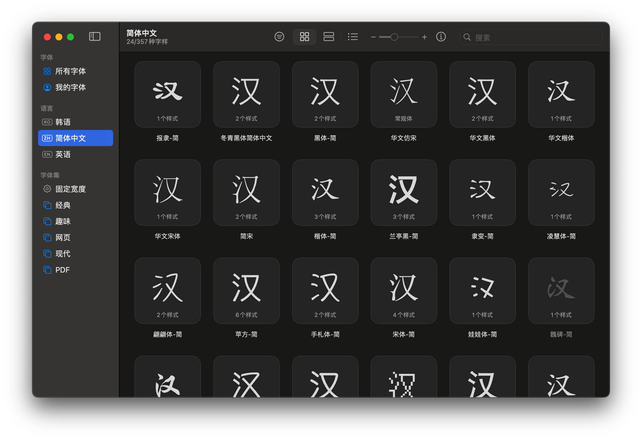
目录地址: /System/Library/Fonts
mac的默认中文字体为苹方-简,windows的默认中文字体为微软雅黑
<!DOCTYPE html>
<html lang="zh-CN">

<head>
    <meta charset="UTF-8">
    <title>Document</title>
    <style>
        .one {
            font-size: 30px;
            font-family: "苹方-简";
        }

        .two {
            font-size: 30px;
        }

        .three {
            font-size: 30px;
            font-family: "行楷-简";
        }

        .four {
            font-size: 30px;
            font-family: "123", "行楷-简", serif;
        }
    </style>
</head>

<body>
    <div class="one">学习css</div>
    <div class="two">学习css</div>
    <div class="three">学习css</div>
    <div class="four">学习css</div>
</body>

</html>
衬线字体和非衬线字体的区别:
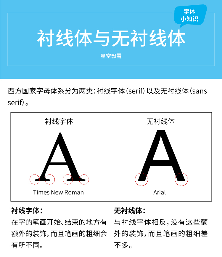
衬线字体
在字母的笔画末端有额外的小装饰线,这些装饰线被称为“衬线”。
例子:Times New Roman、Georgia、Garamond。
应用场景:通常用于印刷品,如书籍、报纸等,因为衬线有助于引导阅读者的视线,使长时间阅读更加舒适。
非衬线字体
特点:字母的笔画末端没有额外的装饰线,整体风格更加简洁、现代。
例子:Arial、Helvetica、Verdana。
应用场景:常用于屏幕显示,如网页、电子文档等,因为非衬线字体在低分辨率屏幕上更易读。
衬线字体适合长篇阅读,尤其是在纸质媒体上。
非衬线字体适合屏幕显示,尤其是在需要简洁、现代感的设计中。
字体中英文对照表
https://www.dute.org/chinese-font-family
注意:
1.使用字体的英文名兼容性会更好
2.使用双引号包裹起来: font-family: "Verdana","Arial",sans-serif
3.设置多个字体时,按照从左到右的顺序进行查找,直到找到设备环境有该字体则使用,如果都没有找到则使用设备默认字体,通过在最后加上非衬线sans-serif或者衬线serif。如下:
body {
    font-family: "Arial", "Helvetica", sans-serif;
}
浏览器会首先尝试使用 Arial 字体,如果 Arial 不可用,则尝试使用 Helvetica,如果两者都不可用,则使用浏览器的默认无衬线字体。
字体风格font-style
<!DOCTYPE html>
<html lang="zh-CN">

<head>
    <meta charset="UTF-8">
    <title>Document</title>
    <style>
        .one {
            font-size: 30px;
            font-style: normal;
        }

        .two {
            font-size: 30px;
            font-style: italic;
            /* 也可以指定角度 */
            font-style: oblique 20deg;
        }

        .three {
            font-size: 30px;
            font-style: oblique;
        }
    </style>
</head>

<body>
    <div class="one">学习css</div>
    <div class="two">学习css</div>
    <div class="three">学习css</div>
    <div class="four">学习css</div>
</body>

</html>
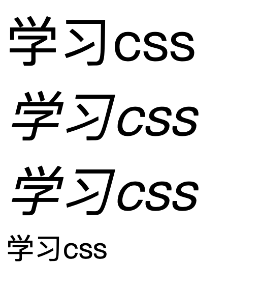
italic: 斜体,通常是由字体设计师专门设计的,使用字体自带的斜体风格。
oblique: 斜体,和italic效果一样,但是可以设置倾斜角度,倾斜不是基于字体本身的斜体变体,而是由浏览器或渲染引擎对正常字体进行变换得到的。
字体粗细font-weight
<!DOCTYPE html>
<html lang="zh-CN">

<head>
    <meta charset="UTF-8">
    <title>Document</title>
    <style>
        .one {
            font-size: 30px;
            font-weight: lighter;
        }

        .two {
            font-size: 30px;
            font-weight: normal;
        }

        .three {
            font-size: 30px;
            font-weight: bold;
        }

        .four {
            font-size: 30px;
            font-weight: bolder;
        }

        .five {
            font-size: 30px;
            font-weight: 100;
        }
    </style>
</head>

<body>
    <div class="one">学习css</div>
    <div class="two">学习css</div>
    <div class="three">学习css</div>
    <div class="four">学习css</div>
    <div class="five">学习css</div>
</body>

</html>
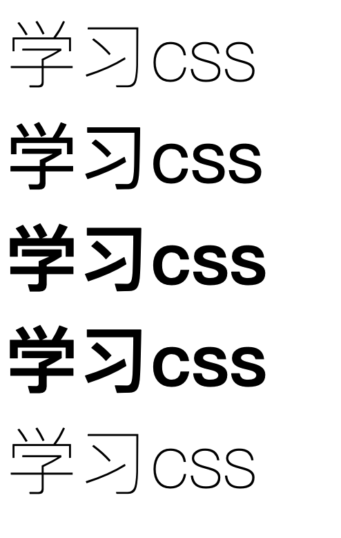
normal:默认值,表示正常粗细的字体,等同于数字值400。
bold:表示粗体字体,等同于数字值700。
bolder:表示比当前元素字体更加粗体的字体。多数字体不支持
lighter:表示比当前元素字体更加细的字体。
数值: 100~1000(包含),无单位,数值越大,字体越粗,100~300同等于lighter,400~500等同于normal,600等同于blod
字体复合属性font
font属性中可以包含大小,族,风格,粗细。
规则:
1.字体大小和字体族必须都写上
2.字体族必须在最后,字体大小必须在倒数第二位
3.各个属性使用空格
开发中推荐使用复合写法,如果只添加字体大小属性,就直接使用font-size;
<!DOCTYPE html>
<html lang="zh-CN">

<head>
    <meta charset="UTF-8">
    <title>Document</title>
    <style>
        .one {
            font: italic bold 30px "Fira Sans", sans-serif;
        }
    </style>
</head>

<body>
    <div class="one">学习css</div>
</body>

</html>

文本属性
颜色color
<!DOCTYPE html>
<html lang="zh-CN">

<head>
    <meta charset="UTF-8">
    <title>Document</title>
    <style>
        .rgb {
            /* 透明度0.5 */
            color: rgb(255, 0, 0, .5);
        }
    </style>
</head>

<body>
    <div class="rgb">学习css</div>
    <div class="rgb2">学习css</div>
</body>

</html>
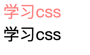
开发中常用: rbg/rgba或者HEX/HEXA
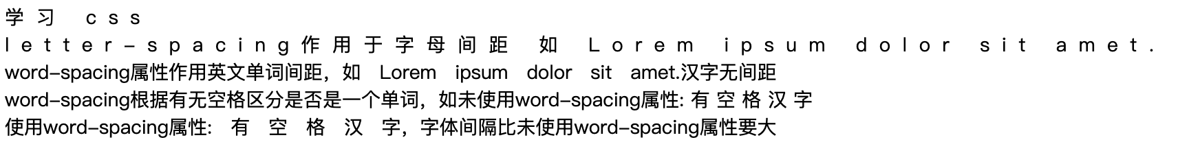
间距letter-spacing和word-spacing
letter-spacing: 字母间距
word-spacing: 单词间距,根据文字间是否有空格判断是否是一个单词。
属性值为像素px,正值让间距增大,负值间距缩小。
<style>
    .letter {
        /* 字母间距 */
        letter-spacing: 10px;
    }

    .letter1 {
        letter-spacing: 10px;
    }

    .letter2 {
        /* 字母间距 */
        word-spacing: 10px;
    }

    .letter4 {
        word-spacing: 10px;
    }
</style>

<body>
    <div class="letter">学习 css</div>
    <div class="letter1">letter-spacing作用于字母间距 如 Lorem ipsum dolor sit amet.</div>
    <div class="letter2">word-spacing属性作用英文单词间距,如 Lorem ipsum dolor sit amet.汉字无间距</div>
    <div class="letter3">word-spacing根据有无空格区分是否是一个单词,如未使用word-spacing属性: 有 空 格 汉 字</div>
    <div class="letter4">使用word-spacing属性: 有 空 格 汉 字,字体间隔比未使用word-spacing属性要大</div>
</body>
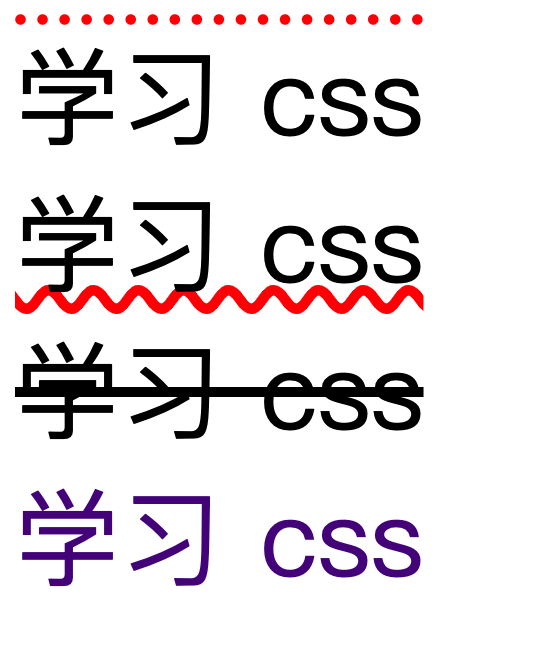
修饰text-decoration
text-decoration:
可选值: none/underline/overline/line-through
<!DOCTYPE html>
<html lang="zh-CN">

<head>
    <meta charset="UTF-8">
    <title>Document</title>
    <style>
        div {
            font-size: 30px;

        }

        .letter {
            /* 上划线 虚线 红色 */
            text-decoration: overline dotted red;
        }

        .letter2 {
            /* 下划线 波浪线 红色 */
            text-decoration: underline wavy red;
        }

        .letter3 {
            /* 删除线 */
            text-decoration: line-through;
        }

        .letter4 {
            /* 去掉带有修饰的属性样式,如去掉a标签下划线 */
            text-decoration: none;
        }
    </style>
</head>

<body>
    <div class="letter">学习 css</div>
    <div class="letter2">学习 css</div>
    <div class="letter3">学习 css</div>
    <div><a class="letter4" href="https://jd.com">学习 css</a></div>
</body>

</html>
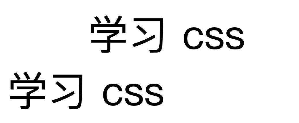
文本缩进text-indent
<style>
    div {
        font-size: 40px;
    }

    .letter {
        /* font-size为40px,80px为缩进了两个字符大小 */
        text-indent: 80px;
    }
</style>

<body>
    <div class="letter">学习 css</div>
    <div class="letter2">学习 css</div>
</body>
对齐text-align
text-align: 文本水平对齐方式,align(排列)
left: 左对齐
right: 右对齐
center: 居中
<style>
    div {
        font-size: 20px;
    }

    .letter {
        background-color: red;
        /* 文本排列方式:  */
        text-align: center;
    }
</style>

<body>
    <div class="letter">学习 css</div>
</body>
text-aling作用范围
块元素中的文字(文字)、行内块元素(整个元素)、行内元素(整个元素)
如下图,对div中的文字居中。
详细研究font-size
<style>
    div {
        font-size: 20px;
        background-color: aqua;
    }

    .letter2 {
        font-family: "报隶-简";
    }

    .letter3 {
        font-family: "翩翩体-简";
    }
</style>

<body>
    <div>
        <span class="letter1">学abcxg</span>
        <span class="letter2">学abcxg</span>
        <span class="letter3">学abcxg</span>
    </div>
</body>
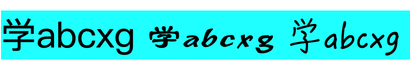
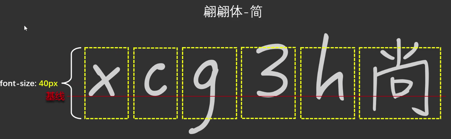
同是font-size大小,不同字体,显示大小不一样。
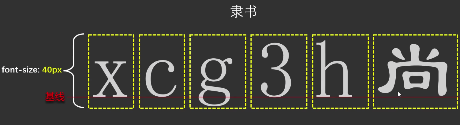
原因: 在设计字体时,不同字体的X字母基线位置不同,汉字和字母都要遵循该基线,因此不同字体的X字母基线高度不同,导致显示效果不一样。
字体设计中的基线系统是一个非常专业的概念,基准线 (Baseline)最基本的参考线
大多数字母的底部对齐位置
例如:'a', 'b', 'c', 'x' 等字母底部都在这条线上
1.由于字体设计不同,文字呈现出的大小并不一定相同
2.通常情况下,文字相对字体设计框,并不是垂直居中的,通常都靠下一些。
行高line-height
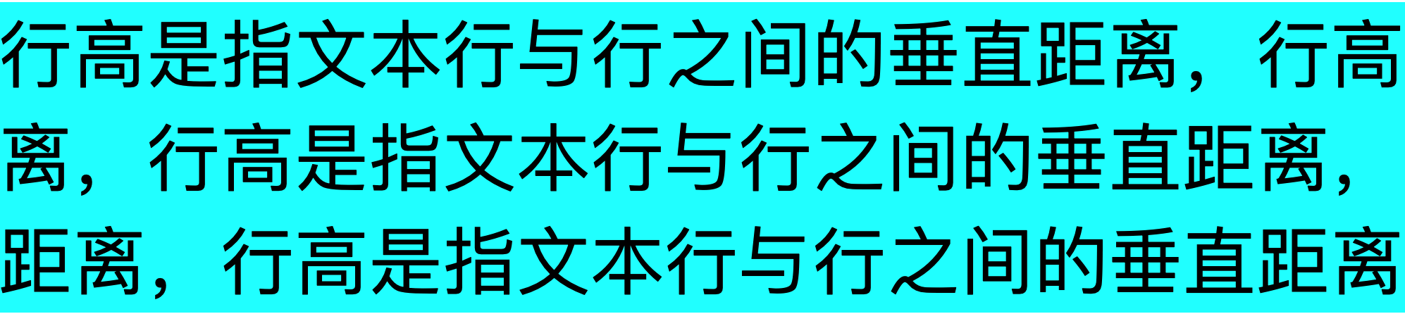
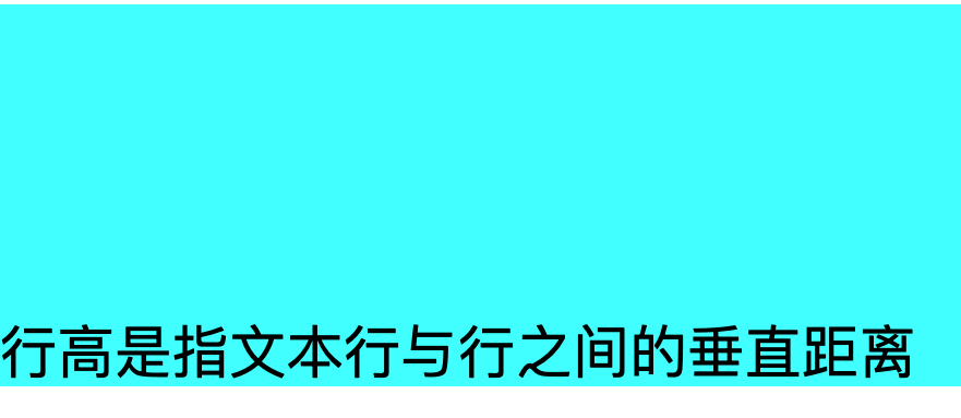
line-height: 行高,指文本行与行之间的垂直距离。
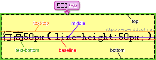
单位: px
可选值:
- normal: 默认值,根据字体大小浏览器自动计算行高
- 像素值: 直接指定行高,如30px,行高为30px
- 数值: font-size的倍数,如 1就为font-size的值(推荐使用)
- 百分比: 根据字体大小计算行高,如100%,行高为字体大小的100%
<style>
    div {
        font-size: 30px;
        background-color: aqua;
    }

    .letter1 {
        /* 默认值 其大小就为font-size的值为30px */
        line-height: normal;
        line-height: 30px;
        /* 其大小就为font-size的值的1倍为30px */
        line-height: 1;
        /* 其大小就为font-size的值的100%为30px */
        line-height: 100%;
    }
</style>
</head>

<body>
    <div>
        <span class="letter1">行高是指文本行与行之间的垂直距离,行高是指文本行与行之间的垂直距离,行高是指文本行与行之间的垂直距离,行高是指文本行与行之间的垂直距离,行高是指文本行与行之间的垂直距离</span>
    </div>
</body>
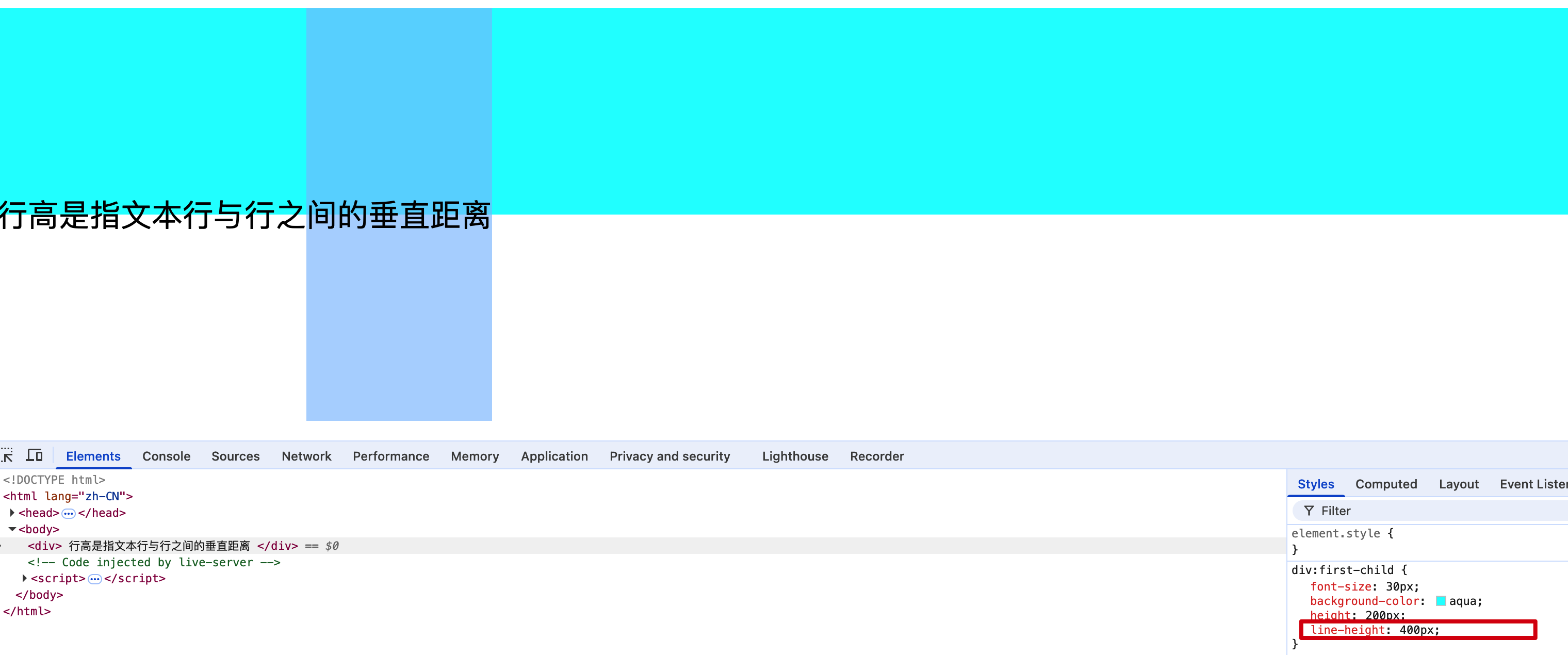
行高注意事项
<style>
    div {
        font-size: 30px;
        background-color: aqua;
        line-height: 0px;
    }
</style>
<body>
    <div>
        行高是指文本行与行之间的垂直距离
    </div>

</body>
不断调整行高展示效果如图:

注意点:
- 行高为0px时,文字重叠,且最小值为0px。不能为负数。
- 行高为0px时,文字上方被截取一部分。
原因:
即使设置 line-height: 0px,文字仍然会占据一定空间,只不过文字的基线位置会发生变化。因此浏览器会截取文字上方的一部分。当不设置line-height时,浏览器会根据字体大小自动计算行高,则正常显示,如果行高小于字体大小,行框的高度不断缩小,基线则不断上移,文字大小又不会改变,导致文字上方超出浏览器
line-height的继承
<style>
    div {
        font-size: 30px;
        background-color: aqua;
        line-height: 1.5;
    }

    span {
        font-size: 50px;
        color: red;
    }
</style>

<body>
    <div>
        行高是可以继承的abcgx行高是可以继承的abcgx行高是可以继承的abcgx行高是可以继承的abcgx行高是可以继承的abcgx行高是可以继承的abcgx
        行高是可以继承的abcgx<span>X行高是可以继承的abcgx</span>行高是可以继承的abcgx行高是可以继承的abcgx行高是可以继承的abcgx行高是可以继承的abcgx
    </div>
</body>
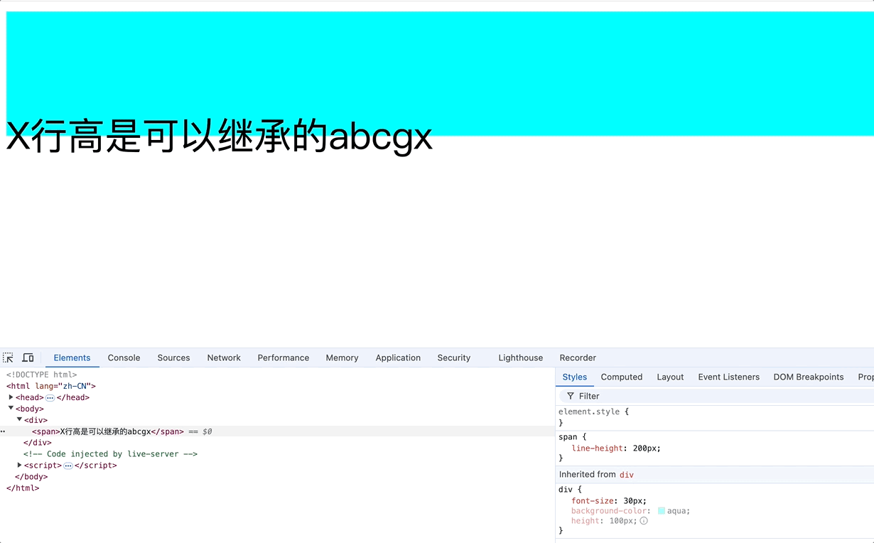
span标签继承了父标签div的行高,因此span的行高为: font-size * line-height = 50px * 1.5 = 75px
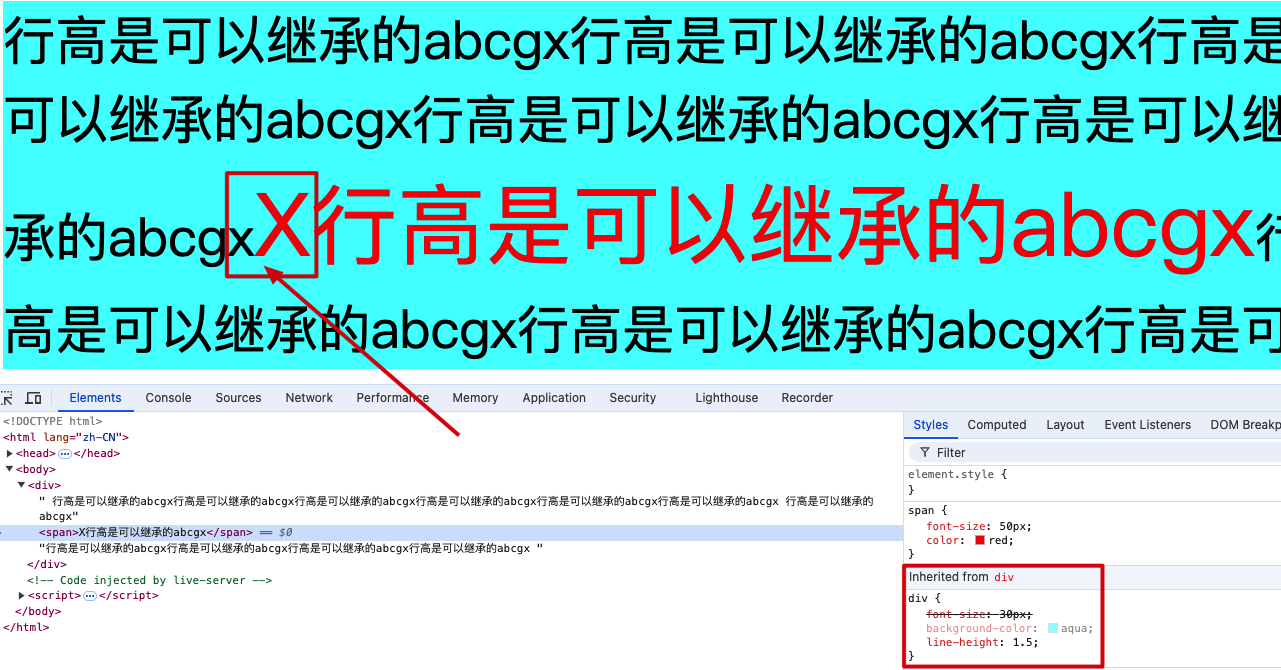
整个div的高度为: 30 * 1.5 * 3 + 50 * 1.5 = 210px,如图

注意点:
1.行高是可以继承的,因此推荐使用行高为数值,如1,1.5,2等。可以动态计算出被继承标签的行高。
2.文本对齐方式默认以基线对齐,如上图的x和X。
line-height与height的关系
<style>
    div {
        font-size: 30px;
        background-color: aqua;
        height: 100px;
    }

    span {
        line-height: 200px;
    }
</style>

<body>
    <div>
        <span>X行高是可以继承的abcgx</span>
    </div>

</body>
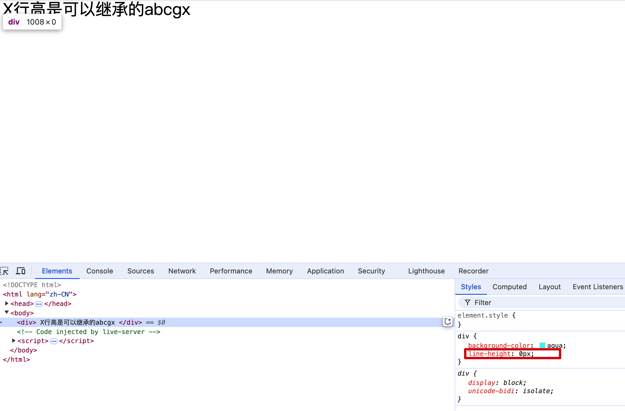
指定div的高度为100px,div中span的行高为200px,那么div高度就固定为100px。当不设置div的高度时,div高度以span的行高为准乘以行数。
div设置了height时,div的高度为height值。
div没有设置height时,会以div内部的line-height * 行数为高度。
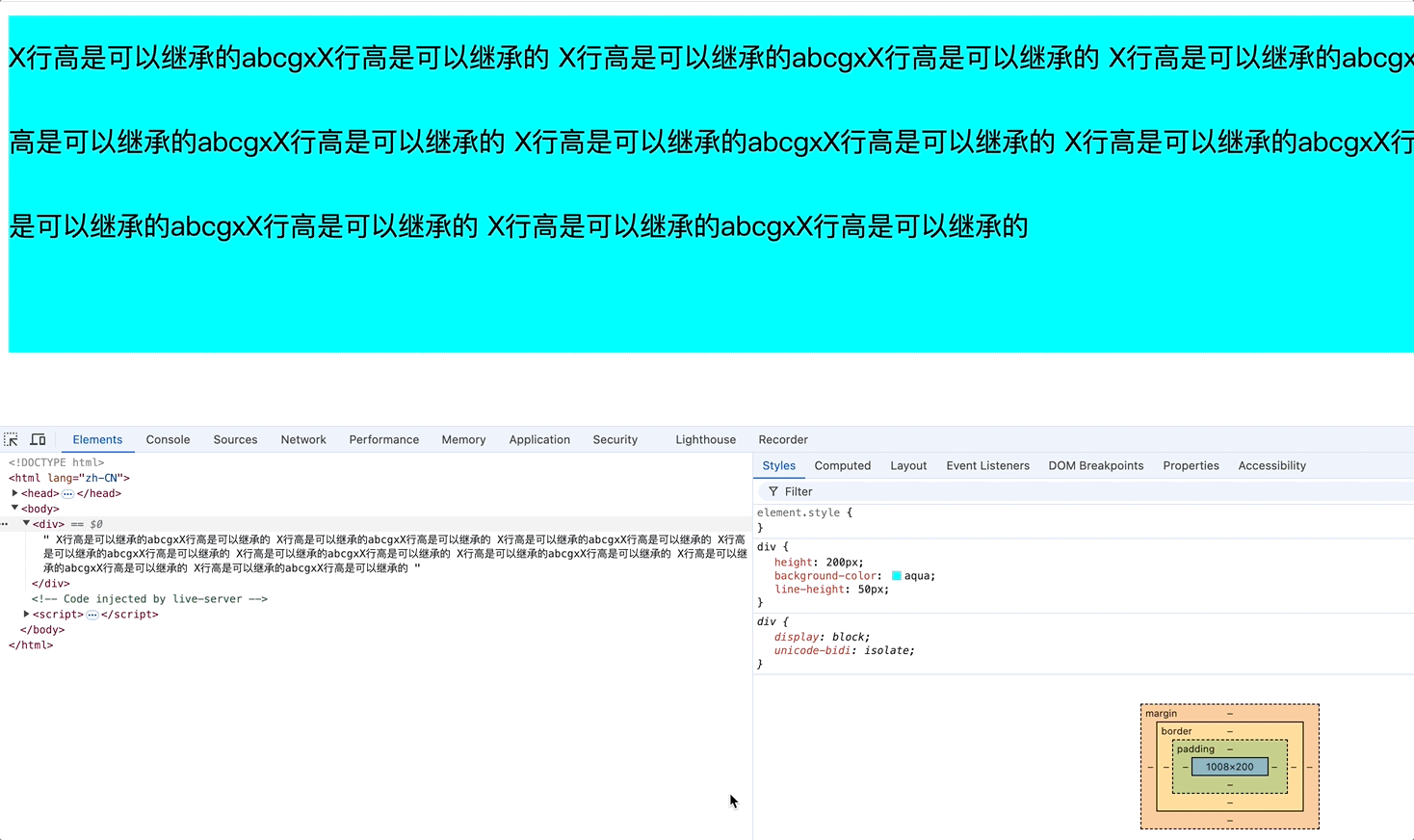
line-height导致div背景色失效的原因
div不指定高度时其高度受到子元素的line-height和height属性的影响,
<style>
    div {
        background-color: aqua;
        line-height: 0px;
    }
</style>

<body>
    <div>
        X行高是可以继承的abcgx
    </div>
</body>
明明设置了div的背景色为蓝色,为什么不显示呢?
div的高度 = 行高 * 行数
原因: 在没有设置div高度时,由内容高度决定,内容行高为0px,因此div的高度为0px,导致蓝色背景不显示。如上图,div的高度0px。
行高的应用场景
场景:
1.调整多行文字的间距。
2.单行垂直居中对齐,设置line-height为height值,并不是绝对垂直居中。这是由于字体设计时,文字并不是在行框居中,而是靠下一些。
<style>
    div {
        height: 200px;
        background-color: aqua;
        line-height: 50px;
    }
</style>

<body>
    <div>
        X行高是可以继承的abcgxX行高是可以继承的
    </div>
</body>

</html>
div的高度 = line-height,使div中的文字和整个行内元素垂直居中,并不是绝对居中。
使用行高使单行文字定位在垂直底部(临时办法不推荐)
<style>
    div {
        font-size: 30px;
        background-color: aqua;
        height: 200px;
        /* line-height = height * 2 - font-size - x */
        line-height: 364px;
    }
</style>

<body>
    <div>
        行高是指文本行与行之间的垂直距离
    </div>
</body>
单行文字计算行高实现垂直底部对齐
行高增加到div高度的2倍,基线大概向下移动div高度1倍
line-height = height * 2: 会超出div,因此仍需要对line-height进行微调减少
最终调整行高是文字底部对齐的公式:
line-height = height * 2 - font-size - x
x: 根据字体大小动态调整,如30px字体,x = 30px * 0.2(大概调整的倍数) = 6px
vertical-align行内元素或行内块元素或表格单元格垂直对齐方式
用法: 对行内元素或行内块元素设置对齐方式,默认基线对齐
作用对象:
行内元素: 作用于整个元素
行内块元素: 作用于整个元素
表格单元格<th><td>: 作用于文字
对于块元素不起作用
使行内元素盒模型与其行内元素容器垂直对齐。例如,用于垂直对齐行文本内的图片
属性值有:
- top: 顶部对齐
- middle: 中间对齐
- bottom: 底部对齐
- baseline: 基线对齐(默认值)
<style>
    .d1 {
        font-size: 80px;
        background-color: aqua;
        height: 300px;
    }

    span {
        font-size: 40px;
        background-color: red;
        vertical-align: middle;
    }

    .div-block {
        background-color: blue;
        height: 300px;
        vertical-align: bottom;
    }

    .td {
        vertical-align: top;
    }
</style>
<body>
    <div class="d1">
        vertical-align 属性设置元素的垂直对齐方式x<span>x对齐方式</span>
    </div>

    <div class="div-block">
        div块级元素不起作用
    </div>

    <table width="250px" border="1" cellspacing="0">
        <caption>vertical-align作用于单元格上</caption>
        <thead>
            <tr>
                <td>姓名</td>
                <td>年龄</td>
            </tr>
        </thead>
        <tbody>
            <tr>
                <td class="td" height="100px">张三</td>
                <td>16</td>
            </tr>
            <tr></tr>
                <td height="100px">李四</td>
                <td>17</td>
            </tr>
        </tbody>
    </table>
</body>
top: 使元素及其后代元素的顶部与整行的顶部对齐。
bottom: 使元素及其后代元素的底部与整行的底部对齐。
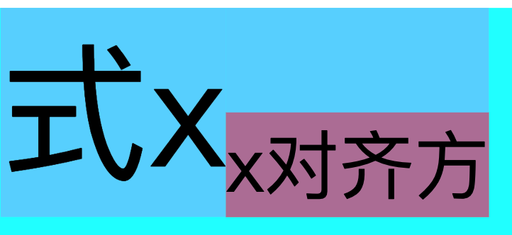
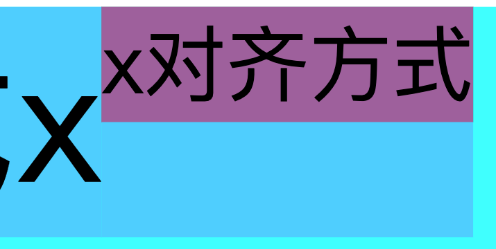
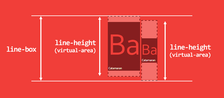
middle: 使元素的中部与父元素的基线加上父元素 x-height 的一半对齐
使元素的中部水平线与父元素的基线到父元素小x高度的一半位置水平线对齐。一定是小x的一半。也就是说,元素中部水平线穿过父元素小x的交叉点。
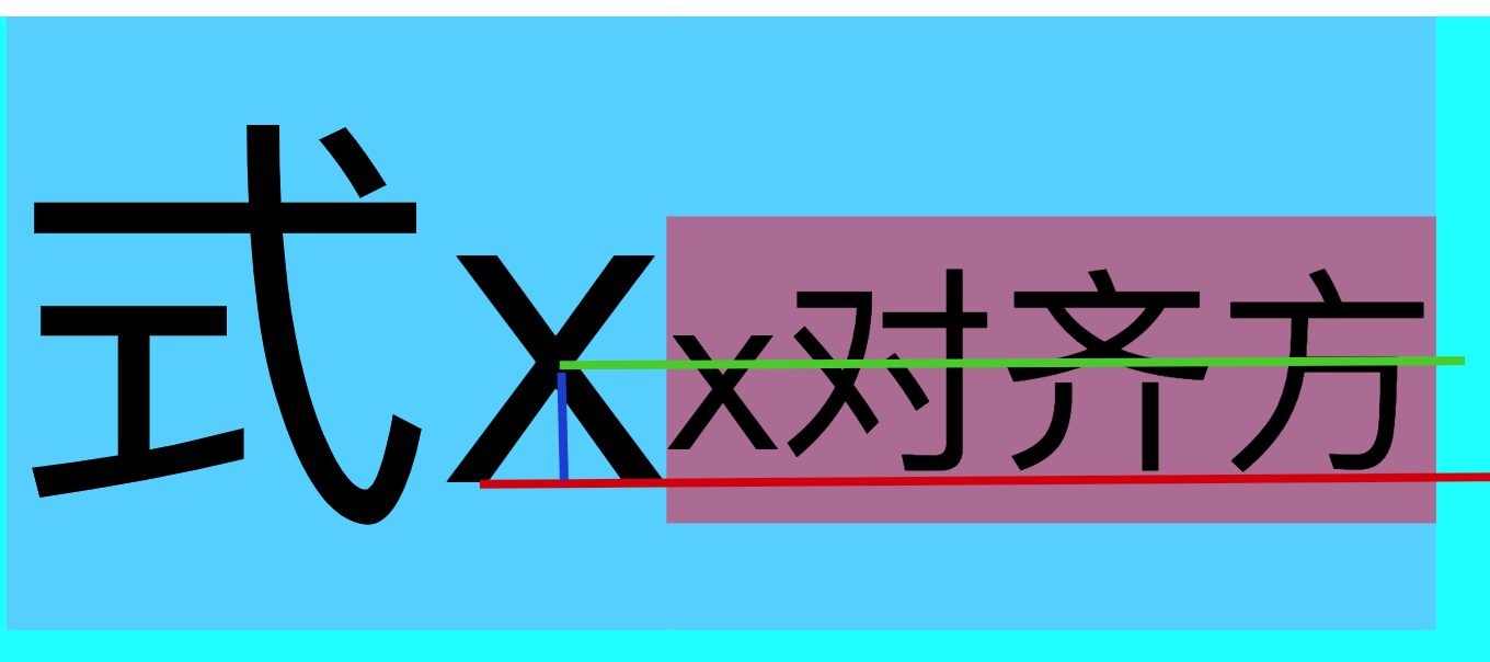
vertical-align对块级元素不起作用,如div标签p标签等,但是可以作用于单元格td标签。如下

分析行内元素和块元素默认基线对齐的影响
<style>
.d1 {
font-size: 50px;
background-color: aqua;
height: 200px;
line-height: 200px;
}
span {
font-size: 20px;
background-color: red;
/* vertical-align: top; */
/* vertical-align: middle; */
/* vertical-align: bottom; */
}
</style>
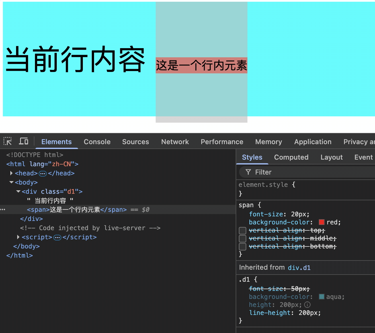
<div class="d1">
当前行内容
<span>这是一个行内元素</span>
</div>
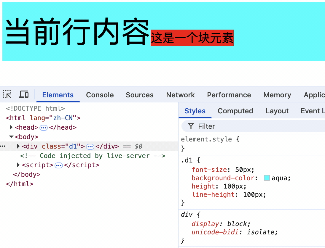
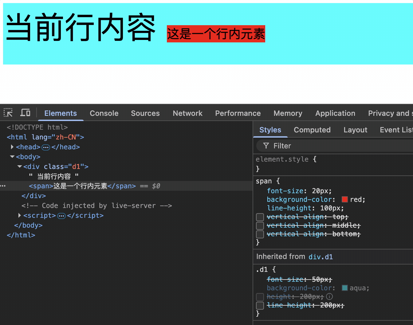
当span字体不断变化时,其基线是不断移动的。如下动图,白色水平线为参考线。
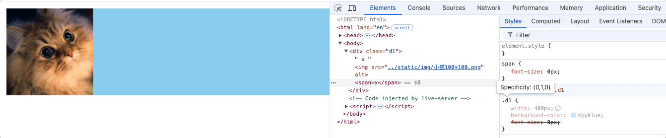
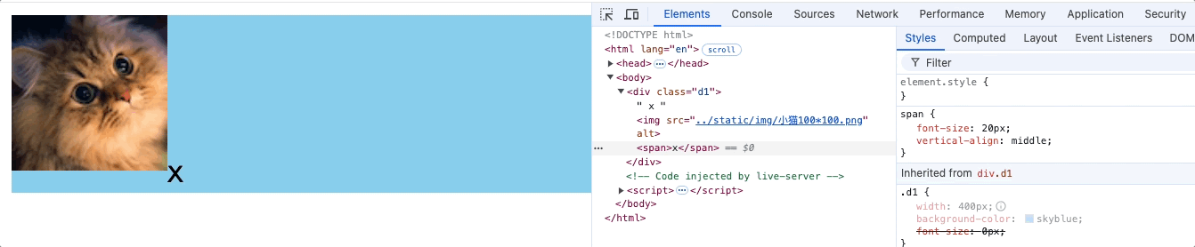
因为span中的文字默认基线对齐于父元素基线。因此基线位置不再移动,相对span的行框位置不断移动,我们从下动图中可以看出span的行高超出了div蓝色背景向下延伸。
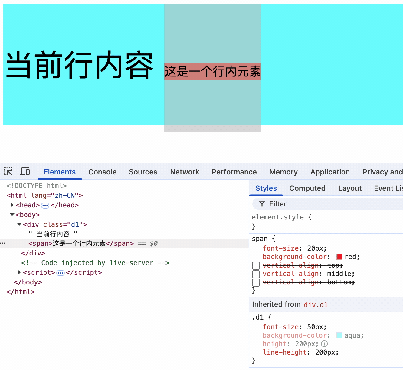
这也导致了整个行高大于200px,因为行高是从子元素的最高点到最低点,如上图。
在div没有指定高度时,其高度会受子元素高度和行高的影响,如下动图。
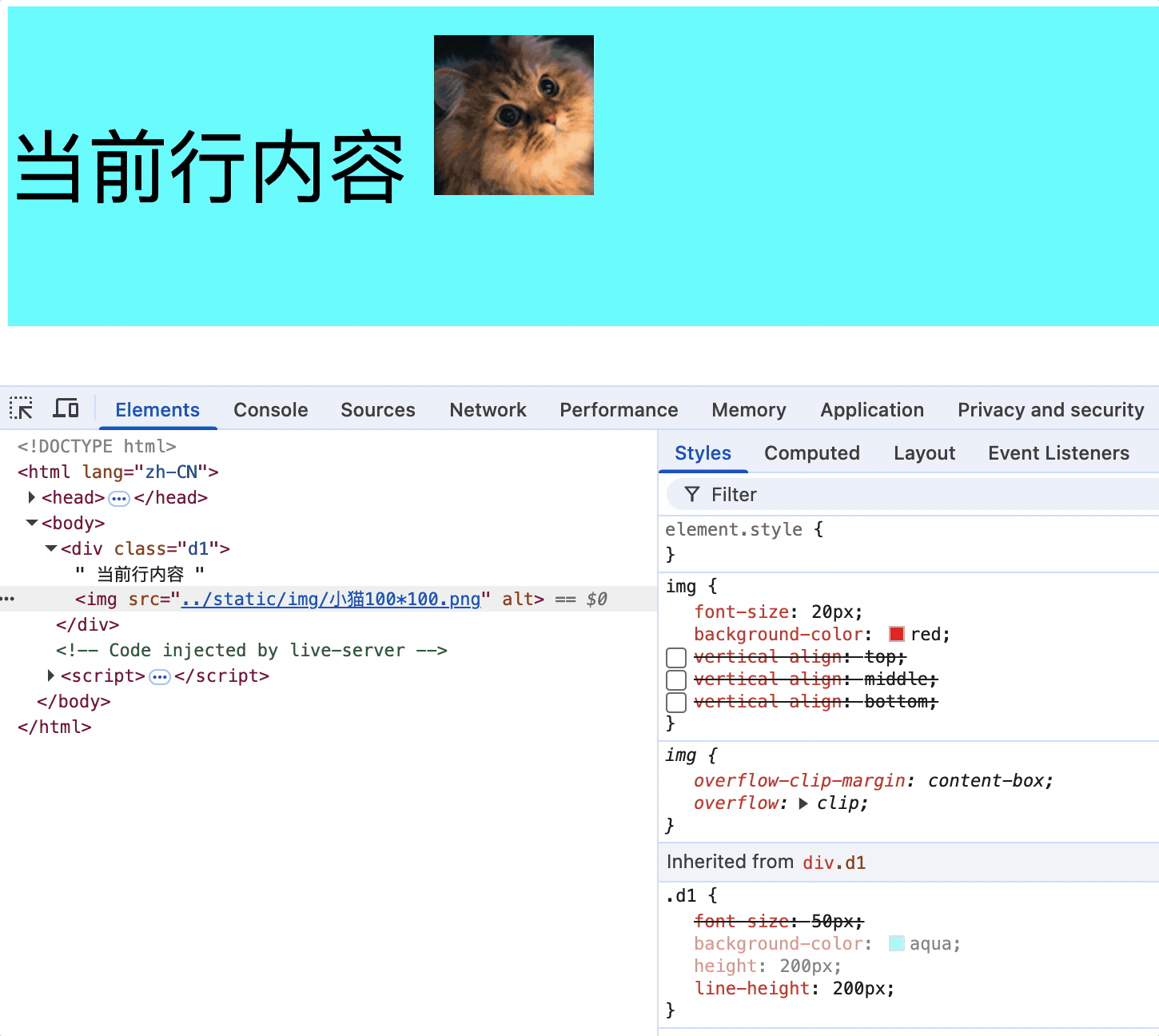
行内块元素使用vertical-align对齐不受基线对齐影响
父元素设置行高,vertical-align对行内块元素效果。
由于行内块元素没有放大缩小的动作,基线不会改变,因此不存基线对齐的影响。
<style>
    .d1 {
        font-size: 50px;
        background-color: aqua;
        height: 200px;
        line-height: 200px;
    }
    img {
        font-size: 20px;
        background-color: red;
        /* vertical-align: top; */
        /* vertical-align: middle; */
        /* vertical-align: bottom; */
    }
</style>
<div class="d1">
    当前行内容
    <img src="../static/img/小猫100*100.png">
</div>
总结
行内元素或行内块元素没有水平对齐,其原因是受字体属性改变从而影响基线位置发生改变,又因为默认基线对齐,也就变相的使行内元素或块元素发生了位移于。
解决方法:设置行内元素或行内块元素vertical-align: top/bottom,使其顶部/底部对齐父元素边界。
如下图,span行高最底部和父元素行高最底部对齐。
列表相关属性
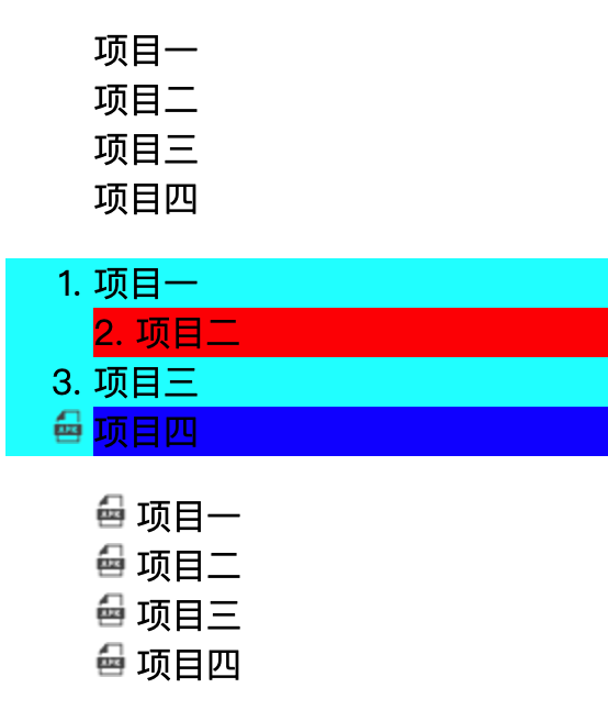
list-style-type: 列表前面的符号,可以是空、数字、方块等。
list-style-position: 符号位置定位在列表内部或者外部。
list-style-image: 使用图片作为列表前面的符号。
list-style: 以上三个属性的简写。
<style>
    .u0 {
        /* 列表前面无任何符号 */
        list-style-type: none;
    }

    .ul {
        /* 列表前面的符号,可以是数字,方块 */
        list-style-type: decimal;
        background-color: aqua;
    }

    .ul li:nth-child(2) {
        /* 符号位置定位在列表内部或者外部 */
        list-style-position: inside;
        background-color: red;
    }

    .ul li:nth-child(4) {
        background-color: blue;
        list-style-image: url("../static/img/APK.png");
    }

    .ul2 {
        /* 列表符合属性 没有数量和位置要求 */
        list-style: decimal inside url("../static/img/APK.png");
    }
</style>

<body>
    <h1>无序列表示例</h1>

    <ul class="u0">
        <li>项目一</li>
        <li>项目二</li>
        <li>项目三</li>
        <li>项目四</li>
    </ul>
    <ul class="ul">
        <li>项目一</li>
        <li>项目二</li>
        <li>项目三</li>
        <li>项目四</li>
    </ul>

    <ul class="ul2">
        <li>项目一</li>
        <li>项目二</li>
        <li>项目三</li>
        <li>项目四</li>
    </ul>
</body>
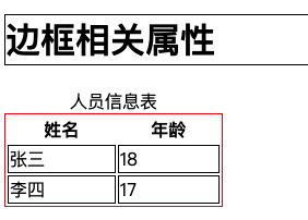
表格相关属性
边框相关属性
border: 边框的简写,包括边框样式、边框宽度、边框颜色。
border-style: 边框样式,如solid、dashed、dotted等。
border-width: 边框宽度,如1px、2px等。
border-color: 边框颜色,如red、blue、green等。
border边框属性也可以作用于其他标签。
<style>
    table {
        width: 200px;
        /* border-style: solid;
        border-width: 1px;
        border-color: black; */
        border: 1px solid red;
    }

    tr,
    td {
        border: 1px solid black;
    }

    h1 {
        border: 1px solid black;

    }
</style>

<body>
    <h1>边框相关属性</h1>

    <table>
        <caption>人员信息表</caption>
        <thead>
            <tr>
                <th>姓名</th>
                <th>年龄</th>
            </tr>
        </thead>
        <tbody>
            <tr>
                <td>张三</td>
                <td>18</td>
            </tr>
            <tr>
                <td>李四</td>
                <td>17</td>
            </tr>
        </tbody>
    </table>

</body>
表格独有属性(只能作用于table标签)
table-layout: 表格布局方式,默认值auto,根据内容调整表格宽度。fixed,表格宽度根据表格宽度调整。默认情况下,大多数浏览器使用自动表格布局算法。表格及其单元格的宽度会根据内容自动调整大小。
empty-cells: 隐藏没有内容的单元格 ,只有当不合并单元格边框时才会生效
border-collapse: 合并单元格边框
border-spacing: 单元格边框之间的距离
caption-side: 表格标题位置,top、bottom
<style>
    table {
        width: 300px;
        border: 2px solid black;
        /* 控制表格的列宽 */
        table-layout: auto;
        /* 表格的间距,生效前提不要合并单元格边框 */
        border-spacing: 0px;
        /* 合并单元格的边框 */
        /* border-collapse: collapse; */
        /* 隐藏没有内容的单元格,生效前提不要合并单元格边框 */
        empty-cells: hide;
        /* 设置表格标题的位置 */
        caption-side: top;
    }

    th,td {
        border: 2px solid red;
    }
</style>

<body>

    <table>
        <caption>人员信息表</caption>
        <thead>
            <tr>
                <th>姓名</th>
                <th>年龄</th>
            </tr>
        </thead>
        <tbody>
            <tr>
                <td>张三</td>
                <td>18</td>
            </tr>
            <tr>
                <td>李四王五</td>
                <td></td>
            </tr>
        </tbody>
    </table>

</body>
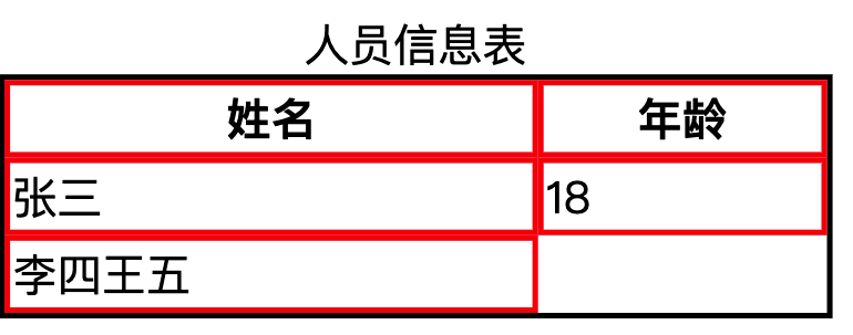
隐藏没有内容的单元格 ,只有当不合并单元格边框时才会生效
背景相关属性
background-color: 设置背景颜色,默认背景颜色为transparent 透明色
background-image: 设置背景图片,url("图片地址")
background-repeat: 设置背景图片是否重复,默认值repeat,可以设置为no-repeat,repeat-x,repeat-y
background-position: 设置背景图片的位置,默认值是left top,写两个值
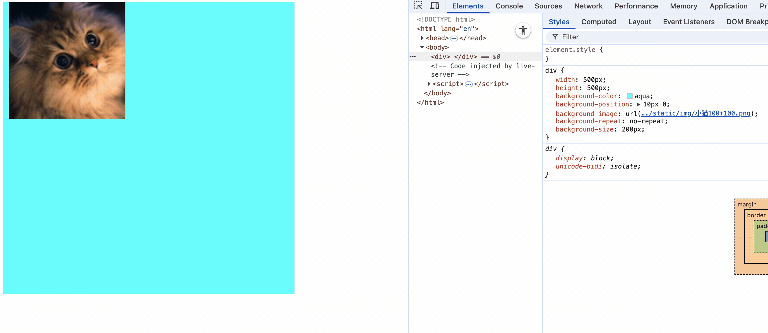
<style>
    div {
        width: 500px;
        height: 500px;
        background-color: aqua;
        background-position: 10px 0;
        background-image: url("../static/img/小猫100*100.png");
        background-repeat: no-repeat;
        background-size: 200px;
    }
</style>
<div></div>
属性值(可以是关键字也可以是像素值):
left top: 使背景图在盒子的左上角
right top: 使背景图在盒子的右上角
left bottom: 使背景图在盒子的左下角
right bottom: 使背景图在盒子的右下角
center: 使背景图在盒子中心
如果只写一个值,另一个方向默认为center。当图片放大时,也就会以中心点放大
像素位置:指定具体像素值,调整位置 原点: 左上角 x: 向右计算 y: 向下计算
如果只有一个值,那么该值表示的是x轴位置,y轴默认居中。
background: 以上四个属性的复合属性,没有顺序要求。
<style>
div {
width: 500px;
height: 500px;
font-size: 50px;
background-color: aqua;
/* 设置背景图片 */
background-image: url("../static/img/小猫100*100.png");
/* 设置图片重复类型 no-repeat 不重复 repeat-x 只在x轴重复 repeat-y 只在Y轴重复*/
background-repeat: no-repeat;
/*
设置背景图片位置 水平方向 垂直方向 left/center/right top/center/bottom
如果只指定一个方向位置,另一个方向默认居中
*/
/* background-position: left center; */
/*
指定具体像素值,调整位置 原点: 左上角 x: 向右计算 y: 向下计算
如果只一个值,那么该值表示的是x轴位置,y轴默认居中
*/
background-position: 10px 100px;
/* 复合属性 复合属性默认背景颜色为transparent 透明,会覆盖掉上面指定background-color的值*/
/* background: url("../static/img/小猫100*100.png") no-repeat 10px 100px; */
}
</style>
<body>
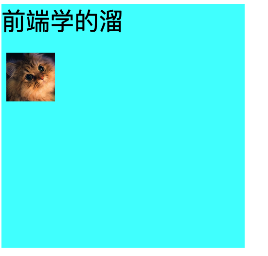
<div>
前端学的溜
</div>
</body>
鼠标相关属性
cursor: 设置鼠标样式,默认值auto,可以设置为pointer,text,wait等。
也可以指定图片。
<style>
div {
width: 500px;
height: 500px;
background-color: aqua;
cursor: url("../static/img/鼠标样式.png"), pointer;
}
button {
/* 控制鼠标移动元素上方时,鼠标光标样式 */
cursor: pointer;
}
</style>
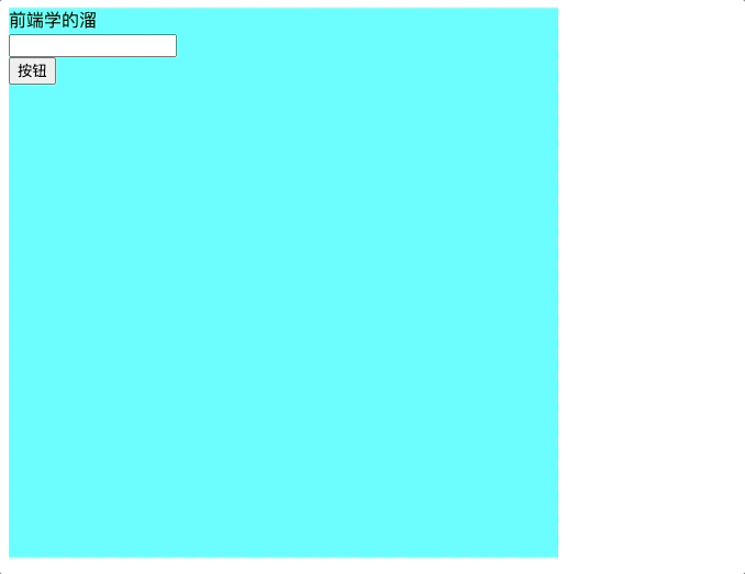
<body>
<div>
前端学的溜
<br>
<input type="text">
<br>
<button>按钮</button>
</div>
</body>
盒模型
长度单位
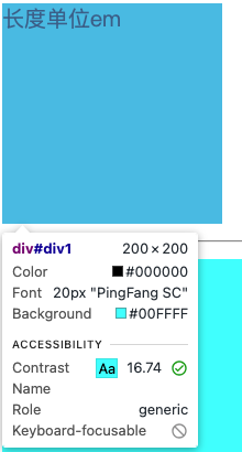
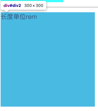
px: 像素
em: 相对于当前元素或其祖先素的font-size的倍数,当前元素的font-size为50px,那么width:10em = 50px10 = 500px 如果当前元素没有font-size,那么继续找父元素的font-size,如果一直找不到,那就使用浏览器默认的font-size
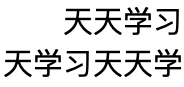
rem: 相对于根元素html的font-size的倍数,如果html的font-size为50px,那么width:10rem = 50px10 = 500px ,如果html元素没有font-size,那就使用浏览器默认的font-size,文字缩进都是用rem进行缩进
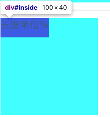
%: 相对于父元素宽度的百分比,如果父元素宽度为100px,那么width:50% = 100px*50% = 50px
<style>
    html {
        font-size: 30px;
    }

    #div1 {
        /*
        em: 相对于当前元素或其祖先素的font-size的倍数,当前元素的font-size为50px,那么width:10em = 50px*10 = 500px
        如果当前元素没有font-size,那么继续找父元素的font-size,如果一直找不到,那就使用浏览器默认的font-size
        */
        width: 10em;
        height: 10em;
        font-size: 20px;
        background-color: aqua;
    }

    #div2 {
        /*
        rem: html元素的font-size的倍数,如果html元素没有font-size,那就使用浏览器默认的font-size
        */
        width: 10rem;
        height: 10rem;
        font-size: 20px;
        background-color: aqua;
    }

    #div3 {
        width: 200px;
        height: 200px;
        font-size: 20px;
        background-color: aqua;
    }

    #inside {
        /*
        %: 相对其父元素的百分比
        */
        width: 50%;
        height: 20%;
        background-color: blue;
    }

    #div4 {
        text-indent: 2rem;
    }
</style>

<body>

    <div id="div1">
        长度单位em
    </div>
    <hr>
    <div id="div2">
        长度单位rem
    </div>
    <hr>
    <div id="div3">
        <div id="inside">长度单位%</div>
    </div>
    <div id="div4">
        天天学习天天学习天天学习天天学习天天学习天天学习天天学习天天学习天天学习天天学习天天学习天天学习天天学习天天学习天天学习天天学习天天学习天天学习天天学习天天学习天天学习天天学习天天学习天天学习天天学习天天学习
    </div>
</body>
使用rem,文字缩进
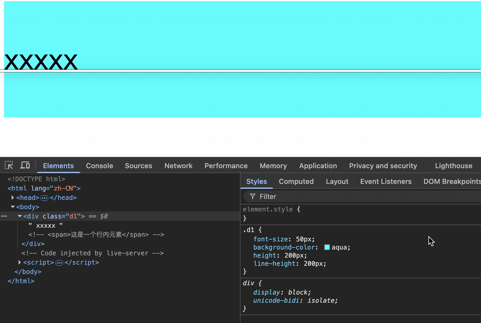
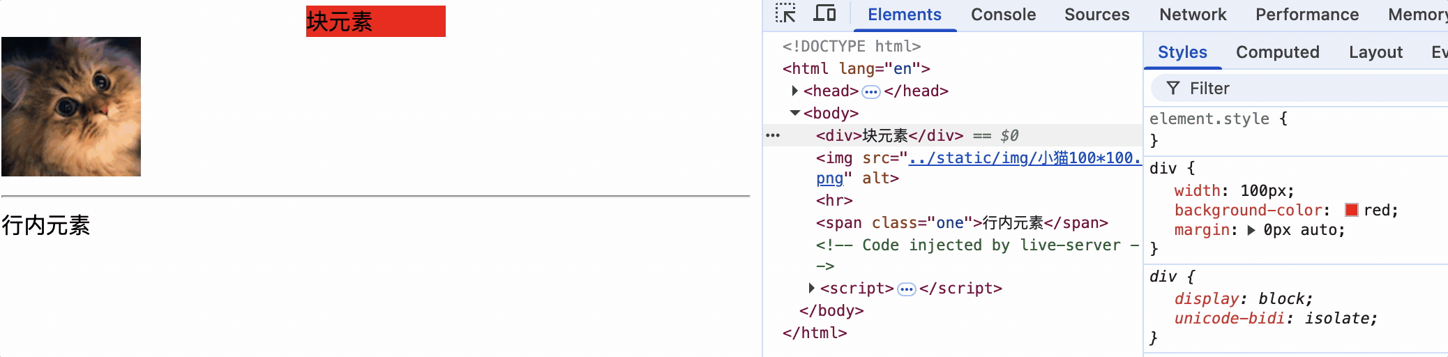
元素的显示模式
块级元素
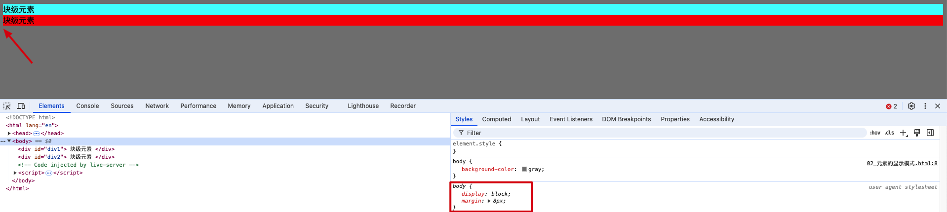
block: 块级元素
特点:
1.默认占一行
2.默认宽度为父元素宽
3.默认高度为内容高
4.可以设置宽高
div为块级元素,从表现上看并没有撑满整个宽度,原因是浏览器默认会给body添加margin样式,如下图。
行内元素
inline: 行内元素,又称为内联元素
特点:
1.在页面中不独占一行,在一行中如果不能容纳下行内元素,回换行继续从左到右排列
2.默认宽度为内容宽
3.默认高度为内容高
4.不能通过css设置宽高
行内块元素
inline-block: 行内块元素,又称为内联块元素
特点:
1.在页面中不独占一行,在一行中如果不能容纳下行内元素,回换行继续从左到右排列
2.默认宽度为内容宽
3.默认高度为内容高
4.可以通过css设置宽高
<style>
body{
background-color: gray;
}
#div1 {
background-color: aqua;
}
#div2 {
background-color: red;
}
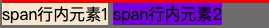
#span1{
background-color: antiquewhite;
}
#span2{
background-color: blueviolet;
}
img{
width: 50px;
}
</style>
<body>
<div id="div1">
块级元素
</div>
<div id="div2">
块级元素
</div>
<span id="span1">span行内元素1</span>
<span id="span2">span行内元素2</span>
<hr>
<img src="../static/img/小猫100*100.png" alt="">
<img src="../static/img/小猫100*100.png" alt="">
</body>
块级元素(block):
- 主体结构标签
<html><body> - 排版标签
<h1><h2><h3><h4><h5><h6><pre><div><p> - 列表标签
<ul><ol><li><dl><dt><dd> - 表格相关标签
<table><tbody><thead><tfoot><tr><caption> <form><option>
行内元素(inline):
- 文本标签
<br><em><strong><sup><sub><del><ins><span> <a><lable>
验证<br>是行内元素
span后面的br并没有换行,由此可见br是行内元素。
lable标签的作用: 让用户可以点击文本,从而激活表单中某个控件
<label>
    年龄
    <input type="text">
</label>

行内块元素(inline-block):
- 图片
<img> - 单元格
<td><th> - 表单控件
<input><textarea><button><select> - 框架标签
<iframe>
修改元素的显示模式
display值有以下几种:
block(默认) 元素作为块级元素显示
inline 元素作为行内元素显示
inline-block 元素作为行内块元素显示
none 隐藏元素
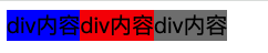
<style>
    div {
        width: 200px;
        height: 200px;
        font-size: 20px;
        background-color: gray;
        display: inline;
    }

    #div1 {
        background-color: blue;
    }

    #div2 {
        background-color: red;
    }

    #div3 {
        background-color: gray;
    }
</style>

<body>
    <div id="div1">div内容</div>
    <div id="div2">div内容</div>
    <div id="div3">div内容</div>
</body>
div之间有白色空格的原因:
元素之间的换行符和空格会被渲染为一个空格。这在inline或inline-block元素中尤为明显。
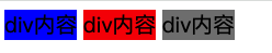
div之间没有换行
<div id="div1">div内容</div><div id="div2">div内容</div><div id="div3">div内容</div>
盒子模型的组成部分
css会把所有的html元素看成一个盒子,所有的样式也都基于这个盒子。
1.margin(外边距): 盒子与外界的距离
2.border(边框): 盒子的边框
3.padding(内边距): 盒子的内部与边框的距离
4.content(内容): 盒子的内部
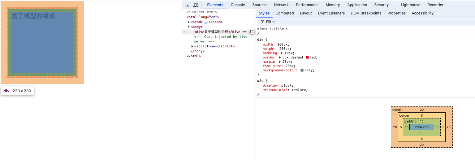
盒子背景色范围
元素的背景色作用范围是content,padding,border如下图:
盒子大小
盒子大小 = content + 左右padding + 左右border
注意: margin的大小不会影响盒子的大小,但会影响盒子的位置。
盒子的内容区
width属性是指元素的内容区的宽度,不包含元素的margin,border和padding。
width: 固定宽度
height: 固定高度
min-width: 最小宽度
max-width: 最大宽度
min-height: 最小高度
max-height: 最大高度
<style>
    div {
        min-width: 200px;
        height: 200px;
        background-color: gray;
    }
</style>

<body>
    <div>盒子内容大小</div>
</body>
指定元素最小值为200xp: min-width: 200px;
查看右侧控制台盒子的宽度降至200px时则不再改变。
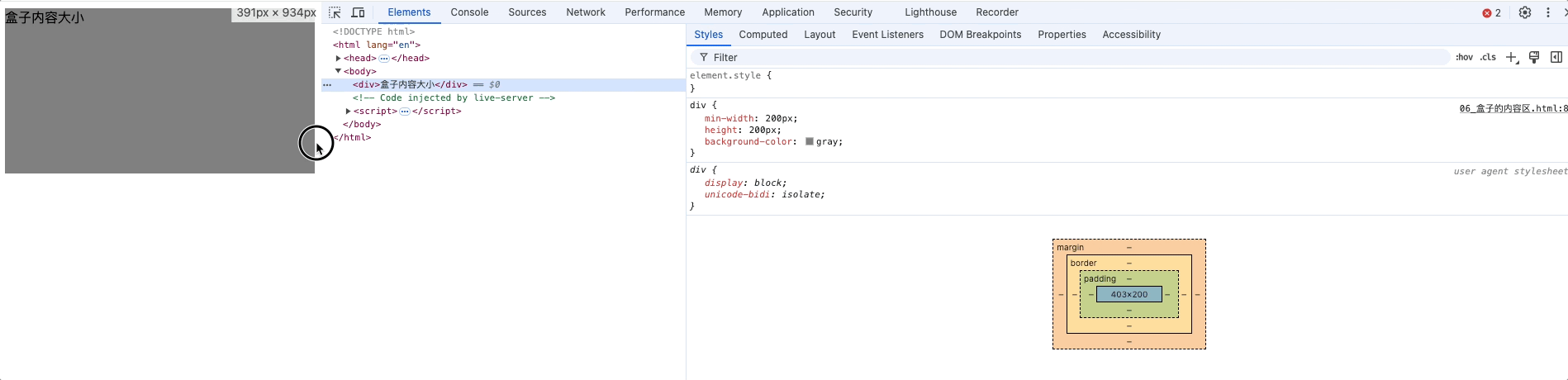
盒子默认宽度
div不指定宽度,不指定margin

div不指定宽度,指定margin
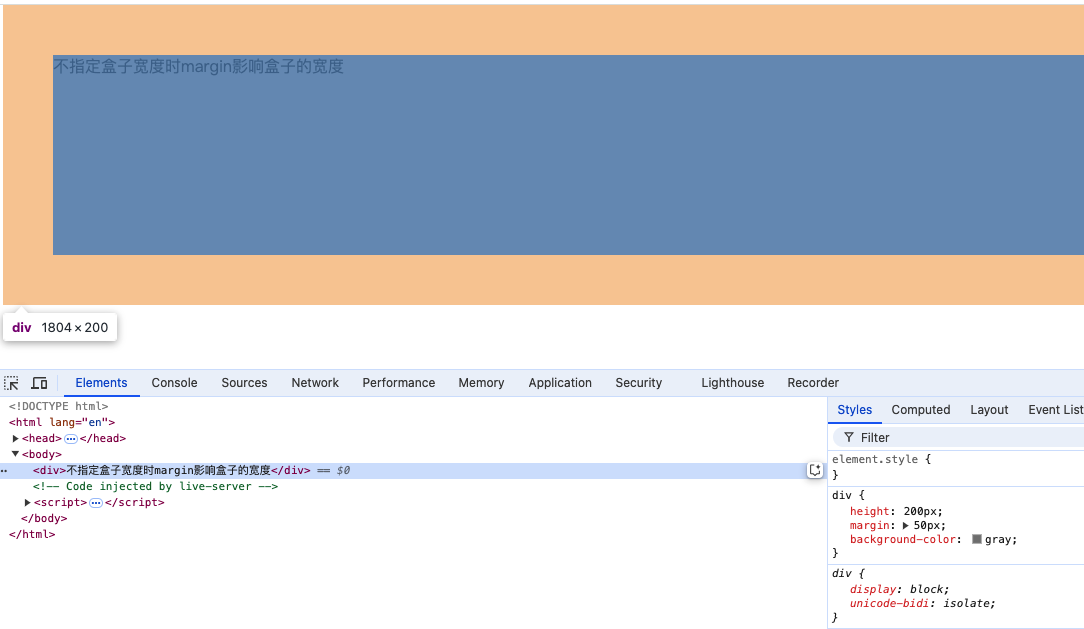
默认宽度: 当不给盒子设置宽度时,所呈现出来的盒子宽度
盒子宽度 = 父的content - 自身左右两边margin
盒子内容区宽度 = 父的content - 自身左右两边margin - 自身左右padding - 自身左右border
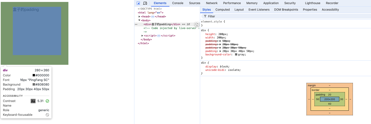
盒子内边距padding
/* padding: 上 */
padding-top: 10px;
/* padding: 下 */
padding-bottom: 10px;
/* padding: 左 */
padding-left: 20px;
/* padding: 右 */
padding-right: 20px;
/* padding: 上 下 左 右 */
padding: 50px;
/* padding: 上下 左右 */
padding: 20px 50px;
/* padding: 上 左右 下*/
padding: 20px 30px 50px;
/* padding: 上 右 下 左*/
padding: 20px 30px 40px 50px;
注意事项
行内元素的padding属性生效,上下内边距不占用文档流,左右内边距占用文档流
<style>
    .first {
        background-color: aqua;
        height: 200px;
    }
    .second {
        background-color: red;
        height: 200px;
    }
    span {
        background-color: green;
        padding: 30px;
    }
</style>
<div class="first"></div>
<span>行内元素上下是不占位置的</span>span之间文字
<span>行内元素上下是不占位置的</span>
<div class="second">div中的文字</div>

也就是说,行内元素上下左右padding是生效的,但是行内元素的上下内边距不占用文档空间,行内元素不会打断上下文档流,下面的div仍然仍可覆盖span的上下内边距。
为什么行内元素的背景色可以覆盖块级元素背景色
在标准文档流中,行内元素的背景层叠顺序高于块级元素的背景。
块级元素和行内块元素的padding属性上下左右都可以完美设置
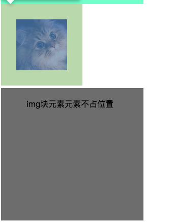
img {
    padding: 30px;
}
<img src="../static/img/小猫100*100.png" />
<div>img块元素元素不占位置</div>
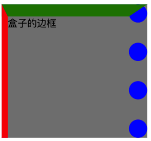
盒子边框border
border-style: 边框样式4个方向的样式,默认值none solid(实线) dotted(点线) dashed(虚线) double(双实现),复合属性;
border-style: dashed solid;
border-width: 边框宽度4个方向的宽度,默认值3px,,复合属性;
border-color: 边框颜色4个方向的颜色,默认值black,,复合属性;
border: border-style + border-width + border-color的复合属性,没有顺序和数量的要求
border: 10px solid red;border: 10px solid;
border-left-style: 左边框样式
border-left-width: 左边框宽度
border-left-color: 左边框颜色
border-left: 左边框复合属性
border-right-style: 右边框样式
border-right-width: 右边框宽度
border-right-color: 右边框颜色
border-right: 右边框复合属性
border-top-style: 上边框样式
border-top-width: 上边框宽度
border-top-color: 上边框颜色
border-top: 上边框复合属性
border-bottom-style: 下边框样式
border-bottom-width: 下边框宽度
border-bottom-color: 下边框颜色
border-bottom: 下边框复合属性
<style>
    div {
        height: 200px;
        width: 200px;
        background-color: gray;

        border-top-width: 20px;
        border-top-color: green;
        border-top-style: solid;

        border-left-width: 20px;
        border-left-color: red;
        border-left-style: solid;

        border-right-width: 30px;
        border-right-color: blue;
        border-right-style: dotted;

        border-left: 10px solid red;

        /* border: 10px solid red; */
    }
</style>

<body>
    <div>盒子的边框</div>
</body>
盒子的外边距margin
写法:
/*  margin: 上 */
margin-top: 20px;
/*  margin: 下 */
margin-bottom: 30px;
/*  margin: 左 */
margin-left: 40px;
/*  margin: 右 */
margin-right: 50px;
/*  margin:上 右 下 左 */
margin: 10px 20px 30px 40px;
/* margin: 上下 左右 */
margin: 10px 20px;
/* margin: 上下左右 */
margin: 10px;
/* margin: 左右*/
margin: auto;
/* margin: 上 左右 下 */
margin: 10px 20px 30px;
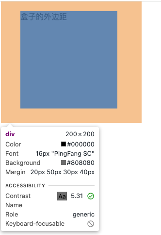
盒子外边距margin注意事项
<style>
    .parent {
        height: 400px;
        width: 400px;
        padding: 40px;
        background-color: pink;


    }
    .child {
            height: 200px;
            width: 200px;
            margin: 30px;
            background-color: skyblue;
        }
</style>
<body>
    <div class="parent">
        父元素盒子
        父元素盒子
        父元素盒子
        父元素盒子
        父元素盒子
        父元素盒子
        <div class="child">子元素盒子</div>
    </div>
</body>
子元素的margin是参考父元素的content进行计算的
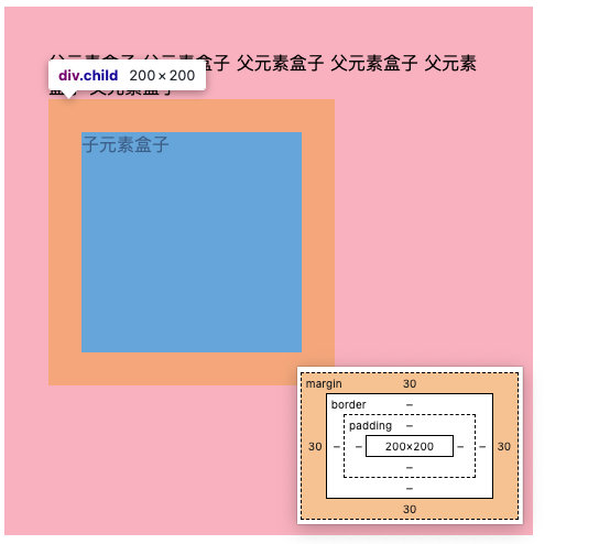
上margin和左margin会影响自身盒子以及下方兄弟盒子和右方兄弟盒子的位置,下margin和右margin会影响下方兄弟盒子和右方兄弟盒子的位置
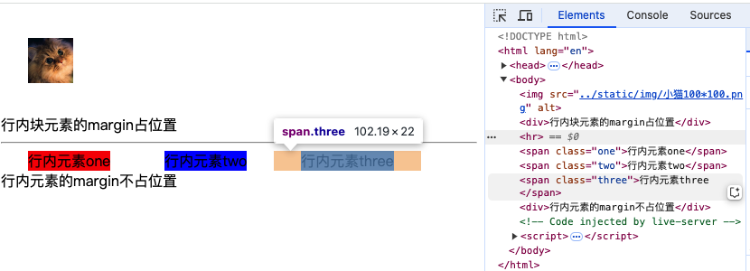
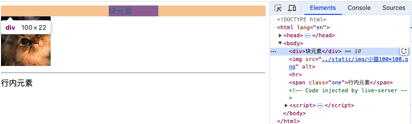
对于行内元素来说,左右的margin是可以完美设置的,上下的margin设置后无效,对于行内块元素来说,margin各个方向都生效
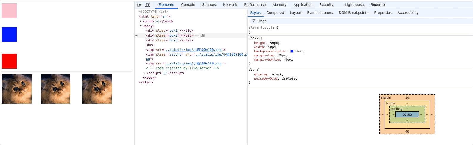
<style>
    img {
        height: 50px;
        width: 50px;
        margin: 30px;
    }
    .one {
        margin-top: 30px;
        margin-right: 30px;
        margin-bottom: 30px;
        margin-left: 30px;
        background-color: red;
    }
    .two {
        margin-top: 30px;
        margin-right: 30px;
        margin-bottom: 30px;
        margin-left: 30px;
        background-color: blue;
    }
    .three {
        margin-top: 30px;
        margin-right: 30px;
        margin-bottom: 30px;
        margin-left: 30px;
        background-color: gray;
    }

</style>

<body>
    <img src="../static/img/小猫100*100.png" alt="">
    <div>行内块元素的margin占位置</div>
    <hr>
    <span class="one">行内元素one</span><span class="two">行内元素two</span><span class="three">行内元素three</span>
    <div>行内元素的margin不占位置</div>
</body>
设置margin: 0 auto,可以使块元素在父元素内水平居中,行内块和行内元素则不生效
margin的值可以设置为auto,表示距离某个方向的最大值。auto也可以设置元素在父元素内水平居中或垂直居中
/* 水平居中 */
margin-left: auto;
margin-right: auto;
/* 垂直居中 */
margin-top: auto;
margin-bottom: auto;
/* 简写 */
margin: auto;
margin: 0 auto;: 上下外边距0,左右自动调整,使元素水平居中
margin: auto 0;: 上下外边距0,左右自动调整,使元素水平垂直居中
<style>
    div {
        width: 100px;
        background-color: red;
        margin: 2px auto;
    }

    img {
        margin: 2px auto;
    }

    .one {
        margin: 2px auto;
    }
</style>

<body>
    <div>块元素</div>
    <img src="../static/img/小猫100*100.png" alt="">
    <hr>
    <span class="one">行内元素</span>
</body>
在使用margin: 0 auto时需要指定该元素的width
设置margin等于auto为什么不能垂直居中
即使让父元素overflow: hidden;,但是依然不能垂直居中
原因: 块级元素设置宽度后仍占据一行空间,左右仍有可计算空间,自动设置左右边距,
而盒子的上下已经没有空间了,无法自动计算,因此auto对于上下边距仍然是0,只能通过margin-top: 确定值的方式垂直居中,并且父元素overflow: hidden;消除margin塌陷
margin的值可以是负值,表示向相反方向移动
<style>
    .div1 {
        width: 100px;
        height: 100px;
        background-color: red;
    }
    .div2 {
        width: 100px;
        height: 100px;
        background-color: blue;
        margin-top: -50px;
    }
</style>

<body>
    <div class="div1"></div>
    <div class="div2"></div>
</body>

margin塌陷问题
margin塌陷问题实质上就是历史遗留问题,在早期页面阅读效果很简单,在设计w3c规范时,为了方便,在给第一个子元素设置顶部外边距或者给最后一个子元素设置底部外边距时,索性交给了父元素。现如今页面布局复杂,原来的设计反而成了一个问题。
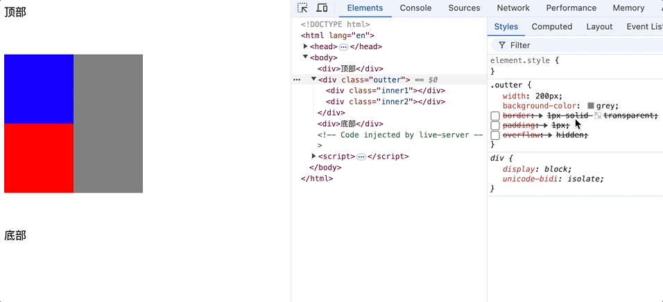
塌陷定义
Margin 塌陷(也称为外边距合并)是指在 CSS 布局中,当两个垂直方向(通常是上下)的块级元素相遇时,它们之间的外边距会以一种特殊的方式合并,而不是简单地相加。这种合并可能会导致布局效果与预期不符。
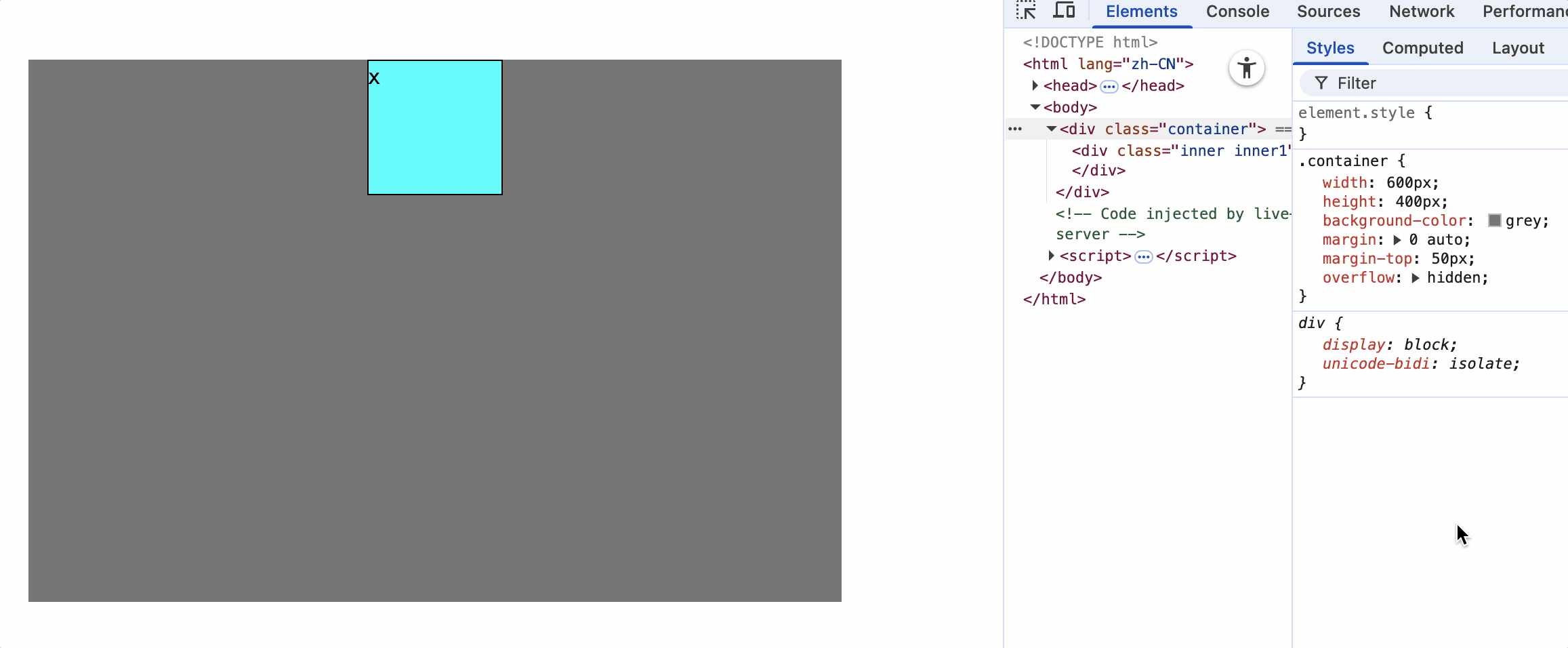
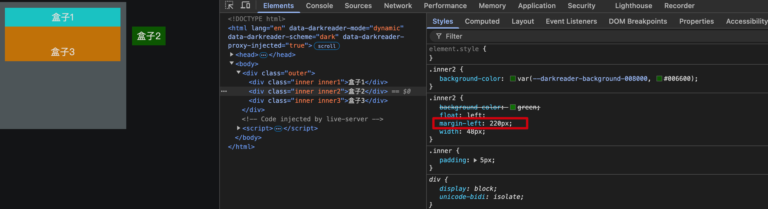
子元素的margin塌陷
形式一
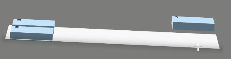
如果对子元素设置上外边距(margin-top),而父元素没有内边距(padding)或边框(border),那么子元素的 margin-top 会传递给父元素,使父元素向下移动,而子元素的margin-top失效,仍然紧靠父元素的顶部。

上图,我们往往希望在蓝色子元素上添加margin-top,使蓝色和红色div整体向下移动,但实际上父元素也向下移动了。代码如下
<style>
    .outter {
        width: 200px;
        height: 300px;
        background-color: grey;
    }

    .inner1 {
        width: 100px;
        height: 100px;
        background-color: blue;
        margin-top: 50px;
    }
    .inner2 {
        width: 100px;
        height: 100px;
        background-color: red;
    }
</style>

<body>
    <div>顶部</div>
    <div class="outter">
        <div class="inner1"></div>
        <div class="inner2"></div>
    </div>
    <div>底部</div>
</body>
为第一个子元素设置margin-top,实际上是被父元素抢走了,即margin-top作用在了父元素上。
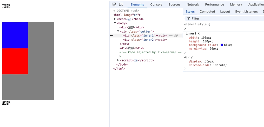
形式二
在不设置父元素高度情况下,最后一个子元素和父元素的底部边界重合时,当 margin-bottom 作用于 子元素 时,如果其 父元素没有 padding 或 border ,那么子元素的 margin-bottom 可能会影响到整个父元素的外边距,使得父元素也像是拥有了 margin-bottom。
<style>
    .outter {
        width: 200px;
        height: 200px;
        background-color: grey;
    }

    .inner1 {
        width: 100px;
        height: 100px;
        background-color: blue;
        margin-top: 50px;
    }
    .inner2 {
        width: 100px;
        height: 100px;
        margin-bottom: 50px;
        background-color: red;
    }
</style>

<body>
    <div>顶部</div>
    <div class="outter">
        <div class="inner1"></div>
        <div class="inner2"></div>
    </div>
    <div>底部</div>
</body>
形式二中为什么对父元素设置高度后,父元素则不存在塌陷问题?
父元素的 height 使其边界确定
当 height 没有设置时,父元素的高度通常是由子元素的内容决定的。如果父元素本身没有 padding 或 border,子元素的 margin-bottom 可能会影响整个父元素,导致看起来像是父元素的 margin-bottom。
当 height 被明确指定(即使是 min-height),父元素的边界固定,子元素的 margin-bottom 只能影响子元素本身,而不会影响整个父元素。
解决塌陷问题方式
- 为父元素设置border
border: 1px solid transparent; - 为父元素设置padding
padding: 1px; - 对祖父元素设置溢出隐藏 (推荐使用)
overflow: hidden;
<style>
    .outter {
        width: 200px;
        background-color: grey;
        /* border: 1px solid transparent; */
        /* padding: 1px; */
        overflow: hidden;
    }

    .inner1 {
        width: 100px;
        height: 100px;
        background-color: blue;
        margin-top: 50px;
    }
    .inner2 {
        width: 100px;
        height: 100px;
        margin-bottom: 50px;
        background-color: red;
    }
</style>
margin合并问题
<style>
    .first {
        width: 200px;
        height: 200px;
        background-color: grey;
        margin-bottom: 50px;
    }

    .second {
        width: 200px;
        height: 200px;
        background-color: blue;
        margin-top: 60px;
    }

    .box {
        width: 200px;
        height: 200px;
        display: inline-block;
    }

    .boxa {
        background-color: red;
        margin-right: 50px;
    }

    .boxb {
        background-color: green;
        margin-left: 50px;
    }
</style>

<body>
    <div class="first"></div>
    <div class="second"></div>
    <hr>
    <div class="box boxa"></div>
    <div class="box boxb"></div>
</body>
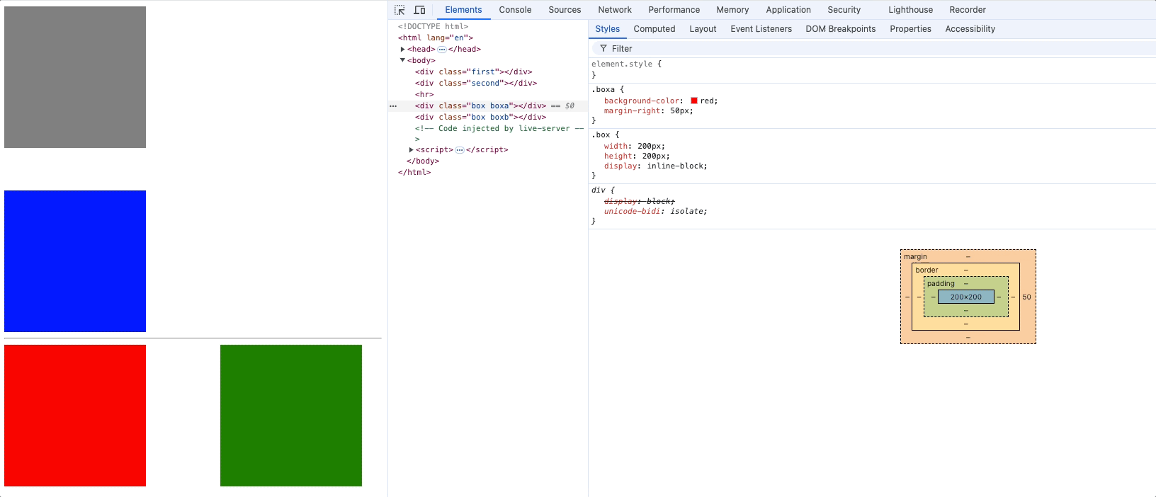
合并问题定义:
上面兄弟元素的margin-bottom和下面兄弟元素的margin-top会合并,取一个最大值而不是相加。
解决margin合并的问题:
无需特意解决,只需要修改某一个兄弟元素的外边距即可。
如果使用float: left布局去解决,会影响整体布局。
overflow处理内容溢出
<style>
    .first {
        width: 300px;
        height: 100px;
        background-color: red;
    }
</style>
<div class="first">
    lorm ipsum dolor sit amet, consectetur adipisicing elit. Quisquam, quidem, quia, voluptatibus, quibusdam,
    voluptates, quos, quod, quae, quibusdam, quia, voluptatibus, quibusdam, voluptates, quos, quae, quibusdam,
    voluptates, quos, quae, quibusdam, voluptates, quos, quae, quib
</div>
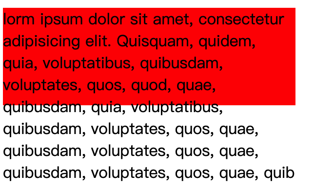
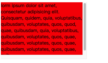
overflow: 控制内容溢出
visible: 显示(默认值),内容可能超过父容器界限hidden: 内容超出隐藏scroll: 内容超出显示滚动条,如果内容不超出,也会显示滚动条占用的边框auto: 内容超出显示滚动条,当滚动条不存在时,不显示滚动条也不显示滚动条占用的边框
overflow-x: 控制水平方向内容溢出 值同overflow
overflow-y: 控制垂直方向内容溢出 值同overflow
注意: overflow-x和overflow-y不能一个是hidden一个是visible,是实验性属性。不建议使用。
overflow常用的值是hidden和auto,除了能处理内容溢出显示问题,还能处理很多疑难杂症。
元素隐藏方式
visibility: show 显示 hidden 隐藏
display: none 隐藏
<style>
    .first {
        width: 200px;
        height: 200px;
        background-color: red;
        visibility: hidden;
        /* display: none; */
    }

    .second {
        width: 200px;
        height: 200px;
        background-color: grey;
    }
</style>

<body>
    <div class="first">1</div>
    <div class="second">2</div>
</body>
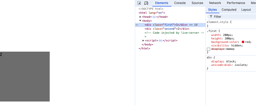
注意:
visibility: hidden仍然占据元素为位置
display: none不占据元素位置,没有大小宽高,彻底隐藏
样式的继承
<style>
    .first {
        width: 500px;
        height: 500px;
        background-color: red;
        padding: 50px;
    }

    .second {
        width: 300px;
        height: 300px;
        background-color: grey;
        padding: 50px;
        font-size: 20px;
        font-weight: bold;
        color: orange
    }

    .third {
        width: 200px;
        height: 200px;
        background-color: green;
    }
</style>
<body>
    <div class="first">
        <div class="second">
            <div class="third">你好</div>
        </div>
    </div>
</body>
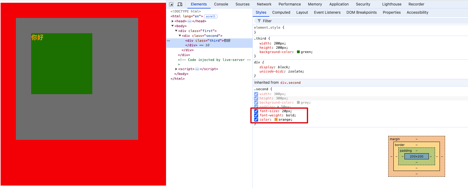
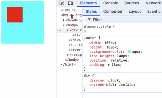
inherited : 继承自某个祖先元素。上图中,把.second的元素属性都列出了,高亮属性代表thrid已经继承了。
会继承的css属性: 字体属性、文本属性(除了vertical-algin)、文字颜色等。
不会继承的css属性: 边框、背景、内边距、外边距、宽高、溢出方式等。
一个规律: 能继承的属性都是不影响布局的,简单说都和盒子模型没关系的属性可以继承。
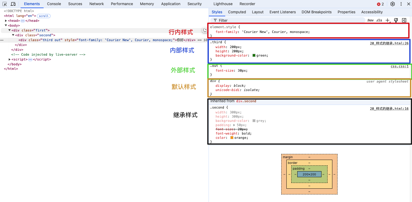
element.style: 行内样式
后面带有.html文件名称的是内部样式,例如: .third 是.html文件的内部样式
后面带有.css文件名称的是外部样式,例如: .out 是css.css文件中的样式
user agent style: 浏览器默认样式
inherited: 继承自某个祖先元素
元素的默认样式
<body>
    <a href="https://baidu.com">去百度</a>
</body>
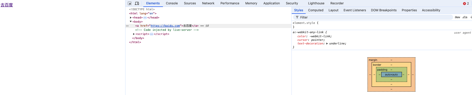
/* 浏览器默认样式 */
a:-webkit-any-link {
    color: -webkit-link;
    cursor: pointer;
    text-decoration: underline;
}
元素一般都有默认样式,如 body元素默认有margin: 8px;
布局技巧
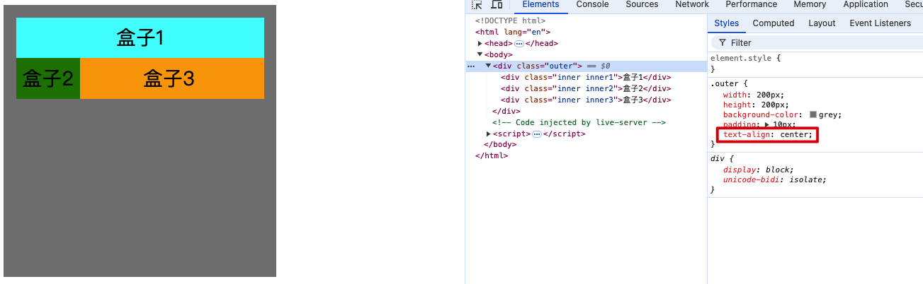
块元素居中
<style>
    .outer {
        width: 400px;
        height: 400px;
        background-color: grey;
        overflow: hidden;
    }

    .inner {
        width: 200px;
        height: 100px;
        background-color: orange;
        margin: auto;
        margin-top: 150px;
        text-align: center;
        line-height: 100px;
    }
</style>

<body>
    <div class="outer">
        <div class="inner">inner</div>
    </div>
</body>
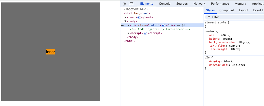
行内元素、行内块元素居中
行内元素和行内块元素在调整位置时都可以像文本一样调整。因此可以为父元素添加文本相关属性,使行内元素居中
<style>
    .outer {
        width: 400px;
        height: 400px;
        background-color: grey;
        text-align: center;
        line-height: 400px;
    }

    .inner {
        background-color: orange;
    }
</style>
<body>
    <div class="outer">
        <span class="inner">inner</span>
    </div>
</body>
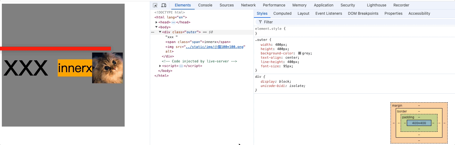
<style>
    .outer {
        width: 400px;
        height: 400px;
        background-color: grey;
        text-align: center;
        line-height: 400px;
        font-size: 0px;
    }

    .span {
        background-color: orange;
        vertical-align: middle;
        font-size: 40px;
    }

    img {
        vertical-align: middle;
    }
</style>

<body>
    <div class="outer">
        <span class="span">innerx</span><img src="../static/img/小猫100*100.png" alt="">
    </div>
</body>
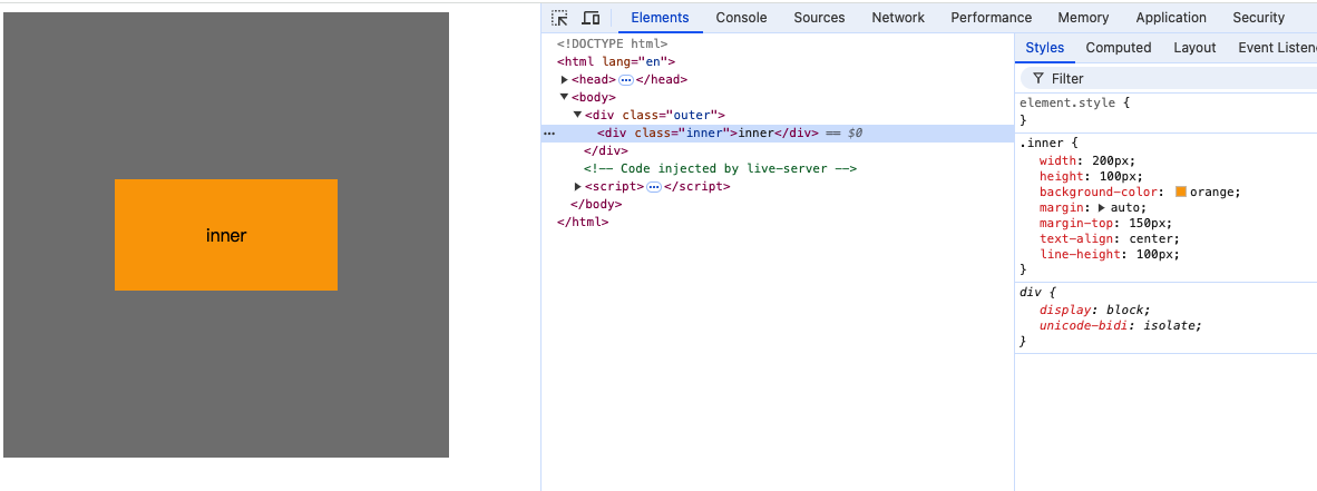
布局技巧总结:
-
行内元素、行内块元素,可以被父元素当做文本处理布局。
即: 可以像处理文本一样,去处理: 行内、行内块在父元素中对齐。
例如: text-align、line-height、text-indent等。 -
未脱离文档流情况下如何让子元素在父元素中水平居中?
- 如果子元素为块元素
- 设置子元素的margin: 0 auto;
- 在使用margin: 0 auto时需要指定该元素的width;
- 如果子元素为行内块元素、行内元素
- 设置父元素的text-align: center;。
- 未脱离文档流情况下如何让子元素在父元素中垂直居中?
- 如果子元素为块元素
- 设置父元素overflow: hidden;消除子元素设置margin不生效(子元素margin塌陷);
- 设置子元素的margin-top: 值px; 值: (父元素content - 子元素盒子总高度) / 2;
- 使用
line-height = 父元素高度不能使块元素垂直居中,只能影响块元素中的文字垂直居中
- 如果子元素为行内元素、或行内块元素
- 设置父元素的line-height: 父元素高度;
- 对每个子元素设置vertical-align: middle;
- 绝对居中: 设置父元素的font-size: 0px;(补充)
注意使用vertical-align: middle时:
子元素的垂直位置是和父元素的小x的基线交叉点持平的,即相对于父元素的基线水平对齐
因此父元素的字体大小会影响子元素vertical-align的垂直位置,如上面动图。
所以需要把父元素的font-size设置为0xp,子元素的中点对齐父元素行框的中点,
又因为父元素line-height为父元素高度,因此子元素中点在父元素行框内绝对垂直居中了。
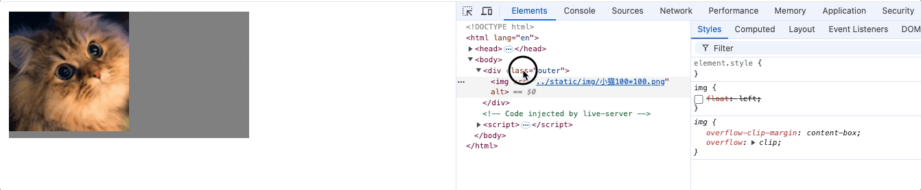
行内元素或行内块元素之间的空白问题
产生的原因: 对于行内元素、行内块元素浏览器在遇到换行代码时会解析为空白字符。
空白字符大小也是由font-size决定,因此
解决办法: 为父元素设置font-size: 0px,子元素设置影响的属性为font-size: 值px。
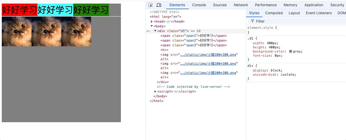
行内块元素的幽灵空白问题
<style>
    .d1 {
        width: 400px;
        background-color: skyblue;
    }
</style>

<body>
    <div class="d1">x
        <img src="../static/img/小猫100*100.png" alt="">
    </div>
</body>
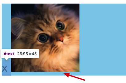
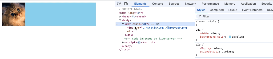
产生的原因,父元素不设置高度情况下,行内块元素是基于父元素的基线水平对齐的,就是图片下边缘和小x的基线保持水平,小x所在的行框中基线和行框下边缘产生的空隙。
解决方式:
方式一:
- 对图片元素设置vertical-align: 非baseline
方式二:
- 把图片设置为块元素,就不存在基线对齐了,前提是父元素中没有其他元素。
img {
    display: block;
}
方式三:
<style>
    .d1 {
        width: 400px;
        background-color: skyblue;
        font-size: 0px;
    }
    span {
        font-size: 20px;
        vertical-align: bottom;
    }
</style>

<body>
    <div class="d1">
        <img src="../static/img/小猫100*100.png" alt="">
        <span>x</span>
    </div>
</body>
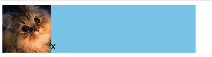
- 设置父元素字体font-size: 0px;
- 把父元素中其他文字用span包裹;
- 对span设置font-size: 20px;vertical-align: bottom;
原理:
基于行内元素默认基线对齐,当父元素的字体设置为0时,基线和图片底部边缘重合
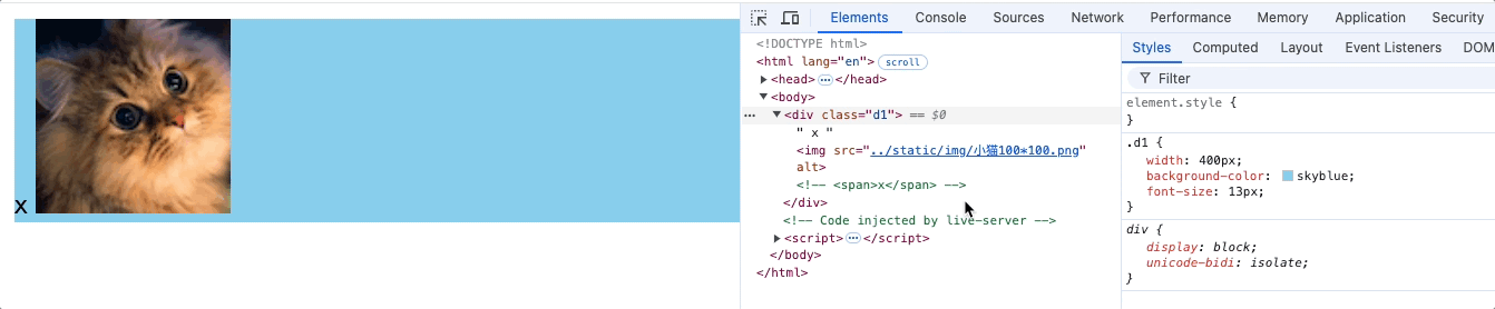
再设置span字体为20px,span字体基于默认基线对齐又撑开了父元素
因此,需要设置span的vertical-align: bottom/top;
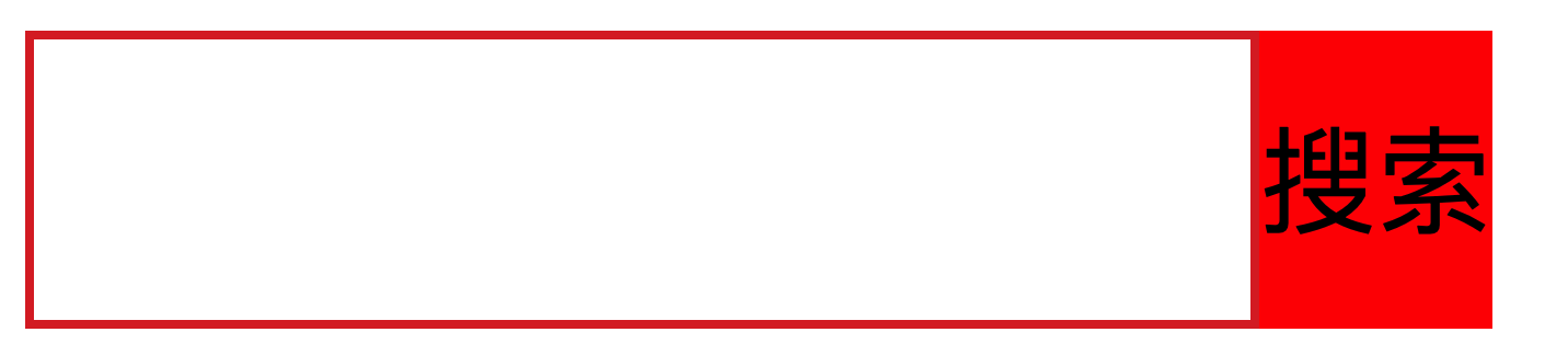
input和按钮对齐
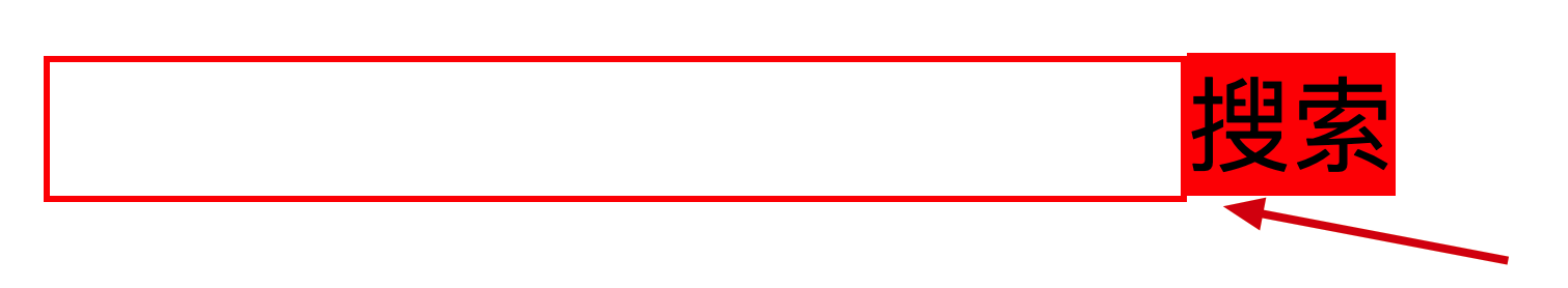
上图代码如下存在输入框和按钮没有对齐的问题
<style>
    input,
    button {
        margin: 0;
        padding: 0;
        box-sizing: border-box;
    }

    input,
    button {
        outline: none;
        border: none;
    }

    .head {
        font-size: 0;
    }

    .head input {
        height: 34px;
        border: 1px solid red;
    }

    .head button {
        height: 34px;
        background-color: red;
    }
</style>

<body>
    <div class="head">
        <form action="#">
            <input type="text">
            <button>搜索</button>
        </form>
    </div>
</body>
产生问题的原因是,行内元素或行内块元素在父元素中默认是基于基线对齐的,input和button都是vertical-align: baseline,而基线并不穿过元素的垂直中点,而中文字体的高度不同,会影响基线位置,因此要消除基线的影响。如下动图输入框的内容会使输入框位置改变
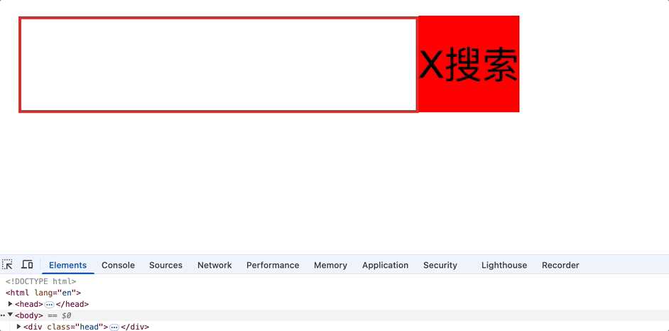
如果把"搜索"改成小"x"就会对齐。
解决方式一:
设置input和button高度相同,并同时设置line-height = height,使元素垂直居中
.head input {
    height: 34px;
    line-height: 34px;
    border: #DD302D 1px solid;
}

.head button {
    height: 34px;
    line-height: 34px;
    background-color: red;
}
解决方式二:
修改input或button的对齐方式,那为什么只修改button元素的对齐方式就能对齐呢,原因是input的高度和父元素.head元素高度一致,已经在父元素中垂直居中了,因此我们只需要把button在父元素中的对齐方式修改后,那么button也在父元素中垂直居中,因此input和button水平对齐。同理只修改input对齐方式也一样。
.head button {
    height: 34px;
    background-color: red;
    vertical-align: top/buttom;
}
浮动float
介绍
浮动在最早期,是用来实现文字环绕图片的效果,现在被用于页面布局方式之一。
浮动元素可以影响兄弟行内元素和兄弟行内块元素,以及后面兄弟块元素的布局。
如下图,文字、行内元素、行内块元素都会回绕浮动元素。也会影响后面的兄弟块元素在后续会详细说明。
<style>
    .div1 {
        width: 400px;
        height: 400px;
    }

    img {
        float: right;
    }
</style>

<body>
    <div class="div1">
        <img src="../static/img/小猫100*100.png" alt="">
        Lorem ipsum dolor sit amet consectetur adipisicing elit. Nam aut temporibus tempora placeat dolor eos harum
        quibusdam sit. At voluptate veritatis vero omnis, cum minus modi eius! Voluptate, natus magni.
    </div>
</body>
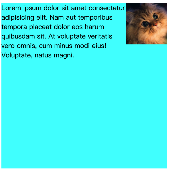
浮动效果
<style>
.outer {
width: 200px;
height: 200px;
background-color: grey;
padding: 10px;
}
.inner {
padding: 5px;
}
.inner1 {
background-color: aqua;
}
.inner2 {
background-color: green;
float: left;
}
.inner3 {
background-color: orange;
}
</style>
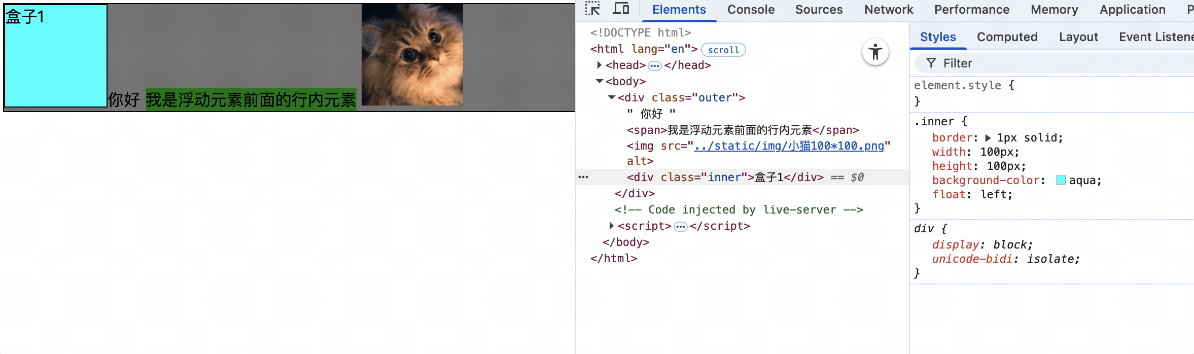
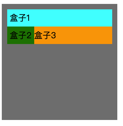
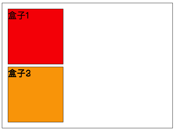
<body>
<div class="outer">
<div class="inner inner1">盒子1</div>
<div class="inner inner2">盒子2</div>
<div class="inner inner3">盒子3</div>
</div>
</body>
3d效果:
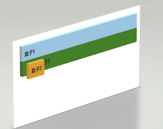
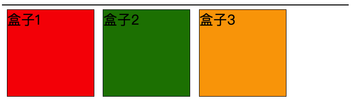
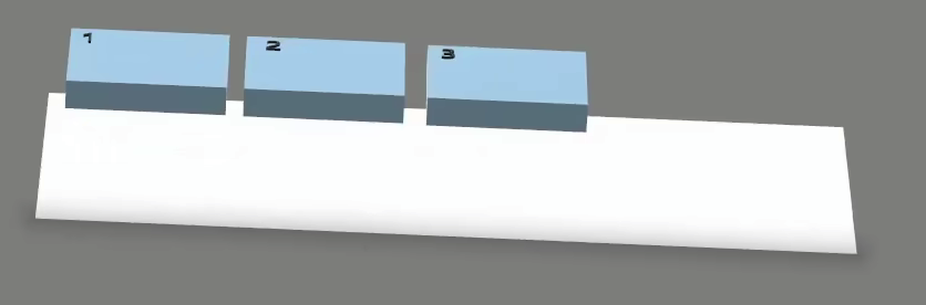
浮动后元素的特点
1.脱离文档流,如上图的3d效果,盒子2悬浮在文档上方
2.浮动后元素不会独占一行,可以与其他元素共用一行。
3.不管浮动前是什么类型的元素,块元素、行内元素、行内块元素浮动后,默认宽高都是由元素内容撑开的,而且可以设置宽高。
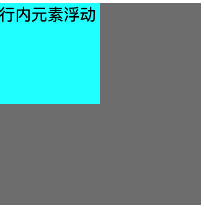
<style>
    .outer {
        width: 200px;
        height: 200px;
        background-color: grey;
    }
    span {
        background-color: aqua;
        float: left;
        height: 100px;
        width: 100px;
    }
</style>
<div class="outer">
    <span>行内元素浮动</span>
</div>
行内元素浮动前设置宽高无效,浮动后行内元素可以设置宽高。
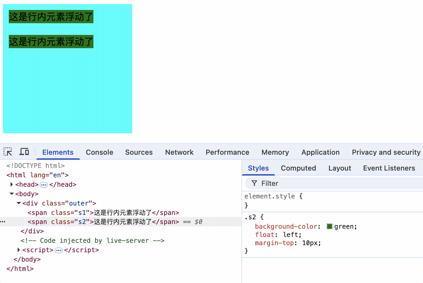
4.浮动元素设置margin不会使父元素出现margin塌陷问题,浮动元素之间也不会有margin合并问题,四个方向都可以完美设置margin和padding,但存在父元素高度塌陷问题。
行内元素设置margin-top生效,并且未出现该元素margin塌陷问题。
<style>
    .outer {
        width: 200px;
        height: 200px;
        background-color: grey;
    }
    .s1 {
        background-color: green;
        margin-top: 50px;
        float: left;
    }
</style>
<div class="outer">
    <span class="s1">这是行内元素浮动了</span>
</div>
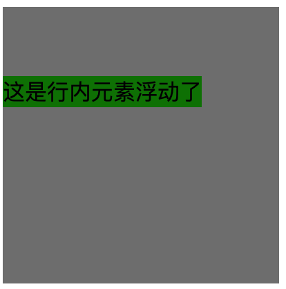
浮动元素不会出现margin合并
5.不会像行内元素一样当做文档进行布局。
例如父元素设置text-align: center;浮动后的盒子2不会水平居中
盒子3文字并没有相对整个宽度居中的原因
text-align: center; 是基于当前盒子内部可用的内容宽度进行居中的。
盒子2使用 float: left; 后虽然脱离了标准文档流,但它仍然占据页面的可视布局空间。
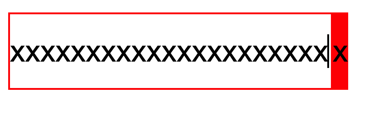
6.没有行内块的幽灵空白问题
7.浮动元素可以超出其父元素
8.浮动后元素位置默认在父元素的内容区,可以通过其他进行调整位置
浮动练习
效果:

实现:
<style>
    .outer {
        width: 300px;
        padding: 5px;
        border: 1px solid #000;
    }

    .inner {
        border: 1px solid;
        width: 100px;
        height: 100px;
        margin: 5px;
    }

    .inner1 {

        background-color: red;
        float: right;
    }

    .inner2 {
        background-color: green;
    }

    .inner3 {
        background-color: orange;
    }
</style>
<body>
    <div class="outer">
        <div class="inner inner1">盒子1</div>
        <div class="inner inner2">盒子2</div>
        <div class="inner inner3">盒子3</div>
    </div>
</body>
3D图:
效果图:
<style>
    .outer {
        width: 300px;
        padding: 5px;
        border: 1px solid #000;
    }

    .inner {
        border: 1px solid;
        width: 100px;
        height: 100px;
        margin: 5px;
    }

    .inner1 {
        background-color: red;
        float: left;
    }

    .inner2 {
        background-color: green;
    }

    .inner3 {
        background-color: orange;
    }
</style>

<body>
    <div class="outer">
        <div class="inner inner1">盒子1</div>
        <div class="inner inner2">盒子2</div>
        <div class="inner inner3">盒子3</div>
    </div>
</body>
3D图:
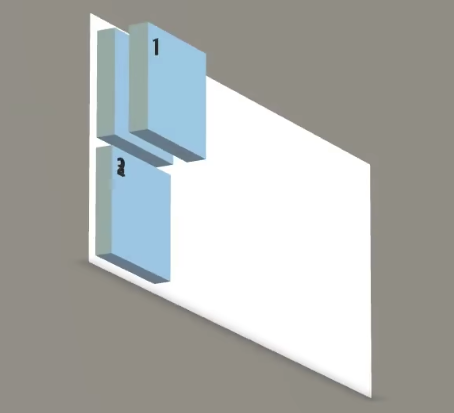
盒子2的div和盒子1重合,但是由于盒子1的盒子占据了盒子2的文字可用内容把盒子2的文字挤到了下方和盒子3的文字重合。初期在设计float时目的就是文字环绕,因此浮动的盒子1不会遮住盒子2中的文字。

效果图:
<style>
    .outer {
        width: 400px;
        border: 1px solid #000;
    }

    .inner {
        border: 1px solid;
        width: 100px;
        height: 100px;
        margin: 5px;
        float: left;
    }

    .inner1 {
        background-color: red;

    }

    .inner2 {
        background-color: green;
    }

    .inner3 {
        background-color: orange;
    }
</style>
<body>
    <div class="outer">
        <div class="inner inner1">盒子1</div>
        <div class="inner inner2">盒子2</div>
        <div class="inner inner3">盒子3</div>
    </div>
</body>
3D图:
效果图:

父元素盒子宽度不够导致盒子3往下悬浮。
<style>
    .outer {
        width: 300px;
        border: 1px solid #000;
    }

    .inner {
        border: 1px solid;
        width: 100px;
        height: 100px;
        margin: 5px;
        float: left;
    }

    .inner1 {
        background-color: red;

    }

    .inner2 {
        background-color: green;
    }

    .inner3 {
        background-color: orange;
    }
</style>

<body>
    <div class="outer">
        <div class="inner inner1">盒子1</div>
        <div class="inner inner2">盒子2</div>
        <div class="inner inner3">盒子3</div>
    </div>
</body>
3D图:
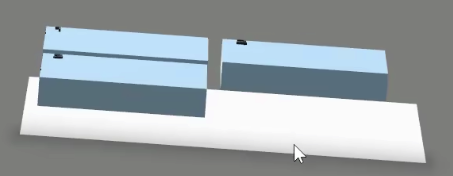
效果图:
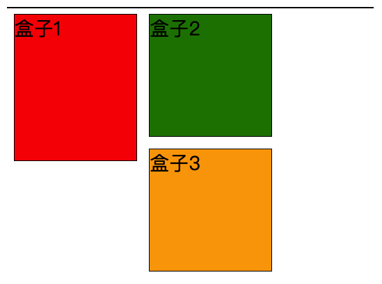
盒子1高于盒子2,那么盒子1会把盒子3卡在右边。
<style>
    .outer {
        width: 300px;
        border: 1px solid #000;
    }

    .inner {
        border: 1px solid;
        width: 100px;
        height: 100px;
        margin: 5px;
        float: left;
    }

    .inner1 {
        background-color: red;
        height: 120px;

    }

    .inner2 {
        background-color: green;
    }

    .inner3 {
        background-color: orange;
    }
</style>

<body>
    <div class="outer">
        <div class="inner inner1">盒子1</div>
        <div class="inner inner2">盒子2</div>
        <div class="inner inner3">盒子3</div>
    </div>
</body>
3D图:
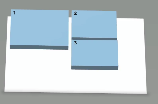
元素浮动后,优先填满旁边的可视化范围。盒子1高于盒子2,盒子1右边仍有空间,因此把盒子3卡在了右边。
父元素的宽度不足以放下浮动子元素时,该浮动子元素优先选择右侧空间。
如下图,浮动子元素盒子3的位置是在第二个盒子2下面。即使第一个盒子2下面的空间比较大也不会在其下面。
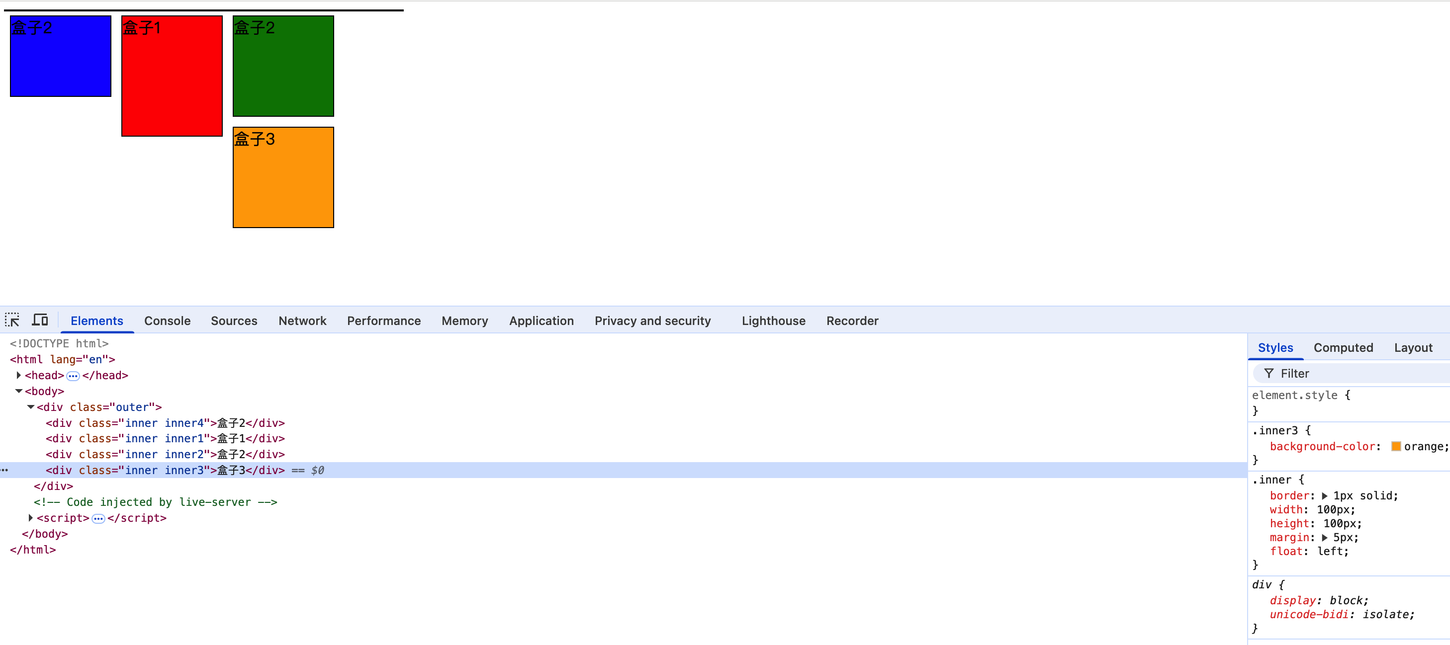
<div class="outer">
    <div class="inner inner1">盒子1</div>
    <div class="inner inner2">盒子2</div>
    <div class="inner inner3">盒子3</div>
    <div class="inner inner4">盒子4</div>
    <div class="inner inner1">盒子1</div>
    <div class="inner inner6">盒子6</div>
</div>
上面所有盒子都左浮动,后面浮动的盒子相对于前面的盒子一定是在右边或下边,在水平方向上不会在前面浮动元素的左边
如下图,所有盒子都左浮动,盒子3相对于盒子4一定是左浮动的,如果父元素宽度不够,那么盒子4就会跑到盒子3的下面,即使红色区域有空间,也绝不会和盒子3在水平方向上有重合
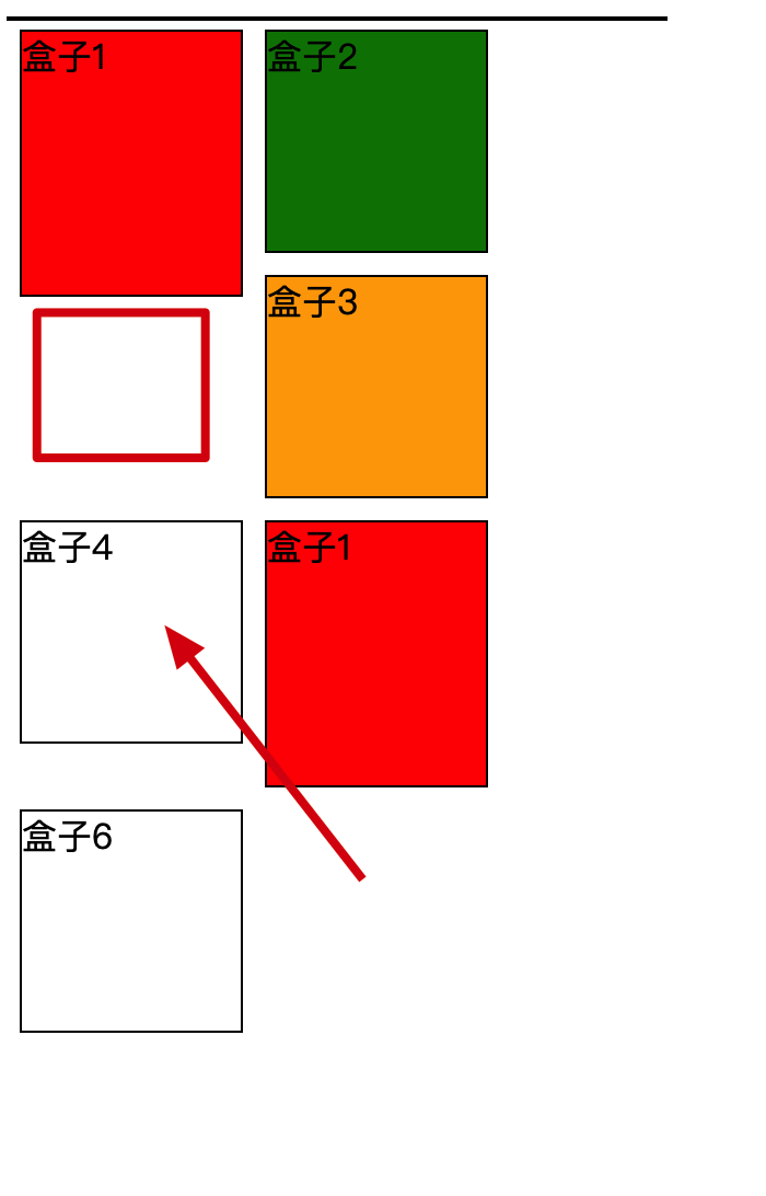
浮动后的影响
影响1: 对后面兄弟块元素的影响: 后面的兄弟元素,会占据浮动元素之前的位置,即在浮动元素的背后;对前面兄弟元素无影响。
<style>
    .outer {
        width: 350px;
        border: 1px solid #000;
        background-color: grey;
    }

    .inner {
        border: 1px solid;
        width: 100px;
        height: 100px;
        margin: 5px;
    }

    .inner1,.inner2,.inner3 {
        background-color:aqua;
        float: left;
    }
</style>

<body>
    <div class="outer">
        <div class="inner inner1">盒子1</div>
        <div class="inner inner2">盒子2</div>
        <div class="inner inner3">盒子3</div>
        <div class="inner inner4">盒子4</div>
    </div>
</body>
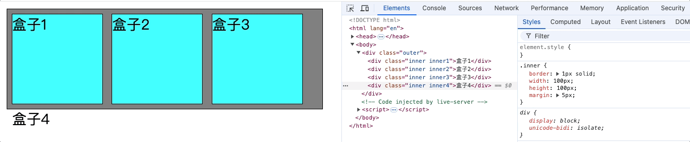
如上图: 后面的兄弟元素盒子4占据了盒子1的位置,和盒子1重合,真实情况是盒子4跑到了盒子1背后,盒子1,盒子2,盒子3都浮动占据了盒子4的可视内容,所以把盒子4文字挤出去了。
为什么后面的兄弟元素盒子4文字不在盒子3的右边,而是另起一行?
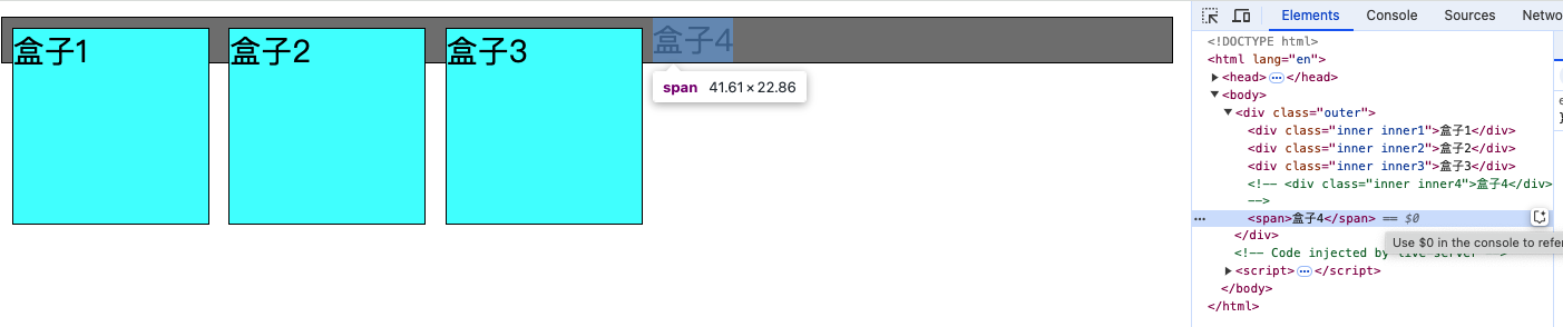
原因是: 后面的兄弟元素盒子4是一个块级元素会独占一行,如果修改为span那么就会挤到盒子3的右边。
影响2: 对父元素的影响: 不能撑起父元素的高度,导致父元素的高度塌陷;但父元素的宽度依然会束缚子元素的浮动范围边界。
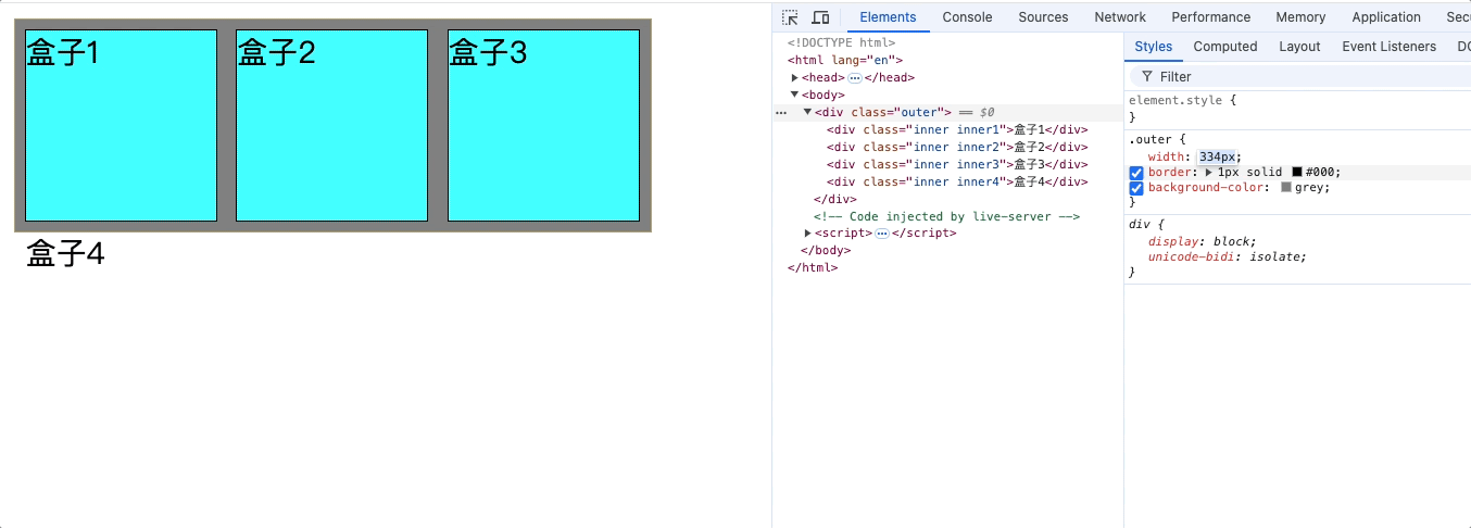
影响3: 浮动元素在没有设置宽度的情况下,其中的文字不受text-align: center的影响,导致文字不能在父元素中水平居中
解决办法一: 浮动元素设置宽度,其宽度等于父元素宽度
.test继承了text-align,但是.test没有宽度,因此不会水平居中d1,需要设置.test的宽度。
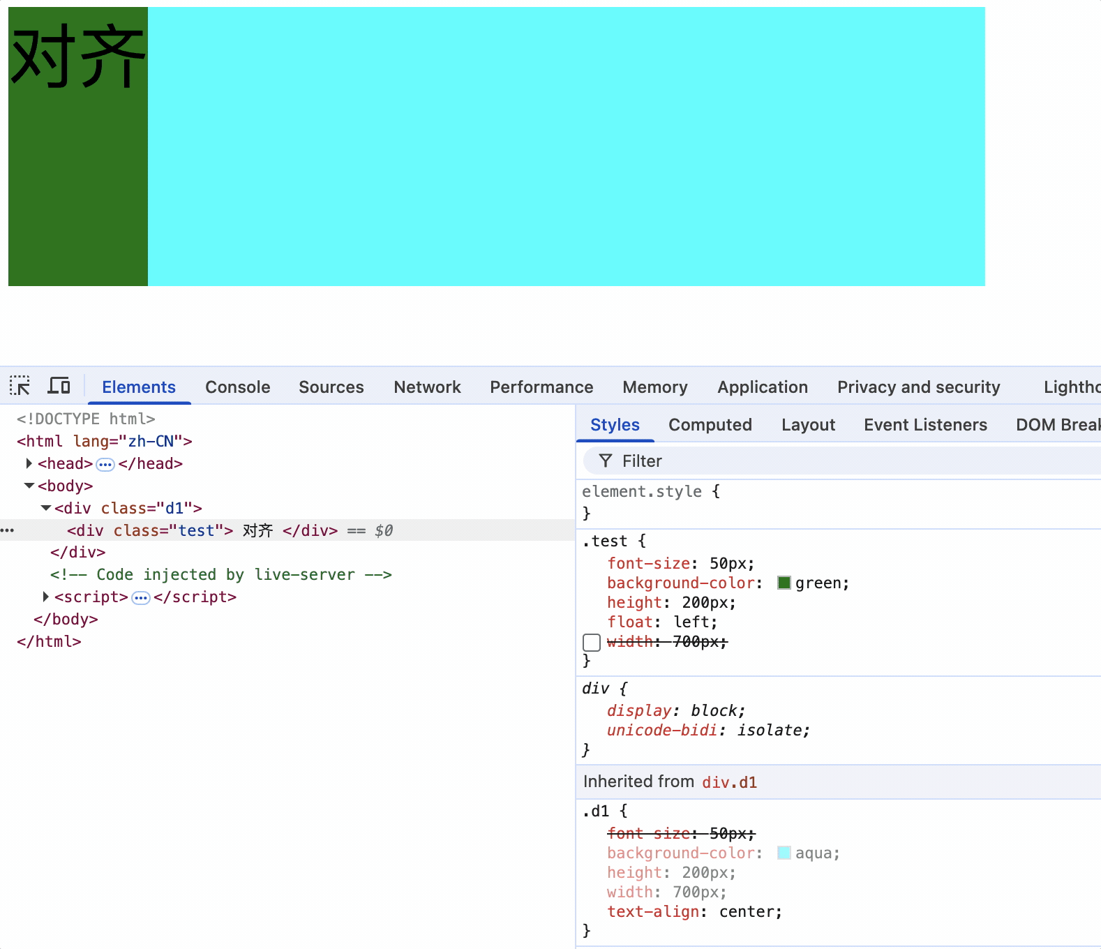
解决办法二: 使其组父元素设置为行内块元素
a标签浮动,设置组父元素ul为行内块元素,text-align会使行内块元素居中,从而使a标签中的文字居中
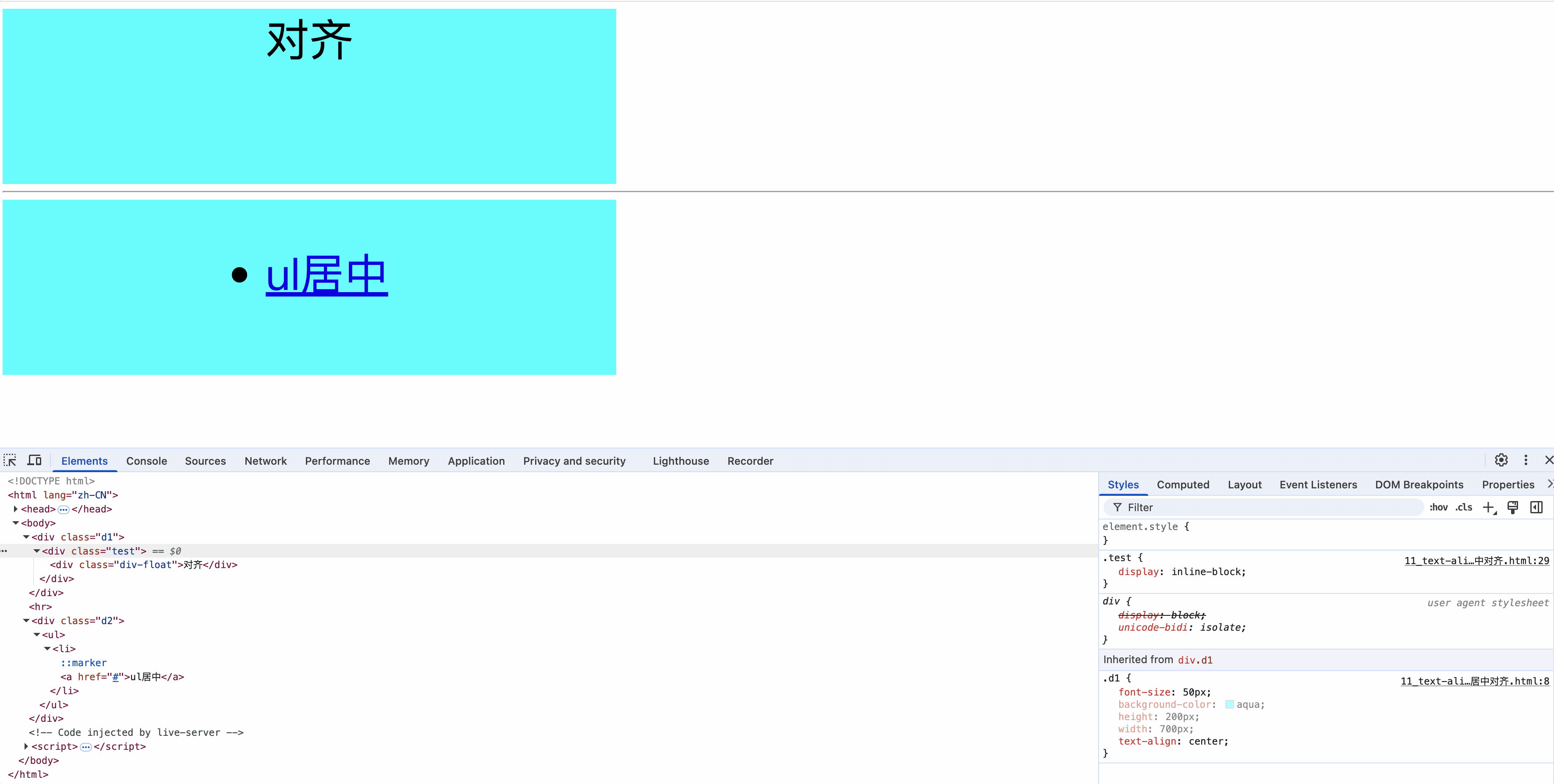
即使没有指定浮动元素宽度,设置其祖父元素为行内块元素,浮动元素的文字也会居中。
浮动元素影响案例
如下案例浮动元素卡住了后面浮动元素:
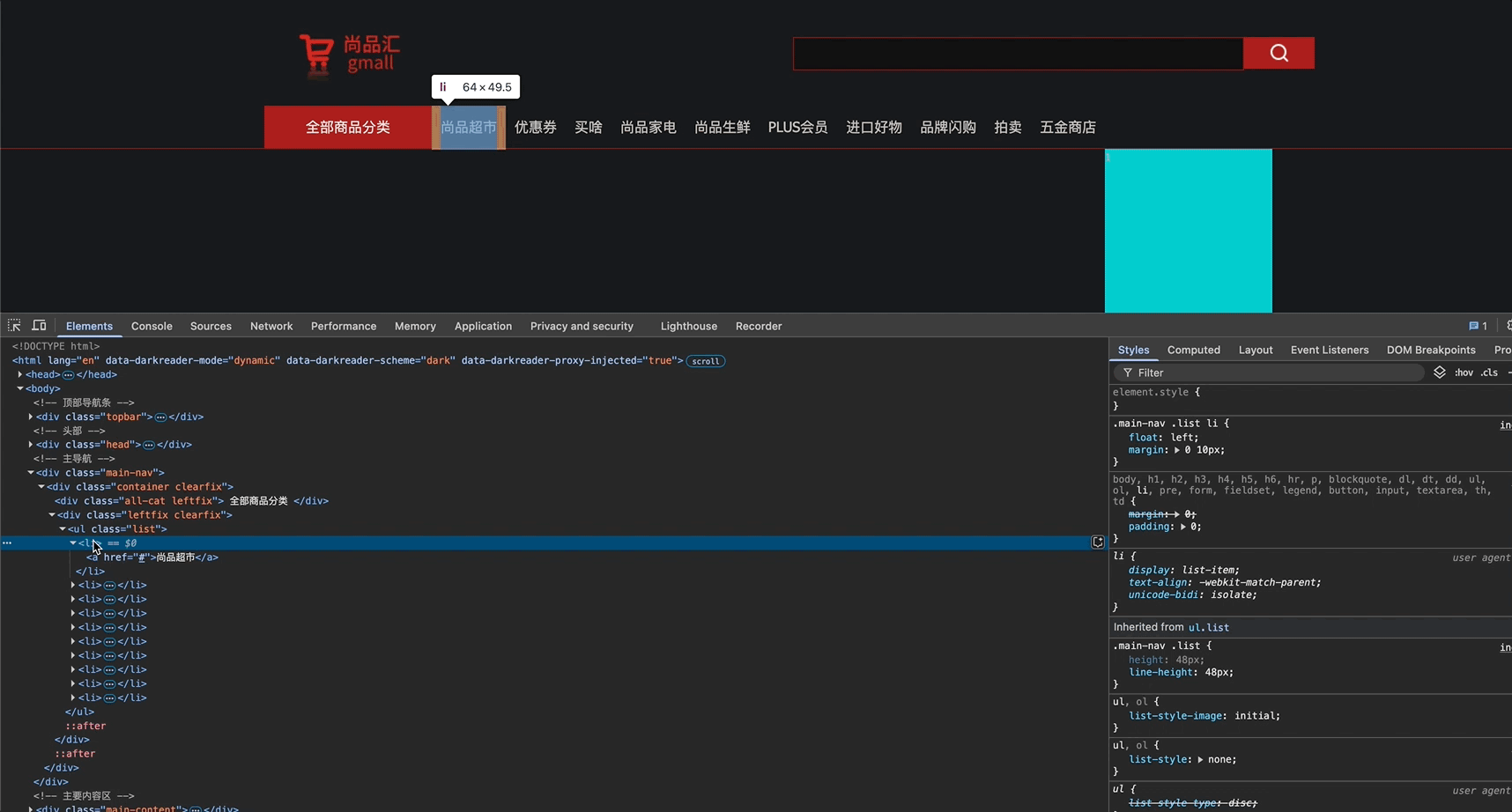
如上图,div class='leftfix clearfix'的高度受子元素高度影响,而浮动子元素li标签的高度是49.5px,因此div class='leftfix clearfix'的高度超过了父容器高度48px,下方的容器中的蓝色盒子卡在了ul的后面。
详细问题代码说明:
<style>
    ul {
        margin: 0;
        padding: 0;
        box-sizing: border-box;
    }

    .outer {
        height: 100px;
    }

    .outer1::after {
        content: '';
        display: block;
        clear: both;
    }

    .float1 {
        width: 200px;
        height: 100px;
        float: left;
        background-color: red;
    }

    .float2 {
        width: 200px;
        float: left;
        background-color: black;
    }

    .no-float-parent {
        height: 100px;
        line-height: 100px;
    }

    .no-float-parent::after {
        content: '';
        display: block;
        clear: both;
    }

    .float-child {
        width: 50px;
        float: left;
        background-color: orange;
        list-style: none;
    }

    .float4 {
        width: 50px;
        height: 100px;
        float: left;
        background-color: blueviolet;
    }

    .outer2 {
        background-color: green;
    }

    .outer2::after {
        content: '';
        display: block;
        clear: both;
    }
</style>

<body>
    <div class="outer">
        <div class="outer1">
            <div class="float1"></div>
            <div class="float2">
                <ul class="no-float-parent">
                    <li class="float-child">
                        1
                    </li>
                    <li class="float-child">
                        2
                    </li>
                </ul>
            </div>
        </div>
    </div>
    <div class="outer2">
        <div class="float4">
            1
        </div>
    </div>
</body>
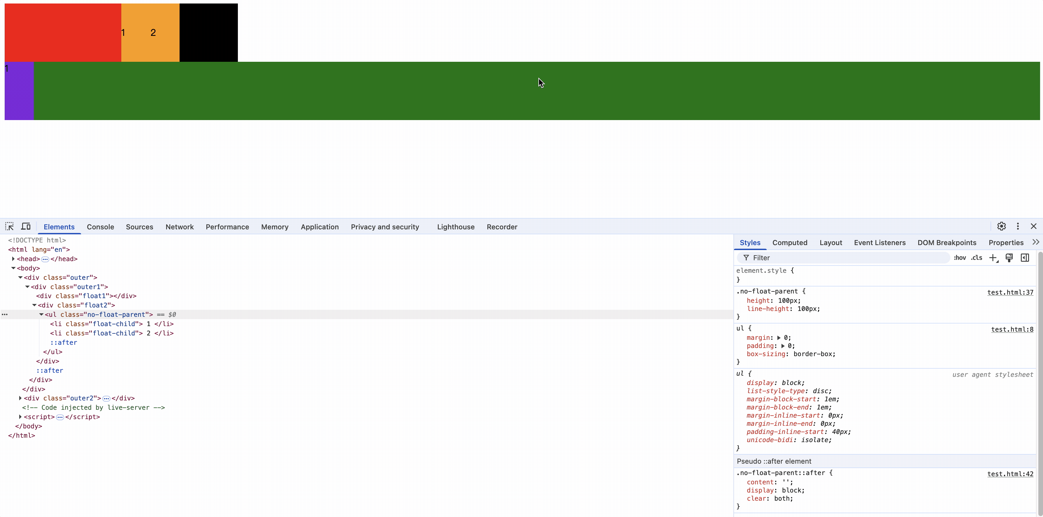
浮动元素float2没有指定高度,因此其高度受子元素高度影响,增加子元素.no-float-parent的内容高度或者line-height高度后,其父元素float2高度也会增加
而float2的宽度大于float4的宽度,因此float4卡在了float2的后面。
因此,浮动元素X的位置和预想的不同时,应该检查前面的浮动元素A在没有设置高度时,其子元素的高度或者行高大于预设值,即使其子元素没有浮动其高度或行高也会影响浮动元素A,导致浮动元素A把浮动元素X卡在了后面。
解决浮动后的影响
所有子元素浮动后,父元素会塌陷,如果在添加一个不浮动的子元素,该子元素会被第一个浮动的子元素覆盖。
方案一: 为父元素设置指定高度;解决父元素高度塌陷问题,但不能解决浮动元素对后面不浮动兄弟元素的影响
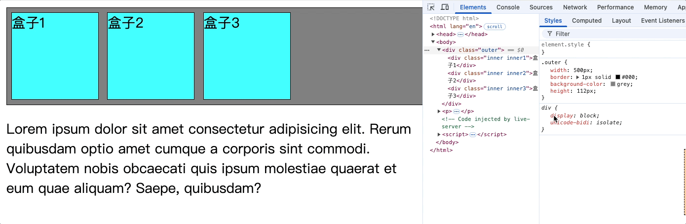
方案二: 让父元素也浮动;解决父元素高度塌陷问题,但不能解决浮动元素对后面不浮动兄弟元素的影响
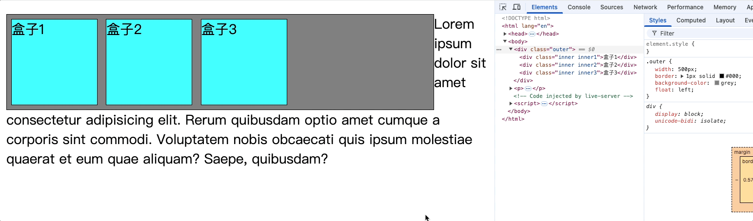
方案三: 使用overflow: hidden;解决父元素高度塌陷问题,但不能解决浮动元素对后面不浮动兄弟元素的影响
<style>
    .outer {
        width: 400px;
        border: 1px solid #000;
        background-color: grey;
        overflow: hidden;
    }

    .inner {
        border: 1px solid;
        width: 100px;
        height: 100px;
        margin: 5px;
    }

    .inner1,
    .inner2,
    .inner3 {
        float: left;
        background-color: aqua;
    }
</style>

<body>
    <div class="outer">
        <div class="inner inner1">盒子1</div>
        <div class="inner inner2">盒子2</div>
        <div class="inner inner3">盒子3</div>
    </div>
</body>
对父元素使用overflow: hidden;
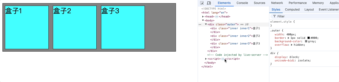
如果在后面加上一个不浮动的兄弟元素盒子4,那么盒子4的内容就会隐藏。如下图
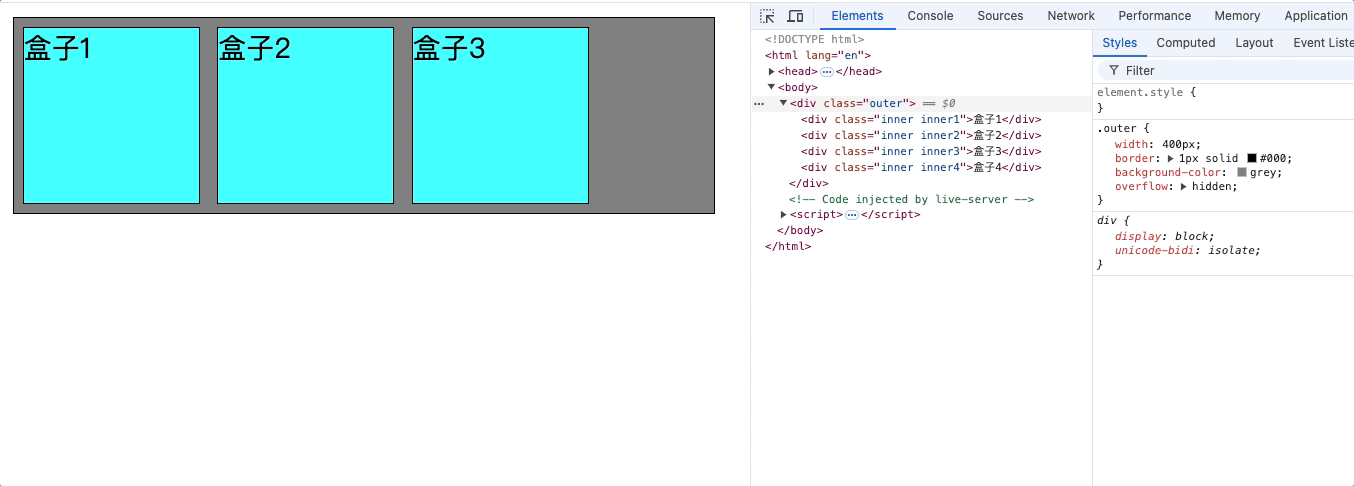
方案四: 对不浮动的元素使用clear: both;解决父元素高度塌陷问题,也能解决浮动元素对后面不浮动兄弟元素的影响
clear: left: 清除左浮动的兄弟元素对该元素的影响
clear: right: 清除右浮动的兄弟元素对该元素的影响
clear: both: 清除所有浮动的兄弟元素对该元素的影响
<style>
    .outer {
        width: 500px;
        border: 1px solid #000;
        background-color: grey;
    }

    .inner {
        border: 1px solid;
        width: 100px;
        height: 100px;
        margin: 5px;
        background-color: aqua;
    }

    .inner1,
    .inner2,
    .inner3 {
        float: left;
    }

    .inner4 {
        clear: both;
    }

</style>

<body>
    <div class="outer">
        <div class="inner inner1">盒子1</div>
        <div class="inner inner2">盒子2</div>
        <div class="inner inner3">盒子3</div>
        <div class="inner inner4">不浮动的盒子4</div>
    </div>
    <p>Lorem ipsum dolor sit amet consectetur adipisicing elit. Rerum quibusdam optio amet cumque a corporis sint
        commodi. Voluptatem nobis obcaecati quis ipsum molestiae quaerat et eum quae aliquam? Saepe, quibusdam?</p>
</body>
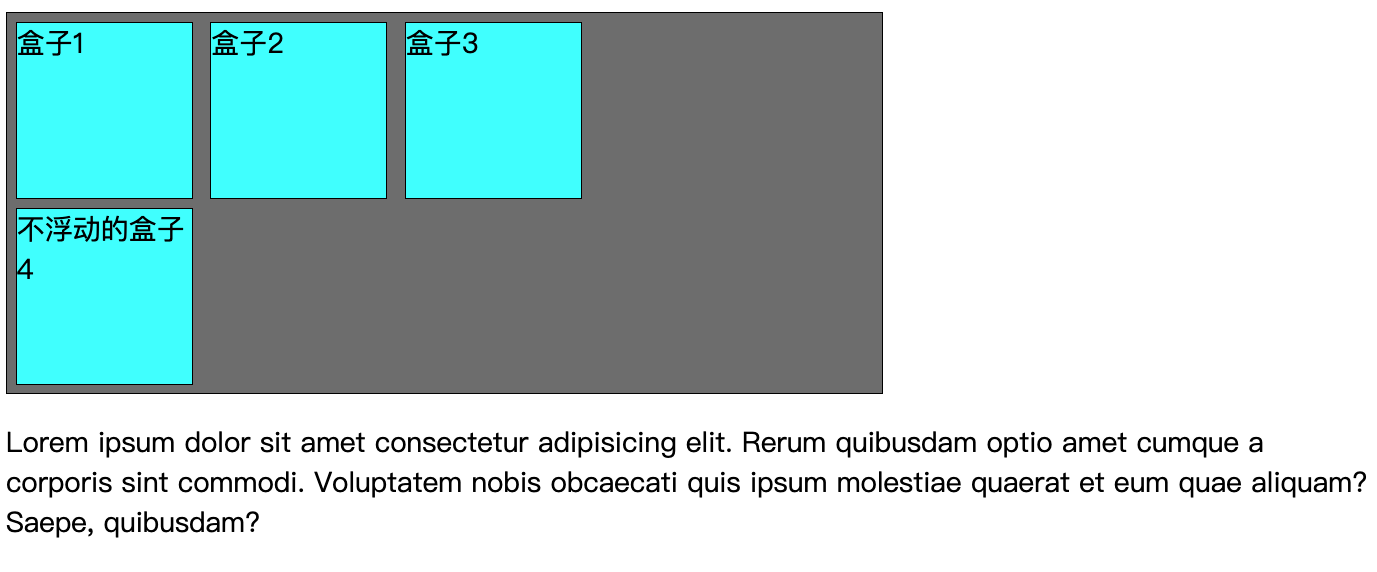
使用clear的前提:
- 当前元素必须不是浮动元素
- 当前元素必须是块元素或者行内块元素
方案五: 使用伪元素为父类添加一个子元素占位;解决父元素高度塌陷问题,但不能解决浮动元素对后面不浮动兄弟元素的影响
<style>
    .outer {
        width: 500px;
        border: 1px solid #000;
        background-color: grey;
    }

    .inner {
        border: 1px solid;
        width: 100px;
        height: 100px;
        margin: 5px;
        background-color: aqua;
    }

    .inner1,
    .inner2,
    .inner3 {
        float: left;
    }

    .outer::after {
        content: '';
        display: block;
        clear: both;
    }
</style>

<body>
    <div class="outer">
        <div class="inner inner1">盒子1</div>
        <div class="inner inner2">盒子2</div>
        <div class="inner inner3">盒子3</div>
    </div>
    <p>Lorem ipsum dolor sit amet consectetur adipisicing elit. Rerum quibusdam optio amet cumque a corporis sint
        commodi. Voluptatem nobis obcaecati quis ipsum molestiae quaerat et eum quae aliquam? Saepe, quibusdam?</p>
</body>
使用伪元素为父元素追加一个子元素,并设置该子元素为块元素,内容为空,消除前面兄弟左浮动元素的影响。
这样就解决了父元素的高度塌陷的问题。
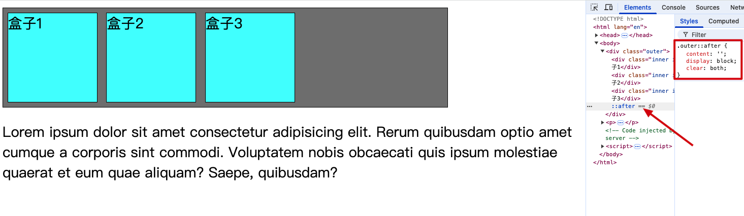
但如果该父元素中存在不浮动的元素,那么该元素就会存在影响1。
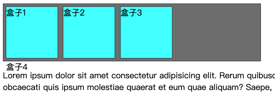
设置浮动原则
综上所述,在设置浮动时要遵循如下原则:
父元素中的子元素要么都使用float要不都不使用float。
所有子元素浮动后,必须是其父元素一定要消除浮动产生的高度塌陷问题。
浮动布局练习
样式:
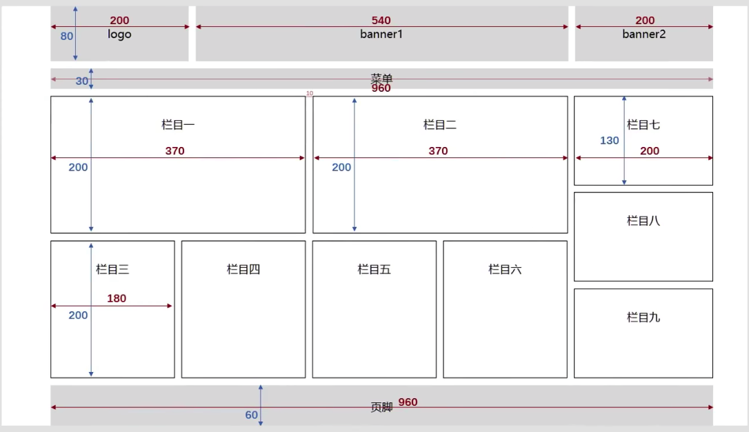
<style>
    * {
        margin: 0px;
        padding: 0px;
    }

    body {
        text-align: center;
        margin: 90px;
    }

    .container {
        margin: 0 auto;
        width: 960px;
    }

    .leftfloat {
        float: left;
    }

    .rightfloat {
        float: right;
    }

    .clearfix::after {
        content: '';
        display: block;
        clear: both;
    }

    .solid {
        border: 1px solid;
    }

    .top-logo {
        width: 200px;
        margin-right: 5px;
    }

    .top-logo,
    .top-banner1,
    .top-banner2 {
        height: 80px;
        background-color: grey;
    }

    .top-banner1 {
        width: 540px;
        margin: 0px 5px;
    }

    .top-banner2 {
        width: 200px;
    }

    .menu {
        height: 30px;
        margin: 10px 0;
        background-color: grey;
        line-height: 30px;
    }

    .top1,
    .top2 {
        width: 368px;
        height: 200px;
        margin-right: 10px;
        line-height: 200px;
        line-height: 80px;
    }

    .bottom {
        line-height: 200px;
        margin: 10px 0;
    }

    .bottom1,
    .bottom2,
    .bottom3,
    .bottom4 {
        width: 178px;
        height: 200px;
        margin-right: 10px;
    }

    .right1,
    .right2,
    .right3 {
        width: 198px;
        height: 130px;
        margin-bottom: 9px;
        line-height: 130px;
    }

    .under {
        height: 60px;
        margin: 10px 0;
        background-color: grey;
        line-height: 60px;
    }

    .midden-left-top {
        line-height: 80px;
    }
</style>

<body>
    <div class="container">
        <!-- 头部 -->
        <div class="top clearfix">
            <div class="top-logo leftfloat">logo</div>
            <div class="top-banner1 leftfloat">banner1</div>
            <div class="top-banner2 rightfloat">banner2</div>
        </div>
        <div class="menu">
            <div>菜单</div>
        </div>
        <div class="midden clearfix">
            <div class="midden-left leftfloat">
                <div class="midden-left-top clearfix">
                    <div class="top1 leftfloat solid">
                        栏目1
                    </div>
                    <div class="top2 leftfloat solid">
                        栏目2
                    </div>
                </div>
                <div class="bottom clearfix">
                    <div class="bottom1 leftfloat solid">
                        栏目3
                    </div>
                    <div class="bottom2 leftfloat solid">
                        栏目4
                    </div>
                    <div class="bottom3 leftfloat solid">
                        栏目5
                    </div>
                    <div class="bottom4 leftfloat solid">
                        栏目6
                    </div>
                </div>
            </div>
            <div class="midden-right leftfloat">
                <div class="right1 solid">
                    栏目7
                </div>
                <div class="right2 solid">
                    栏目8
                </div>
                <div class="right3 solid">
                    栏目9
                </div>
            </div>
        </div>
        <div class="under">
            <div>脚本</div>
        </div>
    </div>
</body>
效果:
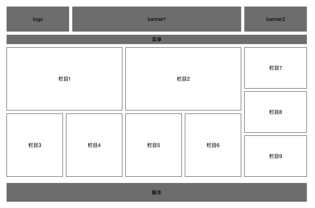
定位
设置元素位置属性
top: 距离参考元素顶部边界距离
bottom: 距离参考元素底部边界距离
left: 距离参考元素左侧边界距离
right: 距离参考元素右侧边界距离
都可以设置负值,定位的元素可以超出自己的父容器的边界。
定位可以作用到块元素,行内元素和行内块元素上
相对定位
position: relative;
可以使用top、left、right、bottom等属性来调整元素位置。
相对参考点: 相对自己原来的位置
<style>
    .container{
        width: 400px;
        background-color:bisque;
        padding: 20px;
    }
    .inner {
        width: 200px;
        height: 200px;
    }

    .container1 {
        background-color: grey;
    }
    /* 对container2设置相对定位 */
    .container2 {
        position: relative;
        left: 100px;
        background-color: green;
    }
    .container3 {
        background-color: darkorange;
    }
</style>

<body>
    <div class="container">
        <div class="inner container1"></div>
        <div class="inner container2"></div>
        <div class="inner container3"></div>
    </div>
</body>
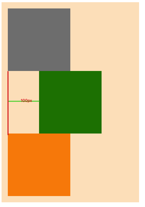
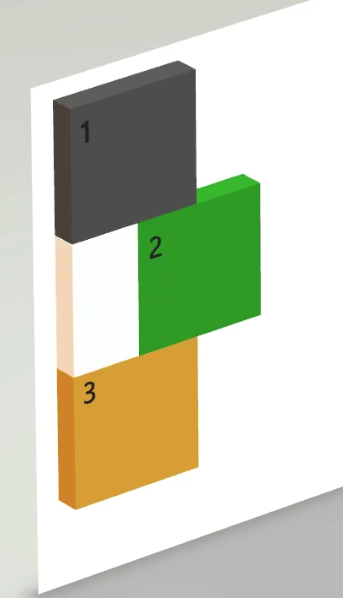
相对定位特点
1.相对定位的元素是指,相对于它没有相对定位时的位置,如上图设置绿色容器相对定位,并且距离左侧为100px,即相对于它之前的位置向右移动了100px。
2.相对定位并没有脱离文档流,相对定位的空间仍在占据着文档流,不会越过父元素padding。如上3D图,即使left距离超过了200px,橙色div也不会顶上去。不会对其他元素产生影响。
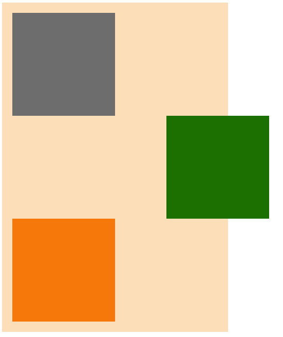
3.开启相对定位的元素,层级要比普通元素要高,但无论相对定位还是绝对定位,他们的显示层级优先级都是一样的,哪个元素后写的,就会覆盖先写的元素。
橙色开启相对定位top: -100px,就会覆盖绿色div,但没有脱离文档流
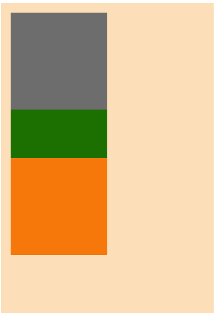
都发生定位的元素,后写的元素会覆盖先写的元素之上。
4.left和right不能一起设置,如果都设置left生效。top和bottom不能一起设置,如果都设置top生效。
5.相对定位的元素也能浮动,但不推荐这样做。
<style>
    .container{
        width: 500px;
        background-color:bisque;
        padding: 20px;
    }
    .inner {
        width: 200px;
        height: 200px;
    }

    .container1 {
        background-color: grey;
    }
    /* 对container2设置相对定位 */
    .container2 {
        background-color: green;
        position: relative;
        float: right;
        left: 150px;

    }
    .container3 {
        background-color: darkorange;
    }
</style>

<body>
    <div class="container">
        <div class="inner container1">1</div>
        <div class="inner container2">2</div>
        <div class="inner container3">3</div>
    </div>
</body>
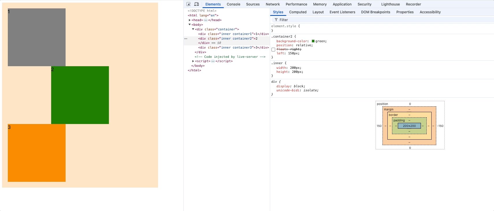
盒子2在浮动的基础上又相对定位了,因此父容器的宽度就会失效。
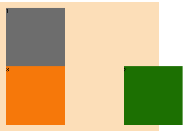
6.相对定位的元素,也能通过margin调整位置,但不推荐这样做。
使用场景
- 相对定位用于微调元素位置,因为相对定位几乎对其他元素没有影响。
- 配合绝对定位一起使用。(绝大多数场景会这样使用)
绝对定位
<style>
    .container{
        width: 500px;
        background-color:bisque;
        padding: 20px;
    }
    .inner {
        width: 200px;
        height: 200px;
    }

    .container1 {
        background-color: grey;
    }
    /* 对container2设置绝对定位 */
    .container2 {
        background-color: darkorange;
        position: absolute;
    }
    .container3 {
        background-color: green 3;
    }
</style>

<body>
    <div class="container">
        <div class="inner container1">1</div>
        <div class="inner container2">2</div>
        <div class="inner container3">3</div>
    </div>
</body>
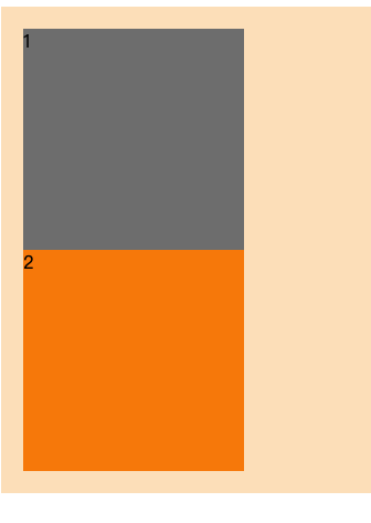
绝对定位特点
1.完全脱离文档流,完全覆盖后面的兄弟元素,可以超出父元素范围
3D效果:
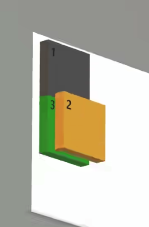
2.开启绝对定位的元素,它所有的位置设定都是基于最近的包含块元素作为基础的
包含块: 默认情况下包含块就是离当前元素最近的块级祖先元素。对于开启绝对定位的元素来说,包含块是离它最近的开启了定位(且position不为static)的祖先元素。如果所有的祖先元素都没有开启定位,则其包含块就是初始包含块,即html标签,也就是整个视窗。
通俗理解包含块就是
- 没有脱离文档流的元素其父元素就是它的包含块
- 脱离文档流的元素,第一个开启定位的祖先元素就是就是它的包含块
把盒子2设置为绝对定位,在找不到最近的包含块时,盒子2的最近包含块为html标签,因此盒子2的绝对位置调整都是基于整个视口。
.container2 {
    background-color: darkorange;
    position: absolute;
    top: 0px;
    left: 0px
}
top: 距离视窗顶部0px, left: 距离视窗左侧0px

设置盒子2父元素为相对块元素或者绝对块元素,因此绝对元素盒子2的最近包含块为container元素。盒子2位置设定都是基于container元素边界的。
.container{
    width: 500px;
    background-color:bisque;
    padding: 20px;
    position: relative;
}

.container2 {
    background-color: darkorange;
    position: absolute;
    right: 0px;
    bottom: 0px
}
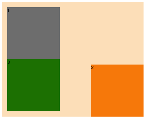
位置设定值可以为负数
.container2 {
    background-color: darkorange;
    position: absolute;
    right: -100px;
    bottom: 0px
}
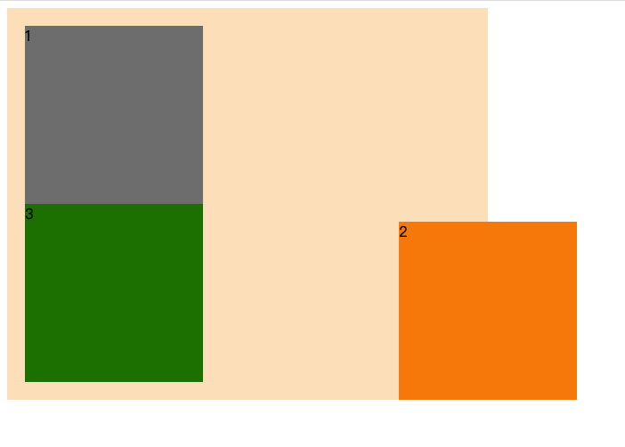
如果left和right同时设定,left生效,top和bottom设定top生效
.container2 {
    background-color: darkorange;
    position: absolute;
    left: 100px;
    right: 100px;
    top: 100px;
    bottom: 100px;
}
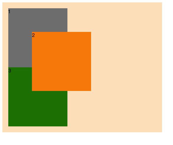
3.开启绝对定位的元素和方向一致的margin同时使用,margin才能生效(某些浏览器该规则不适用,因此不推荐和margin同时使用)
.container2 {
    background-color: darkorange;
    position: absolute;
    left: 100px;
    /* margin-left生效 */
    margin-left: 100px;
    /* margin-right不生效 */
    margin-right: 100px;
}
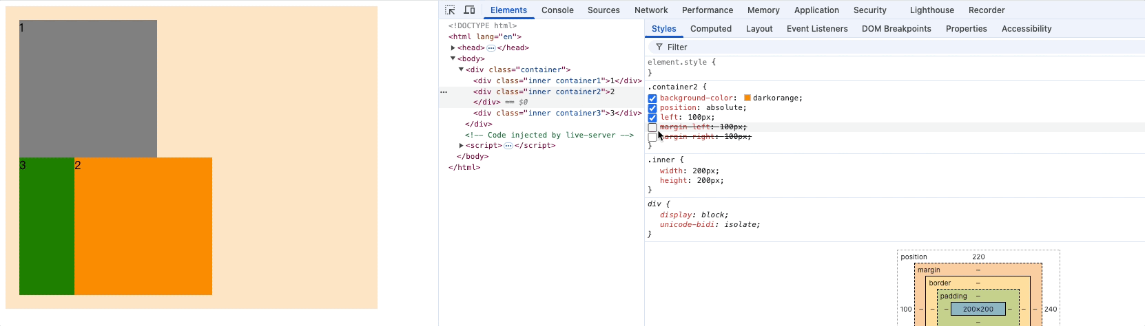
.container2 {
    background-color: darkorange;
    position: absolute;
    bottom: 100px;
    margin-bottom: 100px;
    margin-top: 100px;
}
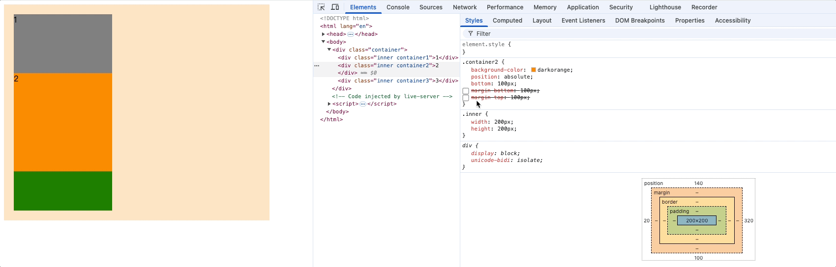
4.开启绝对定位的元素和浮动不能共存,同时设置只有绝对定位生效
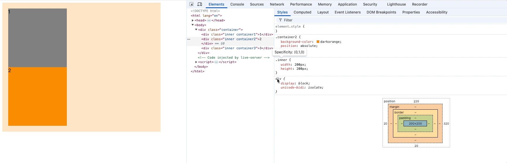
5.开启绝对定位的元素(行内、块级、行内块)就会变成了定位元素,元素默认宽高由内容撑开(块元素不设置宽高时,也是由内容撑开),也可以设置宽高,开启相对定位的元素则没有该特性
span可以设置宽高
.container2 {
    background-color: darkorange;
    position: absolute;
    width: 300px;
}
<body>
    <div class="container">
        <div class="inner container1">1</div>
        <span class="inner container2">2</span>
        <div class="inner container3">3</div>
    </div>
</body>
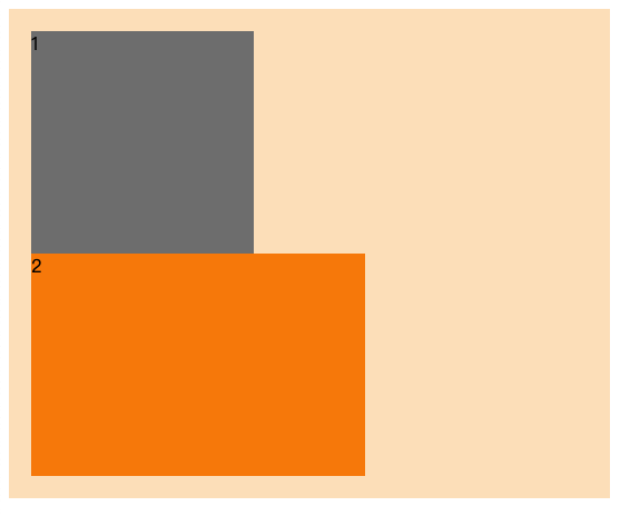
使用场景
- 容器内切换显示内容,如,京东导航栏悬停会覆盖掉原来内容,展示菜单。
- 对浮动元素中的内容进行绝对定位。
绝对定位导致父元素高度塌陷
<style>
    .out2 {
        width: 200px;
        background-color: #ccc;
        border: 1px solid #000;
        margin: 0 auto;
        margin-top: 100px;
        position: relative;
    }
    .inner2 {
        width: 150px;
        height: 150px;
        background-color: aqua;
        position: absolute;
    }
    .inner2::after {
        content: '';
        height: 150px;
        display: block;
        background-color: red;
    }
</style>
<div class="out2">
    <div class="inner2">定位元素</div>
</div>
.out2没有设置高度,.inner2绝对定位后脱离文档流,父元素.out2就会高度塌陷,即使在.inner2后面加上一个块元素也不会撑起父元素高度。
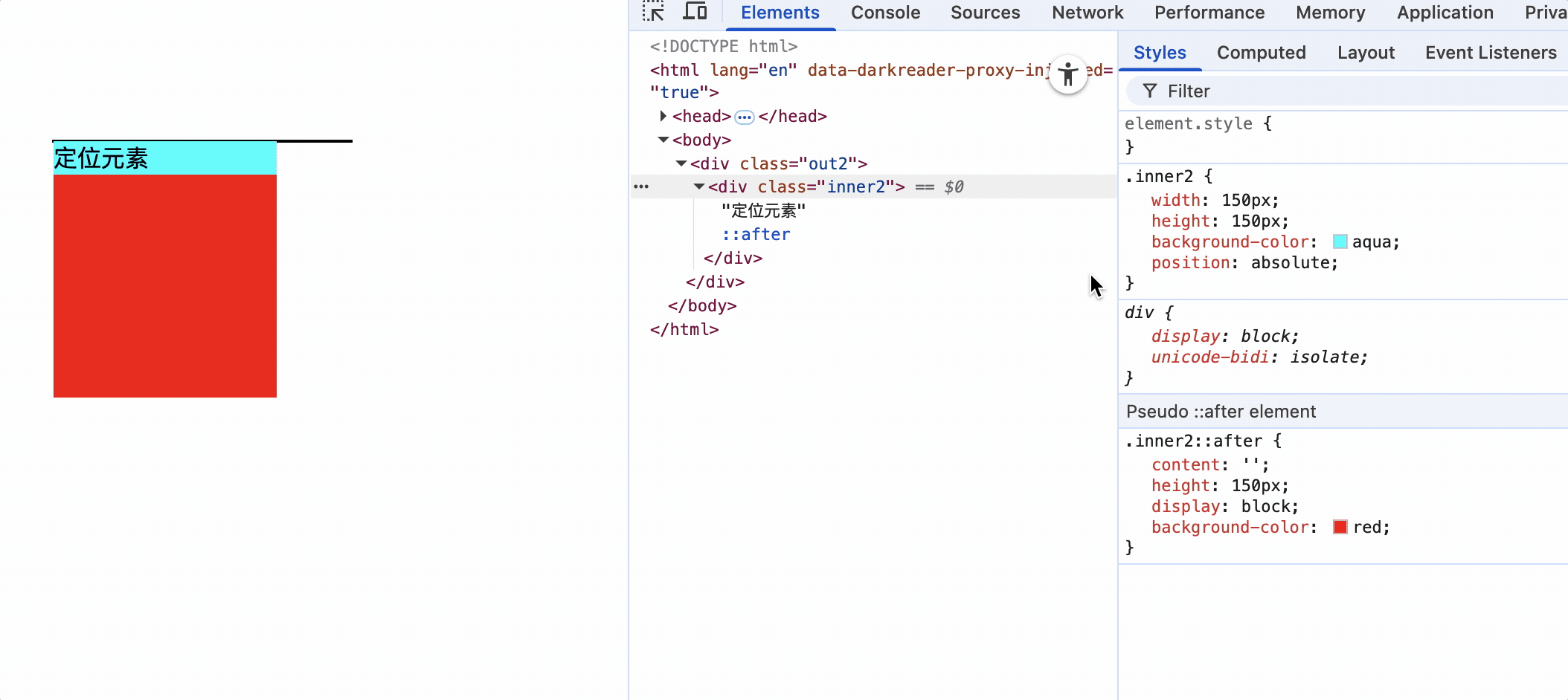
解决方案:
方式一: 设置.out2高度
方式二: 使用js指定.out2高度
方式三: 使用其他布局如,flex布局、grid布局等
固定定位
positon: fixed
可以使用top、bottom、left、right属性。
参考点: 视口,无论有没有找到最近的包含块,固定定位的元素的包含块就是视口。
固定定位特点
1.完全脱离文档流,完全覆盖后面的兄弟元素,可以超出父元素范围
2.left和right不能一起使用,top和bottom不能一起使用
3.开启绝对定位的元素和浮动不能共存,同时设置只有固定定位生效
4.开启固定定位的元素和和方向一致的margin同时使用,margin才能生效(某些浏览器该规则不适用,因此不推荐和margin同时使用)
5.开启固定定位的元素(行内、块级、行内块)就会变成了定位元素,元素默认宽高由内容撑开,也可以设置宽高,开启相对定位的元素则没有该特性
总而言之,固定定位和绝对定位特性基本一致。都脱离了文档流,区别在于绝对定位位于html的content中,而固定定位位于视口中。
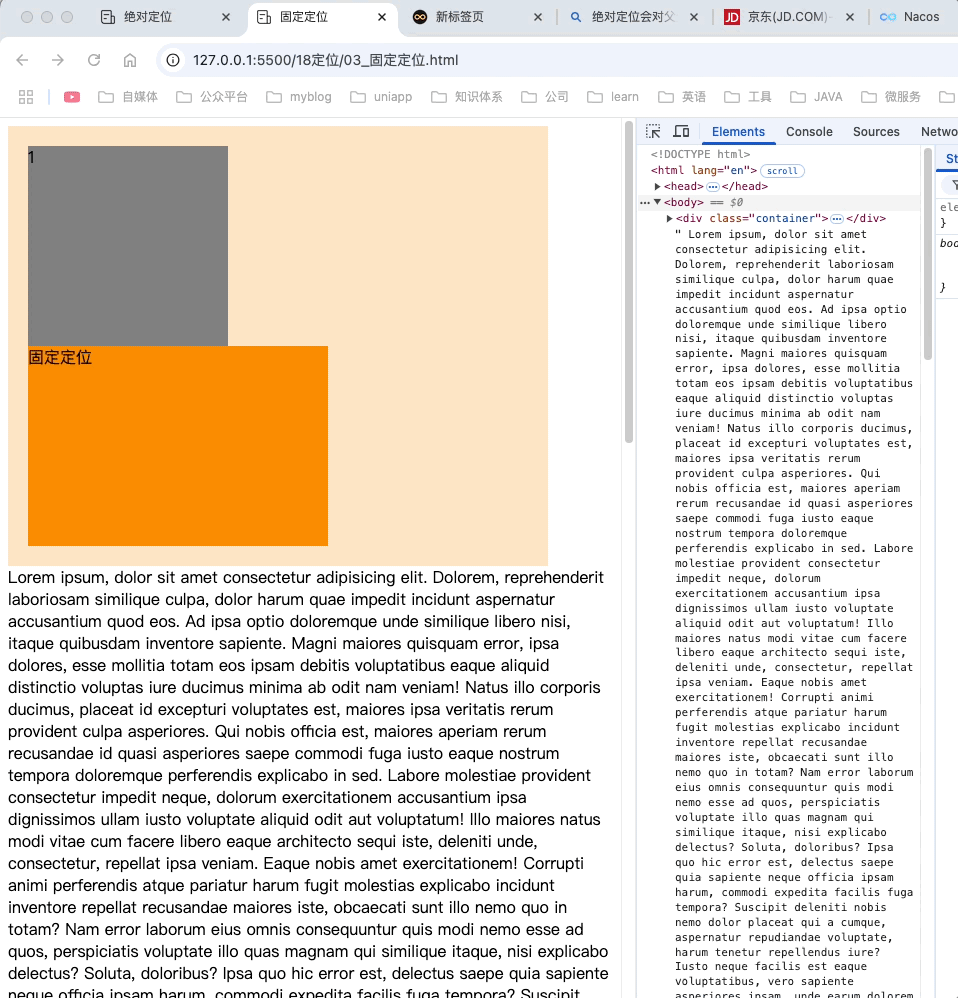
粘性定位
效果如下:
<style>
    * {
        margin: 0;
        padding: 0;
    }

    body {
        height: 2000px;
    }

    .header {
        background-color: orange;
        height: 70px;
        font-size: 50px;
        text-align: center;
        line-height: 70px;
    }

    .menu-one {
        background-color: red;
    }

    .menu-two {
        background-color: green;
    }

    .menu-three {
        background-color: blue;
    }

    .title {
        height: 50px;
        font-size: 40px;
        line-height: 50px;
        position: sticky;
        top: 0px
    }
    .content {
        background-color: antiquewhite;
        height: 20px;
        border: 1px solid beige;
    }
</style>
<!-- 头部 -->
<div class="header">头部</div>
<div class="item">
    <div class="mide">
        <div class="title menu-one">标题1</div>
        <div class="content">内容1</div>
        <div class="content">内容2</div>
        <div class="content">内容3</div>
        <div class="content">内容4</div>
        <div class="content">内容5</div>
        <div class="content">内容6</div>
        <div class="content">内容1</div>
        <div class="content">内容2</div>
        <div class="content">内容3</div>
        <div class="content">内容4</div>
        <div class="content">内容5</div>
        <div class="content">内容6</div>
    </div>
    <div class="mide">
        <div class="title menu-two">标题2</div>
        <div class="content">内容1</div>
        <div class="content">内容2</div>
        <div class="content">内容3</div>
        <div class="content">内容4</div>
        <div class="content">内容5</div>
        <div class="content">内容6</div>
        <div class="content">内容1</div>
        <div class="content">内容2</div>
        <div class="content">内容3</div>
        <div class="content">内容4</div>
        <div class="content">内容5</div>
        <div class="content">内容6</div>
    </div>
    <div class="mide">
        <div class="title menu-three">标题3</div>
        <div class="content">内容1</div>
        <div class="content">内容2</div>
        <div class="content">内容3</div>
        <div class="content">内容4</div>
        <div class="content">内容5</div>
        <div class="content">内容6</div>
        <div class="content">内容1</div>
        <div class="content">内容2</div>
        <div class="content">内容3</div>
        <div class="content">内容4</div>
        <div class="content">内容5</div>
        <div class="content">内容6</div>
    </div>
</div>
如上图中,标题元素的最近有滚动机制的祖先元素是body,所以粘性定位的参考点是body。即标题触碰到body边界就会被黏住。
title设置为粘性定位: 具有粘性功能。
如何设置粘性定位:
position: sticky
可以用top、bottom、left、right属性调整位置,最常用的是top属性,用于导航栏滚定定位。
粘性元素固定的触发条件
粘性元素触碰到设定的粘性边界时就会停留在其父容器内,当父容器离开滚动区域时,粘性元素也会随之移出。
粘性固定元素移动范围是其父元素边界,例如上图,标题1碰到body的顶部边界时就会固定,碰到其父元素<div class="mide">边界时,就会触碰到移动边界,则会跟随父元素一起移动。
如果把item元素设置纵向滚动,并重新设置高度出现滚动条
.item {
    height: 200px;
    overflow: scroll;
}
效果如下:
上图中具有滚动机制是item元素,那么item边界就是粘性元素固定生效条件,title粘性元素触碰到item边界时就会生效固定。
如果item不设置高度,即具有滚动机制,但不能滚动,那么title的粘性边界仍然是item元素,由于item不能滚动,title永远触碰不到item边界,因此表现不出粘性定位效果。
.item {
    overflow: scroll;
}
如下动图:
粘性定位参考点
离它最近的一个拥有滚动属性(overflow: scroll)的祖先元素,即使这个祖先不能滚动。
<style>
    * {
        margin: 0;
        padding: 0;
    }
    .border {
        background-color: antiquewhite;
        height: 500px;
        width: 500px;
        padding: 20px;
    }
    .item {
        width: 500px;
        height: 500px;
        overflow: scroll;
        background-color: gray;
    }
    .test1 {
        width: 300px;
        background-color: green;
        position: sticky;
        top: 10px;
        left: 40px;
    }
</style>
<div class="border">
    <div class="item">
        <div class="test1">粘性元素</div>
    </div>
</div>
对于粘性元素.test1,具有滚动的祖先元素是.item属性,因此参考点就是.item的边界,.test1距离顶部10px,距离左侧40px。
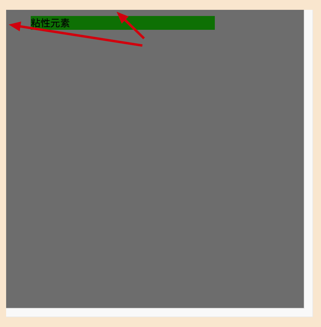
粘性定位的特点
1.不会脱离文档流,不会越过父元素的padding,它是一种专门用于窗口滚动时的新的定位方式
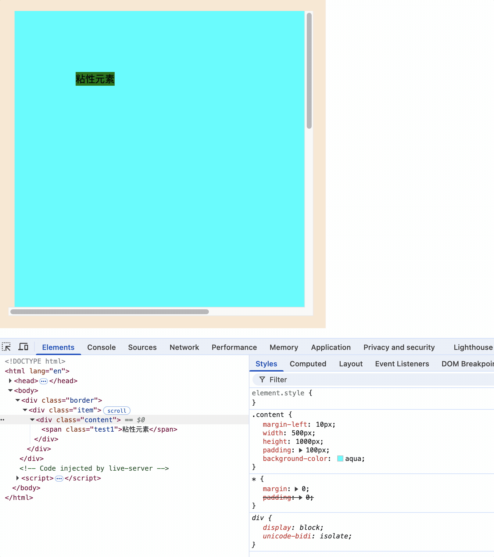
2.最常用的是top属性
3.粘性定位和浮动可以同时设置,但不推荐这样做
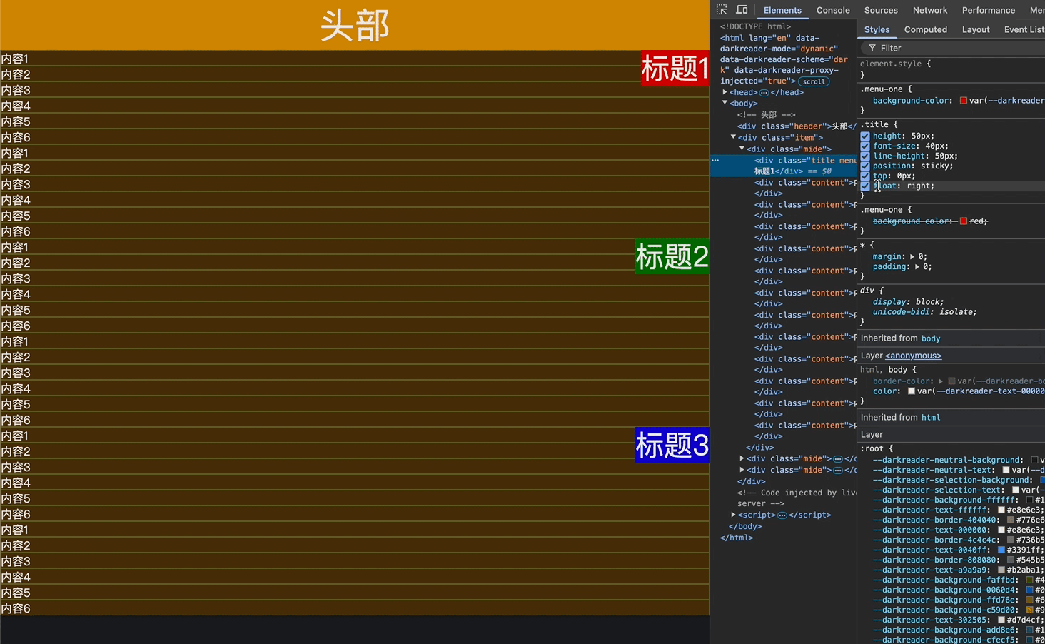
4.粘性定位的元素也可以通过margin调整位置,但不推荐这样做
5.粘性定位元素的位置属性设置值,如果超过生效条件边界距离值,则会迫使粘性元素移动直到其父元素边界
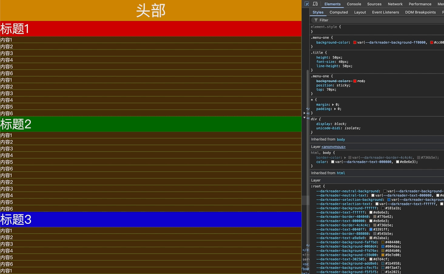
如上图,标题1的粘性生效边界是body,它距离body的顶端距离是头部的高度70px,如果粘性边界top不断变大,即顶部生效边界不断下移,当边界下移大于70px时,则会迫使粘性元素标题1下移,直到移动到父元素边界。
总结:
粘性定位和相对定位特点基本一致,不同的是粘性定位在到达某个位置时将其固定。
粘性定位元素不能定位的问题
<style>
    * {
        margin: 0;
        padding: 0;
    }

    .border {
        background-color: antiquewhite;
        height: 500px;
        width: 500px;
        padding: 20px;
    }

    .item {
        width: 500px;
        height: 500px;
        overflow: scroll;
        background-color: gray;
    }


    .content {
        width: 300px;
        height: 300px;
        background-color: aqua;
    }

    .content1-s {
        width: 300px;
        background-color: green;
        position: sticky;
    }

    .content2-s {
        width: 300px;
        background-color: green;
        position: sticky;
    }

    .content3-s {
        width: 300px;
        background-color: green;
        position: sticky;
    }
    .content4-s {
        width: 300px;
        background-color: green;
        position: sticky;
    }
</style>
<div class="border">
    <div class="item">
        <div class="content1">
            <div class="content1-s">粘性元素1</div>
            <div class="content">content1</div>
        </div>
        <div class="content2">
            <div class="content2-s">粘性元素2</div>
            <div class="content">content2</div>
        </div>
        <div class="content3">
            <div class="content3-s">粘性元素3</div>
            <div class="content">content3</div>
        </div>
        <div class="content4">
            <div class="content4-s">粘性元素4</div>
            <div class="content">content3</div>
        </div>
    </div>
</div>
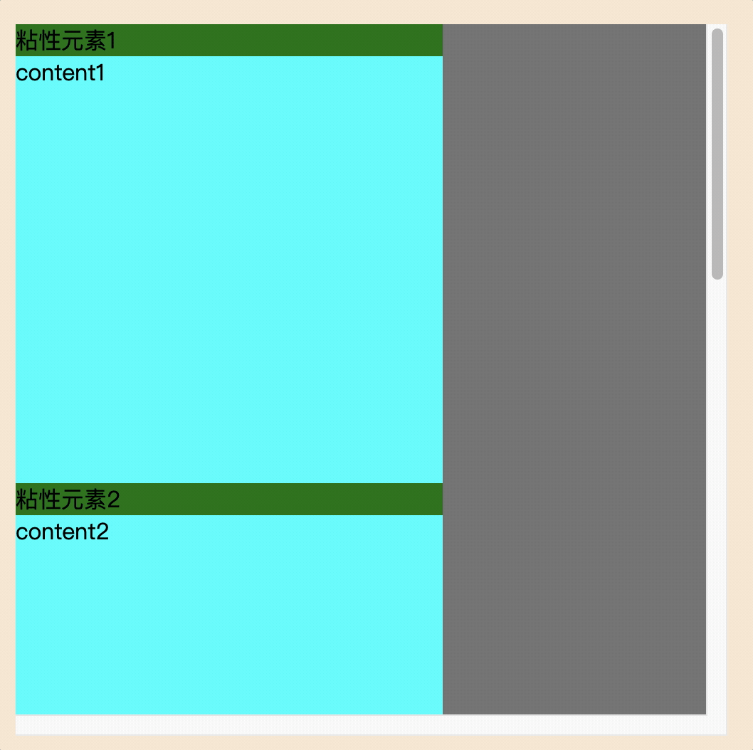
原因:
粘性元素需要指定至少一个定位阈值(如top、bottom等),当滚动到达该阈值时元素才会固定。阈值至少是0,如: top: 0px。
设置粘性元素条件
1.设置祖父元素可滚动属性overflow: scroll(告诉浏览器拦截该滚动区域的粘性元素)
2.指定元素为粘性定位(具有粘性特性)
position: sticky;
3.指定粘性元素的固定位置(告诉浏览器粘性元素在滚动容器中距离滚动边界多远处开始固定)
top: 0px;
定位层级
<style>
    .container {
        width: 500px;
        background-color: bisque;
        padding: 20px;
        position: relative;
    }

    .inner {
        width: 200px;
        height: 200px;
    }

    .container1 {
        background-color: grey;
    }

    .container2 {
        background-color: green;
        position: relative;
        top: 150px;
        left: 100px;

    }

    .container3 {
        background-color: darkorange;
        position: absolute;
        top: 200px;
        left: 200px;
    }

    .container4 {
        background-color: red;
        position: fixed;
        top: 300px;
        left: 300px;
    }
</style>

<body>
    <div class="container">
        <!-- 相对定位 -->
        <div class="inner container2">2</div>
        <!-- 普通元素 -->
        <div class="inner container1">1</div>
        <!-- 绝对定位 -->
        <div class="inner container3">3</div>
        <!-- 固定定位 -->
        <div class="inner container4">4</div>
    </div>
</body>
上面代码中,盒子1为普通元素,即使写在盒子2的后面,由于盒子2为定位元素,因此会被盒子2覆盖。
效果如下:
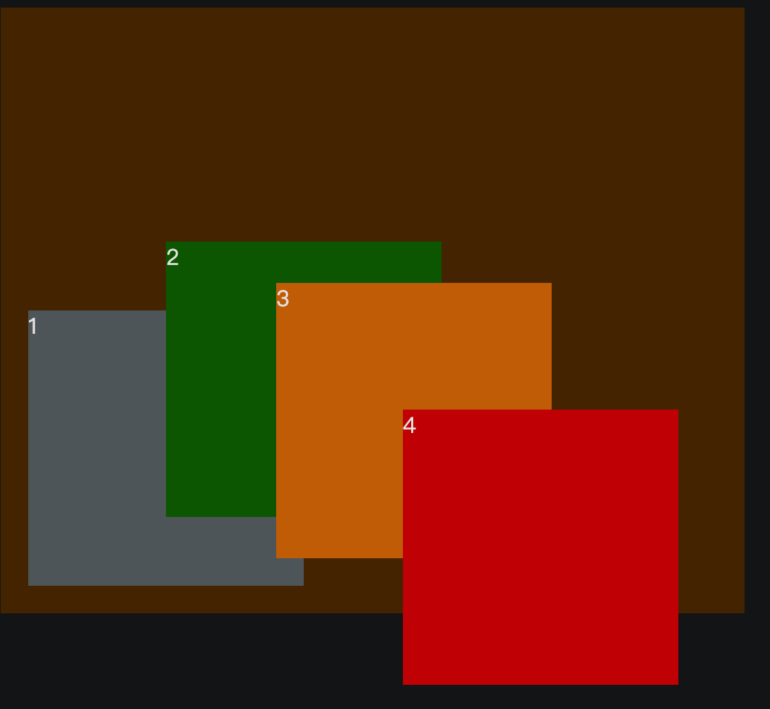
如果把<div class="inner container3">3</div>放到<div class="inner container4">4</div>的后面,效果如下:
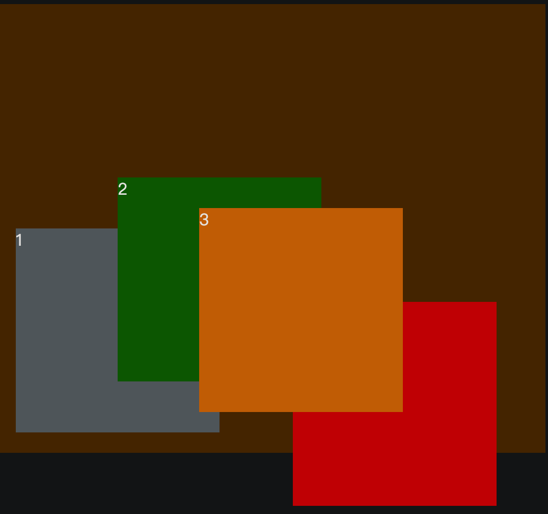
定位元素之间层级相同,但后写的元素会覆盖前面的定位元素。
定位层级特点
1.定位元素层级比普通元素层级要高,无论什么定位,显示层级都一样
2.如果位置发生重叠,默认情况下是: 后面的元素会覆盖前面的元素
3.如果希望后面的元素不被前面的元素覆盖,可以使用z-index属性调整层级,无单位,z-index值越大,层级越高,越靠前
4.只有定位元素才能使用z-index属性,普通元素不能使用z-index属性
5.如果z-index值大的元素没有覆盖z-index值小的元素,请检查其包含块的层级
<style>
    .container {
        width: 500px;
        background-color: bisque;
        padding: 20px;
        position: relative;
        z-index: 30;
    }

    .inner {
        width: 200px;
        height: 200px;
    }

    .container1 {
        background-color: grey;
    }

    .container2 {
        background-color: green;
        position: relative;
        top: -150px;
        left: 100px;

    }

    .container3 {
        background-color: darkorange;
        position: absolute;
        top: 200px;
        left: 200px;
    }

    .container4 {
        background-color: red;
        position: fixed;
        top: 300px;
        left: 300px;
        z-index: 10;
    }

    .container5 {
        background-color: blue;
        position: fixed;
        top: 400px;
        left: 400px;
        z-index: 20;
    }
</style>

<body>
    <div class="container">
        <div class="inner container1">1</div>
        <div class="inner container2">2</div>
        <div class="inner container3">3</div>
        <div class="inner container4">4</div>
    </div>
    <div class="inner container5">5</div>
</body>
蓝色盒子5的z-index值比红色盒子4的z-index值大,但是并没有覆盖掉红色盒子,如下图
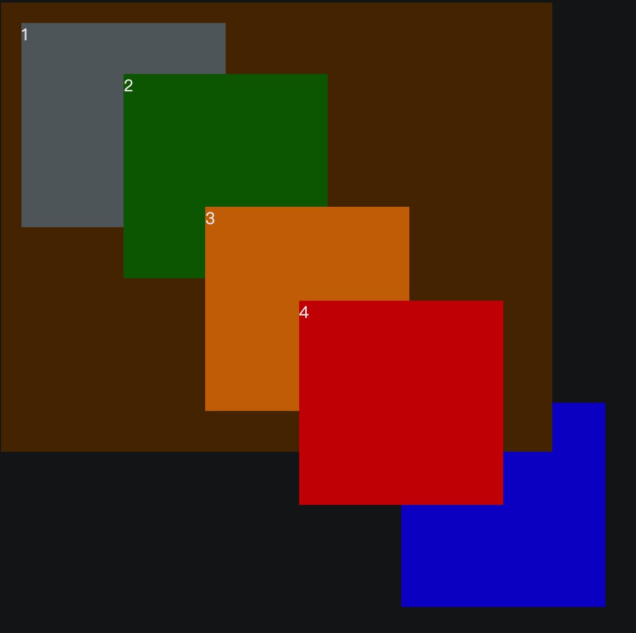
原因是盒子4的包含块是container,而container的层级是30,要大于盒子5的层级20,因此盒子4的包含块层级高于盒子5,即使盒子5的z-index值比盒子4大,也依然不会覆盖盒子4。
子元素定位可以越过父元素的padding
绝对定位和固定定位的元素都脱离了文档流,它们是可以越过包含块的padding的。
<style>
    .outer {
        width: 500px;
        height: 500px;
        background-color: bisque;
        padding: 20px;
        position: relative;
        border:  10px red solid;
    }

    .inner {
        width: 200px;
        height: 200px;
    }

    .container1 {
        background-color: grey;
        position: absolute;
        top: 0;
        left: 0;
    }
</style>

<body>
    <div class="outer">
        <div class="inner container1">1</div>
    </div>
</body>
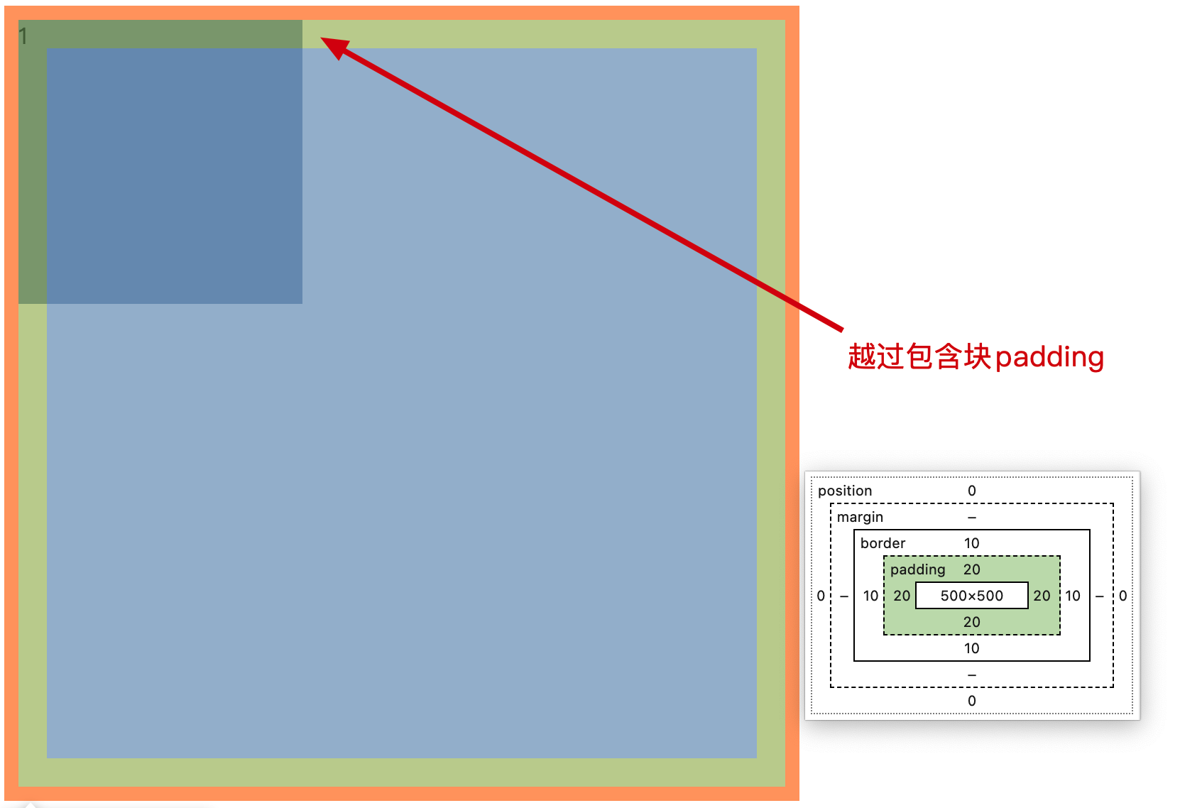
包含块的padding为20px,而子元素开启绝对定位后,其最近包含块为.outer,当设置子元素位置时,会跨过padding依据.outer的内边框进行定位的。
注意
绝对定位元素没有设置top/left时,是不会越过父元素的padding的。
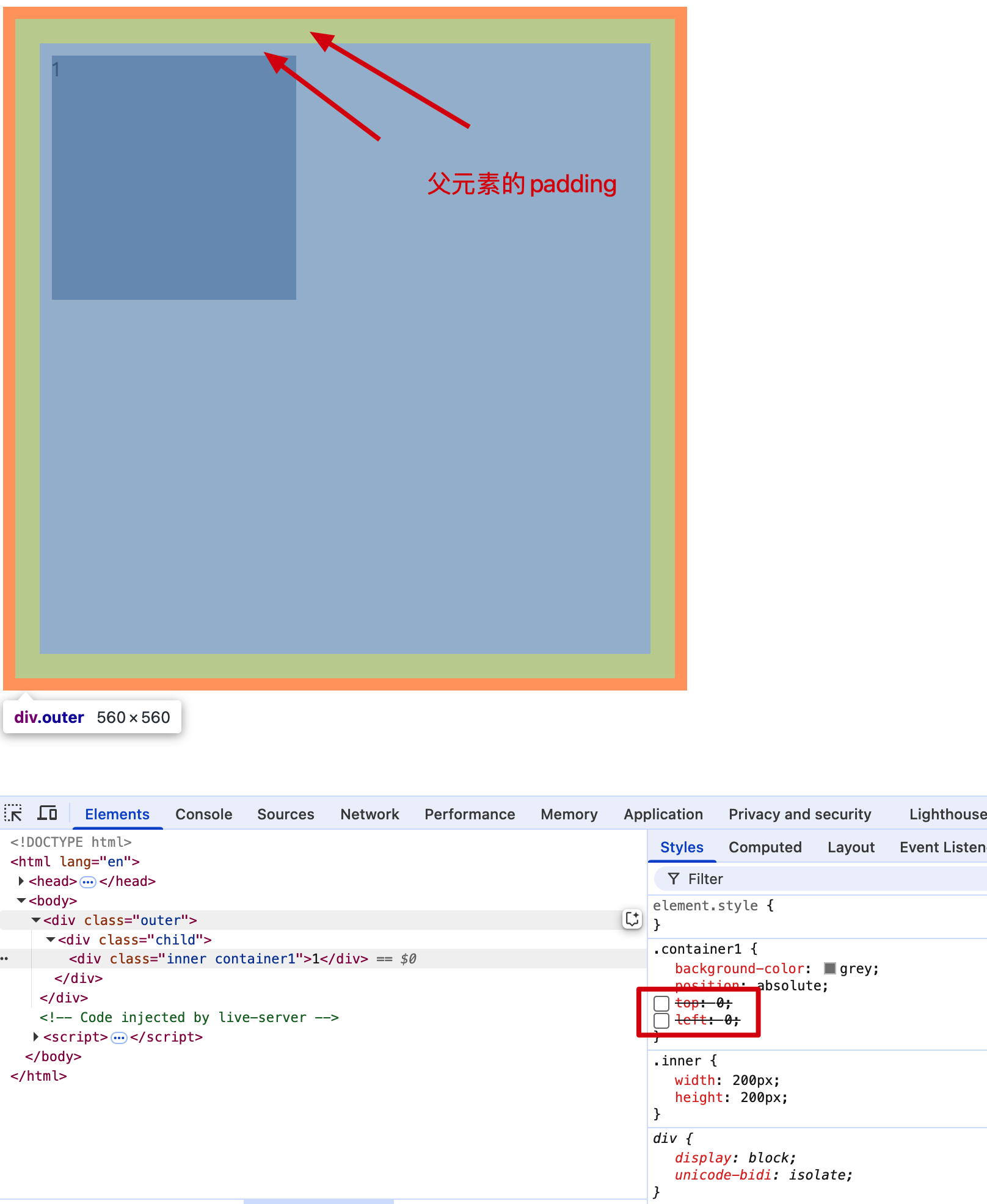
相对定位百分比
<style>
    .container {
        width: 500px;
        padding: 50px;
        background-color: bisque;
    }
    .out {
        width: 100px;
        height: 200px;
        padding-left: 20px;
        padding-right: 50px;
        background-color: red;
    }
    .inner {
        width: 200px;
        height: 200px;
    }
    .container1 {
        position: relative;
        /* left: 100px; */
        left: 170%;
        background-color: grey;
    }
</style>
<div class="container">
    <div class="out">
        <div class="inner container1">
            1.相对定位没有脱离文档流不能越过包含块的padding
            <br>
            2.定位百分比%: 依据父元素内容区宽高的百分比
        </div>
    </div>
</div>
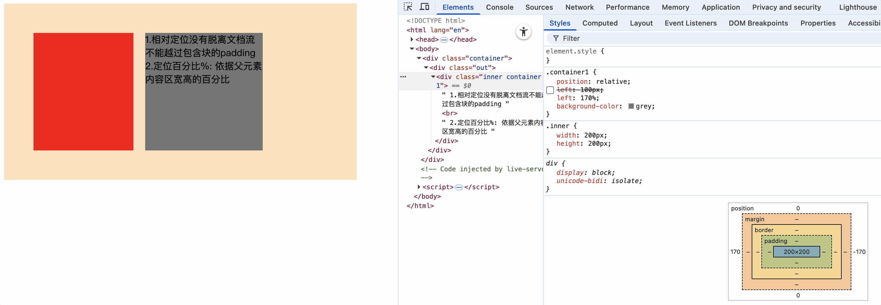
上面代码中,定位元素的父元素设置padding-left:20px,相对定位元素设置left:170%,慢慢减少left比例,相对定位元素慢慢左移,直到100%时紧靠父元素的content区右侧,也就是说100%正好向右移动了父元素的content区的宽度。也就是left: 100px。
因此相对定位元素定位百分比指的是父元素内容区的百分比,和包含块没有关系。
绝对定位百分比
<style>
    .container {
        width: 500px;
        padding: 50px;
        border: 20px solid black;
        background-color: bisque;
        position: relative;
    }
    .out {
        width: 150px;
        height: 200px;
        padding-left: 50px;
        background-color: red;
        /* position: relative; */
    }
    .inner {
        width: 200px;
        height: 200px;
        position: absolute;
        left: 100%;
        background-color: grey;
    }
</style>
<div class="container">
    <div class="out">
        <div class="inner">
        </div>
    </div>
</div>
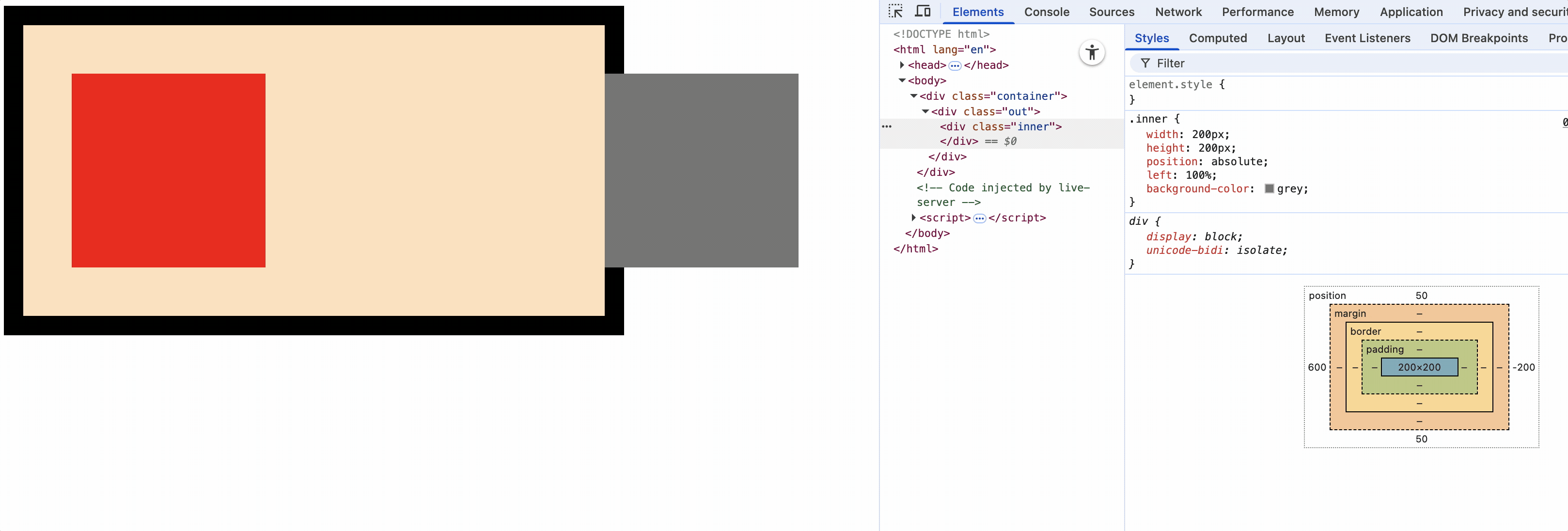
上面代码中,.inner开启绝对定位,.container为包含块,百分比指的是以包含块.container盒子content大小为基础。
设置为.out为包含块,那么百分比指的是以包含块.out盒子的content大小为基础。
因此绝对定位元素定位百分比指的是包含块元素内容区的百分比,和父元素没有关系。
定位的特殊应用
定位特殊应用只适用于定位元素,绝对定位和固定定位,不包括相对定位(相对定位没有脱离文档流)。
撑满父容器的效果
需求:
父容器在不指定宽度的情况下,子元素在设置绝对定位时,让子元素充满父元素宽度。
<style>
    .outer {
        height: 500px;
        background-color: bisque;
        position: relative;
    }

    .inner {
        border: 10px red solid;
        padding: 50px;
        position: absolute;
        /* width: 100%; */
        left: 0;
        right: 0;
    }

    .container1 {
        background-color: grey;
    }
</style>
<
<body>
    <div class="outer">
        <div class="inner container1">1</div>
    </div>
</body>
如果让子元素设置width: 100%时,由于width是基于内容区的,如果子元素有border和padding那么一定会超过父元素。
我们可以使用left和right属性,让子元素在父元素内进行定位,这样子元素就可以撑满父元素了。
子元素绝对定位,基于父元素为包含块,设置距离父元素左边为0,右边为0,因此可以实现子元素撑满父元素宽度。
同理高度也可以撑满整个父元素。
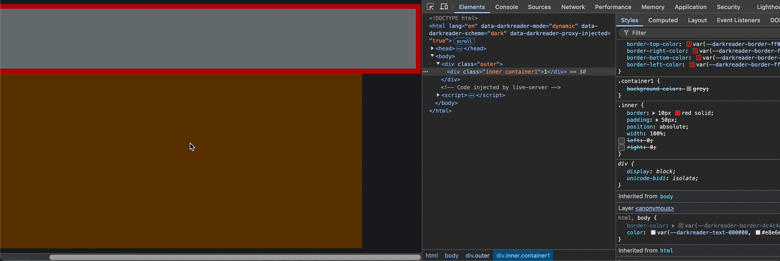
让元素在包含块中居中
<style>
    .outer {
        height: 500px;
        width: 500px;
        background-color: bisque;
        position: relative;
    }

    .inner {
        height: 100px;
        width: 200px;
        position: absolute;
        top: 0;
        left: 0;
        right: 0;
        bottom: 0;
        margin: auto;
    }

    .container1 {
        background-color: grey;
    }
</style>

<body>
    <div class="outer">
        <div class="inner container1">1</div>
    </div>
</body>
方案一(推荐)
父元素为包含块
position: absolute;
top: 0;
left: 0;
right: 0;
bottom: 0;
margin: auto;
让浏览器自己决定元素的margin值是多少,但要保证元素在包含块中的定位都为0,因此margin值则会使元素水平和垂直居中。
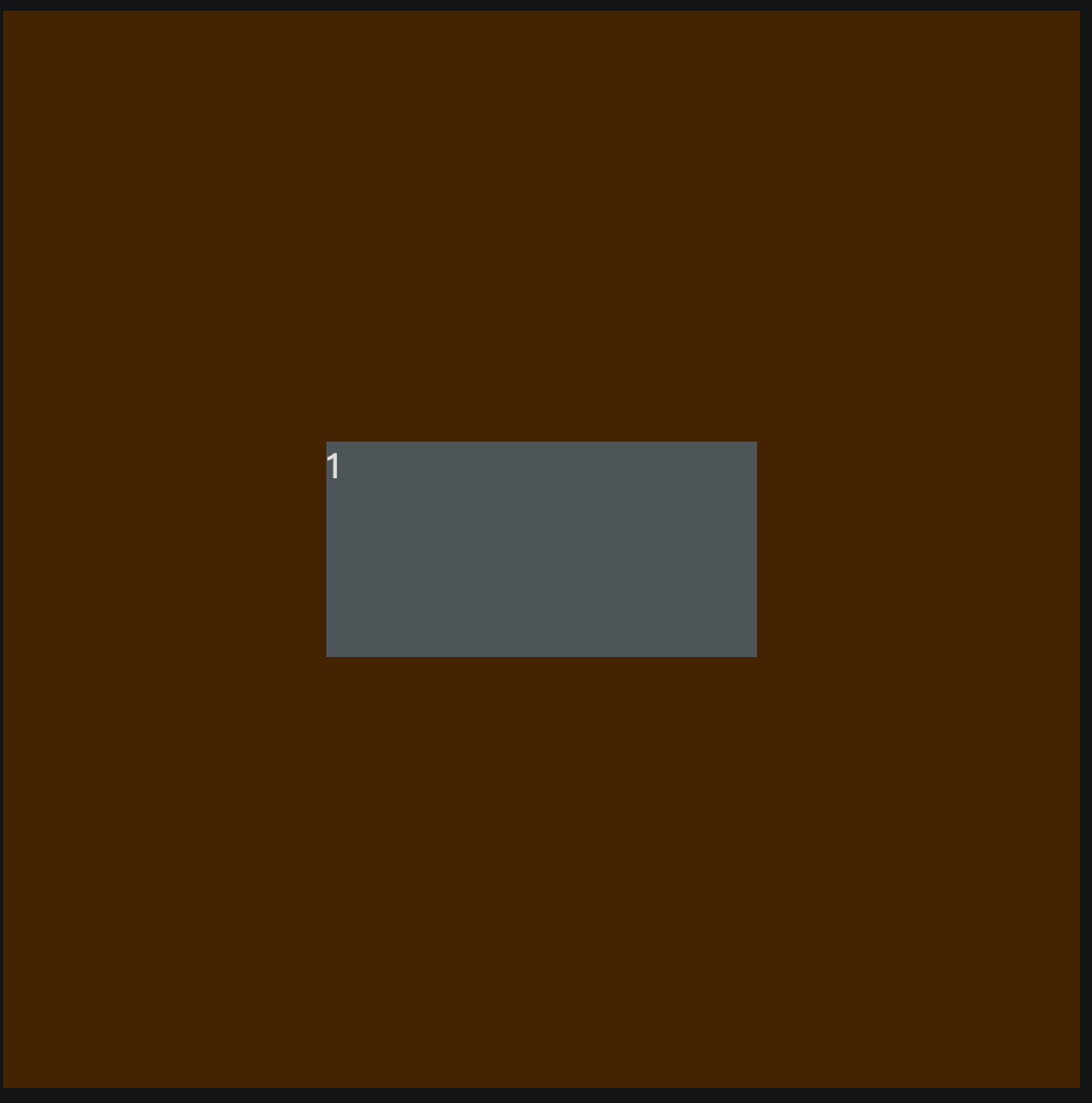
方案二(不推荐)
父元素为包含块
position: absolute;
top: 50%;
left: 50%;
margin-top: -50px;
margin-left: -100px;
设置元素定位为50%,也就是以元素左上角为原点正好在包含块中心点。使用margin-top: -元素高度一半,margin-left: -元素宽度一半,正好使元素中心点和包含块中心点重合,因此元素居中了。
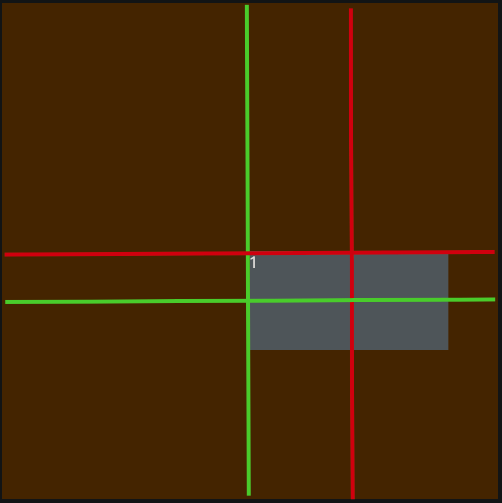
使用定位特殊性质让元素在包含块中居中的条件是,元素必须设置宽高。
绝对定位和浮动对比
1.绝对定位通过调整位置可以完全覆盖前面的兄弟元素以及其中的文字,而浮动元素默认不会覆盖前面的兄弟元素,因为浮动只对后面的兄弟元素有影响
2.浮动元素后,后面的兄弟元素会跑到浮动元素后面,浮动元素会把后面的兄弟元素文字或行内元素或行内块元素挤出去,而绝对定位会完全覆盖
<style>
    .outer {
        width: 300px;
        border: 1px solid #000;
        background-color: grey;
    }
    .inner1 {
        border: 1px solid;
        width: 100px;
        height: 100px;
        float: left;
        background-color: aqua;
    }
    .inner2 {
        border: 1px solid;
        width: 100px;
        height: 100px;
        background-color: red;
    }
</style>
<div class="outer">
    <div class="inner1">盒子1</div>
    <div class="inner2">
        2文字
        <span>2行内元素</span>
        <img src="../static/img/APK.png" alt="">
    </div>
</div>
盒子1浮动后,把后面兄弟元素盒子2中的文字、行内元素、行内块元素甩出去了
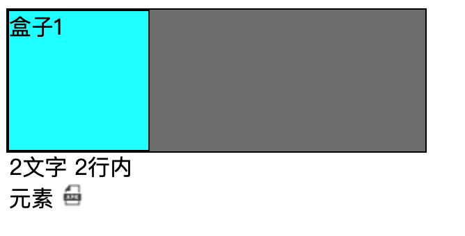
3.浮动可以通过float: left|right等调整位置,默认只能在父元素内容区,只能通过其他属性调整位置
而开启绝对定位元默认位置不变,但可以使用定位属性(left、bottom、top、right)进行调整位置
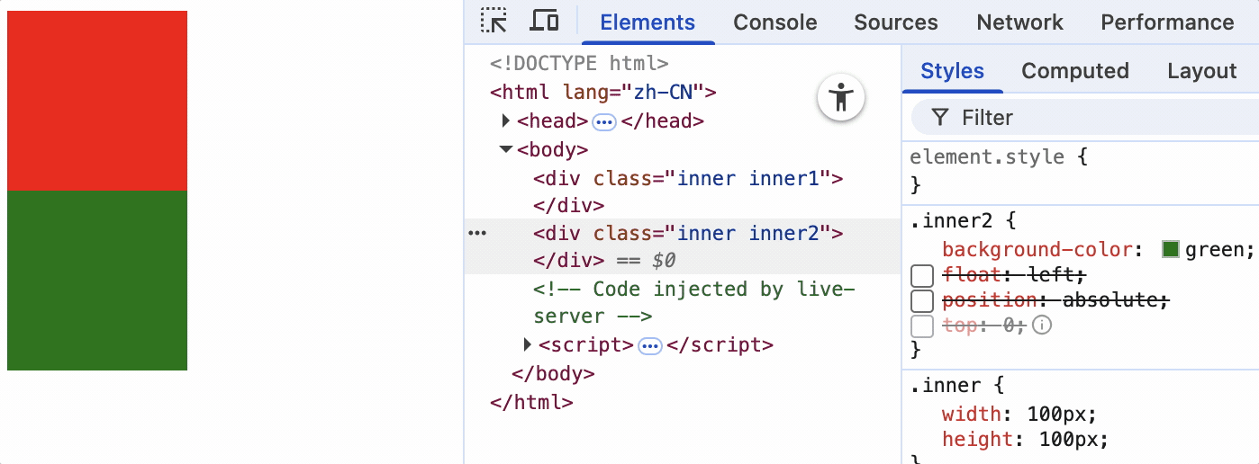
当元素为static静止定位时,不能使用定位属性

布局
版心
- 在PC端网页中,一般都会有一个固定宽度且水平居中的盒子,来显示网页的主要内容,这个盒子就是网页的版心。
- 为适应市场大多数显示器的分辨率,版心宽度一般在960~1200像素之间,随着显示器分辨率的增加的进步,该宽度会增加。
- 版心可以是一个,也可以是多个。
常用的布局名词
顶部导航条: topbar
页头: 页面头部区域 header page-header
导航: nav navigator narbar
搜索框: search search-box
横幅 广告 宣传幅: banner ad
主要内容: main content
侧边栏: aside sidebar
页脚: footer page-footer
底部导航条: bottombar
重置默认样式
很多元素有默认的样式
- p元素有默认的上下margin
- h1~h6元素有默认的上下margin,并且加粗
- body元素有默认的margin: 8px
- 超链接有默认的文字颜色和下划线
- ul元素有默认的左padding
早起为了实现简单样式,设计了元素具有默认样式,而且有的默认样式在不同的浏览器中显示效果不同。随着页面复杂度的提高,这些默认样式反而带来了麻烦。
google和ie浏览器显示超链接样式不同:
清除默认样式
方案一: 使用全局选择器
* {
    margin: 0;
    padding: 0;
}
此种方法在实际开发中不可使用,因为*选中了所有的元素,有时重置样式时,需要做特定处理。比如,想让a标签文字是灰色的,其他元素文字是蓝色的,因此color属性就不能使用通配符方式去掉默认样式。
方案二: reset.css
自定义选择具有默认样式的元素,并把去掉或自定义这些元素的默认样式。
经过reset.css处理后,页面就像一张白纸。
方案三: Normalize.css
是一种最新的方案,它在清除默认样式的基础上,保留了有价值的默认样式。
官网: https://necolas.github.io/normalize.css/
相对reset.css具有以下优点:
- 保护了有价值的样式而不是完全去掉。
- 为大部分的html标签提供了一般化的样式。
- 新增了对html5元素的设置。
- 对并集选择器的使用比较谨慎,有效避免调试工具杂乱。 比如,使用并集选择器,把很多标签设置默认样式,在浏览器调试工具中就会换行,显得调试工具很杂乱。
如果开发团队对Normalize.css的属性设置比较熟悉,使用Normalize.css是比较合适的。但是实际开发中,reset.css使用更加频繁。

 浙公网安备 33010602011771号