
display:table-cell两列自适应布局
html:
<div class="box">
  <img src="img/love2.png" class="fle" />
  <div class="con">
  大家放声大哭放假啊速度快放dkfjaldjfffffffffffff
  </div>
</div>
css:
.box{width:60%; margin:60px auto 0; padding:20px; background:#f5f5f5; overflow:hidden;}
.fle{ float:left;}
.con{display:table-cell;  width:2000px; *width:auto; *zoom:1; border:1px solid red;}
这种两栏的自适应布局,不需要分别计算两列的宽度,是更加直接懒惰的方法。
2016-2-22修改:
当页面布局需要定位时,overflow:hidden;则会隐藏溢出的定位元素,此处overflow:hidden;主要是为了清楚浮动,可以使用以下方法代替:
/* 清除浮 动*/
.fix{*zoom:1;}
.fix:after{display:table; content:''; clear:both;}
代码为:


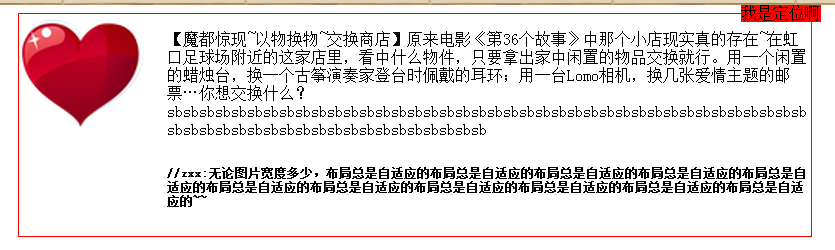
<!DOCTYPE html PUBLIC "-//W3C//DTD XHTML 1.0 Transitional//EN" "http://www.w3.org/TR/xhtml1/DTD/xhtml1-transitional.dtd">
<html xmlns="http://www.w3.org/1999/xhtml">
<head>
<meta http-equiv="Content-Type" content="text/html; charset=utf-8" />
<title>display:table-cell自适应布局</title>
<style type="text/css">
/* 块状元素水平居中 */
.auto{margin-left:auto; margin-right:auto;}
/* 清除浮 动*/
.fix{*zoom:1;}
.fix:after{display:table; content:''; clear:both;}
/* 基于display:table-cell的自适应布局 */
.cell{display:table-cell; *display:inline-block; width:2000px; *width:auto;}
/* 双栏自适应cell部分连续英文字符换行 */
.cell_bk{display:table; width:100%; table-layout:fixed; word-wrap:break-word;}
/* 单行文字溢出虚点显 示*/
.ell{text-overflow:ellipsis; white-space:nowrap; overflow:hidden;}
.mr20{margin-right:20px;}
.l{float:left;}
.r{float:right;}
</style>
</head>

<body>
<div class="fix auto" style="width:50%; border:1px solid red; position:relative;">
    <img src="img/love2.png" width="128" class="l mr20" />
    <div class="cell">
        <p class="f14 cell_bk">【魔都惊现~以物换物~交换商店】原来电影《第36个故事》中那个小店现实真的存在~在虹口足球场附近的这家店里,看中什么物件,只要拿出家中闲置的物品交换就行。用一个闲置的蜡烛台,换一个古筝演奏家登台时佩戴的耳环;用一台Lomo相机,换几张爱情主题的邮票…你想交换什么?sbsbsbsbsbsbsbsbsbsbsbsbsbsbsbsbsbsbsbsbsbsbsbsbsbsbsbsbsbsbsbsbsbsbsbsbsbsbsbsbsbsbsbsbsbsbsbsbsbsbsbsbsbsbsbsbsbsbsbsb</p>
        <h6 class="f12">//zxx:无论图片宽度多少,布局总是自适应的布局总是自适应的布局总是自适应的布局总是自适应的布局总是自适应的布局总是自适应的布局总是自适应的布局总是自适应的布局总是自适应的布局总是自适应的布局总是自适应的~~</h6>
    </div>
    <div style="position:absolute; background:red; top:-10px; right:-10px;">我是定位啊</div>
</div>
</body>
</html>
其中:.cell_bk{display:table; width:100%; table-layout:fixed; word-wrap:break-word;}
解决了连续英文字符换行问题;
但是当页面布局需要 单行文本超出显示省略号时,此种方法不可行,需使用《布局问题——左固定右适应、右固定左适应……》一文中的第一种布局方法。
见下面代码:
<div class="g-bd1 f-cb">
    <div class="g-sd1">
        <p>左侧定宽</p>
    </div>
    <div class="g-mn1">
        <div class="g-mn1c">
            <p>右侧自适应</p>
        </div>
    </div>
</div>
/* 两列右侧自适应布局 */
.g-bd1{margin:0 0 10px;}
.g-sd1{position:relative;float:left;width:190px;margin-right:-190px;}
.g-mn1{float:right;width:100%;}
.g-mn1c{margin-left:200px;}
部分内容学习出处:http://www.zhangxinxu.com/wordpress/?p=2161

 浙公网安备 33010602011771号