

vue ui框架 深色系要么鸡肋,要么付费?自研源码附上 省去1099
vue ui 框架的三驾马车 element ui (饿了么团队) iview ui 北京视图更新科技 ant design vue ui (阿里推过 一点资讯 唐金州)
个人发现 大厂开源不做深色系是因为白色百搭 换了颜色确实很难搭配 (个人意见)
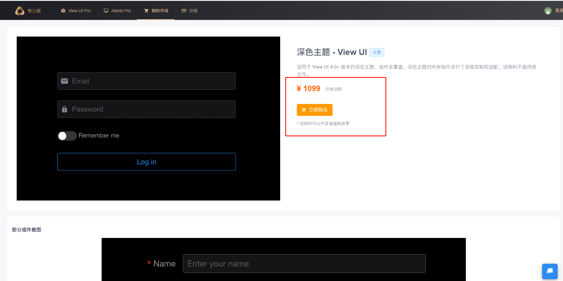
1 iview 太贵

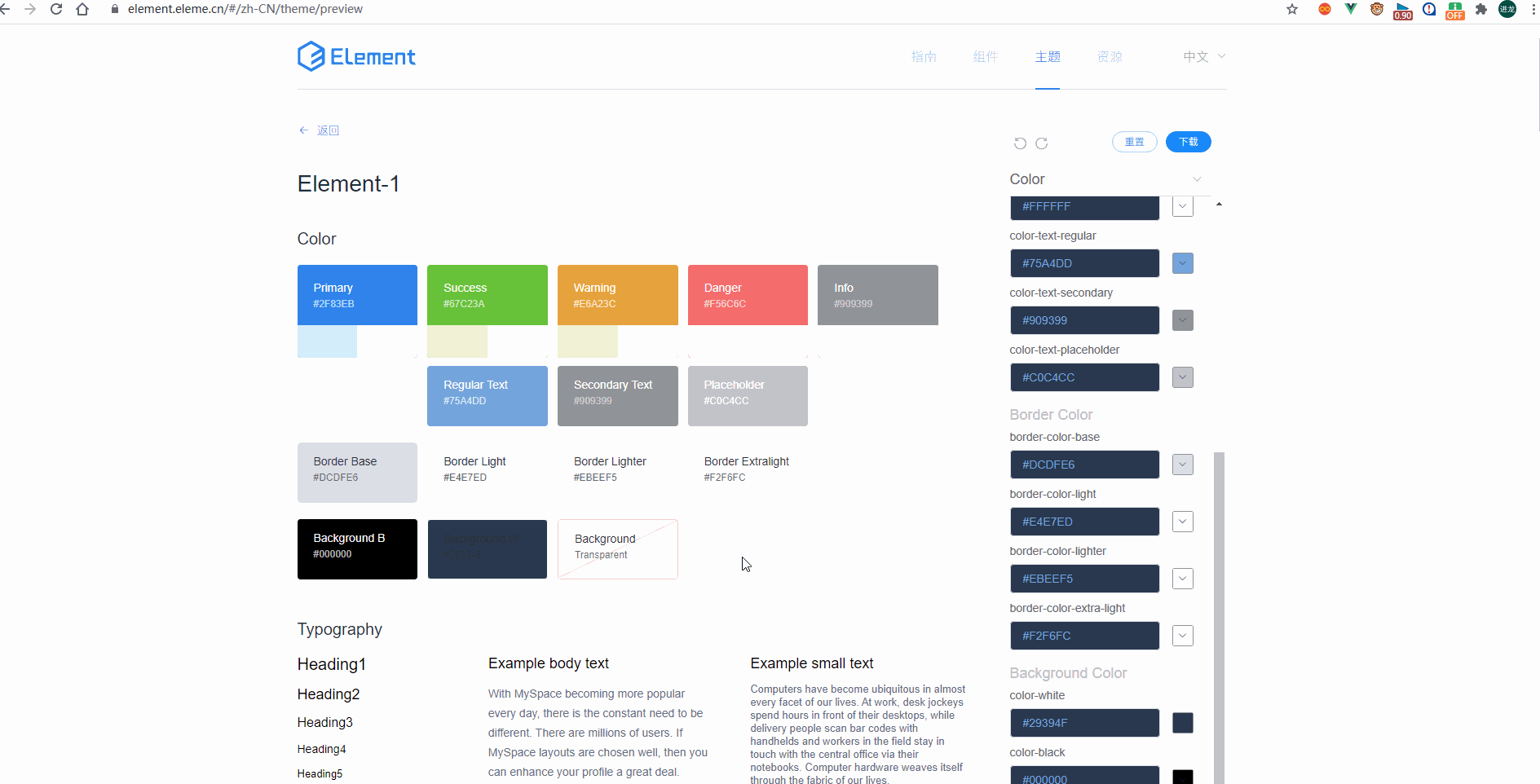
2 element ui
只改主题色??? 鸡肋!!!
页面背景 表格背景色都没变 这不是你想要的
不过线上版改色还是真香的 不愧是vue ui 老大 此处应该有掌声 实时可视化 下面是我配置测试的样子 沉醉
不足 有些样式还需要样式穿透去修改 比如tabs 组件
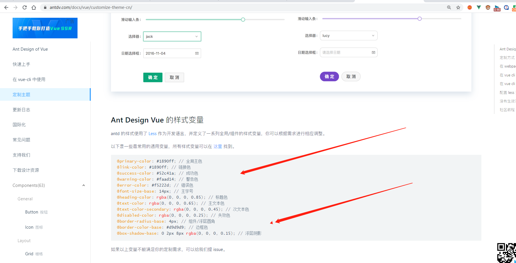
3 ant design 因为是个人维护 主题目前确实不友好 不能在线查看所有组件样式 只能挨个去测 相对element 很麻烦 太累

项目中用到ant desin 怎么办
我们处理的效果如下
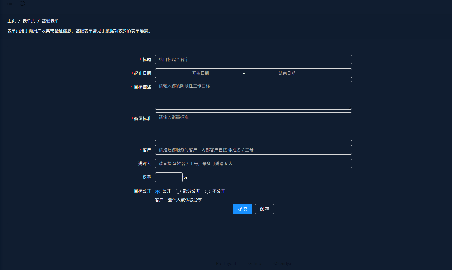
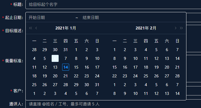
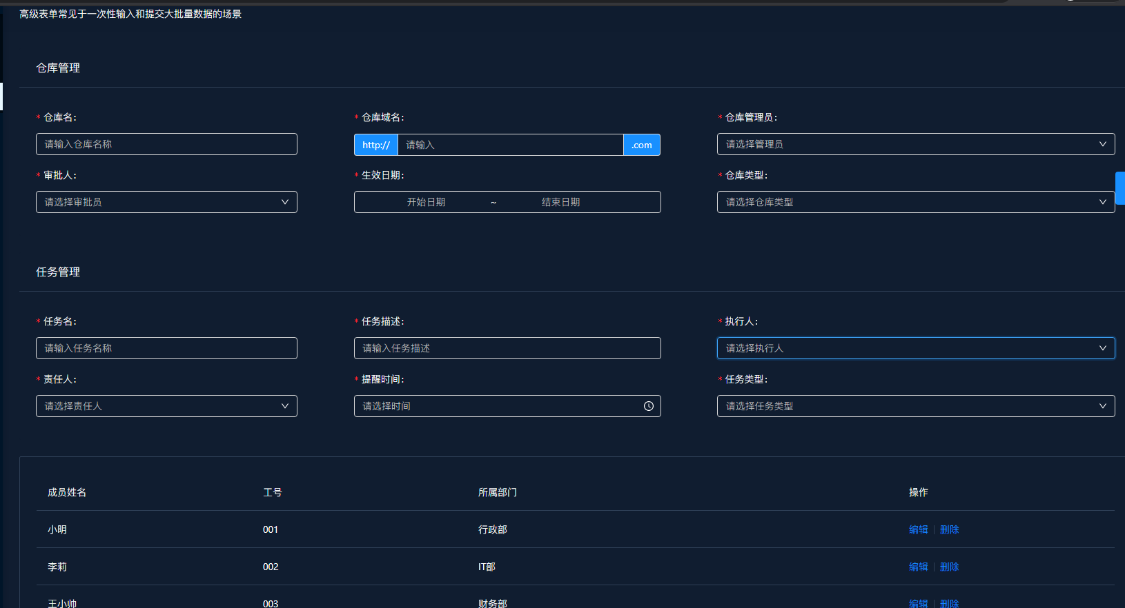
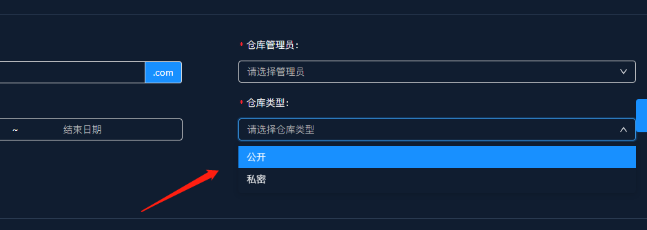
组件页面样式全部深色系 实践过程中 1 很多交互样式 最好优先改变量 要不然样式穿透太多 交互太多 改不完的 2 ant 源码中写死的颜色 使用样式穿透
自研源码附上
原创 gjl   一直闭眼看世界出品

@import '~ant-design-vue/dist/antd.less'; // 引入官方提供的 less 样式入口文件
// 自定义变量
// 全局变量
@g-bgcolor:#11223b;
@g-white:#fff;
@g-bg:rgba(0,0,0,0.6);
@g-red:red;
@g-white:white;
@g-f-color:rgba(137,190,255,1);
@g-m-bg:#101D30;
@g-m-border:#2F4057;
@g-bgcolor:#11223b;
@g-primary:#2f83eb;


//修改ant 原生样式框
@primary-color:#2f83eb; // 全局主色
// An override for the html selector for theme prefixes
@html-selector: html;

// -------- Colors -----------
@primary-color: @blue-6;
@info-color: @blue-6;
@success-color: @green-6;
@processing-color: @blue-6;
@error-color: @red-6;
@highlight-color: @red-6;
@warning-color: @gold-6;
@normal-color: #d9d9d9;
@white: #fff;
@black: #000;

// Color used by default to control hover and active backgrounds and for
// alert info backgrounds.
@primary-1: @primary-color; // replace tint(@primary-color, 90%)
@primary-2: @primary-color; // replace tint(@primary-color, 80%)
@primary-3: color(~`colorPalette('@{primary-color}', 3) `); // unused
@primary-4: color(~`colorPalette('@{primary-color}', 4) `); // unused
@primary-5: color(
  ~`colorPalette('@{primary-color}', 5) `
); // color used to control the text color in many active and hover states, replace tint(@primary-color, 20%)
@primary-6: @primary-color; // color used to control the text color of active buttons, don't use, use @primary-color
@primary-7: color(~`colorPalette('@{primary-color}', 7) `); // replace shade(@primary-color, 5%)
@primary-8: color(~`colorPalette('@{primary-color}', 8) `); // unused
@primary-9: color(~`colorPalette('@{primary-color}', 9) `); // unused
@primary-10: color(~`colorPalette('@{primary-color}', 10) `); // unused

// Base Scaffolding Variables
// ---

// Background color for `<body>`
@body-background: #fff;
// Base background color for most components
@component-background: @g-m-bg;
@font-family: -apple-system, BlinkMacSystemFont, 'Segoe UI', 'PingFang SC', 'Hiragino Sans GB',
  'Microsoft YaHei', 'Helvetica Neue', Helvetica, Arial, sans-serif, 'Apple Color Emoji',
  'Segoe UI Emoji', 'Segoe UI Symbol';
@code-family: 'SFMono-Regular', Consolas, 'Liberation Mono', Menlo, Courier, monospace;
@text-color:  @g-white;
@text-color-secondary:  @g-white;
@text-color-inverse: @white;
@icon-color: inherit;
@icon-color-hover: fade(@black, 75%);
@heading-color: #fff;
@heading-color-dark: fade(@white, 100%);
@text-color-dark: fade(@white, 85%);
@text-color-secondary-dark: fade(@white, 65%);
@text-selection-bg: @primary-color;
@font-variant-base: tabular-nums;
@font-feature-settings-base: 'tnum';
@font-size-base: 14px;
@font-size-lg: @font-size-base + 2px;
@font-size-sm: 12px;
@heading-1-size: ceil(@font-size-base * 2.71);
@heading-2-size: ceil(@font-size-base * 2.14);
@heading-3-size: ceil(@font-size-base * 1.71);
@heading-4-size: ceil(@font-size-base * 1.42);
@line-height-base: 1.5;
@border-radius-base: 4px;
@border-radius-sm: 2px;

// vertical paddings
@padding-lg: 24px; // containers
@padding-md: 16px; // small containers and buttons
@padding-sm: 12px; // Form controls and items
@padding-xs: 8px; // small items

// vertical padding for all form controls
@control-padding-horizontal: @padding-sm;
@control-padding-horizontal-sm: @padding-xs;

// The background colors for active and hover states for things like
// list items or table cells.
@item-active-bg: @primary-1;
@item-hover-bg: @primary-color;

// ICONFONT
@iconfont-css-prefix: anticon;

// LINK
@link-color: @primary-color;
@link-hover-color: color(~`colorPalette('@{link-color}', 5) `);
@link-active-color: color(~`colorPalette('@{link-color}', 7) `);
@link-decoration: none;
@link-hover-decoration: none;

// Animation
@ease-base-out: cubic-bezier(0.7, 0.3, 0.1, 1);
@ease-base-in: cubic-bezier(0.9, 0, 0.3, 0.7);
@ease-out: cubic-bezier(0.215, 0.61, 0.355, 1);
@ease-in: cubic-bezier(0.55, 0.055, 0.675, 0.19);
@ease-in-out: cubic-bezier(0.645, 0.045, 0.355, 1);
@ease-out-back: cubic-bezier(0.12, 0.4, 0.29, 1.46);
@ease-in-back: cubic-bezier(0.71, -0.46, 0.88, 0.6);
@ease-in-out-back: cubic-bezier(0.71, -0.46, 0.29, 1.46);
@ease-out-circ: cubic-bezier(0.08, 0.82, 0.17, 1);
@ease-in-circ: cubic-bezier(0.6, 0.04, 0.98, 0.34);
@ease-in-out-circ: cubic-bezier(0.78, 0.14, 0.15, 0.86);
@ease-out-quint: cubic-bezier(0.23, 1, 0.32, 1);
@ease-in-quint: cubic-bezier(0.755, 0.05, 0.855, 0.06);
@ease-in-out-quint: cubic-bezier(0.86, 0, 0.07, 1);

// Border color
@border-color-base: hsv(0, 0, 85%); // base border outline a component
@border-color-split: @g-m-border; // split border inside a component
@border-color-inverse: @white;
@border-width-base: 1px; // width of the border for a component
@border-style-base: solid; // style of a components border

// Outline
@outline-blur-size: 0;
@outline-width: 2px;
@outline-color: @primary-color;

@background-color-light:@primary-color; // background of header and selected item
@background-color-base: hsv(0, 0, 96%); // Default grey background color

// Disabled states
@disabled-color: #fff;
@disabled-bg: transparent;
@disabled-color-dark: fade(#fff, 35%);

// Shadow
@shadow-color: rgba(0, 0, 0, 0.15);
@shadow-color-inverse: @component-background;
@box-shadow-base: @shadow-1-down;
@shadow-1-up: 0 -2px 8px @shadow-color;
@shadow-1-down: 0 2px 8px @shadow-color;
@shadow-1-left: -2px 0 8px @shadow-color;
@shadow-1-right: 2px 0 8px @shadow-color;
@shadow-2: 0 4px 12px @shadow-color;

// Buttons
@btn-font-weight: 400;
@btn-border-radius-base: @border-radius-base;
@btn-border-radius-sm: @border-radius-base;
@btn-border-width: @border-width-base;
@btn-border-style: @border-style-base;
@btn-shadow: 0 2px 0 rgba(0, 0, 0, 0.015);
@btn-primary-shadow: 0 2px 0 rgba(0, 0, 0, 0.045);
@btn-text-shadow: 0 -1px 0 rgba(0, 0, 0, 0.12);

@btn-primary-color: #fff;
@btn-primary-bg: @primary-color;

@btn-default-color: @text-color;
@btn-default-bg: @component-background;
@btn-default-border: @border-color-base;

@btn-danger-color: #fff;
@btn-danger-bg: color(~`colorPalette('@{error-color}', 5) `);
@btn-danger-border: color(~`colorPalette('@{error-color}', 5) `);

@btn-disable-color: @disabled-color;
@btn-disable-bg: @disabled-bg;
@btn-disable-border: @border-color-base;

@btn-padding-base: 0 @padding-md - 1px;
@btn-font-size-lg: @font-size-lg;
@btn-font-size-sm: @font-size-base;
@btn-padding-lg: @btn-padding-base;
@btn-padding-sm: 0 @padding-xs - 1px;

@btn-height-base: 32px;
@btn-height-lg: 40px;
@btn-height-sm: 24px;

@btn-circle-size: @btn-height-base;
@btn-circle-size-lg: @btn-height-lg;
@btn-circle-size-sm: @btn-height-sm;

@btn-square-size: @btn-height-base;
@btn-square-size-lg: @btn-height-lg;
@btn-square-size-sm: @btn-height-sm;

@btn-group-border: @primary-5;

// Checkbox
@checkbox-size: 16px;
@checkbox-color: @primary-color;
@checkbox-check-color: #fff;
@checkbox-border-width: @border-width-base;

// Descriptions
@descriptions-bg: #fafafa;

// Dropdown
@dropdown-selected-color: @primary-color;

// Empty
@empty-font-size: @font-size-base;

// Radio
@radio-size: 16px;
@radio-dot-color: @primary-color;

// Radio buttons
@radio-button-bg: @btn-default-bg;
@radio-button-checked-bg: @btn-default-bg;
@radio-button-color: @g-white;
@radio-button-hover-color: @primary-5;
@radio-button-active-color: @primary-7;


.ant-radio-wrapper{
     color:@g-white;
}
.ant-radio-disabled .ant-radio-inner::after {
    background-color:@primary-color ;
}

// Media queries breakpoints
// Extra small screen / phone
@screen-xs: 480px;
@screen-xs-min: @screen-xs;

// Small screen / tablet
@screen-sm: 576px;
@screen-sm-min: @screen-sm;

// Medium screen / desktop
@screen-md: 768px;
@screen-md-min: @screen-md;

// Large screen / wide desktop
@screen-lg: 992px;
@screen-lg-min: @screen-lg;

// Extra large screen / full hd
@screen-xl: 1200px;
@screen-xl-min: @screen-xl;

// Extra extra large screen / large desktop
@screen-xxl: 1600px;
@screen-xxl-min: @screen-xxl;

// provide a maximum
@screen-xs-max: (@screen-sm-min - 1px);
@screen-sm-max: (@screen-md-min - 1px);
@screen-md-max: (@screen-lg-min - 1px);
@screen-lg-max: (@screen-xl-min - 1px);
@screen-xl-max: (@screen-xxl-min - 1px);

// Grid system
@grid-columns: 24;
@grid-gutter-width: 0;

// Layout
@layout-body-background: #f0f2f5;
@layout-header-background: #001529;
@layout-footer-background: @layout-body-background;
@layout-header-height: 64px;
@layout-header-padding: 0 50px;
@layout-footer-padding: 24px 50px;
@layout-sider-background: @layout-header-background;
@layout-trigger-height: 48px;
@layout-trigger-background: #002140;
@layout-trigger-color: #fff;
@layout-zero-trigger-width: 36px;
@layout-zero-trigger-height: 42px;
// Layout light theme
@layout-sider-background-light: #fff;
@layout-trigger-background-light: #fff;
@layout-trigger-color-light: @text-color;

// z-index list, order by `z-index`
@zindex-badge: 1;
@zindex-table-fixed: 1;
@zindex-affix: 10;
@zindex-back-top: 10;
@zindex-picker-panel: 10;
@zindex-popup-close: 10;
@zindex-modal: 1000;
@zindex-modal-mask: 1000;
@zindex-message: 1010;
@zindex-notification: 1010;
@zindex-popover: 1030;
@zindex-dropdown: 1050;
@zindex-picker: 1050;
@zindex-tooltip: 1060;

// Animation
@animation-duration-slow: 0.3s; // Modal
@animation-duration-base: 0.2s;
@animation-duration-fast: 0.1s; // Tooltip

//CollapsePanel
@collapse-panel-border-radius: @border-radius-base;

//Dropdown
@dropdown-vertical-padding: 5px;
@dropdown-edge-child-vertical-padding: 4px;
@dropdown-font-size: @font-size-base;
@dropdown-line-height: 22px;

// Form
// ---
@label-required-color: @highlight-color;
@label-color:@g-white;
@form-warning-input-bg: @input-bg;
@form-item-margin-bottom: 5px;
@form-item-trailing-colon: true;
@form-vertical-label-padding: 0 0 8px;
@form-vertical-label-margin: 0;
@form-item-label-colon-margin-right: 8px;
@form-item-label-colon-margin-left: 2px;
@form-error-input-bg: @input-bg;

// Input
// ---
@input-height-base: 32px;
@input-height-lg: 40px;
@input-height-sm: 24px;
@input-padding-horizontal: @control-padding-horizontal - 1px;
@input-padding-horizontal-base: @input-padding-horizontal;
@input-padding-horizontal-sm: @control-padding-horizontal-sm - 1px;
@input-padding-horizontal-lg: @input-padding-horizontal;
@input-padding-vertical-base: 4px;
@input-padding-vertical-sm: 1px;
@input-padding-vertical-lg: 6px;
@input-placeholder-color: hsv(0, 0, 75%);
@input-color: @text-color;
@input-border-color: @border-color-base;
@input-bg: @component-background;
@input-number-hover-border-color: @input-hover-border-color;
@input-number-handler-active-bg: #f4f4f4;
@input-number-handler-hover-bg: @primary-5;
@input-number-handler-bg: @component-background;
@input-number-handler-border-color: @border-color-base;
@input-addon-bg: @background-color-light;
@input-hover-border-color: @primary-5;
@input-disabled-bg: @disabled-bg;
@input-outline-offset: 0 0;

.ant-input[disabled]{
     color:@g-white
}

// Select
// ---
@select-border-color: @border-color-base;
@select-item-selected-color: @text-color;
@select-item-selected-font-weight: 600;
@select-dropdown-bg: @component-background;
@select-dropdown-vertical-padding: @dropdown-vertical-padding;
@select-dropdown-edge-child-vertical-padding: @dropdown-edge-child-vertical-padding;
@select-dropdown-font-size: @dropdown-font-size;
@select-dropdown-line-height: @dropdown-line-height;
@select-item-selected-bg: @background-color-light;
@select-item-active-bg: @item-active-bg;
@select-background: @component-background;

// Cascader
// ----
@cascader-dropdown-vertical-padding: @dropdown-vertical-padding;
@cascader-dropdown-edge-child-vertical-padding: @dropdown-edge-child-vertical-padding;
@cascader-dropdown-font-size: @dropdown-font-size;
@cascader-dropdown-line-height: @dropdown-line-height;

// Anchor
// ---
@anchor-border-color: @border-color-split;

// Tooltip
// ---
// Tooltip max width
@tooltip-max-width: 250px;
// Tooltip text color
@tooltip-color: #fff;
// Tooltip background color
@tooltip-bg: rgba(0, 0, 0, 0.75);
// Tooltip arrow width
@tooltip-arrow-width: 5px;
// Tooltip distance with trigger
@tooltip-distance: @tooltip-arrow-width - 1px + 4px;
// Tooltip arrow color
@tooltip-arrow-color: @tooltip-bg;

// Popover
// ---
// Popover body background color
@popover-bg: @component-background;
// Popover text color
@popover-color: @text-color;
// Popover maximum width
@popover-min-width: 177px;
// Popover arrow width
@popover-arrow-width: 6px;
// Popover arrow color
@popover-arrow-color: @popover-bg;
// Popover outer arrow width
// Popover outer arrow color
@popover-arrow-outer-color: @popover-bg;
// Popover distance with trigger
@popover-distance: @popover-arrow-width + 4px;

// Modal
// --
@modal-body-padding: 24px;
@modal-header-bg: @g-m-bg;
@modal-header-border-color-split: @border-color-split;
@modal-heading-color:@g-white;
@modal-footer-bg: transparent;
@modal-footer-border-color-split: @border-color-split;
@modal-mask-bg: fade(@black, 45%);

// Progress
// --
@progress-default-color: @processing-color;
@progress-remaining-color: @background-color-base;
@progress-text-color: @text-color;
@progress-radius: 100px;

// Menu
// ---
@menu-inline-toplevel-item-height: 40px;
@menu-item-height: 40px;
@menu-collapsed-width: 80px;
@menu-bg: @component-background;
@menu-popup-bg: @component-background;
@menu-item-color: @text-color;
@menu-highlight-color: @primary-color;
@menu-item-active-bg: @item-active-bg;
@menu-item-active-border-width: 3px;
@menu-item-group-title-color: @text-color-secondary;
@menu-icon-size: @font-size-base;
@menu-icon-size-lg: @font-size-lg;

@menu-item-vertical-margin: 4px;
@menu-item-font-size: @font-size-base;
@menu-item-boundary-margin: 8px;

// dark theme
@menu-dark-color: @text-color-secondary-dark;
@menu-dark-bg: @layout-header-background;
@menu-dark-arrow-color: #fff;
@menu-dark-submenu-bg: #000c17;
@menu-dark-highlight-color: #fff;
@menu-dark-item-active-bg: @primary-color;
@menu-dark-selected-item-icon-color: @white;
@menu-dark-selected-item-text-color: @white;
@menu-dark-item-hover-bg: transparent;
// Spin
// ---
@spin-dot-size-sm: 14px;
@spin-dot-size: 20px;
@spin-dot-size-lg: 32px;

// Table
// --
@table-header-bg: @g-m-bg;
@table-header-color: @heading-color;
@table-header-sort-bg: @background-color-base;
@table-body-sort-bg: rgba(0, 0, 0, 0.01);
@table-row-hover-bg: fadeout(@g-primary,0.5) ;
@table-selected-row-color: inherit;
@table-selected-row-bg:  fadeout(@g-primary,0.5) ;
@table-body-selected-sort-bg: @table-selected-row-bg;
@table-selected-row-hover-bg: @table-selected-row-bg;
@table-expanded-row-bg: #fbfbfb;
@table-padding-vertical: 16px;
@table-padding-horizontal: 16px;
@table-border-radius-base: @border-radius-base;
@table-footer-bg: @background-color-light;
@table-footer-color: @heading-color;
@table-header-bg-sm: transparent;

// Tag
// --
@tag-default-bg: @background-color-light;
@tag-default-color: @text-color;
@tag-font-size: @font-size-sm;

// TimePicker
// ---
@time-picker-panel-column-width: 56px;
@time-picker-panel-width: @time-picker-panel-column-width * 3;
@time-picker-selected-bg: @background-color-base;

// Carousel
// ---
@carousel-dot-width: 16px;
@carousel-dot-height: 3px;
@carousel-dot-active-width: 24px;

// Badge
// ---
@badge-height: 20px;
@badge-dot-size: 6px;
@badge-font-size: @font-size-sm;
@badge-font-weight: normal;
@badge-status-size: 6px;
@badge-text-color: @component-background;

// Rate
// ---
@rate-star-color: @yellow-6;
@rate-star-bg: @border-color-split;

// Card
// ---
@card-head-color: @heading-color;
@card-head-background: transparent;
@card-head-padding: 16px;
@card-inner-head-padding: 12px;
@card-padding-base: 24px;
@card-actions-background: @background-color-light;
@card-skeleton-bg: #cfd8dc;
@card-background: @component-background;
@card-shadow: 0 2px 8px rgba(0, 0, 0, 0.09);
@card-radius: @border-radius-sm;

// Comment
// ---
@comment-padding-base: 16px 0;
@comment-nest-indent: 44px;
@comment-font-size-base: @font-size-base;
@comment-font-size-sm: @font-size-sm;
@comment-author-name-color: @text-color-secondary;
@comment-author-time-color: #ccc;
@comment-action-color: @text-color-secondary;
@comment-action-hover-color: #595959;

// Tabs
// ---
@tabs-card-head-background: @background-color-light;
@tabs-card-height: 40px;
@tabs-card-active-color: @primary-color;
@tabs-title-font-size: @font-size-base;
@tabs-title-font-size-lg: @font-size-lg;
@tabs-title-font-size-sm: @font-size-base;
@tabs-ink-bar-color: @primary-color;
@tabs-bar-margin: 0 0 16px 0;
@tabs-horizontal-margin: 0 32px 0 0;
@tabs-horizontal-padding: 12px 16px;
@tabs-horizontal-padding-lg: 16px;
@tabs-horizontal-padding-sm: 8px 16px;
@tabs-vertical-padding: 8px 24px;
@tabs-vertical-margin: 0 0 16px 0;
@tabs-scrolling-size: 32px;
@tabs-highlight-color: @primary-color;
@tabs-hover-color: @primary-5;
@tabs-active-color: @primary-7;
@tabs-card-gutter: 2px;
@tabs-card-tab-active-border-top: 2px solid transparent;

// BackTop
// ---
@back-top-color: #fff;
@back-top-bg: @text-color-secondary;
@back-top-hover-bg: @text-color;

// Avatar
// ---
@avatar-size-base: 32px;
@avatar-size-lg: 40px;
@avatar-size-sm: 24px;
@avatar-font-size-base: 18px;
@avatar-font-size-lg: 24px;
@avatar-font-size-sm: 14px;
@avatar-bg: #ccc;
@avatar-color: #fff;
@avatar-border-radius: @border-radius-base;

// Switch
// ---
@switch-height: 22px;
@switch-sm-height: 16px;
@switch-sm-checked-margin-left: -(@switch-sm-height - 3px);
@switch-disabled-opacity: 0.4;
@switch-color: @primary-color;
@switch-shadow-color: fade(#00230b, 20%);

// Pagination
// ---
@pagination-item-size: 32px;
@pagination-item-size-sm: 24px;
@pagination-font-family: Arial;
@pagination-font-weight-active: 500;
@pagination-item-bg-active: @component-background;

// PageHeader
// ---
@page-header-padding: 24px;
@page-header-padding-vertical: 16px;
@page-header-padding-breadcrumb: 12px;
@page-header-back-color: #000;

// Breadcrumb
// ---
@breadcrumb-base-color: @text-color-secondary;
@breadcrumb-last-item-color: @text-color;
@breadcrumb-font-size: @font-size-base;
@breadcrumb-icon-font-size: @font-size-base;
@breadcrumb-link-color: @text-color-secondary;
@breadcrumb-link-color-hover: @primary-5;
@breadcrumb-separator-color: @text-color-secondary;
@breadcrumb-separator-margin: 0 @padding-xs;

// Slider
// ---
@slider-margin: 14px 6px 10px;
@slider-rail-background-color: @background-color-base;
@slider-rail-background-color-hover: #e1e1e1;
@slider-track-background-color: @primary-3;
@slider-track-background-color-hover: @primary-4;
@slider-handle-border-width: 2px;
@slider-handle-background-color: @component-background;
@slider-handle-color: @primary-3;
@slider-handle-color-hover: @primary-4;
@slider-handle-color-focus: tint(@primary-color, 20%);
@slider-handle-color-focus-shadow: fade(@primary-color, 20%);
@slider-handle-color-tooltip-open: @primary-color;
@slider-handle-shadow: 0;
@slider-dot-border-color: @border-color-split;
@slider-dot-border-color-active: tint(@primary-color, 50%);
@slider-disabled-color: @disabled-color;
@slider-disabled-background-color: @component-background;

// Tree
// ---
@tree-title-height: 24px;
@tree-child-padding: 18px;
@tree-directory-selected-color: #fff;
@tree-directory-selected-bg: @primary-color;
@tree-node-hover-bg: @item-hover-bg;
@tree-node-selected-bg: @primary-color;

// Collapse
// ---
@collapse-header-padding: 12px 16px;
@collapse-header-padding-extra: 40px;
@collapse-header-bg: @background-color-light;
@collapse-content-padding: @padding-md;
@collapse-content-bg: @component-background;

// Skeleton
// ---
@skeleton-color: #f2f2f2;

// Transfer
// ---
@transfer-header-height: 40px;
@transfer-disabled-bg: @disabled-bg;
@transfer-list-height: 200px;

// Message
// ---
@message-notice-content-padding: 10px 16px;

// Motion
// ---
@wave-animation-width: 6px;

// Alert
// ---
@alert-success-border-color: ~`colorPalette('@{success-color}', 3) `;
@alert-success-bg-color: ~`colorPalette('@{success-color}', 1) `;
@alert-success-icon-color: @success-color;
@alert-info-border-color: ~`colorPalette('@{info-color}', 3) `;
@alert-info-bg-color: ~`colorPalette('@{info-color}', 1) `;
@alert-info-icon-color: @info-color;
@alert-warning-border-color: ~`colorPalette('@{warning-color}', 3) `;
@alert-warning-bg-color: ~`colorPalette('@{warning-color}', 1) `;
@alert-warning-icon-color: @warning-color;
@alert-error-border-color: ~`colorPalette('@{error-color}', 3) `;
@alert-error-bg-color: ~`colorPalette('@{error-color}', 1) `;
@alert-error-icon-color: @error-color;

// List
// ---
@list-header-background: transparent;
@list-footer-background: transparent;
@list-empty-text-padding: @padding-md;
@list-item-padding: @padding-sm 0;
@list-item-meta-margin-bottom: @padding-md;
@list-item-meta-avatar-margin-right: @padding-md;
@list-item-meta-title-margin-bottom: @padding-sm;

// Statistic
// ---
@statistic-title-font-size: @font-size-base;
@statistic-content-font-size: 24px;
@statistic-unit-font-size: 16px;
@statistic-font-family: @font-family;

// Drawer
// ---
@drawer-header-padding: 16px 24px;
@drawer-body-padding: 24px;

// Timeline
// ---
@timeline-width: 2px;
@timeline-color: @border-color-split;
@timeline-dot-border-width: 2px;
@timeline-dot-color: @primary-color;
@timeline-dot-bg: @component-background;

// Typography
// ---
@typography-title-font-weight: 600;
@typography-title-margin-top: 1.2em;
@typography-title-margin-bottom: 0.5em;


// 弹窗
.ant-modal{
     .ant-modal-confirm-body .ant-modal-confirm-title{
          color:@g-f-color;
     }
     .ant-modal-content{
          background-color: @g-m-bg ;
     }
     .ant-modal-confirm-body > .anticon + .ant-modal-confirm-title + .ant-modal-confirm-content{
         color: @g-f-color ;
     }
     .ant-modal-footer{
          text-align: center;
     }
}
.ant-modal-confirm .ant-modal-confirm-btns{
     float: none;
    text-align: center;
}
// 日期
.ant-calendar-selected-day .ant-calendar-date{
     color: #fff;
}

// 表格
.customTable {
  margin-top: 30px;
  cursor: pointer;
  margin-bottom:20px ;
     .ant-table-placeholder{
     border-top: 1px solid #29394F;
     border-bottom: 1px solid #29394F;
     }
     .ant-table-thead > tr > th {
     color: #fff;
     }
     .ant-table {
     color: rgba(125, 175, 237, 1);
     }
     .ant-empty-normal{
     color:@g-white ;
     }

     .ant-table-fixed-header > .ant-table-content > .ant-table-scroll > .ant-table-body{
     background: #101D30;
     }
}

// 滚动条样式
::-webkit-scrollbar {
     height: 5px;
     width: 4px;
}
::-webkit-scrollbar-thumb {
     border-radius: 5px;
     -webkit-box-shadow: inset 0 0 5px rgba(0, 0, 0, 0.2);
     background: #737372;
}
::-webkit-scrollbar-track {
     -webkit-box-shadow: 0;
     border-radius: 0;
     background: #191f28;
}
