使用vant-ui二次封装日期范围组件
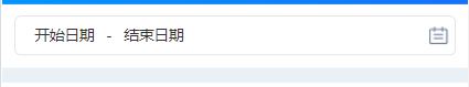
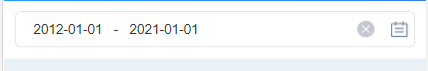
在做移动端的项目中,经常会用到选择日期范围的业务需要,vant官方只有弹出框,日期显示的框需要自己写,因此我封装了一个日期显示框和弹出框结合的组件:
其中双向绑定使用到了model属性的运用,通过设置event,组件$emit 这个event名称时,就会把值直接传递给父组件绑定的值,父组件就不需要额外的去获取最新的日期了。
以下组件的是全部代码:
DateRangePicker.vue
 <!--
  **组件名称:日期范围选择框,包含日期选择弹出框
  **使用示例:
      <date-range-picker
        class="date-input"
        width="100vw"
        height="30px"
        v-model="date">
  **功能:
      1.日历图标是否显示及位置、清除按钮、宽度、高度、边框均可自定义
      2.支持多种日期类型:年月日、年月、月日、时间
  **参数:
      1.value(v-model):日期范围, type: Array
      2.mode:模式,type: String,默认date,eg: date-年月日,year-month - 年月,month-day - 月日,time - 时间
      3.isShowClearBtn:是否显示清除日期按钮,type: Boolean,默认true
      4.isShowCalendarIcon:是否显示日历图标,type: Boolean,默认true
      5.isShowArrowIcon:是否显示箭头图标,type: Boolean,默认false
      6.bordered:是否显示边框,type: Boolean,默认true
      7.borderStyle: 边框样式,type: String, 默认:1px solid #dddddd;
      8.borderRadius: 边框圆角,type: String, 默认:5px
      7.width:宽度, type: String,默认'100vw'
      8.height:高度, type: String,默认'38px'
      9.position:日历图标的位置,type: String,默认'right',eg: 'left'、'right'
      10.spacer:日期间隔符,type: String,默认'-'
      11.background 背景色

  ** 方法
      change([startTimeString, endTimeString])
  -->

<template>
  <div class="date-input-container">
    <div
      class="date-picker"
      :class="bordered ? 'bordered' : ''"
      @click="isShowStartTime = true"
      :style="{ width: width, height: height, background: background, border: borderStyle, 'border-radius': borderRadius }">
      <!-- 日历图标 -->
      <img v-show="isShowCalendarIcon && position === 'left'" class="calendar left" src="../assets/img/common/rl.png" />
      <!-- 日期范围 -->
      <span class="text-container" :class="textClass">
        <span class="timePosition">{{ startDateText || (mode === 'time' ? '开始时间' : '开始日期') }}</span>
        <span class="spacer">{{ spacer }}</span>
        <span class="timePosition">{{ endDateText || (mode === 'time' ? '结束时间' : '结束日期') }}</span>
      </span>

      <div class="right-btn">
        <!-- 清除按钮 -->
        <img v-show="isShowClearBtn && startDateText" @click.stop="clearDate()" class="clear-date" src="../assets/img/login/user.png" />

        <!-- 日历图标 -->
        <img v-show="isShowCalendarIcon  && position === 'right'" class="calendar right" src="../assets/img/common/rl.png" />

        <!-- 箭头图标 -->
        <van-icon v-show="isShowArrowIcon" name="arrow-down" class="arrow-down" />
      </div>
    </div>

    <van-popup v-model="isShowStartTime" position="bottom" get-container="body">
      <van-datetime-picker
        v-model="startTime"
        :type="mode"
        :title="mode === 'time' ? '选择开始时间' : '选择开始日期'"
        @confirm="onConfirmStartDate"
        @cancel="isShowStartTime = false"
      />
    </van-popup>

    <van-popup v-model="isShowEndTime" position="bottom" get-container="body">
      <van-datetime-picker
        v-model="endTime"
        :type="mode"
        :title="mode === 'time' ? '选择结束时间' : '选择结束日期'"
        @confirm="onConfirmEndDate"
        @cancel="isShowEndTime = false"
      />
    </van-popup>
  </div>
</template>

<script>
import dayjs from 'dayjs'
export default {
  name: 'DateRangeInput',
  props: {
    value: {
      type: [Array, String],
      required: true
    },

    // 日期间隔符
    spacer: {
      type: String,
      default: '-'
    },

    // 模式: date-年月日  year-month - 年月   month-day - 月日  time - 时间  datehour年月日小时 datetime年月日时分
    mode: {
      type: String,
      default: 'date'
    },

    // 是否显示清除日期按钮
    isShowClearBtn: {
      type: Boolean,
      default: true
    },

    // 是否显示日历图标
    isShowCalendarIcon: {
      type: Boolean,
      default: true
    },

    // 是否显示箭头图标
    isShowArrowIcon: {
      type: Boolean,
      default: false
    },

    // 是否显示边框
    bordered: {
      type: Boolean,
      default: true
    },

    // 容器宽度
    width: {
      type: String,
      default: () => '100vw'
    },

    height: {
      type: String,
      default: () => '38px'
    },

    background: {
      type: String,
      default: () => '#ffffff'
    },

    borderStyle: {
      type: String,
      default: () => '1px solid #dddddd;'
    },

    borderRadius: {
      type: String,
      default: () => '5px'
    },

    // 日历图标的位置: left、right
    position: {
      type: String,
      default: () => 'right'
    }
  },
  model: {
    props: 'value',
    event: 'change' // 通过emit触发change将内部值传递给父组件v-model绑定的值
  },

  data() {
    return {
      startDateText: this.value[0] || '',
      endDateText: this.value[1] || '',
      isShowStartTime: false,
      isShowEndTime: false,
      textClass: '', // 日期样式
      startTime: '',
      endTime: '',
      format: '' // 日期格式
    }
  },

  created() {
    this.textClass = this.position
    switch (this.mode) {
      case 'date': // 年月日
        this.format = 'YYYY-MM-DD'
        break
      case 'year-month': // 年月
        this.format = 'YYYY-MM'
        break
      case 'month-day': // 月日
        this.format = 'MM-DD'
        break
      case 'datetime': // 年月日小时分钟
        this.format = 'YYYY-MM-DD hh:mm'
        break
      case 'datehour': // 年月日小时
        this.format = 'YYYY-MM-DD hh'
        break
      case 'time': // 小时分钟
        this.format = undefined
        break
    }

    if (this.format) {
      this.startTime = this.value[0] ? new Date(this.value[0]) : new Date()
      this.endTime = this.value[1] ? new Date(this.value[1]) : new Date()
    } else {
      this.startTime = this.value[0]
      this.endTime = this.value[1]
    }
  },

  methods: {
    onConfirmStartDate(val) {
      if (this.format) {
        this.startTime = dayjs(val).format(this.format)
      } else {
        this.startTime = val
      }

      this.startDateText = this.startTime
      this.isShowStartTime = false
      this.isShowEndTime = true
    },
    onConfirmEndDate(val) {
      if (this.format) {
        this.endTime = dayjs(val).format(this.format)
      } else {
        this.endTime = val
      }

      this.endDateText = this.endTime
      this.isShowEndTime = false
      this.$emit('change', [this.startTime, this.endTime])
    },
    clearDate() {
      this.startDateText = ''
      this.endDateText = ''
      this.$emit('change', ['', ''])
    }
  }
}
</script>

<style lang="scss" scoped>
  .date-input-container {
    position: relative;

    .date-picker {
      position: relative;
      display: flex;
      align-items: center;
      justify-content: space-between;
      z-index: 499;
      text-indent: 5px;
      white-space: nowrap;
      padding: 0 5px;
      border-radius: 15px;
      &.bordered {
        border: 1px solid #dddddd;
        border-radius: 5px;
      }

      .text-container {
        display: inline-block;
        white-space: nowrap;
        text-overflow: ellipsis;
        overflow: hidden;
        width: 100%;
        display: flex;
        justify-content: space-around;
        align-items: center;

        &.left {
          margin-left: 15px;
        }
      }

      .timePosition {
        display: inline-block;
        vertical-align: middle;
        &:last-child {
          min-width: 75px;
          white-space: nowrap;
          text-overflow: ellipsis;
          overflow: hidden;
        }
      }

      .spacer {
        display: inline-block;
        height: 28px;
        margin: 0 5px;
        line-height: 28px;
        vertical-align: middle;
      }

      .date {
        font-style: normal;
        font-size: 14px;
      }
      .right-btn {
        display: flex;
        align-items: center;
        .clear-date {
          margin: 0 6px;
          width: 15px;
          height: 15px;
          vertical-align: middle;
        }

        .calendar {
          vertical-align: middle;
          margin-left: 6px;
          width: 15px;
          height: 14px;

          &.left {
            margin-right: 6px;
          }

          &.right {
            margin-left: 10px;
          }
        }
        .arrow-down {
          vertical-align: middle;
          width: 7px;
          right: 12px;
        }
      }
    }
  }
</style>
生活是痛苦的白天,死亡是凉爽的夜晚。

 浙公网安备 33010602011771号