(6) WPF 标签、按钮、提示工具 控件
所有控件都继承自System.Windows.Control 类
该类的基础能力:
- 控件内容对齐方式
- Tab顺序
- 前景,背景,边框
- 格式化文本内容的尺寸和大小
一、颜色设置
1.代码颜色设置
            button1.Background = new SolidColorBrush(Colors.Red);
            //获取系统颜色
            button1.Background = new SolidColorBrush(SystemColors.ControlColor);
            //系统画刷简写
            button1.Background = SystemColors.ControlBrush;
            //RGB方式,前景色
            button1.Foreground = new SolidColorBrush(Color.FromRgb(0,255,0));
2.xaml颜色设置
        <Button x:Name="button1"  Content="Button" HorizontalAlignment="Left" VerticalAlignment="Top" Width="75" Click="button1_Click">
            <Button.Background>
                <SolidColorBrush Color="RED" />
            </Button.Background>
        </Button>
或者
<Button x:Name="button1" Background="Brown" HorizontalAlignment="Left" VerticalAlignment="Top" Width="75" Click="button1_Click" />
二、字体设置
1.字体
代码
//字体名
//系统字体库 C:\Windows\Fonts
button1.FontFamily = new FontFamily("Freestyle Script");
//字体大小
button1.FontSize = 18;
//字体粗细
button1.FontWeight = FontWeights.Bold;
xaml
<Button x:Name="button1" FontFamily="Freestyle Script" FontSize="18" FontWeight="Bold" Content="Button" HorizontalAlignment="Left" Margin="62,48,0,0" VerticalAlignment="Top" Width="75" />
如果没有该字体可以使用后一位
FontFamily="Freestyle Script,xxx,xxx"
获得本地字体
foreach(FontFamily fontFamily in Fonts.SystemFontFamilies)
三、光标设置
this.Cursor = Cursors.SizeWE;
四、内容控件
content control:内容控件是可以包含单个嵌套元素的控件
1.content属性
支持任何类型的对象,但只能包含一个对象
可以是文本
<Button Width="30" Height="20">内容</Button>
可以是单个控件
        <Button Width="200" Height="200">
            <Image Source="/man.png" Stretch="None"></Image>
        </Button>
可以是布局控件
        <Button Width="200" Height="200">
            <StackPanel>
                <Label>man</Label>
                <Image Source="/man.png" Stretch="None"></Image>
            </StackPanel>
        </Button>
2.对齐内容
容器里的内容水平或垂直对齐
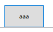
<Button Width="50" Height="30" HorizontalContentAlignment="Left" VerticalContentAlignment="Bottom"> abc </Button>
控件与内容控件之间用padding,两个控件之间用margin
3.标签
lable
支持快捷键设置焦点
    <StackPanel>
        <!--_A用来表示快捷键,再用Target标签绑定指定的控件,就可以用alt+a alt+b 来回切换绑定控件的焦点-->
        <Label Target="{Binding ElementName=tb1}"> hello_A </Label>
        <TextBox Name="tb1" Height="20" Width="80" ></TextBox>
        <Label Target="{Binding ElementName=tb2}">hello_B</Label>
        <TextBox Name="tb2" Height="20" Width="80" ></TextBox>
    </StackPanel>
TextBlock
支持换行
4.按钮
Button、CheckBox、RadioButton 这三种按钮都继承自ButtonBase
ButtonBase类 ,添加了Click事件,ClickMode属性决定何时引发Click事件,
- 默认是ClickMode.Release 当单击并释放是引发
- ClickMode.Press 按下按钮时引发
- ClickMode.Hover 鼠标悬停到按钮时引发
(1)Button
IsCancel 属性设置为True时,当按下Esc就会触发该事件
<Button Height="45" Width="80" IsCancel="True" Click="button1_Click">aaa</Button>
IsDefault 属性设置为True时,焦点在其他位置,单击回车会触发click事件
<Button Height="45" Width="80" IsDefault="True" Click="button1_Click">aaa</Button>
该属性为true时按钮会有蓝色边框
(2) ToggleButton RepeatButton
这两个控件和GridViewColumnHeader类也都继承自ButtonBase类
GridViewColumnHeader 基于ListView控件时,表示一列可以单击标题
RepeatButton 只要按钮保持按下状态,就会不断触发click事件
ToggleButton 具有两个状态 按下和未按下,CheckBox和RadioButton 继承了该控件
(3)CheckBox控件
IsChecked 属性用来判断是否被选中
(4)RadioButton 控件
StackPanel中存放一组单选按钮
        <StackPanel>
                <RadioButton>aaa</RadioButton>
                <RadioButton>bbb</RadioButton>
                <RadioButton>ccc</RadioButton>
        </StackPanel>
使用GroupName属性区分一组单选按钮,优先级高于stackpanel
        <StackPanel>
                <RadioButton>aaa</RadioButton>
                <RadioButton>bbb</RadioButton>
                <RadioButton GroupName="G1">ccc</RadioButton>
        </StackPanel>
        <StackPanel>
            <RadioButton>DDD</RadioButton>
            <RadioButton>EEE</RadioButton>
            <RadioButton GroupName="G1">FFF</RadioButton>
        </StackPanel>
这样 ccc 和FFF是一组单选, aaa和ccc不在一个组里
5.提示工具
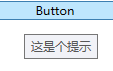
ToolTip属性
<Button ToolTip="这是个提示" Content="Button"/>
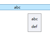
更复杂的提示,可以带上图片等
        <Button >
            <Button.ToolTip>
                <StackPanel>
                    <Label>abc</Label>
                    <Image Source=" "></Image>
                    <Label>def</Label>
                </StackPanel>
            </Button.ToolTip>
            <Button.Content>
                abc
            </Button.Content>
        </Button>
不能在提示中,设置点击的按钮。
后待补
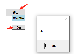
6.Popup控件
可以弹出一个界面,和ToolTip不同,popup弹出界面允许被操作,
        <Button Name="btn1" Height="32" Width="80" Click="btn1_Click">
            <StackPanel>
                <Label>弹出</Label>
                <Popup Name="pop">
                    <StackPanel Background="LightBlue">
                        <Label>输入内容</Label>
                        <TextBox></TextBox>
                        <Button Name="btn2" Click="btn2_Click">点击</Button>
                    </StackPanel>
                </Popup>
            </StackPanel>
        </Button>
C#
        private void btn1_Click(object sender, RoutedEventArgs e)
        {
            if (pop.IsOpen)
            {
                pop.IsOpen = false;
            }
            else
            {
                pop.IsOpen = true;
            }

        }
        private void btn2_Click(object sender, RoutedEventArgs e)
        {
            MessageBox.Show("abc");
        }
7. AccessText
两种方式,alt+下划线后的字母的组合快捷键触发按钮事件
        <Button Click="edit_Click">
            <AccessText>_Edit</AccessText>
        </Button>
        <Button Click="cut_Click">_Cut</Button>
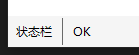
设置底部状态栏
        <StatusBar VerticalAlignment="Bottom" Background="WhiteSmoke">
            <StatusBarItem>
                <Label>状态栏</Label>
            </StatusBarItem>
            <Separator />
            <StatusBarItem>
                <Label>OK</Label>
            </StatusBarItem>
        </StatusBar>