pyecharts模块
pyecharts简介
官网链接:http://pyecharts.org/#/
pyecharts 是一个用于生成 Echarts 图表的类库。Echarts 是百度开源的一个数据可视化 JS 库。用 Echarts 生成的图可视化效果非常好,pyecharts 是为了与 Python 进行对接,方便在 Python 中直接使用数据生成图。
pyecharts 用于 web 绘图,有较多的绘图种类,且代码量比较少。它是基于一个 Echarts 的库噶欧辰的,而Echarts 是百度开源的一个可视化 JavaScript 库。
pyecharts 可以将图片保存为多种格式,但需要插件,否则只能保存为 html 格式。安装 pyecharts 可以用:
pip install pyecharts
安装图片保存插件可用:
pip install pyecharts-snapshot
以及:
npm install -g phantomjs-prebuilt
柱状图
from pyecharts.charts import Bar
from pyecharts import options as opts
bar = Bar()
bar.add_xaxis(['毛衣','寸衫',"领带",'裤子',"风衣","高跟鞋","袜子"])
bar.add_yaxis('商家A',[114,55,27,101,125,27,105])
bar.add_yaxis('商家B',[57,134,101,22,69,90,129])
bar.set_global_opts(title_opts=opts.TitleOpts(title="某商场销售情况",subtitle='A和B公司'),
                   toolbox_opts=opts.ToolboxOpts(is_show=True))
bar.set_series_opts(label_opts=opts.LabelOpts(position="top"))
bar.render_notebook()    # 在 notebook 中展示
# bar.render(r"D:\桌面\snapshot.html") 生成 html 文件

bar = Bar()
bar.add_xaxis(['毛衣','寸衫',"领带",'裤子',"风衣","高跟鞋","袜子"])
bar.add_yaxis('商家A',[114,55,27,101,125,27,105])
bar.add_yaxis('商家B',[57,134,101,22,69,90,129])
bar.set_global_opts(title_opts=opts.TitleOpts(title="某商场销售情况",subtitle='A和B公司'),
                   toolbox_opts=opts.ToolboxOpts(is_show=True))
bar.set_series_opts(label_opts=opts.LabelOpts(position="right"))
bar.reversal_axis()
bar.render_notebook()

饼状图
普通饼图
from pyecharts.charts import Pie
from pyecharts import options as opts
L1 = ["教授","副教授","讲师","助教","其他"]
num = [20,30,10,12,8]
c = Pie()
c.add("",[list(z) for z in zip(L1,num)])
c.set_global_opts(title_opts = opts.TitleOpts(title="Pie-职称比例"),
                 toolbox_opts = opts.ToolboxOpts(is_show=True))
c.set_series_opts(label_opts = opts.LabelOpts(formatter="{b}:{c}"))
c.render_notebook()

环形图
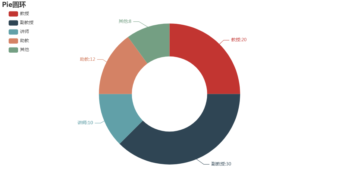
from pyecharts.charts import Pie
from pyecharts import options as opts
c = Pie()
L1 = ["教授","副教授","讲师","助教","其他"]
num = [20,30,10,12,8]
c.add("",[list(z) for z in zip(L1,num)],radius=["40%","75%"])
c.set_global_opts(title_opts=opts.TitleOpts(title='Pie圆环'),
                 legend_opts=opts.LegendOpts(orient='vertical',pos_top='5%',pos_left="2%"))
c.set_series_opts(label_opts=opts.LabelOpts(formatter="{b}:{c}"))
c.render_notebook()
玫瑰图
from pyecharts.charts import Pie
from pyecharts import options as opts
c = Pie()
L1 = ["教授","副教授","讲师","助教","其他"]
num = [20,30,10,12,8]
c.add("",[list(z) for z in zip(L1,num)],radius=["40%","75%"],rosetype="area")
c.set_global_opts(title_opts = opts.TitleOpts(title="玫瑰图"),toolbox_opts = opts.ToolboxOpts(is_show=True),
                 legend_opts=opts.LegendOpts(orient='vertical',pos_top="5%",pos_left="2%"))
c.set_series_opts(label_opts=opts.LabelOpts(formatter='{b}:{c}'))
c.render_notebook()

散点图
from pyecharts.charts import Scatter
from pyecharts import options as opts
s = Scatter()
week = ['Mon','Thur','Wed','Tues','Fri','Sar','Sun']
s.add_xaxis(week)
s.add_yaxis('商家A',[11,22,33,44,55,66,77])
s.add_yaxis('商家B',[0,10,20,30,40,50,60])
s.set_global_opts(title_opts=opts.TitleOpts(title='散点图'),
                 toolbox_opts = opts.ToolboxOpts(is_show=True),
                 legend_opts = opts.LegendOpts(orient='vertical',pos_top='5%',pos_left="2%"))
s.set_series_opts(label_opts=opts.LabelOpts(position='top'))
s.render_notebook()

多图绘制
# 如果要在一张图中绘制两幅图,需要用到 网格:

from pyecharts import options as opts
from pyecharts.charts import Bar,Line,Grid
A = ["小米","三星","华为","苹果","魅族","VIVO","OPPO"]
CA = [100,125,87,90,78,98,118]
B = ["草莓","芒果","葡萄","雪梨","西瓜","柠檬","车厘子"]
CB = [78,95,120,102,88,108,98]
bar = Bar()
bar.add_xaxis(A)
bar.add_yaxis("商家A",CA)
bar.add_yaxis("商家B",CB)
bar.set_global_opts(title_opts=opts.TitleOpts(title="多图绘制"))
bar.render_notebook()

line = Line()
line.add_xaxis(B)
line.add_yaxis("商家A",CA)
line.add_yaxis("商家B",CB)
line.set_global_opts(title_opts=opts.TitleOpts(title="2图",pos_top="48%"),
                    legend_opts=opts.LegendOpts(pos_top="48%"))
line.render_notebook()

grid = Grid()
grid.add(bar,grid_opts=opts.GridOpts(pos_bottom="60%"))
grid.add(line,grid_opts=opts.GridOpts(pos_top="60%"))
grid.render_notebook()

桑基图
一般用于分析原因,流量等:

import pandas as pd
from pyecharts import options as opts
from pyecharts.charts import Sankey

df = pd.DataFrame({'性别':['男','男','男','女','女','女'],
                  "熬夜原因":['打游戏','看剧','加班','打游戏','看剧','加班'],
                  '人数':[40,20,40,8,25,36]})
display(df)
def transForm(df):
    nodes = []
    links = []
    for i in range(2):
        values = df.iloc[:,i].unique()
        for value in values:
            dic = {}
            dic['name']=value
            nodes.append(dic)
    for i in df.values:
        dic = {}
        dic['source'] = i[0]
        dic['target'] = i[1]
        dic['value'] = i[2]
        links.append(dic)
    return nodes,links

nodes,links = transForm(df)
print(nodes)
print(links)
sankey = Sankey()
sankey.add("桑基图",nodes,links,
          linestyle_opt = opts.LineStyleOpts(opacity=0.2,curve=0.5,color="source"),
          label_opts = opts.LabelOpts(position='right'))
sankey.set_global_opts(title_opts=opts.TitleOpts(title='桑基图示例'))
sankey.render_notebook()

词云
from pyecharts import options as opts
from pyecharts.charts import Page,WordCloud
from pyecharts.globals import SymbolType
words = [
    ("牛肉面",7800),("黄河",6181),("《读者》",4386),("水晶饺子",3055),("雨燕中学",4244),("碣石文化广场",2055),
    ("玄武山",8067),("华工",1868),("十一孔",3483),("宋瘄寮",1122),("石洲",980),("红白",1111),("Beautyleg",3000),
    ("Winnie",6666),("toxic_妲己",2222),("绯月樱",4444)
]
c = WordCloud()
c.add("",words,word_size_range=[10,70])
c.set_global_opts(title_opts=opts.TitleOpts(title="词云"))
c.render_notebook()


 浙公网安备 33010602011771号