CSS3新特性——新增选择器,2D/3D转换,动画
CSS3新特性——新增选择器,2D/3D转换,动画
欢迎大家去博客冰山一树Sankey,浏览效果更好。直接右上角搜索该标题即可
博客园主页:博客园主页-冰山一树Sankey
CSDN主页:CSDN主页-冰山一树Sankey
前端学习:学习地址:黑马程序员pink老师前端入门教程,零基础必看的h5(html5)+css3+移动,下面这些都是一些学习笔记。临渊羡鱼,不如退而结网!!愿我自己学有所成,也愿每个前端爱好者学有所成
一. CSS3选择器
1.1 属性选择器
属性选择器可以根据元素特定属性的来选择元素。 这样就可以不用借助于类或者id选择器。
| 选择符 | 简介 |
|---|---|
| E[att] | 选择具有att属性的E元素 |
| E[att=“val”] | 选择具有att属性且属性值等于val的E元素 |
| E[att^=“val”] | 匹配具有att属性且值以val开头的E元素 |
| E[att$=“val”] | 匹配具有att属性且值以val结尾的E元素 |
| E[att*=“val”] | 匹配具有att属性且值中含有val的E元素 |
注意:类选择器、属性选择器、伪类选择器,权重为 10。
1.2 结构伪类选择器
结构伪类选择器主要根据文档结构来选择器元素, 常用于根据父级选择器里面的子元素
| 选择符 | 简介 |
|---|---|
| E:first-child | 匹配父元素中的第一个子元素E |
| E:last-child | 匹配父元素中最后一个E元素 |
| E:nth-child(n) | 匹配父元素中的第n个子元素E |
| E:first-of-type | 指定类型E的第一个 |
| E:last-of-type | 指定类型E的最后一个 |
| E:nth-of-type(n) | 指定类型E的第n个 |
区别:
- nth-child 对父元素里面所有孩子排序选择(序号是固定的) 先找到第n个孩子,然后看看是否和E匹配
- nth-of-type 对父元素里面指定子元素进行排序选择。 先去匹配E ,然后再根据E 找第n个孩子
例:
<!DOCTYPE html>
<html lang="en">

<head>
    <meta charset="UTF-8">
    <meta name="viewport" content="width=device-width, initial-scale=1.0">
    <meta http-equiv="X-UA-Compatible" content="ie=edge">
    <title>CSS3新增结构伪类选择器-nth-child</title>
    <style>
        /* 1.把所有的偶数 even的孩子选出来 */
        ul li:nth-child(even) {
            background-color: #ccc;
        }
        /* 2.把所有的奇数 odd的孩子选出来 */
        ul li:nth-child(odd) {
            background-color: gray;
        }
        /* 3.nth-child(n) 从0开始 每次加1 往后面计算  这里面必须是n 不能是其他的字母 选择了所有的孩子*/
        ol li:nth-child(n) {
            background-color: pink;
        }
        /* 4.nth-child(2n)母选择了所有的偶数孩子 等价于 even*/
        ol li:nth-child(2n) {
            background-color: pink;
        }
        /* 4.nth-child(2n+1)母选择了所有的奇数孩子 等价于 odd*/
        ol li:nth-child(2n+1) {
            background-color: skyblue;
        }
        /* 选择第三个以后的元素 */
        ol li:nth-child(n+3) {
            background-color: pink;
        }
        /* 选择前3个 */
        ol li:nth-child(-n+3) {
            background-color: pink;
        }
        /*选择第二个到第五个*/
        ol li:nth-child(n+2):nth-child(-n+5) {
            background-color: pink;
        }
    </style>
</head>

<body>
    <ul>
        <li>我是第1个孩子</li>
        <li>我是第2个孩子</li>
        <li>我是第3个孩子</li>
        <li>我是第4个孩子</li>
        <li>我是第5个孩子</li>
        <li>我是第6个孩子</li>
        <li>我是第7个孩子</li>
        <li>我是第8个孩子</li>
    </ul>
    <ol>
        <li>我是第1个孩子</li>
        <li>我是第2个孩子</li>
        <li>我是第3个孩子</li>
        <li>我是第4个孩子</li>
        <li>我是第5个孩子</li>
        <li>我是第6个孩子</li>
        <li>我是第7个孩子</li>
        <li>我是第8个孩子</li>
    </ol>
</body>

</html>
1.3 伪元素选择器
伪元素选择器可以帮助我们利用CSS创建新标签元素,而不需要HTML标签,从而简化HTML结构。
| 选择符 | 简介 |
|---|---|
| ::before | 在元素内部的前面插入内容 |
| ::after | 在元素内部的后面插入内容 |
注意:
- before 和 after 创建一个元素,但是属于行内元素
- 新创建的这个元素在文档树中是找不到的,所以我们称为伪元素
- 语法: element::before {}
- before 和 after 必须有 content 属性
- before 在父元素内容的前面创建元素,after 在父元素内容的后面插入元素
- 伪元素选择器和标签选择器一样,权重为 1
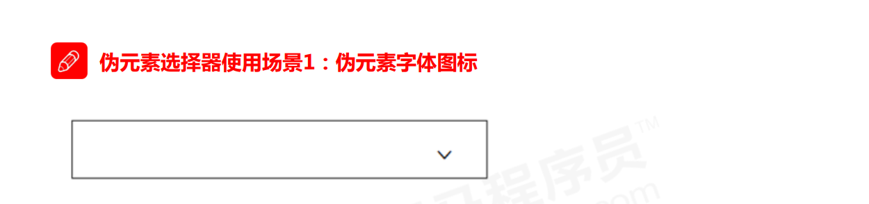
1.3.1 伪元素字体图标
<!DOCTYPE html>
<html lang="en">
<head>
<meta charset="UTF-8">
<meta name="viewport" content="width=device-width, initial-scale=1.0">
<meta http-equiv="X-UA-Compatible" content="ie=edge">
<title>伪元素选择器使用场景-字体图标</title>
<style>
@font-face {
font-family: 'icomoon';
src: url('fonts/icomoon.eot?1lv3na');
src: url('fonts/icomoon.eot?1lv3na#iefix') format('embedded-opentype'),
url('fonts/icomoon.ttf?1lv3na') format('truetype'),
url('fonts/icomoon.woff?1lv3na') format('woff'),
url('fonts/icomoon.svg?1lv3na#icomoon') format('svg');
font-weight: normal;
font-style: normal;
font-display: block;
}
div {
position: relative;
width: 200px;
height: 35px;
border: 1px solid red;
}
div::after {
position: absolute;
top: 10px;
right: 10px;
font-family: 'icomoon';
/* content: ''; */
content: '\e91e';
color: red;
font-size: 18px;
}
</style>
</head>
<body>
<div></div>
</body>
</html>
二. 其他特性
2.1 CSS3 盒子模型
CSS3 中可以通过 box-sizing 来指定盒模型,有2个值:即可指定为 content-box、border-box,这样我们计算盒子大小的方式就发生了改变。
可以分成两种情况:
- box-sizing: content-box 盒子大小为 width + padding + border (以前默认的)
- box-sizing: border-box 盒子大小为 width
如果盒子模型我们改为了box-sizing: border-box , 那padding和border就不会撑大盒子了(前提padding和border不会超过width宽度)
2.2 图片变模糊
ilter CSS属性将模糊或颜色偏移等图形效果应用于元素。
filter: 函数(); 例如: filter: blur(5px); blur模糊处理 数值越大越模糊

2.3 CSS3 calc 函数
calc() 此CSS函数让你在声明CSS属性值时执行一些计算。
width: calc(100% - 80px);
括号里面可以使用 + - * / 来进行计算。
2.3 CSS3 过渡(重点)
**过渡(transition)**是CSS3中具有颠覆性的特征之一,我们可以在不使用 Flash 动画或
JavaScript 的情况下,当元素从一种样式变换为另一种样式时为元素添加效果。
过渡动画: 是从一个状态 渐渐的过渡到另外一个状态
可以让我们页面更好看,更动感十足,虽然 低版本浏览器不支持(ie9以下版本) 但是不会影响页面布局。
现在经常和 :hover 一起 搭配使用。
transition: 花费时间 运动曲线 何时开始;
-
属性 : 想要变化的 css 属性, 宽度高度 背景颜色 内外边距都可以 。如果想要所有的属性都变化过渡, 写一个all 就可以。
-
花费时间: 单位是 秒(必须写单位) 比如 0.5s
-
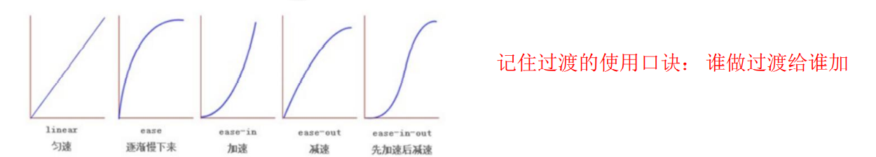
运动曲线: 默认是 ease (可以省略)
-
何时开始 :单位是 秒(必须写单位)可以设置延迟触发时间 默认是 0s (可以省略)
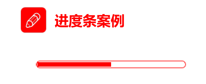
案例:
<!DOCTYPE html>
<html lang="en">
<head>
    <meta charset="UTF-8">
    <meta name="viewport" content="width=device-width, initial-scale=1.0">
    <meta http-equiv="X-UA-Compatible" content="ie=edge">
    <title>CSS3过渡练习-进度条</title>
    <style>
        .bar {
            width: 150px;
            height: 15px;
            border: 1px solid red;
            border-radius: 7px;
            padding: 1px;
        }
        .bar_in {
            width: 50%;
            height: 100%;
            background-color: red;
            /* 谁做过渡给谁加 */
            transition: all .7s;
        }
        .bar:hover .bar_in {
            width: 100%;
        }
    </style>
</head>
<body>
    <div class="bar">
        <div class="bar_in"></div>
    </div>
</body>
</html>
三. 2D转换
转换(transform)是CSS3中具有颠覆性的特征之一,可以实现元素的位移、旋转、缩放等效果
- 移动:translate
- 旋转:rotate
- 缩放:scale
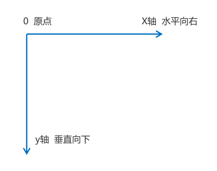
2D转换是改变标签在二维平面上的位置和形状的一种技术,在html页面中,二维坐标系是下图这个样子
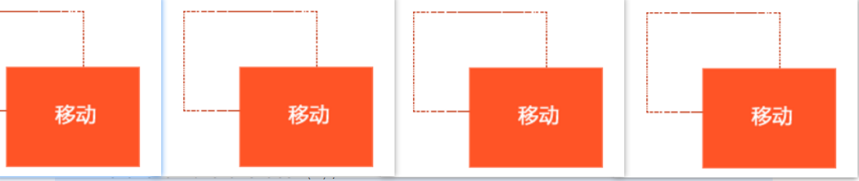
3.1 移动tanslate
2D移动是2D转换里面的一种功能,可以改变元素在页面中的位置,类似定位。
语法:
transform: translate(x,y); 或者分开写
transform: translateX(n);
transform: translateY(n);
重点:
- 定义 2D 转换中的移动,沿着 X 和 Y 轴移动元素
- translate最大的优点:不会影响到其他元素的位置
- translate中的百分比单位是相对于自身元素的 translate:(50%,50%);
- 对行内标签没有效果
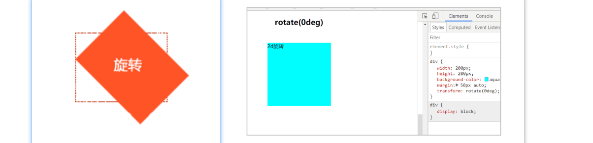
3.1 旋转 rotate
2D旋转指的是让元素在2维平面内顺时针旋转或者逆时针旋转。
语法:
transform:rotate(度数)
重点:
- rotate里面跟度数, 单位是 deg 比如 rotate(45deg)
- 角度为正时,顺时针,负时,为逆时针
- 默认旋转的中心点是元素的中心点
<!DOCTYPE html>
<html lang="en">

<head>
    <meta charset="UTF-8">
    <meta name="viewport" content="width=device-width, initial-scale=1.0">
    <meta http-equiv="X-UA-Compatible" content="ie=edge">
    <title>Document</title>
    <style>
        div {
            position: relative;
            width: 249px;
            height: 35px;
            border: 1px solid #000;
        }

        div::after {
            content: "";
            position: absolute;
            top: 8px;
            right: 15px;
            width: 10px;
            height: 10px;
            border-right: 1px solid #000;
            border-bottom: 1px solid #000;
            transform: rotate(45deg);
            transition: all 0.2s;
        }
        /* 鼠标经过div  里面的三角旋转 */

        div:hover::after {
            transform: rotate(225deg);
        }
    </style>
</head>

<body>
    <div></div>
</body>

</html>
3.3 中心点 transform-origin
语法:
transform-origin: x y;
重点:
- 注意后面的参数 x 和 y 用空格隔开
- x y 默认转换的中心点是元素的中心点 (50% 50%)
- 还可以给x y 设置 像素 或者 方位名词 (top bottom left right center)
案例:鼠标经过,浅红色方块旋转上来。
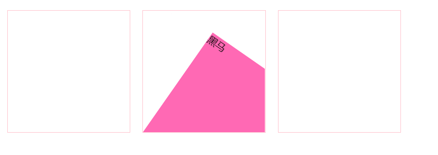
<style>
        div {
            overflow: hidden;
            width: 200px;
            height: 200px;
            border: 1px solid pink;
            margin: 10px;
            float: left;
        }

        div::before {
            content: "黑马";
            display: block;
            width: 100%;
            height: 100%;
            background-color: hotpink;
            transform: rotate(180deg);
            transform-origin: left bottom;
            transition: all 0.4s;
        }
        /* 鼠标经过div 里面的before 复原 */

        div:hover::before {
            transform: rotate(0deg);
        }
</style>

<body>
    <div></div>
    <div></div>
    <div></div>
</body>
3.4 缩放scale
缩放,顾名思义,可以放大和缩小。 只要给元素添加上了这个属性就能控制它放大还是缩小。
语法:
transform:scale(x,y);
重点:
- 注意其中的x和y用逗号分隔
- transform:scale(1,1) :宽和高都放大一倍,相当于没有放大
- transform:scale(2,2) :宽和高都放大了2倍
- transform:scale(2) :只写一个参数,第二个参数则和第一个参数一样,相当于 scale(2,2)
- transform:scale(0.5,0.5):缩小
- sacle缩放最大的优势:可以设置转换中心点缩放,默认以中心点缩放的,而且不影响其他盒子
案例:
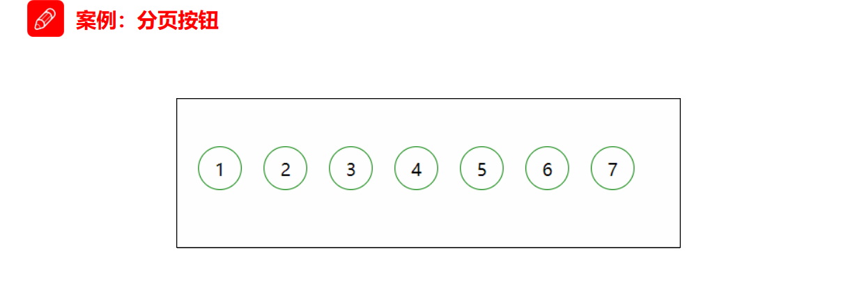
<style>
        li {
            float: left;
            width: 30px;
            height: 30px;
            border: 1px solid pink;
            margin: 10px;
            text-align: center;
            line-height: 30px;
            list-style: none;
            border-radius: 50%;
            cursor: pointer;
            transition: all .4s;
        }

        li:hover {
            transform: scale(1.2);
        }
</style>
<body>
    <ul>
        <li>1</li>
        <li>2</li>
        <li>3</li>
        <li>4</li>
        <li>5</li>
        <li>6</li>
        <li>7</li>
    </ul>
</body>
3.5 2D 转换综合写法
- 同时使用多个转换,其格式为:transform: translate() rotate() scale() …等,
- 其顺序会影转换的效果。(先旋转会改变坐标轴方向)
- 当我们同时有位移和其他属性的时候,记得要将位移放到最前
<style>
        div {
            width: 200px;
            height: 200px;
            background-color: pink;
            transition: all .5s;
        }

        div:hover {
            /* transform: rotate(180deg) translate(150px, 50px); */
            /* 我们同时有位移和其他属性,我们需要把位移放到最前面 */
            transform: translate(150px, 50px) rotate(180deg) scale(1.2);
        }
</style>

<body>
    <div></div>
</body>
四. 动画
动画(animation)是CSS3中具有颠覆性的特征之一,可通过设置多个节点来精确控制一个或一组动画,常用来实现复杂的动画效果。
相比较过渡,动画可以实现更多变化,更多控制,连续自动播放等效果。
4.1 动画的基本使用
制作动画分为两步:
- 先定义动画
- 再使用(调用)动画
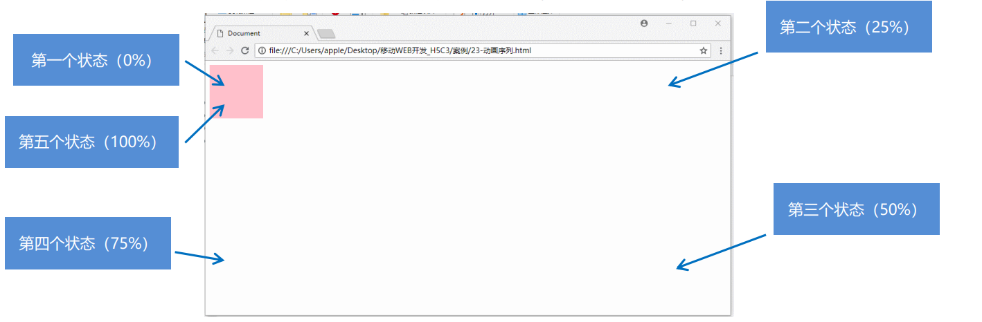
4.1.1 用keyframes定义动画
@keyframes 动画名称 {
0%{
	width:100px;
}
100%{
	width:200px;
}
动画序列:
- 0% 是动画的开始,100% 是动画的完成。这样的规则就是动画序列。
- 在 @keyframes 中规定某项 CSS 样式,就能创建由当前样式逐渐改为新样式的动画效果。
- 动画是使元素从一种样式逐渐变化为另一种样式的效果。您可以改变任意多的样式任意多的次数。
- 请用百分比来规定变化发生的时间,或用关键词 “from” 和 “to”,等同于 0% 和 100%。
4.1.2 元素使用动画
div {
    width: 200px;
    height: 200px;
    background-color: aqua;
    margin: 100px auto;
    /* 调用动画 */
    animation-name: 动画名称;
    /* 持续时间 */
    animation-duration: 持续时间;
}
4.2 动画常用属性
| 属性 | 描述 |
|---|---|
| @keyframes | 规定动画。 |
| animation | 所有动画属性的简写属性,除了animation-play-state/属性。 |
| animation-name | 规定@keyframesz动画的名称。(必须的) |
| animation-duration | 规定动画完成一个周期所花费的秒或毫秒,默认是0。(必须的) |
| animation-timing-function | 规定动画的速度曲线,默认是“ease”。 |
| animation-delay | 规定动画何时开始,默认是0。 |
| animation-iteration-count | 规定动画被播放的次数,默认是1,还有infinit |
| animation-direction | 规定动画是否在下一周期逆向播放,默认是"normal",alternate是逆播放 |
| animation-play-state | 规定动画是否正在运行或暂停。默认是"running",有"paused"。 |
| animation-fill-mode | 规定动画结束后状态,保持forwards回到起始backwards |
 <style>
        @keyframes move {
            0% {
                transform: translate(0, 0);
            }
            100% {
                transform: translate(1000px, 0);
            }
        }

        div {
            width: 100px;
            height: 100px;
            background-color: pink;
            /* 动画名称 */
            animation-name: move;
            /* 持续时间 */
            animation-duration: 2s;
            /* 运动曲线 */
             animation-timing-function: ease;
            /* 何时开始 */
            animation-delay: 1s;
            /* 重复次数  iteration 重复的 conut 次数  infinite  无限 */
             animation-iteration-count: infinite;
            /* 是否反方向播放 默认的是 normal  如果想要反方向 就写 alternate */
             animation-direction: alternate;
            /* 动画结束后的状态 默认的是 backwards  回到起始状态 我们可以让他停留在结束状态 forwards */
            /animation-fill-mode: forwards;
            /* animation: name duration timing-function delay iteration-count direction fill-mode; */
             animation: move 2s linear 0s 1 alternate forwards;
            /* 前面2个属性 name  duration 一定要写 */
            /* animation: move 2s linear  alternate forwards; */
        }

        div:hover {
            /* 鼠标经过div 让这个div 停止动画,鼠标离开就继续动画 */
            animation-play-state: paused;
        }
</style>

<body>
    <div>
    </div>
</body>
4.3 动画简写属性
animation:动画名称 持续时间 运动曲线 何时开始 播放次数 是否反方向 动画起始或者结束的状态;
animation: myfirst 5s linear 2s infinite alternate;
- 简写属性里面不包含 animation-play-state
- 暂停动画:animation-play-state: puased; 经常和鼠标经过等其他配合使用
- 想要动画走回来 ,而不是直接跳回来:animation-direction : alternate
- 盒子动画结束后,停在结束位置: animation-fill-mode : forwards
案例:
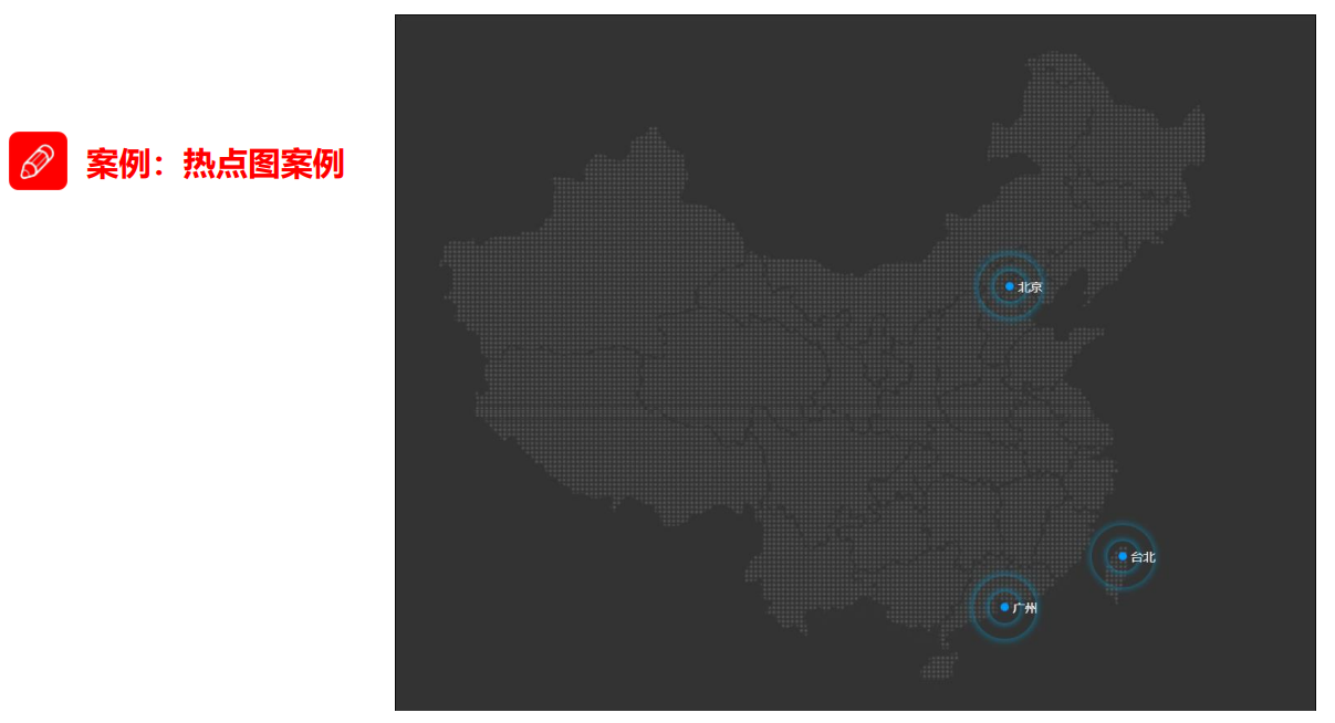
<style>
        body {
            background-color: #333;
        }

        .map {
            position: relative;
            width: 747px;
            height: 616px;
            background: url(media/map.png) no-repeat;
            margin: 0 auto;
        }

        .city {
            position: absolute;
            top: 227px;
            right: 193px;
            color: #fff;
        }

        .tb {
            top: 500px;
            right: 80px;
        }

        .dotted {
            width: 8px;
            height: 8px;
            background-color: #09f;
            border-radius: 50%;
        }

        .city div[class^="pulse"] {
            /* 保证我们小波纹在父盒子里面水平垂直居中 放大之后就会中心向四周发散 */
            position: absolute;
            top: 50%;
            left: 50%;
            transform: translate(-50%, -50%);
            width: 8px;
            height: 8px;
            box-shadow: 0 0 12px #009dfd;
            border-radius: 50%;
            animation: pulse 1.2s linear infinite;
        }

        .city div.pulse2 {
            animation-delay: 0.4s;
        }

        .city div.pulse3 {
            animation-delay: 0.8s;
        }

        @keyframes pulse {
            0% {}
            70% {
                /* transform: scale(5);  我们不要用scale 因为他会让 阴影变大*/
                width: 40px;
                height: 40px;
                opacity: 1;
            }
            100% {
                width: 70px;
                height: 70px;
                opacity: 0;
            }
        }
</style>

<body>
    <div class="map">
        <div class="city">
            <div class="dotted"></div>
            <div class="pulse1"></div>
            <div class="pulse2"></div>
            <div class="pulse3"></div>
        </div>
        <div class="city tb">
            <div class="dotted"></div>
            <div class="pulse1"></div>
            <div class="pulse2"></div>
            <div class="pulse3"></div>
        </div>
    </div>
</body>
4.4 速度曲线调节
animation-timing-function:规定动画的速度曲线,默认是“ease”
| 值 | 描述 |
|---|---|
| linear | 动画从头到尾的速度是相同的。匀速 |
| ease | 默认。动画以低速开始,然后加快,在结束前变慢 |
| ease-in | 动画以低速开始。 |
| ease-out | 动画以低速结束。 |
| ease-in-out | 动画以低速开始和结束。 |
| steps() | 指定了时间函数中的间隔数量(步长) |
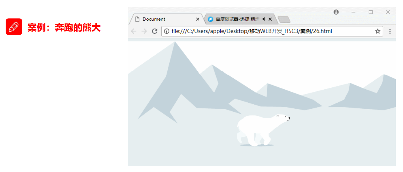
<style>
        body {
            background-color: #ccc;
        }

        div {
            position: absolute;
            width: 200px;
            height: 100px;
            background: url(media/bear.png) no-repeat;
            /* 元素可以添加多个动画, 用逗号分隔 */
            animation: bear .4s steps(8) infinite, move 3s forwards;
        }

        @keyframes bear {
            0% {
                background-position: 0 0;
            }
            100% {
                background-position: -1600px 0;
            }
        }

        @keyframes move {
            0% {
                left: 0;
            }
            100% {
                left: 50%;
                /* margin-left: -100px; */
                transform: translateX(-50%);
            }
        }
</style>

<body>
    <div></div>
</body>
五. 3D转换
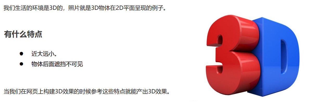
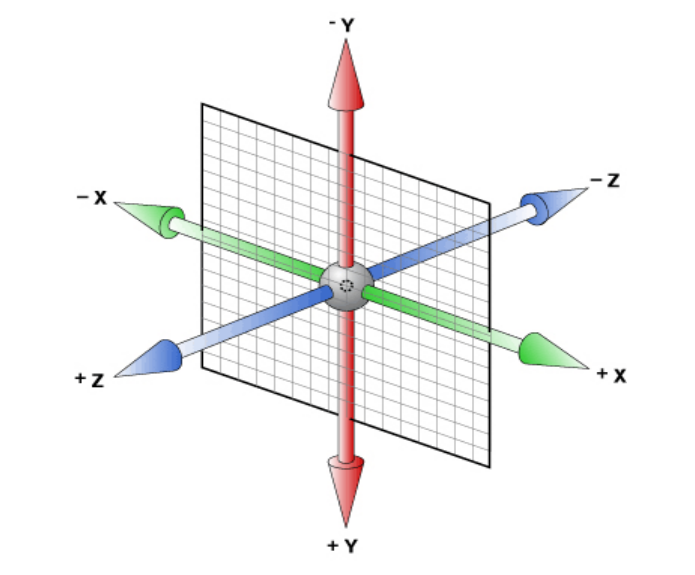
5.1 三维坐标系
三维坐标系其实就是指立体空间,立体空间是由3个轴共同组成的。
- x轴:水平向右 注意: x 右边是正值,左边是负值
- y轴:垂直向下 注意: y 下面是正值,上面是负值
- z轴:垂直屏幕 注意: 往外面是正值,往里面是负值
5.2 透视 perspective
- 在2D平面产生近大远小视觉立体,但是只是效果二维的
- 如果想要在网页产生3D效果需要透视(理解成3D物体投影在2D平面内)。
- 模拟人类的视觉位置,可认为安排一只眼睛去看
- 透视我们也称为视距:视距就是人的眼睛到屏幕的距离
- 距离视觉点越近的在电脑平面成像越大,越远成像越小
- 透视的单位是像素
透视写在被观察元素的父盒子上面的
d:就是视距,视距就是一个距离人的眼睛到屏幕的距离。
z:就是 z轴,物体距离屏幕的距离,z轴越大(正值) 我们看到的物体就越大。
body {
    /* 透视写到被观察元素的父盒子上面 */
    perspective: 200px;
}
5.3 3D移动translate
3D移动在2D移动的基础上多加了一个可以移动的方向,就是z轴方向。
- translform:translateX(100px):仅仅是在x轴上移动
- translform:translateY(100px):仅仅是在Y轴上移动
- translform:translateZ(100px):仅仅是在Z轴上移动(注意:translateZ一般用px单位)
- transform:translate3d(x,y,z):其中 x、y、z 分别指要移动的轴的方向的距离
因为z轴是垂直屏幕,由里指向外面,所以默认是看不到元素在z轴的方向上移动
<style>
    body {
    /* 透视 */
    perspective: 200px;
    }

    div {
        width: 200px;
        height: 200px;
        background-color: pink;
        /* transform: translateX(100px);
        transform: translateY(100px); */
        /* transform: translateX(100px) translateY(100px) translateZ(100px); */
        /* 1. translateZ 沿着Z轴移动 */
        /* 2. translateZ 后面的单位我们一般跟px */
        /* 3. translateZ(100px) 向外移动100px (向我们的眼睛来移动的) */
        /* 4. 3D移动有简写的方法 */
        /* transform: translate3d(x,y,z); */
        /* transform: translate3d(100px, 100px, 100px); */
        /* 5. xyz是不能省略的,如果没有就写0 */
        transform: translate3d(400px, 100px, 100px);
    }
</style>

<body>
    <div></div>
</body>
5.4 3D旋转rotate3d
3D旋转指可以让元素在三维平面内沿着 x轴,y轴,z轴或者自定义轴进行旋转。
语法:
transform:rotateX(45deg):沿着x轴正方向旋转 45度

transform:rotateY(45deg) :沿着y轴正方向旋转 45deg

transform:rotateZ(45deg) :沿着Z轴正方向旋转 45deg

transform:rotate3d(x,y,z,deg): 沿着自定义轴旋转 deg为角度(了解即可)
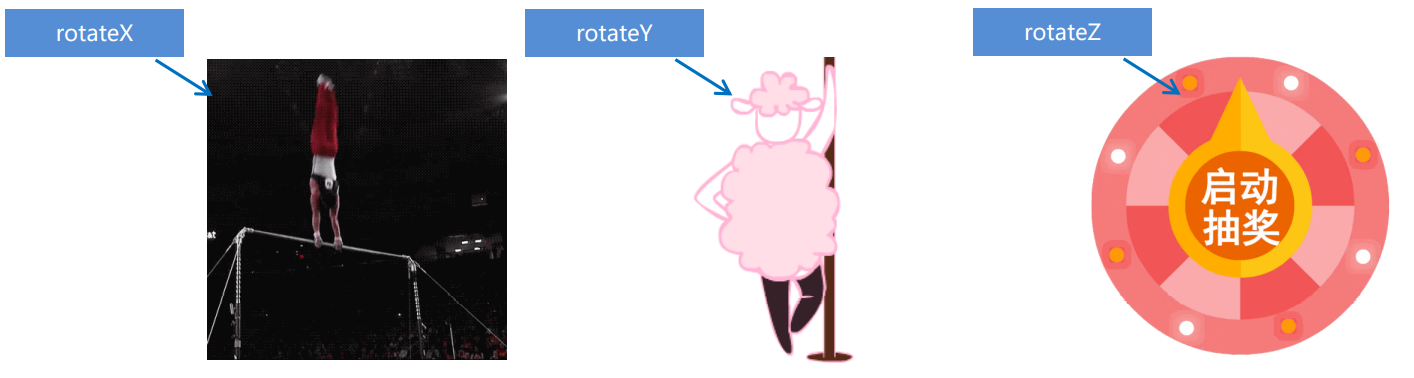
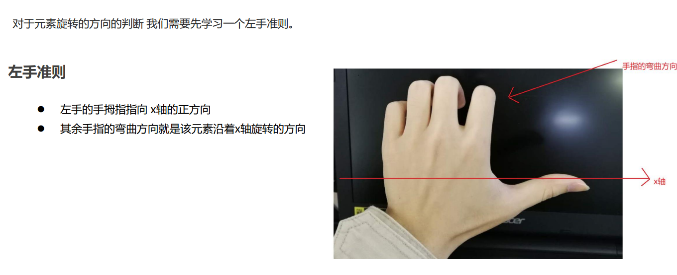
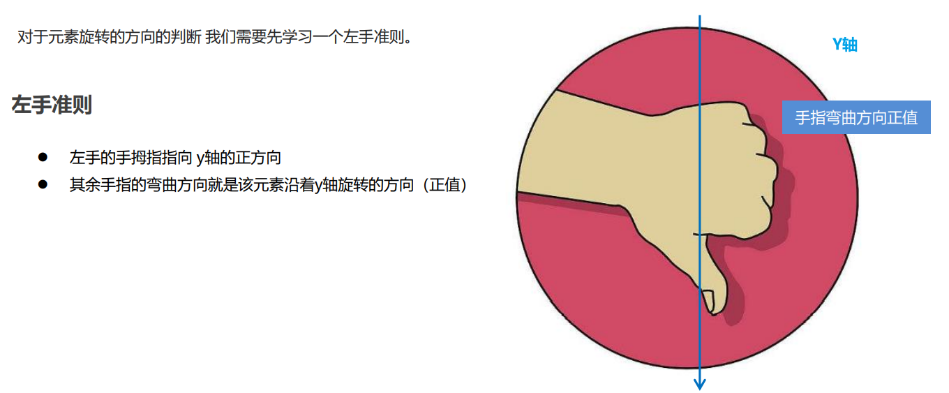
5.4.1 正方向判断
- X轴
- Y轴
5.4.2 自定义轴旋转
transform:rotate3d(x,y,z,deg): 沿着自定义轴旋转 deg为角度(了解即可)
xyz是表示旋转轴的矢量,是标示你是否希望沿着该轴旋转,最后一个标示旋转的角度。
- transform:rotate3d(1,0,0,45deg) 就是沿着x轴旋转 45deg
- transform:rotate3d(1,1,0,45deg) 就是沿着对角线旋转 45deg
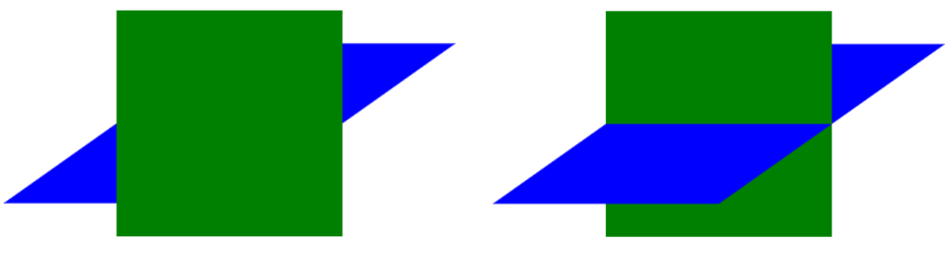
5.5 3D呈现 transfrom-style
- 控制子元素是否开启三维立体环境。
- transform-style: flat 子元素不开启3d立体空间 默认的。
- transform-style: preserve-3d; 子元素开启立体空间。
- 代码写给父级,但是影响的是子盒子。
- 这个属性很重要,后面必用。
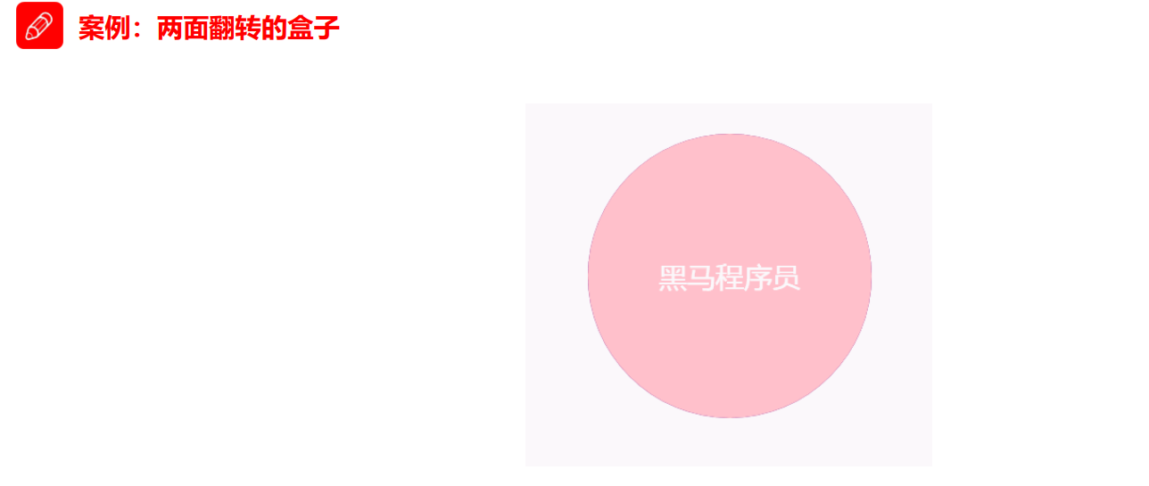
 <style>
     body {
     perspective: 400px;
     }

    .box {
    position: relative;
    width: 300px;
    height: 300px;
    margin: 100px auto;
    transition: all .4s;
    /* 让背面的紫色盒子保留立体空间 给父级添加的 */
    transform-style: preserve-3d;
    }

    .box:hover {
    transform: rotateY(180deg);
    }

    .front,
    .back {
    position: absolute;
    top: 0;
    left: 0;
    width: 100%;
    height: 100%;
    border-radius: 50%;
    font-size: 30px;
    color: #fff;
    text-align: center;
    line-height: 300px;
    }

    .front {
    background-color: pink;
    z-index: 1;
    }

    .back {
    background-color: purple;
    /* 像手机一样 背靠背 旋转 */
    transform: rotateY(180deg);
    }
/style>


<body>
    <div class="box">
        <div class="front">黑马程序员</div>
        <div class="back">pink老师这里等你</div>
    </div>
</body>
5.6 综合案例
5.6.1 3D导航栏
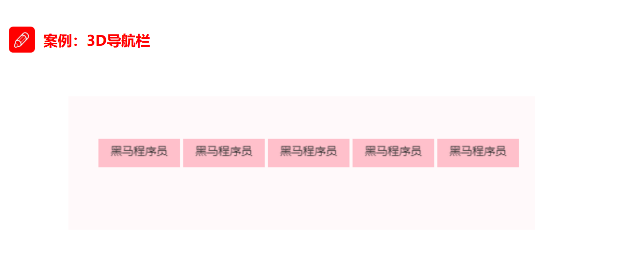
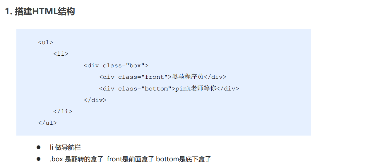
<style>
    * {
    margin: 0;
    padding: 0;
    }

    ul {
    margin: 100px;
    }
    ul li {
    width: 120px;
    height: 35px;
    list-style: none;
    perspective: 400px;
    }
    .box {
    position: relative;
    width: 100%;
    height: 100%;
    transform-style: preserve-3d;
    transition: all 0.5s;
    }
    .box:hover {
    transform: rotateX(90deg);
    }
    .front,
    .back {
    position: absolute;
    left: 0;
    top: 0;
    width: 100%;
    height: 100%;
    line-height: 35px;
    text-align: center;
    }
    .front {
    background-color: skyblue;
    z-index: 1;
    transform: translateZ(50%);
    }
    .back {
    background-color: yellow;
    /* transform: translateY(50%) rotateX(-90deg); */
    transform: rotateX(-90deg) translateZ(17.5px);
    }

</style>

<body>
    <ul>
        <li>
            <div class="box">
                <div class="front">你好</div>
                <div class="back">明天</div>
            </div>
        </li>
    </ul>
</body>
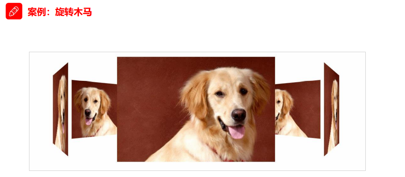
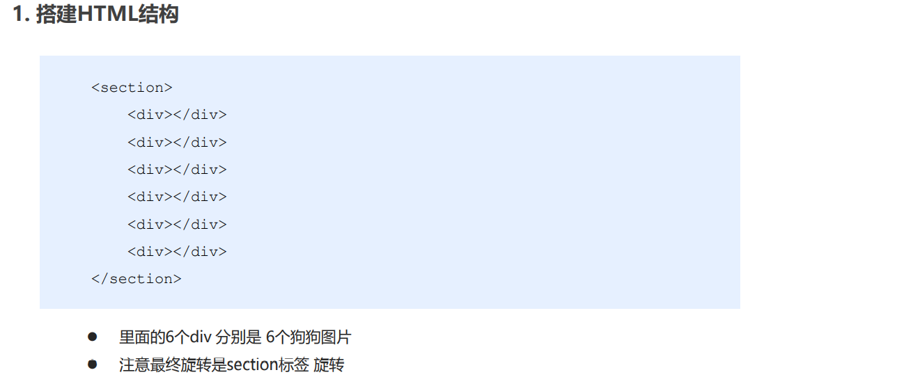
5.6.2 旋转木马
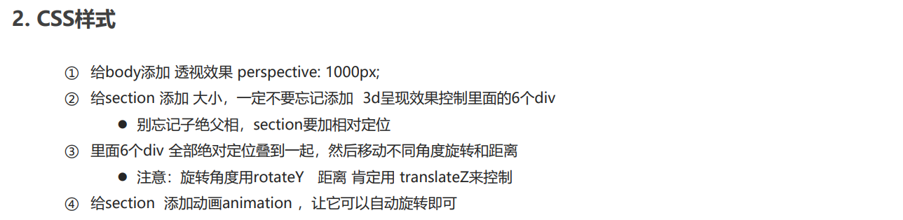
<style>
    body {
    perspective: 1000px;
    }

    section {
    position: relative;
    width: 300px;
    height: 200px;
    margin: 150px auto;
    transform-style: preserve-3d;
    /* 添加动画效果 */
    animation: rotate 10s linear infinite;
    background: url(media/pig.jpg) no-repeat;
    }

    section:hover {
    /* 鼠标放入section 停止动画 */
    animation-play-state: paused;
    }

    @keyframes rotate {
    0% {
    transform: rotateY(0);
    }
    100% {
    transform: rotateY(360deg);
    }
    }

    section div {
    position: absolute;
    top: 0;
    left: 0;
    width: 100%;
    height: 100%;
    background: url(media/dog.jpg) no-repeat;
    }

    section div:nth-child(1) {
    transform: rotateY(0) translateZ(300px);
    }

    section div:nth-child(2) {
    /* 先旋转好了再 移动距离 */
    transform:rotateY(60deg) translateZ(300px);
    }

    section div:nth-child(3) {
    /* 先旋转好了再 移动距离 */
    transform: rotateY(120deg) translateZ(300px);
    }

    section div:nth-child(4) {
    /* 先旋转好了再 移动距离 */
    transform: rotateY(180deg) translateZ(300px);
    }

    section div:nth-child(5) {
    /* 先旋转好了再 移动距离 */
    transform: rotateY(240deg) translateZ(300px);
    }

    section div:nth-child(6) {
    /* 先旋转好了再 移动距离 */
    transform: rotateY(300deg) translateZ(300px);
    }
</style>

<body>
    <section>
        <div></div>
        <div></div>
        <div></div>
        <div></div>
        <div></div>
        <div></div>
    </section>
</body>

 浙公网安备 33010602011771号