前端布局学习
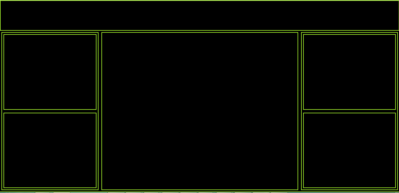
- 杭州出差中,项目要做大屏展示,据说到时候是4块1920*1080的显示屏进行展示,这几天一直苦想到底如何进行屏幕适配呢,探索了一两天,决定用媒体查询结合比例计算来进行页面设计,以便于全屏、屏幕放大缩小的正常展示,学着写了个demo:
<!DOCTYPE html>
<html>

	<head>
		<meta charset="UTF-8">
		<title>全屏测试</title>
		<style type="text/css">
			* {
				margin: 0;
				padding: 0;
				overflow-x: hidden;
			}

			html {
				height: 100%;
				width: 100%;
			}

			body {
				width: 100%;
				max-width: 100%;
				height: 100%;
				max-height: 100%;
				background-color: greenyellow;
			}

			.header {
				width: calc(100% - 4px);
				height: 100px;
				background-color: black;
				border: 2px solid greenyellow;
			}
			/*媒体查询操作*/

			@media screen and (min-width: 640px) and (max-width: 1920px) {
				.left {
					width: calc(25% - 14px);
					height: calc(100% - 14px);
					border: 2px solid greenyellow;
					margin: 5px;
					float: left;
				}
				.center {
					width: calc(50% - 14px);
					height: calc(100% - 14px);
					border: 2px solid greenyellow;
					margin: 5px;
					float: left;
				}
				.right {
					width: calc(25% - 14px);
					height: calc(100% - 14px);
					border: 2px solid greenyellow;
					margin: 5px;
					float: left;
				}
			}

			@media screen and (min-width: 200px) and (max-width: 640px) {
				.left {
					width: calc(100% - 14px);
					height: calc(100% - 14px);
					border: 2px solid greenyellow;
					margin: 5px;
				}
				.center {
					width: calc(100% - 14px);
					height: calc(100% - 14px);
					border: 2px solid greenyellow;
					margin: 5px;
				}
				.right {
					width: calc(100% - 14px);
					height: calc(100% - 14px);
					border: 2px solid greenyellow;
					margin: 5px;
				}
			}

			.main {
				width: 100%;
				height: calc(100% - 106px);
				background-color: #000000;
			}

			.sub-left {
				width: calc(100% - 14px);
				height: calc(50% - 14px);
				border: 2px solid greenyellow;
				margin: 5px;
				float: left;
			}

			.sub-right {
				width: calc(100% - 14px);
				height: calc(50% - 14px);
				border: 2px solid greenyellow;
				margin: 5px;
				float: left;
			}
		</style>
	</head>

	<body>
		<div class="header">

		</div>
		<div class="main">
			<div class="left">
				<div class="sub-left">

				</div>
				<div class="sub-left">

				</div>
			</div>
			<div class="center">

			</div>
			<div class="right">
				<div class="sub-right">

				</div>
				<div class="sub-right">

				</div>
			</div>
		</div>
	</body>

</html>
展示效果

 浙公网安备 33010602011771号