

用css实现圆形波浪效果图
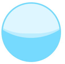
在移动端经常看到一些圆形波浪图来显示金额,刚开始我认为这种效果只能用canvas写的,后来发现用css也可以。
原理:我们都知道让块元素的
border-radius:50%会变成圆形,如果少于50%呢,其实就变成不规则的圆形。我们可以利用这个特征,用伪类加上transform动画来实现波浪效果。
先看一下效果图:
//css代码

.wave {
        position: relative;
	width: 200px;
	height: 200px;
	background: @color;
	border: 5px solid #76daff;
	border-radius: 50%;
	overflow: hidden;
}

.wave-box::before,
.wave-box::after {
      content: '';
      position: absolute;
      top: 0;
      left: 50%;
      width: 400px;
      height: 400px;
      border-radius: 45%;
      -webkit-transform: translate(-50%, -70%);
      transform: translate(-50%, -70%);
      background: rgba(255, 255, 255, 0.5);
      -webkit-animation: rotate 10s linear infinite;
      animation: rotate 10s linear infinite;
      z-index: 10;
}

@keyframes rotate {
  50% {
            -webkit-transform: translate(-50%, -75%) rotate(180deg);
            transform: translate(-50%, -75%) rotate(180deg);
  }
  100% {
            -webkit-transform: translate(-50%, -70%) rotate(180deg);
            transform: translate(-50%, -70%) rotate(180deg);
  }
}


//或者使用预编译语言更方便,这里使用less
.wave(@width; @height; @color) {
	position: relative;
	width: @width;
	height: @height;
	background: @color;
	border: 5px solid @color;
	border-radius: 50%;
	overflow: hidden;

	&::before,
	&::after {
		content: '';
		position: absolute;
		top: 0;
		left: 50%;
		width: @width * 2;
		height: @height * 2;
		border-radius: 45%;
		transform: translate(-50%, -70%);
		background: rgba(255,255,255,0.5);
		animation: rotate 10s linear infinite;
		z-index: 10;

	}

	&::after {
		border-radius: 47%;
		background: rgba(255,255,255,0.5);
		animation: rotate 10s linear -5s infinite;
		z-index: 20;
	}
}

//调用
.wave-box {
	.wave(200px; 200px; #76daff);
}
<!-- 页面上调用 -->
<div class="wave-box"></div>
