CSS3 动画
1. 动画
动画(animation)是CSS3中具有颠覆性的特征之一,可通过设置多个节点来精确控制一个或一组动画,常用来实现复杂的动画效果。
相比较过渡,动画可以实现更多变化,更多控制,连续自动播放等效果。
1.1 动画的基本使用
制作动画分为两步:
1.先定义动画
2.再使用(调用)动画
1. 用keyframes 定义动画(类似定义类选择器)
@keyframes 动画名称 {
   0%{
        width:100px;
   }
   100%{
        width:200px;
   }
}
动画序列
1>0% 是动画的开始,100% 是动画的完成。这样的规则就是动画序列。
2>在 @keyframes 中规定某项 CSS 样式,就能创建由当前样式逐渐改为新样式的动画效果。
3>动画是使元素从一种样式逐渐变化为另一种样式的效果。您可以改变任意多的样式任意多的次数。
4>请用百分比来规定变化发生的时间,或用关键词 "from" 和 "to",等同于 0% 和 100%。
2. 元素使用动画
div {
       width: 200px;
       height: 200px;
       background-color: aqua;
       margin: 100px auto;
       /* 调用动画 */
       animation-name: 动画名称;
       /* 持续时间 */
       animation-duration: 持续时间;
    }
1.2动画常用属性
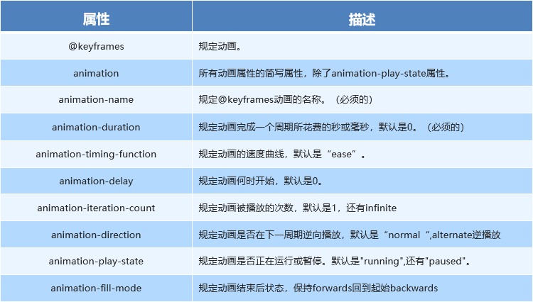
1.3 动画简写属性
animation:动画名称 持续时间 运动曲线 何时开始 播放次数 是否反方向 动画起始或者结束的状态;
animation: myfirst 5s linear 2s infinite alternate;
1>简写属性里面不包含 animation-play-state
2>暂停动画:animation-play-state: puased; 经常和鼠标经过等其他配合使用
3>想要动画走回来 ,而不是直接跳回来:animation-direction : alternate
4>盒子动画结束后,停在结束位置: animation-fill-mode : forwards
案例:热点图案例
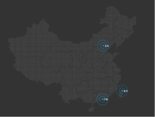
<!DOCTYPE html>
<html lang="en">

<head>
    <meta charset="UTF-8">
    <meta name="viewport" content="width=device-width, initial-scale=1.0">
    <meta http-equiv="X-UA-Compatible" content="ie=edge">
    <title>Document</title>
    <style>
        body {
            background-color: #333;
        }

        .map {
            position: relative;
            width: 747px;
            height: 616px;
            background: url(media/map.png) no-repeat;
            margin: 0 auto;
        }

        .city {
            position: absolute;
            top: 227px;
            right: 193px;
            color: #fff;
        }

        .tb {
            top: 500px;
            right: 80px;
        }

        .dotted {
            width: 8px;
            height: 8px;
            background-color: #09f;
            border-radius: 50%;
        }

        .city div[class^="pulse"] {
            /* 保证我们小波纹在父盒子里面水平垂直居中 放大之后就会中心向四周发散 */
            position: absolute;
            top: 50%;
            left: 50%;
            transform: translate(-50%, -50%);
            width: 8px;
            height: 8px;
            box-shadow: 0 0 12px #009dfd;
            border-radius: 50%;
            animation: pulse 1.2s linear infinite;
        }

        .city div.pulse2 {
            animation-delay: 0.4s;
        }

        .city div.pulse3 {
            animation-delay: 0.8s;
        }

        @keyframes pulse {
            0% {}
            70% {
                /* transform: scale(5);  我们不要用scale 因为他会让 阴影变大*/
                width: 40px;
                height: 40px;
                opacity: 1;
            }
            100% {
                width: 70px;
                height: 70px;
                opacity: 0;
            }
        }
    </style>
</head>

<body>
    <div class="map">
        <div class="city">
            <div class="dotted"></div>
            <div class="pulse1"></div>
            <div class="pulse2"></div>
            <div class="pulse3"></div>
        </div>
        <div class="city tb">
            <div class="dotted"></div>
            <div class="pulse1"></div>
            <div class="pulse2"></div>
            <div class="pulse3"></div>
        </div>
    </div>
</body>

</html>
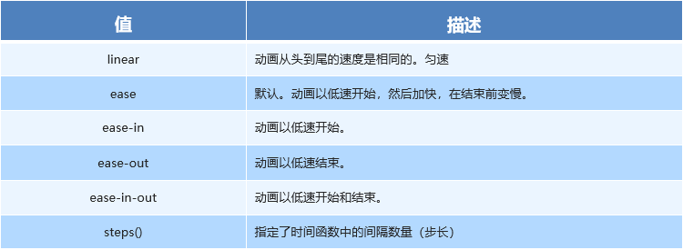
1.4 速度曲线细节
animation-timing-function:规定动画的速度曲线,默认是“ease”

 浙公网安备 33010602011771号