弹性盒子布局
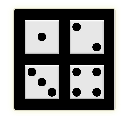
骰子布局
CSS样式
section {
            width: 350px;
            height: 350px;
            background-color: #000;
            border: 5px solid #e0dfcc;
            margin: 100px auto;
            display: flex;
            flex-wrap: wrap;
            justify-content: space-evenly;
            align-content: space-evenly;
            border-radius: 3%;
            /* box-shadow: 0 0 2px #f5f5d5; */
            box-shadow: 0 0 20px #f5f5d5;
        }

        div {
            width: 120px;
            height: 120px;
            background-color: #e7e7e7;
            display: flex;
            border-radius: 3%;
            padding: 10px;
            box-sizing: border-box;
            box-shadow: 0 5px 2px #fdfdfd inset, -5px 0 2px #d1d1d1 inset, 0px -5px 2px #bbb inset, 5px 0 2px #d1d1d1 inset;
        }

        /* 第一个骰子 */
        div:nth-child(1) span {
            width: 30px;
            height: 30px;
            background-color: #000;
            margin: auto;
            border-radius: 50%;
        }

        /* 第二个骰子 */
        div:nth-child(2) {
            display: flex;
            justify-content: space-between;
        }

        div:nth-child(2) span {
            width: 30px;
            height: 30px;
            background-color: #000;
            border-radius: 50%;
        }

        div:nth-child(2) span:nth-child(2) {
            align-self: flex-end;
        }

        /* 第三个骰子 */
        div:nth-child(3) {
            display: flex;
            justify-content: space-between;
        }

        div:nth-child(3) span {
            width: 30px;
            height: 30px;
            background-color: #000;
            border-radius: 50%;
        }

        div:nth-child(3) span:nth-child(2) {
            align-self: center;
        }

        div:nth-child(3) span:nth-child(3) {
            align-self: flex-end;
        }


        /* 第四个骰子 */
        div:nth-child(4) {
            display: flex;
            justify-content: space-between;
        }

        div:nth-child(4) p {
            display: flex;
            height: 100px;
            margin: 0; /* p标签有默认margin和padding 要手动清0*/
            /* flex-wrap: wrap; */
            flex-direction: column;
            justify-content: space-between;
        }

        div:nth-child(4) p span {
            width: 30px;
            height: 30px;
            background-color: #000;
            border-radius: 50%;
        }
HTML结构
<section>
        <div>
            <span></span>
        </div>
        <div>
            <span></span>
            <span></span>
        </div>
        <div>
            <span></span>
            <span></span>
            <span></span>
        </div>
        <div>
            <P>
                <span></span>
                <span></span>
            </P>
            <P>
                <span></span>
                <span></span>
            </P>
        </div>
    </section>
效果图
-圆的应用 border-radius:50%~100%;
-结构选择器的应用:nth-child();
-图片阴影的使用box-shadow;box-shadow: 水平方向偏移量 垂直方向偏移量 模糊程度(可选) 阴影的扩张程度(可选) 颜色 内外阴影(默认外阴影);
-其中水平方向:正数左阴影/负数右阴影 垂直方向: 正数下阴影/负数上阴影
-p标签的默认margin是16px,而padding则是1em;如果不希望有空隙 p{margin: 0;padding: 0;};
-margin的bug当两个同级元素设置了margin-botton、margin-top的时候会错误解析,取之间的最大值;那么如果使用了多个p标签时,也存在这个bug问题
-弹性盒的应用:换行flex-wrap:wrap;
-主轴/侧轴两端对齐 justify-content:space-between; align-items:space-between;
-换行后侧轴两端对齐 align-content:space-between;
-[难点]在弹性盒中不设置宽高的项目默认会拉伸 (拉伸就是往侧轴方向 主轴方向根据内容撑开)

 浙公网安备 33010602011771号