
用html标签+css写出旋转的正方体
有一段时间没写代码了,刚写有点手生,无从下手,为了能快速进入状态,就写了这一个小东西,纯用标签和样式表写。下面看一下我写的。
这一段是样式表:

  <style>
        *{
            margin: 0;
            padding: 0;
        }
        ul,li{
            list-style: none;
        }
        ul{
            position: relative;
            top: 200px;
            left: 200px;
            width: 200px;
            height: 200px;
            transform-style: preserve-3d;
            transition: all 5s;
       transform:rotateX(-45deg) rotateY(-45deg);

        }
        ul:hover{
            transform: rotateX(360deg) rotateY(360deg);
        }
        li{
            position: absolute;
            width: 200px;
            height: 200px;
            border-radius: 20px;
            background-color: #222;
        }
        li:nth-child(1){
            transform: translateZ(100px);
            background-color: red;
        }
        li:nth-child(2){
            background-color: green;
            transform: translateZ(-100px);
        }
        li:nth-child(3){
            background-color: silver;
            transform: rotateY(90deg) translateZ(-100px);
        }
        li:nth-child(4){
            background-color: pink;
            transform: rotateY(90deg) translateZ(100px);
        }
        li:nth-child(5){
            background-color: brown;
            transform: rotateX(90deg) translateZ(-100px);
        }
        li:nth-child(6){
            background-color: yellow;
            transform: rotateX(90deg)  translateZ(100px);
        }
    </style>
这一段是HTML:
  <ul>
        <li></li>
        <li></li>
        <li></li>
        <li></li>
        <li></li>
        <li></li>
    </ul>
对于这种毫无技术含量的,实在没脸。看一下效果: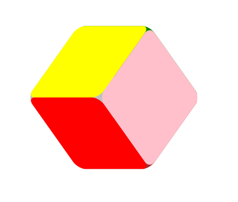
鼠标放在上面就会旋转,感兴趣的可以试一下,觉得low的多提意见,脸皮厚。


【推荐】编程新体验,更懂你的AI,立即体验豆包MarsCode编程助手
【推荐】凌霞软件回馈社区,博客园 & 1Panel & Halo 联合会员上线
【推荐】抖音旗下AI助手豆包,你的智能百科全书,全免费不限次数
【推荐】博客园社区专享云产品让利特惠,阿里云新客6.5折上折
【推荐】轻量又高性能的 SSH 工具 IShell:AI 加持,快人一步