

CSS:三栏布局,两边固定,中间自适应
之前去面试被问到一个布局的问题:
三栏布局,两边固定,中间自适应
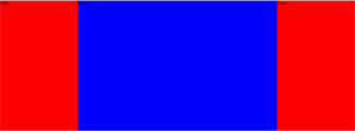
当时给出的答案是左右两边分别左浮动和右,中间自适应,然后设置一个margin。也算是实现了效果。
<style type="text/css">
	*{margin:0;padding:0;}
	.left{float:left;width:300px;background:red;height:500px;}
	.right{float:right;width:300px;background:red;height:500px;}
	.center{margin:0 230px;background:blue;}
</style>

<div class="left">left</div>
<div class="right">right</div>
<div class="center">center</div>
注意:中间一列一定要放到最下面
在网上发现了另一种用定位的方式实现的。左右设置为固定定位,中间自适应。
<style type="text/css">
	html,body{margin:0;padding:0;height:100%;}
	.left,.right{
		position:absolute;
		top:0;
		width:300px;
		height:100%;
		background-color:blue;
	}
	.left{
		left:0;
	}
	.right{
		right:0;
	}
	.center{
		margin:0 230px;
		height:100%;
		color:#f90;
		background:red;
	}
</style>
还有类似这样的面试题:比如,中间固定,两边自适应;左边固定,右边自适应等等。有时间再去研究。
