响应式页面
简述
用同一套代码上不同设备上显示不同适配的效果,且能自适应页面宽度。如https://v3.bootcss.com/
而baidu.com就不是响应式页面,首先它不能自适应页面宽度,然后它虽然在切换设备显示不同的效果
但原理是监听设备切换合适的代码,不是同一套代码
媒体查询
通过@media定义样式,浏览器窗口满足指定条件,才会应用此样式。通过媒体查询下实现响应式页面
<!DOCTYPE html>
<html lang="en">
<head>
<meta charset="UTF-8">
<meta http-equiv="X-UA-Compatible" content="IE=edge">
<meta name="viewport" content="width=device-width, initial-scale=1.0">
<title>Document</title>
<style>
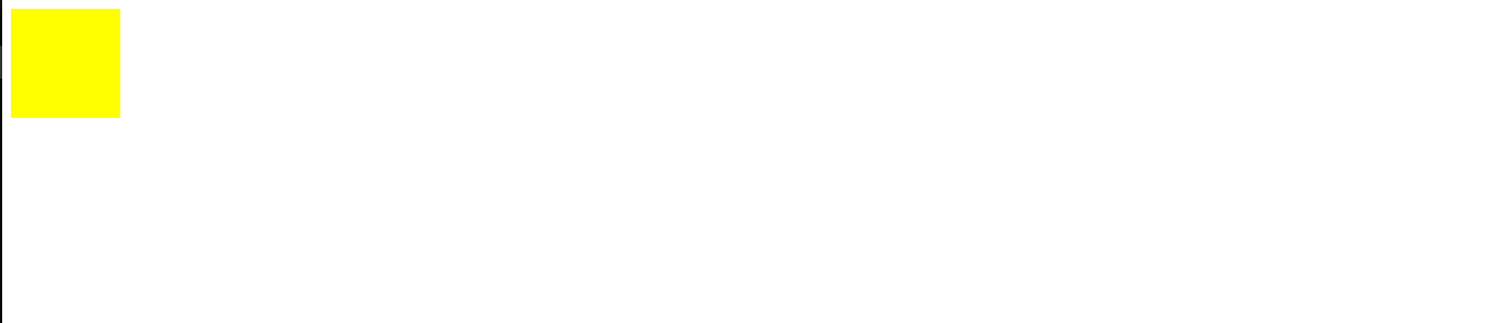
.box{
width: 100px;
height: 100px;
background-color: yellow;
}
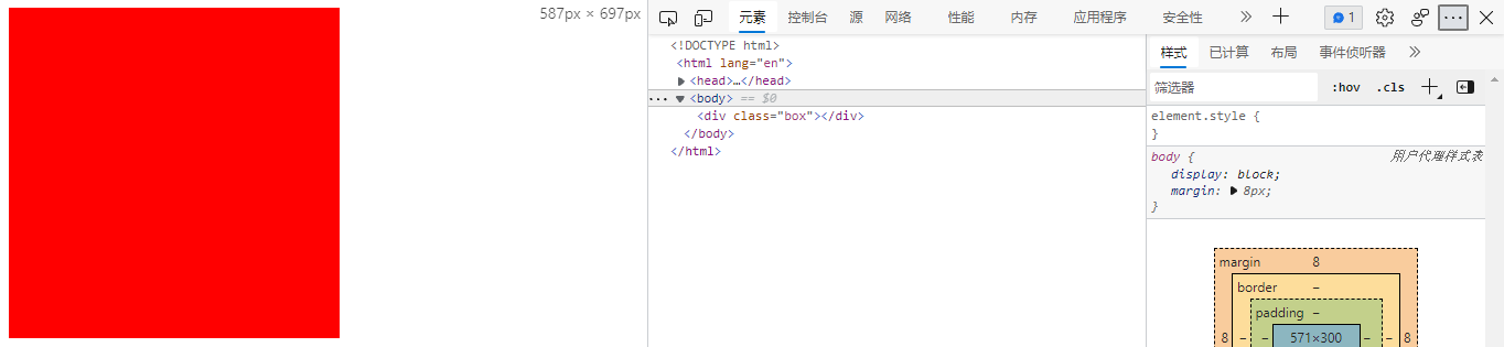
@media screen and (max-width:600px){/*页宽小于600px时*/
.box{
width: 300px;
height: 300px;
background-color: red;
}
}
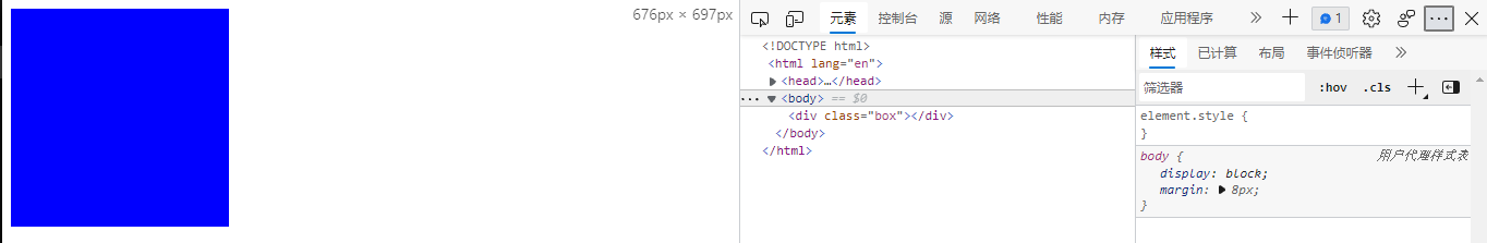
@media screen and (min-width:600px) and (max-width:900px){/*页宽在600-900px之间时*/
.box{
width: 200px;
height: 200px;
background-color: blue;
}
}
</style>
</head>
<body>
<div class="box"></div>
</body>
</html>
练习
<!DOCTYPE html>
<html lang="en">
<head>
<meta charset="UTF-8">
<meta http-equiv="X-UA-Compatible" content="IE=edge">
<meta name="viewport" content="width=device-width, initial-scale=1.0">
<title>Document</title>
<style>
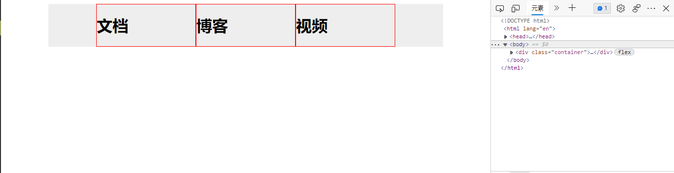
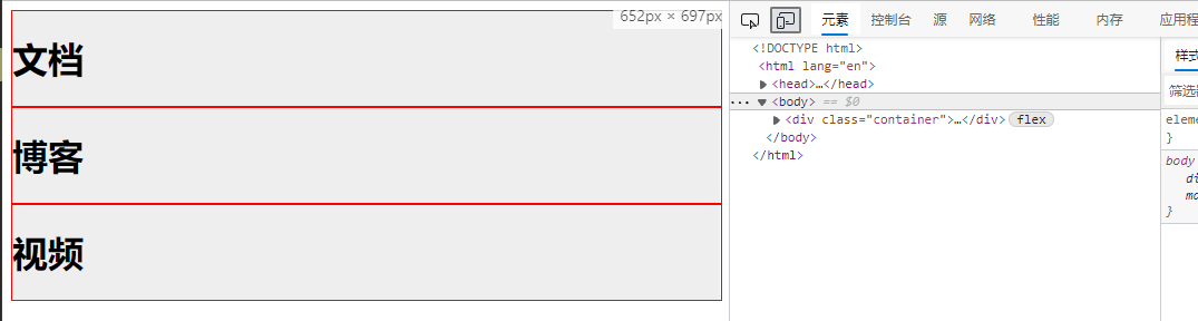
.container{
width: 800px;
display: flex;
background-color: #eee;
margin: 0 auto;
justify-content: center;
}
.item{
width: 200px;
border: 1px solid red;
}
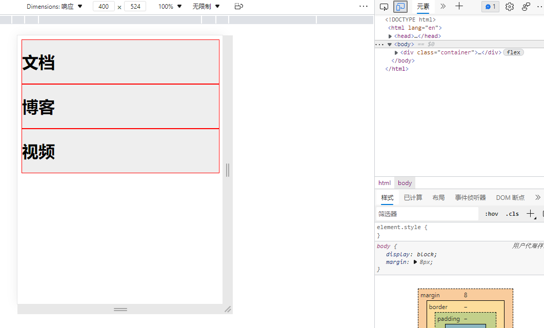
@media screen and (max-width:700px){/*小于700px时*/
.container{
width: 100%;
flex-direction: column;
}
.item{
width: 100%;
}
}
</style>
</head>
<body>
<div class="container">
<div class="item">
<h1>文档</h1>
</div>
<div class="item">
<h1>博客</h1>
</div>
<div class="item">
<h1>视频</h1>
</div>
</div>
</body>
</html>
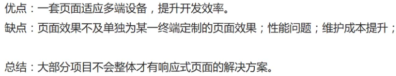
优缺点

 浙公网安备 33010602011771号