
CSS定位
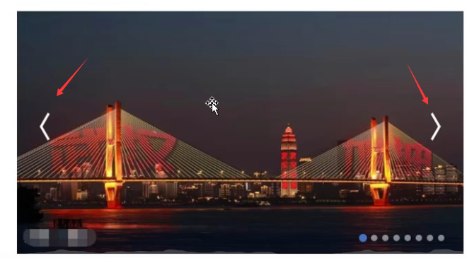
应用
图片上的俩箭头
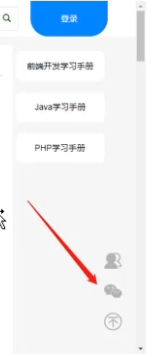
网页中回到顶部的按键,不管滚轮到哪,它都是一直在右下角
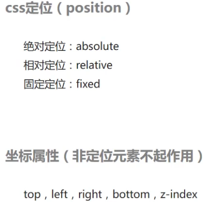
CSS定位(position)
建议电脑屏幕分辨率调100%,不然可能会显示额外的内外边距的情况
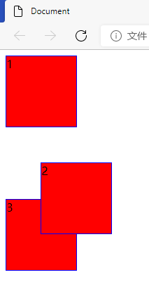
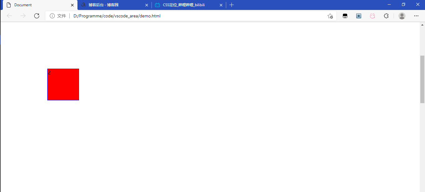
绝对定位(absolute)
- 脱离文档流:跟浮动类似,不占位
- 默认参照物为网页左上角,top、left等计算以左上角为起点
<!DOCTYPE html>
<html lang="en">
<head>
<meta charset="UTF-8">
<meta http-equiv="X-UA-Compatible" content="IE=edge">
<meta name="viewport" content="width=device-width, initial-scale=1.0">
<title>Document</title>
<style>
.box{
width: 100px;
height: 100px;
background-color: red;
border: 1px solid blue;
}
.pos{
position: absolute;
top: 150px;
left: 150px;
}
</style>
</head>
<body>
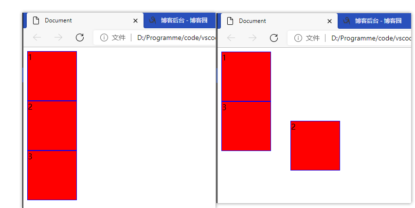
<div class="box">1</div>
<div class="box pos">2</div>
<div class="box">3</div>
</body>
</html>
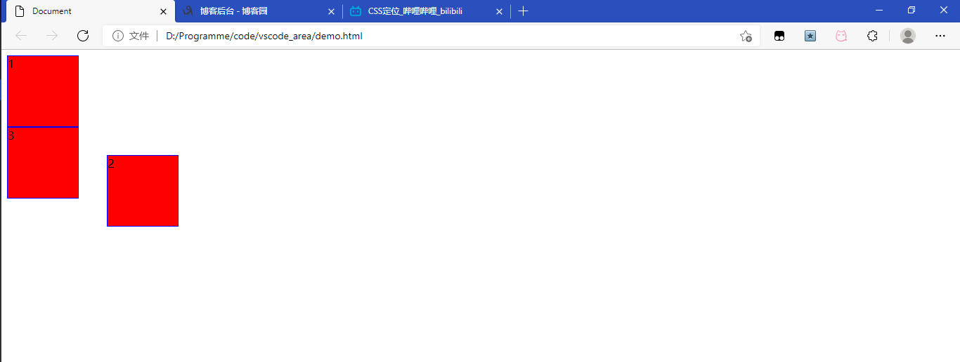
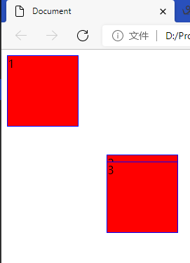
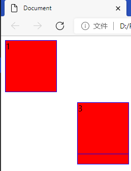
前后对比
相对定位(relative)
- 不脱离文档流
- 默认参照物为此元素的原来的位置
<style>
        .box{
            width: 100px;
            height: 100px;
            background-color: red;
            border: 1px solid blue;
        }
        .pos{
            position: relative;
            top: 50px;
            left: 50px;
        }
    </style>
</head>
<body>
    <div class="box">1</div>
    <div class="box pos">2</div>
    <div class="box">3</div>
</body>
与原来相比,跟上边和左边间隔50px
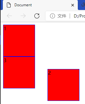
固定定位(fixed)
与绝对定位很像,但它可以随着滚轮条的移动而移动
- 脱离文档流
- 默认参照为网页左上角
![]()
看起来跟绝对定位没什么不同
![]()
如果把页面高度加长,再往下滚
<style>
        body{
            height: 3000px;
        }
        .box{
            width: 100px;
            height: 100px;
            background-color: red;
            border: 1px solid blue;
        }
        .pos{
            position: fixed;
            top: 150px;
            left: 150px;
        }
    </style>
</head>
<body>
    <div class="box">1</div>
    <div class="box pos">2</div>
    <div class="box">3</div>
</body>
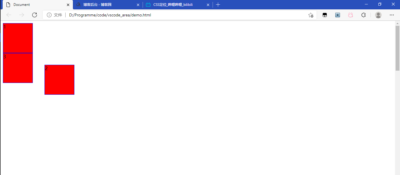
可以发现当往下滚时,2也跟着动,但还是跟左上角的上部和左边保持150px
设置z轴(z-index)
当元素重叠时根据这个来判断哪个在上面
- 值为整数,每个元素默认值为0
- 数值越大越靠上层
![]()
3上2上面
![]()
可以通过设置z轴使2在上面
<style>
        body{
            height: 3000px;
        }
        .box{
            width: 100px;
            height: 100px;
            background-color: red;
            border: 1px solid blue;
        }
        .pos{
            position: fixed;
            top: 150px;
            left: 150px;
            z-index: 1;
        }
        .pos1{
            position: absolute;
            top: 160px;
            left: 150px;
        }
    </style>
</head>
<body>
    <div class="box">1</div>
    <div class="box pos">2</div>
    <div class="box pos1">3</div>
</body>

设置参照物
列表123设置成绝对定位
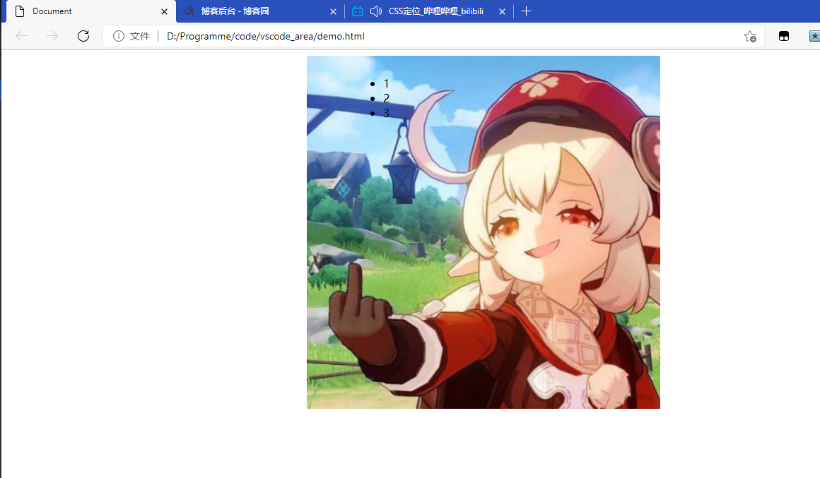
当页面宽度向左缩小时图片是居中的,会跟着移动,但是列表是绝对位置,并不会移动
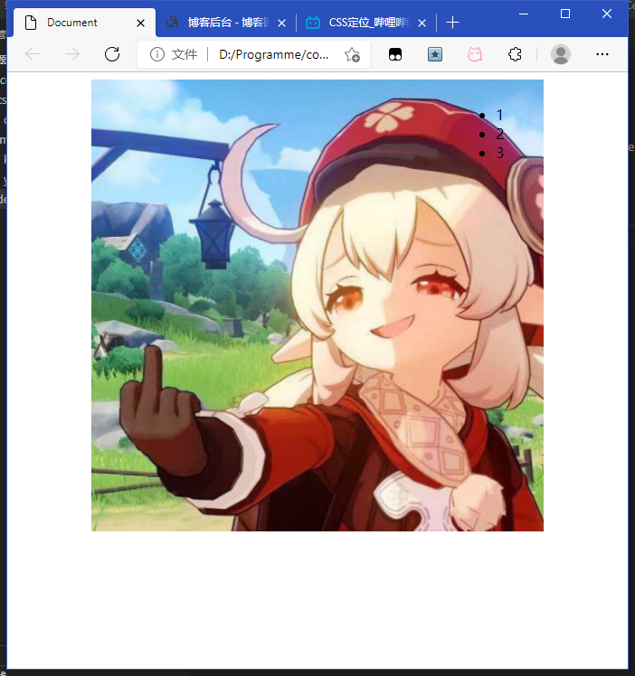
要想列表list也跟着移动就要改变它的参照物,可以把list的父级pic-box设置成相对定位
因为绝对定位的元素会以最近的父级元素为参照物进行定位,没有就找往上找
最后父级及祖先级都没有设置定位时,会找到body,效果是默认以网页的左上角为参照物
<!DOCTYPE html>
<html lang="en">
<head>
    <meta charset="UTF-8">
    <meta http-equiv="X-UA-Compatible" content="IE=edge">
    <meta name="viewport" content="width=device-width, initial-scale=1.0">
    <title>Document</title>
    <style>
        .pic-box{
            width: 500px;
            margin: 0 auto;
            position: relative;
        }
        .list{
            position: absolute;
            top: 20px;
            left: 500px;
        }
    </style>
</head>
<body>
    <div class="pic-box">
        <img src="img/keli.jpg" alt="" width="500px">
        <ul class="list">
            <li>1</li>
            <li>2</li>
            <li>3</li>
        </ul>
    </div>
</body>
</html>
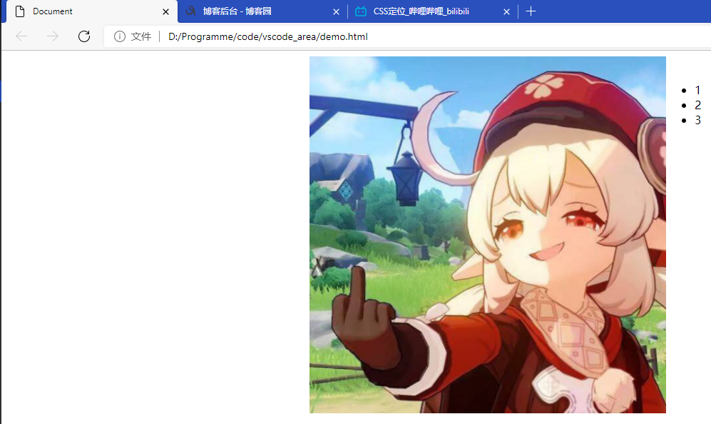
这回列表的位置变了,现在它以pic-box为参照物,会随着宽度缩小而改变位置。
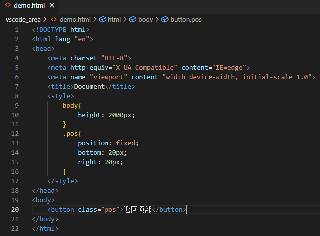
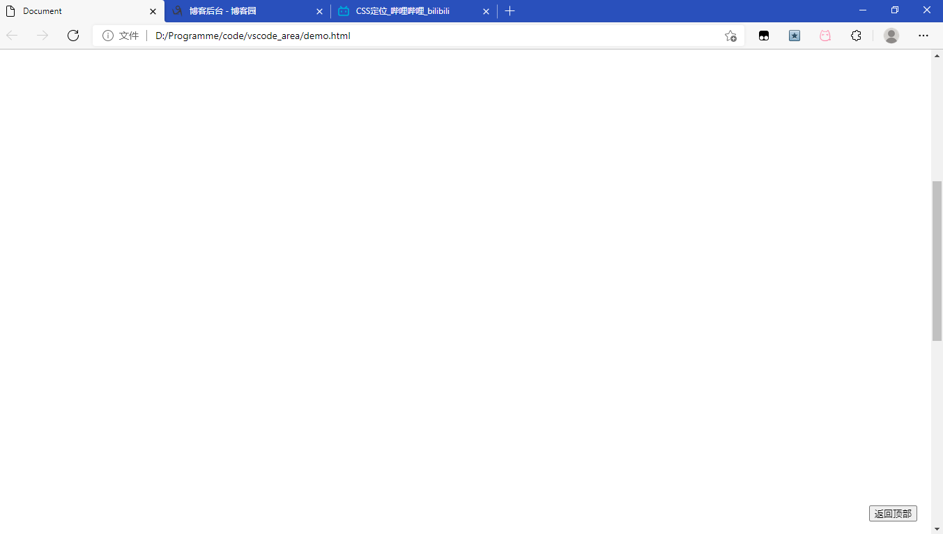
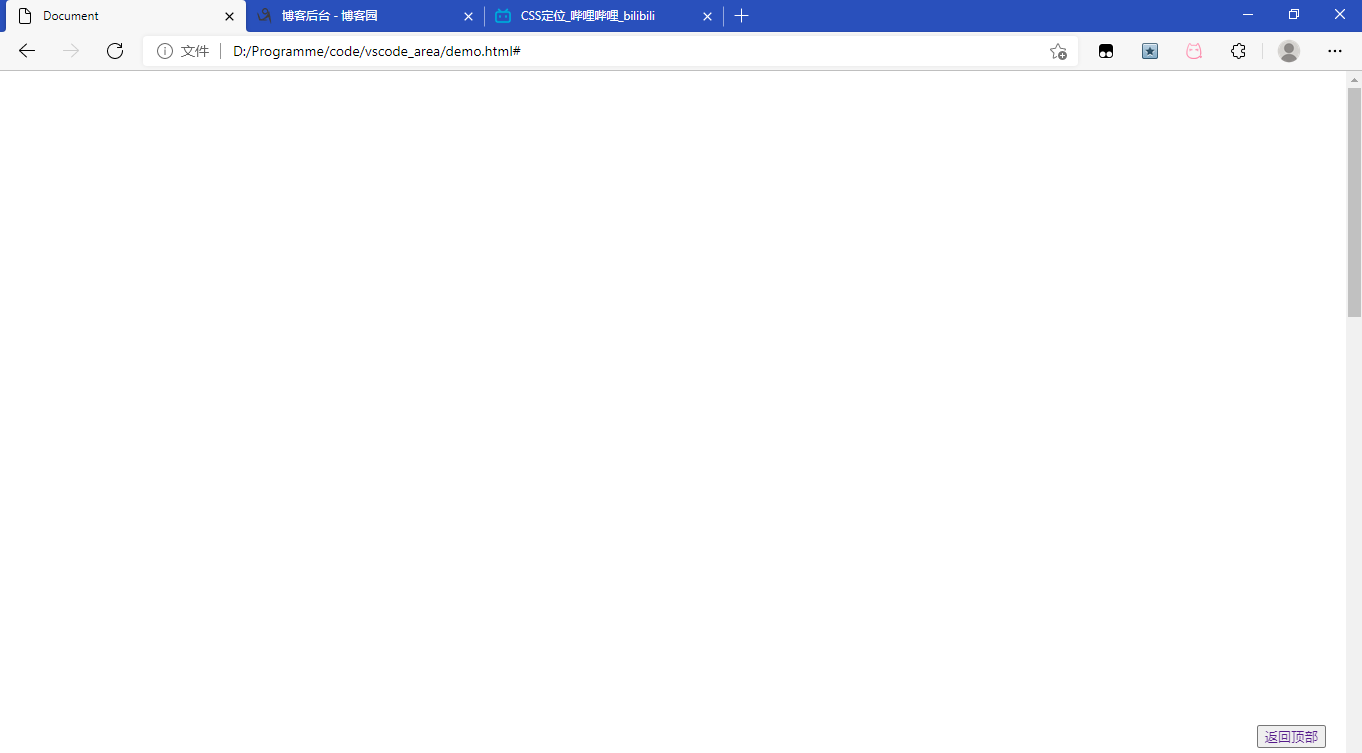
返回顶部实现
先实现返回顶部的布局
滚动鼠标,按钮也会在固定的位置了
再实现返回顶部的功能,加个#的a标签,#是锚点,功能是返回顶部
    <style>
        body{
            height: 2000px;
        }
        .pos{
            position: fixed;
            bottom: 20px;
            right: 20px;
        }
    </style>
</head>
<body>
    <button class="pos"><a href="#" style="text-decoration:none">返回顶部</a></button>
</body>
鼠标定位悬停效果


 浙公网安备 33010602011771号