【全】CSS动画大全之其他【火影忍者动态背景】
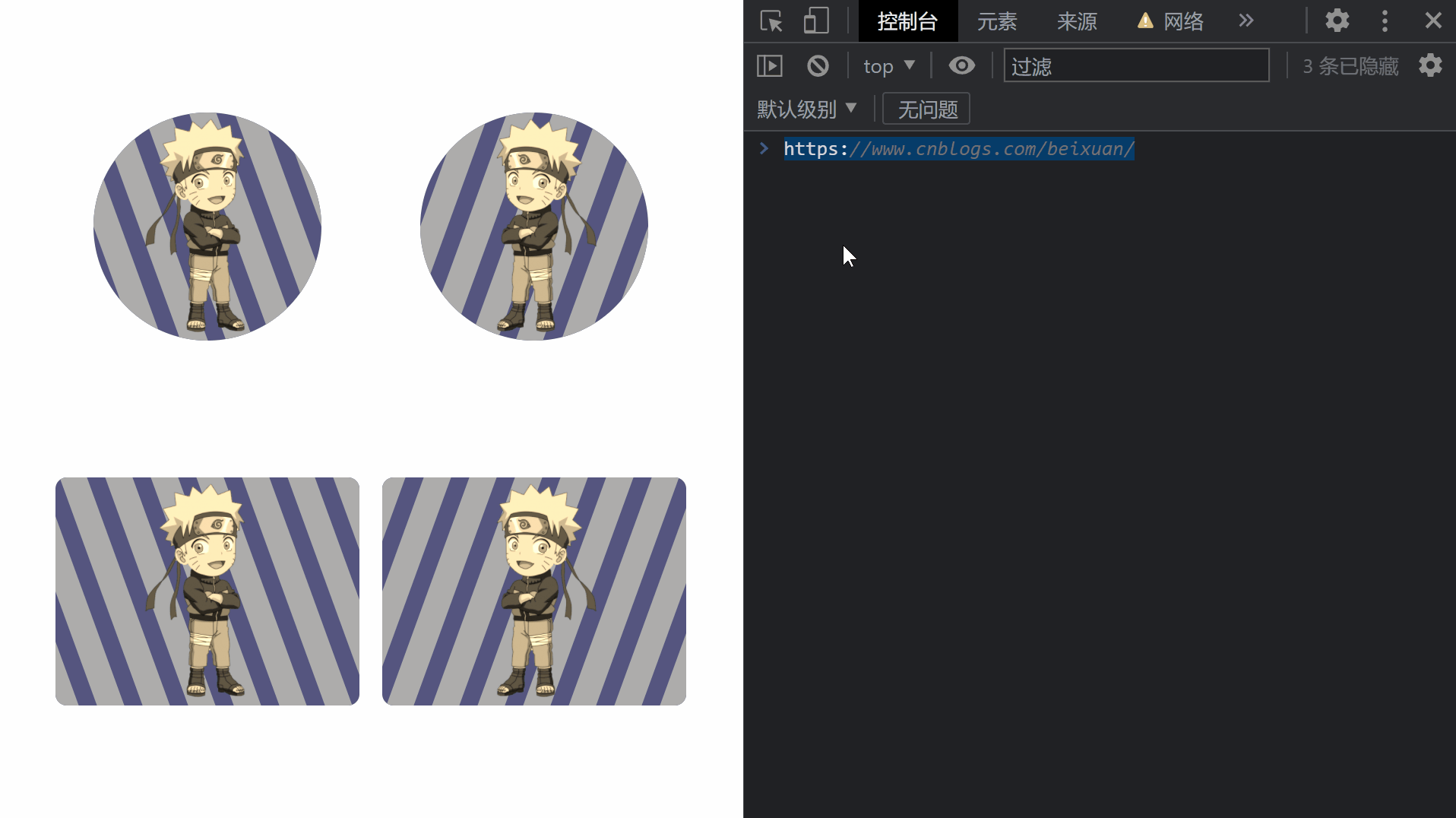
效果预览
代码
<!DOCTYPE html>
<html>
  <head>
    <head>
      <meta charset="utf-8" />
      <meta name="author" content="https://www.cnblogs.com/beixuan">
      <meta name="version" content="1.0.0">
      <meta name="date" content="2021/12/05 17:05:50">
      <meta name="viewport" content="width=device-width, initial-scale=1">
      <title>CSS动画大全之火影忍者动态背景</title>
    </head>
  </head>
  <style>

    body {
      padding: 0;
      margin: 0;
      box-sizing: border-box;
    }

    .page-wrapper {
      width: 100%;
      height: 100vh;
      display: flex;
      justify-content: space-around;
      align-items: center;
      justify-items: center;
      flex-direction: row;
      flex-wrap: wrap;
      box-sizing: border-box;
      padding: 3rem;
    }

    .page-wrapper > div {
      width: 20rem;
      height: 15rem;
      background-color: #55557f;
      position: relative;
      border-radius: 12px;
      display: grid;
      grid-template-columns: 100%;
      grid-template-rows: 100%;
      justify-content: center;
      justify-items: center;
      align-items: center;
      cursor: pointer;
    }

    .circle {
      width: 15rem !important;
      height: 15rem !important;;
      border-radius: 50% !important;;
    }

    img {
      z-index: 10;
      transition: all 0.8s ease;
      filter: sepia(1);
    }

    .right img {
      transform: scaleX(-1);
    }

    .bg {
      position: absolute;
      top: 0;
      left: 0;
      width: 100%;
      height: 100%;
      border-radius: 12px;
      overflow: hidden;
    }

    .first > .bg,
    .second > .bg  {
      border-radius: 50%;
    }

    .bg > span {
      position: absolute;
      top: 0;
      left: 0;
      width: 1.8rem;
      height: 100%;
      background-color: #acacac;
      transform: skewX(20deg);
      transition: all 0.5s ease;
    }

    .right > .bg > span {
      transform: skewX(-20deg);
    }

    .bg > span::before {
      content: '';
      position: absolute;
      left: 3rem;
      top: 0;
      width: 100%;
      height: 100%;
      background-color: #acacac;
      transition: all 0.5s ease;
    }

    .bg > span::after {
      content: '';
      position: absolute;
      left: -3rem;
      top: 0;
      width: 100%;
      height: 100%;
      background-color: #acacac;
      transition: all 0.5s ease;
    }

    .bg > span:nth-child(1) {
      left: -3rem;
    }

    .bg > span:nth-child(2) {
      left: 6rem;
    }

    .bg > span:nth-child(3) {
      left: 15rem;
    }

    .bg > span:nth-child(4) {
      left: 24rem;
    }

    .left:hover img {
      filter: drop-shadow(2px 4px 6px black);
      transform: scale(1.5) translateY(-30px);
    }

    .right:hover img {
      filter: drop-shadow(2px 4px 6px black);
      transform: scaleX(-1) scale(1.5) translateY(-30px);
    }

    .left:hover .bg > span {
      animation: animeSpanLeft 0.5s infinite linear;
    }

    .right:hover .bg > span {
      animation: animeSpanRight 0.5s infinite linear;
    }

    .page-wrapper > div:hover span,
    .page-wrapper > div:hover span::before,
    .page-wrapper > div:hover span::after {
      background-color: #ffff7f;
    }

    @keyframes animeSpanLeft {
      from{
        transform: translateX(0) skew(20deg);
      }
      to{
        transform: translateX(6.25rem) skew(20deg);
      }
    }

    @keyframes animeSpanRight {
      from{
        transform: translateX(0) skew(-20deg);
      }
      to{
        transform: translateX(6.25rem) skew(-20deg);
      }
    }

  </style>
  <body>
    <div class="page-wrapper">
      <div class="first circle left">
        <img src="./鸣人.png" height="280" />
        <div class="bg">
          <span></span>
          <span></span>
          <span></span>
          <span></span>
        </div>
      </div>

      <div class="second circle right">
        <img src="./鸣人.png" height="280" />
        <div class="bg">
          <span></span>
          <span></span>
          <span></span>
          <span></span>
        </div>
      </div>

      <div class="third left">
        <img src="./鸣人.png" height="280" />
        <div class="bg">
          <span></span>
          <span></span>
          <span></span>
          <span></span>
        </div>
      </div>

      <div class="fourth right">
        <img src="./鸣人.png" height="280" />
        <div class="bg">
          <span></span>
          <span></span>
          <span></span>
          <span></span>
        </div>
      </div>
    </div>
  </body>
</html>
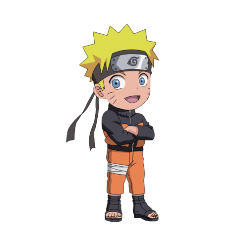
图片资源
本文要是对您有帮助,顶我一下哦!↓↓↓