
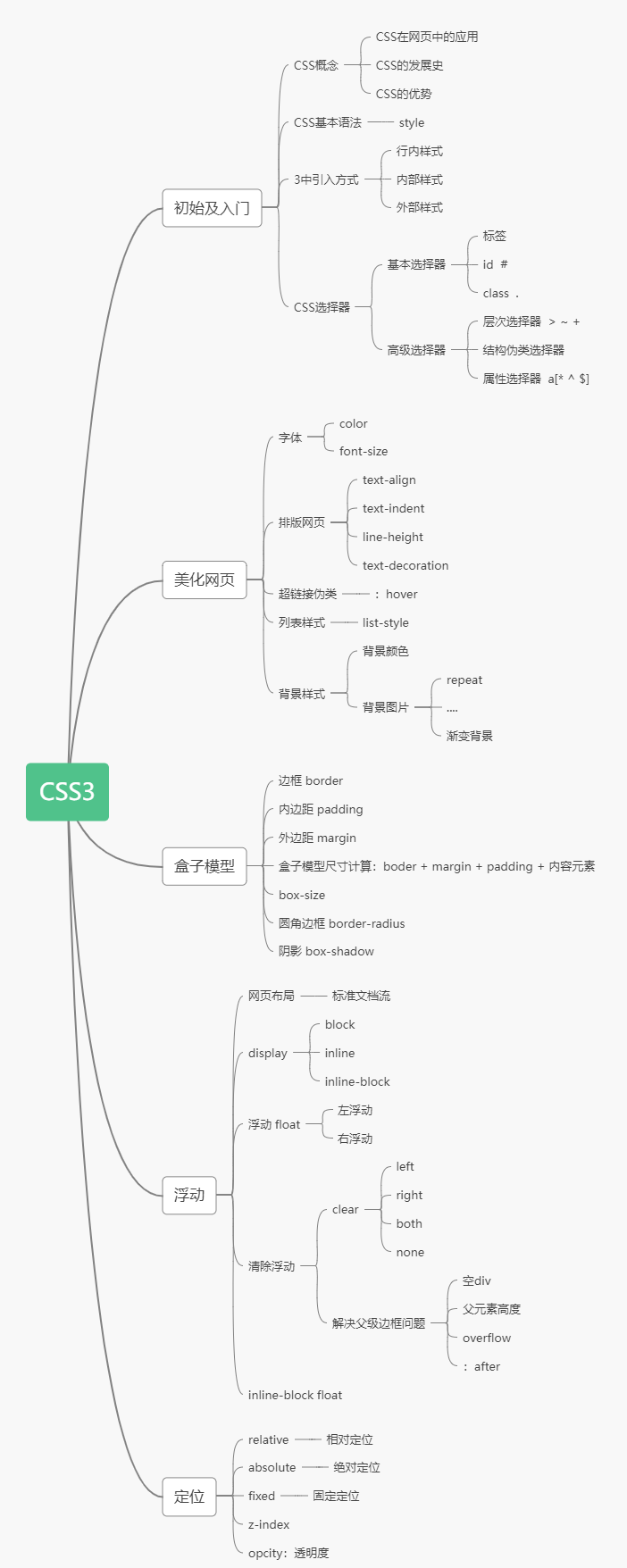
CSS学习
CSS学习笔记(狂神说Java)
狂神说B站视频:https://www.bilibili.com/video/BV1YJ411a7dy
HTML + CSS +JavaScript
结构 + 表现 + 交互
一、什么是CSS
Cascading Style Sheet(层叠级联样式表)
CSS:表现(美化网页)
字体、颜色、边距、高度、宽度、背景图片、网页定位、网页浮动…
二、CSS发展史
CSS1.0 : 加粗
CSS2.0 : div (自定义块) + CSS HTML和CSS分离的思想 SEO(搜索引擎优化)
CSS2.1 :浮动 + 定位
CSS3.0 : 圆角 + 阴影 动画… 浏览器兼容性~
练习:养成习惯!
三、快速入门
style标签
基本入门
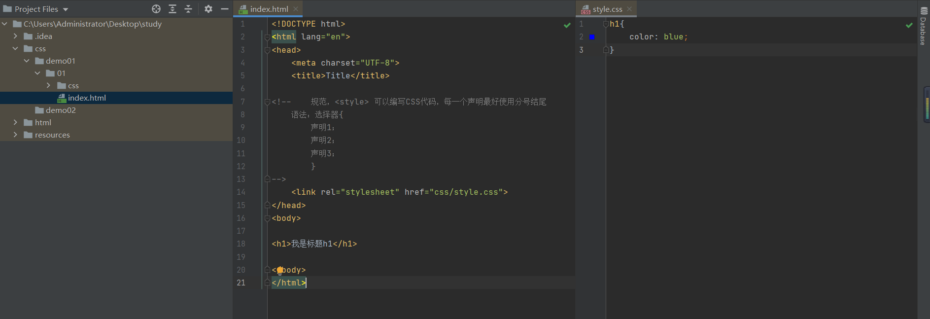
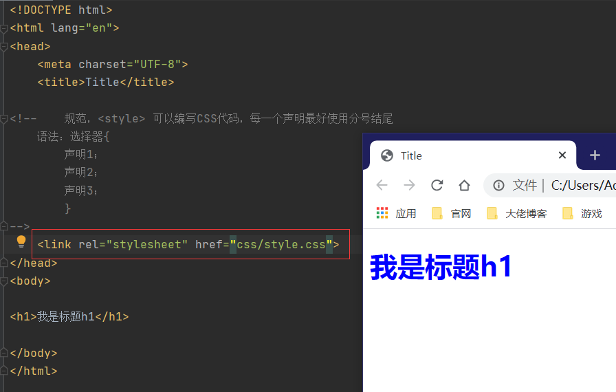
<!DOCTYPE html>
<html lang="en">
<head>
    <meta charset="UTF-8">
    <title>Title</title>

<!--    规范,<style> 可以编写CSS代码,每一个声明最好使用分号结尾
    语法:选择器{
        声明1;
        声明2;
        声明3;
        }
-->

    <style>
        h1{
            color: blue;
        }
    </style>

</head>
<body>

<h1>我是标题h1</h1>

</body>
</html>
写入style.css(建议使用方式)
CSS优势
1.内容和表现分离
2.网页加载速度快
3.网页结构表现统一,可以实现多网页复用
4.样式十分丰富
5.利于SEO 容易被搜索引擎优化收录!
四、CSS的3种导入方式
优先级:行内样式表>外部样式表&&内部样式表(就近原则)
行内样式表
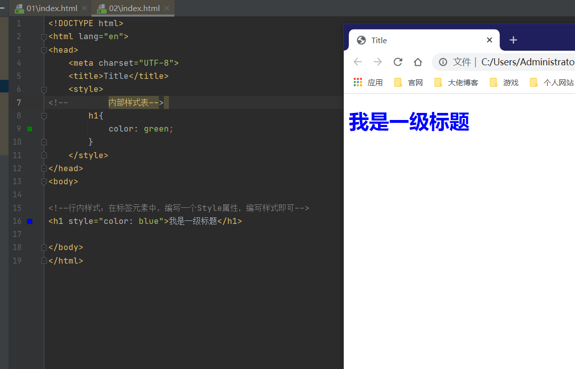
<!--行内样式:在标签元素中,编写一个Style属性,编写样式即可-->
<h1 style="color: blue">我是一级标题</h1>
内部样式表
    <style>
<!--        内部样式表-->
        h1{
            color: green;
        }
    </style>
外部样式表
<link rel="stylesheet" href="css/style.css">
拓展:外部样式的两种写法
- 链接式
即外部样式表!
- 导入式
CSS 2.1
舍弃原因:先加载网页,再渲染!
<!--    导入式外部样式表-->
    <style>
        /*@import "css/style.css";*/
        @import url(css/style.css);
    </style>
link标签和import标签的区别
1.link属于html标签,而@import是css提供的
2.页面被加载时,link会同时被加载,而@import引用的css会等到页面加载结束后加载。
3.link是html标签,因此没有兼容性,而@import只有IE5以上才能识别。
4.link方式样式的权重高于@import的。
五、选择器
作用:选择页面上的某一个或者某一类元素。
基本选择器
优先级:id选择器>class选择器>标签选择器
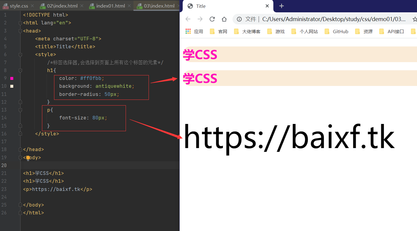
1.标签选择器:选择一类标签
标签选择器格式: 标签{}
<!DOCTYPE html>
<html lang="en">
<head>
    <meta charset="UTF-8">
    <title>Title</title>
    <style>
        /*标签选择器,会选择到页面上所有这个标签的元素*/
        h1{
            color: #ff0fbb;
            background: antiquewhite;
            border-radius: 50px;
        }
        p{
            font-size: 80px;
        }
    </style>

</head>
<body>

<h1>学CSS</h1>
<h1>学CSS</h1>
<p>https://baixf.tk</p>

</body>
</html>
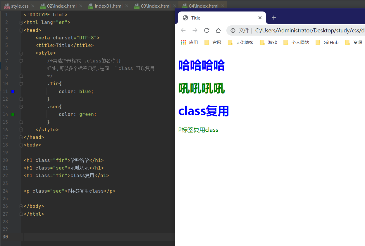
2.类选择器:选择所有class属性一致的标签,跨标签
类选择器格式 : .class的名称{}
- 实现同一标签的不同设置
- 可以复用
<!DOCTYPE html>
<html lang="en">
<head>
    <meta charset="UTF-8">
    <title>Title</title>
    <style>
        /*类选择器格式 .class的名称{}
        好处,可以多个标签归类,是同一个class 可以复用
        */
        .fir{
            color: blue;
        }
        .sec{
            color: green;
        }
    </style>
</head>
<body>

<h1 class="fir">哈哈哈哈</h1>
<h1 class="sec">吼吼吼吼</h1>
<h1 class="fir">class复用</h1>

<p class="sec">P标签复用class</p>

</body>
</html>
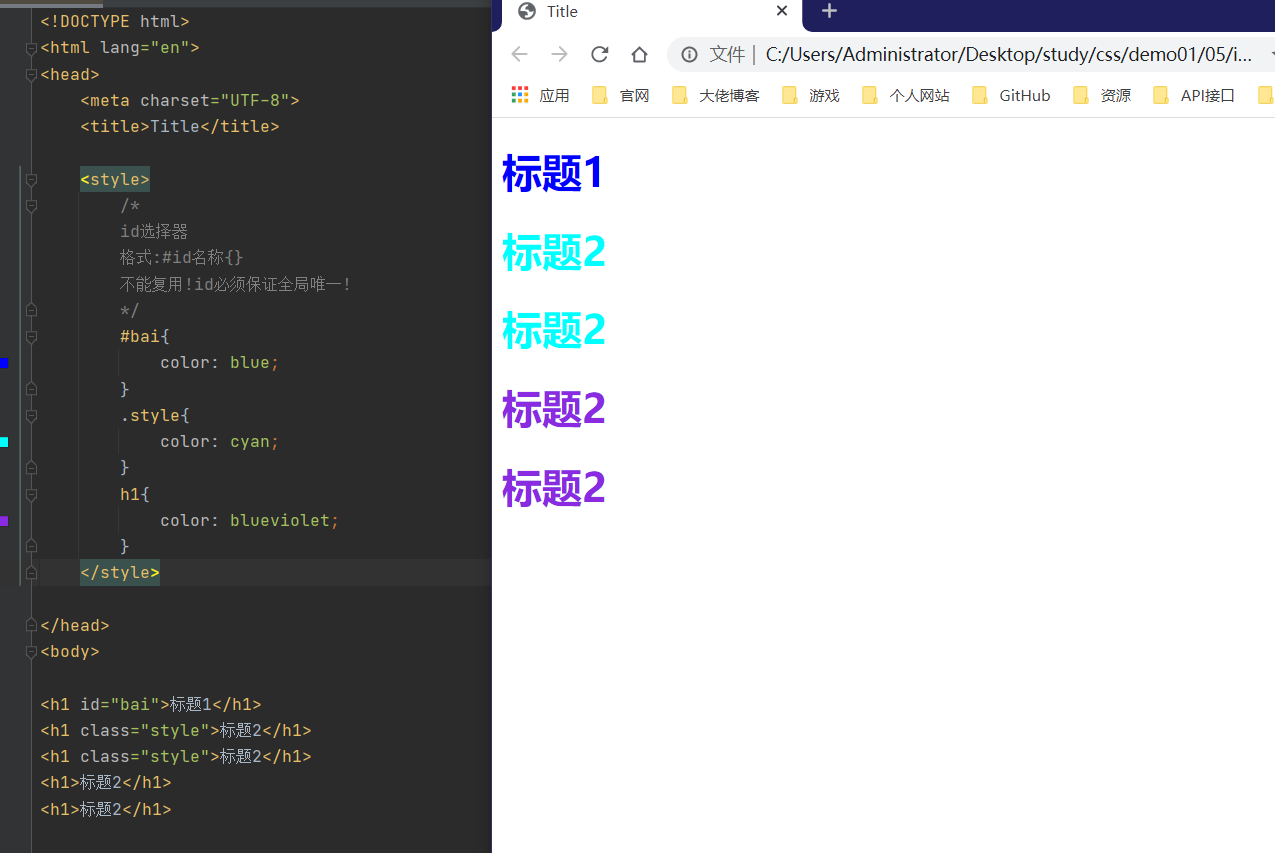
3.id选择器:全局唯一!
格式 : #id名称{}
- 不能复用!id必须保证全局唯一!
<!DOCTYPE html>
<html lang="en">
<head>
    <meta charset="UTF-8">
    <title>Title</title>

    <style>
        /*
        id选择器
        格式:#id名称{}
        不能复用!id必须保证全局唯一!
        */
        #bai{
            color: blue;
        }
        .style{
            color: cyan;
        }
        h1{
            color: blueviolet;
        }
    </style>

</head>
<body>

<h1 id="bai">标题1</h1>
<h1 class="style">标题2</h1>
<h1 class="style">标题2</h1>
<h1>标题2</h1>
<h1>标题2</h1>

</body>
</html>
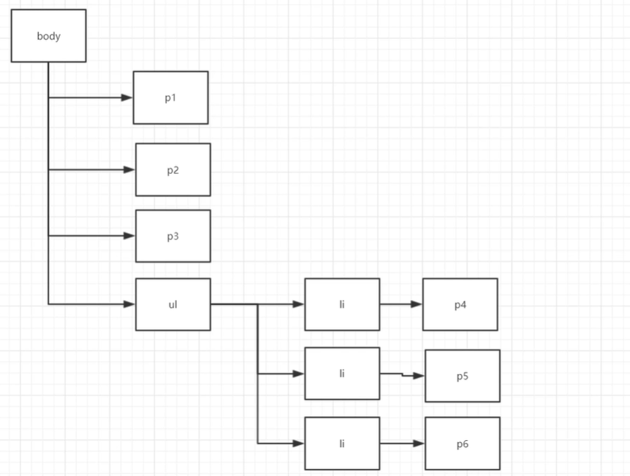
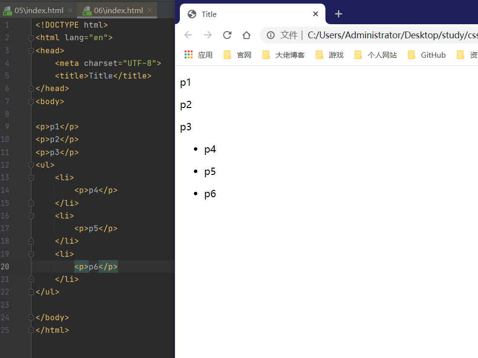
层次选择器
<!DOCTYPE html>
<html lang="en">
<head>
    <meta charset="UTF-8">
    <title>Title</title>
</head>
<body>

<p>p1</p>
<p>p2</p>
<p>p3</p>
<ul>
    <li>
        <p>p4</p>
    </li>
    <li>
        <p>p5</p>
    </li>
    <li>
        <p>p6</p>
    </li>
</ul>

</body>
</html>
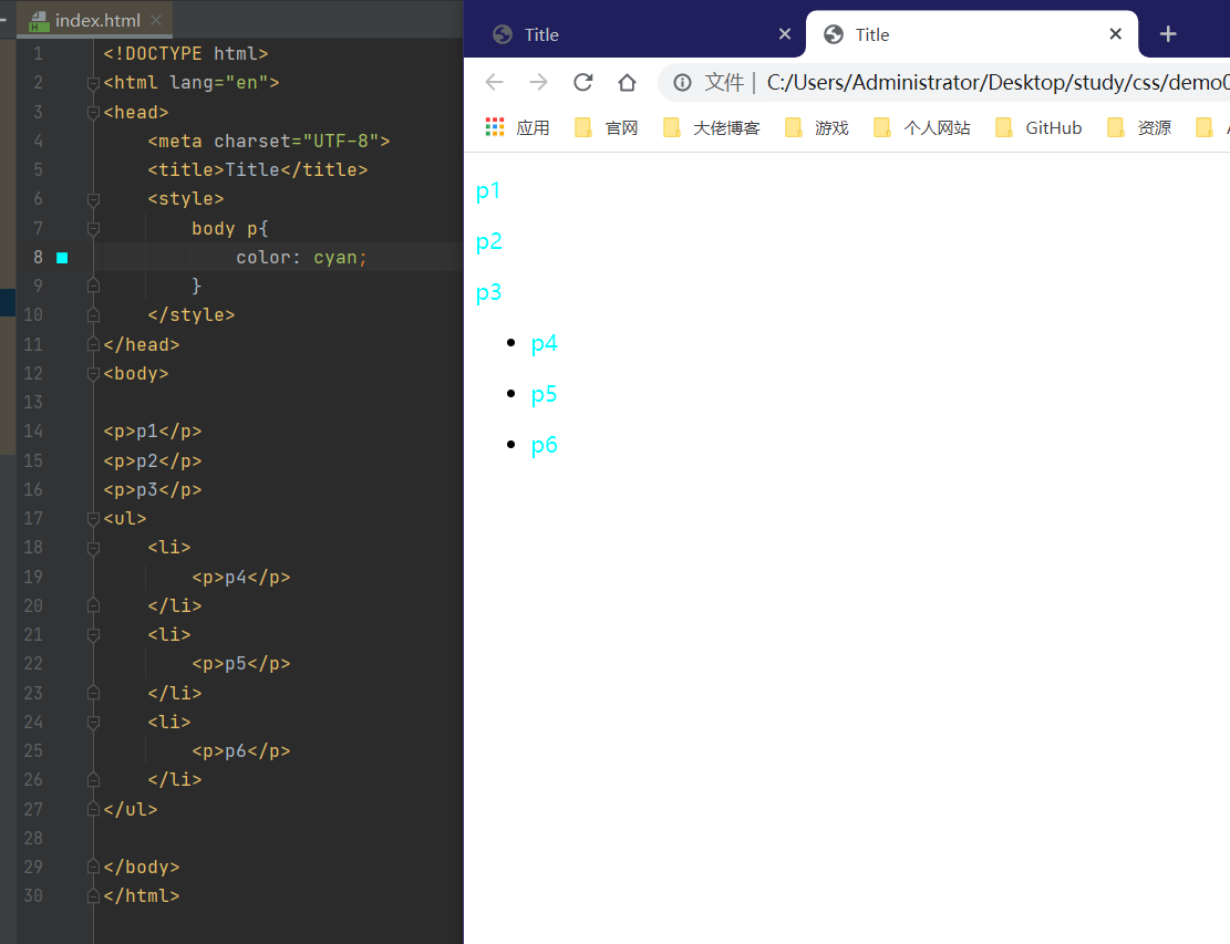
1.后代选择器
<style>
    body p{
       color: cyan;
    }
</style>
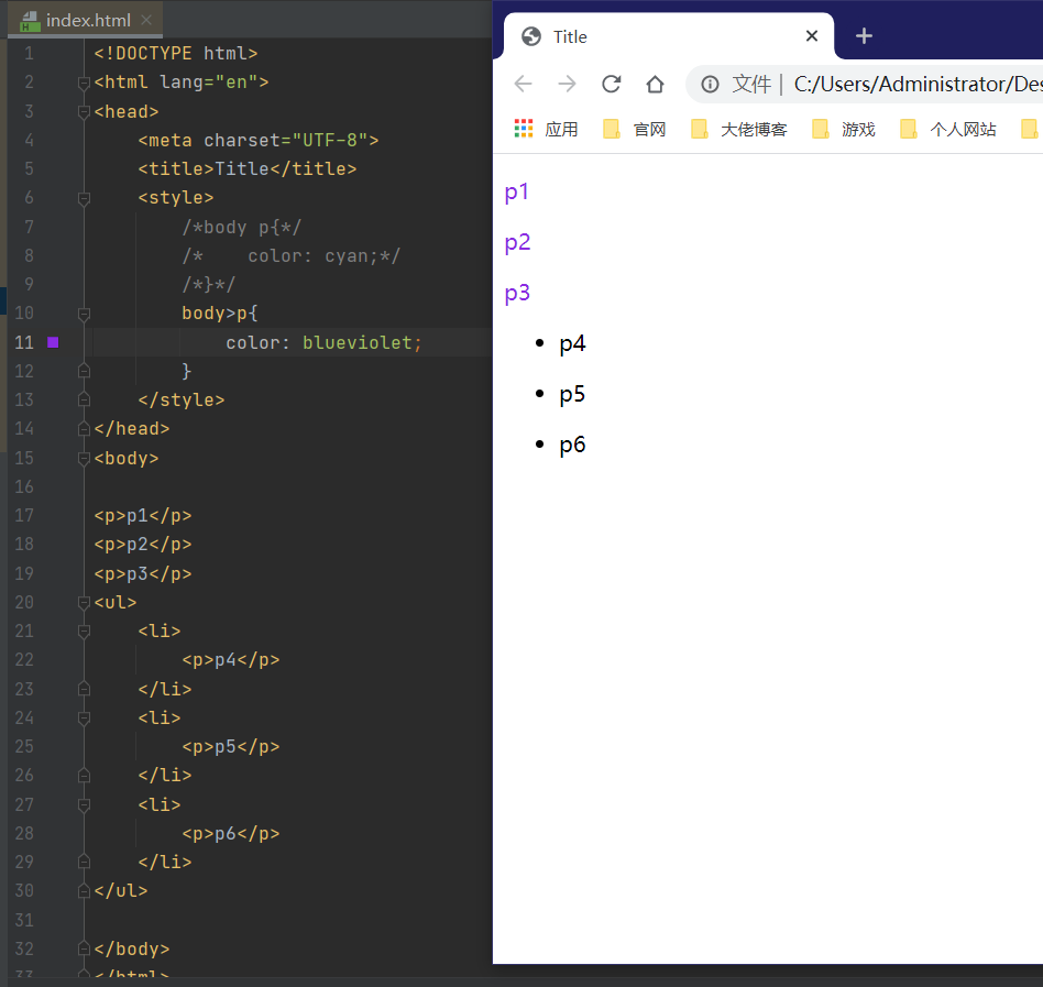
2.子选择器
<style>
    body>p{
        color: blueviolet;
    }
</style>
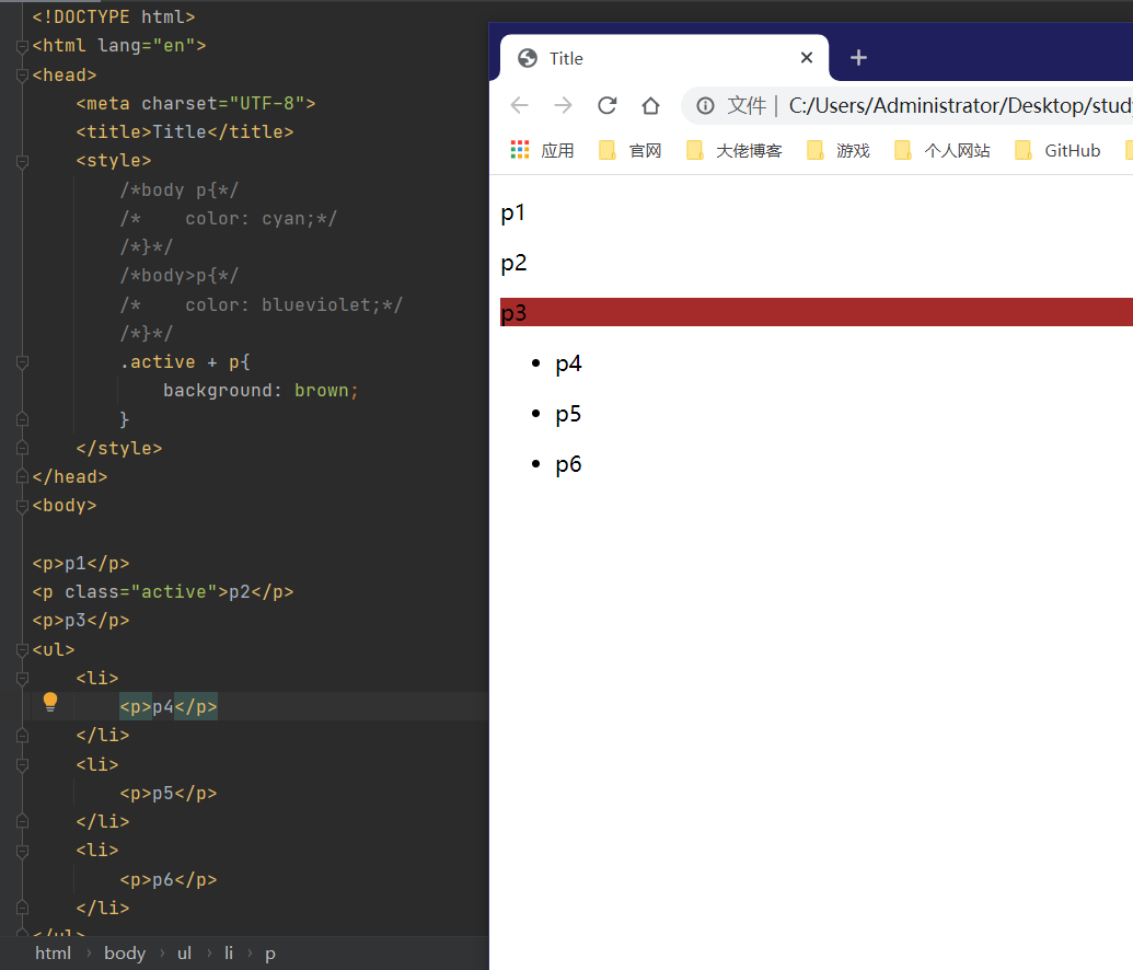
3.相邻兄弟选择器(只有一个,相邻)
<style>
.active + p{
        background: brown;
    }
</style>
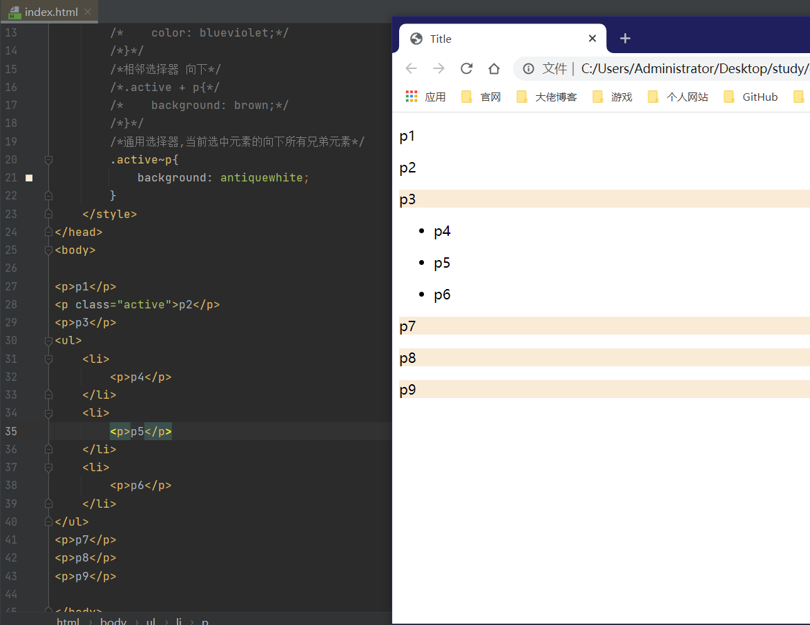
4.通用选择器
<style>
/*通用选择器,当前选中元素的向下所有兄弟元素*/
        .active~p{
            background: antiquewhite;
        }
</style>
结构伪类选择器
伪类选择器
<style>
    h1:hover{
        color: brown;
        background: yellow;
    }
</style>
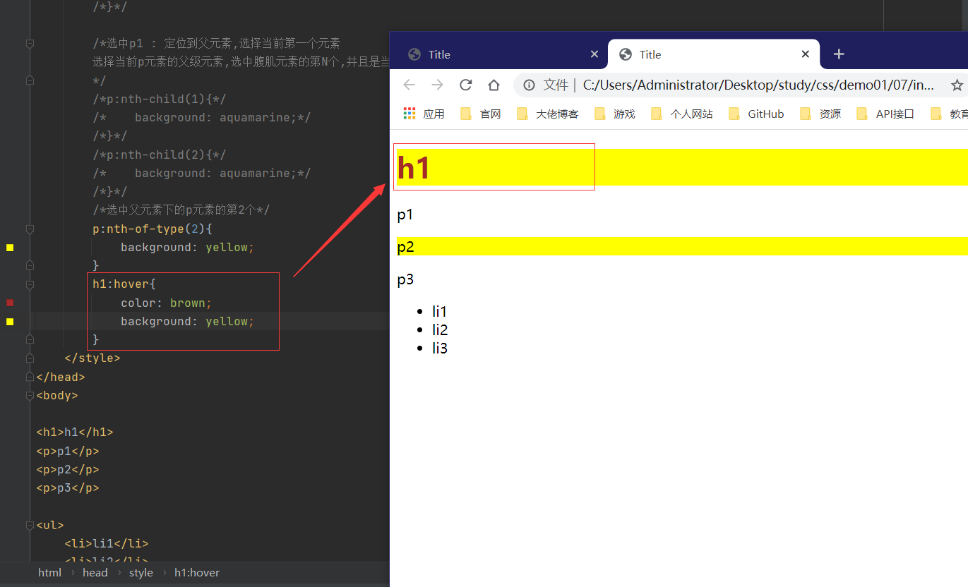
结构伪类选择器:定位元素
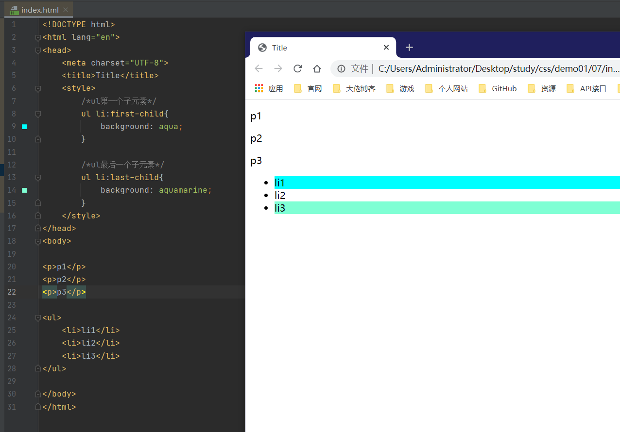
<style>
   /*ul第一个子元素*/
   ul li:first-child{
      background: aqua;
    }

   /*ul最后一个子元素*/
    ul li:last-child{
    	background: aquamarine;
   	}
</style>
<style>
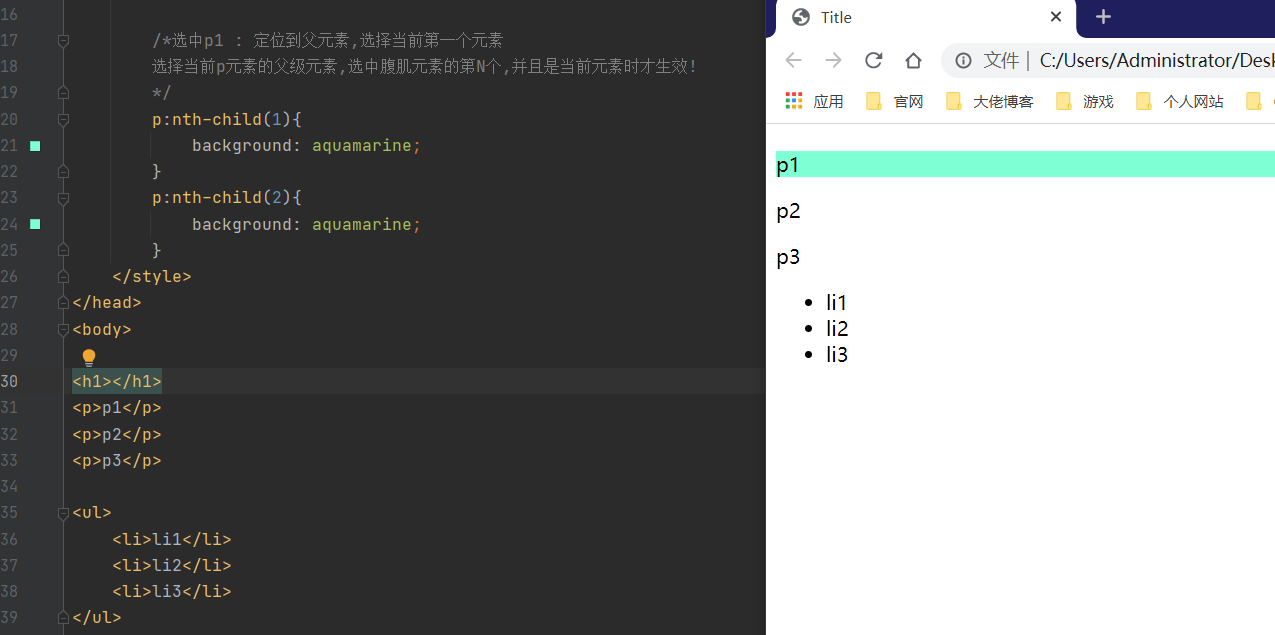
/*选中p1 : 定位到父元素,选择当前第一个元素
选择当前p元素的父级元素,选中腹肌元素的第N个,并且是当前元素时才生效!
*/
p:nth-child(1){
background: aquamarine;
}
p:nth-child(2){
background: aquamarine;
}
</style>
<style>
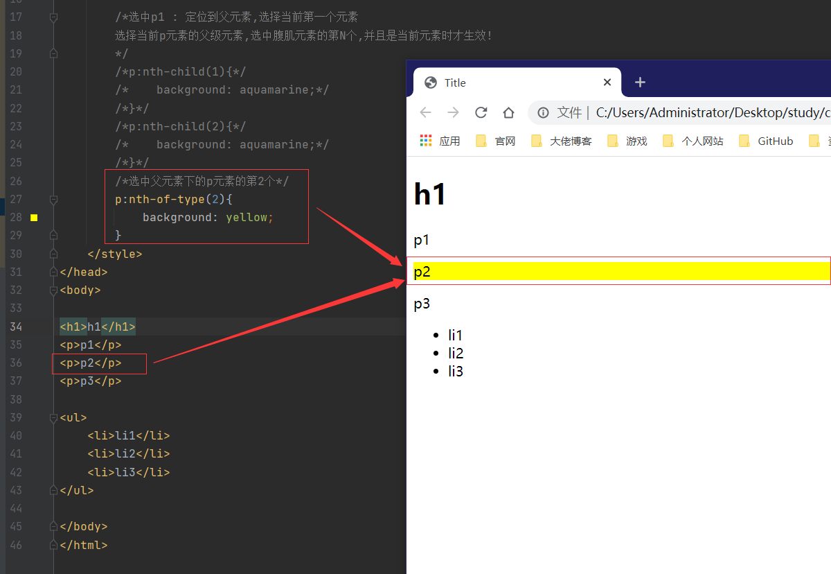
/*选中父元素下的p元素的第2个*/
p:nth-of-type(2){
background: yellow;
}
</style>
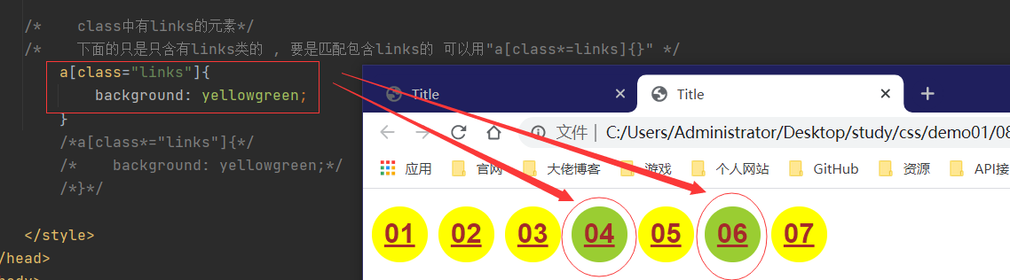
属性选择器
id + class
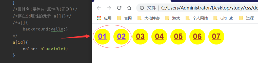
属性名:属性名=属性值(正则)
- = 绝对等于
- *= 包含这个元素
- ^= 以某个元素开头
- $= 以某个元素结尾
/*属性名:属性名=属性值(正则)*/
        /*存在id属性的元素 a[]{}*/
        /*a[]{
            background:yello;}
        */
        a[id]{
            color: blueviolet;
        }
    /*    class中有links的元素*/
    /*    下面的只是只含有links类的 , 要是匹配包含links的 可以用"a[class*=links]{}" */
        a[class="links"]{
            background: yellowgreen;
        }
        /*a[class*="links"]{*/
        /*    background: yellowgreen;*/
        /*}*/
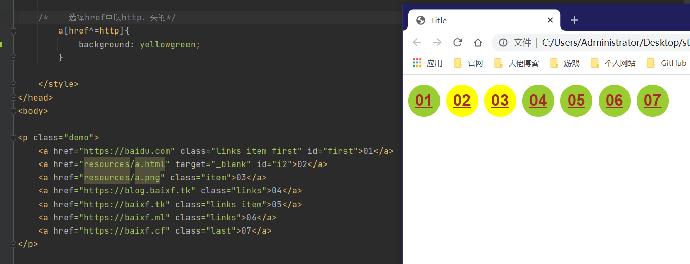
    /*    选择href中以http开头的*/
        a[href^=http]{
            background: yellowgreen;
        }
六、美化网页元素
为什么要美化网页
- 有效传递页面信息
- 美化网页 吸引用户
- 凸显页面主题
- 提高用户体验
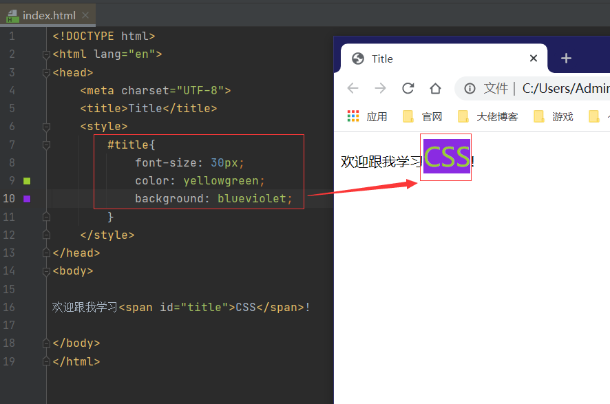
span标签
<!DOCTYPE html>
<html lang="en">
<head>
    <meta charset="UTF-8">
    <title>Title</title>
    <style>
        #title{
            font-size: 30px;
        }
    </style>
</head>
<body>

欢迎跟我学习<span id="title">CSS</span>!

</body>
</html>
字体样式
font-family字体font-size字体大小font-weight字体粗细color字体颜色
<!DOCTYPE html>
<html lang="en">
<head>
    <meta charset="UTF-8">
    <title>Title</title>
    <style>
        /*font-family 字体
        font-size 字体大小
        font-weight 字体粗细
        color 字体颜色

        */
        body{
            font-family: 楷体;
        }
        h1{
            font-size: 20px;
        }
        .p1{
            font-weight: bold;
        }
        .p2{
            font: oblique bold 12px "楷体";
        }
    </style>
</head>
<body>
<h1>百度招聘广告:</h1>
<p class="p1">每一个星球都有一个驱动核心,</p>
<p>每一种思想都有影响力的种子。</p>
<p>感受世界的温度,</p>
<p>年轻的你也能成为改变世界的动力,</p>
<p>百度珍惜你所有的潜力。</p>
<p class="p2">你的潜力,是改变世界的动力!</p>
</body>
</html>
文本样式
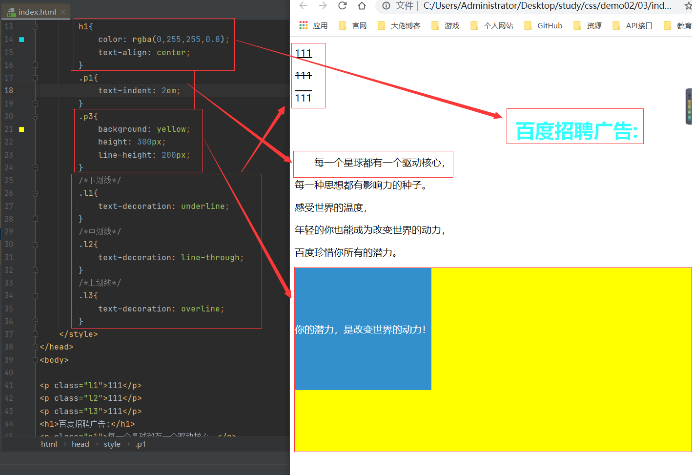
color: 颜色: RGB:0-F ; RGBA: A(0-1)text-align文本位置 left/center/righttext-indent首行缩进(em)height块的高度(若和块高一致则会居中)line-height行高 单行文字上下居中!
<!DOCTYPE html>
<html lang="en">
<head>
    <meta charset="UTF-8">
    <title>Title</title>
    <style>
        /*color : 颜色: RGB:0-F ; RGBA: A(0-1)
        text-align 文本位置 left/center/right
        text-indent 首行缩进(em)
        height 块的高度
        line-height 行高(若和块高一致则会居中)
        */
        h1{
            color: rgba(0,255,255,0.8);
            text-align: center;
        }
        .p1{
            text-indent: 2em;
        }
        .p3{
            background: yellow;
            height: 300px;
            line-height: 200px;
        }
        /*下划线*/
        .l1{
            text-decoration: underline;
        }
        /*中划线*/
        .l2{
            text-decoration: line-through;
        }
        /*上划线*/
        .l3{
            text-decoration: overline;
        }
    </style>
</head>
<body>

<p class="l1">111</p>
<p class="l2">111</p>
<p class="l3">111</p>
<h1>百度招聘广告:</h1>
<p class="p1">每一个星球都有一个驱动核心,</p>
<p>每一种思想都有影响力的种子。</p>
<p>感受世界的温度,</p>
<p>年轻的你也能成为改变世界的动力,</p>
<p>百度珍惜你所有的潜力。</p>
<p class="p3">你的潜力,是改变世界的动力!</p>


</body>
</html>
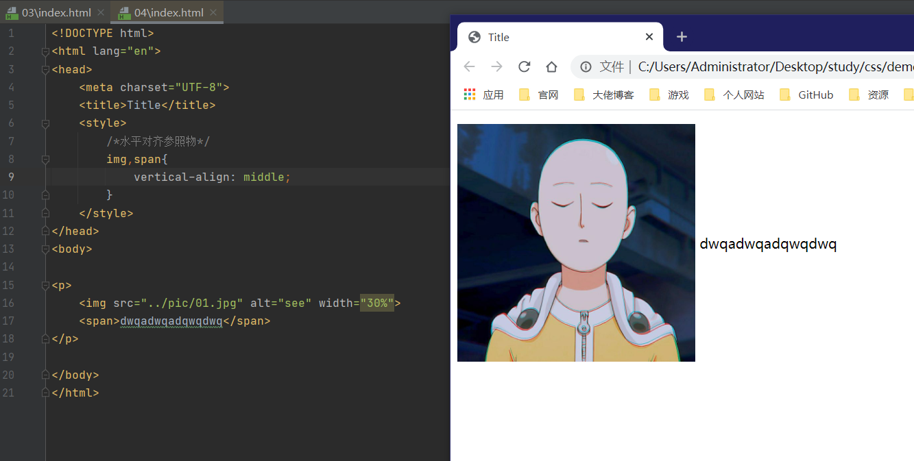
<!DOCTYPE html>
<html lang="en">
<head>
    <meta charset="UTF-8">
    <title>Title</title>
    <style>
        /*水平对齐参照物*/
        img,span{
            vertical-align: middle;
        }
    </style>
</head>
<body>

<p>
    <img src="../pic/01.jpg" alt="see" width="30%">
    <span>dwqadwqadqwqdwq</span>
</p>

</body>
</html>
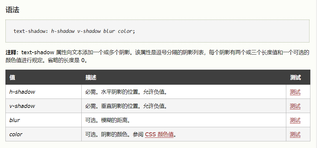
阴影
text-shadow:阴影
text-shadow: h-shadow v-shadow blur color;
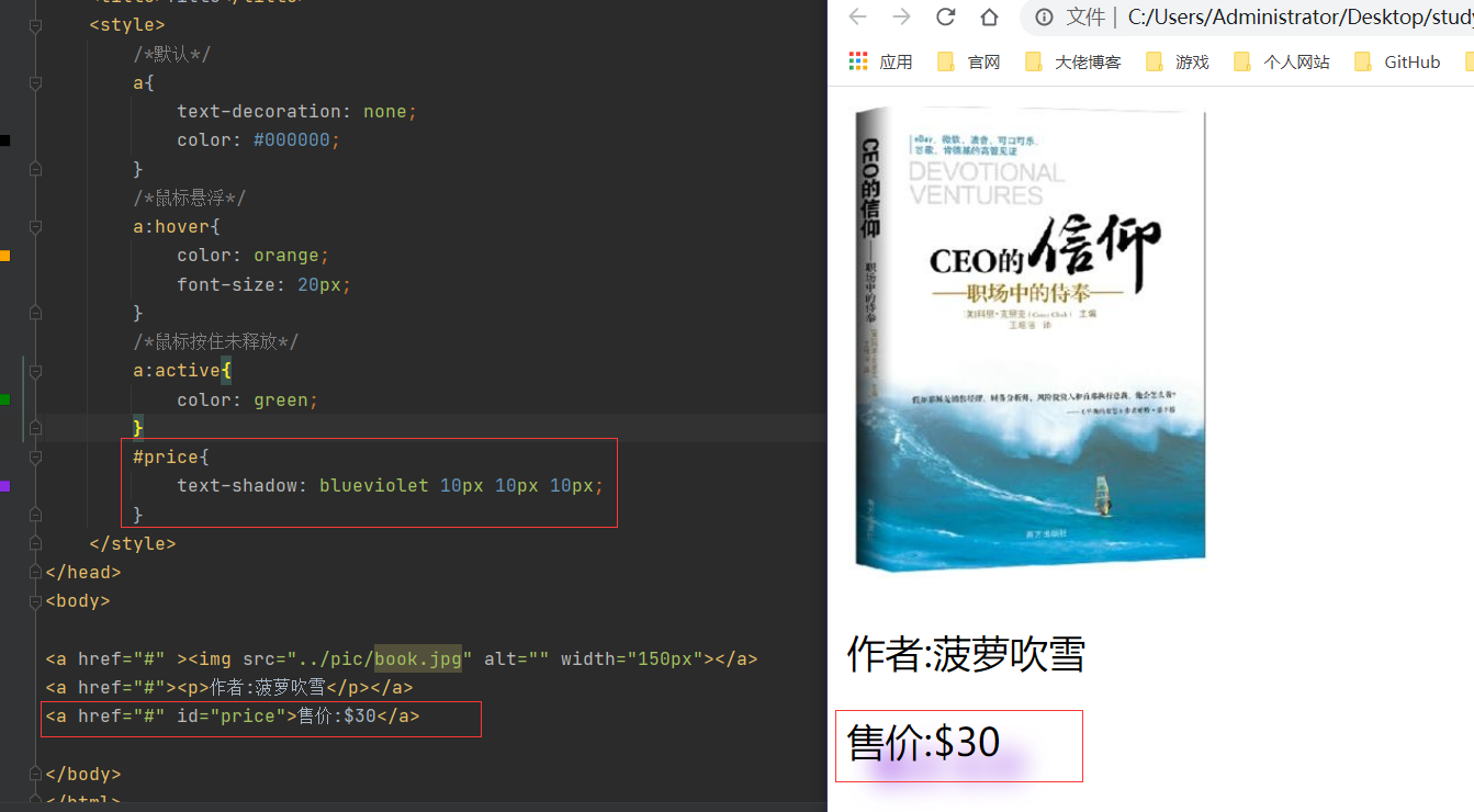
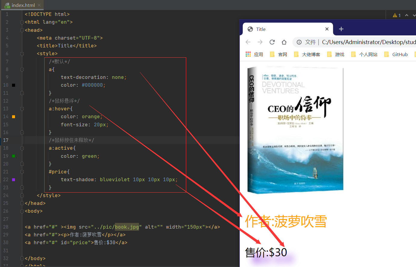
超链接伪类
a:hover:鼠标悬浮
a:active:点击后
a:默认值
<!DOCTYPE html>
<html lang="en">
<head>
    <meta charset="UTF-8">
    <title>Title</title>
    <style>
        /*默认*/
        a{
            text-decoration: none;
            color: #000000;
        }
        /*鼠标悬浮*/
        a:hover{
            color: orange;
            font-size: 20px;
        }
        /*鼠标按住未释放*/
        a:active{
            color: green;
        }
        #price{
            text-shadow: blueviolet 10px 10px 10px;
        }
    </style>
</head>
<body>

<a href="#" ><img src="../pic/book.jpg" alt="" width="150px"></a>
<a href="#"><p>作者:菠萝吹雪</p></a>
<a href="#" id="price">售价:$30</a>

</body>
</html>
列表
text-decoration列表序号种类!
none去掉原点circle空心圆decimal有序列表square正方形
<!DOCTYPE html>
<html lang="en">
<head>
    <meta charset="UTF-8">
    <title>列表样式</title>
    <link rel="stylesheet" type="text/css" href="css/style.css">
</head>
<body>

<div id="nav">
    <h2 class="title">全部商品分类</h2>

    <ul>
        <li>
            <a href="#">图书</a>
            <a href="#">音像</a>
            <a href="#">数字商品</a>
        </li>
        <li>
            <a href="#">家用电器</a>
            <a href="#">手机</a>
            <a href="#">数码</a>
        </li>
        <li>
            <a href="#">电脑</a>
            <a href="#">办公</a>
        </li>
        <li>
            <a href="#">家居</a>
            <a href="#">家装</a>
            <a href="#">厨具</a>
        </li>
        <li>
            <a href="#">服饰鞋帽</a>
            <a href="#">个性化妆</a>
        </li>
        <li>
            <a href="#">礼品箱包</a>
            <a href="#">钟表</a>
            <a href="#">珠宝</a>
        </li>
        <li>
            <a href="#">食品饮料</a>
            <a href="#">保健食品</a>
        </li>
        <li>
            <a href="#">彩票</a>
            <a href="#">旅行</a>
            <a href="#">充值</a>
            <a href="#">票务</a>
        </li>
    </ul>
</div>

</body>
</html>
#nav{
    width: 300px;
    background: darkgrey;
}
.title{
    font-size: 18px;
    font-weight: bold;
    text-indent: 1em;
    line-height: 35px;
    background: crimson;
}

/*ul li*/
/*
none 去掉原点
circle 空心圆
decimal 有序列表
square 正方形
*/
ul{
    background: darkgrey;
}
ul li{
    height: 30px;
    list-style: none;
    text-indent: 1em;
}
a{
    text-decoration: none;
    font-size: 14px;
    color: #000000;
}
a:hover{
    text-decoration: underline;
    color: orange;
}
背景
- 背景颜色
background
- 背景图片
<!DOCTYPE html>
<html lang="en">
<head>
<meta charset="UTF-8">
<title>Title</title>
<style>
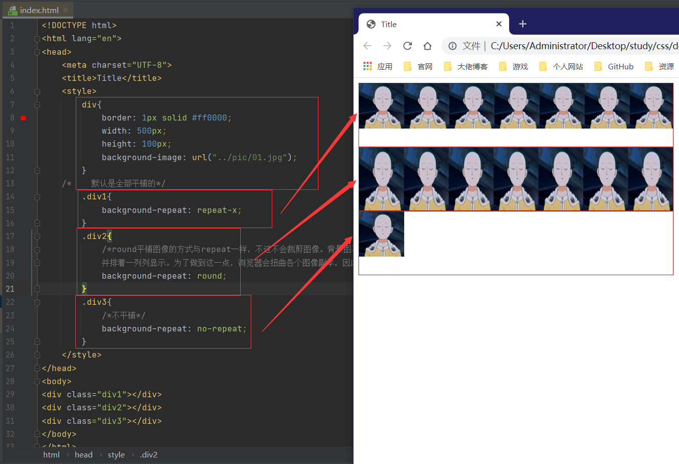
div{
border: 1px solid #ff0000;
width: 500px;
height: 100px;
background-image: url("../pic/01.jpg");
}
/* 默认是全部平铺的*/
.div1{
background-repeat: repeat-x;
}
.div2{
/*round平铺图像的方式与repeat一样,不过不会裁剪图像。背景图不会被裁剪,而是被缩放。
并排着一列列显示。为了做到这一点,浏览器会扭曲各个图像副本,因此会破坏图像的纵横比。*/
background-repeat: round;
}
.div3{
/*不平铺*/
background-repeat: no-repeat;
}
</style>
</head>
<body>
<div class="div1"></div>
<div class="div2"></div>
<div class="div3"></div>
</body>
</html>
综合练习
<!DOCTYPE html>
<html lang="en">
<head>
    <meta charset="UTF-8">
    <title>列表样式</title>
    <link rel="stylesheet" type="text/css" href="css/style.css">
</head>
<body>

<div id="nav">
    <h2 class="title">全部商品分类</h2>

    <ul>
        <li>
            <a href="#">图书</a>
            <a href="#">音像</a>
            <a href="#">数字商品</a>
        </li>
        <li>
            <a href="#">家用电器</a>
            <a href="#">手机</a>
            <a href="#">数码</a>
        </li>
        <li>
            <a href="#">电脑</a>
            <a href="#">办公</a>
        </li>
        <li>
            <a href="#">家居</a>
            <a href="#">家装</a>
            <a href="#">厨具</a>
        </li>
        <li>
            <a href="#">服饰鞋帽</a>
            <a href="#">个性化妆</a>
        </li>
        <li>
            <a href="#">礼品箱包</a>
            <a href="#">钟表</a>
            <a href="#">珠宝</a>
        </li>
        <li>
            <a href="#">食品饮料</a>
            <a href="#">保健食品</a>
        </li>
        <li>
            <a href="#">彩票</a>
            <a href="#">旅行</a>
            <a href="#">充值</a>
            <a href="#">票务</a>
        </li>
    </ul>
</div>

</body>
</html>
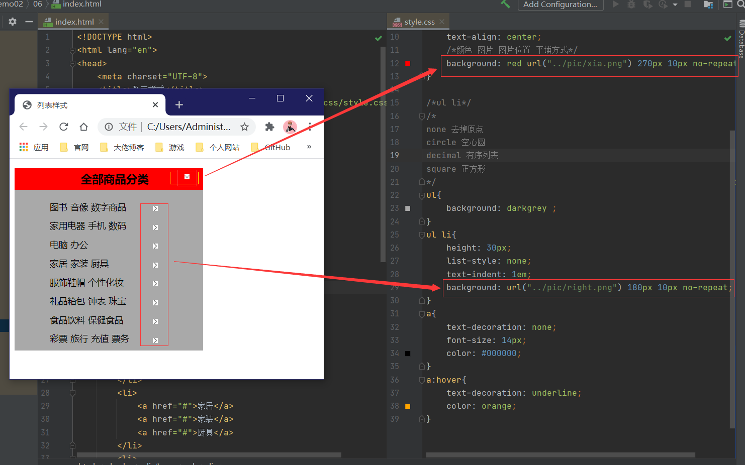
#nav{
    width: 300px;
    background: darkgrey;
}
.title{
    font-size: 18px;
    font-weight: bold;
    text-indent: 1em;
    line-height: 35px;
    text-align: center;
    /*颜色 图片 图片位置 平铺方式*/
    background: red url("../pic/xia.png") 270px 10px no-repeat;
}

/*ul li*/
/*
none 去掉原点
circle 空心圆
decimal 有序列表
square 正方形
*/
ul{
    background: darkgrey ;
}
ul li{
    height: 30px;
    list-style: none;
    text-indent: 1em;
    background: url("../pic/right.png") 180px 10px no-repeat;
}
a{
    text-decoration: none;
    font-size: 14px;
    color: #000000;
}
a:hover{
    text-decoration: underline;
    color: orange;
}
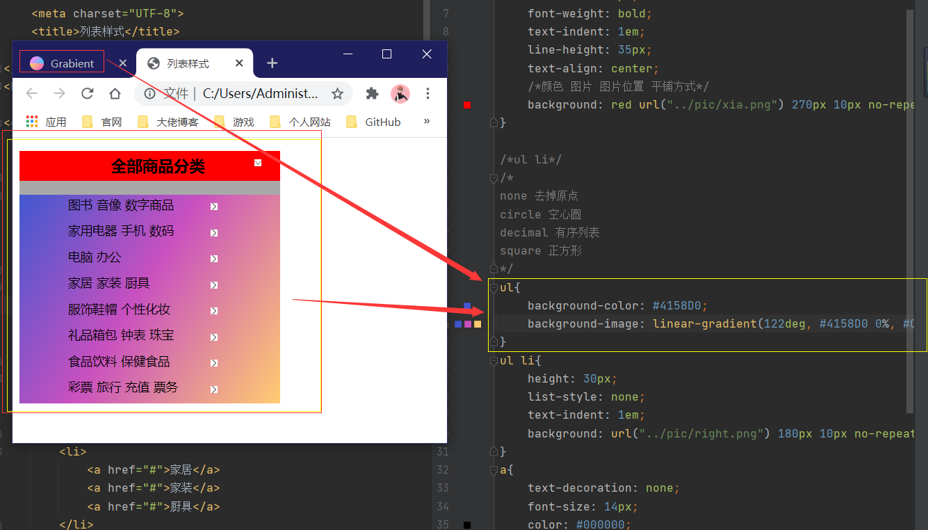
渐变
background-color: #4158D0;
background-image: linear-gradient(122deg, #4158D0 0%, #C850C0 46%, #FFCC70 100%);
grabient:渐变CSS网站
七、盒子模型
什么是盒子
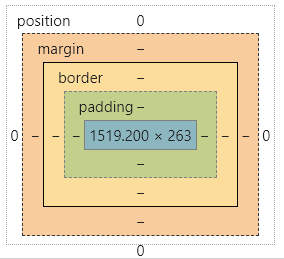
margin:外边距
padding:内边距
border:边框
边框
1.边框的粗细
2.边框的样式
3.边框的颜色
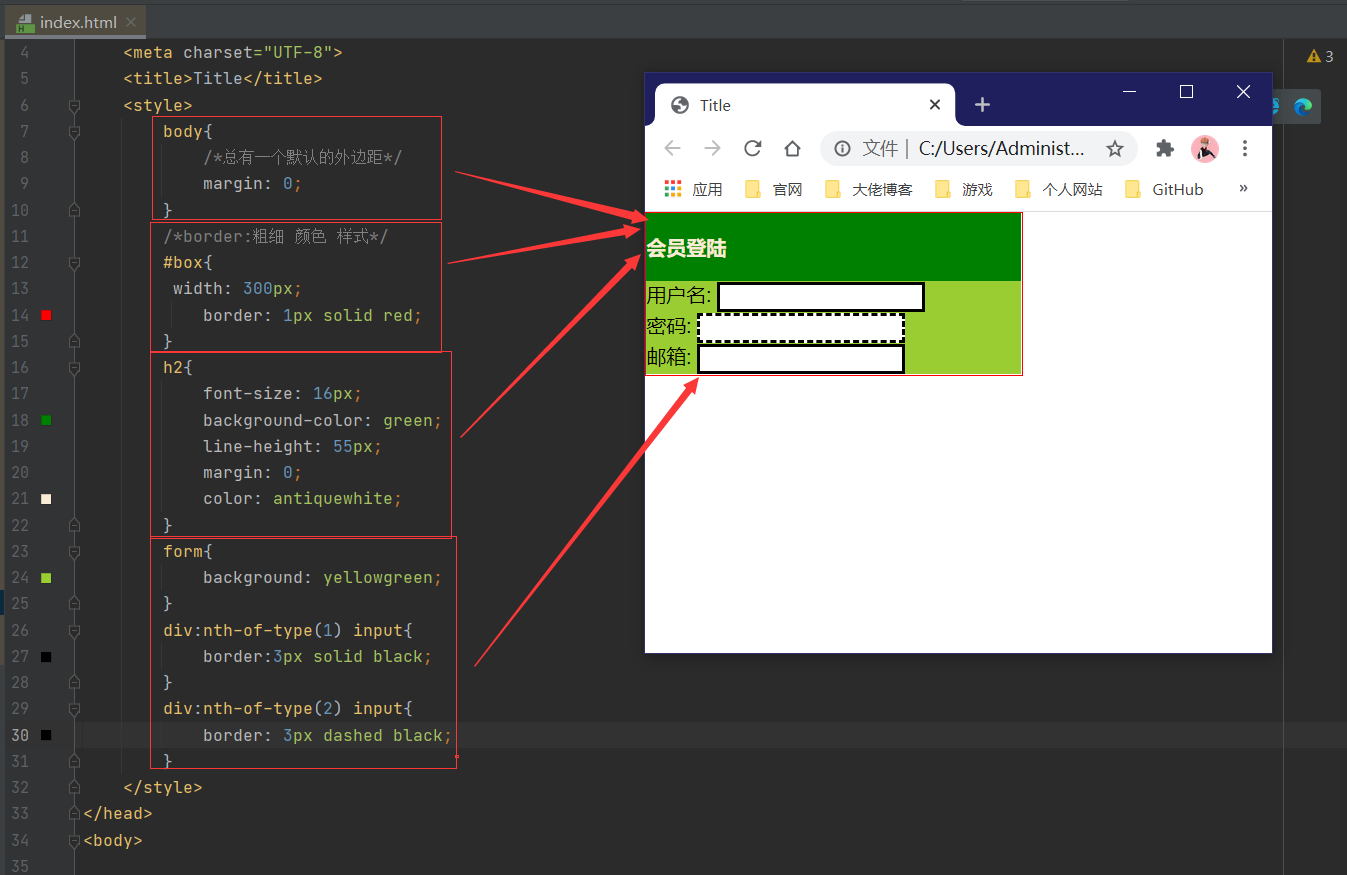
<!DOCTYPE html>
<html lang="en">
<head>
    <meta charset="UTF-8">
    <title>Title</title>
    <style>
        body{
            /*总有一个默认的外边距*/
            margin: 0;
        }
        /*border:粗细 颜色 样式*/
        #box{
         width: 300px;
            border: 1px solid red;
        }
        h2{
            font-size: 16px;
            background-color: green;
            line-height: 55px;
            margin: 0;
            color: antiquewhite;
        }
        form{
            background: yellowgreen;
        }
        div:nth-of-type(1) input{
            border:3px solid black;
        }
        div:nth-of-type(2) input{
            border: 3px dashed black;
        }
    </style>
</head>
<body>

<div id="box">
    <h2>会员登陆</h2>
    <form action="#">
        <div>
            <span>
                用户名:
            </span>
            <input type="text">
        </div>
        <div>
            <span>
                密码:
            </span>
            <input type="text">
        </div>
        <div>
            <span>
                邮箱:
            </span>
            <input type="text">
        </div>
    </form>
</div>

</body>
</html>
内外边距
<!DOCTYPE html>
<html lang="en">
<head>
<meta charset="UTF-8">
<title>Title</title>
</head>
<body>
<!DOCTYPE html>
<html lang="en">
<head>
<meta charset="UTF-8">
<title>Title</title>
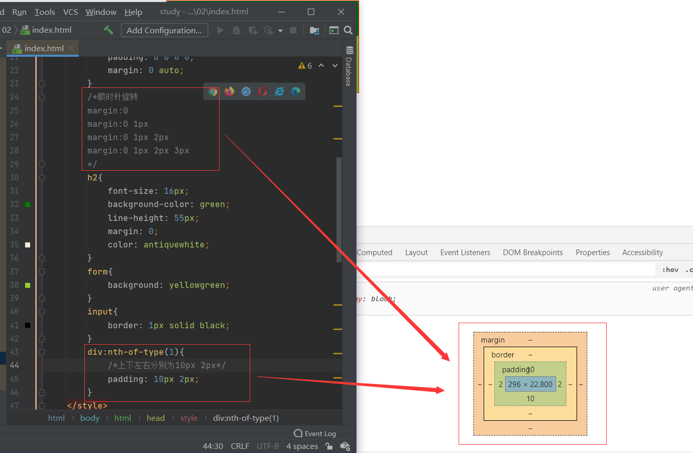
<!-- 外边距的妙用:居中元素
margin: 0 auto;
限制条件:块元素有固定宽度
-->
<style>
#box{
width: 300px;
border: 1px solid red;
/*padding:上 下 左 右*/
padding: 0 0 0 0;
margin: 0 auto;
}
/*顺时针旋转
margin:0
margin:0 1px
margin:0 1px 2px
margin:0 1px 2px 3px
*/
h2{
font-size: 16px;
background-color: green;
line-height: 55px;
margin: 0;
color: antiquewhite;
}
form{
background: yellowgreen;
}
input{
border: 1px solid black;
}
div:nth-of-type(1){
/*上下左右均为10px*/
padding: 10px 2px;
}
</style>
</head>
<body>
<div id="box">
<h2>会员登陆</h2>
<form action="#">
<div>
<span>
用户名:
</span>
<input type="text">
</div>
<div>
<span>
密码:
</span>
<input type="text">
</div>
<div>
<span>
邮箱:
</span>
<input type="text">
</div>
</form>
</div>
</body>
</html>
</body>
</html>
盒子的计算:元素究竟多大?
美工+前端
margin + border + padding + 内容宽度
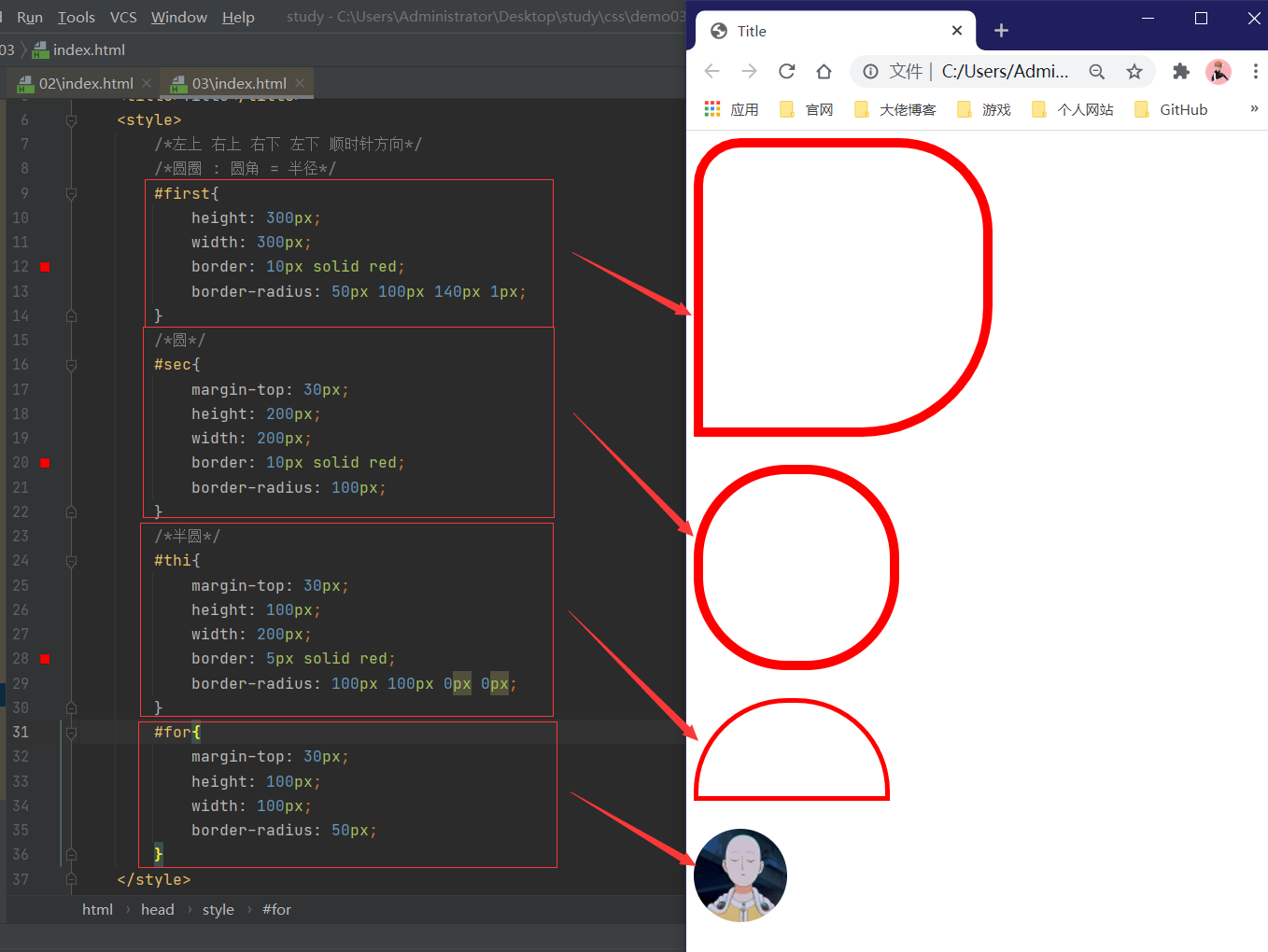
圆角边框
<!DOCTYPE html>
<html lang="en">
<head>
    <meta charset="UTF-8">
    <title>Title</title>
    <style>
        /*左上 右上 右下 左下 顺时针方向*/
        /*圆圈 : 圆角 = 半径*/
        #first{
            height: 300px;
            width: 300px;
            border: 10px solid red;
            border-radius: 50px 100px 140px 1px;
        }
        /*圆*/
        #sec{
            margin-top: 30px;
            height: 200px;
            width: 200px;
            border: 10px solid red;
            border-radius: 100px;
        }
        /*半圆*/
        #thi{
            margin-top: 30px;
            height: 100px;
            width: 200px;
            border: 5px solid red;
            border-radius: 100px 100px 0px 0px;
        }
        #for{
            margin-top: 30px;
            height: 100px;
            width: 100px;
            border-radius: 50px;
        }
    </style>
</head>
<body>

<div id="first">
</div>
<div id="sec">
</div>
<div id="thi">
</div>
<img src="01.jpg" alt="" id="for">
</body>
</html>
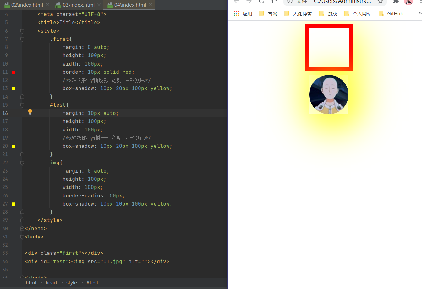
盒子阴影
margin:0 auto;问题:必须将图片放到存在有长宽度div中才可居中!!!
<!DOCTYPE html>
<html lang="en">
<head>
    <meta charset="UTF-8">
    <title>Title</title>
    <style>
        .first{
            margin: 0 auto;
            height: 100px;
            width: 100px;
            border: 10px solid red;
            /*x轴投影 y轴投影 宽度 阴影颜色*/
            box-shadow: 10px 20px 100px yellow;
        }
        #test{
            margin: 10px auto;
            height: 100px;
            width: 100px;
            /*x轴投影 y轴投影 宽度 阴影颜色*/
            box-shadow: 10px 20px 100px yellow;
        }
        img{
            margin: 0 auto;
            height: 100px;
            width: 100px;
            border-radius: 50px;
            box-shadow: 10px 10px 100px yellow;
        }
    </style>
</head>
<body>

<div class="first"></div>
<div id="test"><img src="01.jpg" alt=""></div>

</body>
</html>
八、浮动
标准文档流
- 块级元素:独占一行
h1-h6 p div ...
- 行内元素:不独占一行
span a img strong ...
行内元素可以被包含于块级元素中,反之,则不可以!
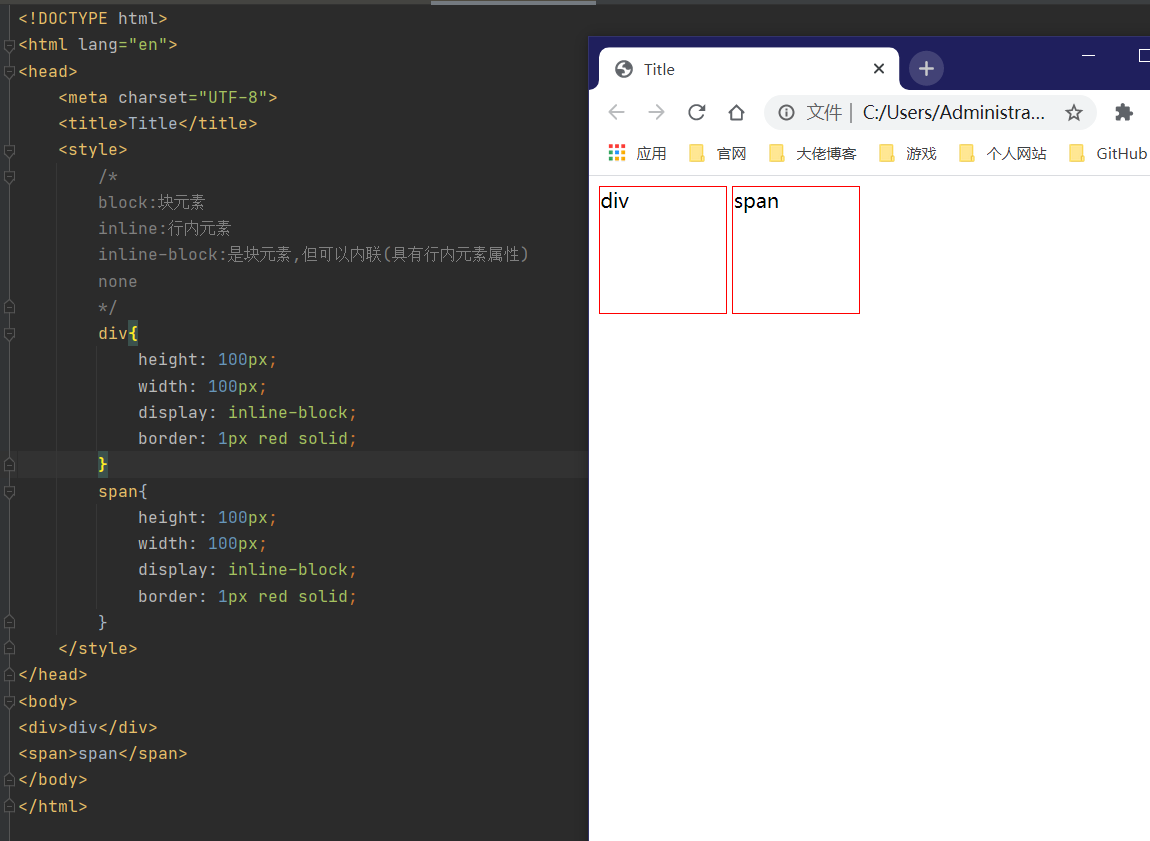
display
- block:块元素
- inline:行内元素
- inline-block:是块元素,但可以内联(具有行内元素属性)
- none
<!DOCTYPE html>
<html lang="en">
<head>
    <meta charset="UTF-8">
    <title>Title</title>
    <style>
        /*
        block:块元素
        inline:行内元素
        inline-block:是块元素,但可以内联(具有行内元素属性)
        none
        */
        div{
            height: 100px;
            width: 100px;
            display: inline-block;
            border: 1px red solid;
        }
        span{
            height: 100px;
            width: 100px;
            display: inline-block;
            border: 1px red solid;
        }
    </style>
</head>
<body>
<div>div</div>
<span>span</span>
</body>
</html>
<!DOCTYPE html>
<html lang="en">
<head>
    <meta charset="UTF-8">
    <title>Title</title>
    <style>
        /*
        block:块元素
        inline:行内元素
        inline-block:是块元素,但可以内联(具有行内元素属性)
        none
        */
        a{
           text-decoration: none;
            color: white;
        }
        div{
            height: 100px;
            width: 750px;
            display: inline-block;
            background-color: deepskyblue;
            border-radius: 20px;
        }
        span{
            text-align: center;
            text-decoration: dashed;
            margin:50px 0px 0px 0px;
            height: 50px;
            width: 100px;
            display: inline-block;
        }
        a:hover{
            font-size: 10px;
            font-weight: bold;
            color: blueviolet;
        }
    </style>
</head>
<body>
<div>
    <span><a href="#">主站</a></span>
    <span><a href="">番剧</a></span>
    <span><a href="">游戏中心</a></span>
    <span><a href="">直播</a></span>
    <span><a href="">会员购</a></span>
    <span><a href="">游戏</a></span>
    <span><a href="">漫画</a></span>
</div>

</body>
</html>
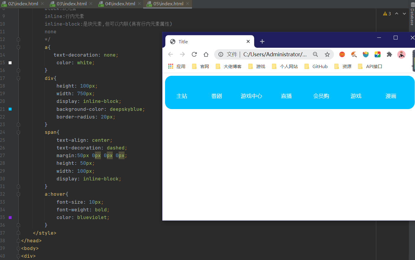
1.这个也是一种实现行内元素排列的方式,但是我们很多情况使用float。
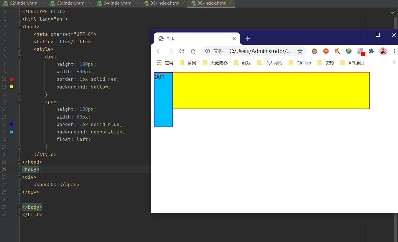
float
<!DOCTYPE html>
<html lang="en">
<head>
    <meta charset="UTF-8">
    <title>Title</title>
    <style>
        div{
            height: 100px;
            width: 600px;
            border: 1px solid red;
            background: yellow;
        }
        span{
            height: 150px;
            width: 50px;
            border: 1px solid blue;
            background: deepskyblue;
            float: left;
        }
    </style>
</head>
<body>
<div>
    <span>001</span>
</div>

</body>
</html>
父级边框塌陷的问题
clear
clear:right:右侧不允许有浮动元素clear:left:左侧不允许有浮动元素clear:both:两侧不允许有浮动元素clear:none
解决方案:
- 增加父级元素的高度
#con{
    border:1px #000 solid;
    height:800px;
}
- 增加一个空的div 清除浮动
<div class="clear"></div>

.clear{
    clear:both;
    margin:0;
    padding:0;
}
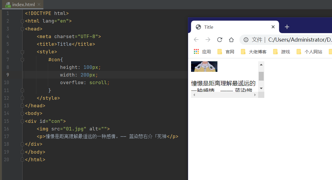
- overflow
- hidden:多余部分隐藏
- scroll:滚轮
- auto
 <style>
   #con{
        height: 100px;
        width: 200px;
        overflow: scroll;
    }
</style>
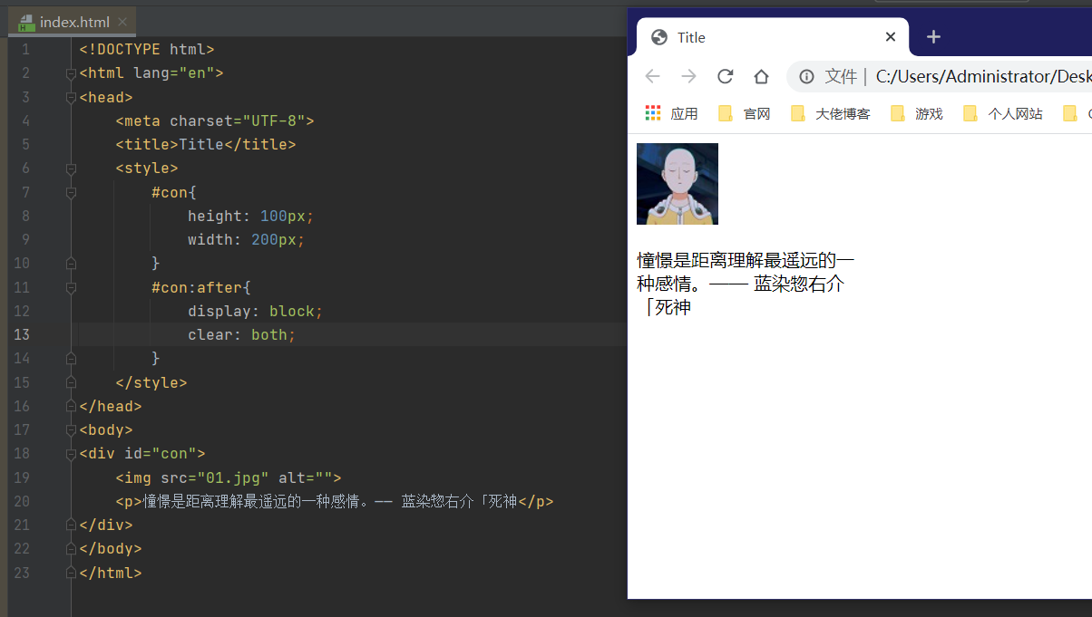
- 父类添加一个伪类:after
#con:after{
    content: '';
    display: block;
    clear: both;
}
小结
1.浮动元素后面增加空div
简单,代码中尽量避免空div
2.设置父元素的高度
简单,元素假设有了固定的高度,就会被限制
3.overflow
简单,下拉的一些场景避免使用
4.父类添加一个伪类: after(推荐)
写法稍微复杂一点,但是没有副作用,推荐使用
对比
- display
方向不可以控制 - float
浮动起来的话会脱离标准文档流,所以要解决父级边框塌陷的问题~
九、定位
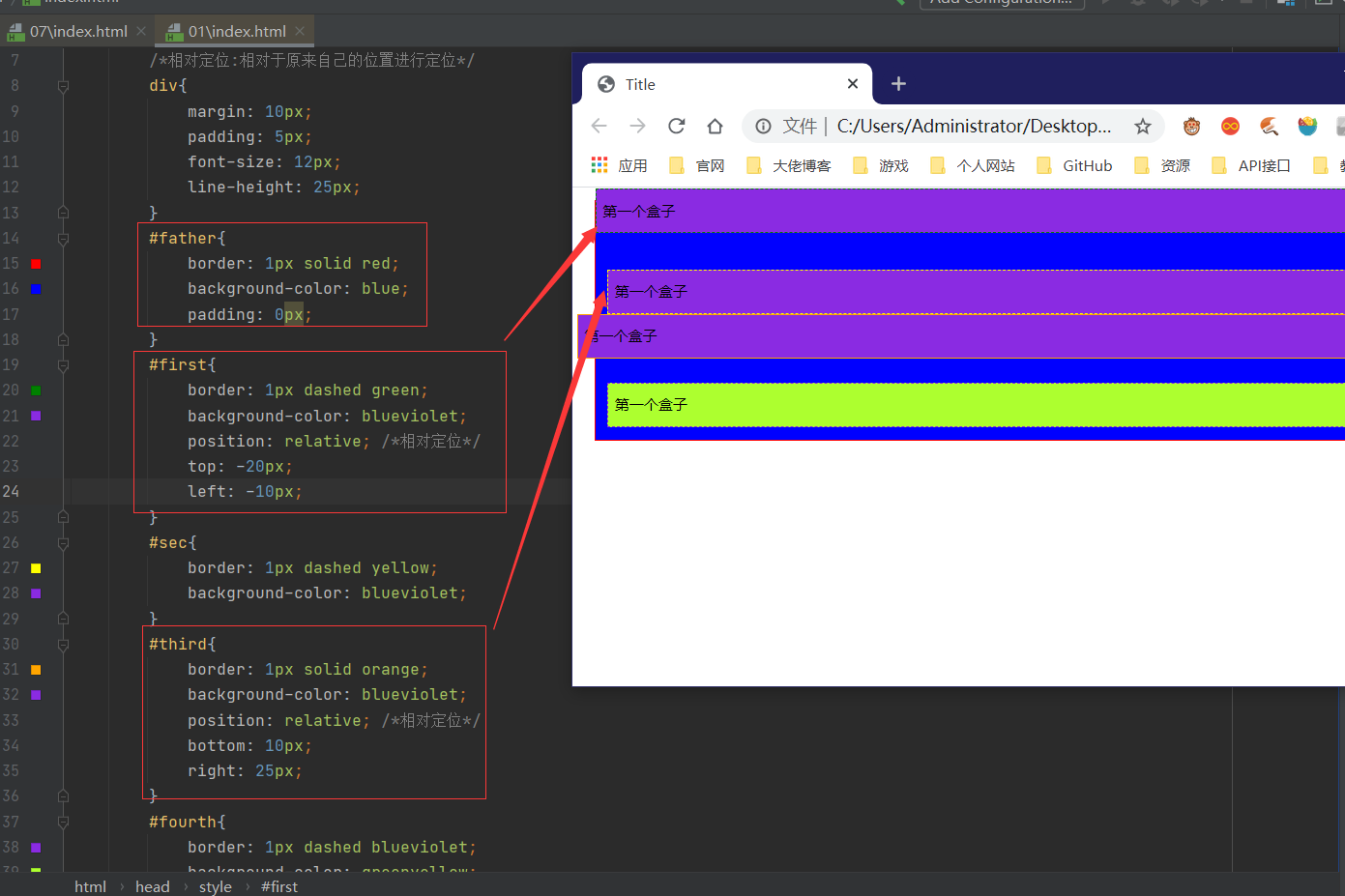
相对定位
相对定位:position:relative;
相对于原来的位置,进行指定的偏移
相对定位的话,他仍然在标准文档流中,原来的位置会被保留。
top:20px;
bottom:10px;
left:10px;
right:10px;
<!DOCTYPE html>
<html lang="en">
<head>
<meta charset="UTF-8">
<title>Title</title>
<style>
/*相对定位:相对于原来自己的位置进行定位*/
div{
margin: 10px;
padding: 5px;
font-size: 12px;
line-height: 25px;
}
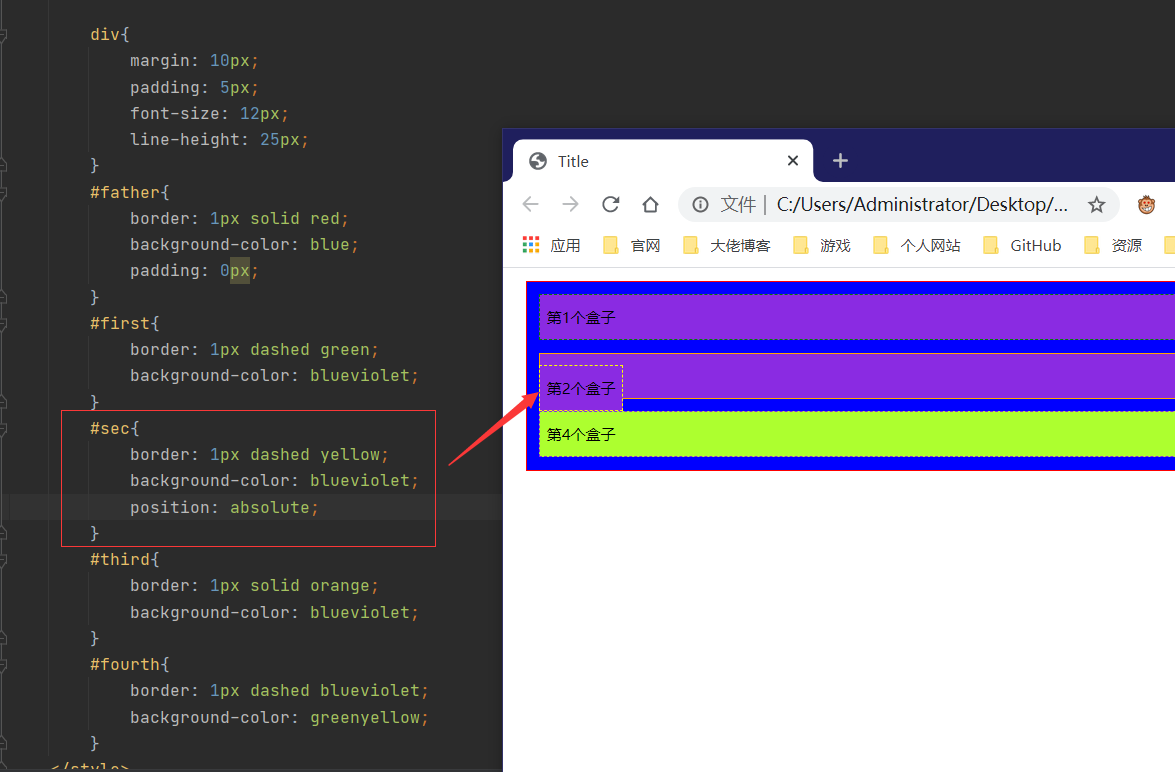
#father{
border: 1px solid red;
background-color: blue;
padding: 0px;
}
#first{
border: 1px dashed green;
background-color: blueviolet;
position: relative; /*相对定位*/
top: -20px;
left: -10px;
}
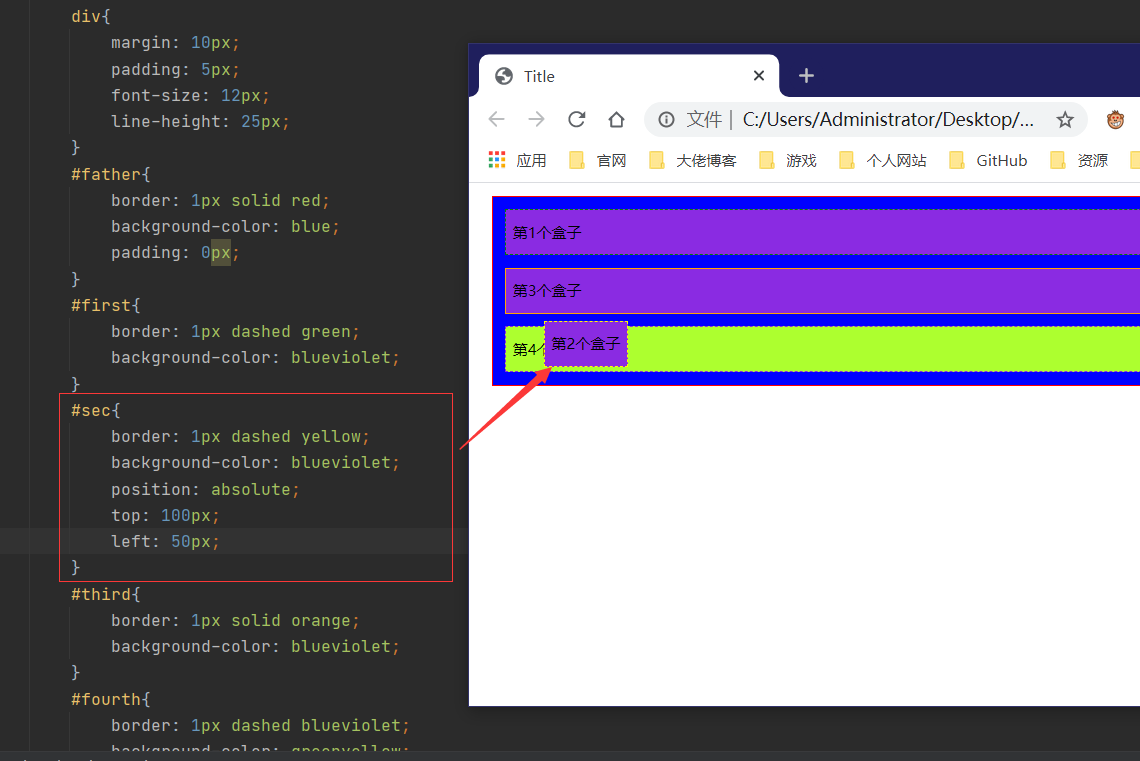
#sec{
border: 1px dashed yellow;
background-color: blueviolet;
}
#third{
border: 1px solid orange;
background-color: blueviolet;
position: relative; /*相对定位*/
bottom: 10px;
right: 25px;
}
#fourth{
border: 1px dashed blueviolet;
background-color: greenyellow;
}
</style>
</head>
<body>
<div id="father">
<div id="first">第一个盒子</div>
<div id="sec">第一个盒子</div>
<div id="third">第一个盒子</div>
<div id="fourth">第一个盒子</div>
</div>
</body>
</html>
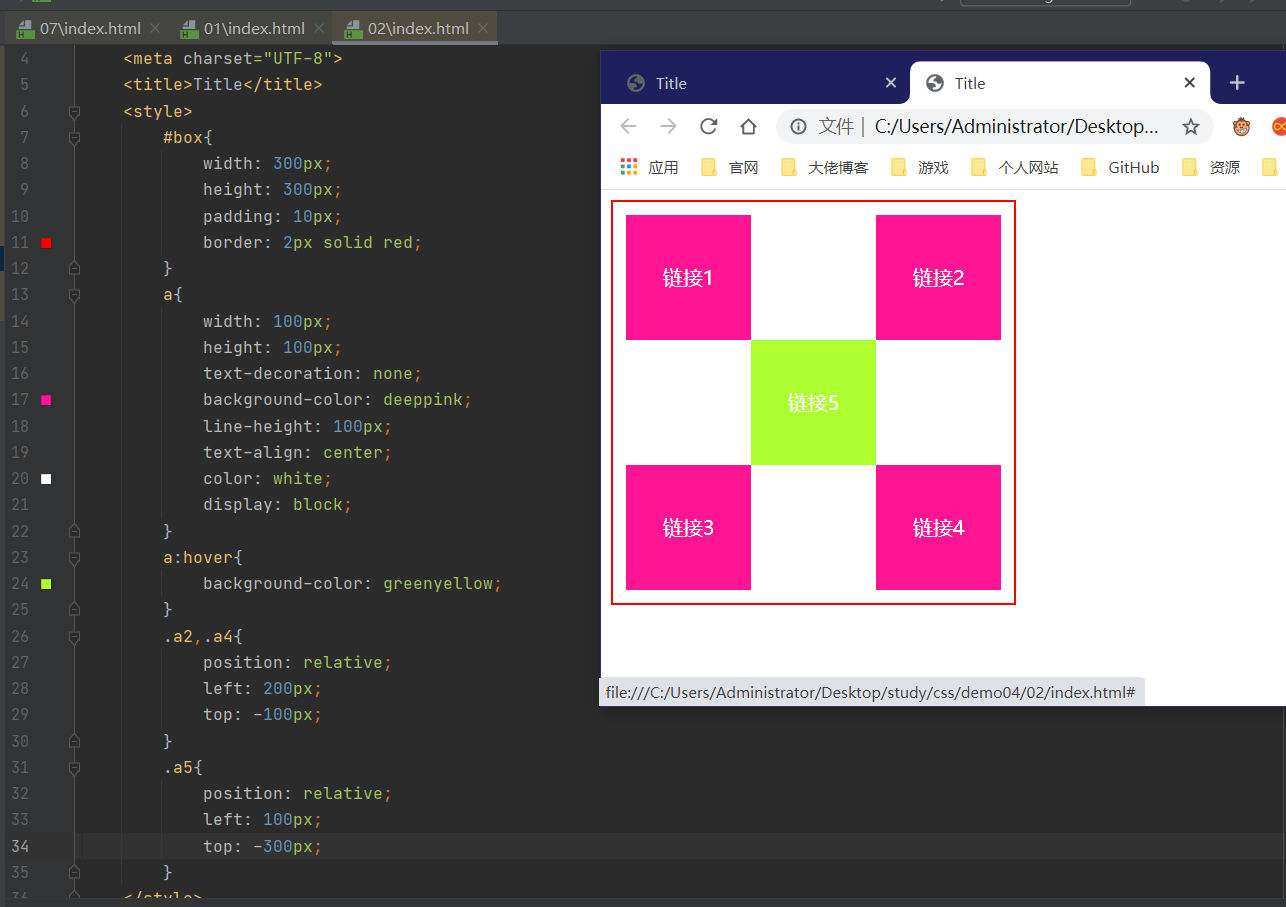
练习
<!DOCTYPE html>
<html lang="en">
<head>
    <meta charset="UTF-8">
    <title>Title</title>
    <style>
        #box{
            width: 300px;
            height: 300px;
            padding: 10px;
            border: 2px solid red;
        }
        a{
            width: 100px;
            height: 100px;
            text-decoration: none;
            background-color: deeppink;
            line-height: 100px;
            text-align: center;
            color: white;
            display: block;
        }
        a:hover{
            background-color: greenyellow;
        }
        .a2,.a4{
            position: relative;
            left: 200px;
            top: -100px;
        }
        .a5{
            position: relative;
            left: 100px;
            top: -300px;
        }
    </style>
</head>
<body>
<div id="box">
    <a class="a1" href="#">链接1</a>
    <a class="a2" href="#">链接2</a>
    <a class="a3" href="#">链接3</a>
    <a class="a4" href="#">链接4</a>
    <a class="a5" href="#">链接5</a>
</div>
</body>
</html>
绝对定位
定位:基于xxx定位,上下左右~
1、没有父级元素定位的前提下,相对于浏览器定位
2、假设父级元素存在定位,我们通常会相对于父级元素进行偏移~
3、在父级元素范围内移动
相对于父级或浏览器的位置,进行指定的偏移,绝对定位的话,它不在在标准文档流中,原来的位置不会被保留
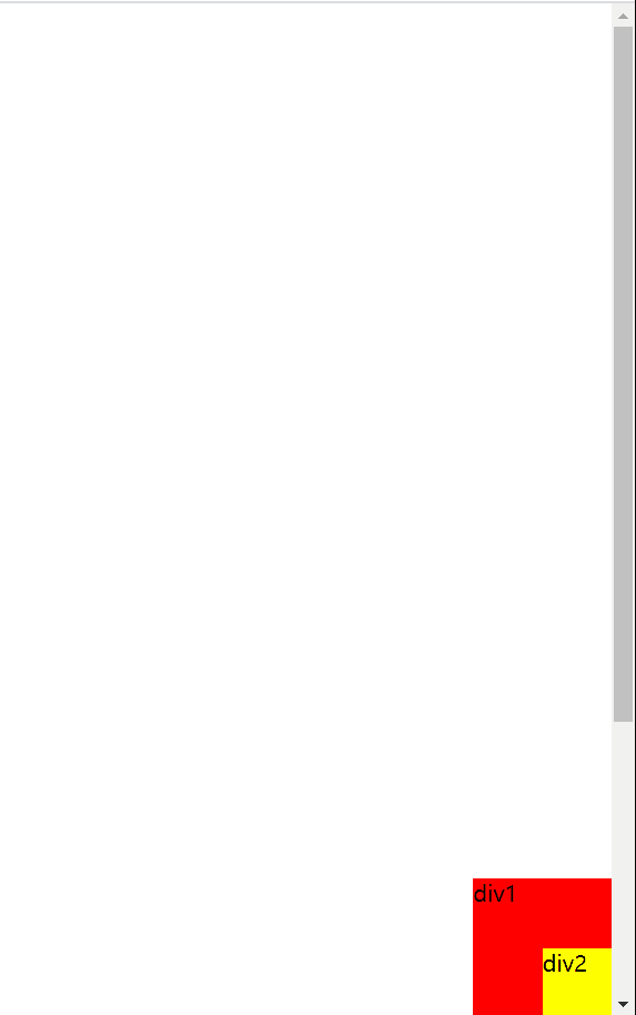
固定定位
<style>
        body{
            height: 1000px;

        }
        div:nth-of-type(1){/*绝对定位*/
            width: 100px;
            height: 100px;
            background-color: red;
            position: absolute;
            right: 0;
            bottom: 0;
        }
        div:nth-of-type(2){
            /*固定定位*/
            width: 50px;
            height: 50px;
            background-color: yellow;
            position: fixed;
            right: 0;
            bottom: 0;
        }
</style>
z-index
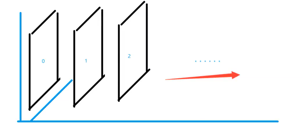
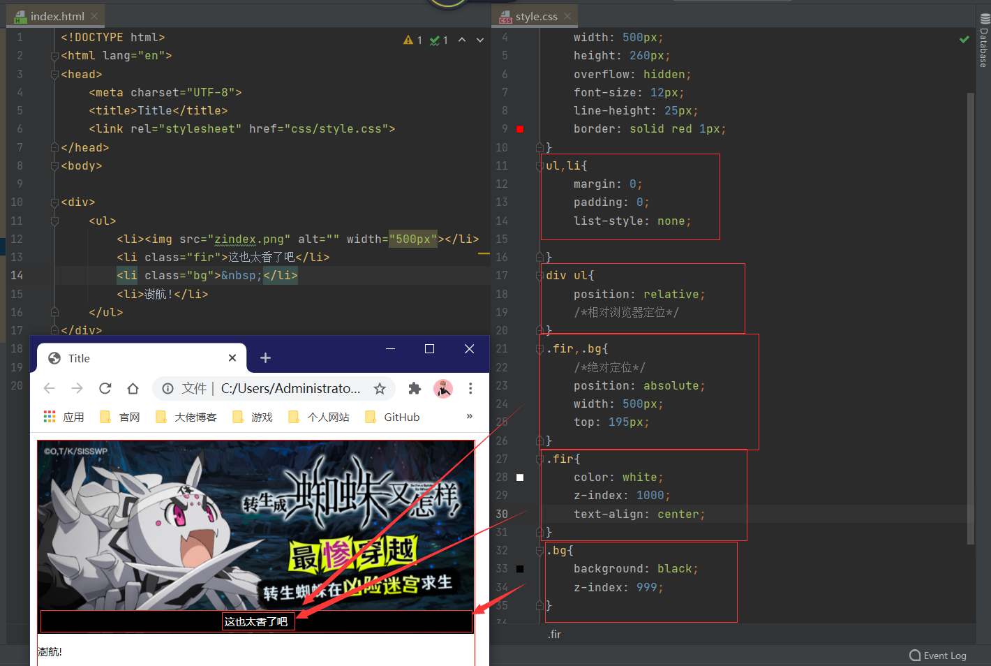
层级概念-相当于PS的层级概念
<!DOCTYPE html>
<html lang="en">
<head>
<meta charset="UTF-8">
<title>Title</title>
<link rel="stylesheet" href="css/style.css">
</head>
<body>
<div>
<ul>
<li><img src="zindex.png" alt="" width="500px"></li>
<li class="fir">这也太香了吧</li>
<li class="bg"> </li>
<li>澍航!</li>
</ul>
</div>
</body>
</html>
div{
    padding: 0;
    margin: 0;
    width: 500px;
    height: 260px;
    overflow: hidden;
    font-size: 12px;
    line-height: 25px;
    border: solid red 1px;
}
ul,li{
    margin: 0;
    padding: 0;
    list-style: none;

}
div ul{
    position: relative;
    /*相对浏览器定位*/
}
.fir,.bg{
    /*绝对定位*/
    position: absolute;
    width: 500px;
    top: 195px;
}
.fir{
    color: white;
    z-index: 1000;
    text-align: center;
}
.bg{
    background: black;
    z-index: 999;
    opacity: 0.5;/*可用作网页透明度*/
}
十、动画
十一、总结


【推荐】国内首个AI IDE,深度理解中文开发场景,立即下载体验Trae
【推荐】编程新体验,更懂你的AI,立即体验豆包MarsCode编程助手
【推荐】抖音旗下AI助手豆包,你的智能百科全书,全免费不限次数
【推荐】轻量又高性能的 SSH 工具 IShell:AI 加持,快人一步
· TypeScript + Deepseek 打造卜卦网站:技术与玄学的结合
· Manus的开源复刻OpenManus初探
· AI 智能体引爆开源社区「GitHub 热点速览」
· 三行代码完成国际化适配,妙~啊~
· .NET Core 中如何实现缓存的预热?