shape selector 背景 圆形 矩形 圆环
目录
目录
shape selector 背景 圆形 矩形 圆环
selector
支持的状态
我们在定义一个drawable的时候可以通过xml定义drawable对象,它能使一个图片能在不同的状态下显示不同的图案,具体支持以下类型
- android:state_pressed 是否按下,如一个按钮触摸或者点击。☆☆☆
- android:state_focused 是否取得焦点,比如用户选择了一个文本框。
- android:state_hovered 光标是否悬停,通常与focused相同,它是4.0的新特性
- android:state_selected 被选中,它与focus 并不完全一样,如一个list view 被选中的时候,它里面的各个子组件可能通过方向键,被选中了。
- android:state_checkable 组件是否能被check。如:RadioButton是可以被check的。
- android:state_checked 被checked了,如:一个【RadioButton】可以被check了。☆☆☆
- android:state_enabled 能够接受触摸或者点击事件,默认为true。
- android:state_activated 被激活(这个麻烦举个例子,不是特明白)
- android:state_window_focused 应用程序是否在前台,当有通知栏被拉下来或者一个对话框弹出的时候应用程序就不在前台了
注意
- 如果有多个item,那么程序将自动【从上到下】进行匹配,最先匹配的将得到应用。(不是通过最佳匹配)
- 如果一个item没有任何的状态说明,那么它将可以和任何一个状态匹配
- 所以,无状态的item一定要放在最下面。
案例
颜色--不能作为背景资源
android:textColor="@drawable/_color_selector"
<?xml version="1.0" encoding="utf-8"?>
<selector xmlns:android="http://schemas.android.com/apk/res/android">
    <item android:state_pressed="true" android:color="@color/_color_press"/>
    <item android:state_enabled="false" android:color="@color/_color_enable/>
    <item android:color="@color/_color"/>
</selector>
图片--背景资源
android:background="@drawable/_bg_selector"
<?xml version="1.0" encoding="utf-8"?>
<selector xmlns:android="http://schemas.android.com/apk/res/android">
    <item android:drawable="@drawable/_bg_press" android:state_pressed="true"/>
    <item android:drawable="@drawable/_bg_select" android:state_selected="true"/>
    <item android:drawable="@drawable/_bg"/>
</selector>
.9 和 shape 图片--背景资源
android:background="@drawable/_bg_selector"
<?xml version="1.0" encoding="utf-8"?>
<selector xmlns:android="http://schemas.android.com/apk/res/android">
    <item android:state_pressed="true"><nine-patch android:src="@drawable/_press" ></nine>
    </item>
    <item><shape>
            <corners android:radius="3dp" ></corners>
            <stroke android:width="1dp" android:color="@color/line_divider" ></stroke>
        </shape></item>
</selector
shape 基本使用
如果在某些手机中使用 shape 出现黑色填充背景,设置
<solid android:color="@color/transparent"/>即可。
常用属性
- shape 定义shape的形状,默认为矩形,可以设置为矩形(rectangle)、椭圆形(oval)、线性形状(line)、环形(ring)
- corners 圆角半径,在shape为rectangle时有用,可以分别设置四个角的圆角半径
- solid 固定的填充颜色,不能与渐变色gradient一起使用;如果出现黑色填充背景等异常效果,可以把solid设为透明试试
- stroke 描边、边框,可以设置描边线条的颜色、宽度和样式
- gradient 渐变填充颜色,这个稍微复杂点
- padding 内边距大小,可以分别设置四个方位的内边距大小
圆角半径 corners
- android:radius 整型 半径
- android:topLeftRadius 整型 左上角半径
- android:topRightRadius 整型 右上角半径
- android:bottomLeftRadius 整型 左下角半径
- android:bottomRightRadius 整型 右下角半径
描边、边框 stroke
- android:width 整型 描边的宽度;实线的宽度
- android:color 颜色值 描边的颜色;实线的颜色
- android:dashWidth [dash:破折号、虚线]表示描边为虚线时,虚线的长度, 不设置或设为0时,表示实线
- android:dashGap [gap:间隔]表示描边为虚线时,虚线之间的间隙宽度, 不设置或设为0时,表示实线
渐变色 gradient
- android:startColor 起始颜色;android:endColor 结束颜色;android:centerColor 中间的颜色
- android:angle 渐变起始角度,然后逆时针方向转,值必须为45的整数倍。=0时(默认),从左向右;=90时,从下往上。该属性只有在type=linear(默认)情况下起作用
- android:type 渐变类型,取值有三个: linear线性渐变(默认),radial放射性渐变(以开始色为中心),sweep(扫描线式的渐变)
- android:gradientRadius 渐变色半径,整型或百分比,当 android:type="radial" 时【必须】使用,否则会报错
- android:useLevel boolean值,如果当做是LevelListDrawable使用时值为true(无渐变),否则为false(默认值,有渐变色)
- android:centerX 整型 渐变中心X点坐标的相对位置
- android:centerY 整型 渐变中心Y点坐标的相对位置
内边距大小 padding
- android:left 整型 左内边距
- android:top 整型 上内边距
- android:right 整型 右内边距
- android:bottom 整型 下内边距
图形大小 size
指定图形的宽高;只有控件指定的是wrap_content时,这个属性才会起作用
- android:width 宽度
- android:height 高度
ring的其他属性
下面的属性只有在android:shape="ring"时可用:
- android:innerRadius 内环的半径
- android:thickness 环的厚度
- android:useLevel boolean值,如果当做是LevelListDrawable使用时值为true(默认值),否则为false
- android:innerRadiusRatio 代表"环的宽度/内环半径"的值,比如环的宽度为50,比例为2.5,那么内环半径为20
- android:thicknessRatio 代表"环的宽度/环的厚度"的值
shape 案例
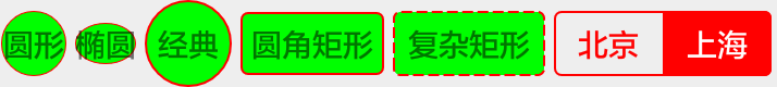
圆形与矩形
<LinearLayout xmlns:android="http://schemas.android.com/apk/res/android"
    android:layout_width="match_parent"
    android:layout_height="wrap_content"
    android:layout_marginTop="10dp"
    android:gravity="center_vertical"
    android:orientation="horizontal" >
    <TextView
        android:layout_width="30dp"
        android:layout_height="30dp"
        android:layout_margin="2dp"
        android:background="@drawable/shape_oval_simple"
        android:gravity="center"
        android:text="圆形" />
    <!-- 如果设置为wrap_content,会因为字体宽高不相同导致圆被挤压成为椭圆 -->
    <TextView
        android:layout_width="wrap_content"
        android:layout_height="wrap_content"
        android:layout_margin="2dp"
        android:background="@drawable/shape_oval_simple"
        android:gravity="center"
        android:text="椭圆" />
    <TextView
        android:layout_width="40dp"
        android:layout_height="40dp"
        android:layout_margin="2dp"
        android:background="@drawable/shape_oval_popular"
        android:gravity="center"
        android:text="经典" />
    <TextView
        android:layout_width="wrap_content"
        android:layout_height="wrap_content"
        android:layout_margin="2dp"
        android:background="@drawable/shape_rectangle_popular"
        android:gravity="center"
        android:padding="5dp"
        android:text="圆角矩形" />
    <TextView
        android:layout_width="70dp"
        android:layout_height="30dp"
        android:layout_margin="2dp"
        android:background="@drawable/shape_rectangle_complex"
        android:gravity="center"
        android:text="复杂矩形" />
    <LinearLayout
        android:layout_width="100dp"
        android:layout_height="30dp"
        android:layout_margin="2dp"
        android:background="@drawable/shape_rectangle_parent"
        android:orientation="horizontal" >
        <TextView
            android:id="@+id/left"
            android:layout_width="0dp"
            android:layout_height="match_parent"
            android:layout_weight="1"
            android:background="@drawable/shape_rectangle_l"
            android:gravity="center"
            android:text="北京"
            android:textColor="@color/white" />
        <TextView
            android:id="@+id/right"
            android:layout_width="0dp"
            android:layout_height="match_parent"
            android:layout_weight="1"
            android:gravity="center"
            android:text="上海"
            android:textColor="@color/red" />
    </LinearLayout>
</LinearLayout>
圆环、环形
<LinearLayout xmlns:android="http://schemas.android.com/apk/res/android"
android:layout_width="match_parent"
android:layout_height="wrap_content"
android:layout_marginTop="10dp"
android:gravity="center_vertical"
android:orientation="horizontal" >
<TextView
android:layout_width="40dp"
android:layout_height="40dp"
android:layout_margin="2dp"
android:background="@drawable/shape_ring_simple"
android:gravity="center"
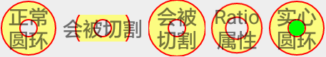
android:text="正常圆环" />
<!-- 如果设置为wrap_content,会导致圆环外缘线被切割掉 -->
<TextView
android:layout_width="wrap_content"
android:layout_height="wrap_content"
android:layout_margin="2dp"
android:background="@drawable/shape_ring_simple"
android:gravity="center"
android:text="会被切割" />
<!-- 如果layout_width或layout_height小于圆环中定义的大小,也会导致圆环外缘线被切割掉 -->
<TextView
android:id="@+id/tv_42"
android:layout_width="40dp"
android:layout_height="40dp"
android:layout_margin="2dp"
android:background="@drawable/shape_ring_failed"
android:gravity="center"
android:text="会被切割" />
<TextView
android:id="@+id/tv_43"
android:layout_width="40dp"
android:layout_height="40dp"
android:background="@drawable/shape_ring_ratio"
android:gravity="center"
android:text="Ratio属性" />
<RelativeLayout
android:layout_width="wrap_content"
android:layout_height="wrap_content"
android:layout_margin="2dp" >
<TextView
android:layout_width="40dp"
android:layout_height="40dp"
android:layout_centerInParent="true"
android:background="@drawable/shape_ring_simple"
android:gravity="center"
android:text="实心圆环" />
<!-- View的宽高应该为:【2*innerRadius】-【stroke_width/2】 是否要除以2我也不确定-->
<View
android:layout_width="11dp"
android:layout_height="11dp"
android:layout_centerInParent="true"
android:background="@drawable/shape_oval" />
</RelativeLayout>
</LinearLayout>
渐变
<LinearLayout xmlns:android="http://schemas.android.com/apk/res/android"
android:layout_width="match_parent"
android:layout_height="wrap_content"
android:layout_marginTop="10dp"
android:gravity="center_vertical"
android:orientation="horizontal" >
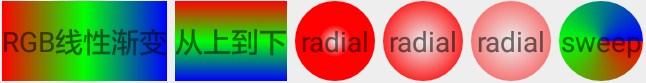
<TextView
android:layout_width="wrap_content"
android:layout_height="40dp"
android:layout_margin="2dp"
android:background="@drawable/shape_gradient_simple"
android:gravity="center"
android:text="RGB线性渐变" />
<!-- angle:渐变起始角度,然后逆时针方向转,值必须为45的整数倍。=0时(默认),从左向右;=90时,从下往上。该属性只有在type=linear(默认)情况下起作用 -->
<TextView
android:layout_width="wrap_content"
android:layout_height="40dp"
android:layout_margin="2dp"
android:background="@drawable/shape_gradient_angle"
android:gravity="center"
android:text="从上到下" />
<!-- type:渐变类型, linear 线性渐变,默认; radial 放射性渐变,以开始色为中心; sweep 扫描线式的渐变。 -->
<!-- gradientRadius:渐变色半径,整型或百分比,当 android:type="radial" 时【必须】使用,否则会报错。 -->
<TextView
android:layout_width="40dp"
android:layout_height="40dp"
android:layout_margin="2dp"
android:background="@drawable/shape_gradient_type_radial_20"
android:gravity="center"
android:text="radial" />
<TextView
android:layout_width="40dp"
android:layout_height="40dp"
android:layout_margin="2dp"
android:background="@drawable/shape_gradient_type_radial_60"
android:gravity="center"
android:text="radial" />
<TextView
android:layout_width="40dp"
android:layout_height="40dp"
android:layout_margin="2dp"
android:background="@drawable/shape_gradient_type_radial_99"
android:gravity="center"
android:text="radial" />
<TextView
android:layout_width="42dp"
android:layout_height="40dp"
android:layout_margin="2dp"
android:background="@drawable/shape_gradient_type_sweep"
android:gravity="center"
android:text="sweep" />
</LinearLayout>
代码中设置 shape
tvContent.setBackground(getDrawable(mTemplateTag.color));
private GradientDrawable getDrawable(int bgColor) {
    GradientDrawable gradientDrawable = new GradientDrawable();
    gradientDrawable.setColor(bgColor);
    gradientDrawable.setCornerRadius(DisplayUtil.dip2px(ApplicationContext.getContext(), 4));
    return gradientDrawable;
}
可设置圆形、半圆、圆角的自定义TV
/**
 * 可设置圆形,半圆,圆角的textview
 */
public class ShapeTextView extends android.support.v7.widget.AppCompatTextView {

    private int TOUCH_SLOP = ViewConfiguration.get(ApplicationContext.getContext()).getScaledTouchSlop();
    private float startX;
    private float startY;
    private OnClickListener mOnClickListener;
    private static final int EXPAND_SPEC = MeasureSpec.makeMeasureSpec(Integer.MAX_VALUE >> 2, MeasureSpec.AT_MOST);

    //默认各种状态圆角的大小都一样,
    private int topLeftRadius;         //上左圆角
    private int topRightRadius;        //上右圆角
    private int bottomLeftRadius;       //下左圆角
    private int bottomRightRadius;     //下右圆角

    private int radius;                //背景圆角,这个是用

    private int normalStartBgColor;   //正常的开始颜色
    private int normalEndBgColor;     //正常的结束颜色
    private int normalBgAngle;        //正常的角度
    private int normalBgColor;        //正常的背景色
    private int normalStorkeWidth;    //未点击的边框宽度
    private int normalStorkeColor;    //未点击的边框色
    private int normaltextColor;      //未点击时文字颜色

    private int pressedStartBgColor;   //点击时开始颜色
    private int pressedEndBgColor;     //点击时结束颜色
    private int pressedBgAngle;        //点击时渐变角度
    private int pressedBgColor;       //点击时的背景色
    private int pressedStorkeWidth;   //点击时的边框宽度
    private int pressedStorkeColor;   //点击时的边框颜色
    private int pressedTextColor;     //点击时文字颜色

    private int selectedStartBgColor;   //选中的开始颜色
    private int selectedEndBgColor;     //选中结束颜色
    private int selectedBgAngle;        //选中的角度
    private int selectedTextColor;   //选中变换的颜色
    private int selectedStorkeWidth; //选中的边框宽度
    private int selectedStorkeColor; //选中的边框色
    private int selectedBgColor;     //选中的背景色

    public ShapeTextView(Context context) {
        this(context, null);
    }

    public ShapeTextView(Context context, AttributeSet attrs) {
        this(context, attrs, 0);
    }

    public ShapeTextView(Context context, AttributeSet attrs, int defStyleAttr) {
        super(context, attrs, defStyleAttr);
        TypedArray a = context.obtainStyledAttributes(attrs, R.styleable.ShapeTextView);

        radius = a.getDimensionPixelOffset(R.styleable.ShapeTextView_allradius, 0);  //圆角

        normalBgColor = a.getColor(R.styleable.ShapeTextView_normalBgColor, Color.TRANSPARENT);
        normalStorkeWidth = a.getDimensionPixelOffset(R.styleable.ShapeTextView_normalStorkeWidth, Utils.dpToPx(1)); //默认边框1dp
        normalStorkeColor = a.getColor(R.styleable.ShapeTextView_normalStorkeColor, Color.TRANSPARENT);   //边框默认透明
        normaltextColor = a.getColor(R.styleable.ShapeTextView_normalTextColor, Color.BLACK);       //字体默认为黑色
        normalStartBgColor = a.getColor(R.styleable.ShapeTextView_normalBgStartColor, Color.TRANSPARENT);       //字体默认为黑色
        normalEndBgColor = a.getColor(R.styleable.ShapeTextView_normalBgEndColor, Color.TRANSPARENT);       //字体默认为黑色
        normalBgAngle = a.getInteger(R.styleable.ShapeTextView_normalAngle, 0); //默认边框1dp

        pressedBgColor = a.getColor(R.styleable.ShapeTextView_pressedBgColor, Color.TRANSPARENT);
        pressedStorkeWidth = a.getDimensionPixelOffset(R.styleable.ShapeTextView_pressedStorkeWidth, Utils.dpToPx(1));//默认边框1dp
        pressedStorkeColor = a.getColor(R.styleable.ShapeTextView_pressedStorkeColor, Color.TRANSPARENT);     //边框默认透明
        pressedTextColor = a.getColor(R.styleable.ShapeTextView_pressedTextColor, Color.BLACK);         //字体默认为黑色
        pressedStartBgColor = a.getColor(R.styleable.ShapeTextView_pressedBgStartColor, Color.TRANSPARENT);       //字体默认为黑色
        pressedEndBgColor = a.getColor(R.styleable.ShapeTextView_pressedBgEndColor, Color.TRANSPARENT);       //字体默认为黑色
        pressedBgAngle = a.getInteger(R.styleable.ShapeTextView_pressedAngle, 0); //默认边框1dp

        topLeftRadius = a.getDimensionPixelOffset(R.styleable.ShapeTextView_topLeftRadius, 0);
        topRightRadius = a.getDimensionPixelOffset(R.styleable.ShapeTextView_topRightRadius, 0);
        bottomLeftRadius = a.getDimensionPixelOffset(R.styleable.ShapeTextView_bottomLeftRadius, 0);
        bottomRightRadius = a.getDimensionPixelOffset(R.styleable.ShapeTextView_bottomLeftRadius, 0);

        selectedBgColor = a.getColor(R.styleable.ShapeTextView_selectedBgColor, Color.TRANSPARENT);
        selectedStorkeWidth = a.getDimensionPixelOffset(R.styleable.ShapeTextView_selectedStorkeWidth, Utils.dpToPx(1));//默认边框1dp
        selectedStorkeColor = a.getColor(R.styleable.ShapeTextView_selectedStorkeColor, Color.TRANSPARENT);   //边框默认透明
        selectedTextColor = a.getColor(R.styleable.ShapeTextView_selectedTextColor, Color.BLACK);       //字体默认为黑色
        selectedStartBgColor = a.getColor(R.styleable.ShapeTextView_selectedBgStartColor, Color.TRANSPARENT);       //字体默认为黑色
        selectedEndBgColor = a.getColor(R.styleable.ShapeTextView_selectedBgEndColor, Color.TRANSPARENT);       //字体默认为黑色
        selectedBgAngle = a.getInteger(R.styleable.ShapeTextView_selectedAngle, 0); //默认边框1dp

        a.recycle();

        setSelect();
    }

    @TargetApi(Build.VERSION_CODES.JELLY_BEAN)
    private void setSelect() {
        normaltextColor = getCurrentTextColor();
        GradientDrawable normal = null;
        GradientDrawable pressed = null;
        GradientDrawable selected = null;

        if (radius != 0) {
            normal = getDrawable(radius, normalBgColor, normalStorkeWidth, normalStorkeColor,
                    normalStartBgColor,normalEndBgColor,normalBgAngle);
            pressed = getDrawable(radius, pressedBgColor, pressedStorkeWidth, pressedStorkeColor,
                    pressedStartBgColor,pressedEndBgColor,pressedBgAngle);
            selected = getDrawable(radius, selectedBgColor, selectedStorkeWidth, selectedStorkeColor,
                    selectedStartBgColor,selectedEndBgColor,selectedBgAngle);
        } else {
            normal = getDrawable(topLeftRadius, topRightRadius, bottomLeftRadius, bottomRightRadius,
                    normalBgColor, normalStorkeWidth, normalStorkeColor,normalStartBgColor,normalEndBgColor,normalBgAngle);
            pressed = getDrawable(topLeftRadius, topRightRadius, bottomLeftRadius, bottomRightRadius,
                    pressedBgColor, pressedStorkeWidth, pressedStorkeColor,pressedStartBgColor,pressedEndBgColor,pressedBgAngle);
            selected = getDrawable(topLeftRadius, topRightRadius, bottomLeftRadius, bottomRightRadius,
                    selectedBgColor, selectedStorkeWidth, selectedStorkeColor,selectedStartBgColor,selectedEndBgColor,selectedBgAngle);
        }

        //没有设置点击背景色,表示不设置Selector 只设置Draw
        if (pressedBgColor != 0) {
            StateListDrawable selector = getSelector(normal, pressed, selected);
            setBackground(selector);
        } else {
            setBackground(normal);
        }
    }

    /**
     * 设置是否是被选择了,这里要手动设置是否选择的状态
     */
    public void setTextViewSelect(boolean isSelected) {
        setSelected(isSelected);
        if (isSelected == true) {
            setTextColor(selectedTextColor);
        } else {
            setTextColor(normaltextColor);
        }
    }

    /**
     * 重写了onclick的监听
     */
    @Override
    public void setOnClickListener(OnClickListener listener) {
        mOnClickListener = listener;
    }

    @Override
    public boolean onTouchEvent(MotionEvent event) {
        if (pressedTextColor != 0) {
            switch (event.getAction()) {
                case MotionEvent.ACTION_DOWN:
                    startX = event.getX();
                    startY = event.getY();
                    setTextColor(pressedTextColor);
                    break;
                case MotionEvent.ACTION_UP:
                    setTextColor(normaltextColor);
                    float endX = event.getX();
                    float endY = event.getY();
                    if (isClick(startX, endX, startY, endY)) {
                        if (mOnClickListener != null) {
                            mOnClickListener.onClick(this);
                        }
                    }
                    break;
            }
            return true;
        }
        return super.onTouchEvent(event);
    }

    /**
     * 设置背景选择器
     */
    private StateListDrawable getSelector(Drawable normalDraw, Drawable pressedDraw, Drawable selected) {
        StateListDrawable stateListDrawable = new StateListDrawable();
        stateListDrawable.addState(new int[]{android.R.attr.state_pressed}, pressedDraw);
        stateListDrawable.addState(new int[]{android.R.attr.state_enabled}, normalDraw);
        stateListDrawable.addState(new int[]{android.R.attr.state_selected}, selected);
        return stateListDrawable;
    }

    /**
     * 设置shape,这里设置一个radius就好了
     */
    private GradientDrawable getDrawable(int radius, int bgColor, int storkeWidth, int strokeColor ,
                                         int startColor, int endColor, int angle) {
        GradientDrawable gradientDrawable;
        if (startColor != 0 && endColor != 0) {
            int[] colors = {startColor, endColor};
            gradientDrawable = new GradientDrawable(getOrientationByAngle(angle),colors);
        }else {
            gradientDrawable = new GradientDrawable();
            gradientDrawable.setColor(bgColor);
        }
        gradientDrawable.setCornerRadius(radius);
        gradientDrawable.setStroke(storkeWidth, strokeColor);
        return gradientDrawable;
    }

    /**
     * 通过angle的值,来转换成枚举标量
     */
    public GradientDrawable.Orientation getOrientationByAngle(int angle) {
        GradientDrawable.Orientation orientation = GradientDrawable.Orientation.LEFT_RIGHT;
        switch (angle) {
            case 0:
                orientation = GradientDrawable.Orientation.LEFT_RIGHT;
                break;
            case 45:
                orientation = GradientDrawable.Orientation.BL_TR;
                break;
            case 90:
                orientation = GradientDrawable.Orientation.BOTTOM_TOP;
                break;
            case 135:
                orientation = GradientDrawable.Orientation.BR_TL;
                break;
            case 180:
                orientation = GradientDrawable.Orientation.RIGHT_LEFT;
                break;
            case 225:
                orientation = GradientDrawable.Orientation.TR_BL;
                break;
            case 270:
                orientation = GradientDrawable.Orientation.TOP_BOTTOM;
                break;
            case 315:
                orientation = GradientDrawable.Orientation.TL_BR;
                break;
        }
        return orientation;
    }

    /**
     * 设置shape,分别设置所有的边角
     */
    private GradientDrawable getDrawable(float topLeftRadius, float topRightRadius, float bottomLeftRadius,
                                         float bottomRightRadius, int bgColor, int storkeWidth, int strokeColor,
                                                 int startColor, int endColor, int angle) {
        GradientDrawable gradientDrawable;

        //top-left, top-right, bottom-right, bottom-left
        float[] radius = new float[]{topLeftRadius, topLeftRadius, topRightRadius, topRightRadius,
                bottomLeftRadius, bottomLeftRadius, bottomRightRadius, bottomRightRadius};
        //这个方法传入的数组长度必须是 > = 8 否则会抛数值下标越界  数组值分别对应 top-left, top-right, bottom-right, bottom-left

        if (startColor != 0 && endColor != 0) {
            int[] colors = {startColor, endColor};
            gradientDrawable = new GradientDrawable(getOrientationByAngle(angle),colors);
        }else {
            gradientDrawable = new GradientDrawable();
            gradientDrawable.setColor(bgColor);
        }
        gradientDrawable.setCornerRadii(radius);
        gradientDrawable.setStroke(storkeWidth, strokeColor);
        return gradientDrawable;
    }

    /**
     * 判断是否移动了,如果没有怎么移动,抬起按钮,说明是激活了按键消息
     */
    private boolean isClick(float startX, float endX, float startY, float endY) {
        float differenceX = Math.abs(startX - endX);
        float differenceY = Math.abs(startY - endY);
        return !(differenceX > TOUCH_SLOP || differenceY > TOUCH_SLOP);
    }
}
使用
圆角,带描边
app:allradius="15dp"
app:normalStorkeWidth="1dp"
app:normalStorkeColor="#ffffff"

渐变
app:normalBgStartColor="#10bfaf"
app:normalBgEndColor="#0897ac"
app:normalAngle="0"
app:allradius="4dp"

圆角,选择器
app:allradius="15dp"
app:normalStorkeColor="@color/color_80ffffff"
app:normalTextColor="@color/color_80ffffff"
app:pressedStorkeColor="@color/color_40ffffff"
app:pressedTextColor="@color/color_40ffffff"

注意,文字颜色不是默认的黑色的话必须同时设置以下几个属性才能保证不会出问题
android:textColor="@color/color_ffffff"
app:normalTextColor="@color/color_ffffff"
app:pressedTextColor="@color/color_ffffff"
app:selectedTextColor="@color/color_ffffff"
2016-03-24
本文来自博客园,作者:白乾涛,转载请注明原文链接:https://www.cnblogs.com/baiqiantao/p/5316578.html


【推荐】国内首个AI IDE,深度理解中文开发场景,立即下载体验Trae
【推荐】编程新体验,更懂你的AI,立即体验豆包MarsCode编程助手
【推荐】抖音旗下AI助手豆包,你的智能百科全书,全免费不限次数
【推荐】轻量又高性能的 SSH 工具 IShell:AI 加持,快人一步
· AI与.NET技术实操系列:基于图像分类模型对图像进行分类
· go语言实现终端里的倒计时
· 如何编写易于单元测试的代码
· 10年+ .NET Coder 心语,封装的思维:从隐藏、稳定开始理解其本质意义
· .NET Core 中如何实现缓存的预热?
· 分享一个免费、快速、无限量使用的满血 DeepSeek R1 模型,支持深度思考和联网搜索!
· 基于 Docker 搭建 FRP 内网穿透开源项目(很简单哒)
· ollama系列01:轻松3步本地部署deepseek,普通电脑可用
· 25岁的心里话
· 按钮权限的设计及实现