
import matplotlib.pyplot as plt
from sklearn.datasets import load_iris
import numpy as np
import plotly.express as px
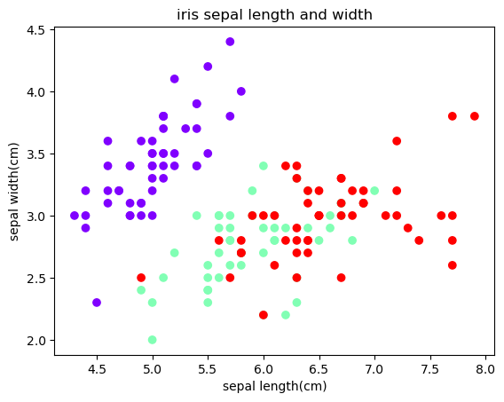
【pyplot】 绘制鸢尾花数据
# 加载鸢尾花数据集  返回值的不同
iris = load_iris(return_X_y = True)    # return (data(ndarrge), target)
# iris = load_iris(as_frame = False)   # return pandas dataframe

# 提取花萼长度和宽度做为变量
sepal_len = iris[0][:,0]
sepal_wid = iris[0][:,1]
sepal_target = iris[1]


fih, ax = plt.subplots()

# 创建散点图
ax.scatter(sepal_len, sepal_wid, c = sepal_target, cmap = 'rainbow')

plt.title("iris sepal length and width")
ax.set_xlabel("sepal length(cm)")
ax.set_ylabel("sepal width(cm)")
plt.show()
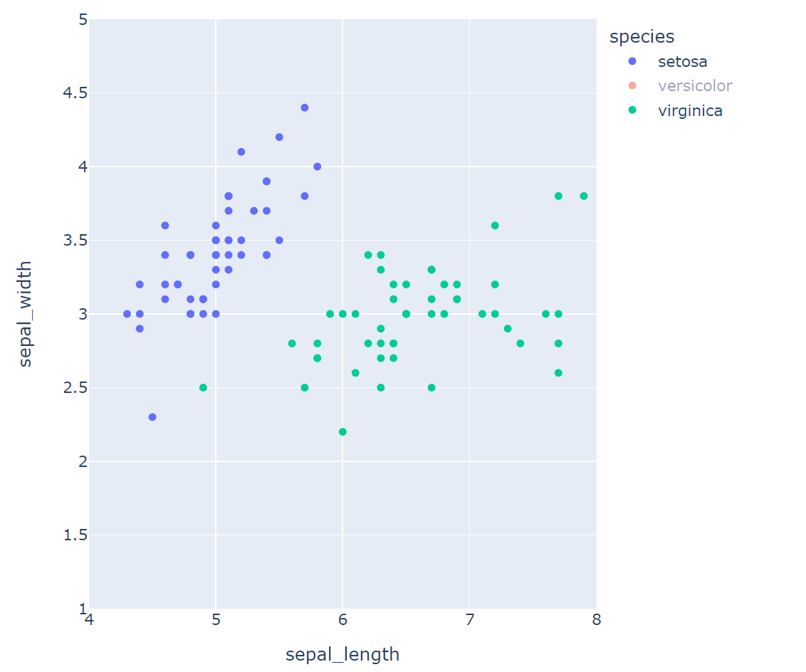
【plotly】
1.鸢尾花散点图
# 获取鸢尾花数据集
iris_df = px.data.iris()
# print(iris_df.head())
fig = px.scatter(iris_df, x = iris_df.columns[0], y = iris_df.columns[1],  # 导入数据
                 width = 500 , height = 500                                # 图片尺寸
                )
fig.update_layout(xaxis_range = [4, 8] , yaxis_range = [1, 5])
fig.show()
散点图(按品种分类)
fig = px.scatter(iris_df, x = iris_df.columns[0], y = iris_df.columns[1],  # 导入数据
                 width = 600, height = 600,                               # 图片尺寸
                 color = "species"
                )
fig.update_layout(xaxis_range = [4, 8] , yaxis_range = [1, 5])
fig.show()
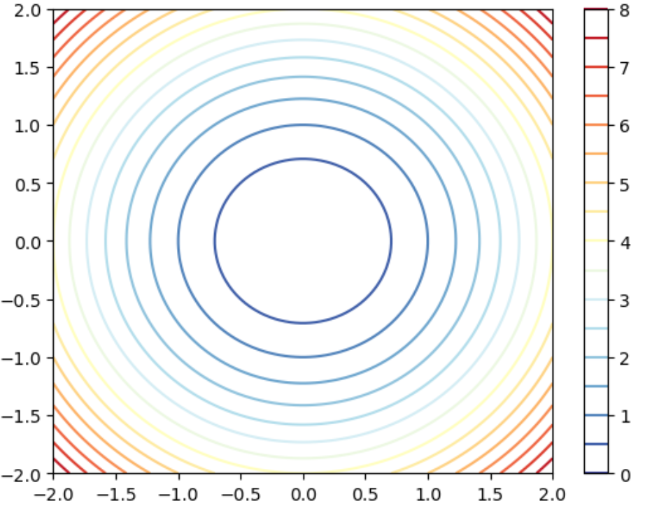
2.使用plotly绘制平面等高线
meshgrid example
x1 = np.arange(10)
x2 = np.arange(5)

xx1, xx2 = np.meshgrid(x1, x2)
x1,x2,xx1,xx2
(array([0, 1, 2, 3, 4, 5, 6, 7, 8, 9]),
 array([0, 1, 2, 3, 4]),
 array([[0, 1, 2, 3, 4, 5, 6, 7, 8, 9],
        [0, 1, 2, 3, 4, 5, 6, 7, 8, 9],
        [0, 1, 2, 3, 4, 5, 6, 7, 8, 9],
        [0, 1, 2, 3, 4, 5, 6, 7, 8, 9],
        [0, 1, 2, 3, 4, 5, 6, 7, 8, 9]]),
 array([[0, 0, 0, 0, 0, 0, 0, 0, 0, 0],
        [1, 1, 1, 1, 1, 1, 1, 1, 1, 1],
        [2, 2, 2, 2, 2, 2, 2, 2, 2, 2],
        [3, 3, 3, 3, 3, 3, 3, 3, 3, 3],
        [4, 4, 4, 4, 4, 4, 4, 4, 4, 4]]))
平面等高线
import matplotlib.pyplot as plt

x = np.linspace(-2, 2, 100)
y = np.linspace(-2, 2, 100)
X, Y = np.meshgrid(x, y)
Z = X**2 + Y**2

# 绘制等高线
plt.contour(X, Y, Z, levels = np.linspace(0, 8, 17), cmap = 'RdYlBu_r')
plt.colorbar()
plt.show()
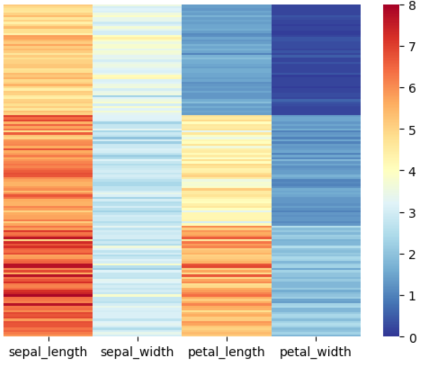
3.热图
pyplot.imshow()函数可以将二维的数据矩阵的值映射为不同的颜色,从而展示数据的密度
seaborn.heatmap
import seaborn as sns
import numpy as np

iris_sns = sns.load_dataset('iris')
iris_sns.iloc[:,:-1].head()
sns.heatmap(data = iris_sns.iloc[ : ,0 : -1],
            vmin = 0, vmax = 8,  # 最大值和最小值
            cmap = 'RdYlBu_r',    # 颜色映射
            annot = False,       # 是否显示值
            xticklabels = True,  # 是否显示刻度
            yticklabels = False
           )
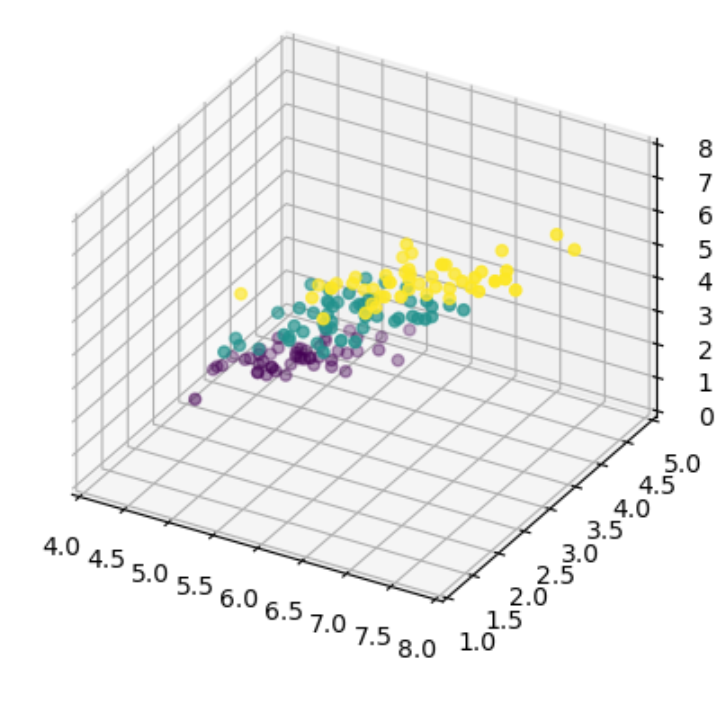
4.三维散点图
import matplotlib.pyplot as plt
import numpy as np
from sklearn import datasets

iris = datasets.load_iris()
X = iris.data[: , : 3]
Y = iris.target

fig = plt.figure()
ax = fig.add_subplot(111,projection = '3d')

# 绘制散点图
ax.scatter(X[:, 0 ], X[:, 1], X[:, 2], c = Y)

ax.set_xlim(4, 8)
ax.set_ylim(1, 5)
ax.set_zlim(0, 8)

ax.set_proj_type('ortho') # 设置正投影

plt.show()
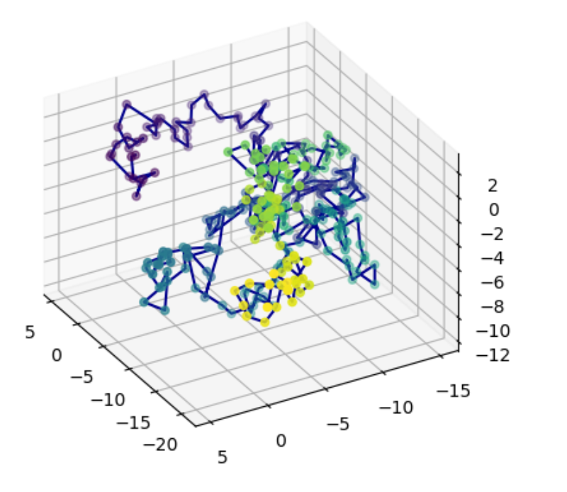
5.三维线图
import matplotlib.pyplot as plt
import numpy as np
# import plotly.graph_objects as go

# 生成随机游走的数据
num_step = 300
t = np.arange(num_step)
x = np.cumsum(np.random.standard_normal(num_step))  # 服从标准正太分布
y = np.cumsum(np.random.standard_normal(num_step))
z = np.cumsum(np.random.standard_normal(num_step))

fig = plt.figure()
ax = fig.add_subplot(111,projection = '3d')

ax.plot(x, y, z, color = 'darkblue')
ax.scatter(x, y, z, c = t, cmap = 'viridis' )

ax.set_proj_type('ortho')
ax.view_init(elev = 30, azim = 150)
plt.show()
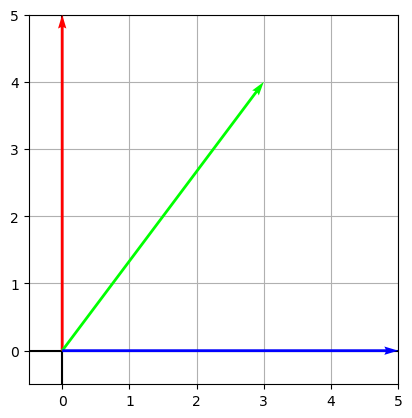
6.箭头图
import matplotlib.pyplot as plt

A = [[0, 5],
    [3, 4],
    [5, 0]]

def draw_vector(vector, RGB):
    '''
    quiver([X, Y], U, V, [C], **kwargs)

    '''
    plt.quiver(0, 0,  # 箭头的起始坐标
               vector[0], vector[1],  # 箭头方向的 x 和 y 的分量 组成了箭头向量
               angles = 'xy',
              scale_units= 'xy', scale = 1, color = RGB,zorder = 1e5)


fig, ax = plt.subplots()
v1 = A[0]
draw_vector(v1, '#FF0000')
v2 = A[1]
draw_vector(v2, '#00FF00')
v3 = A[2]
draw_vector(v3, '#0000FF')

ax.axvline(x = 0, c = 'k')
ax.axhline(y = 0, c = 'k')
ax.grid()
ax.set_aspect('equal', adjustable = 'box')
ax.set_xbound(lower = -0.5, upper = 5)
ax.set_ybound(lower = -0.5, upper = 5)
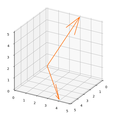
def draw_vector_3D(vector, RGB):
    '''
    quiver([X, Y], U, V, [C], **kwargs)

    '''
    plt.quiver(0, 0, 0,  # 箭头的起始坐标
               vector[0], vector[1], vector[2], # 箭头方向的 x 和 y 的分量 组成了箭头向量
               color = RGB,zorder = 1e5)
fig = plt.figure(figsize = (6, 6))
ax = fig.add_subplot(111, projection = '3d', proj_type = 'ortho')

v_1 = [row[0] for row in A]
draw_vector_3D(v_1, '#FF6600')
v_2 = [row[1] for row in A]
draw_vector_3D(v_2, '#FF6600')
ax.set_xlim(0, 5)
ax.set_ylim(0, 5)
ax.set_zlim(0, 5)
ax.view_init(azim = 30 ,elev = 25)
ax.set_box_aspect([1, 1,1 ])

ax,A
(<Axes3D: >, [[0, 5], [3, 4], [5, 0]])

 浙公网安备 33010602011771号