ArkUI自定义组件
一、自定义组件
组件是 OpenHarmony 页面最小显示单元,一个页面可由多个组件组合而成,也可只由一个组件组合而成,这些组件可以是ArkUI框架自带系统组件,比如 Text 、 Button 等,也可以是自定义组件,
在ArkUI中,UI显示的内容均为组件,由框架直接提供的称为系统组件,由开发者定义的称为自定义组件。在进行 UI 界面开发时,通常不是简单的将系统组件进行组合使用,而是需要考虑代码可复用性、业务逻辑与UI分离,后续版本演进等因素。因此,将UI和部分业务逻辑封装成自定义组件是不可或缺的能力。
自定义组件具有以下特点:
- 可组合:允许开发者组合使用系统组件、及其属性和方法。
- 可重用:自定义组件可以被其他组件重用,并作为不同的实例在不同的父组件或容器中使用。
- 数据驱动UI更新:通过状态变量的改变,来驱动UI的刷新。
二、语法如下
自定义一个组件,需要要定义组件名称,做到见名知意,比如定义一个标题栏组件,笔者把它命名为 TitleBar ,为了让系统知道这是一个组件,需要使用 @Component 修饰符和 struct 关键字修饰,格式:【@Component struct + 组件名称】,如下所示:
@Component
struct TitleBar {
  build() {
    // 省略
  }
}

@Entry
@Component struct Index {
  build() {
    // 省略
  }
}
说明如下:
- struct:表示
TitleBar是一个结构体,使用struct关键字必须实现build()方法,否则编译器报错:Require build function for struct。 - @Component:表示
TitleBar这个结构体具有组件化的能力,可以成为一个独立的组件。 - @Entry:表示当前组件是页面的总入口,就是页面的根节点,一个页面有且仅有一个
@Entry修饰符,只有被@Entry修饰的组件或者子组件才会在页面上显示。
注意:自定义组件禁止添加构造函数,否则编译器报错
三、自定义组件案例
3.1.需求说明
以之前的商品列表展示页面为案例演示:
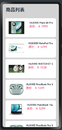
先给上面的内容添加,标题栏添加返回按钮和刷新按钮,如下:
实现代码如下:
class Item{
  //定位属性
  name: string
  image: any
  price: number

  constructor(name: string, image: any, price: number) {
    this.name = name
    this.image = image
    this.price = price
  }
}

@Entry
@Component
struct ListExample {
  private items:Array<Item> = [
    new Item("HUAWEI Mate 60 Pro",$r("app.media.mate60"),  7999.00),
    new Item("HUAWEI MatePad Pro",$r("app.media.MatePadPro"),4299.00),
    new Item("HUAWEI WATCH GT 4", $r("app.media.WATCHGT4"), 1538.00),
    new Item("HUAWEI FreeBuds Pro 3", $r("app.media.FreeBudsPro3"), 1499.00),
    new Item("HUAWEI MateBook 14s", $r("app.media.MateBook14s"), 5299.00),
    new Item("HUAWEI FreeBuds Pro 3", $r("app.media.FreeBudsPro3"), 1499.00),
    new Item("HUAWEI MateBook 14s", $r("app.media.MateBook14s"), 5299.00),
    new Item("HUAWEI Mate 60",$r("app.media.mate60"),  5999.00),
    new Item("HUAWEI MatePad2 Pro",$r("app.media.MatePadPro"),4599.00),
    new Item("HUAWEI WATCH GT 5", $r("app.media.WATCHGT4"), 1638.00),
    new Item("HUAWEI FreeBuds Pro 4", $r("app.media.FreeBudsPro3"), 1699.00),
  ]
  build() {
    Column({space:8}){
      Row(){
        //返回按钮
        Image($r("app.media.icon_back_button")).width(30).height(30)

        Text("商品列表")
          .fontSize(30)
          .fontWeight(FontWeight.Bold)
        Blank()//这里为了有让文字和刷新按钮之间空间,Blank会占满剩余空间
        //刷新按钮
        Image($r("app.media.icon_refresh_button")).width(30).height(30)
      }
      .width("100%")
      .padding(20)

      List({space:10}){
        ForEach(this.items,(item: Item)=>{
          ListItem(){
            Row({space:10}){
              Image(item.image).width(100)
              Column({space:4}){
                Text(item.name).fontSize(15).fontWeight(FontWeight.Bold)
                Text(`原价:¥ ${item.price}`).fontColor("#F36").fontSize(18)
              }
              .height("100%")
              .alignItems(HorizontalAlign.Start)
            }
            .width("90%")  //设置宽度
            .height(120)    //设置高度
            .justifyContent(FlexAlign.SpaceBetween) //设置主轴方向主轴方向均匀分配弹性元素,相邻元素之间距离相同。 第一个元素与行首对齐,最后一个元素与行尾对齐。
            .backgroundColor("#FFFFFF") //设置背景为白色
            .borderRadius(10) //这是圆角班级
            .padding(20) //内边距
          }
        })
      }
        .alignListItem(ListItemAlign.Center) //ListItem在List交叉轴方向的布局方式,默认为首部对齐。这里改为居中对齐
        .height("100%")
        .width("100%")

    }
    .width("100%")
    .height("100%")
    .backgroundColor("#D3D3D3")
  }
}
3.2.页面内部自定义标题组件
上面的代码的将标题部分,抽取出来,形成组件,如下:
//自定义标题组件
@Component
struct TitleBar{
  private title:string;

  build(){
    Row(){
      //返回按钮
      Image($r("app.media.icon_back_button")).width(30)

      //标题
      Text(this.title)
        .fontSize(30)
        .fontWeight(FontWeight.Bold)
      Blank()//这里为了有让文字和刷新按钮之间空间,Blank会占满剩余空间
      //刷新按钮
      Image($r("app.media.icon_refresh_button")).width(30)
    }
    .width("100%")
    .padding(20)
  }
}

class Item{
  //定位属性
  name: string
  image: any
  price: number

  constructor(name: string, image: any, price: number) {
    this.name = name
    this.image = image
    this.price = price
  }
}

@Entry
@Component
struct ListExample {
  private items:Array<Item> = [
    new Item("HUAWEI Mate 60 Pro",$r("app.media.mate60"),  7999.00),
    new Item("HUAWEI MatePad Pro",$r("app.media.MatePadPro"),4299.00),
    new Item("HUAWEI WATCH GT 4", $r("app.media.WATCHGT4"), 1538.00),
    new Item("HUAWEI FreeBuds Pro 3", $r("app.media.FreeBudsPro3"), 1499.00),
    new Item("HUAWEI MateBook 14s", $r("app.media.MateBook14s"), 5299.00),
    new Item("HUAWEI FreeBuds Pro 3", $r("app.media.FreeBudsPro3"), 1499.00),
    new Item("HUAWEI MateBook 14s", $r("app.media.MateBook14s"), 5299.00),
    new Item("HUAWEI Mate 60",$r("app.media.mate60"),  5999.00),
    new Item("HUAWEI MatePad2 Pro",$r("app.media.MatePadPro"),4599.00),
    new Item("HUAWEI WATCH GT 5", $r("app.media.WATCHGT4"), 1638.00),
    new Item("HUAWEI FreeBuds Pro 4", $r("app.media.FreeBudsPro3"), 1699.00),
  ]
  build() {
    Column({space:8}){

      //调用自定义组件实现标题
      TitleBar({title:"商品列表"})

      List({space:10}){
        ForEach(this.items,(item: Item)=>{
          ListItem(){
            Row({space:10}){
              Image(item.image).width(100)
              Column({space:4}){
                Text(item.name).fontSize(15).fontWeight(FontWeight.Bold)
                Text(`原价:¥ ${item.price}`).fontColor("#F36").fontSize(18)
              }
              .height("100%")
              .alignItems(HorizontalAlign.Start)
            }
            .width("90%")  //设置宽度
            .height(120)    //设置高度
            .justifyContent(FlexAlign.SpaceBetween) //设置主轴方向主轴方向均匀分配弹性元素,相邻元素之间距离相同。 第一个元素与行首对齐,最后一个元素与行尾对齐。
            .backgroundColor("#FFFFFF") //设置背景为白色
            .borderRadius(10) //这是圆角班级
            .padding(20) //内边距
          }
        })
      }
        .alignListItem(ListItemAlign.Center) //ListItem在List交叉轴方向的布局方式,默认为首部对齐。这里改为居中对齐
        .height("100%")
        .width("100%")

    }
    .width("100%")
    .height("100%")
    .backgroundColor("#D3D3D3")
  }
}
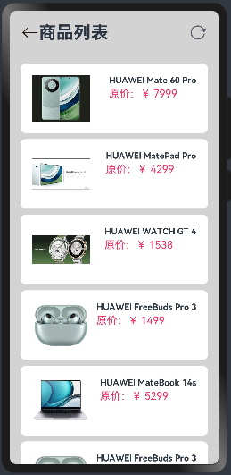
预览效果如下:
上面这样实现没用问题,但是像标题组件这种组件,后续其他模块也要使用,那么就需要定义在外部一个功能的模块,后续调用
3.3.外部自定义标题组件
将上面的标题组件,定位在其他的模块文件中,以供其他的模块调用
1)在ets目录下先创建components目录,然后创建CommonComponents.ets,内容如下:
//自定义标题组件
@Component
export struct TitleBar{
  private title:string;

  build(){
    Row(){
      //返回按钮
      Image($r("app.media.icon_back_button")).width(30)

      //标题
      Text(this.title)
        .fontSize(30)
        .fontWeight(FontWeight.Bold)
      Blank()//这里为了有让文字和刷新按钮之间空间,Blank会占满剩余空间
      //刷新按钮
      Image($r("app.media.icon_refresh_button")).width(30)
    }
    .width("100%")
    .padding(20)
  }
}
注意:在struct前面需要添加export,其他模块才可以导入使用
2)删除上一个章节模块中定义的组件,在模块中导入外部定义的组件,代码如下:
//导入组件
import {TitleBar} from "../components/CommonComponents"

class Item{
  //定位属性
  name: string
  image: any
  price: number

  constructor(name: string, image: any, price: number) {
    this.name = name
    this.image = image
    this.price = price
  }
}

@Entry
@Component
struct ListExample {
  private items:Array<Item> = [
    new Item("HUAWEI Mate 60 Pro",$r("app.media.mate60"),  7999.00),
    new Item("HUAWEI MatePad Pro",$r("app.media.MatePadPro"),4299.00),
    new Item("HUAWEI WATCH GT 4", $r("app.media.WATCHGT4"), 1538.00),
    new Item("HUAWEI FreeBuds Pro 3", $r("app.media.FreeBudsPro3"), 1499.00),
    new Item("HUAWEI MateBook 14s", $r("app.media.MateBook14s"), 5299.00),
    new Item("HUAWEI FreeBuds Pro 3", $r("app.media.FreeBudsPro3"), 1499.00),
    new Item("HUAWEI MateBook 14s", $r("app.media.MateBook14s"), 5299.00),
    new Item("HUAWEI Mate 60",$r("app.media.mate60"),  5999.00),
    new Item("HUAWEI MatePad2 Pro",$r("app.media.MatePadPro"),4599.00),
    new Item("HUAWEI WATCH GT 5", $r("app.media.WATCHGT4"), 1638.00),
    new Item("HUAWEI FreeBuds Pro 4", $r("app.media.FreeBudsPro3"), 1699.00),
  ]
  build() {
    Column({space:8}){

      //调用自定义组件实现标题
      TitleBar({title:"商品列表"})

      List({space:10}){
        ForEach(this.items,(item: Item)=>{
          ListItem(){
            Row({space:10}){
              Image(item.image).width(100)
              Column({space:4}){
                Text(item.name).fontSize(15).fontWeight(FontWeight.Bold)
                Text(`原价:¥ ${item.price}`).fontColor("#F36").fontSize(18)
              }
              .height("100%")
              .alignItems(HorizontalAlign.Start)
            }
            .width("90%")  //设置宽度
            .height(120)    //设置高度
            .justifyContent(FlexAlign.SpaceBetween) //设置主轴方向主轴方向均匀分配弹性元素,相邻元素之间距离相同。 第一个元素与行首对齐,最后一个元素与行尾对齐。
            .backgroundColor("#FFFFFF") //设置背景为白色
            .borderRadius(10) //这是圆角班级
            .padding(20) //内边距
          }
        })
      }
        .alignListItem(ListItemAlign.Center) //ListItem在List交叉轴方向的布局方式,默认为首部对齐。这里改为居中对齐
        .height("100%")
        .width("100%")

    }
    .width("100%")
    .height("100%")
    .backgroundColor("#D3D3D3")
  }
}
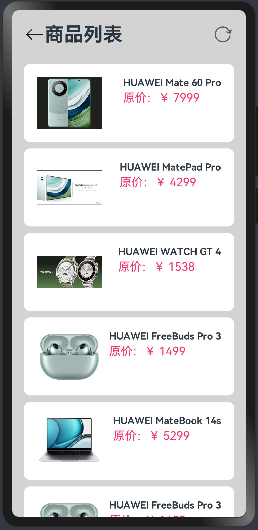
预览效果如下:
四、自定义函数
上面的自定义组件,可以用于整个项目的一些全局组件的封装调用,但是有时候我们往往需要对某个页面内部的部分内容进行封装调用,这个时候使用自定义函数更加的合适,当然这并不是说不能使用之前的自定义组件来实现
4.1.自定义函数
1)在组件外部自定义函数,这里所说的外部还是在同一个ets文件中,只不过不在struct里面,如下抽取商品列表的Row组件,自定义函数 ProductList ,然后调用,代码如下:
//导入组件
import {TitleBar} from "../components/CommonComponents"


class Item{
  //定位属性
  name: string
  image: any
  price: number

  constructor(name: string, image: any, price: number) {
    this.name = name
    this.image = image
    this.price = price
  }
}

//自定义函数,抽取出商品列表
@Builder function ProductList(item:Item){
  Row({space:10}){
    Image(item.image).width(100)
    Column({space:4}){
      Text(item.name).fontSize(15).fontWeight(FontWeight.Bold)
      Text(`原价:¥ ${item.price}`).fontColor("#F36").fontSize(18)
    }
    .height("100%")
    .alignItems(HorizontalAlign.Start)
  }
  .width("90%")  //设置宽度
  .height(120)    //设置高度
  .justifyContent(FlexAlign.SpaceBetween) //设置主轴方向主轴方向均匀分配弹性元素,相邻元素之间距离相同。 第一个元素与行首对齐,最后一个元素与行尾对齐。
  .backgroundColor("#FFFFFF") //设置背景为白色
  .borderRadius(10) //这是圆角班级
  .padding(20) //内边距
}


@Entry
@Component
struct ListExample {
  private items:Array<Item> = [
    new Item("HUAWEI Mate 60 Pro",$r("app.media.mate60"),  7999.00),
    new Item("HUAWEI MatePad Pro",$r("app.media.MatePadPro"),4299.00),
    new Item("HUAWEI WATCH GT 4", $r("app.media.WATCHGT4"), 1538.00),
    new Item("HUAWEI FreeBuds Pro 3", $r("app.media.FreeBudsPro3"), 1499.00),
    new Item("HUAWEI MateBook 14s", $r("app.media.MateBook14s"), 5299.00),
    new Item("HUAWEI FreeBuds Pro 3", $r("app.media.FreeBudsPro3"), 1499.00),
    new Item("HUAWEI MateBook 14s", $r("app.media.MateBook14s"), 5299.00),
    new Item("HUAWEI Mate 60",$r("app.media.mate60"),  5999.00),
    new Item("HUAWEI MatePad2 Pro",$r("app.media.MatePadPro"),4599.00),
    new Item("HUAWEI WATCH GT 5", $r("app.media.WATCHGT4"), 1638.00),
    new Item("HUAWEI FreeBuds Pro 4", $r("app.media.FreeBudsPro3"), 1699.00),
  ]
  build() {
    Column({space:8}){

      //调用自定义组件实现标题
      TitleBar({title:"商品列表"})

      List({space:10}){
        ForEach(this.items,(item: Item)=>{
          ListItem(){
            //调用自定义函数
            ProductList(item)
          }
        })
      }
        .alignListItem(ListItemAlign.Center) //ListItem在List交叉轴方向的布局方式,默认为首部对齐。这里改为居中对齐
        .height("100%")
        .width("100%")
    }
    .width("100%")
    .height("100%")
    .backgroundColor("#D3D3D3")
  }
}
注意:
- 在组件外部自定义函数的时候使用@Builder和function关键字,后面写函数名,括号中可以写参数
- 在调用的时候使用 ProductList(item)的形式即可
2)在内部自定义函数,也就是在struct里面,如下抽取商品列表的Row组件(先注释或者删除上面上面在外部定义的函数),在内部自定义函数 ProductList ,然后调用,代码如下:
//导入组件
import {TitleBar} from "../components/CommonComponents"

class Item{
  //定位属性
  name: string
  image: any
  price: number

  constructor(name: string, image: any, price: number) {
    this.name = name
    this.image = image
    this.price = price
  }
}

@Entry
@Component
struct ListExample {
  private items:Array<Item> = [
    new Item("HUAWEI Mate 60 Pro",$r("app.media.mate60"),  7999.00),
    new Item("HUAWEI MatePad Pro",$r("app.media.MatePadPro"),4299.00),
    new Item("HUAWEI WATCH GT 4", $r("app.media.WATCHGT4"), 1538.00),
    new Item("HUAWEI FreeBuds Pro 3", $r("app.media.FreeBudsPro3"), 1499.00),
    new Item("HUAWEI MateBook 14s", $r("app.media.MateBook14s"), 5299.00),
    new Item("HUAWEI FreeBuds Pro 3", $r("app.media.FreeBudsPro3"), 1499.00),
    new Item("HUAWEI MateBook 14s", $r("app.media.MateBook14s"), 5299.00),
    new Item("HUAWEI Mate 60",$r("app.media.mate60"),  5999.00),
    new Item("HUAWEI MatePad2 Pro",$r("app.media.MatePadPro"),4599.00),
    new Item("HUAWEI WATCH GT 5", $r("app.media.WATCHGT4"), 1638.00),
    new Item("HUAWEI FreeBuds Pro 4", $r("app.media.FreeBudsPro3"), 1699.00),
  ]

  //自定义函数,抽取出商品列表, 内部定义不能加function
  @Builder ProductList(item:Item){
  Row({space:10}){
    Image(item.image).width(100)
    Column({space:4}){
      Text(item.name).fontSize(15).fontWeight(FontWeight.Bold)
      Text(`原价:¥ ${item.price}`).fontColor("#F36").fontSize(18)
    }
    .height("100%")
    .alignItems(HorizontalAlign.Start)
  }
  .width("90%")  //设置宽度
  .height(120)    //设置高度
  .justifyContent(FlexAlign.SpaceBetween) //设置主轴方向主轴方向均匀分配弹性元素,相邻元素之间距离相同。 第一个元素与行首对齐,最后一个元素与行尾对齐。
  .backgroundColor("#FFFFFF") //设置背景为白色
  .borderRadius(10) //这是圆角班级
  .padding(20) //内边距
}

  build() {
    Column({space:8}){

      //调用自定义组件实现标题
      TitleBar({title:"商品列表"})

      List({space:10}){
        ForEach(this.items,(item: Item)=>{
          ListItem(){
            //调用自定义函数
            this.ProductList(item)
          }
        })
      }
        .alignListItem(ListItemAlign.Center) //ListItem在List交叉轴方向的布局方式,默认为首部对齐。这里改为居中对齐
        .height("100%")
        .width("100%")
    }
    .width("100%")
    .height("100%")
    .backgroundColor("#D3D3D3")
  }
}
注意:
- 在组件内部自定义函数的时候使用@Builder关键字,后面写函数名,括号中可以写参数,注意不能加function关键字,否则会报错
- 在调用的时候使用 this.ProductList(item)的形式即可,this必须要有
4.2.@styles装饰器,仅可封装组件通用属性
1)组件外部定义样式函数,将组件中Column的样式设置,封装成函数 fillStyles,然后调用,如下:
//导入组件
import {TitleBar} from "../components/CommonComponents"

class Item{
  //定位属性
  name: string
  image: any
  price: number

  constructor(name: string, image: any, price: number) {
    this.name = name
    this.image = image
    this.price = price
  }
}

//封装组件通用属性成函数
@Styles function fillStyles(){
  .width("100%")
  .height("100%")
  .backgroundColor("#D3D3D3")
}

@Entry
@Component
struct ListExample {
  private items:Array<Item> = [
    new Item("HUAWEI Mate 60 Pro",$r("app.media.mate60"),  7999.00),
    new Item("HUAWEI MatePad Pro",$r("app.media.MatePadPro"),4299.00),
    new Item("HUAWEI WATCH GT 4", $r("app.media.WATCHGT4"), 1538.00),
    new Item("HUAWEI FreeBuds Pro 3", $r("app.media.FreeBudsPro3"), 1499.00),
    new Item("HUAWEI MateBook 14s", $r("app.media.MateBook14s"), 5299.00),
    new Item("HUAWEI FreeBuds Pro 3", $r("app.media.FreeBudsPro3"), 1499.00),
    new Item("HUAWEI MateBook 14s", $r("app.media.MateBook14s"), 5299.00),
    new Item("HUAWEI Mate 60",$r("app.media.mate60"),  5999.00),
    new Item("HUAWEI MatePad2 Pro",$r("app.media.MatePadPro"),4599.00),
    new Item("HUAWEI WATCH GT 5", $r("app.media.WATCHGT4"), 1638.00),
    new Item("HUAWEI FreeBuds Pro 4", $r("app.media.FreeBudsPro3"), 1699.00),
  ]

  //自定义函数,抽取出商品列表, 内部定义不能加function
  @Builder ProductList(item:Item){
  Row({space:10}){
    Image(item.image).width(100)
    Column({space:4}){
      Text(item.name).fontSize(15).fontWeight(FontWeight.Bold)
      Text(`原价:¥ ${item.price}`).fontColor("#F36").fontSize(18)
    }
    .height("100%")
    .alignItems(HorizontalAlign.Start)
  }
  .width("90%")  //设置宽度
  .height(120)    //设置高度
  .justifyContent(FlexAlign.SpaceBetween) //设置主轴方向主轴方向均匀分配弹性元素,相邻元素之间距离相同。 第一个元素与行首对齐,最后一个元素与行尾对齐。
  .backgroundColor("#FFFFFF") //设置背景为白色
  .borderRadius(10) //这是圆角班级
  .padding(20) //内边距
}

  build() {
    Column({space:8}){

      //调用自定义组件实现标题
      TitleBar({title:"商品列表"})

      List({space:10}){
        ForEach(this.items,(item: Item)=>{
          ListItem(){
            //调用自定义函数
            this.ProductList(item)
          }
        })
      }
        .alignListItem(ListItemAlign.Center) //ListItem在List交叉轴方向的布局方式,默认为首部对齐。这里改为居中对齐
        .height("100%")
        .width("100%")
    }
    .fillStyles() //调用外部定义的样式
  }
}
注意:
- 在组件外部自定义样式函数的时候使用@Styles和function关键字,后面写函数名,括号中可以写参数
- 在调用的时候使用 .fillStyles() 的形式即可,前面必须有一个点,当成普通的属性使用即可
2)组件内部定义样式函数,将组件中Column的样式设置,封装成函数 fillStyles(先删除之前在外部定义的样式函数),然后调用,如下:
//导入组件
import {TitleBar} from "../components/CommonComponents"

class Item{
  //定位属性
  name: string
  image: any
  price: number

  constructor(name: string, image: any, price: number) {
    this.name = name
    this.image = image
    this.price = price
  }
}

@Entry
@Component
struct ListExample {
  private items:Array<Item> = [
    new Item("HUAWEI Mate 60 Pro",$r("app.media.mate60"),  7999.00),
    new Item("HUAWEI MatePad Pro",$r("app.media.MatePadPro"),4299.00),
    new Item("HUAWEI WATCH GT 4", $r("app.media.WATCHGT4"), 1538.00),
    new Item("HUAWEI FreeBuds Pro 3", $r("app.media.FreeBudsPro3"), 1499.00),
    new Item("HUAWEI MateBook 14s", $r("app.media.MateBook14s"), 5299.00),
    new Item("HUAWEI FreeBuds Pro 3", $r("app.media.FreeBudsPro3"), 1499.00),
    new Item("HUAWEI MateBook 14s", $r("app.media.MateBook14s"), 5299.00),
    new Item("HUAWEI Mate 60",$r("app.media.mate60"),  5999.00),
    new Item("HUAWEI MatePad2 Pro",$r("app.media.MatePadPro"),4599.00),
    new Item("HUAWEI WATCH GT 5", $r("app.media.WATCHGT4"), 1638.00),
    new Item("HUAWEI FreeBuds Pro 4", $r("app.media.FreeBudsPro3"), 1699.00),
  ]

  //自定义函数,抽取出商品列表, 内部定义不能加function
  @Builder ProductList(item:Item){
  Row({space:10}){
    Image(item.image).width(100)
    Column({space:4}){
      Text(item.name).fontSize(15).fontWeight(FontWeight.Bold)
      Text(`原价:¥ ${item.price}`).fontColor("#F36").fontSize(18)
    }
    .height("100%")
    .alignItems(HorizontalAlign.Start)
  }
  .width("90%")  //设置宽度
  .height(120)    //设置高度
  .justifyContent(FlexAlign.SpaceBetween) //设置主轴方向主轴方向均匀分配弹性元素,相邻元素之间距离相同。 第一个元素与行首对齐,最后一个元素与行尾对齐。
  .backgroundColor("#FFFFFF") //设置背景为白色
  .borderRadius(10) //这是圆角班级
  .padding(20) //内边距
}

  //封装组件通用属性成函数,不需要添加function
  @Styles fillStyles(){
    .width("100%")
    .height("100%")
    .backgroundColor("#D3D3D3")
  }

  build() {
    Column({space:8}){

      //调用自定义组件实现标题
      TitleBar({title:"商品列表"})

      List({space:10}){
        ForEach(this.items,(item: Item)=>{
          ListItem(){
            //调用自定义函数
            this.ProductList(item)
          }
        })
      }
        .alignListItem(ListItemAlign.Center) //ListItem在List交叉轴方向的布局方式,默认为首部对齐。这里改为居中对齐
        .height("100%")
        .width("100%")
    }
    .fillStyles() //调用外部定义的样式
  }
}
注意:
- 在组件内部自定义样式函数的时候使用@Styles关键字,后面写函数名,括号中可以写参数,注意不能加function关键字,否则会报错
- 在调用的时候和上面一样,还是使用 .fillStyles() 的形式即可,前面必须有一个点,当成普通的属性使用即可,不需要添加this
4.3.@Extend装饰器,仅可定义在全局,可以设置组件特有属性
将商品价格Text的样式抽取出来,封装成样式,但是有一个问题,这里的字体样式大小设置,是继承自Text组件,跟上一个章节中宽和高不同,宽和高是公共属性,这时候就无法在使用@styles装饰器, 而是使用@Extend装饰器,但是需要注意@Extend装饰器仅可定义在全局,可以设置组件特有属性,如下:
//导入组件
import {TitleBar} from "../components/CommonComponents"

class Item{
  //定位属性
  name: string
  image: any
  price: number

  constructor(name: string, image: any, price: number) {
    this.name = name
    this.image = image
    this.price = price
  }
}

//@Extend装饰器,仅可定义在全局,可以设置组件特有属性
@Extend(Text) function priceText(){
  .fontColor("#F36").fontSize(18)
}

@Entry
@Component
struct ListExample {
  private items:Array<Item> = [
    new Item("HUAWEI Mate 60 Pro",$r("app.media.mate60"),  7999.00),
    new Item("HUAWEI MatePad Pro",$r("app.media.MatePadPro"),4299.00),
    new Item("HUAWEI WATCH GT 4", $r("app.media.WATCHGT4"), 1538.00),
    new Item("HUAWEI FreeBuds Pro 3", $r("app.media.FreeBudsPro3"), 1499.00),
    new Item("HUAWEI MateBook 14s", $r("app.media.MateBook14s"), 5299.00),
    new Item("HUAWEI FreeBuds Pro 3", $r("app.media.FreeBudsPro3"), 1499.00),
    new Item("HUAWEI MateBook 14s", $r("app.media.MateBook14s"), 5299.00),
    new Item("HUAWEI Mate 60",$r("app.media.mate60"),  5999.00),
    new Item("HUAWEI MatePad2 Pro",$r("app.media.MatePadPro"),4599.00),
    new Item("HUAWEI WATCH GT 5", $r("app.media.WATCHGT4"), 1638.00),
    new Item("HUAWEI FreeBuds Pro 4", $r("app.media.FreeBudsPro3"), 1699.00),
  ]

  //自定义函数,抽取出商品列表, 内部定义不能加function
  @Builder ProductList(item:Item){
  Row({space:10}){
    Image(item.image).width(100)
    Column({space:4}){
      Text(item.name).fontSize(15).fontWeight(FontWeight.Bold)
      Text(`原价:¥ ${item.price}`)
        .priceText() //使用自定义的样式
    }
    .height("100%")
    .alignItems(HorizontalAlign.Start)
  }
  .width("90%")  //设置宽度
  .height(120)    //设置高度
  .justifyContent(FlexAlign.SpaceBetween) //设置主轴方向主轴方向均匀分配弹性元素,相邻元素之间距离相同。 第一个元素与行首对齐,最后一个元素与行尾对齐。
  .backgroundColor("#FFFFFF") //设置背景为白色
  .borderRadius(10) //这是圆角班级
  .padding(20) //内边距
}

  //封装组件通用属性成函数,不需要添加function
  @Styles fillStyles(){
    .width("100%")
    .height("100%")
    .backgroundColor("#D3D3D3")
  }

  build() {
    Column({space:8}){

      //调用自定义组件实现标题
      TitleBar({title:"商品列表"})

      List({space:10}){
        ForEach(this.items,(item: Item)=>{
          ListItem(){
            //调用自定义函数
            this.ProductList(item)
          }
        })
      }
        .alignListItem(ListItemAlign.Center) //ListItem在List交叉轴方向的布局方式,默认为首部对齐。这里改为居中对齐
        .height("100%")
        .width("100%")
    }
    .fillStyles() //调用外部定义的样式
  }
}
注意:
- 在组件内部自定义样式函数的时候使用@Extend和function关键字,后面写函数名,括号中可以写参数
- 在调用的时候和上面一样,还是使用 .priceText() 的形式即可,前面必须有一个点,当成普通的属性使用即可,不需要添加this
- 尽可以定义在全局使用,不可以在内部定义

 浙公网安备 33010602011771号