
前端常见loading动画
loading动画是前端页面加载时必不可少的元素,好看合适的加载动画会极大的提升用户体验与系统的交互效果。下面为大家提供几种简单的加载动画效果,如果帮助到你了请点赞评论。😊😊😊
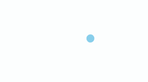
1.无限循环的圆圈
<div class="chase-wrapper">
    <div class="chase-item"></div>
    <div class="chase-item"></div>
    <div class="chase-item"></div>
    <div class="chase-item"></div>
    <div class="chase-item"></div>
    <div class="chase-item"></div>
</div>
.chase-wrapper {
  width: 60px;
  height: 60px;
  display: inline-block;
  animation: chase-loader 2.5s infinite linear both;
  margin: 50px;
}
.chase-item {
  width: 100%;
  height: 100%;
  position: absolute;
  top: 0;
  left: 0;
  animation: chase-dot 2s infinite ease-in-out both;
}
.chase-item:before {
  content: "";
  display: block;
  width: 25%;
  height: 25%;
  background-color: skyBlue;
  border-radius: 100%;
  animation: chase-dot-before 2s infinite ease-in-out both;
}

.chase-item:nth-child(1),
.chase-item:nth-child(1):before {
  animation-delay: -1.1s;
}
.chase-item:nth-child(2),
.chase-item:nth-child(2):before {
  animation-delay: -1s;
}
.chase-item:nth-child(3),
.chase-item:nth-child(3):before {
  animation-delay: -0.9s;
}
.chase-item:nth-child(4),
.chase-item:nth-child(4):before {
  animation-delay: -0.8s;
}
.chase-item:nth-child(5),
.chase-item:nth-child(5):before {
  animation-delay: -0.7s;
}
.chase-item:nth-child(6),
.chase-item:nth-child(6):before {
  animation-delay: -0.6s;
}

@keyframes chase-loader {
  100% {
    transform: rotate(1turn);
  }
}

@keyframes chase-dot {
  80%,
  100% {
    transform: rotate(360deg);
  }
}

@keyframes chase-dot-before {
  50% {
    transform: scale(0.4);
  }
  100%,
  0% {
    transform: scale(1);
  }
}
2.若隐若现的方块

<div class="cube-wrapper">
    <div class="cube cube1"></div>
    <div class="cube cube2"></div>
    <div class="cube cube3"></div>
    <div class="cube cube4"></div>
    <div class="cube cube5"></div>
    <div class="cube cube6"></div>
    <div class="cube cube7"></div>
    <div class="cube cube8"></div>
    <div class="cube cube9"></div>
</div>
.cube-wrapper {
  width: 60px;
  height: 60px;
  display: inline-block;
  margin: 50px;
}
.cube {
  width: 33%;
  height: 33%;
  float: left;
  background: skyBlue;
  animation: cube-loader 1.3s infinite ease-in-out;
  animation-delay: 0.2s;
}
.cube1 {
  animation-delay: 0.2s;
}
.cube2 {
  animation-delay: 0.3s;
}
.cube3 {
  animation-delay: 0.4s;
}
.cube4 {
  animation-delay: 0.1s;
}
.cube5 {
  animation-delay: 0.2s;
}
.cube6 {
  animation-delay: 0.3s;
}
.cube7 {
  animation-delay: 0s;
}
.cube8 {
  animation-delay: 0.1s;
}

@keyframes cube-loader {
  0%,
  70%,
  100% {
    transform: scale3D(1, 1, 1);
  }
  35% {
    transform: scale3D(0, 0, 1);
  }
}
3.闪转腾挪的方块

<div class="plane-wrapper"></div>
.plane-wrapper {
  width: 60px;
  height: 60px;
  background-color: skyBlue;
  display: inline-block;
  animation: plane-loader 1.2s infinite ease-in-out;
  margin: 50px;
}

@keyframes plane-loader {
  0% {
    transform: perspective(120px);
  }
  50% {
    transform: perspective(120px) rotateY(180deg);
  }
  100% {
    transform: perspective(120px) rotateY(180deg) rotateX(180deg);
  }
}
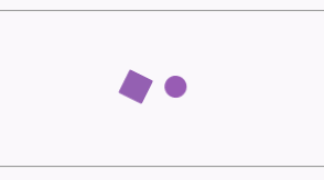
4.左右交互的方圆
<div class="preloader-wrapper"></div>
.preloader-wrapper {
  position: relative;
  display: inline-block;
  width: 20px;
  height: 20px;
  margin: 50px;
}
.preloader-wrapper:before {
  width: 20px;
  height: 20px;
  border-radius: 20px;
  background: blue;
  content: "";
  position: absolute;
  background: #9b59b6;
  animation: preloader_before 2s infinite ease-in-out;
}

.preloader-wrapper:after {
  width: 20px;
  height: 20px;
  border-radius: 20px;
  background: blue;
  content: "";
  position: absolute;
  background: #2ecc71;
  left: 22px;
  animation: preloader_after 1.5s infinite ease-in-out;
}

@keyframes preloader_before {
  0% {
    transform: translateX(0px) rotate(0deg);
  }
  50% {
    transform: translateX(50px) scale(1.2) rotate(260deg);
    background: #2ecc71;
    border-radius: 0px;
  }
  100% {
    transform: translateX(0px) rotate(0deg);
  }
}
@keyframes preloader_after {
  0% {
    transform: translateX(0px);
  }
  50% {
    transform: translateX(-50px) scale(1.2) rotate(-260deg);
    background: #9b59b6;
    border-radius: 0px;
  }
  100% {
    transform: translateX(0px);
  }
}
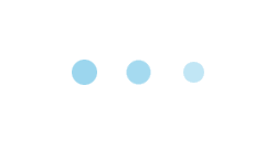
5.一闪一闪的圆圈
<div class="pulse-wrapper">
    <div class="pulse-item one"></div>
    <div class="pulse-item two"></div>
    <div class="pulse-item three"></div>
</div>
.pulse-wrapper {
  margin: 50px;
}
.pulse-item {
  width: 20px;
  height: 20px;
  border-radius: 50%;
  background-color: skyBlue;
  animation: pulse-loader 0.4s ease 0s infinite alternate;
  position: relative;
  display: inline-block;
}
.two {
  margin: 0 15px;
  animation: pulse-loader 0.4s ease 0.2s infinite alternate;
}
.three {
  animation: pulse-loader 0.4s ease 0.4s infinite alternate;
}

@keyframes pulse-loader {
  0% {
    opacity: 1;
    transform: scale(1);
  }
  100% {
    opacity: 0.5;
    transform: scale(0.75);
  }
}
6.高低起伏的音符
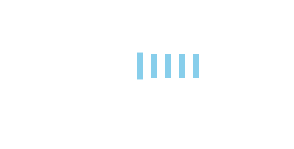
  <div class="rect-wrapper">
      <div class="rect-item rect1"></div>
      <div class="rect-item rect2"></div>
      <div class="rect-item rect3"></div>
      <div class="rect-item rect4"></div>
      <div class="rect-item rect5"></div>
    </div>
.rect-wrapper {
  margin: 50px;
}
.rect-item {
  width: 6px;
  height: 60px;
  background-color: skyBlue;
  display: inline-block;
  margin: 0 4px;
  animation: rect-loader 1.2s infinite ease-in-out;
}
.rect2 {
  animation-delay: -1.1s;
}
.rect3 {
  animation-delay: -1s;
}
.rect4 {
  animation-delay: -0.9s;
}
.rect5 {
  animation-delay: -0.8s;
}

@keyframes rect-loader {
  0%,
  40%,
  100% {
    transform: scaleY(0.4);
  }
  20% {
    transform: scaleY(1);
  }
}
后续我也会继续分享精美的loading动画,你也可以继续优化,选择适合你的方案😉😉😉。

 浙公网安备 33010602011771号